2023 WAArchitecture Awards Winners
2023 National Architecture Awards
2023 WA Architecture Awards - results
The Australian Institute of Architects Awards program offers an opportunity for public and peer recognition of the innovative work of our WA members.
The program also provides the Institute with a valuable mechanism to promote architects and architecture within the WA, across Australia and internationally.
2023 WA Architecture Awards and Prizes
George Temple Poole Award
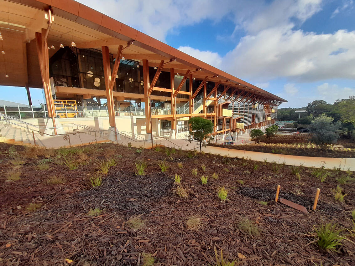
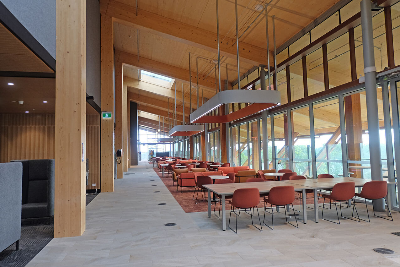
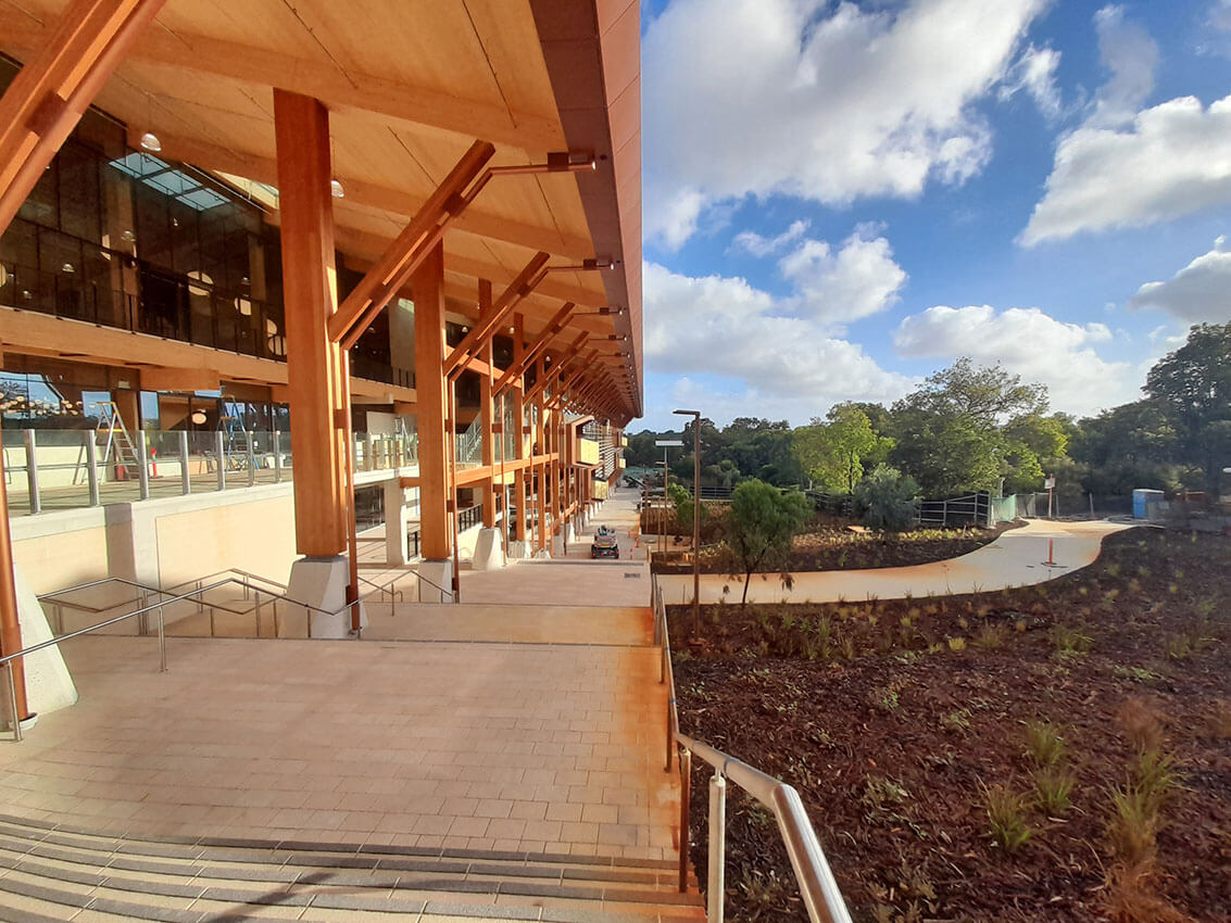
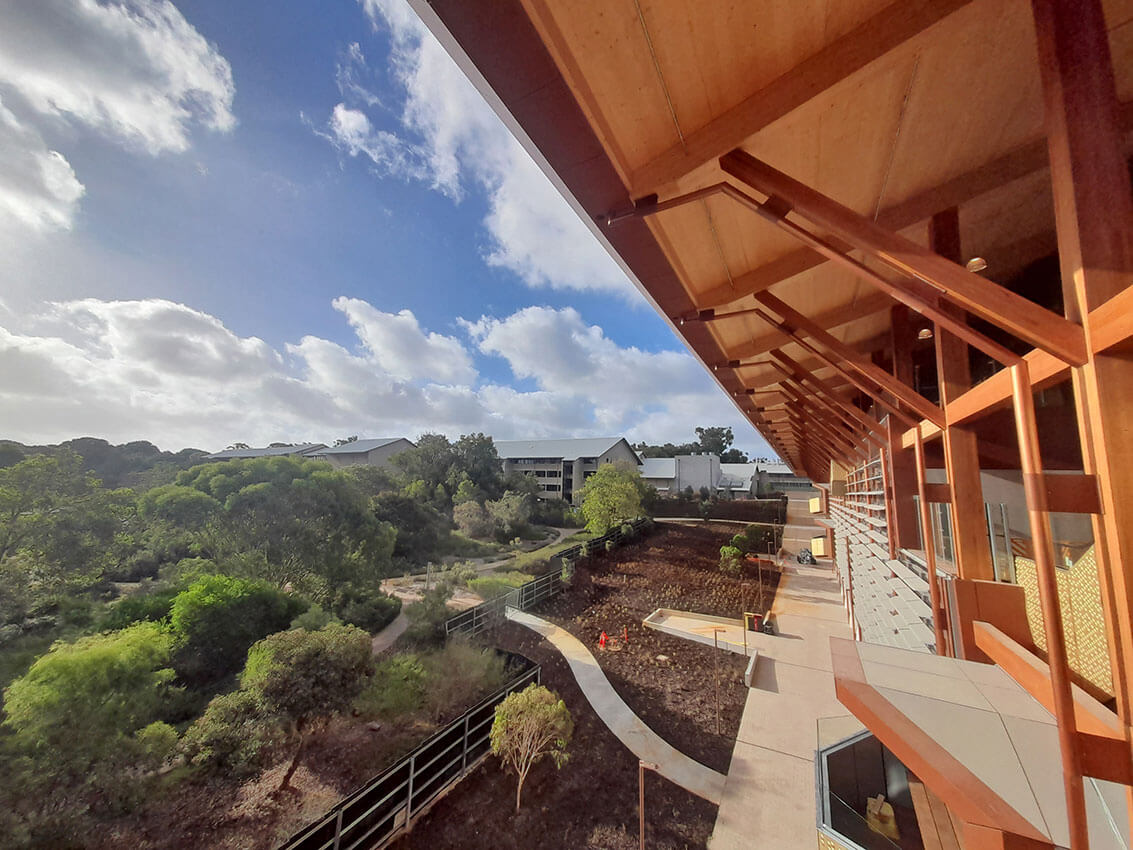
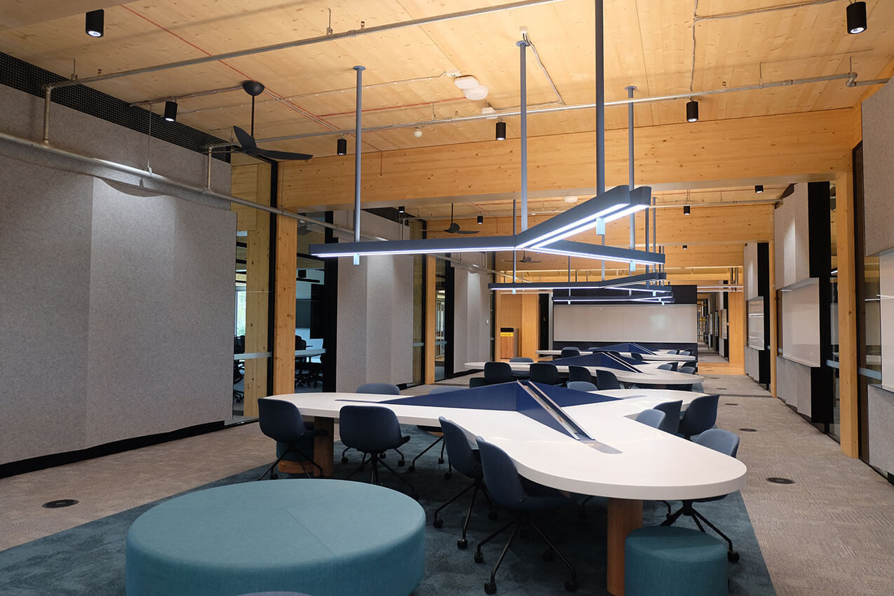
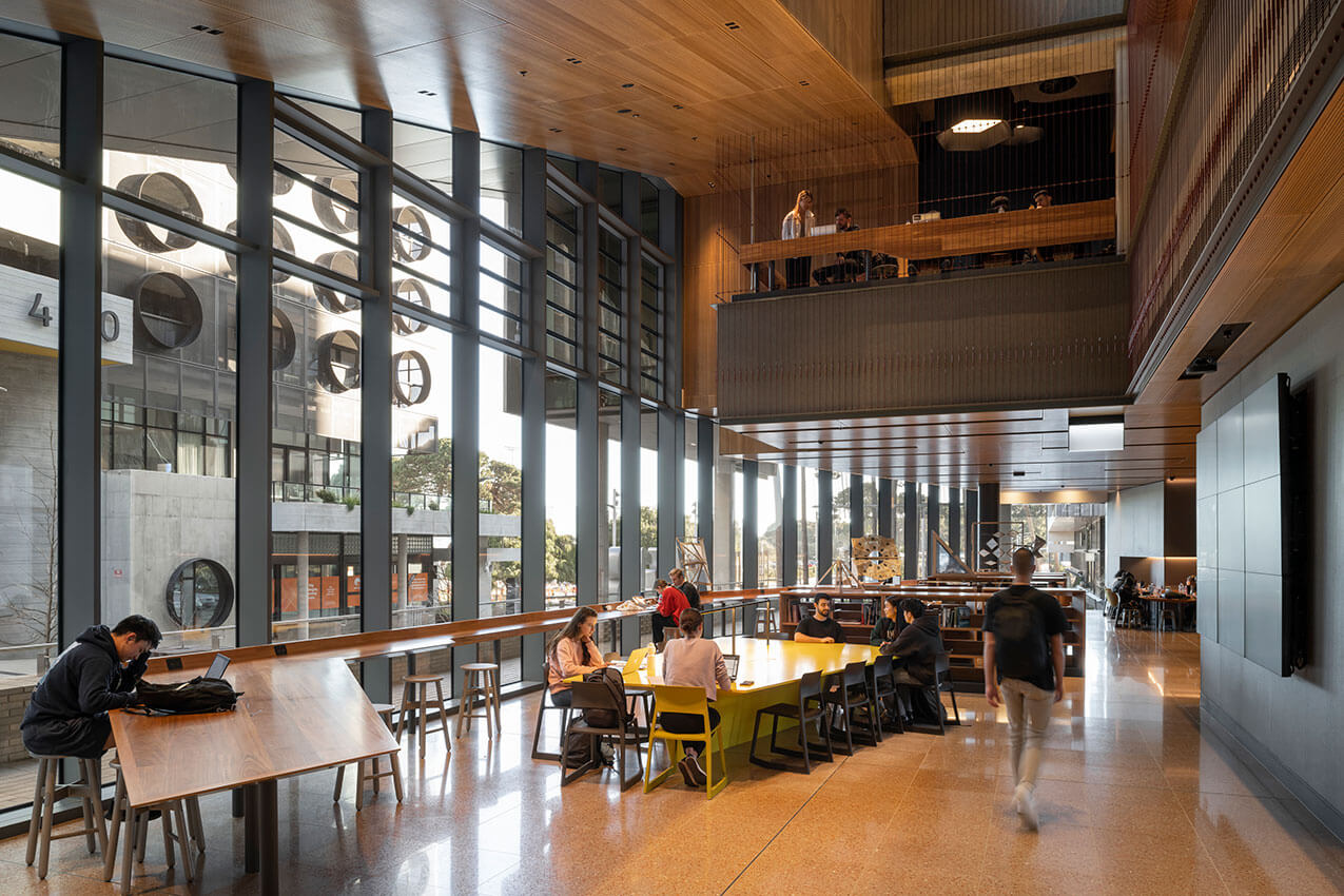
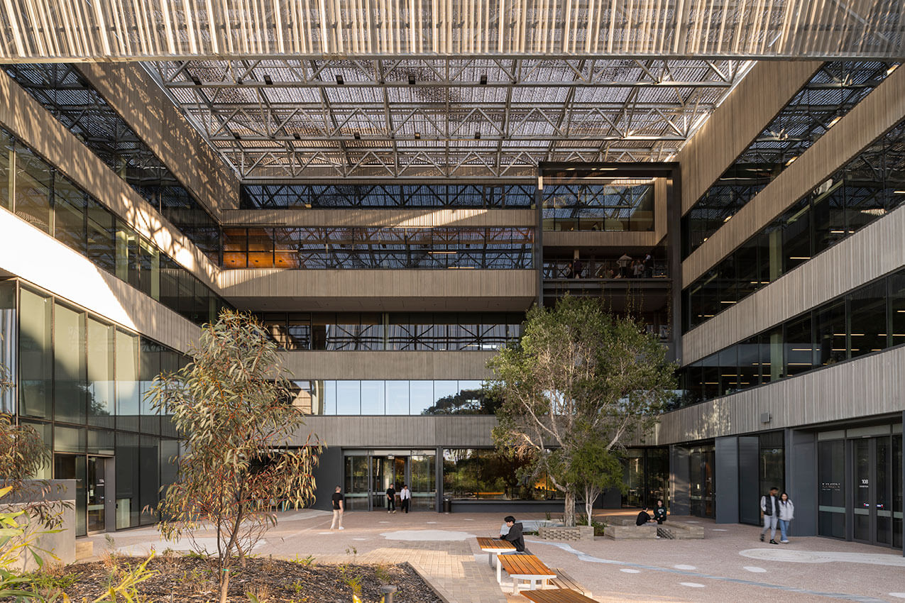
Boola Katitjin | Lyons with Silver Thomas Hanley, Officer Woods, The Fulcrum Agency
Jury citation
This collaboration of Lyons Architects, Silver Thomas Hanley, Fulcrum Agency, and Officer Woods Architects, to create a new academic building for Murdoch University, has resulted in an exciting and innovative outcome.
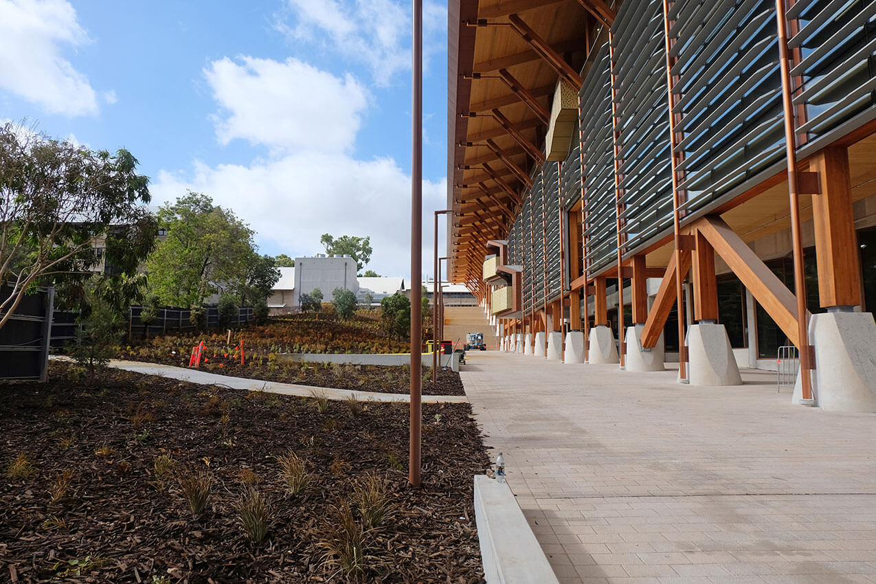
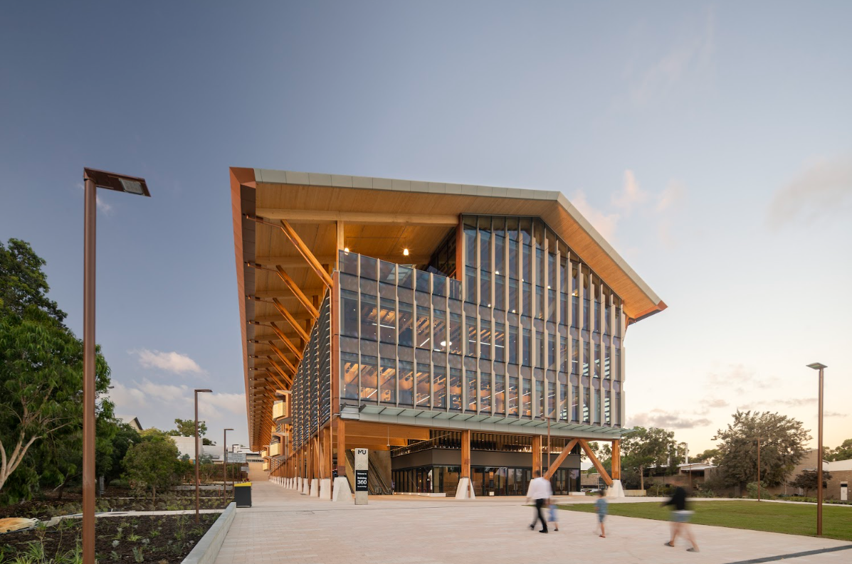
This project is transforming the Murdoch University Campus by creating a new primary universal access physically linking the new southern arrival areas off Discovery Way through Boola Katitjin to the ‘spiritual heart’ of the campus (the Bush Court). The vertical system of lifts, stairs and escalators overcomes a 13m natural level change and provides a full range of highly equitable access options both into the building or along circulation layers within its western façade. These layers provide sun, rain and wind protection and take students and visitors from arrival by public transport through timber colonnades north to the heart of the campus.
These journeys up to, through and within the building are rewarded with spatial delight, distant views to the escarpment, to Banksia Court and the horizon of trees within and beyond the campus precinct. Movement within the building ensures frequent glimpses of the creative learning and teaching activity sheltered within the many educational spaces. The colonnades and circulation layers to the western façade also filter and diminish the intensity of the late afternoon western sun.
The building provides large collaborative learning spaces for 6 to 120 students. These formal learning spaces are supplemented by a diverse range of informal student peer to peer learning areas, and quiet spaces. This rich variety and sequence of internal places some containing commissioned work by indigenous artists, is supported by the outside spaces of Banksia court and the two large arrival plazas, one to the south adjacent to Discovery Way and one to the north of Boola Katitjin.
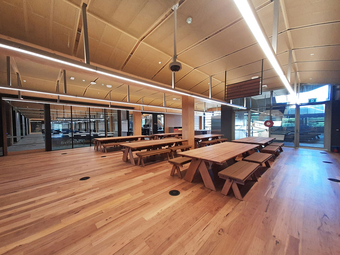
This northern space has 4 external timber structural bays supporting the extended roof which creates a weather protected threshold and space for university events such as student markets, open days, and graduation.
The building boldly expands the campus typologies and architecture of Murdoch including the work of eminent WA architect Gus Ferguson. This while respecting the language of the campus, one of linear colonnades with deep shade and internal spaces connected to the extraordinary bush landscapes.
The architects describe this building as having a ‘Warehouse for learning’ quality. Perhaps that’s true, especially if that warehouse has the DNA of a crafted and majestic medieval tithe barn. Lyons and their creative team have with skill ensured that Boola Katitjin is more than a repository of knowledge, it is a building that facilitates collaboration, a stimulating place of learning, teaching, and discovery, for students, teachers, staff, and visitors.
Boola Katitjin demonstrates a leadership level of sustainability while enhancing the existing character and adding to the evolving future character of the Murdoch campus.
Brian Kidd Enabling Architecture Prize
Emmanuel Christian Community School | Hartree + Associates Architects
Jury Citation:
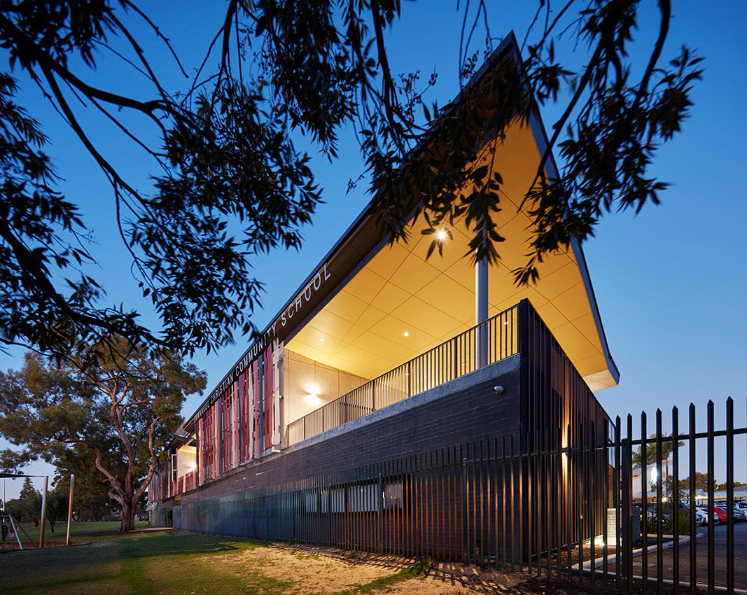
A great sense of empathy for staff, students, and the community is at the heart of Emmanuel Christian Community School. The education centre is particularly responsive to the community of refugee and migrant families’ support inclusion to complement a growing, diverse neighbourhood.
Providing learning spaces that can expand and physical breaks in the built form allowed an improved connection to the landscape and playing fields, encouraging a greater relationship between each other and further reinforcing a sense of safe community.
The benefits of the design approach are proven by the uplift in student attendance numbers and frequency.
Mondoluce Lighting Award
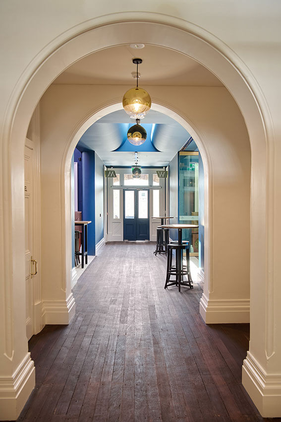
Republic of Fremantle | spaceagency
Jury citation:
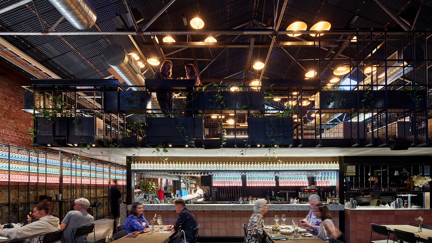
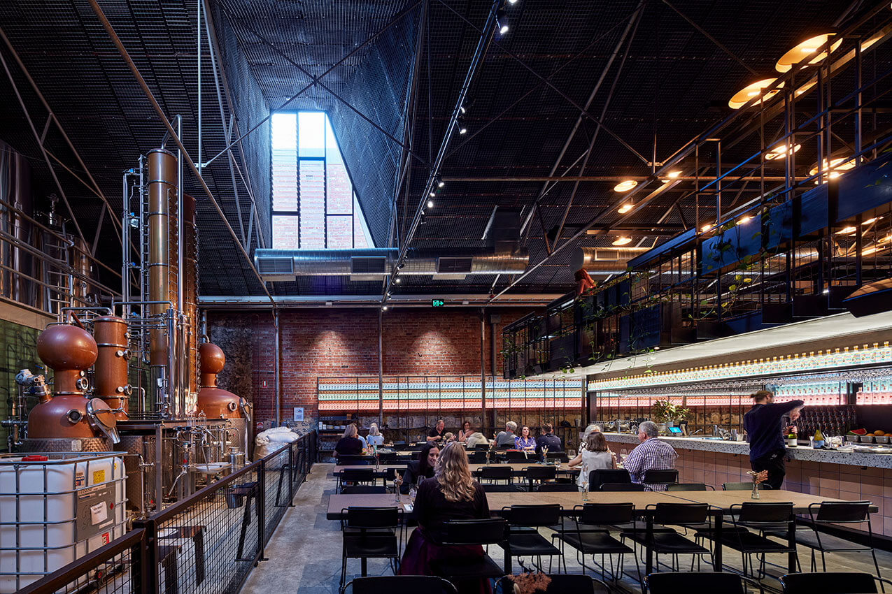
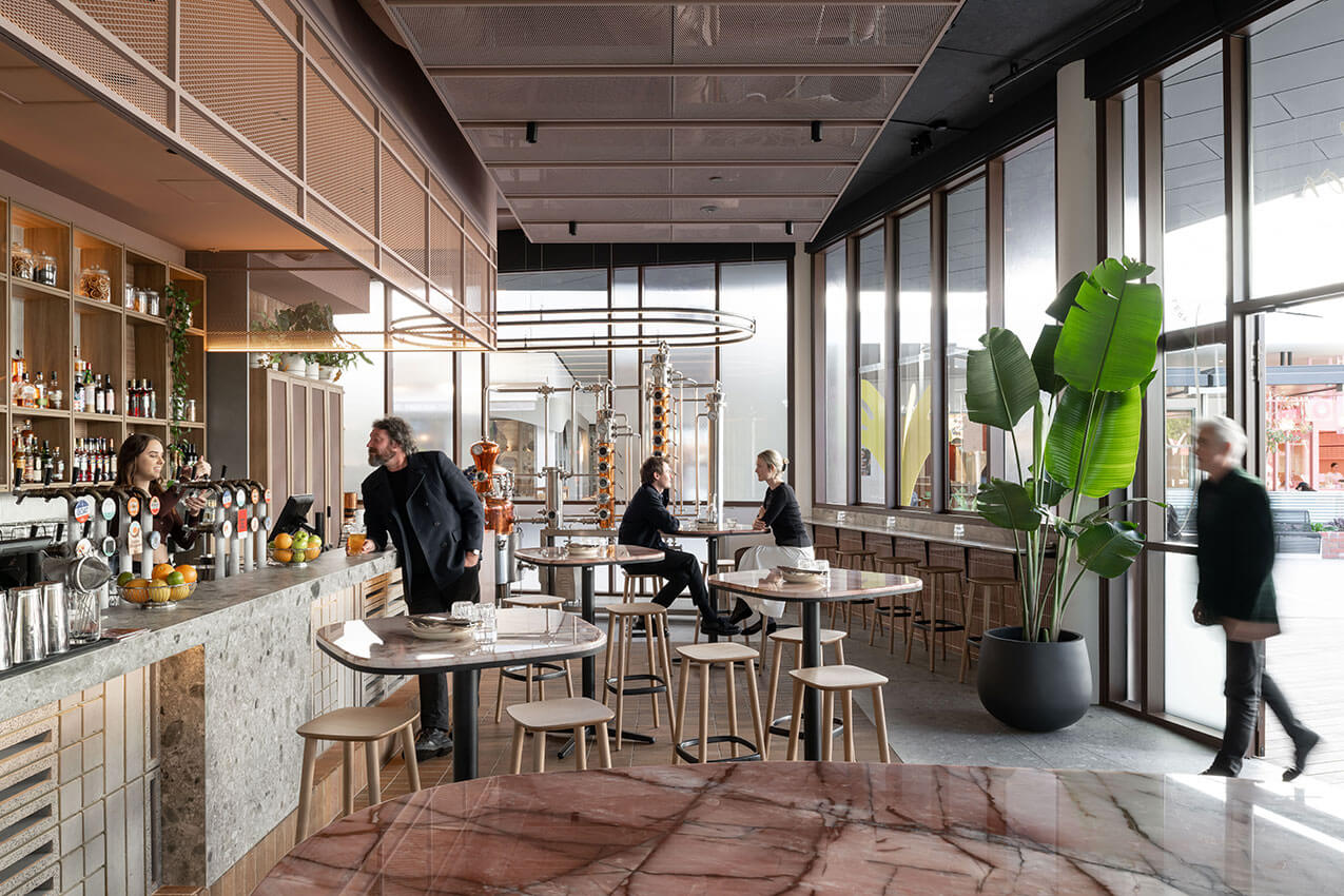
Located in the original warehouse district of Fremantle, Republic of Fremantle’s unique site forms the backdrop for a theatrical style hospitality space. During the day, the space is flooded with natural daylight via carefully placed skylight panels creating a distinctive high contrast warehouse environment.
During the night the space is transformed into a series of experiences; the glowing wall of Gin bottles, the slithers of light escaping from the kitchen carefully selected to lead the eye to specific points of interest, the use of narrow beam spotlights over tables help to create an intimate setting in a voluminous space.
Details are expertly lit with the eye drawn to the glowing copper still as the backdrop for the room. The mezzanine level was skilfully executed, notably the bespoke luminaires bringing a sense of depth to a relatively low clearance and engaging the space with a relaxed warmth.
Mondoluce Lighting Award - Commendation
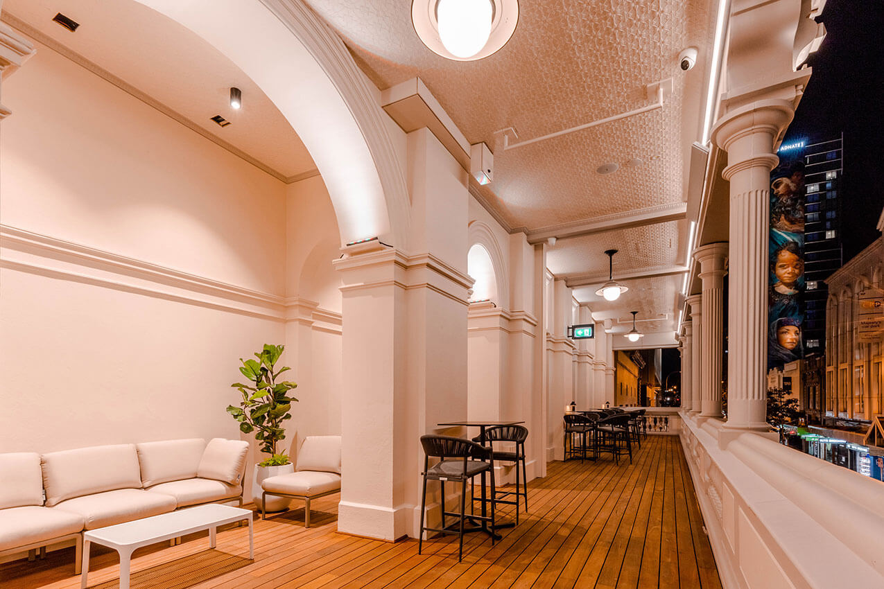
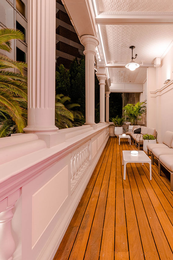
His Majesty's Theatre - Balcony Reconstruction | Griffiths Architects
Jury citation:
The reinstatement of the balconies at the historic His Majesty’s Theatre in Perth’s King Street precinct has wonderfully transformed the façade of this historic theatre and hotel which was built during the goldrush period. The original design intent has been restored, reversing the decision to remove the balconies more than 70 years ago. The architects have demonstrated care and expertise in the research for documentary evidence and study of the building fabric to create seamless outdoor spaces which can be enjoyed again by patrons and performers.
The innovation employed in making the balconies self-supporting has provided a level of safety that was missing in the original design. In addition, the experimental use of contemporary materials for traditional detailing has made it possible to conceal services for the activation of these external spaces which overflow from the newly refurbished bar area in the interior.
The character of the inner-city street and arts precinct are revitalised by this latest work to this decorative masterpiece that is unique and significant to the history of Perth.
Mondoluce Lighting Award - Commendation
Coleman Bajrovic Residence | Klopper & Davis Architects
PROJECT SUMMARY
Located on a street with significant heritage value and character, the Coleman Bajrovic Residence is a two-storey home for a couple and their adult son. It features a striking, yet contextually appropriate form, which reinterprets the surrounding pitched roofs of Shenton Park and cleverly reinterprets the local planning policies. As the living spaces were located towards the street, careful consideration of planning and screening was used to balance privacy, light, and connection the outdoor spaces.
EmAGN Project Award
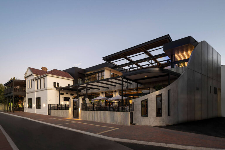
The Claremont Hotel | Rothelowman (Previously Fratelle)
Jury citation:
The Claremont Hotel by Rothelowman is a delightfully compelling response to a large complex site, which celebrates the stories and history of the place and creates a new series of spaces which invite a more inclusive audience.
The project, delivered by the emerging architect team, is a highly resolved and functional response which respects the heritage of the past while simultaneously announcing itself as an iconic venue which welcomes all.
colorbond project
COLORBOND® Award for Steel Architecture
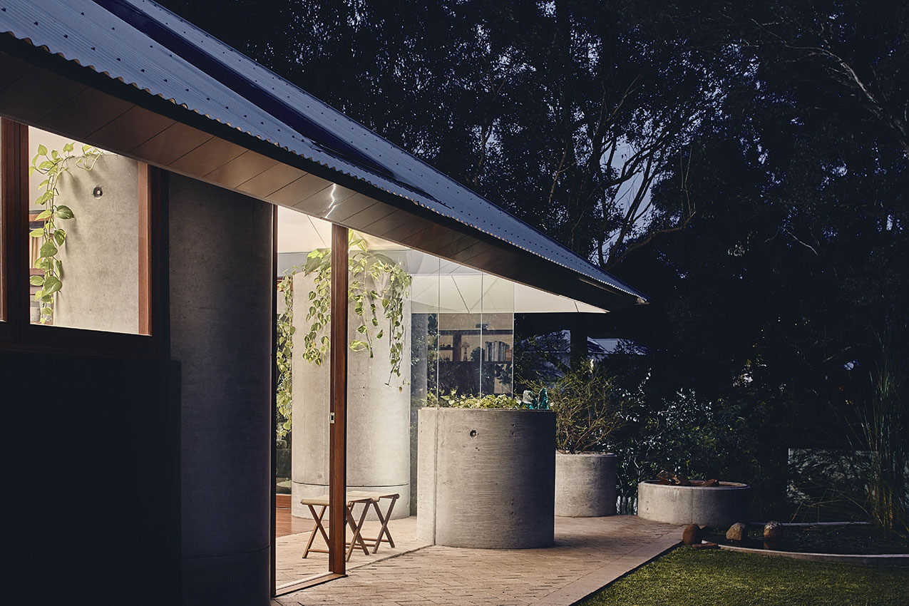
Celilo Springs | Western Architecture Studio
Jury citation
In Celilo Springs, Western Architecture Studio has produced a beautiful, modest project on a compact, steeply sloping site.
The Colorbond Steel award was made for the efficient and elegant roof structure and design that minimised cranage and made site construction efficient, making use of a pop-up tent concept.
The selection of roof material responded to the contextual vernacular and the shimmering fascia reflects light and the water bodies of the landscape.
The choice of Alucabond for the ceilings has beneficial thermal qualities, while also capturing the dapple reflection of the ponded spring throughout the day.
Celilo Springs is a beautiful compilation of West Australian steel applications.
COLORBOND® Award for Steel Architecture - Commendation
Main Roads and Department of Transport Geraldton Office | TAG Architects
Jury citation
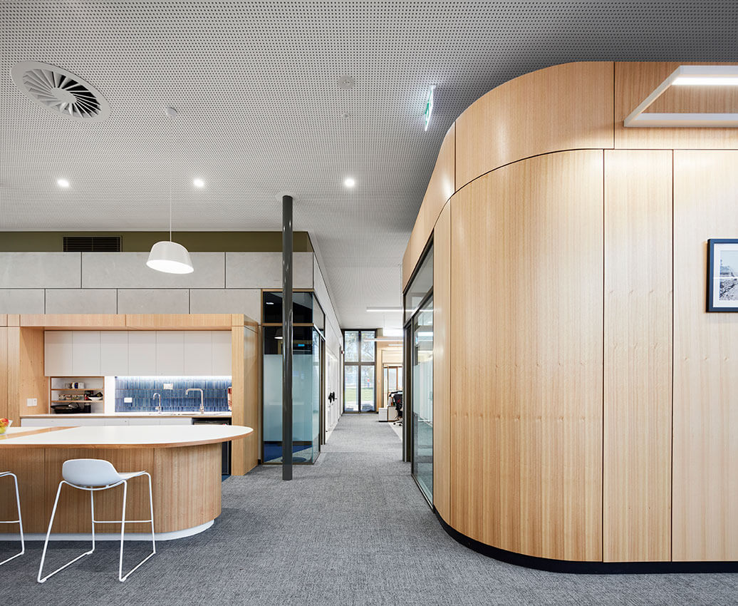
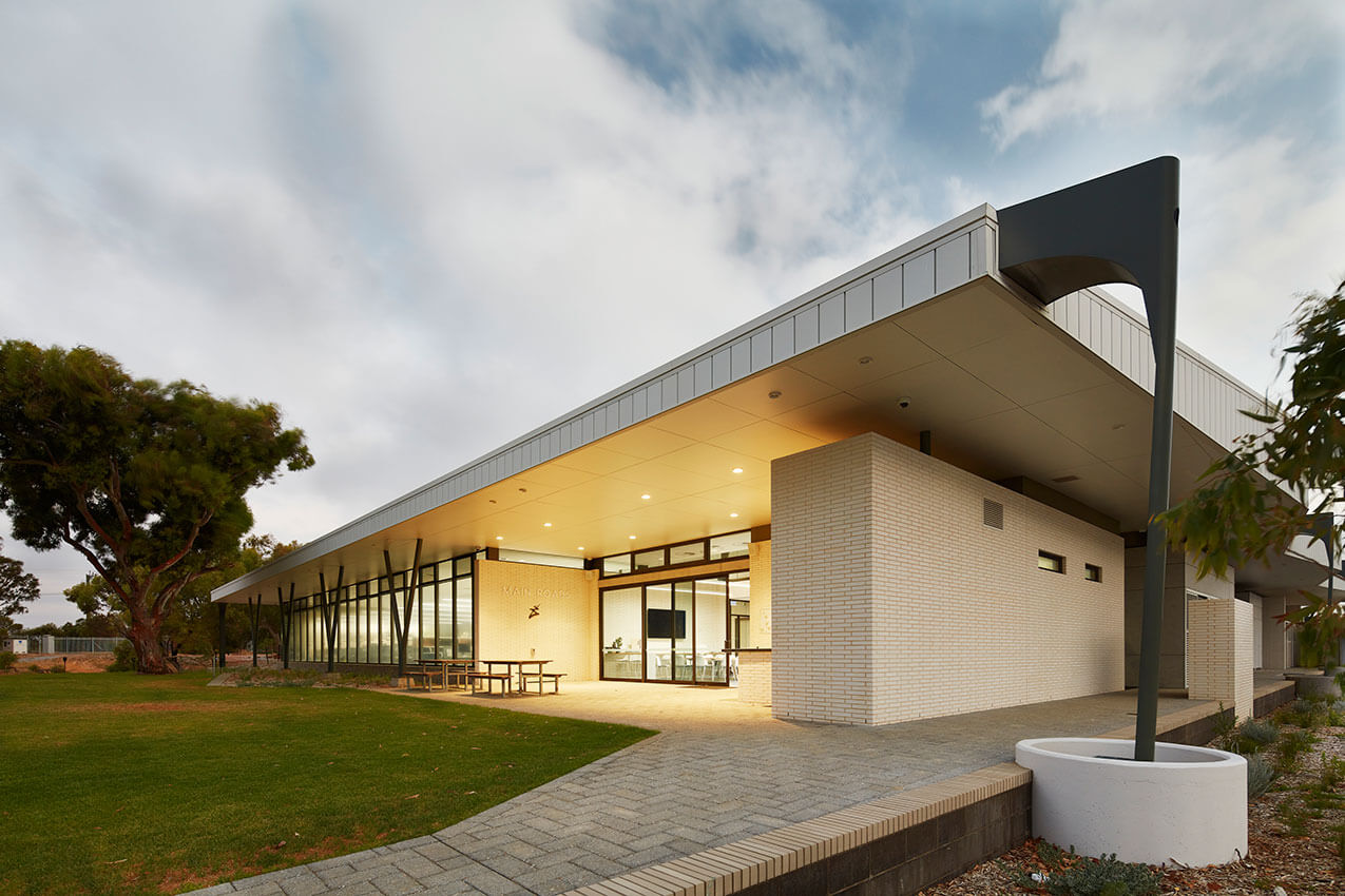
The new Main Roads and Department of Transport Geraldton Office facilities are a good example of designing a cohesive and efficient space for both public and staff members alike. The project responds to a specific brief to bring both departments under the same roof, including the operational and economic organisations, accommodating larger staff numbers in a flexible work environment that enables seamless collaboration and interaction.
The building responds to the urban context by providing a new access point from the adjacent main road, with carparking for staff and visitors. The entrance is well-designed, offering an informal gathering space with endemic plants and eucalyptus trees, whilst the façade shows a clear relationship with the inside and outside spaces.
A clever roof profile allowing for controlled natural light throughout the building, and the incorporation of LED lighting, double glazing and passive ventilation brings a sustainable approach to its design. Locally-sourced materials inclusive of some of the original re-used furniture, help to achieve an environment that is pleasant and relaxing for people to use.
Commercial Architecture
The Ross Chisholm and Gil Nicol Award for Commercial Architecture
Main Roads and Department of Transport Geraldton Office | TAG Architects
Jury citation
The new Main Roads and Department of Transport Geraldton Office facilities are a good example of designing a cohesive and efficient space for both public and staff members alike. The project responds to a specific brief to bring both departments under the same roof, including the operational and economic organisations, accommodating larger staff numbers in a flexible work environment that enables seamless collaboration and interaction.
The building responds to the urban context by providing a new access point from the adjacent main road, with carparking for staff and visitors. The entrance is well-designed, offering an informal gathering space with endemic plants and eucalyptus trees, whilst the façade shows a clear relationship with the inside and outside spaces.
A clever roof profile allowing for controlled natural light throughout the building, and the incorporation of LED lighting, double glazing and passive ventilation brings a sustainable approach to its design. Locally-sourced materials inclusive of some of the original re-used furniture, help to achieve an environment that is pleasant and relaxing for people to use.
Award for Commercial Architecture
Brook Lane | TRCB
Jury citation
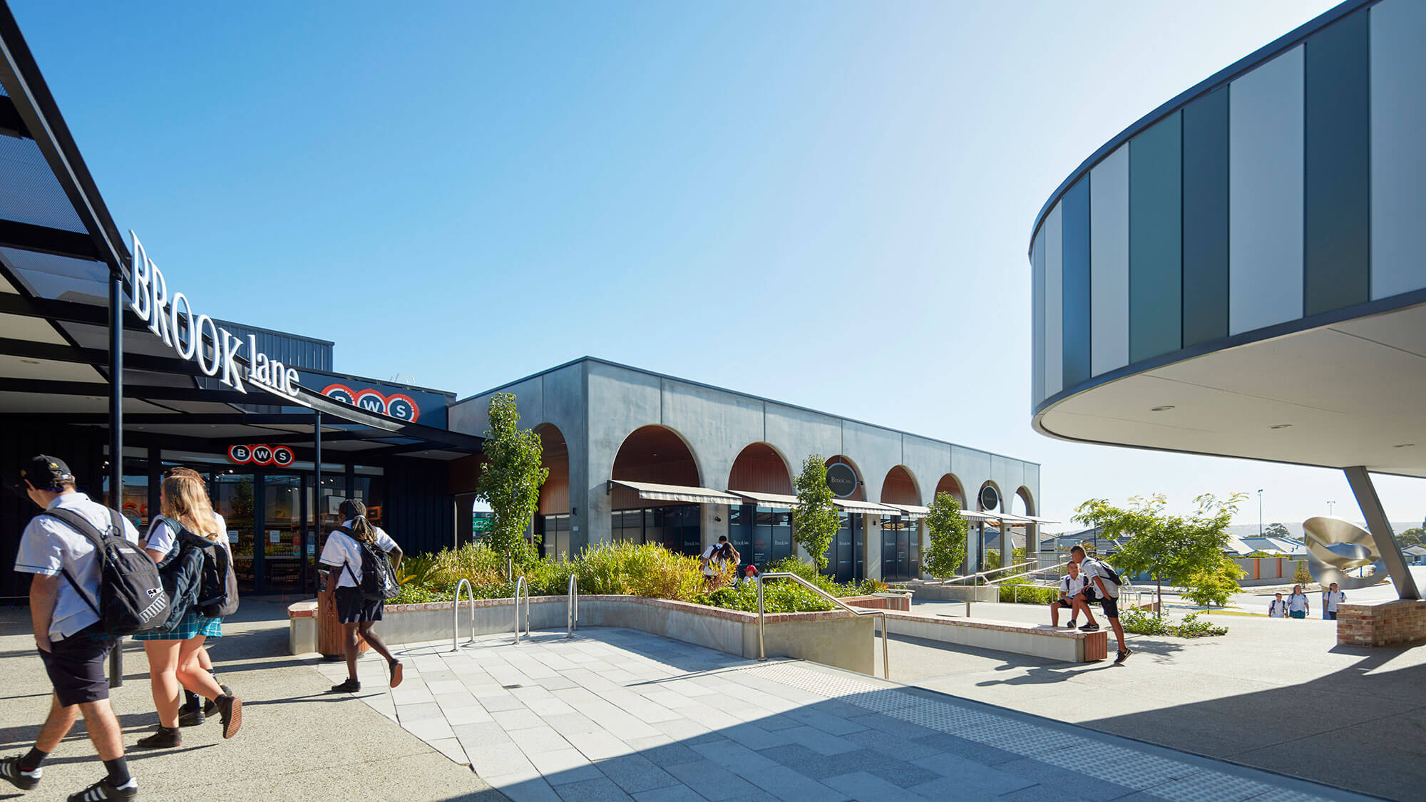
The new shopping centre sits within the original 1994 Ellenbrook masterplan. The now established ‘Village’ centre serves the growing Ellenbrook community, providing an attractive amenity for the town centre and its northern villages.
The urban integration within this context has been achieved by linking the internal and external areas to the site. This design response is evident in both connectivity and scale using the site level differences to express the landscape and leveraging the orientation of the buildings. The terraced piazza with the forecourt integrates well with the place and allows visitors to intuitively navigate through the site. The Brook Lane project conceptually responds to the Swan Valley with its Swan Estuary waterways. The space encourages visitors’ activities and interaction along the north–south axis, offering coverage to visitors moving between the shops, courtyard and carparks.
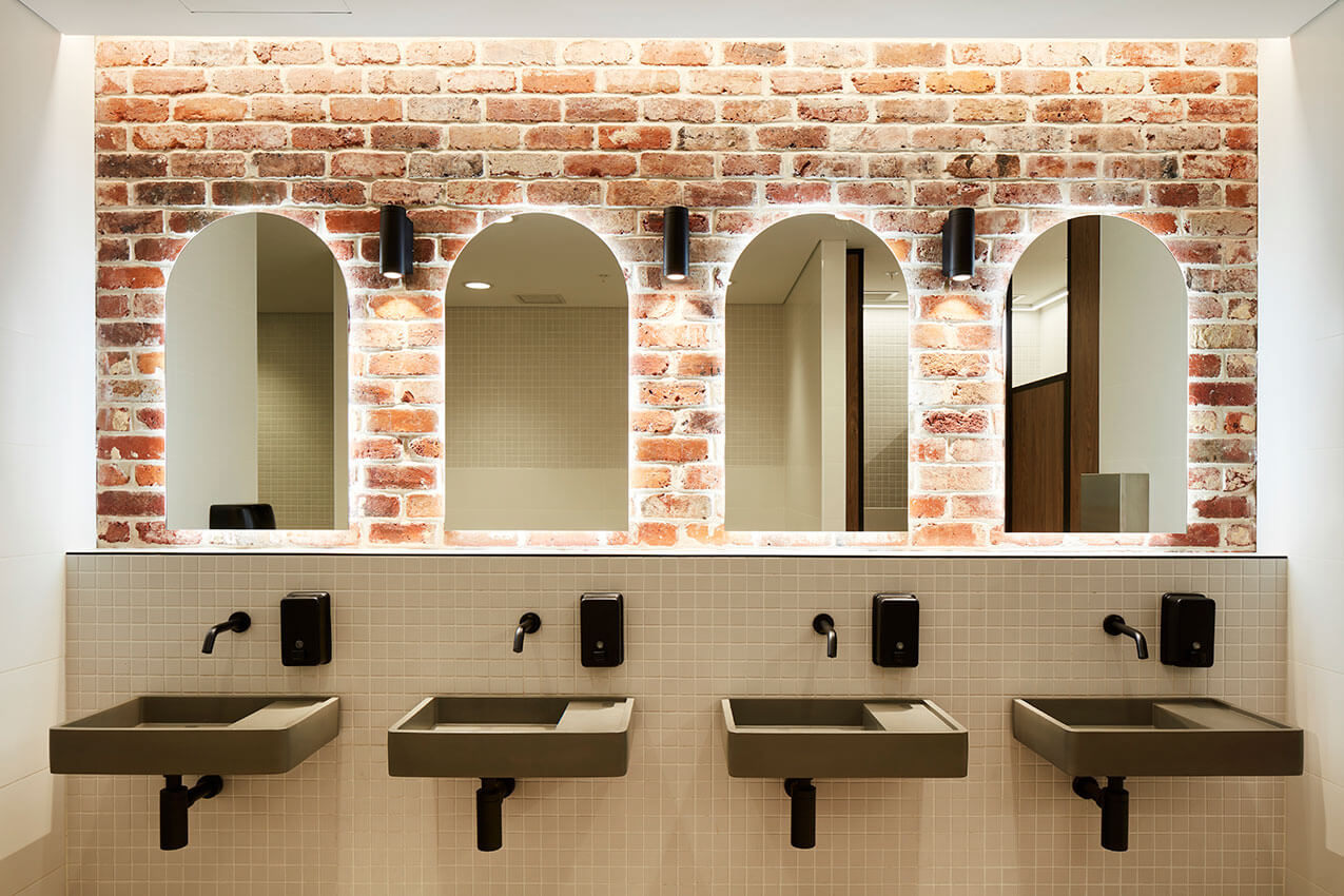
The buildings have a human-scaled approach and designed with local materials. The building adjoining the forecourt features raw-concrete arches reminiscence of the Swan Valley’s historical market gardens. Reclaimed bricks, concrete basins and a restrained palette in the ablution facilities are an ambient addition to a centre marked by a modern aesthetic.
Public art component calls for a distinctive style at Brook Lane’s northern entrance with both mural and sculptures by local artists.
Commendation for Commercial Architecture (WA)
Claremont Hotel | Rothelowman (Previously Fratelle)
Jury citation
The Claremont Hotel by Rothelowman is a delightfully compelling response to a large complex site, which celebrates the stories and history of the place and creates a new series of spaces which invite a more inclusive audience.
The project, delivered by the emerging architect team, is a highly resolved and functional response which respects the heritage of the past while simultaneously announcing itself as an iconic venue which welcomes all.
Commendation for Commercial Architecture (WA)
Republic of Fremantle | spaceagency
Jury citation
Located in the original warehouse district of Fremantle, Republic of Fremantle’s unique site forms the backdrop for a theatrical style hospitality space. During the day, the space is flooded with natural daylight via carefully placed skylight panels creating a distinctive high contrast warehouse environment.
During the night the space is transformed into a series of experiences; the glowing wall of Gin bottles, the slithers of light escaping from the kitchen carefully selected to lead the eye to specific points of interest, the use of narrow beam spotlights over tables help to create an intimate setting in a voluminous space.
Details are expertly lit with the eye drawn to the glowing copper still as the backdrop for the room. The mezzanine level was skilfully executed, notably the bespoke luminaires bringing a sense of depth to a relatively low clearance and engaging the space with a relaxed warmth.
Enduring Architecture
The Richard Roach Jewell Award for Enduring Architecture
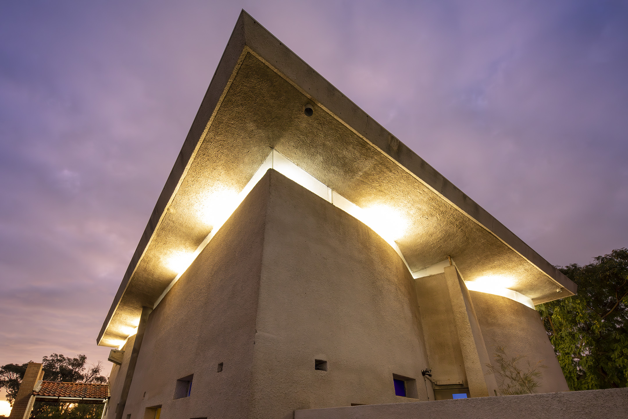
Wollaston College Chapel | Julius Elischer
Jury citation
The Wollaston College Chapel, designed by the Hungarian-born Perth architect Julius Elischer, is a pre-eminent example of enduring architecture. Of outstanding merit, this building continues to meet its original brief and due to its meticulous detailing, it appears as fresh today as the day it was opened in 1965.
Influenced by Le Corbusier, the stark white interior of the Chapel is punctuated by deep-set windows of different coloured glass. Its design was a bold departure from traditional church buildings and reflects the revolutionary spirit of the 1960s.
The architect’s vision was of a ‘tent of meeting’. There is no set place for the altar or any furniture, to enable it to be configured in multiple ways. The concave ceiling appears to ‘float’ above the building, owing to clear glass panels between the tops of the thick concrete walls and the roof itself. Light ‘flickers’ through the coloured glass and through the ‘clerestory’, suggesting the movement of light through canvas walls and under a canvas roof.
The Wollaston College Chapel is a worthy recipient of the 2023 Richard Roach Jewell Award for Enduring Architecture.
EDUCATIONAL ARCHITECTURE
The Hillson Beasley Award for Educational Architecture
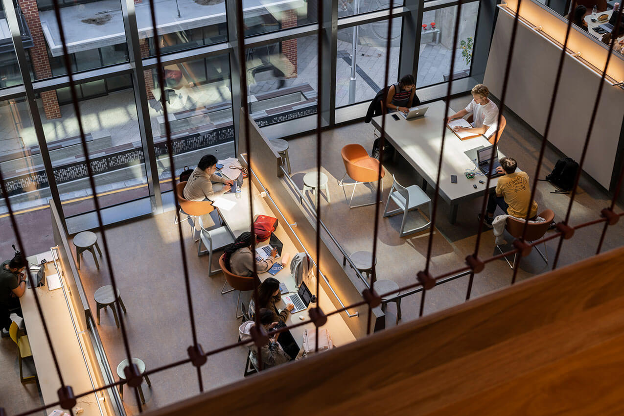
School of Design & the Built Environment, Curtin University | Wardle
Jury citation
The School of Design & the Built Environment at Curtin University is an honourable work with a complexity and thoughtfulness that make it both a landmark and good neighbour.
In a precinct that is distinctly more urban than the existing campus the building still manages to make strong connections to nature with carefully curated distant views through neighbouring buildings and a courtyard composition bringing landscape up to and onto the building.
The interior is inviting and warm with soft, earthy hues that invoke a sense of nurturing calm. Exposed services are coordinated with precision and artworks skilfully interwoven.
The zinc façade veil effectively provides passive solar shading, yet its beauty is in its precisely articulated folds. Of note is the southwestern corner where the veil gently opens making a welcoming gesture to the passer-by and inviting a glimpse to the learning within.
An exemplar in sustainable design achieving a 6 Star Green Star, Design and As Built V1.2 rating, the building is a testament to the skill of its creators.
Award for Educational Architecture
Boola Katitjin | Lyons with Silver Thomas Hanley, Officer Woods, and The Fulcrum Agency
Jury citation
This project is transforming the Murdoch University Campus by creating a new primary universal access linking the new southern public transport arrival areas off Discovery Way through Boola Katitjin to the ‘spiritual heart’ of the campus (the Bush Court). The vertical system of lifts, stairs and escalators overcomes a 13m natural level change and provides a full range of highly equitable access options both into the building or along circulation layers and timber colonnades within its western façade.
The sustainability credentials of this project are significant including the highly innovative use of structural timber, reducing the embodied carbon within the building by 55%. Added to this the integration of mixed mode ventilation strategies throughout, the gable roof cloaked in a 450kW array of PV solar cells, which when combined with the many other low energy systems greatly reduce the overall operational energy consumed. Many further sustainability initiatives assist in targeting independent GBCA certification for 6-star Greenstar v1.3 as built. A project specific Climate Change Adaptation Plan was also undertaken. The building servicing strategy ensures that the building can be fully electrified and operate with 100% renewables. The Lyons team are also undertaking the careful enhancement of the adjacent Banksia Court as part of this project including the expansion of Banksia Court by 3,300 sqm of predominately native planting.
Lyons have championed sustainability – it’s a building that facilitates collaboration, a stimulating place of learning, teaching, and discovery, for students, teachers, staff, and visitors.
Boola Katitjin demonstrates a leadership level of sustainability while enhancing the existing character and adding to the evolving future character of the Murdoch Campus.
Award for Educational Architecture
Emmanuel Christian Community School | Hartree + Associates Architects
Jury citation
Emmanuel Christian College stands out as having set a high standard of architecture, elevated well above typical small education projects where budgets are often limited with a very pragmatic approach taken to maximising the floor area provided.
Approaching their task in an ageing school with a number of generations of ad hoc buildings and additions, the developed a masterplan to inform and guide the design of their new building. This has directed not only the approach of their building, but established a pattern to assist the school community to grow their school in a strategic and purposive manner into the future. In their building, as with the masterplan, the spaces created have been conceived as flexible and robust, to respond to a wide range of pedagogical and community situations.
Working within this masterplan, the Architects achieved a noteworthy outcome, putting cost-effective materials and finishes to work in a thoughtful manner to articulate underlying principles of identity and connection; these principles are skilfully expressed from the arrangement of forms on site to provide a connection and interface to the adjoining public park, through to the abstraction of traditional textile patterns and colours to create screening and cladding.
Commendation for Educational Architecture
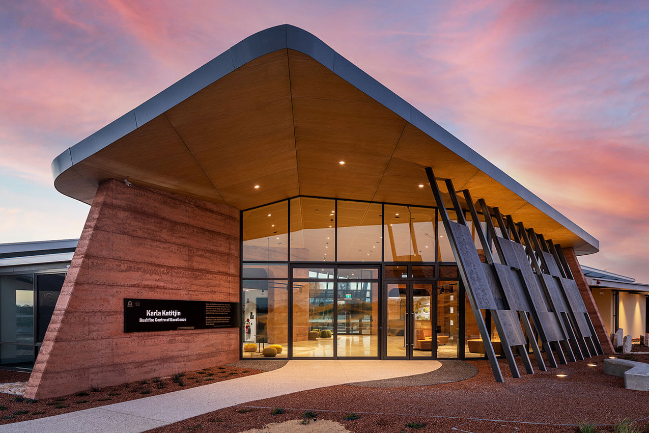
Karla Katitjin Bushfire Centre of Excellence | Site Architecture Studio
Project Description:
The project was a first of its kind and also the first building to be located within the new Peel Business Park, Borne from the outcome of an extensive Business Case, DFES identified the need for a facility to support agencies and communities in understanding, preparing and adapting to climate change in a highly fire prone environment. Four key service delivery functions of the Bushfire Centre of Excellence (BCoE) were identified as: Training, Knowledge, Engagement and Outreach, Business Management.
SITE developed the following project objectives through a series of client workshops involving key staff from the Department of Fire & Emergency Services, the Shire of Murray, various volunteer fire fighting representatives and the Bindjareb Cultural Group.
The collaborative briefing process raised the importance of landscape and building as a teaching tool in bush firefighting and prevention design best practice and the need for a significant public outreach space at the project heart.
Through paths meandering through interpretative landscaped areas in, out and around the building, we aimed to provide an experience of the Australian landscape for all trainees, visitors and staff. The raised, relaxed roof form of the public entry foyer overhangs rammed earth walls much like a traditional aboriginal shelter. The public art, a collaboration between Penelope Forlano and Bindjareb Traditional Owner Karrie-Anne Kearing Salmon, support the entry courtyard and rear breakout spaces, casting morning and afternoon shadows of indigenous flora and fauna into the public spaces.
The reception is placed at the rear, allowing the library, interpretive and informal seating areas to be the focus, emphasizing a sense of community, connection to landscape and celebration of traditional bush firefighting techniques and culture.
HERITAGE ARCHITECTURE
Award for Heritage
Old Courthouse, Fremantle | Slavin Architects
Jury citation
The Old Courthouse has been given a new lease of life in its clever repurposing into a contemporary hospitality venue. The transformation of the derelict dis-used building is a sustainable outcome which has allowed it to continue to contribute to Fremantle’s historic precinct.
The program for adaptive re-use was comprehensive and executed in record time. The heritage building remains minimally impacted by the adjacent new pavilion as the changes are reversible. The celebration of the archaeological find is manifest in its prominent display in the entry foyer and the original magistrate’s bench and dock carefully restored and respectfully retained.
The Architect’s skill is evident in the exemplary detailing between the new pavilion and heritage building, the design of new bar furniture and the new logo design for signage. Visual prominence is bestowed on the Old Courthouse with the excellent choice to clad the walls of the pavilion in clear glazing. Glimpses of the people who once walked through its doors are depicted in informational interpretive displays throughout and contribute to the successful recycling of this heritage building.
Award for Heritage
His Majesty's Theatre - Balcony Reconstruction | Griffiths Architects
Jury citation
The reinstatement of the balconies at the historic His Majesty’s Theatre in Perth’s King Street precinct has wonderfully transformed the façade of this historic theatre and hotel which was built during the goldrush period. The original design intent has been restored, reversing the decision to remove the balconies more than 70 years ago. The architects have demonstrated care and expertise in the research for documentary evidence and study of the building fabric to create seamless outdoor spaces which can be enjoyed again by patrons and performers.
The innovation employed in making the balconies self-supporting has provided a level of safety that was missing in the original design. In addition, the experimental use of contemporary materials for traditional detailing has made it possible to conceal services for the activation of these external spaces which overflow from the newly refurbished bar area in the interior.
The character of the inner-city street and arts precinct are revitalised by this latest work to this decorative masterpiece that is unique and significant to the history of Perth.
commendation for heritage
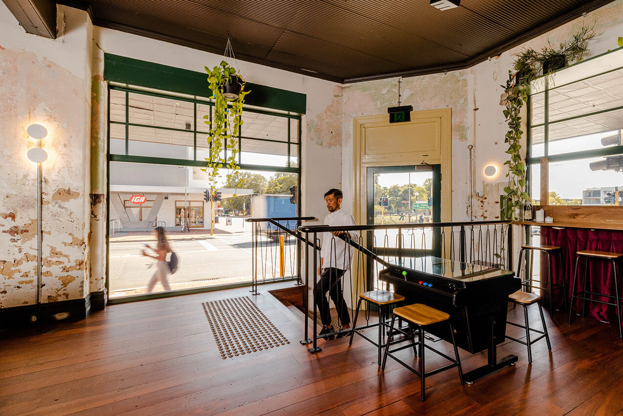
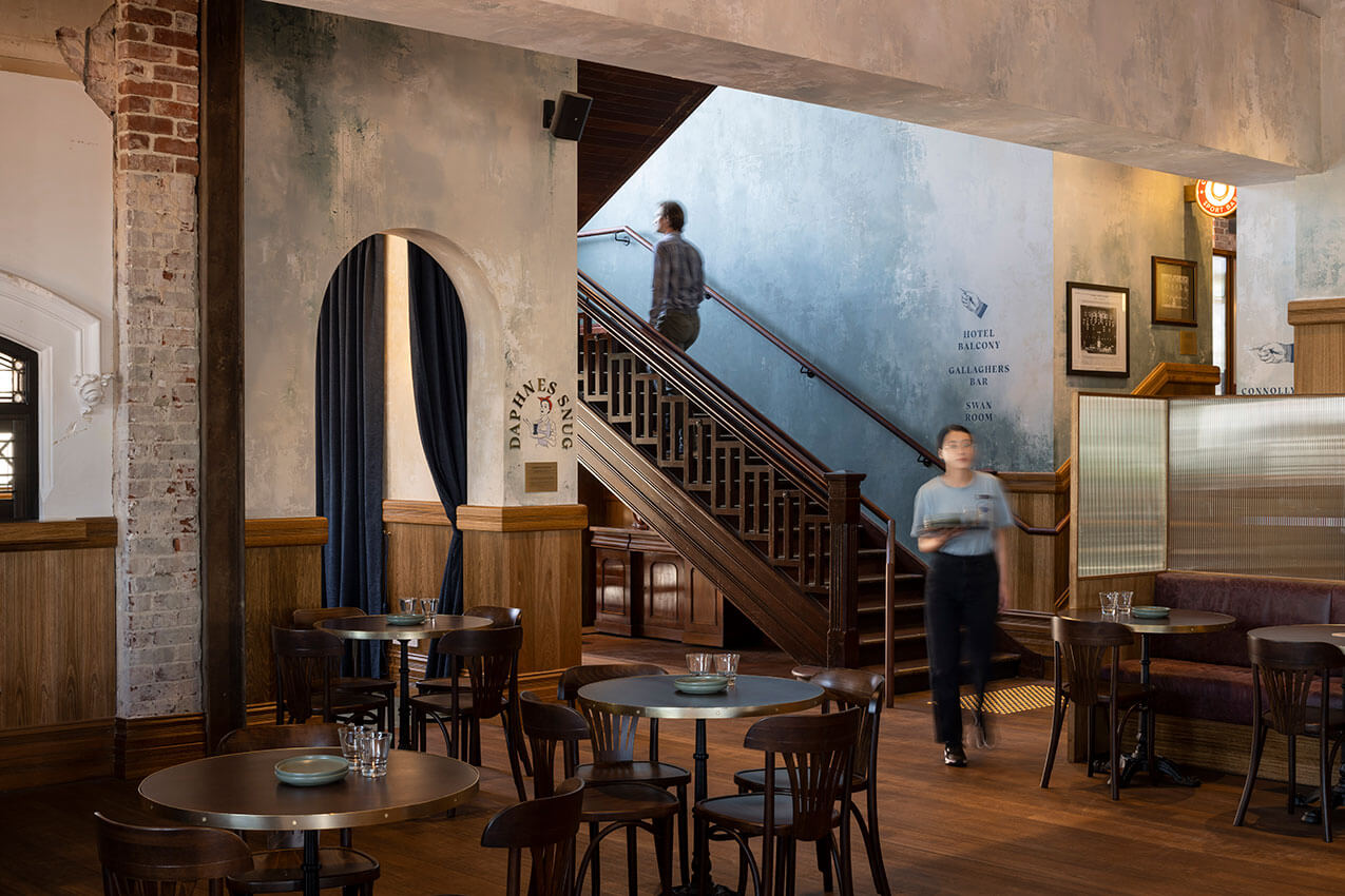
Ruin Bar | Klopper & Davis Architects
Project Description
The client brief was to transform a heritage-listed building into a thriving hospitality venue.
The project was successful due to the collaboration between all parties, who embraced the concepts of decay and rebirth as themes for the design and venue. The tenant’s extensive experience in the hospitality industry, had a good understanding of the operational requirements.
They were, however, also open to exploring creative solutions to incorporate different elements of the program into the building and resolve any issues that arose on site. The final result was a harmonious balance between old and new, creating a unique ‘patchwork quilt’ composition that perfectly fits the character of the venue – Ruin Bar. The client and tenant were both delighted with the outcome.
Ruin Bar is formed of a series of beer rooms and garden residing inside a previously derelict and inhabited building. Each of the rooms celebrates the old fabric by juxtaposing and highlighting the original finishes with new insertions. The entries of the bar both transport the occupant from a remnants of the outdoor finishes, to framing and highlighting the original state of the building.
A collaborative and evolving approach was taken during the design and construction phase. A revaluation of each material was constantly done based on what was revealed on site. Informed by this assessment, the design continued to be developed and refined to create this heavily layered and rich space.
INTERIOR ARCHITECTURE
Award for Interior Architecture
School of Design & the Built Environment, Curtin University | Wardle
Jury citation
The School of Design and the Built Environment building mirrors the precinct in which it is located: Exchange. Designed as a living laboratory and teaching tool, the five-storey building is home to students, professional and academic staff, industry partners and commercial tenants.
The building is conceived as an activity map of ‘thinking, making and showing’ – putting learning on display around a central quarried atrium that creates strong visual, physical and audible connections between levels. Opportunities for informal learning, gathering and socialising have been embedded within the stairs and activate the primary circulation, complementing the dedicated learning spaces.
A warm and activated interior contrasts the cooler palette of the exterior. Internal finishes have been chosen to be enduring, local and sustainable. Achieving a 6 Star Green Star rating, excellent indoor air environment, independent power generation and passive solar design, and visual connections to landscape from every level; the building is an exemplar in sustainable design and a vibrant new home for the School of Design and the Built and Environment.
award for interior architecture
Weeties Warehouse | spaceagency
Jury citation
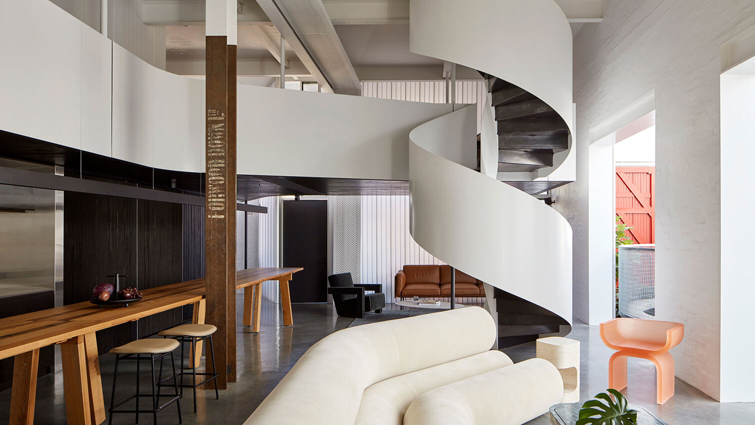
Situated within the heritage-listed former Weeties Factory in North Fremantle, spaceagency’s brief was to combine three existing standalone apartments into a unique family home.
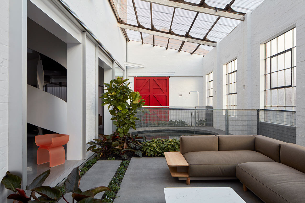
The design cleverly resolves the need to appreciate and respect the heritage fabric, with the desire to bring nature, light and fresh air into the space. New glazed and translucent walls pull away from the industrial exterior, freeing the floor plan from the constraints of the heritage shell while reinstating the original warehouse volume. Light wells and thermal chimneys flood the space with light and fresh air, prioritising principles of environmental design over a maximised internal footprint, with one third of the floorplate being given over to a lush internal courtyard garden and its dark circular swimming hole.
Theatrical, dramatic and fun, this home is filled with surprise and delight. A sculptural spiral stair connects the living spaces to a hanging mezzanine over, allowing the original 5-meter volume to be experienced for the first time since its adaptive reuse in 1990. A bespoke 8-metre long timber island bench doubles as a dining table for 22 guests, and new steel portal framed openings in the brick wall connect the interior with the garden, bringing the outside in. The bold and playful design juxtaposes texture, light and colour to celebrate both the building’s history and its new life.
award for interior architecture
Bassendean Hotel | Woods Bagot
Jury citation
The Bassendean hotel presented the opportunity to rejuvenate a historic landmark, transforming the tired inter-war building and disjointed interiors into a multi-venue Australian pub. Woods Bagot sought to reveal and celebrate the pub’s rich history by removing unsympathetic refurbishments, uncovering original finishes, structure and markings, and reinstating ‘the Basso’ as the community’s social heart and lynchpin.
The local memory and fondness for The Basso has seen the community extensively involved in the redevelopment. Curated antiques and second-hand finds sit side-by-side elements of the original fitout – complementing rather than matching – to create an authentic and multi-layered aesthetic.
The interconnected venues have distinct identities and tell different stories inspired by the building itself. The zones appeal to an intentionally broad demographic, transforming the pub into a truly inclusive community asset that is enduring, authentic and filled with local spirit – built by the community, for the community.
Commendation for interior architecture
Central Park End of Trip | Woods Bagot
Project Description
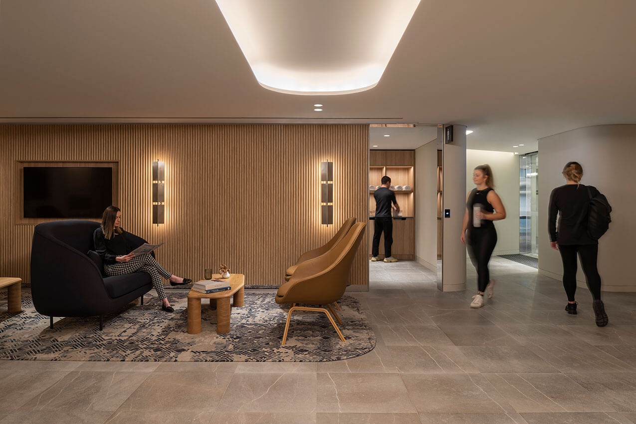
30-year-old Central Park is Perth’s tallest building and an icon of our city. The building owners undertook a significant upgrade of the base building in 2021 (designed by Woods Bagot); and the newest addition in the building’s revitalisation journey is a brand-new premium End of Trip facility, that prioritises luxury, wellness and convenience.
The new Central Park EOT is a high-quality offering, placing tenant experience at the heart of the design that is generously proportioned and exquisitely detailed. Facilities include a communal cool down lounge, speed showers, private vanity stations with soft feature lighting. A closer connection to the St Georges Terrace street entry enables more convenience and a safer journey for end users.
Usage of the facilities has significantly increased since its opening and has successfully supports tenants in their return to the workplace.
Commendation for interior architecture
Department of Primary Industries and Regional Development Headquarters | Parry and Rosenthal Architects
Project Description
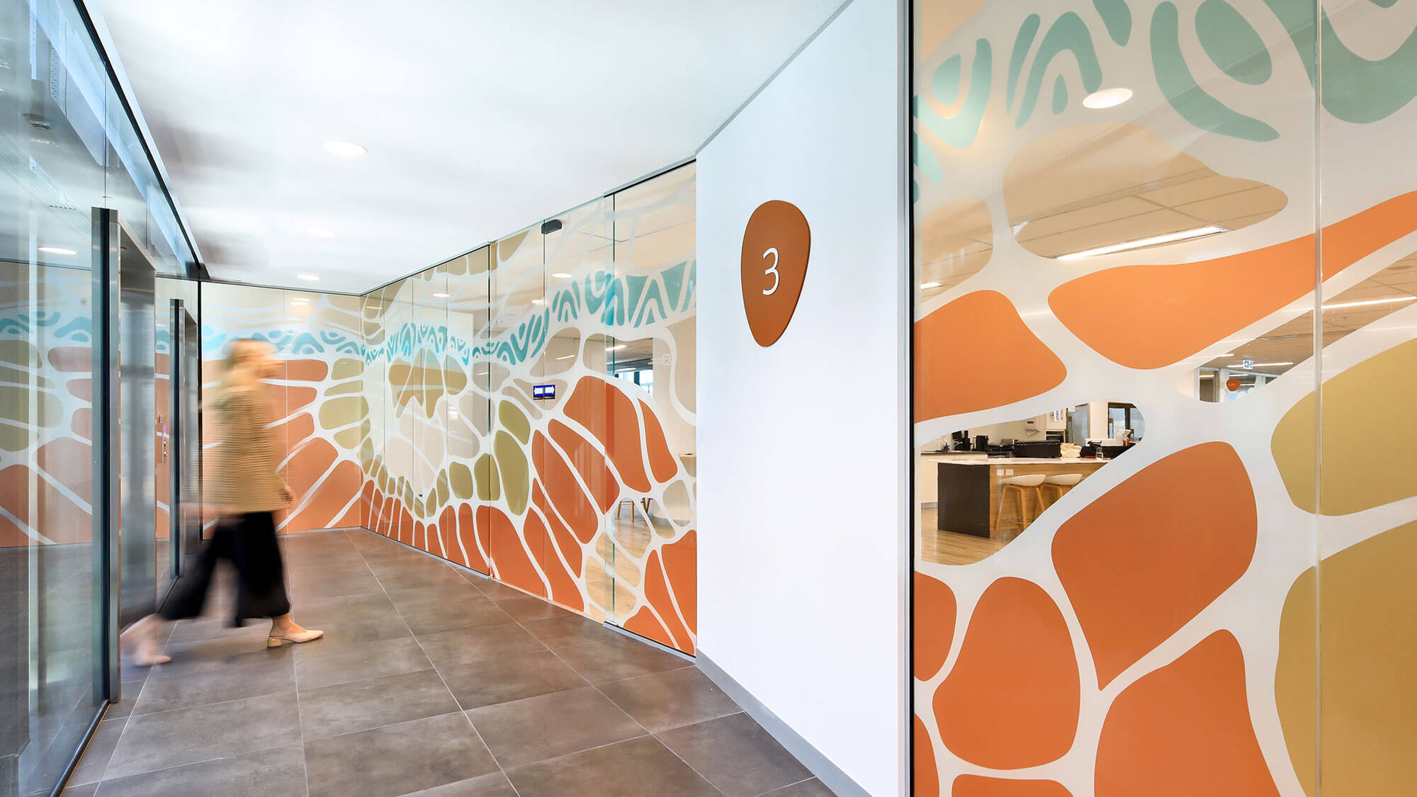
The brief was to repurpose a former Telstra call centre to create a new workplace for DPIRD over four levels on a tight budget that embraces open-plan and flexible work arrangements, promotes cross-collaboration between the various pillars of the department and unites them.
Local Aboriginal artist Dr. Richard Walley was commissioned to create unique artwork, originally intended as standalone pieces within the fitout. Inspired by one of Richard’s linework drawings, which he developed to recognise the significance of the place, it was agreed that instead of just creating art pieces, the artwork could be used as a generator to give the whole fitout over 4 levels a specific identity linked to place and the work the department does within the WA environment. Whilst each level has its own identity, the artwork, colours, materials, wayfinding and furniture selection tie all the floors together in a unified agency and corporate identity.
Commendation for interior architecture
Dandelion | MJA Studio
Project Description
Dandelion Bar, Kitchen and Distillery is multi-faceted hospitality venue that embraces the generosity of open space yet challenges the traditional shopping-center hospitality offering. This 720m2, 500 capacity venue spreads over two floors and looks over “The West Deck” precinct. The project design narrative explores the lifecycle of the Dandelion flower from germination through to maturity, mirroring the regeneration of the broader Karrinyup shopping centre.
Dandelion is a culmination of detailed finishes and functional joinery, collated with an eclectic edit of colour that breaks up volume and programme. It captures a warm, inviting footprint that cultivates a flexible space for drinkers, diners and staff alike, balanced in visual aesthetics to marry the guests other sensory experiences. Dandelion is a collaborative balance between design and function that embodies a benchmark for neighbourhood gatherings and genuine hospitality and social exchange.
public ARCHITECTURE
Award for public Architecture
Saint Teresa Church | Parry and Rosenthal Architects
Jury citation
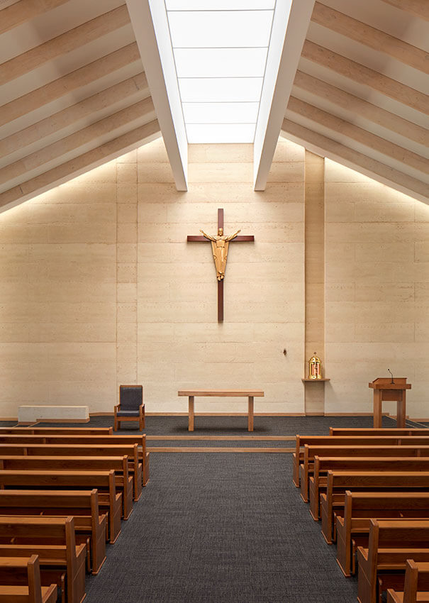
The project is a succinct and refined response to the conceptual framework and program, reinforced by a restrained and considered material palette. The execution of the simple material palette and refined detailing illustrates a dedication to craft which is to be commended.
There are many moments of delight within the project – interesting pause points have been created throughout – from subtle recesses in walling used to emphasise items of importance, to the location of large openings used to break and horizontally extend the vertically compressed volume at the Narthex.
Subtle and diffuse lighting throughout helps to elevate the space and emphasise the internal volume, while the extended external roof line and the rhythm of the roof structure helps to create a great sense of calm, comfort, and privacy when inside.
A simple project delivered with maturity and restraint, executed with economy and a high level of skill and care. There is also an element of clever opportunism that should be commended in that the Architects have been able to capitalise upon the knowledge in material specification, detailing and skilled trade knowledge already co-developed by the architects and established across the campus.
award for public architecture
Airport Central Station (Perth) | GHDWoodhead with Weston Williamson + Partners
Jury citation
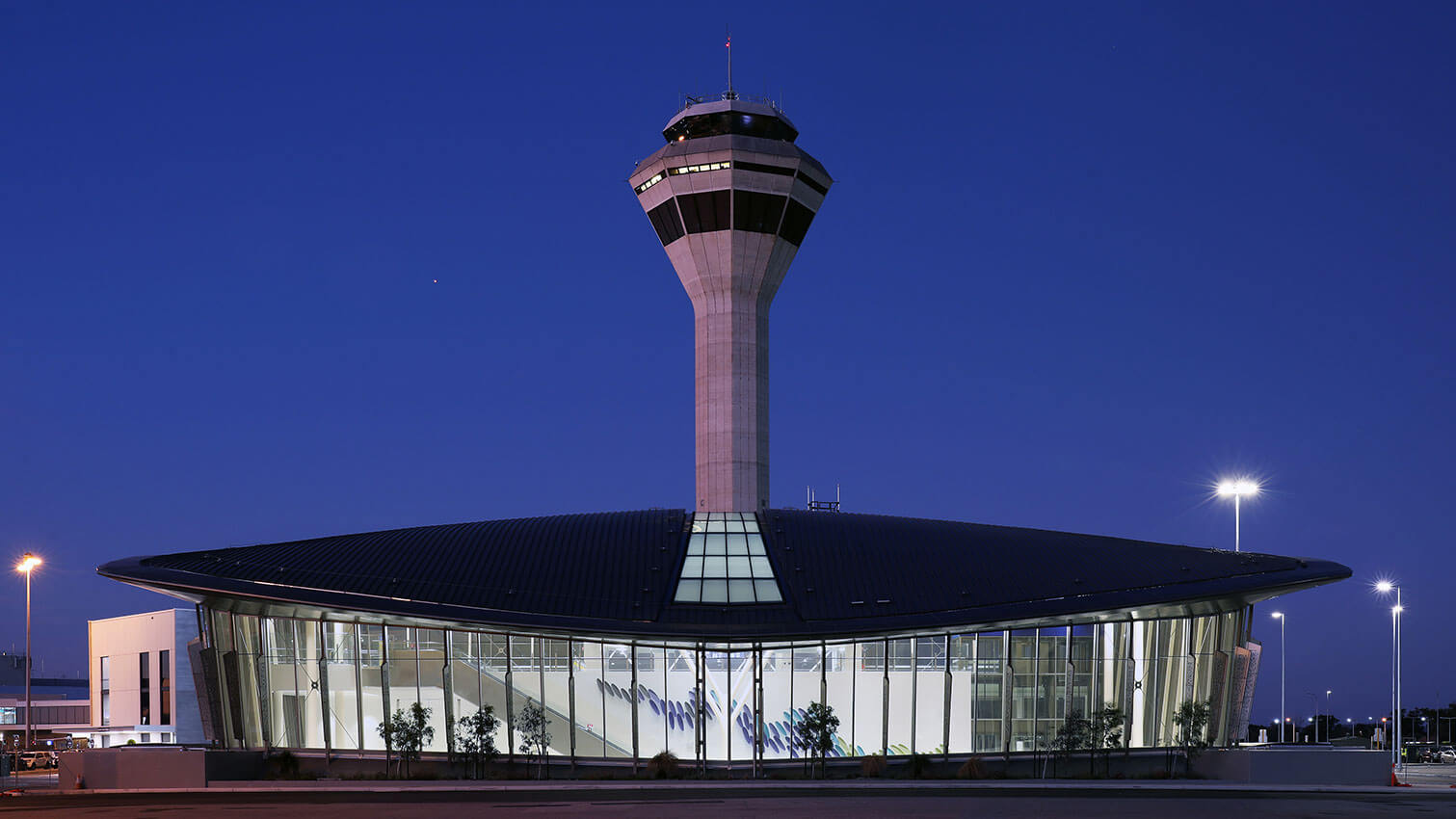
This is a highly complex project and the delivery of such is an achievement in itself. The public and functional benefits of this project are enormous, in relation to our city’s infrastructure. It successfully negotiates a multitude of complex challenges, including the sometimes competing concerns and requirements of the various key stakeholders.
Externally the curved forms sit comfortably within the context and are a friendly nod to the aerodynamic forms of the aircraft passing overhead. The glazed facades help to blur the boundary between internal and external space and allow direct visual links to the wider Perth context. Having the main volume of space naturally ventilated helps to strengthen this feeling of connection to the outside – further reinforcing the concept of vastness.
Open voids, expanses of glazing and vast volumes of space equate to a dramatic sense of arrival as you move up from the train platform, or down from the pedestrian link. The decompression of space is an apparent and strong concept and is further emphasised by a simple and bright material palette.
Clever consideration for patron capacity increases and future proofing for new linkages and connections ensures this project will continue to be relevant into the distant future.
Residential Architecture - Houses (New)
The Marshall Clifton Award for Residential Architecture - Houses (New)
Celilo Springs | Western Architecture Studio
Jury citation
Celilo Springs is a strikingly different home. Ephemeral qualities of light and nature are wrapped in a singular room that reimagines human occupation. Acknowledgement and acceptance of this ‘difficult’ site, provided opportunities for experimentation with structure, challenged conventional construction methodologies and most importantly the concept of typical suburban infill. The terroir has been embraced, with a seamless transition between the thriving bush and diverse ecology outside, and the home’s interior. With its deliberate openness to nature and its surroundings, this house provides a lesson for living well. It is rigorously elemental in its form, but could variously be described as tent-like, playful, liberating, and joyful. It is both simple and very much of the 21st century. There is a quality that is quintessentially of this land.
Award for Residential Architecture – Houses (New)
Davidson Residence | Klopper & Davis Architects
Jury citation
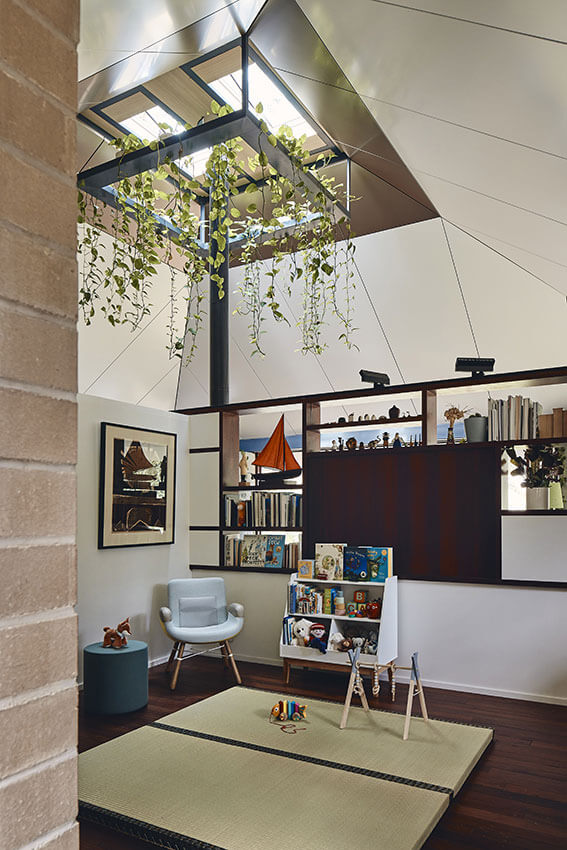
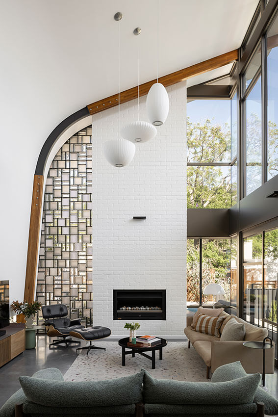
When first seen from the street, the somewhat unusual form and structure, contrasted against a familiar neighbourhood materiality, invites the question of what lies within. And it does not disappoint. On entering your eye is drawn to the soaring, north facing void above the living room, framed like the ribs of an up-turned wooden boat, and infilled to the west by the artful and indeed beautiful use of glass bricks. Creative detailing and stunning spaces make this home a creative and inspiring space.
Commendation for Residential Architecture – Houses (New)
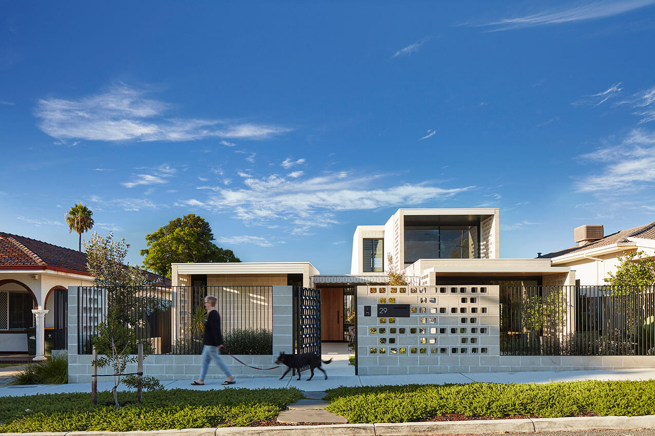
Filter House | AHA Studio (Andrew Hagemann Architecture Studio)
Project Description:
The owners required a design for a new home that would cater to their growing family. The house had to exhibit environmental performance through passive heating/cooling systems. It had to create effortless spaces that would cater to a variety of daytime activities while also being flexible enough to future-proof the house for changing family and work dynamics.
The house is located within a small pocket of post-war architecture. The clients were keen to develop the climatic advantages of the surrounding housing, characterized by high ceilings, light-colored external walls, and shaded frontages, in their new home.
The site runs north-south, so the perforated blade walls external to the house help screen out the harsh sun while also framing semi-enclosed outdoor spaces facing the street. This also makes the front of the owners’ home a more usable place and fosters a closer relationship with their neighbors.
Challenges set by the council included mitigating the bulk and scale of any upper floor portion visible from the street, adhering to existing street setbacks, and respecting the scale, style, and massing of the neighboring housing.
The house is organized as an H-shaped plan with a bedroom wing to the east and a living wing to the west, joined by the entrance hall that crosses the internal street. Above all this is the master bedroom on the upper floor to the west. The internal street serves as a mediator for light, breezes, and activities, allowing these elements to filter deep into the site.
Spaces are captured between the blade end walls. Joining elements are kept permeable and include steel landscaping screens, Marri timber screens, sliding doors, glass operable louvers, and stackable glass doors.
Ceilings and roof planes are simply expressed with burnished concrete flooring, off-form concrete soffits, and plywood. Black is designated for private zones, while birch is used in the public areas.
Suburban sites often suffer from wide plans with wasted peripheral space. Here, the internal street allows the entire interior to engage with the external environment. This important design decision has resulted in effortless interior spaces throughout, filled with natural light and breezes. The house breathes easily.
The landscape architect was engaged very early in the design process, and this is reflected in the project’s resolution being more of a “house-in-garden,” resulting in a greater variety and quality of outdoor spaces.
Commendation for Residential Architecture – Houses (New)
Corner House | spaceagency
Project Description:
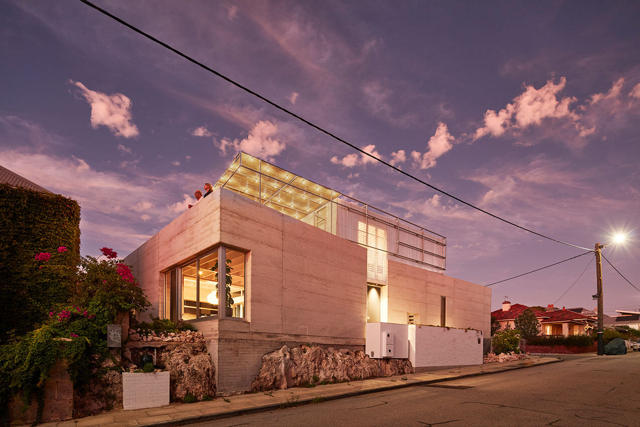
The project involves the strategic demolition of an existing house, while retaining some fragments that enable advantageous site planning moves on the small lot – a parapet wall to the north and west is retained to negate required set backs to those boundaries; a below ground pool is removed and the excavation is transformed as a sunken garden for lower level rooms, effectively minimising building height above ground level, reducing boundary set backs.
Realising the opportunity of its corner position and elevated topography, the house is pushed as close as possible to the street boundaries in order to create a north facing garden courtyard, the plan curls around the courtyard allowing all rooms a dual aspect; generous openings face inward to the privacy of the courtyard and smaller, deep set openings address the street. A roof terrace to the south west corner captures ocean views and sunsets.
The program is a down-size dwelling for a family with 3 adult children, strategically the house can accommodate visitors or returning children as required, while prioritising the planning for the primary occupants.
The design invites connection between inside and out through a variety of garden experiences; the lush north facing courtyard is protected from prevailing winds, the sunken garden is planted to shade the east elevation, a narrow succulent garden to the west and the green roof above features coastal plants that can tolerate the exposed location.
The form is divided into two rectangles – an open plan living, kitchen and dinning volume is set to the west, and tilted so that a corner of the rectangle touches the boundary, acknowledging the nearby heritage buildings with no street set back, a characteristic local condition that is contextually relevant, as well as referencing the South Fremantle vernacular; iterations of the ‘mediterranean villa’, roof terrace and pergola.
paces.
Residential Architecture - Houses (Alterations and Additions)
The Peter Overman Award for Residential Architecture – Houses (Alterations and Additions)
Tanoa | vittinoAshe
Jury citation
Tanoa is a highly considered and thoughtfully crafted insertion to an intergenerational family home that sits on a quiet, beachside cul-de-sac. The architects sought to engage with the lively, communal use of the street through two new outdoor spaces: a ground level terrace wrapped with a swale-like landscape, and an upper level balcony. The addition of a new living and study space nested within the roof of the original semi-detached house reached by a delicate, external spiral stair, constantly connecting the family with the landscape and enhancing neighbourhood interaction.
As the sole access, this generates flexibility, and allows the upper level space to be inhabited independently from the main house, and provides a sense of retreat.
The architects sought a First Nations perspective to enhance their understanding of the site, which has informed both built elements and landscape in a meaningful way. For its contribution to a streetscape, its consideration of a broader ecology and its finely crafted details, Tanoa is an extraordinary home addition.
Award for Residential Architecture - Houses (Alterations and Additions)
North Perth House | Simon Pendal Architect
Jury citation
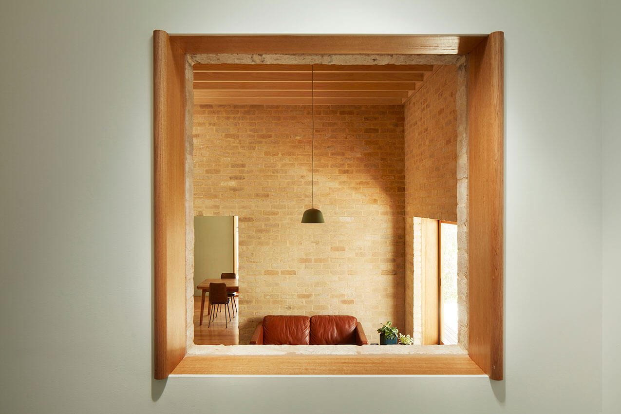
Through a combination of carefully curated materials, textures, colours and tones, the catching of light and casting of shadow, and the playfulness of its volumes, this alteration and additions home from Simon Pendal Architects is expressive, bold, and nuanced. Upon entry to the federation home, a visual connection is made via its central corridor to a conversation window defining the meeting place of old and new. Framed with curved timber reveals, and ideally placed, this opening gives the first hint of the sophisticated architectural detailing you will find throughout the extension. Described by the architects as “a collection of distinctive rooms gathered under a large, singular roof,” there is a deeply considered spatial sequence played out between the new roof line and ceilings—alternately high, low, peaked, sky-lit and recessed—in approaches both subtle and dramatic. While each room feels distinct, together they surround the occupants with domestic warmth and beauty. The extension is wrapped by a raw timber veranda, defined by elegant columns, which is welcomed inside through large window-seats and openable, screened windows and doors. Deep openings and thresholds bridge between the warm interior and the wild, endemic garden beyond.
Award for Residential Architecture - Houses (Alterations and Additions)
Weeties Warehouse | spaceagency
Jury citation
No ordinary warehouse, the Weeties building has shone its brightly painted signage over North Fremantle for decades. spaceagency have taken on the project as a conversion into a family dwelling, and made of it an equally extraordinary internal world. The design makes full use of the warehouse’s height, assembling three layers of rooms, a leafy courtyard, and a lofty, double volume living space. The detailing across the project is elegant and precise, striking a balance between the rawness of the warehouse’s heritage and an elevated refinement. One enters the warehouse into its voluminous living space, with the strong leading lines of an overhanging mezzanine and a linear kitchen directing the eye to a dramatic spiral staircase made of fine steel. Red curtains envelop a guest room above, amplifying the theatrical nature of the home. Spaces alternate between large and light, and deep and recessed, and tactile details delight throughout. The project is structurally striking, largely suspending from existing beam systems, with new elements rarely touching ground or skin. Voids and offsets bring light and air to each room. With a plunge pool, a nested study, plush bathrooms, and bedrooms enveloping the original gantry, the project joyfully and adventurously embraces the unique nature of its setting.
Residential Architecture - Multiple Housing
The Harold Krantz Award for Residential Architecture - Multiple Housing
Clifton & Central | MJA Studio with CAPA Studio
Jury citation
MJA’s Clifton & Central project took the opportunity to turn a charming but neglected corner shop into a community meeting place, and to demolish a highly compromised and a poor standard dwelling to way make for a well-considered and designed mixed use development. The corner shop was activated prior to the commencement of the main project and developed a strong local following, hinting at what was to come.
Inglewood is an important heritage area and the design resolution integrates conservation of a key minor element of the precinct and a sympathetic solution for the new work that draws on the language and materiality of the context and reinterpreting it in a fresh and pleasing manner.
Interaction with the public domain is underpinned by the conservation and reactivation of the cafe, maintenance of a garden setting to Central Avenue, design rhythm of Clifton Avenue commercial tenancies, and minimisation of the visual impact of the car park entry.
The historic context comprised a mix of significant single storey houses, a church and later two storey developments. The project successfully sits in the context and provides a new elegant visual landmark.
The brief required the reactivation of the cafe and the introduction of activated ground floor development and as many residences that were compatible with the context. MJA have produced an outcome that meets this brief with care and skill.
All apartments are dual aspect, naturally ventilated, have high-performance glass, insulation, shading to windows, EV charging stations, a solar array and hot water recirculating. This combined with low maintenance envelope materials will contribute to long term sustainability.
Award for Residential Architecture - Multiple Housing
ONE Subiaco | Hames Sharley
Jury citation
One Subiaco was designed during the period of development of SPP 7.3 and the approval process required design excellence using the then draft policy as a benchmark.
One Subiaco brings new life’ into the once socially important Subiaco Markets site. Mixed-use development has become Subiaco’s most sought-after real estate. One Subiaco brings together a highly activated ground plane, a high degree of public access and will allow movement through to other development sites to the south to promote interconnectivity. The site was earmarked for this kind of development and development density.
A successful dimension of the development is its response to the existing one and two storey developments on Rokeby and Roberts roads and breaking the upper-level developments in separate buildings. At street level, it presents as a four-storey building, which is in keeping with the Subiaco ethos in the station precinct. This is the element that reads strongly from the pedestrian view and it is only at some distance that the towers come into visual play.
One Subiaco was intended to, and does mark, a new era as the first luxury high-rise development outside of the Perth CBD, delivering luxury with heritage reflections and modern living in harmony.
The program successfully achieved a high standard of mixed-use development and the soon to be completed tenancy fit outs will play an important role in the gateway to the City experience. The ambition of the development vision is vindicated by the quality of the outcome.
Award for Residential Architecture - Multiple Housing
Forrest Hall | KHA (Kerry Hill Architects)
Jury citation
Forrest Hall is a successful reflection of the collaboration between the Architects , The University of Western Australia, the Forrest Research Foundation, and the Minderoo Foundation.
The ground level provides a public plaza with a visual link to the river and a legible entry point to the buildings. The landscape at ground floor level, with its sunken ground plane and eucalyptus trees, provides natural light and visual connection between the ground plane and lower entries.
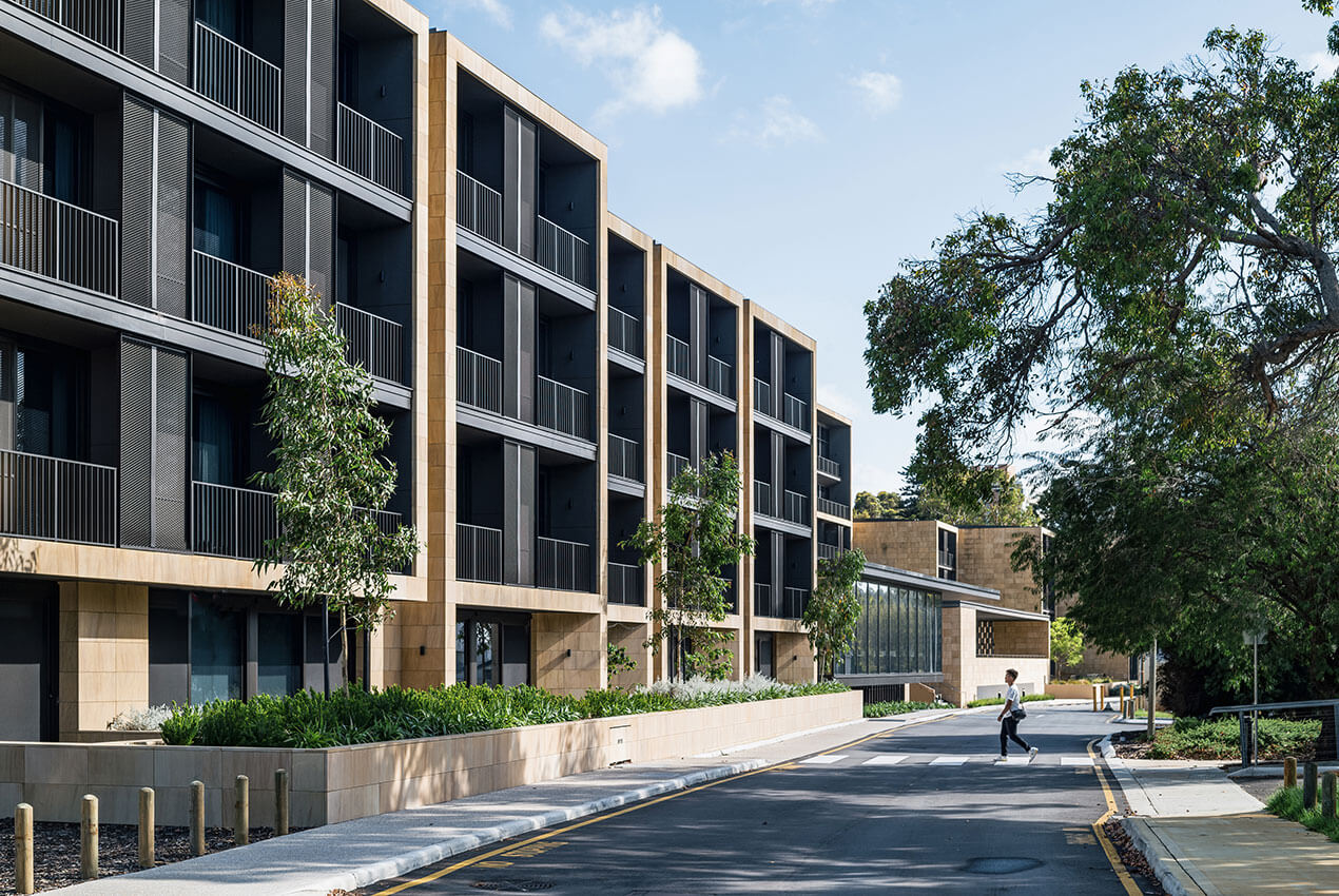
The second stage builds on the language of the first and refines the architecture. Well-designed scholars’ apartments on the upper levels have their own individual balcony and view of the Swan River.
The apartments are screened from the traffic on Mounts Bay Road through the use of permeable masonry and green walls. This approach has also been used to enable views and amenity to the majority of the short stay accommodation rooms in the academics’ wing.
The final outcome is a collection of well-crafted buildings which sit comfortably on the edge of the Swan River.
Commendation for Residential Architecture - Multiple Housing
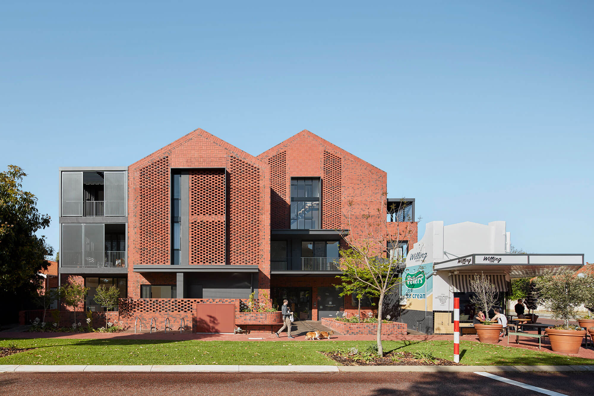
Evans Street | MJA Studio
Project Description
95 Evans St is the first multi-residential development to be completed in METRONET’s station precinct of Shenton Park. As a result, the project bore much responsibility to set a positive precedent for all future development in the predominantly single residential zoning of the surrounding area. The site is particularly sensitive as it is situated at the transition point between the R15 and R100 zones. With the burden of such an abrupt transition, a well-considered response was essential. It was the intent for both the client and design team to rise to this challenge and respond responsibly and with as much sensitivity as possible.
The project provides much needed housing diversity for Shenton Park, with ten quality apartments offering local downsizers the opportunity to live comfortably in the suburb they love, close to neighbourhood amenities and public transportation. In addition to this, with a rich heritage of existing high-quality, sculptural architectural precedents in the area, 95 Evans Street sought to offer a striking and unique addition to both the street and architectural history of Shenton Park and Subiaco.
With 95 Evans Street, the architecture itself becomes the transition point. Side setbacks are maximised to the east, pushing the main building mass away from the sensitive neighbour. This key movement, coupled with an incremental increase to the primary street setbacks, carefully shapes the fundamental massing of the building on the site, maximising sensitivities to the adjacent block.
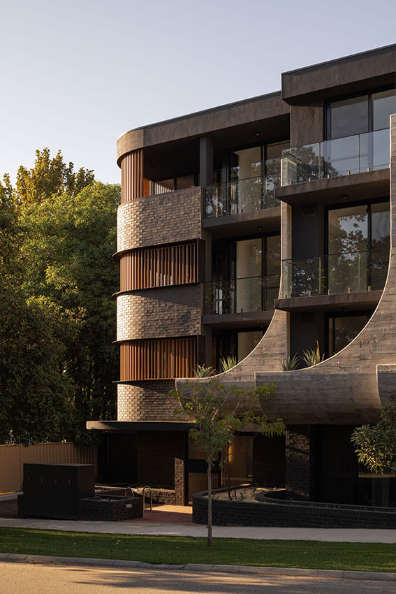
These massing movements are then integrated into the built form to further reflect the zone transition. With a material palette that draws from the surrounding context, the primary street façade is separated into four bays. The first bay to the sensitive eastern neighbour expresses the horizontal, while the remaining three bays embody the transition to R100 through the flowing upward sweep of the board-formed concrete planters as the building steps forward to meet the higher density zoning.
Commendation for Residential Architecture - Multiple Housing
Salt Lane at Shoreline | Gresley Abas with Development WA
Project Description
For many years Gresley Abas has partnered with DevelopmentWA to demonstrate how to deliver innovative, affordable and sustainable housing projects to the housing market in Western Australia.
Continuing our relationship, Gresley Abas has completed a key portion of the Salt Lane Demonstration Project at Shoreline, a component of DevelopmentWA’s Cockburn Coast Redevelopment. This visionary development seeks to transform former industrial land into a vibrant urban centre in a desirable coastal setting. In the initial design process for this new community, DevelopmentWA collaborated with AUDRC and a full range of engineering and design professionals to create an innovative new urban precinct model, one designed to address the challenge of “the missing middle”. DevelopmentWA undertook extensive research and testing of urban design and housing typologies through this collaborative process. Urban designers, landscape architects, traffic engineers and architects worked together to deliver affordable, innovative design solutions for the medium-density housing sector.
Through this process, Gresley Abas developed several designs which were used to define a variety of different lot dimensions and sizes including 80 sqm small lots, assisting the Department of Planning, Lands and Heritage in developing the small lot policy for medium-density housing. Our designs prioritised spaciousness while creating excellent access to daylight and cross-ventilation. Efficient planning exploited opportunities to build volume and meaningful connections to outdoor spaces, enhancing the living experience.
Achieving dwellings of a townhouse scale that present attractive streetscapes to both the front, east-facing public open space and the rear, west-facing laneway was an important project success. Similar developments do not commonly exploit the opportunity to activate the rear lane access in a way that contributes to the homes and the urban context. Our design solution creates an activated laneway with strong articulation, sensitively dealing with garages and car parking whilst providing optimum access to northern light, protection from the western sun, excellent cross-ventilation and strong interactions between indoor and outdoor spaces. The result is a medium-density environment with exceptionally strong focus on quality of the urban landscape and public space.
Commendation for Residential Architecture - Multiple Housing
Eden Floreat | Hillam Architects
Project Description
Eden Floreat comprising 163 apartments plus café over two complexes, brings premium apartment living to Perry Lakes, successfully meeting a specific brief to offer superior lifestyle options to downsizers in a locality where spacious homes on large blocks prevail.
The complex utilises all measures generally associated with highly sustainable buildings. However, the greatest success in sustainability terms is that the project has successfully inspired affluent residents who are reluctant to move from their large homes to move to a vibrant apartment community. We estimate that these homes would occupy approximately 7.5 hectares reducing pressure on unban infrastructure and sprawl.
A diverse range of layouts cater for households of all sizes, from one to four-bedroom apartments, penthouses and two-storey townhouses with direct street access. Resident amenities include a 25m heated pool, spa, sauna, steam room, fully equipped gym, cinema, wine cellar, book retreat, alfresco dining areas, sunset terrace and a dining and residents lounge.
The site provided an exceptional opportunity to deliver a building with street presence and is inspired by the rich historical context of the site, offering a modern interpretation of the Post-War International Style identified within its location. The design builds on the existing urban fabric to create a strong engagement with the streetscape, whilst being sympathetic to the sporting heritage of the precinct and its expansive parkland surrounds.
The unique frontage to Perry Lakes Reserve informed the design, with generous setbacks to all boundary interfaces and careful consideration being applied to overshadowing and access to natural light and ventilation. At ground level, low walls, open fencing and planting provide subtle separation between public and private spaces. Above ground, balconies typically wrap the building, providing protection from the elements and privacy to internal spaces, whilst maximising passive surveillance of the public realm.
Small project architecture
The Iwan Iwanoff Award for Small Project Architecture
Postal Hall | Trower Falvo Architects
Jury citation
Located within the vast volume of the State Building’s Postal Hall, the architects have crafted an installation that holds its own, creating space and encourages patrons to inhabit, linger and enjoy the Hall. Whilst creating a retail activation it also creates a civic meeting place and allows for a variety of uses across the week.
Consideration of the concept required connection to the historic nature of the building and a well-crafted approach to assembly. The design of the componentry was complex, yet simple enough to ensure that is can easily be constructed and deconstructed when needing to be moved.
Natural textures, timber and steel form a material palette that respond sympathetically to the surrounding heritage features. The geometry is derived from the unique site requirements and distilled throughout the entire project down to the smallest details such as the connection points of the screens and displays.
Award for Small Project Architecture
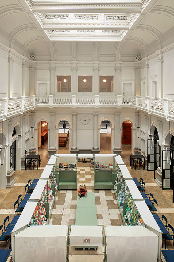
AGWA Design Store | Nic Brunsdon
Jury citation
The WA Art Gallery has evolved over the decades through successive expansion projects that constrained the visitor experience and reduced the legibility of the Gallery for patrons entering the space.
Recreating the entry, respecting the existing building fabric and creating a welcoming zone that didn’t compete with the art yet crafted a space that could set the tone for the rest of the gallery was exceptionally executed. The approach of the architect is one of restraint to the installation of the entry and retail facilities. The jury though the paired back design solution was both sympathetic and celebrates the Gallery’s original material palette and the art on display. The result is achieved through a clever rationalisation of circulation and display items, utilising modular pediments that are multi-functional, adaptable to suit exhibitions and events within the space.
Award for Small Project Architecture
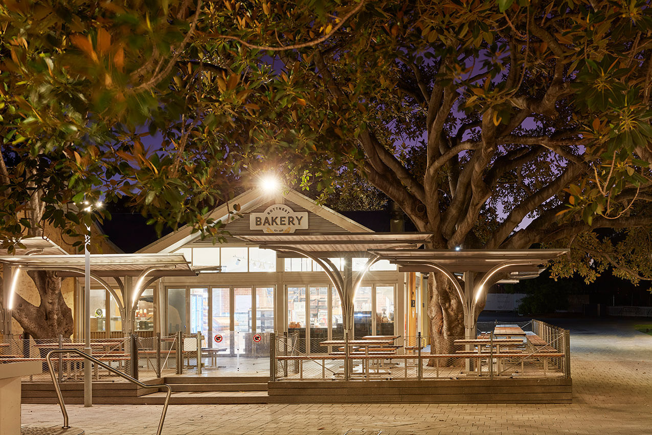
Rottnest Bakery Shelters | Hartree + Associates Architects
Jury citation
Initially our client was seeking to replace existing canvas umbrellas, however lack of sun protection and umbrella deterioration demanded a better solution – critically Seagull poo was washing off during rain periods).
The strategy evolved to exploring alternative shelter structures and concurrently refitting the Bakery interior (Interior scope by others) – seeking an extension of the decking area and trading hours.
Meetings with authorities confirmed heritage aspects of the location (Rottnest General Store, Heritage Moreton Bay Figs over the deck) would limit approving contemporary PVC structures – creating an opportunity to deliver bespoke shelter structure.
Public/Cultural Benefits:
At a famous location for WA holidaymakers (10k pies/pasties/sausage rolls sold per week at the peak), enhancing the customer experience year round has been significant.
The shelters provide weather protection, with the dining space increased by 41.5m2, complemented with a balustrade system preventing Quokka access to the dining space.
Relationship of Built Form to Context
The concept was developed for the structures to share an organic dialogue with the heritage trees, our intent was for the branches of the shelters to merge into the tree structure when viewed from a distance; allowing the heritage aspects of the setting (Rottnest General Store, Moreton Bay Fig Trees) to dominate the mall experience.
Program Resolution
The shelters were pre-fabricated in steel a; a trunk and wishbone structure (branches) that support the gutter, subframe and polycarbonate sheeting printed in a motive designed to mitigate the appearance of mess on the canopies between cleans (weekly in summer).
Shelters are arranged to stagger in height and retain leaves/figs for removal, with a concealed RWP system delivering foul water to the tree roots below the decking.
Illumination of the “branches” extend hours of operation, supported by evening roast chicken and veg from the French Rotisserie.
Detailing of the balustrade system responds to the maritime setting.
Improved steps and a wheelchair ramp improve access to meet code compliance and pram movements.
sustainable architecture
The Wallace Greenham Award for Sustainable Architecture
Boola Katitjin | Lyons with Silver Thomas Hanley, Officer Woods, and The Fulcrum Agency
Jury citation
This project is transforming the Murdoch University Campus by creating a new primary universal access linking the new southern public transport arrival areas off Discovery Way through Boola Katitjin to the ‘spiritual heart’ of the campus (the Bush Court). The vertical system of lifts, stairs and escalators overcomes a 13m natural level change and provides a full range of highly equitable access options both into the building or along circulation layers and timber colonnades within its western façade.
The sustainability credentials of this project are significant including the highly innovative use of structural timber, reducing the embodied carbon within the building by 55%. Added to this the integration of mixed mode ventilation strategies throughout, the gable roof cloaked in a 450kW array of PV solar cells, which when combined with the many other low energy systems greatly reduce the overall operational energy consumed. Many further sustainability initiatives assist in targeting independent GBCA certification for 6-star Greenstar v1.3 as built. A project specific Climate Change Adaptation Plan was also undertaken. The building servicing strategy ensures that the building can be fully electrified and operate with 100% renewables. The Lyons team are also undertaking the careful enhancement of the adjacent Banksia Court as part of this project including the expansion of Banksia Court by 3,300 sqm of predominately native planting.
Lyons have championed sustainability – it’s a building that facilitates collaboration, a stimulating place of learning, teaching, and discovery, for students, teachers, staff, and visitors.
Boola Katitjin demonstrates a leadership level of sustainability while enhancing the existing character and adding to the evolving future character of the Murdoch Campus.
Award for Sustainable Architecture
School of Design & the Built Environment, Curtin University | Wardle
Jury citation
Leveraging of the work encapsulated in Curtin University’s award-winning Masterplan for the Curtin Exchange Precinct, The Wardle team have created an exciting new School of Design and the Built Environment (DBE) at the heart of Curtin’s Innovation precinct.
The DBE Building recently Achieved and has received a 6 Star Green Star Design as Built V1.2 rating from the Green Building Council of Australia. An extensive list of Sustainability initiatives integrated into this design helped the project achieve this world leading accreditation. These included high performance facades for heat resilience and large solar PV (187.3KW) providing renewable energy. The project achieved a 71% reduction in operational carbon compared to a benchmark building (calculated via Green Star GHG modelling protocol). Embodied carbon (reviewed via Life Cycle assessment) and environmental credentials were carefully considered in the material selection.
The building provides many protected sheltered spaces for study throughout its interior and exterior footprint all with excellent access to natural light both from windows and the roof lights above the central staircase.
The DBE Building integrates seamlessly into the surrounding streetscape, exceeds it’s brief to be a place of collaborative community practice, and is an excellent, truly sustainable, addition to Curtin Exchange Precinct.
Award for Sustainable Architecture
Farrier Lane House | MDC Architects
Project Description
Architect Matt Delroy-Carr approached his family home as an R&D project, to test and evaluate the best ways to reduce operational and embodied carbon in design and construction, while creating a healthy and comfortable environment for his young family.
Located on a small, subdivided lot facing a back lane, the design makes the most of its outlook into mature trees; more than half the site is given over to gardens and greenery. Visual connections enable the quiet laneway to function as an expanded forecourt; a place for local kids to gather and play.
The design exploits the northern orientation using passive solar principles, with extensive glazing to welcome in winter sun to warm the concrete floors. In summer the glazing is shaded, and carefully positioned windows capture the “Freo Doctor” to keep the house naturally cool.
A central void in the dining room acts as a thermal chimney to vent warm air up and out of the high-level windows, while the thermal mass helps to maintain stable internal temperatures.
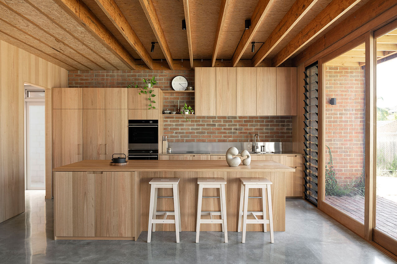
Exploring #TrueNetZero pathways and options, materials were chosen for their low embodied carbon; longevity and durability; and to contribute towards a healthy indoor environment. The bricks were redundant stock and were certified carbon neutral by the manufacturer. Other natural materials include cork flooring, timber cladding, timber veneers, and exposed timber beams.
A life cycle analysis was undertaken to compare performance against established benchmarks, and gather data for research and demonstration purposes. These data will be shared and added to professional and community knowledge-banks, to accelerate the shift towards a more sustainable design and construction industry.
Award for Sustainable Architecture
Celilo Springs | Western Architecture Studio
Jury citation
Celilo Springs is a strikingly different home. Ephemeral qualities of light and nature are wrapped in a singular room that reimagines human occupation. Acknowledgement and acceptance of this ‘difficult’ site, provided opportunities for experimentation with structure, challenged conventional construction methodologies and most importantly the concept of typical suburban infill. The terroir has been embraced, with a seamless transition between the thriving bush and diverse ecology outside, and the home’s interior. With its deliberate openness to nature and its surroundings, this house provides a lesson for living well. It is rigorously elemental in its form, but could variously be described as tent-like, playful, liberating, and joyful. It is both simple and very much of the 21st century. There is a quality that is quintessentially of this land.
URBAN DESIGN
The John Septimus Roe Award for Urban Design
Curtin Exchange Precinct Stage 01 | Christou Design Group with Wardle, Nettleton Tribe and Six Degrees
Jury citation
To achieve the delivery of the Curtin Exchange Precinct Stage 01, Christou Design Group have skilfully managed a range of significant design inputs in this complex and multifaceted precinct. This required a close and detailed coordination with the separately engaged Architects of the precinct’s buildings including Wardle Studio, Nettleton Tribe and 6 Degrees, as well as with the landscape architects REALMstudios.
The individually contributing buildings are diverse in typology, including educational, residential, hotel, retail, commercial and hospitality, as well as public spaces, roads and public transport infrastructure, however Christou Design Group have skilfully stitched these elements together as a precinct resulting in an exciting, responsive and engaging outcome which says more about “precinct” than simply building in close proximity.
The urban design outcome of Curtin Exchange Precinct Stage 1 is of the highest standard, establishing an ambitious benchmark for further implementation of the Greater Curtin Master Plan, and providing an exemplar for the coordinated delivery of campus masterplans and high-quality mixed-use precincts in general.
Commendation for Urban Design
Brook Lane | TRCB
Jury citation
The new shopping centre sits within the original 1994 Ellenbrook masterplan. The now established ‘Village’ centre serves the growing Ellenbrook community, providing an attractive amenity for the town centre and its northern villages.
The urban integration within this context has been achieved by linking the internal and external areas to the site. This design response is evident in both connectivity and scale using the site level differences to express the landscape and leveraging the orientation of the buildings. The terraced piazza with the forecourt integrates well with the place and allows visitors to intuitively navigate through the site. The Brook Lane project conceptually responds to the Swan Valley with its Swan Estuary waterways. The space encourages visitors’ activities and interaction along the north–south axis, offering coverage to visitors moving between the shops, courtyard and carparks.
The buildings have a human-scaled approach and designed with local materials. The building adjoining the forecourt features raw-concrete arches reminiscence of the Swan Valley’s historical market gardens. Reclaimed bricks, concrete basins and a restrained palette in the ablution facilities are an ambient addition to a centre marked by a modern aesthetic.
Public art component calls for a distinctive style at Brook Lane’s northern entrance with both mural and sculptures by local artists.
