2023 NSW Architecture Award Winners
2022 NSW Architecture Awards
2023 NSW Architecture Awards - WINNERS
The NSW Architecture Awards celebrates design excellence in architecture in NSW. It is also a great way for architects to receive public and peer recognition for projects and helps the Institute to promote architects and architecture within NSW, across Australia and internationally.
NSW ARCHITECTURE MEDALLION
NSW ARCHITECTURE MEDALLION
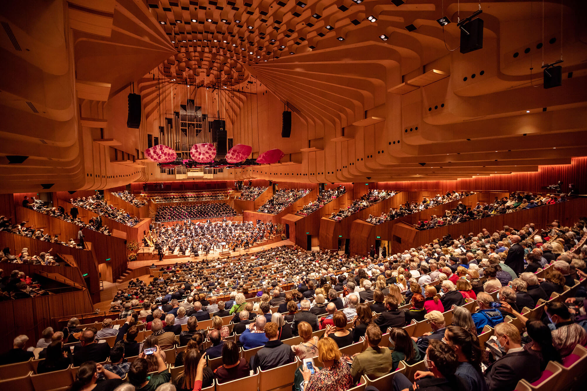
SYDNEY OPERA HOUSE CONCERT HALL RENEWAL | ARM ARCHITECTURE
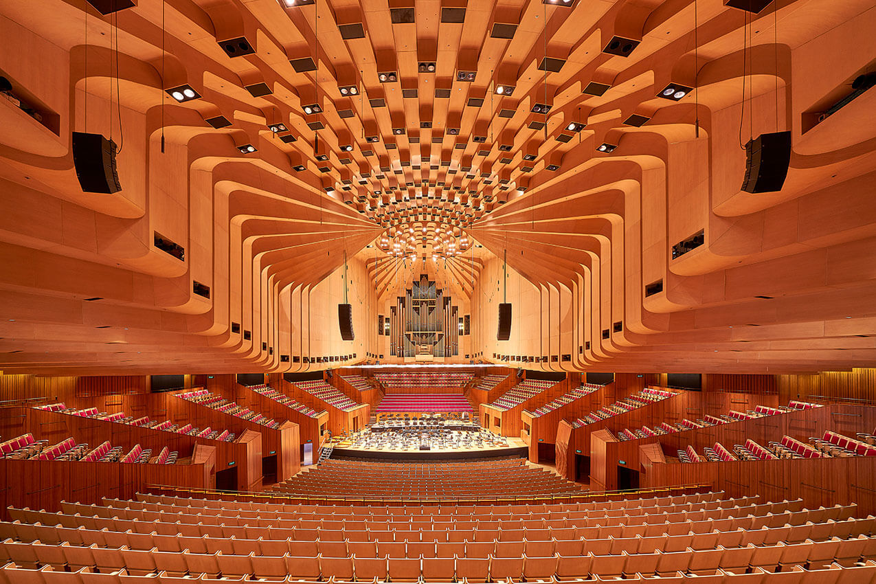


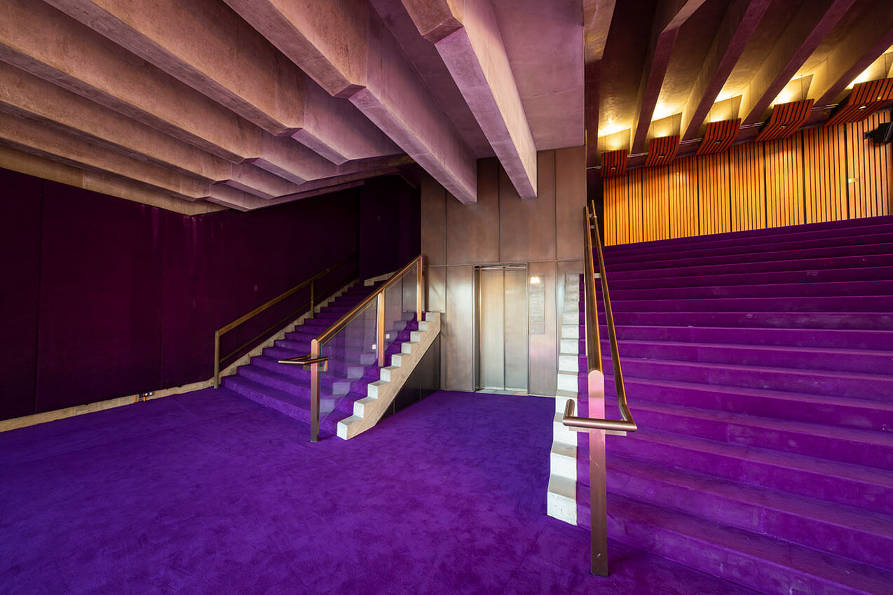
Completed in celebration of its 50th year, the Sydney Opera House concert hall refurbishment is a symphony of design, innovation, and acoustic excellence, seamlessly merging the past with the present. This remarkable achievement pays homage to the complex history of an undisputed masterpiece of 20th-century architecture, while reimagining its interior spaces to augment and improve the experience of both the public and performers.
The design team’s meticulous attention to detail is evident throughout the refurbishment, which has revitalised the concert hall while thoroughly respecting and enhancing the original design.
Technical virtuosity, engineering innovation, and skillful integration of existing and new materials define the reimagined interior. The incorporation of sophisticated new systems for acoustics and lighting, simultaneously celebrate and enhance the heritage of the original space while reconciling its previous shortcomings.
The subtle rhythms and melodies of the new works visually resonate with the historic space whilst expanding the sensory experience and enjoyment of the visitor. Respecting and honouring the work of both Jørn Utzon and Peter Hall, ARM’s works have achieved the previously unimaginable – the addition of a recognisable third design voice, in perfect harmony.
The result is a renewed Concert Hall for the next generation, on par with the world’s greatest auditoria. This accomplishment deserves the highest recognition, and we applaud the entire project team for their remarkable performance.
PUBLIC ARCHITECTURE
SULMAN MEDAL FOR PUBLIC ARCHITECTURE
Art Gallery of NSW, Sydney Modern building | Lead Consultant: SANAA; Executive Architect: Architectus
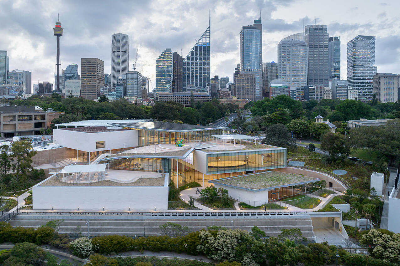
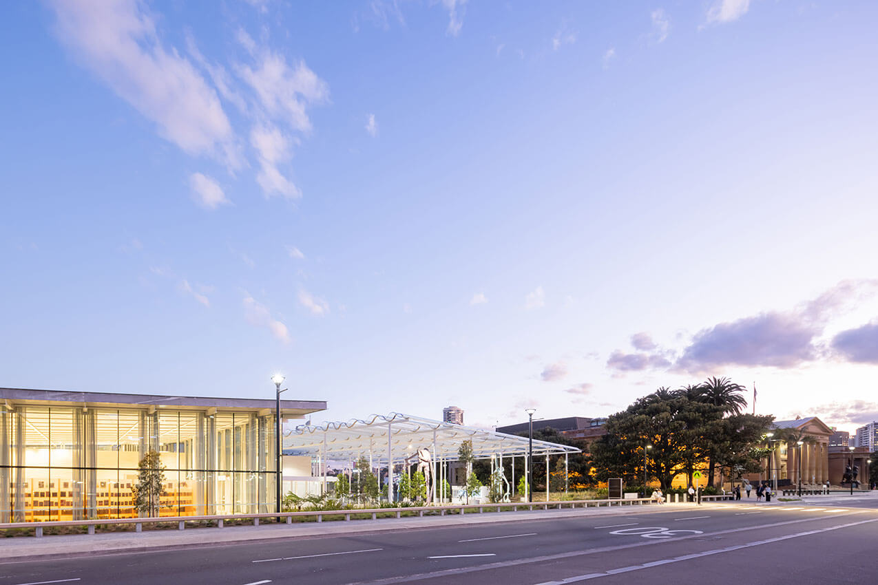
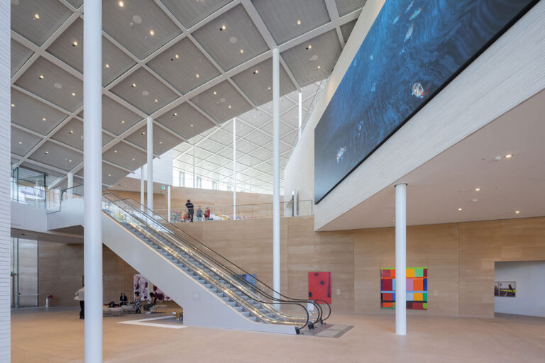
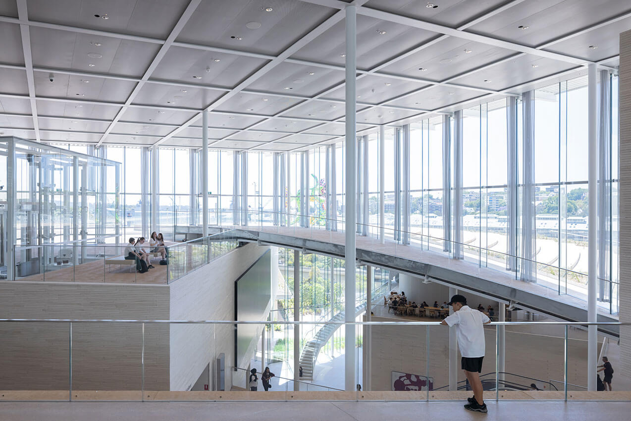
Situated on Gadigal Country adjacent to the 151-year-old Art Gallery of New South Wales, SANAA and Architectus have skilfully negotiated a complex site spanning the Eastern Distributor motorway and a 20m + topographic fall to create a fresh and engaging gallery that opens new possibilities for experiencing art in Sydney.
The strategic siting of a cluster of pavilions stepping towards Woolloomooloo Bay, ensures Sydney Modern defers to the existing 19C building as the primary face of the new two building gallery, cleverly disguising its mass from the Botanic Gardens and the Domain.
Rethinking the orthodoxies of the art experience in relation to both enclosure and circulation, Sydney Modern provides a new type of gallery experience that is freer in movement, more connected to the landscape surrounding it, and more diverse in the scale and type of art it can house. Particularly successful is the legibility of the interior spaces and movement paths as the building steps down the topography of the site, and the sublime re-use and connection to a disused fuel bunker as a key experience of the new gallery.
While the jury acknowledged concerns around the levels of glazing in the galleries and plaza as a climate response in the Sydney context, the result is a highly inventive and unconventional art experience that contributes to the global conversation about new ways for art, landscape and place to interact in the 21st Century.
AWARD FOR PUBLIC ARCHITECTURE
Art Gallery of NSW Library and Members Lounge | Tonkin Zulaikha Greer Architects


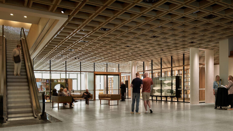
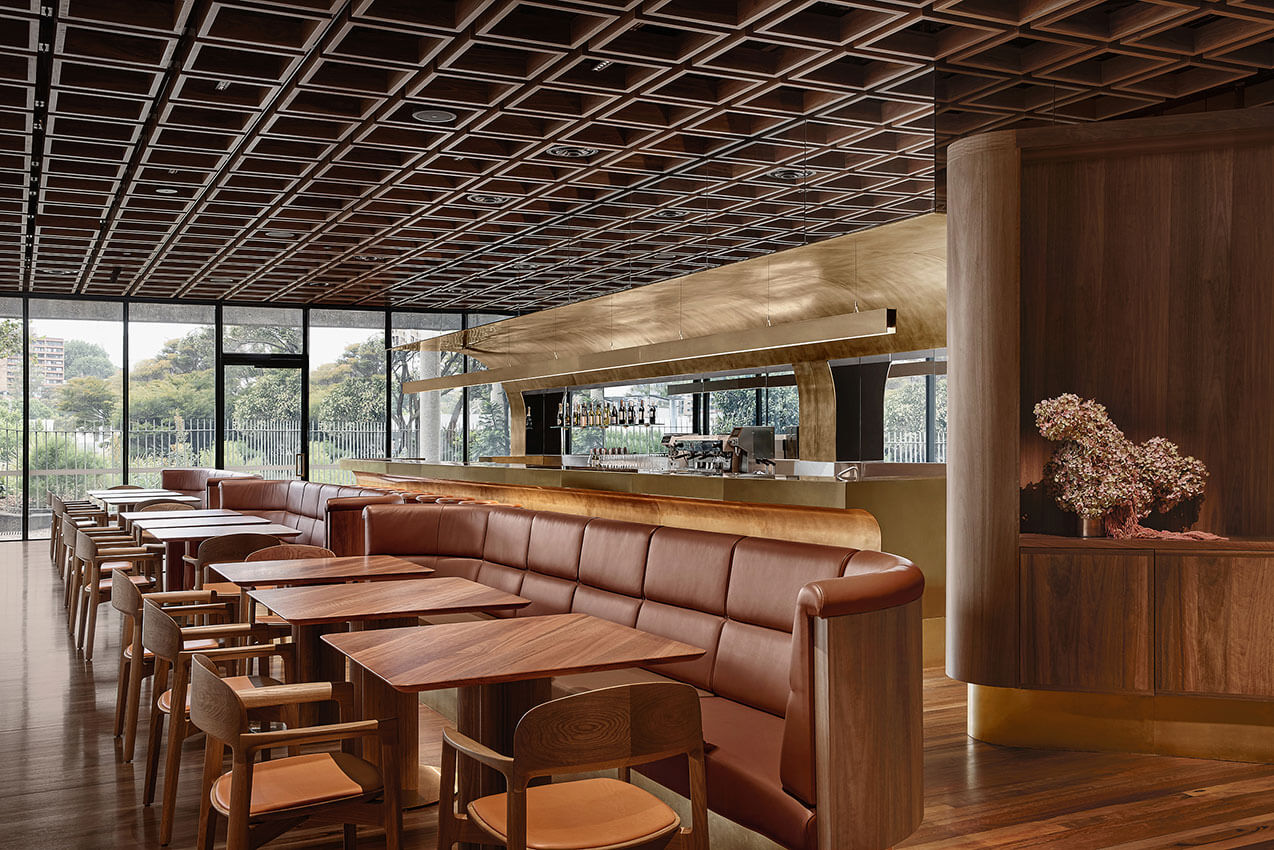
A once closed, non-publicly accessible portion of the 1988 wing of the Art Gallery at lower level 3, has been significantly transformed and beautifully refurbished into a highly public Library, Children’s Library, Art Archive and new Members Lounge. The transformation acknowledges the original Sulman Award winning wing, by extending and enhancing distinctive elements such as the GRC ceiling grid in a new contemporary way.
It is delightful to wander through and now have access to this important art book collection which serves as the National Art Archive, beautifully displayed in custom joinery with specialist lighting. There is significant care and attention given to the detailing of each furniture piece throughout, evidence of a great collaboration with skilled designers such as Tom Fereday.
The Children’s library is whimsical and inviting yet sophisticated, its wall seating element invites small minds to take a book and find a niche to read. The repurposing of existing wintergardens and clever skylight enclosure of the Members Lounge, expands the area available for public use. Upgrades to adjoining amenities, a volunteers area and theatre foyer space enhance and provide improved amenity for public and staff activities.
The Jury congratulates Tonkin Zulaikha Greer Architects and team for an exquisitely resolved project.
AWARD FOR PUBLIC ARCHITECTURE
Bondi Pavilion Restoration and Conservation | Tonkin Zulaikha Greer Architects


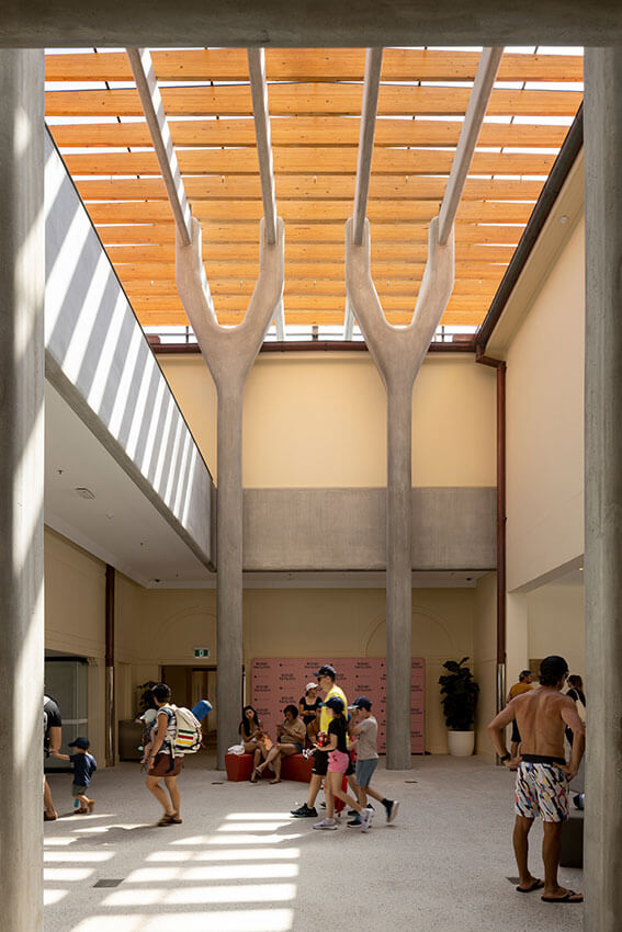
Tonkin Zulaikha Greer Architects Restoration and Conservation of the Bondi Pavilion transforms a much loved but aging Sydney icon into a delightful and functional series of public spaces, serving the community and civic needs of this famous beachside destination.
The jury particularly commended the urban design outcomes of the project, with a series of strategic subtractions opening up a new axial entry and gateway to the beach from Campbell Parade.
Similarly, the removal of poor past renovations within the building’s courtyard, has opened up new opportunities for public events at the Pavilion, providing a coherent and protected courtyard experience that complements the direct beachside engagement of its principal beach façade.
Also commendable was the playful nature of the heritage restoration – with a coloured tile pattern bringing delight to its very visible roof, and the light touch with which many community uses – art gallery, theatre and bar, local radio station, flexible performance rooms, and a pottery studio. These were renovated with simple modifications, that transformed a series of tired spaces, into a fresh and engaging public facility that maintains and expands the civic potential of this national landmark.
AWARD FOR PUBLIC ARCHITECTURE
St George Sailing Club, Sans Souci | Jon Jacka Architects
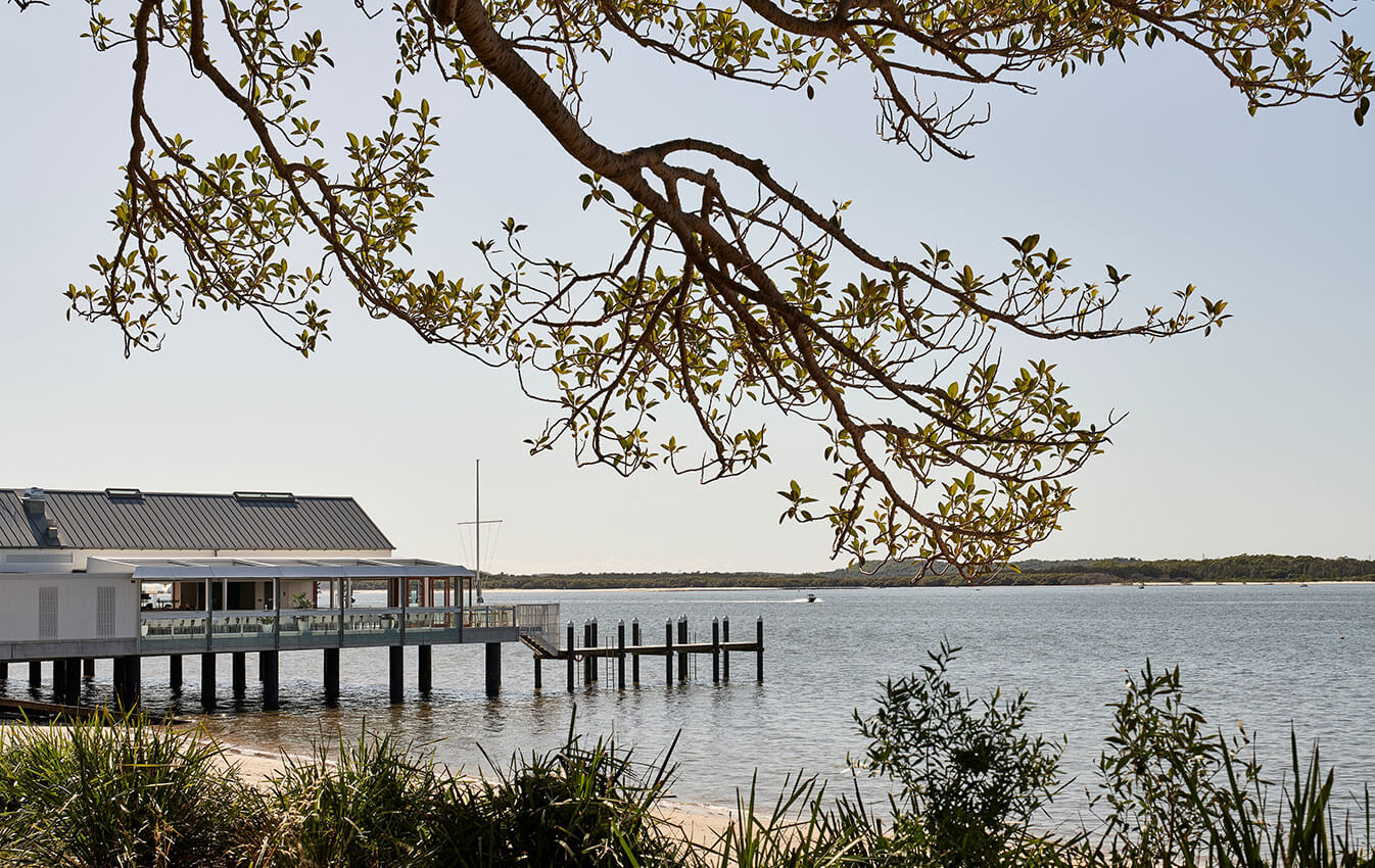
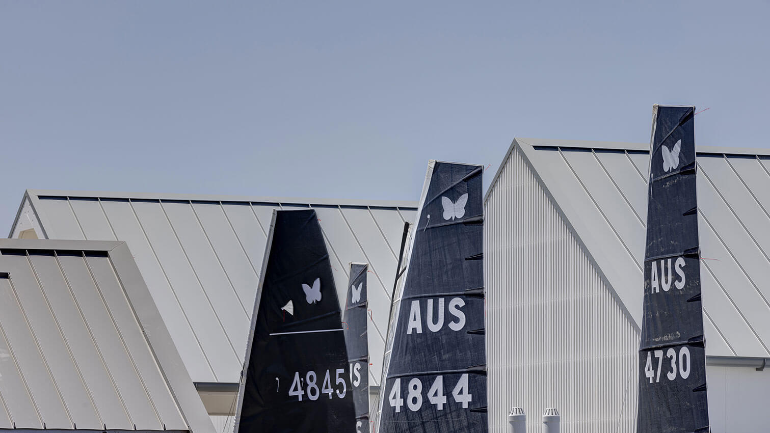
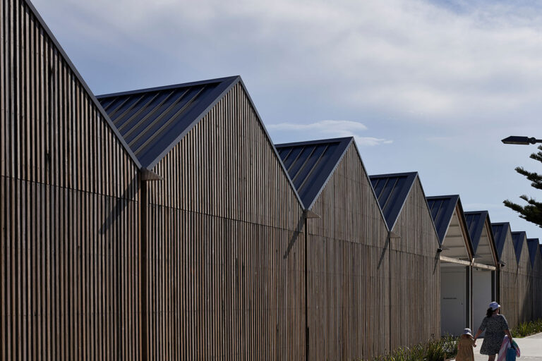
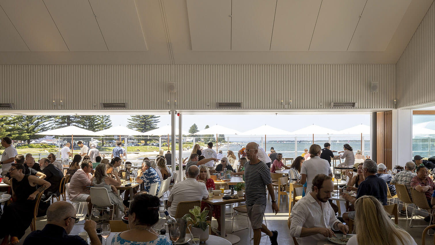
The St George Sailing Club at Sans Souci appears to be a low key and simple response. It is in fact a highly appropriate series of spaces and shelters that respond to place, community, circulation, scale and function in a poetic and cohesive way. Beautifully detailed, the first impression is of recycled, vertical boardwalk timbers that enclose the boat store with elegantly resolved structure and form.
The public enters through a centrally located covered space from the open carpark that leads to an open spine parallel to the shore edge. The entry and axial organisation of the club is logical, with a hierarchy of spaces leading to pavilions with verandahs on 3 sides.
The building envelope is defined by timber framed glass sliding panels that stack completely outside the rooms. Infinitely tuneable by the users, the building is climatically appropriate, with naturally ventilated spaces and protected perimeter glazing. The fitout and finishes were selected by the architect and create a unified interior. The success of the project is conveyed by the significant increase in use by the community since it opened.
The Jury congratulates Jon Jacka Architects in providing a positive addition to the local area and harbour foreshore.
COMMENDATION FOR PUBLIC ARCHITECTURE
PHIVE - Community, Cultural and Civic Hub | DesignInc Sydney, Lacoste+Stevenson and Manuelle Gautrand Architecture
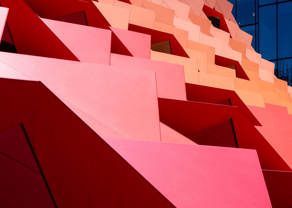
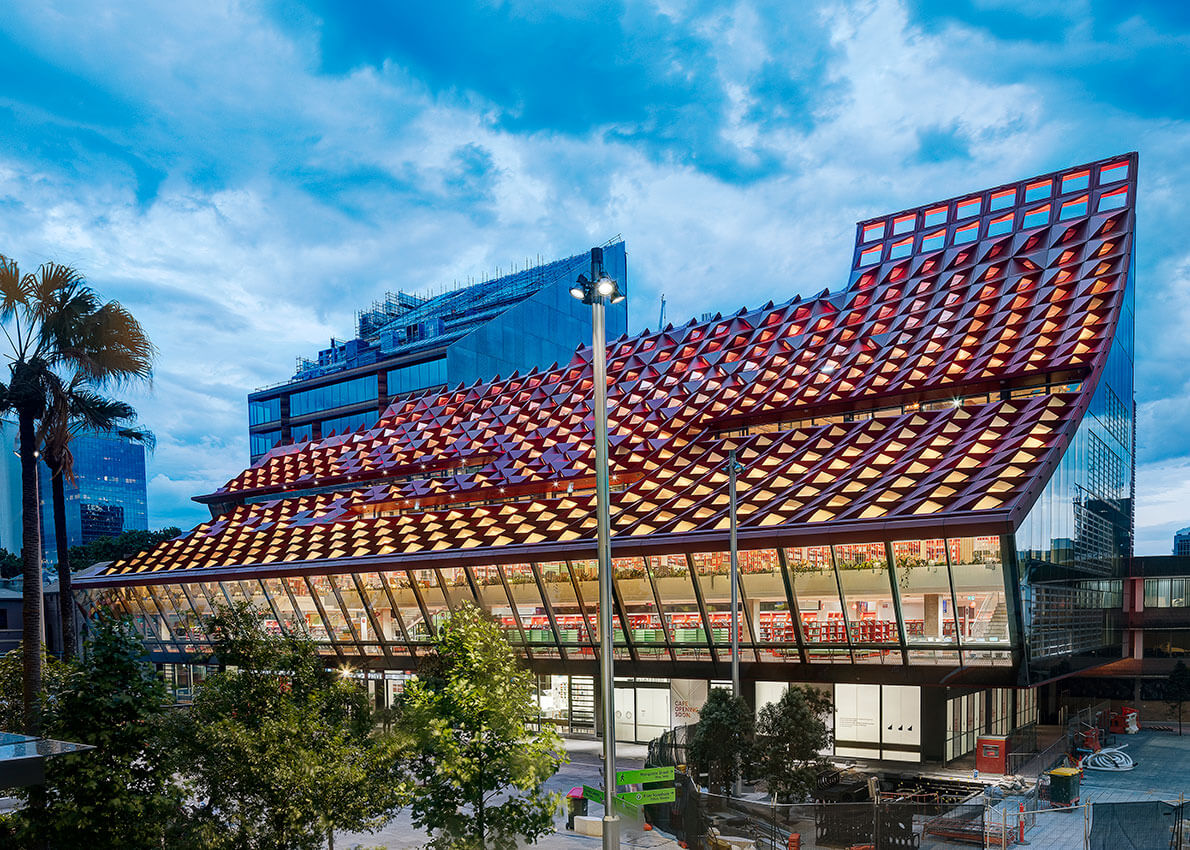
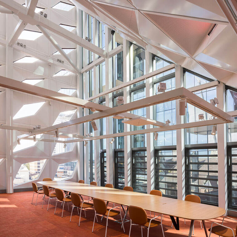
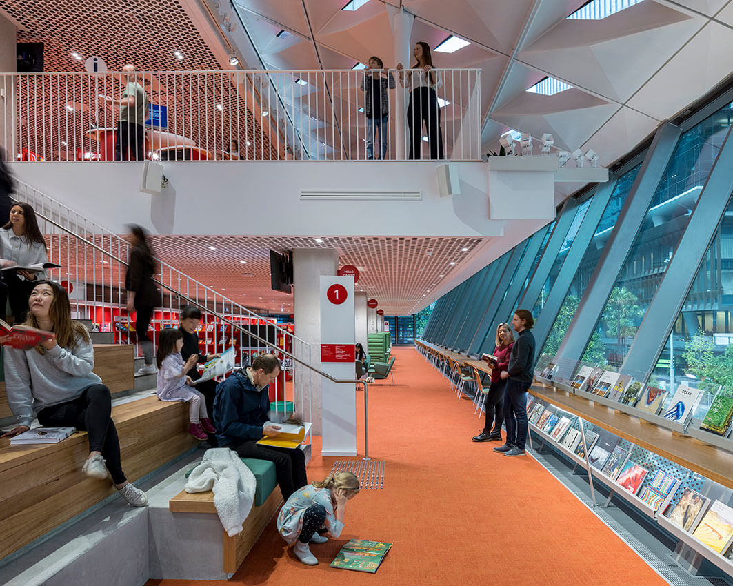
PHIVE creates a new world-class community, cultural and civic hub for the Parramatta community. The building form and expressive sculptural façade sits comfortably within its highly urban setting of Parramatta plaza, the building scale is appropriately civic. Internally the arrangement of library spaces and community rooms are legible and clearly functional. The sweeping folded envelope creates an interesting series of library spaces along the southern edge, and atop the building a series of voluminous Council Chamber meeting spaces. The large format black box space below ground, appears highly flexible and provides a great space for exhibitions and interactive displays.
The jury congratulates the architects on creating a new civic heart for Parramatta.
Educational architecture
The William E Kemp Award for Educational Architecture
Cranbrook School – Hordern Oval Precinct Redevelopment | Architectus
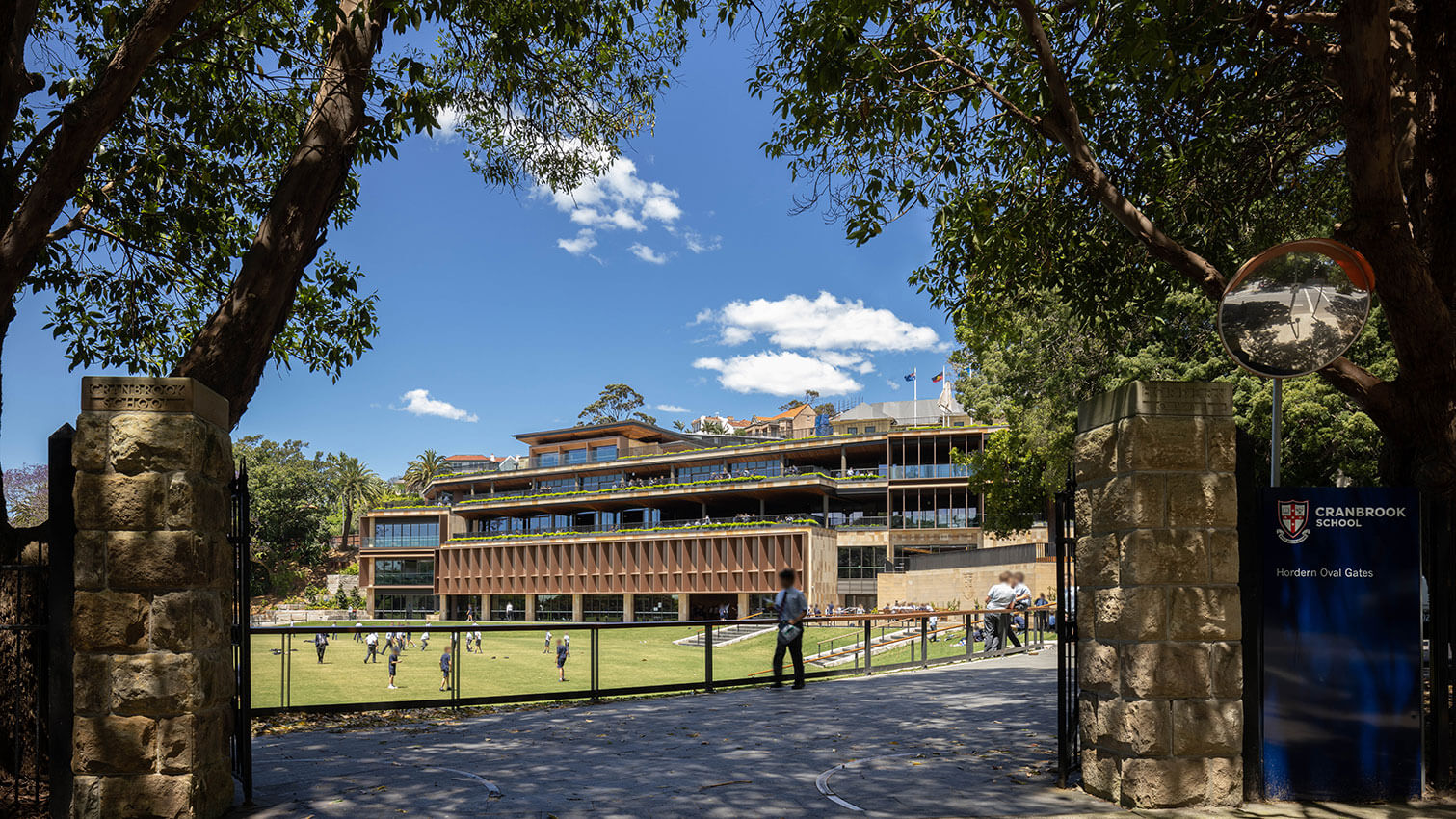
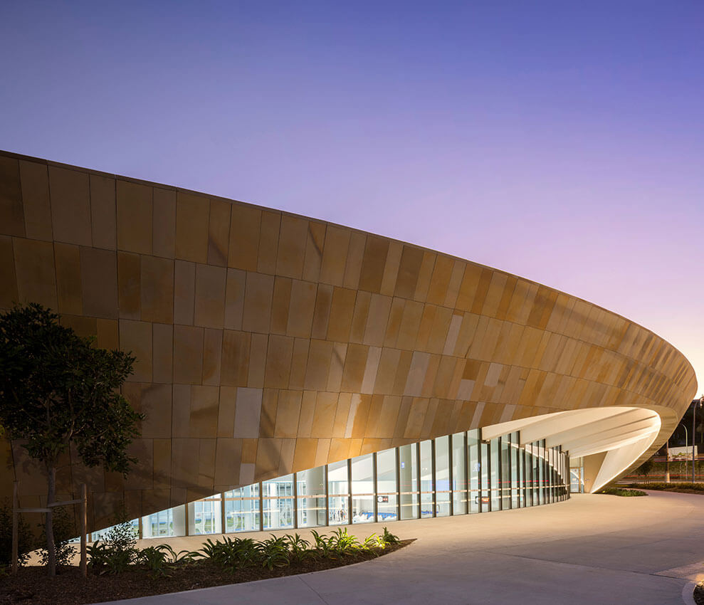
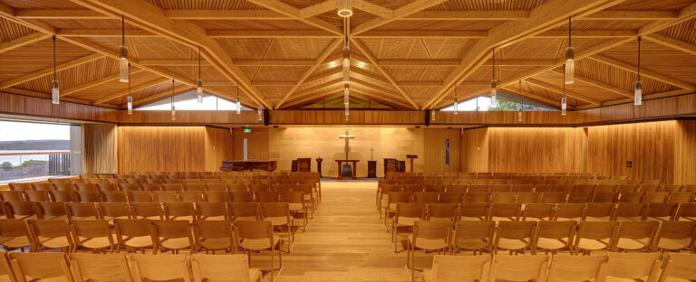
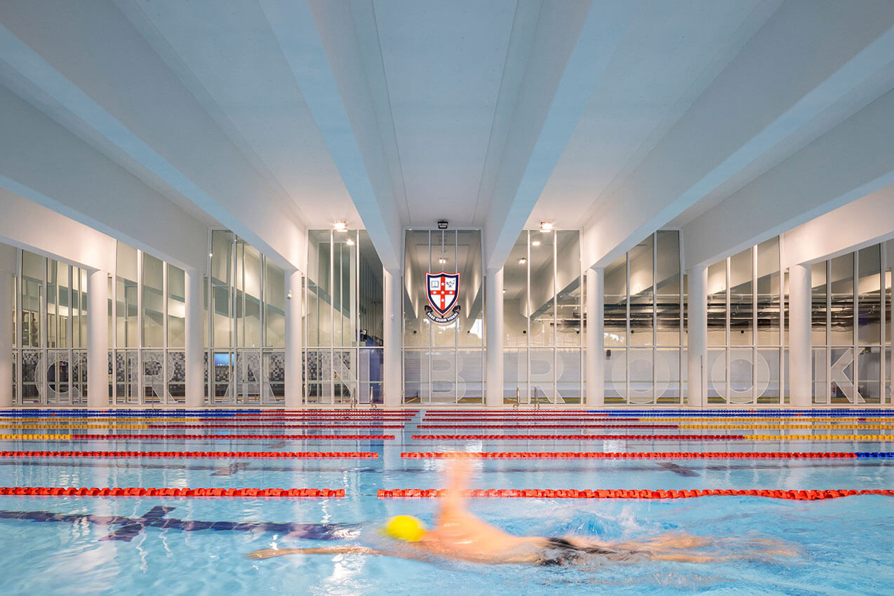
Nestled into its historic context the Cranbrook School Horden Oval Precinct Redevelopment is an exemplar response to both place and brief. In part, spread across a steeply terraced site, the building is beautifully interwoven into the rich tapestry of the schools’ senior campus.
Partially below ground but bathed in natural light, the considered location of the Murray Rose Aquatic and Fitness centre at the base of the site, encourages use of the facility by both students and the wider community alike. Above the Horden Oval, a series of sandstone terraces seamlessly interconnect all levels of the campus to the Vicars Centenary Building.
A core tenet of the brief was to create a place where students wanted to be, encouraging them to remain on campus, enhancing learning and pastoral care. Testament to the success of the project, a truly diverse collection of spaces has been created which enable students to gather, perform, play, compete, nourish and replenish at all times of the day.
Building on their previous work, Architectus‘ design of the humble rooftop chapel demonstrates true mastery in the use of timber in all its applications. Sitting in quiet repose atop the Vicars Centenary Building the Memorial Chapel is truly sublime.
AWARD FOR EDUCATIONAL ARCHITECTURE
UTS Central | fjcstudio (formerly fjmtstudio) and DJRD with Lacoste + Stevenson (Original Broadway Podium Design)
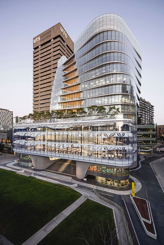
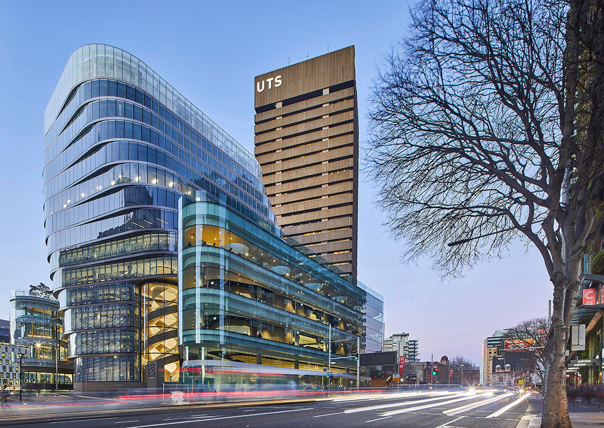
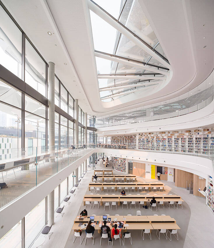
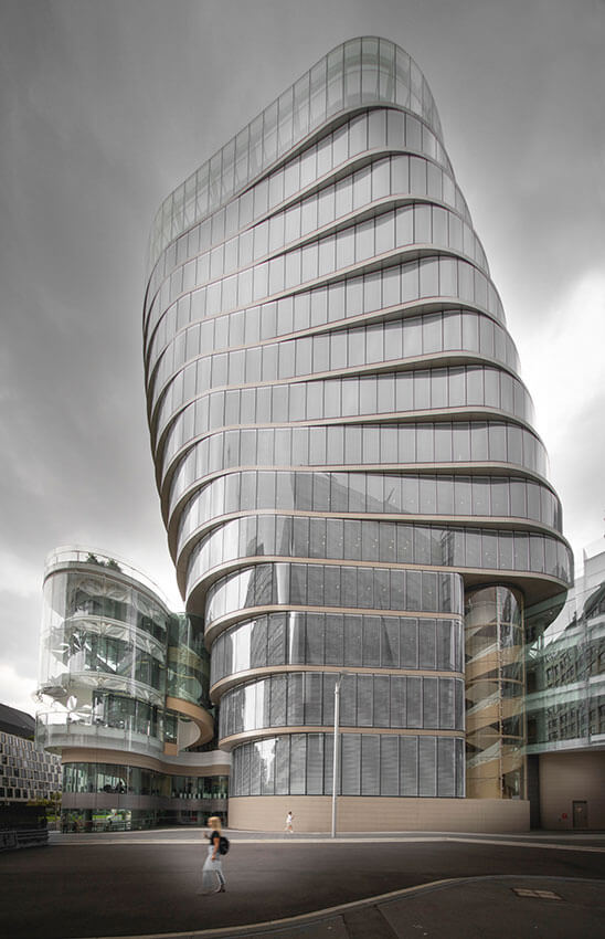
UTS Central is a polished and sophisticated series of spaces that positively contribute to the experience of tertiary students and academics. Providing through-site links at ground level, the new podium is a suspended glassy and transparent base that allows student study and life to be clearly visible from Broadway and surrounding streets. Canted Corbusian-shaped skylights offer daylight and interest from above.
The tower and podium respond in a sympathetic manner to the adjacent NSW Govt Architect, Dysart designed tower and podium of the 1970’s through appropriate scale, rhythm and colour selection. The twisting form of the tower is proportioned to offer a positive addition to the context of the Broadway skyline. The curvaceous library is a brightly lit white gem where every seat is occupied around a beautifully proportioned top-lit atrium and delicate operable sunscreens.
Landscaped study verandahs, provided with rain and sun screens, open to views of the alumni green. The diverse and varied teaching and study spaces provide options for both intimate and group work as well as centralised or satellite tutorial. The refined detailing, finishes, co-ordination of services, acoustics and lighting of UTS Central, demonstrates how 21st Century University buildings should prepare the professions for their future.
COMMENDATION FOR EDUCATIONAL ARCHITECTURE
The Village Preschool | Carter Williamson
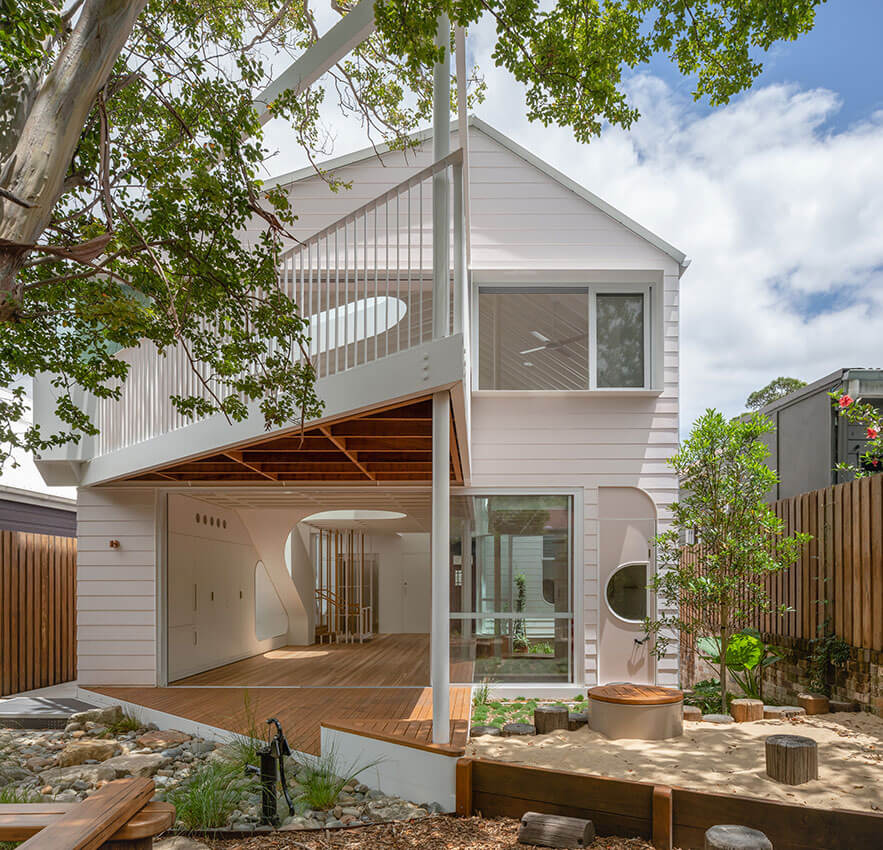
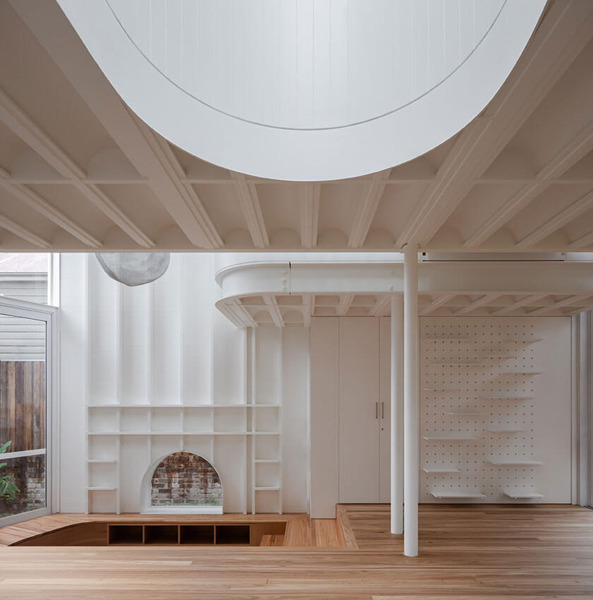
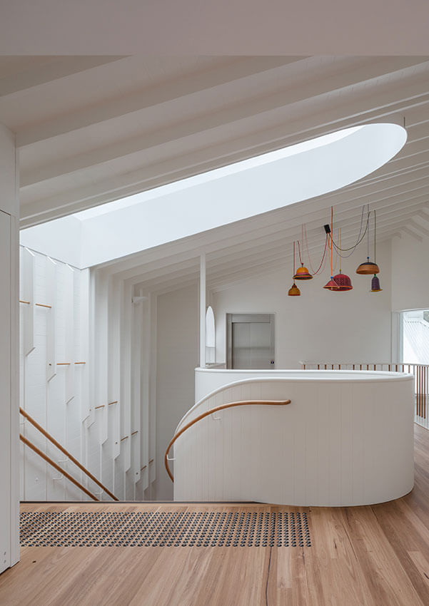
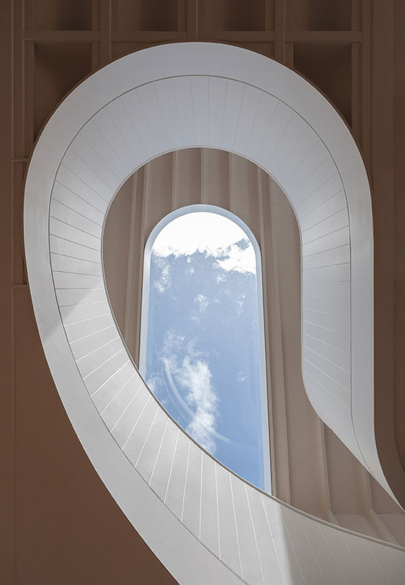
Hiding behind a classic cottage façade within a quintessential Dulwich Hill streetscape is the Village Preschool by Carter Williamson.
On entry little learners are welcomed into a series of beautifully detailed spaces, each with its own purpose and charm. Fittingly, its perhaps the little things that Village Pre-school does best, from balancing the need for dignity and supervision in the amenities, to integration of moments of texture, discovery, and delight within the learning spaces both inside and out.
Students and parents alike will no doubt be filled with joy and wonder once the Village Pre-school opens its doors later this year.
RESIDENTIAL ARCHITECTURE – HOUSES (NEW)
The Wilkinson Award for Residential Architecture - Houses (New)
19 Waterloo Street | SJB
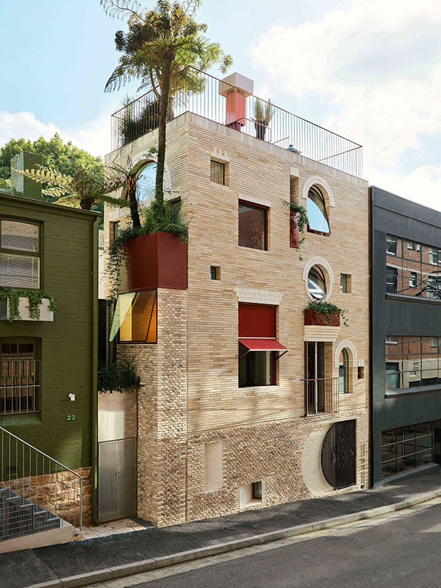
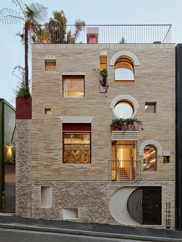
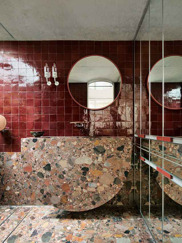
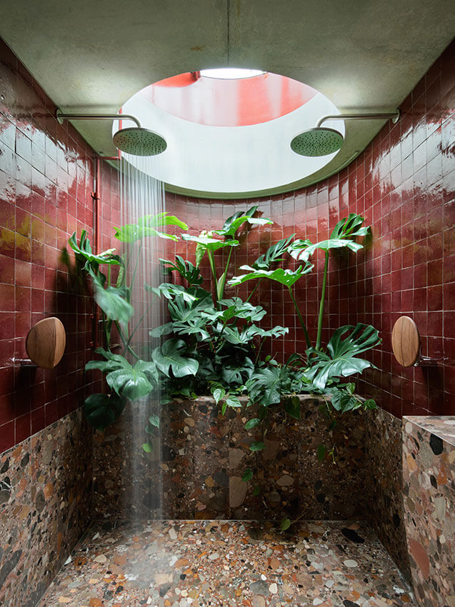
This remarkable infill project in Surry Hills challenges thinking about what is a ‘home’ in Australia today, the jury said.
The 69 sqm dwelling for a couple and their small dog, is a bold testament to doing more with less, the jury agreed.
19 Waterloo Street is nestled between brick warehouses, local shops, terraces, and faceless commercial towers in the rag-trade area of Surry Hills.
Spread over three levels and crowned with a rooftop garden, this building is a jewel box of experimentation.
Every inch of space has been meticulously detailed to create a home that is joyful and inventive, and lovingly tailored to the lifestyle of all three of its occupants including a little window for the dog, Eric.
Richly resourceful in its use of materials ranging from scavenged carrara marble and damaged bricks destined for rubble, the building’s façade is akin to a tapestry. It showcases carefully sculpted views of award-winning artwork on an interior wall while providing its residents with privacy.
The wider impact of this project, however, is not reflected in its scale. It is a generous invitation to its surrounding community to pause and reflect on this unexpected addition to the urban fabric.
It inspires us to think differently about how we wish to live.
AWARD FOR RESIDENTIAL ARCHITECTURE – HOUSES (NEW)
Little Manly House | CHROFI House
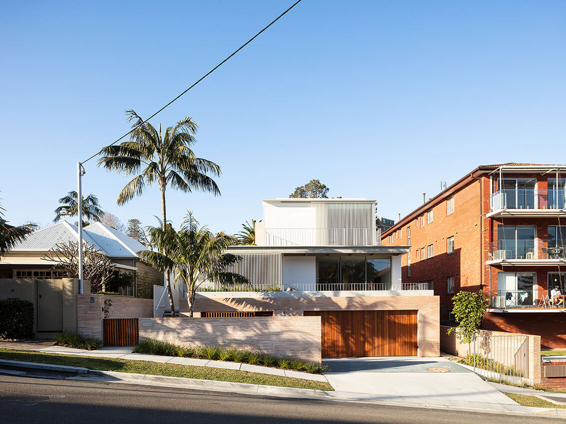
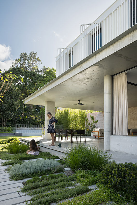
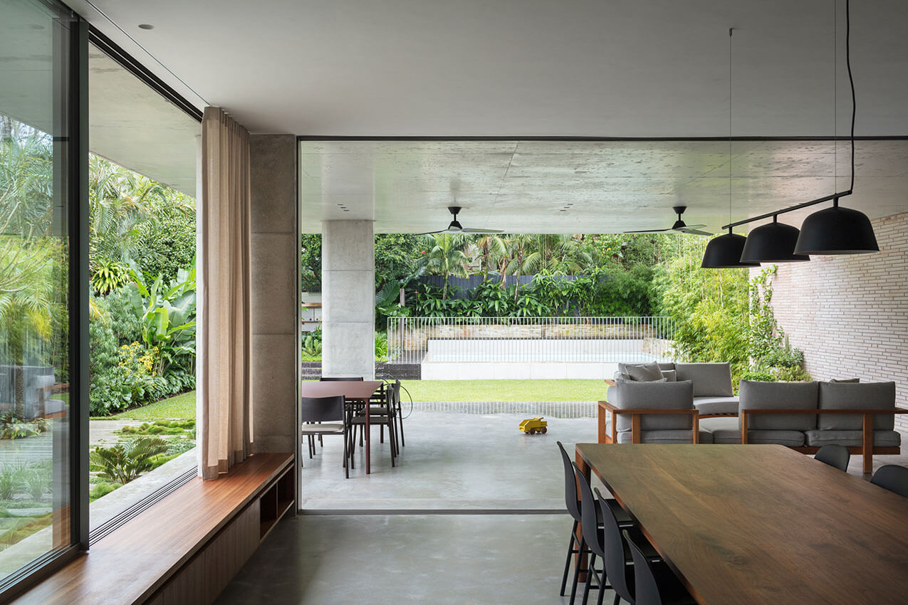
When the owners of Little Manly bought a fantastic home on a site with an amazing green backdrop and lovely sheltered views to Sydney Harbour, they were oblivious to the trials and tribulations ahead.
After discovering the location was a major thoroughfare for stormwater from the surrounding area, they shifted gear. They abandoned plans to renovate the existing home, and asked their architects CHROFI, who’d they worked with before, to create a comfortable new family home.
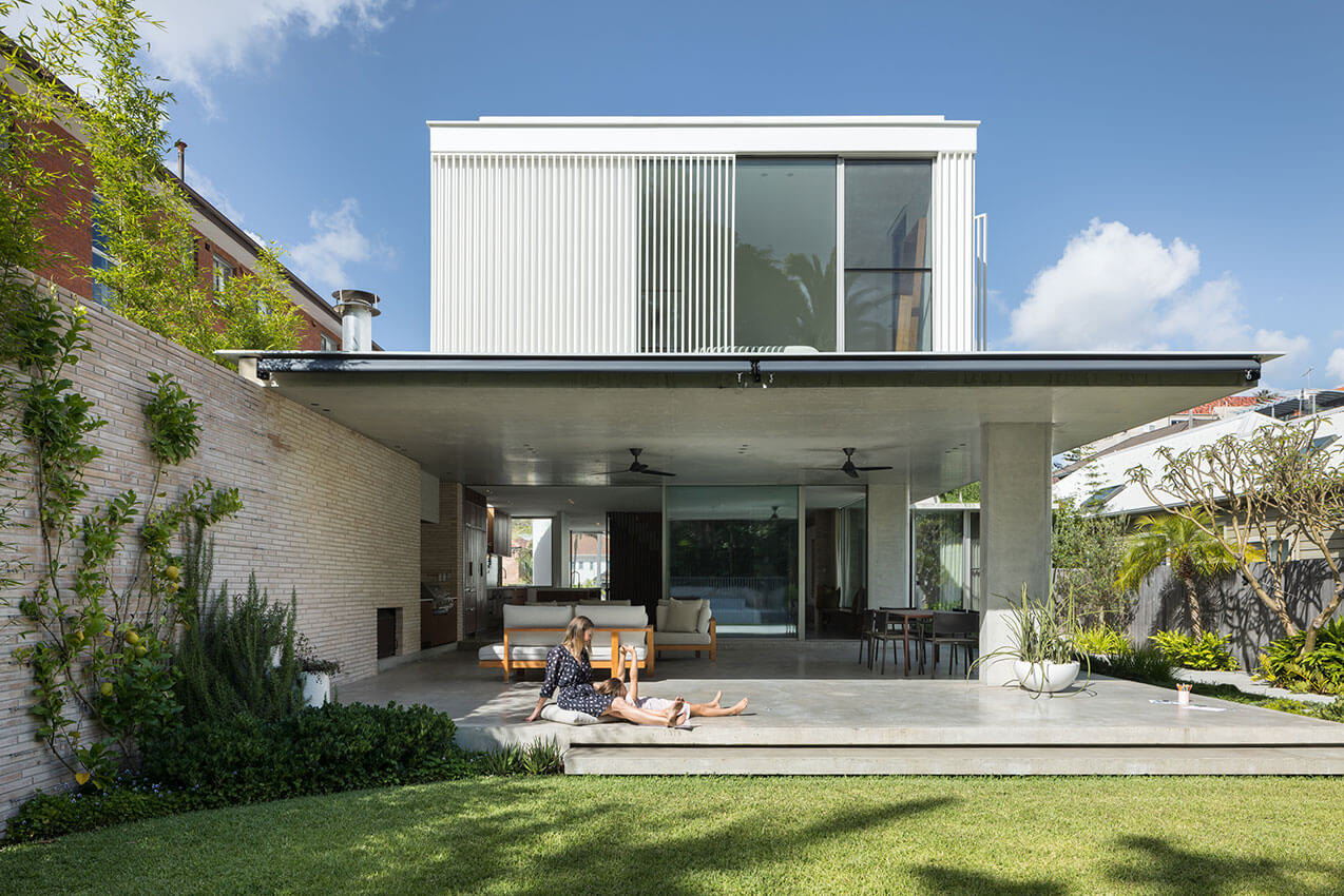
By diverting the stormwater around the site with large culverts, CHROFI turned a negative into a positive. The architects created wonderful platforms and gardens that mask the intelligent civil engineering feat.
Regardless of this major hurdle, the house is masterfully resolved with faultless planning that reflects the client’s love of Austrian-American modernist architect, Richard Joseph Neutra’s platform homes in Los Angeles.
The walls shield and open in all the right places to mediate between the varying scales of density surrounding the house, while still allowing generous flow through the spaces and capturing the delightful view. The materials throughout the house are smart, thoughtful and complementary to the client’s growing family.
The jury thought it was the most comfortable and delightful house: They would all happily drop everything to move in, they said.
AWARD FOR RESIDENTIAL ARCHITECTURE – HOUSES (NEW)
Mossy Point House | Edition Office
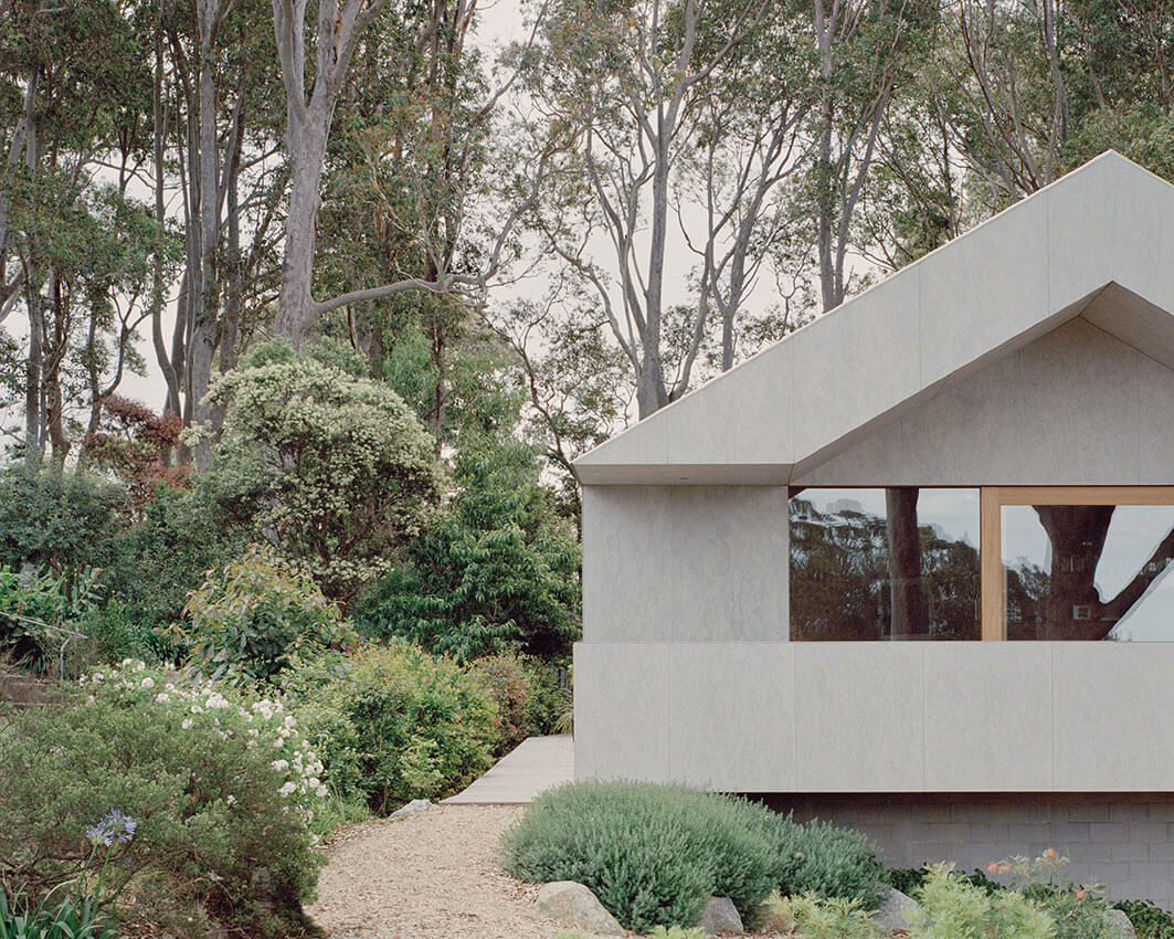
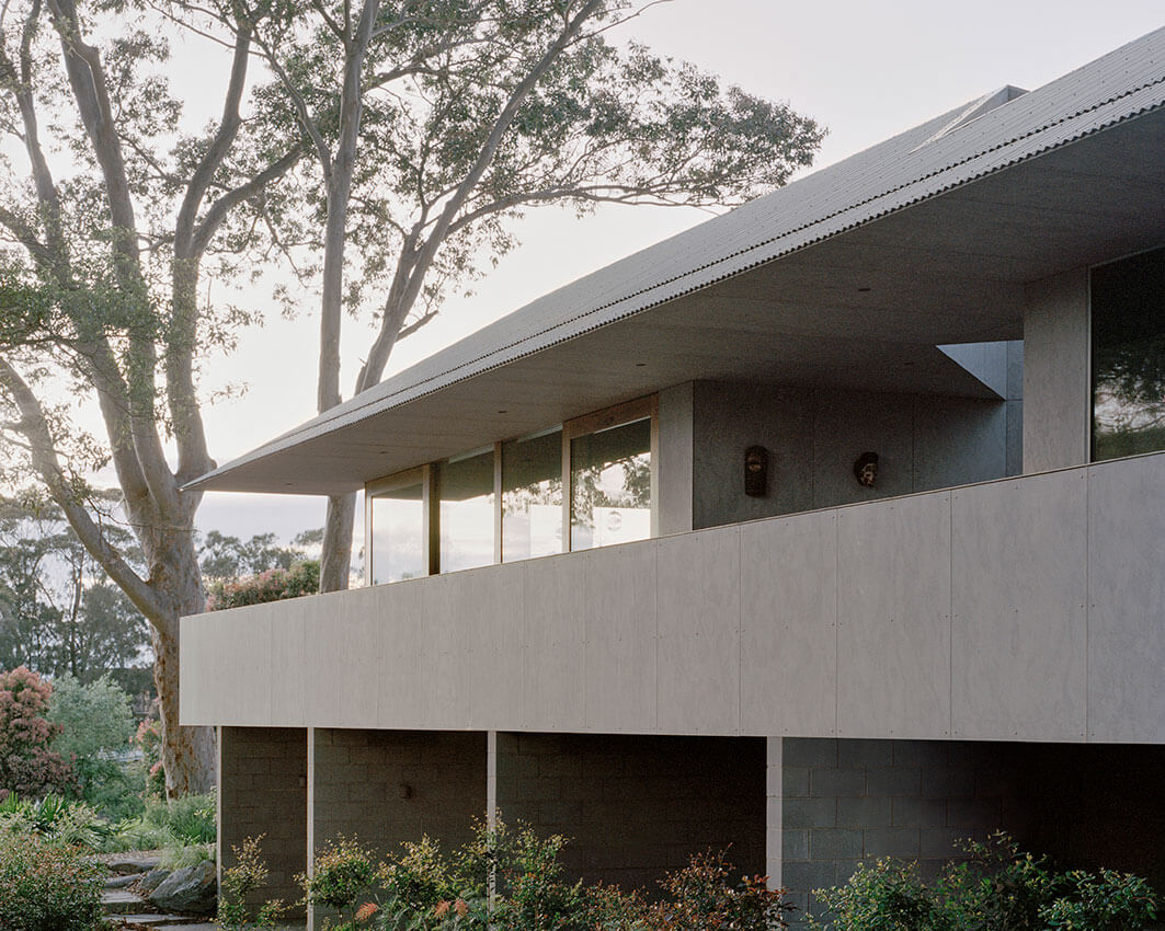
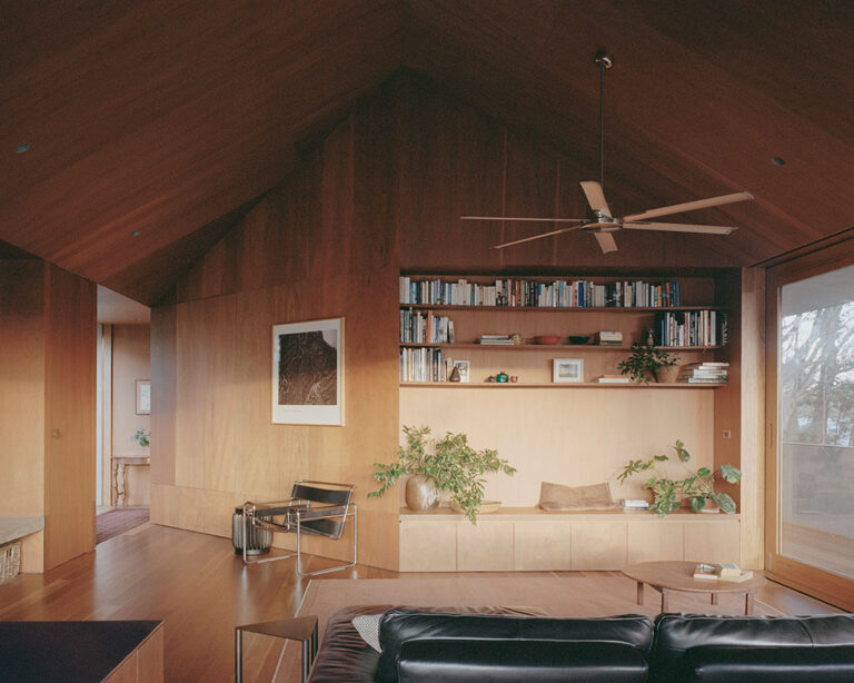
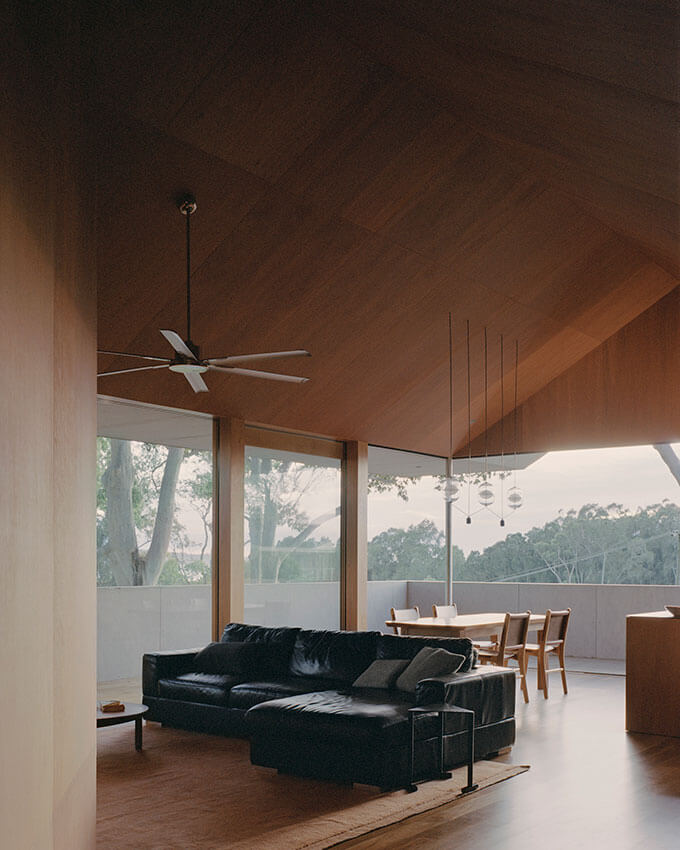
Playful, yet restrained, Mossy Point, reinterprets the vernacular of beach-side architecture.
The dwelling has presence, yet it recedes into the landscape to enhance the colours and the grandeur of magnificent gums and the bush that surrounds it.
This dwelling’s extruded timber form structure and unadorned fibre-cement clad exterior provides an eloquent and singular language to the building’s expression. It also responds to bushfire requirements.
This home feels at once connected and private for its occupants.
A wrap-around veranda with solid balustrade provides layered connections to the street.
From there, the occupants enjoy chatting with neighbours and taking in the views toward Broulee Bay. But this balustrade also turns the home into a retreat. When the owners are seated, neighbors’ homes disappear from view, and the outlook is established gums.
A diamond counterpoint in the entry divides, directing visitors to the right to the living areas and the street in one direction, while the private areas of the home and its rear garden are on the left.
On its generous verandah, the folds of this diamond creates an unexpected walled courtyard garden.
Life in this house is easy, the jury thought.
COMMENDATION FOR RESIDENTIAL ARCHITECTURE – HOUSES (NEW)
Bronte House | Tribe Studio Architects
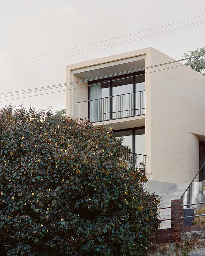
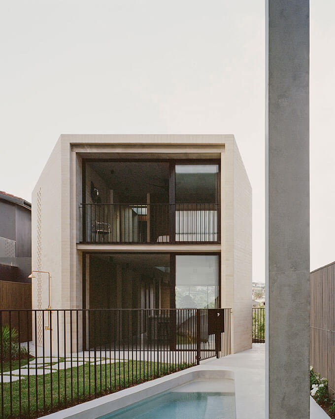
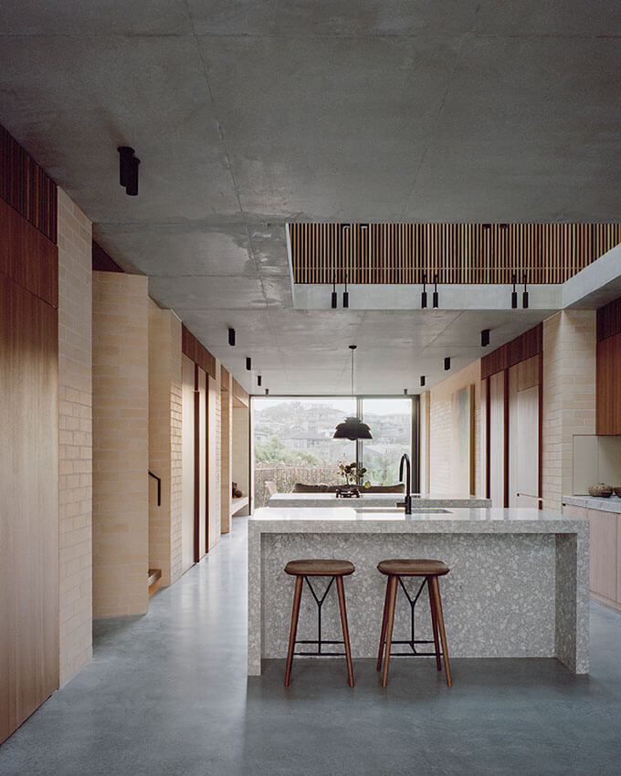
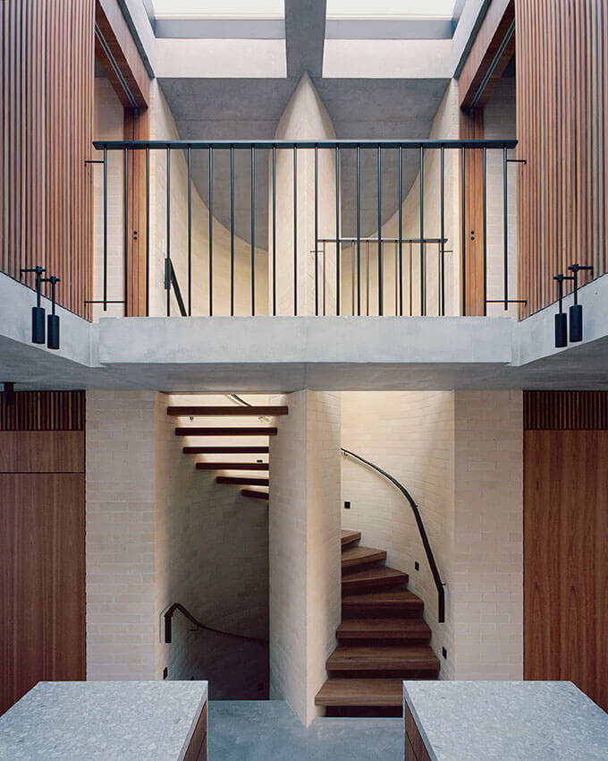
An evocation of Sydney’s coastal escarpments, Bronte House punctuates the streetscape and carefully frames views to the beach and ocean.
With a pared back palette of blonde bricks and concrete, this dwelling navigates complex changes in the levels of nearby homes and the street. The jury loved the detailing and finish.
Tribe’s vision was one of generosity to the neighbours. The home was sculpted to provide views for the owners of the home, without interrupting their neighbours’ while avoiding overshadowing.
The carefully curated interior facilitates the needs of a family who work from home and come together in the light filled heart of this home.
COMMENDATION FOR RESIDENTIAL ARCHITECTURE – HOUSES (NEW)
Draped House | TRIAS
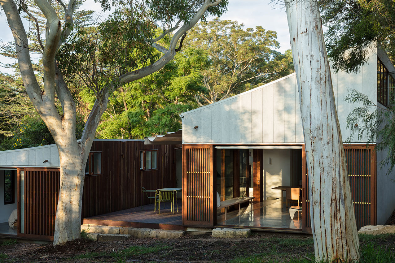
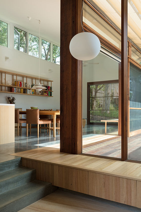
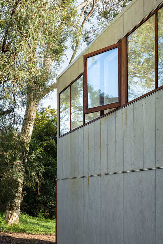
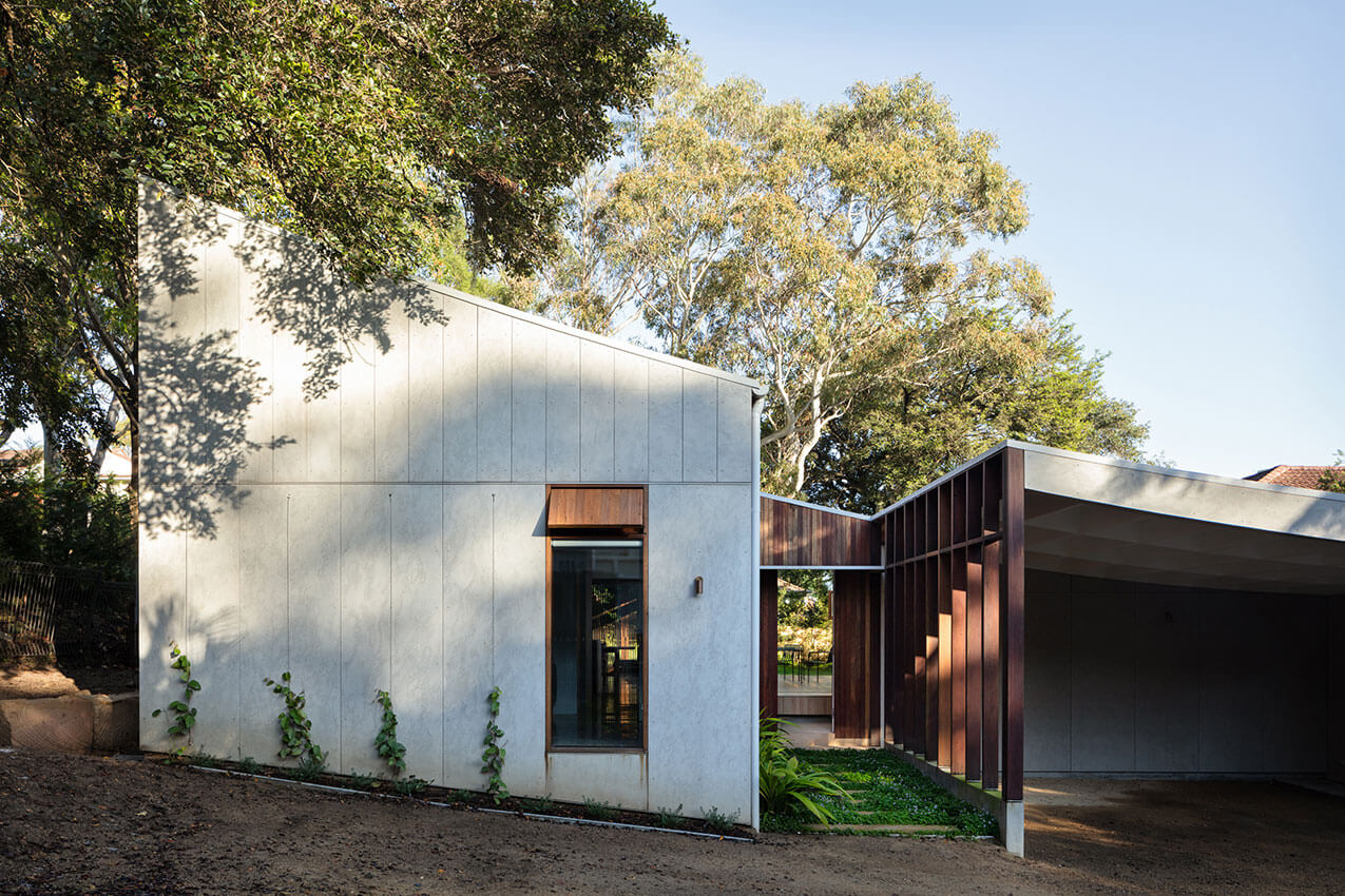
On a battle-axe lot in suburban Chatswood lies Draped House. It was named for the subtle roof form that elegantly follows the natural topography of the site. The living spaces are light-filled and voluminous. They sit at a higher level than the private areas of the house. The courtyard provides a natural separation between the two zones.
An economical use of materials, custom detailed timber screens and ventilation panels, are just some of the passive design elements contributing to this home’s low impact on the environment.
Delivered as a complying development, TRIAS has produced a high-quality design for its clients that has the potential to be a model for exploration on other suburban divided dwelling lots.
COMMENDATION FOR RESIDENTIAL ARCHITECTURE – HOUSES (NEW)
Shiplap House | Chenchow Little
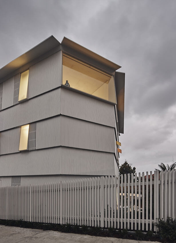
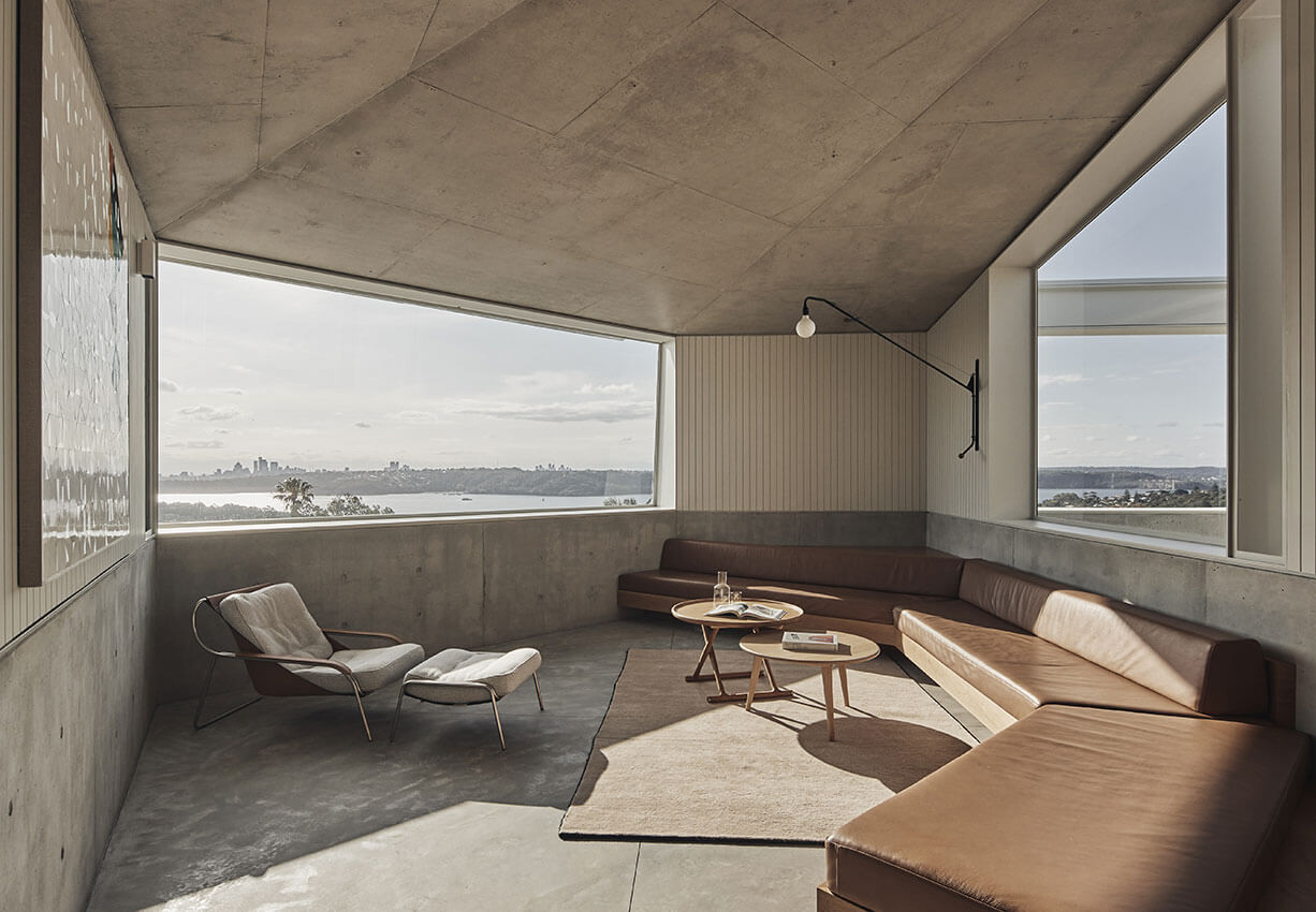
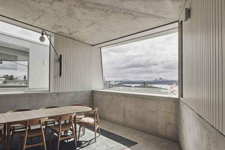
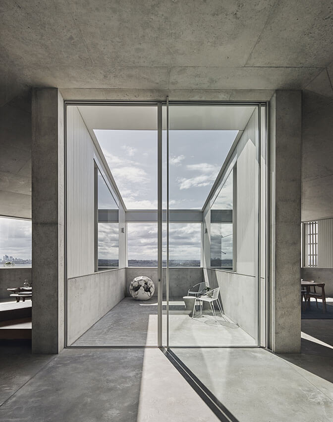
Located in Vaucluse surrounded by large and view-hungry mansions, Shiplap house is a delightful hidden diamond in the opulent rough. Named shiplap for the quaint weatherboard cottages that once adorned the suburb, the house intentionally shapes itself to be friendly to its neighbours and shares the suburb’s famous view to the ocean and to the harbour.
The end result is a meticulously detailed trio of floors, with carefully placed windows that house clever ventilation panels to make the most of the view and environment. The jury were delighted to see the house being comfortably used as a robust family home, while still letting the architecture shine.
RESIDENTIAL ARCHITECTURE – HOUSES (ALTERATIONS & ADDITIONS)
The Hugh and Eva Buhrich Award for Residential Architecture – Houses (Alterations and Additions)
Lane Cove House | SAHA
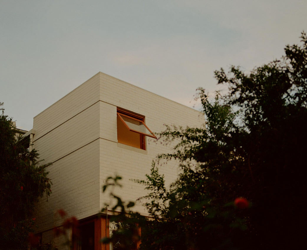
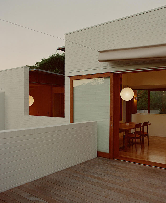
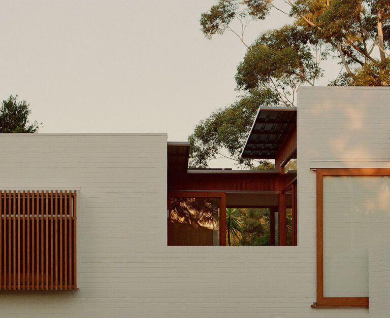
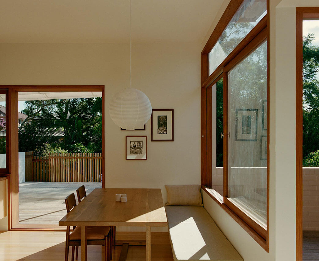
The positive densification of suburbs is a pressing national issue. SAHA suggests a way forward with Lane Cove House. The project doubles density at low cost, consumes no land, delivers huge social benefit to its intergenerational occupants, and does so with high architectural ambition.
The project brief reflects current soaring house prices and high aged care and childcare costs, but is also timeless: to enable extended families to live together yet separately, for the benefit of all. Resisting the ubiquitous rear extension, SAHA forms a new dwelling at first floor accessed by a common entry, conserving the rear green space and large trees. The layout of the new level is innovative: rather than fill to the extents, the plan contains internal courtyards cutting inward, bringing a pattern of indoor and outdoor conditions to the living spaces. New perimeter building fabric continues the old, but extends and carves it. Demolished materials are reworked. Detailing throughout is well executed with a rich yet restrained material palette.
There is a calm confidence to the Lane Cove House. It is at once everyday and radical. The architects show how intervention in seemingly intractable urban and social problems is possible, and they make it look easy.
AWARD FOR RESIDENTIAL ARCHITECTURE – HOUSES (ALTERATIONS & ADDITIONS)
Balmain House | SAHA
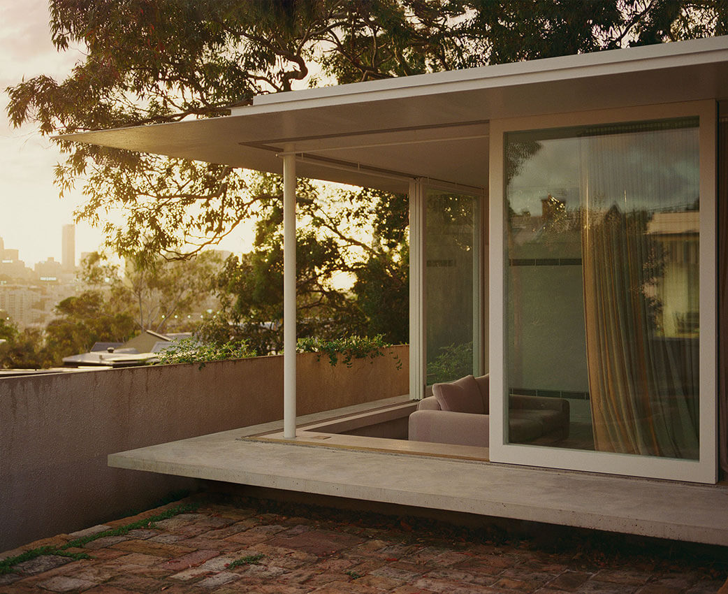
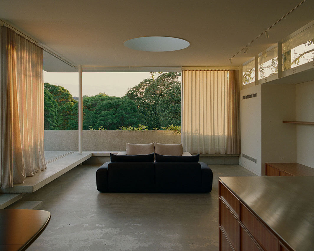
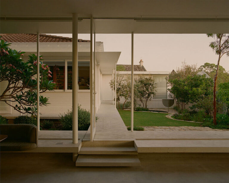
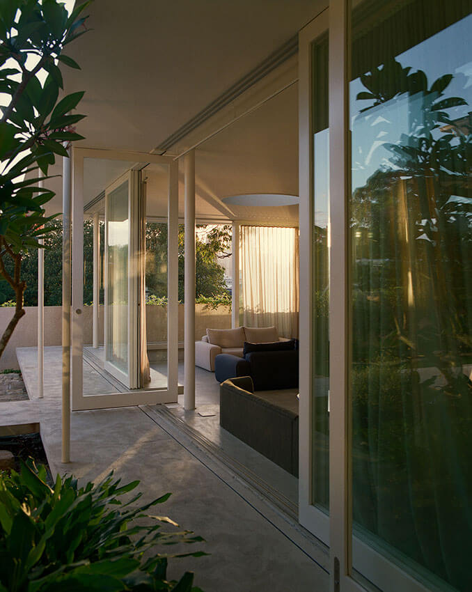
SAHA’s Balmain House extends an inner city suburban home with a pavilion-like addition to the rear, connected by an axial link. Rather than a stand-alone object, Balmain House is an excellent example of whole-site design which provides a feeling of immersion in a wider environment akin to an arcadian walled garden. Key to this is the scheme’s integration of various gardens and lightwells which are skillfully handled. A cantilevering perimeter seat, feathered roof eave and dispersion of structural supports gives a sense of lightness to the main pavilion, and subtle interplay of floor and site levels lends a sense of grace to the overall composition. The architect’s strengths in materials, detailing and construction is evident, with complex interfaces resolving with apparent ease. The client’s numerous high quality art pieces sit comfortably in the architecture; a surprisingly rare accomplishment. New work to the street frontage supports the existing house rather than competes with it.
Overall Balmain House is a triumph of subtlety: you look for the moment of high architecture and can’t find it, as you feel it all around you.
COMMENDATION FOR RESIDENTIAL ARCHITECTURE – HOUSES (ALTERATIONS & ADDITIONS)
Aija's Place | Curious Practice
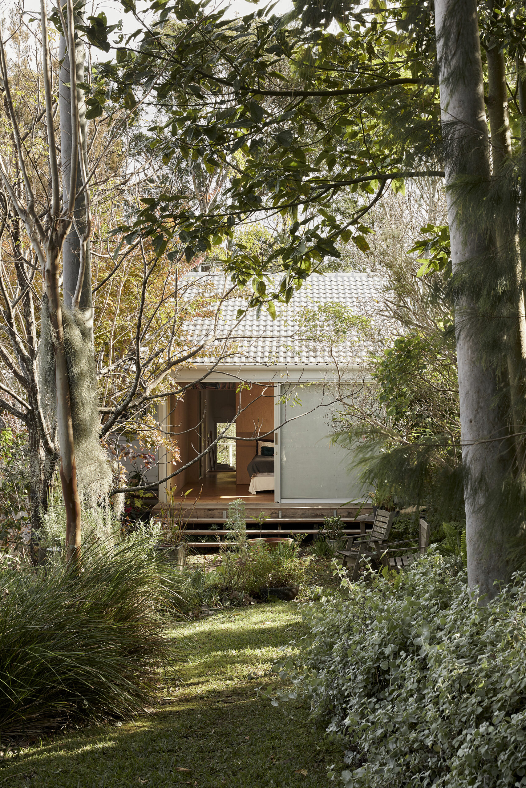
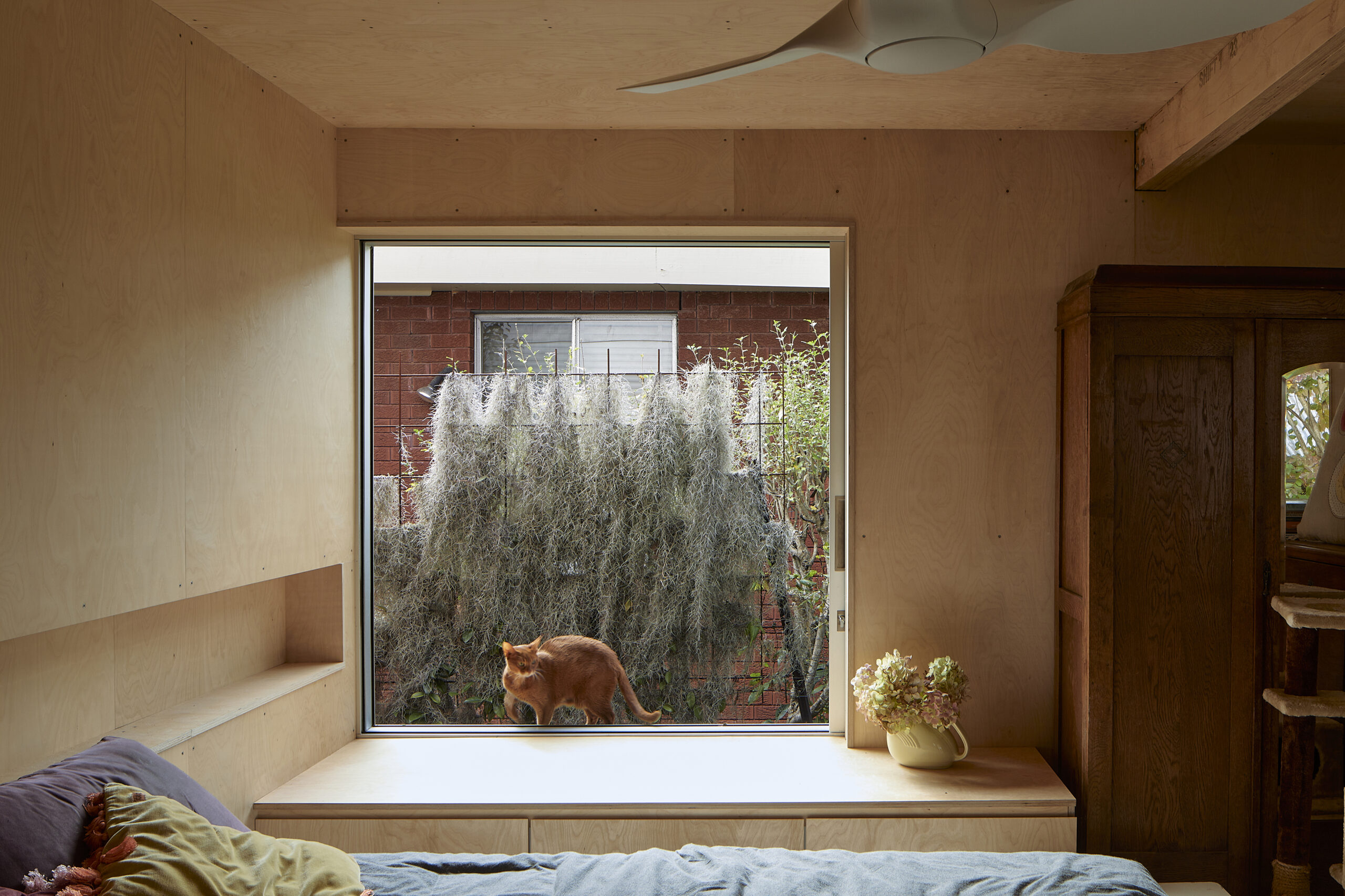
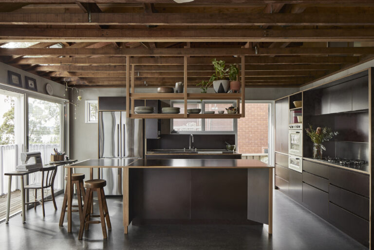
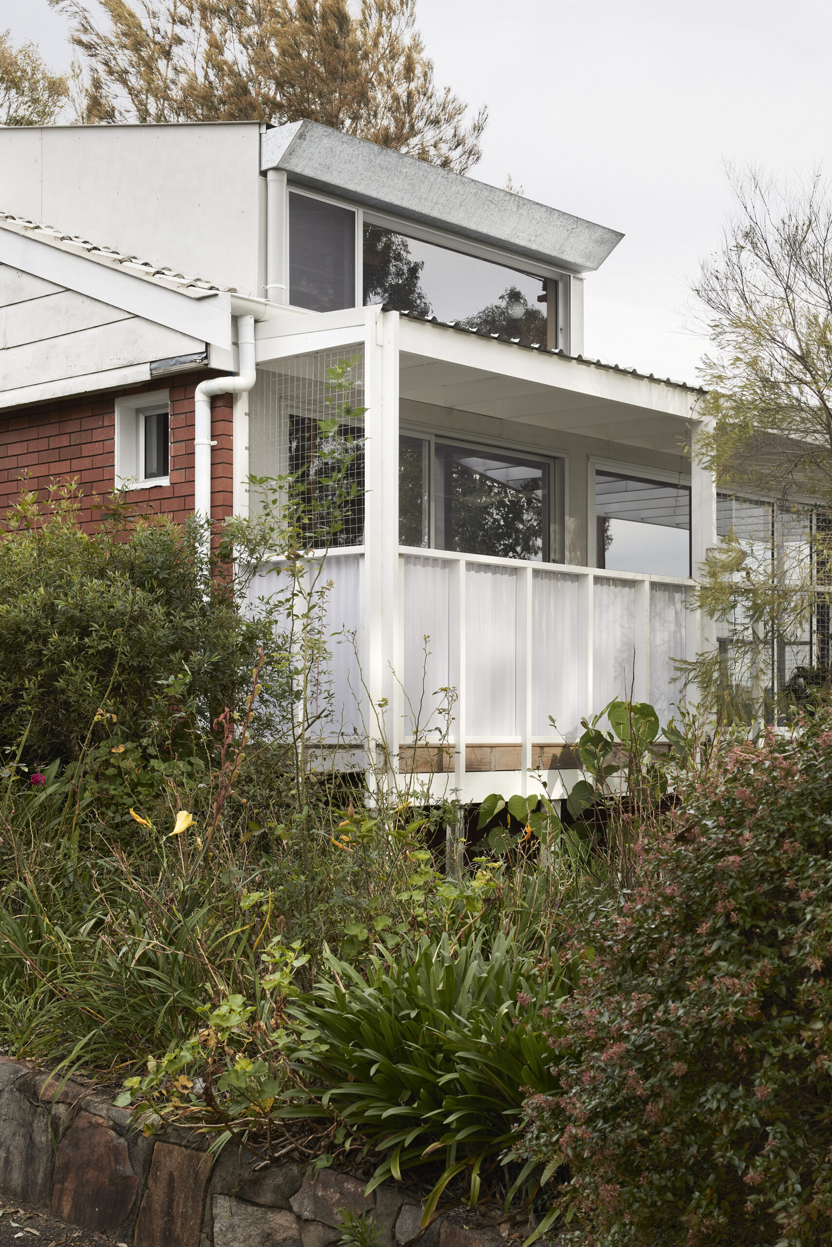
Aija’s Place is an excellent example of how low budget additions to an existing house can be tailored to the client’s needs when approached with inventiveness and sensitivity. Avoiding the single large gesture, Aija’s Place consists of many small, cost effective, targeted interventions that respond carefully to the client’s way of living. Outdoor spaces are celebrated from every room, with views to greenery in all directions. Humorously, two houses seem intertwined, one for the owner and another for their cat, each with their own movement routes and spaces. The architect’s strategy of insertion and disaggregated design ensures the additions have their own identity while being part of a complex architectural whole.
COMMENDATION FOR RESIDENTIAL ARCHITECTURE – HOUSES (ALTERATIONS & ADDITIONS)
Fisherman's House | Studio Prineas
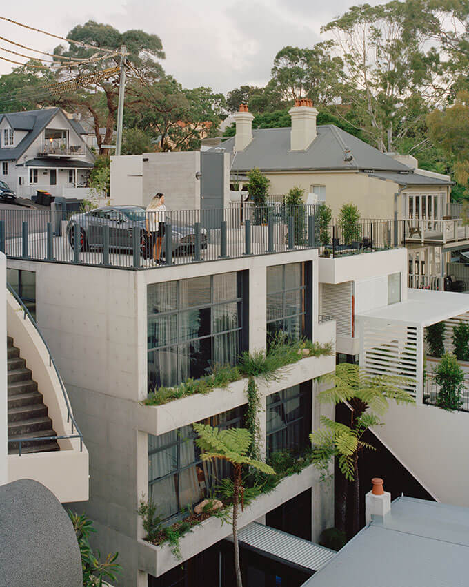
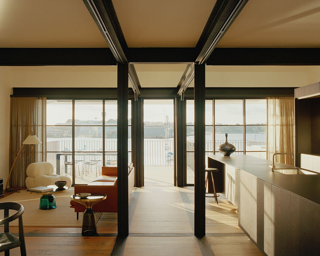
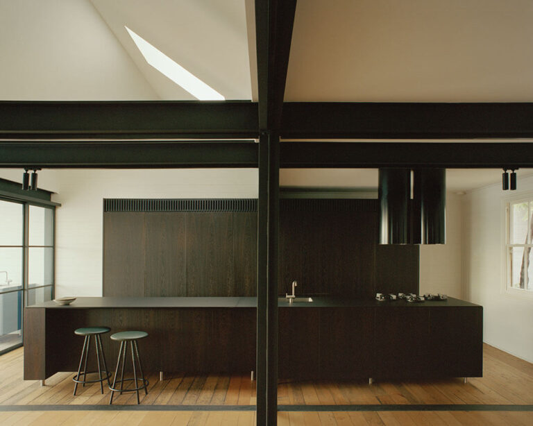
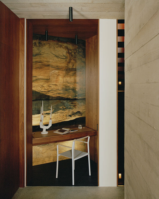
The Fisherman’s house in Birchgrove occupies an extraordinary site: a sandstone harbourside cliff, which drops several levels sheer from street frontage down to an existing fisherman’s cottage near the water. The original cottage has been retained and altered for contemporary living, while a new multi-storey addition has been placed against the cliff face. This narrow vertical addition houses the night-time spaces and circulation in a unique layout offering dual aspect: north facing harbour views on one side and rock face on the other. Unassuming from the street and only changing the backdrop of the cottage when seen from the water, the new construction is well integrated in the steep coastline.
COMMENDATION FOR RESIDENTIAL ARCHITECTURE – HOUSES (ALTERATIONS & ADDITIONS)
House for BEES | Downie North
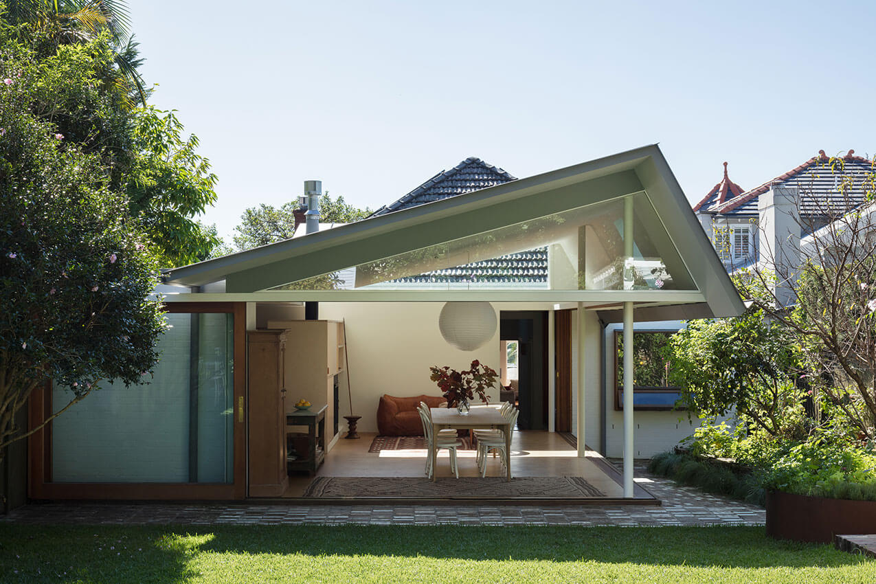
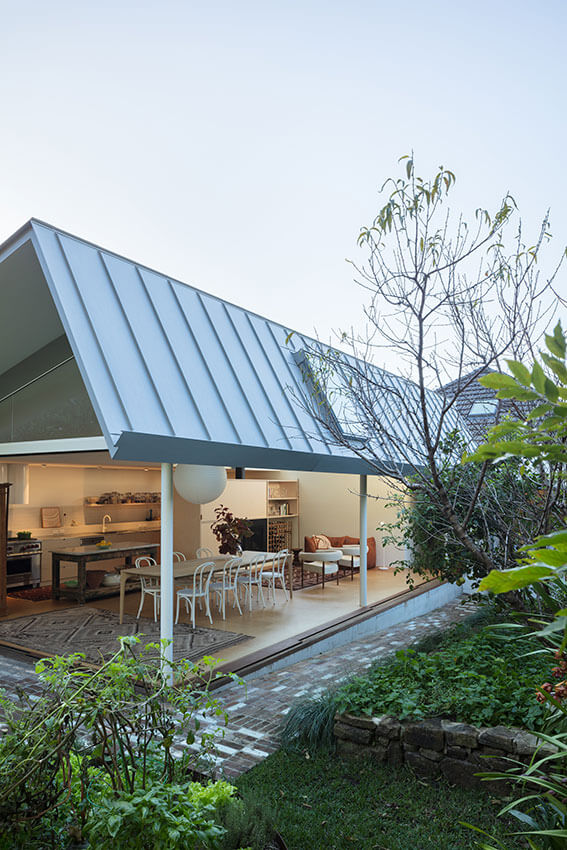
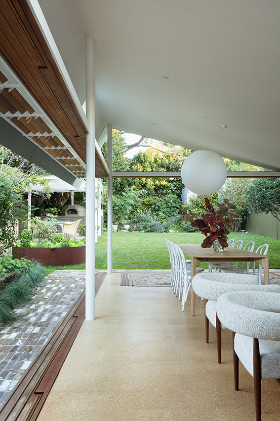
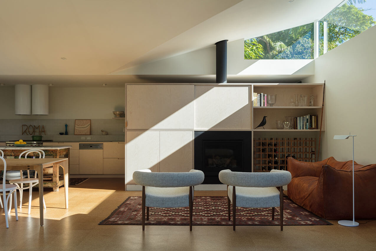
The “House of Bees” is an impressive example of how seemingly pragmatic additions can breathe new life and architecture into an existing dwelling. The new pavilion, located at the back of the house, features living areas housed under a floating roof, catching the sunlight and allowing for natural ventilation even on rainy days. The architectural language is simple but powerful, its interesting structure expressed, and its outer skins skillfully manipulated. The entire pavilion is openable to the garden, creating seamless indoor-outdoor connections, and elevating a mere extension to a unique garden room.
COMMENDATION FOR RESIDENTIAL ARCHITECTURE – HOUSES (ALTERATIONS & ADDITIONS)
Trilogy House | Peter Stutchbury Architecture
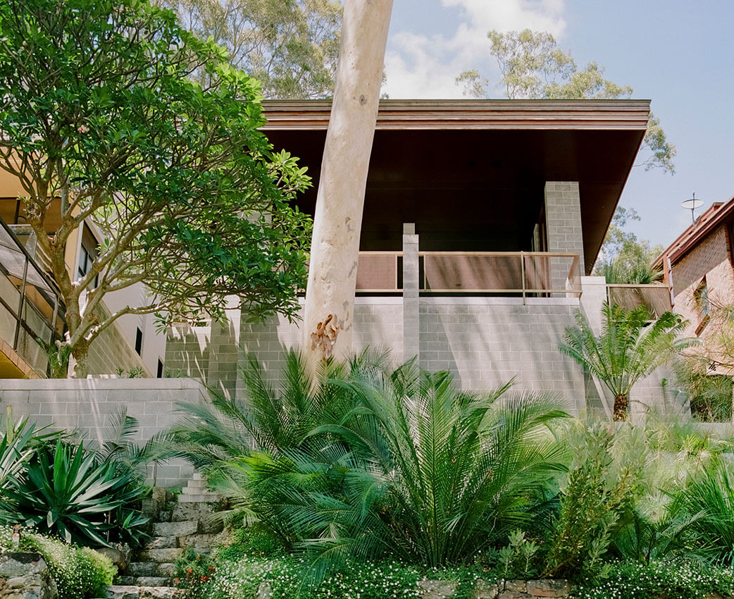
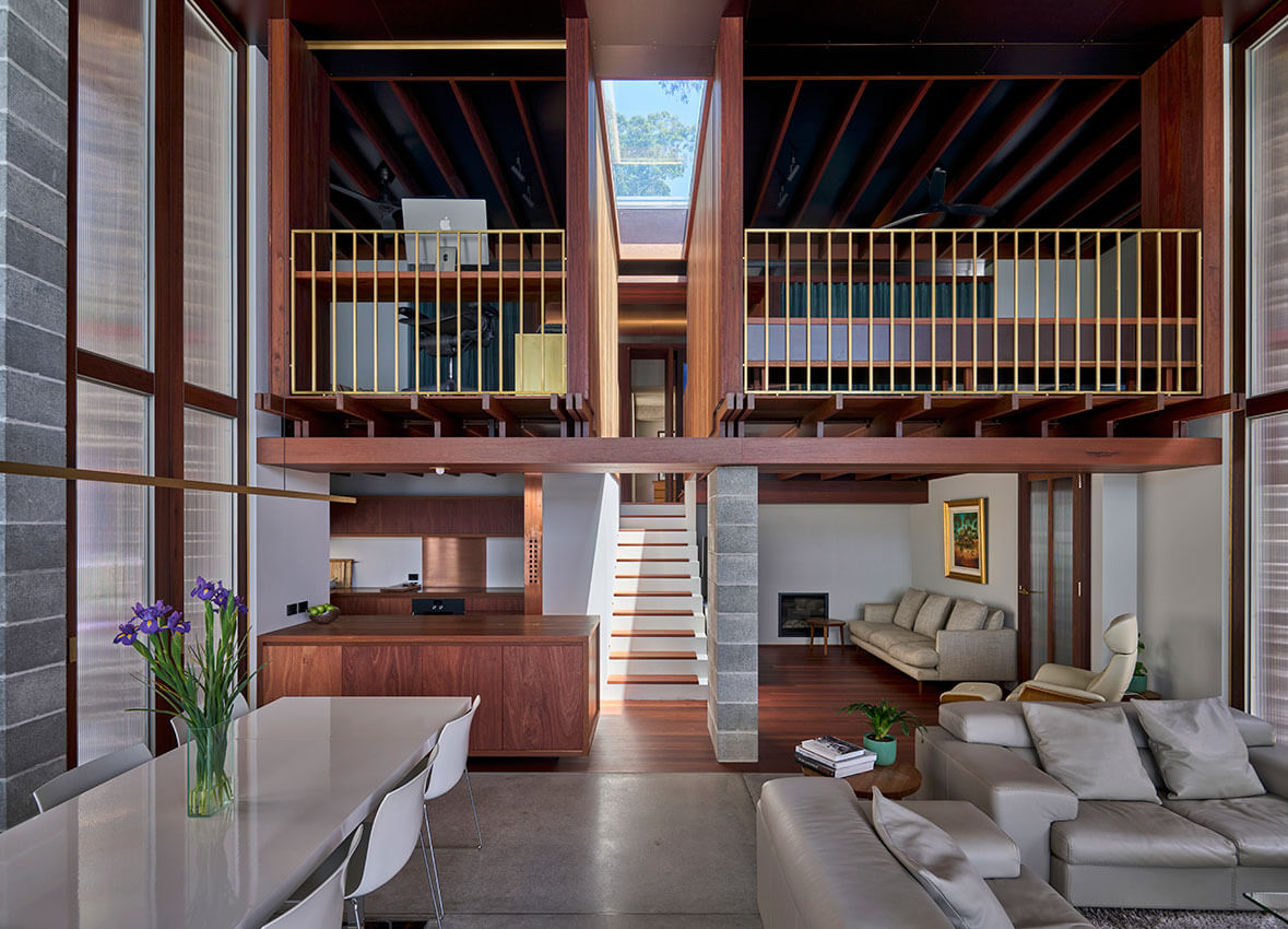
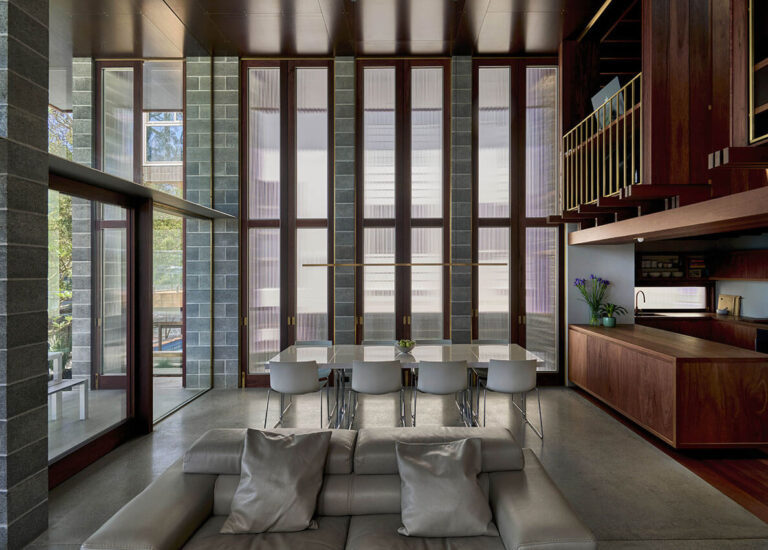
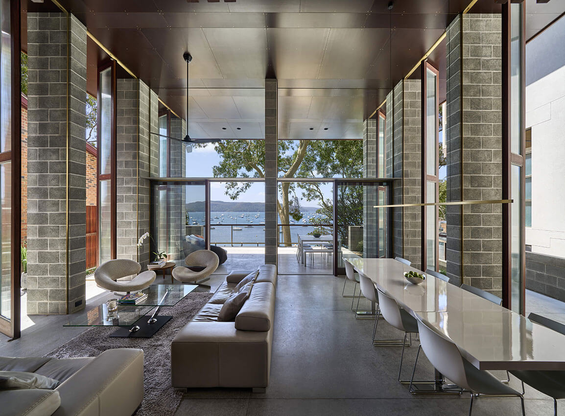
Designed by Peter Muller in the early ‘60’s and added to by Glenn Murcutt in the ‘90’s, Peter Stutchburys ‘Trilogy House’ successfully weaves a 2020’s way of living into an already architecturally layered house.
Trilogy House showcases expert knowledge of materials and how best to use them. Special mention must be made of Tony Larter of ANL Constructions for his exceptional craftsmanship. The cumulation of attentive design and flawless execution results in an interior space that feels almost shiplike.
The harmonious relationship between project architect Belinda Koopman, the clients, and the builder is apparent in every aspect of Trilogy House. This harmonious trilogy has resulted in a building with a very high level of finish, and clients who are thrilled with their new vessel for living.
RESIDENTIAL ARCHITECTURE – MULTIPLE HOUSING
The Aaron Bolot Award for Residential Architecture - Multiple Housing
Iglu Summer Hill | Bates Smart
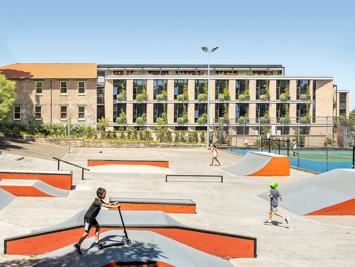
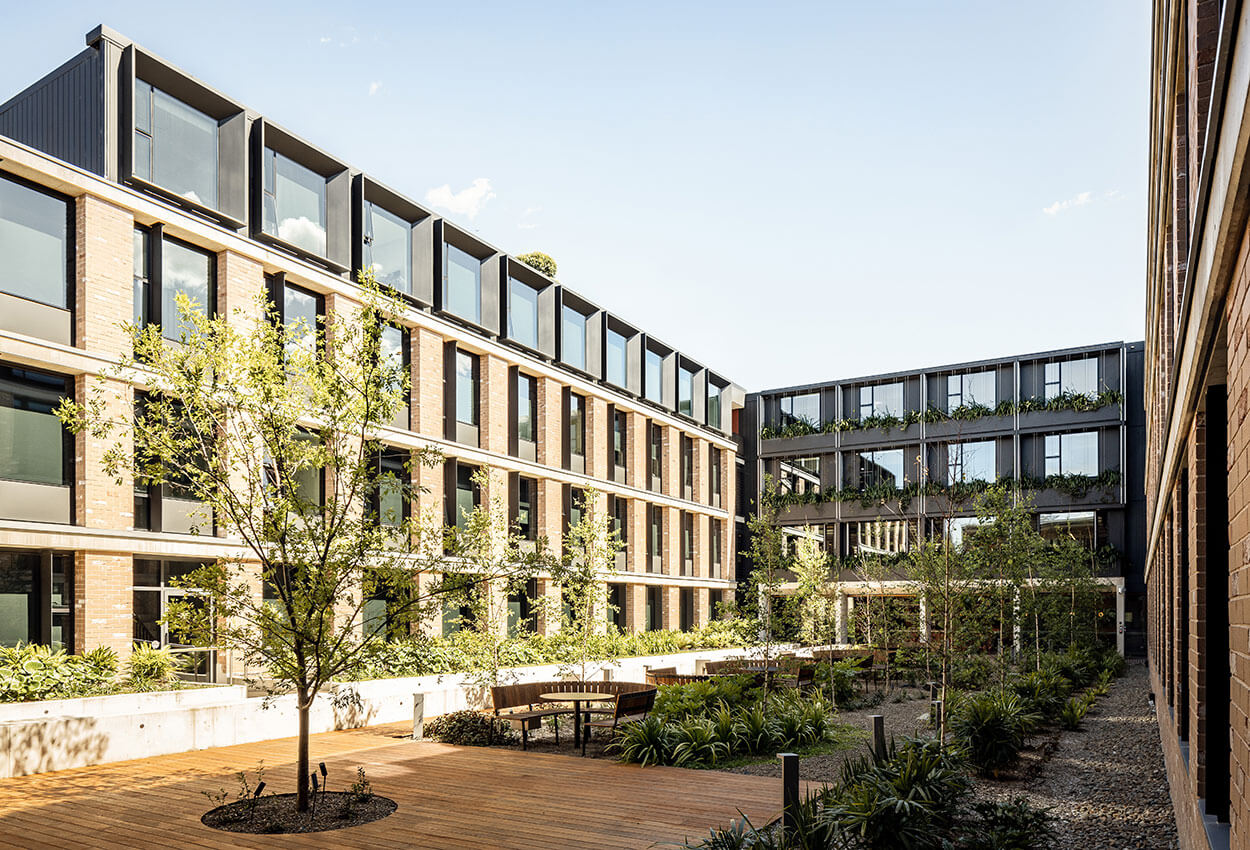
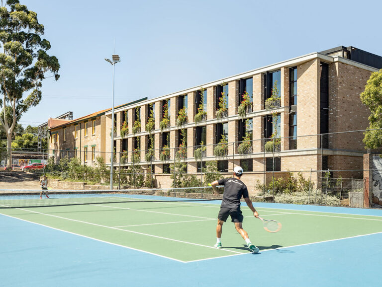
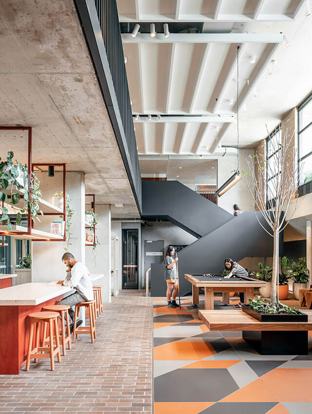
Iglu is an elegant new courtyard building that resolves a difficult site in Summer Hill, repurposing an existing heritage-listed Ambulance station on Carlton Crescent. Each frontage responds well to its immediate context; a landscaped edge on the public reserve, a smart new façade against a drab shopping centre and a spacious accessway that provides light and ventilation along a blank side wall of adjoining building.
Inside, social and communal spaces enjoy northern aspect and open to a generous landscaped courtyard garden. This courtyard is the focus of the scheme, with both the communal areas and the majority of rooms opening to it. 184 studios with self-contained kitchens and bathrooms, are compact yet cleverly designed to maximise the student amenity, with beds that double as sofas set into bay windows. The majority of rooms enjoy east or west orientation and breezeways provide fresh air to all single loaded corridors.
The architecture is sophisticated and robust, with the rawness of the off-form concrete and face brick relieved by the contrasting crisp metalwork and window boxes. The same palette of base materials forms the interiors shell, balanced by the warm timber joinery, landscaping and furniture throughout the communal and social ground floor.
AWARD FOR RESIDENTIAL ARCHITECTURE – MULTIPLE HOUSING
The Crossing | CHROFI with de Rome Architects and Dezignteam
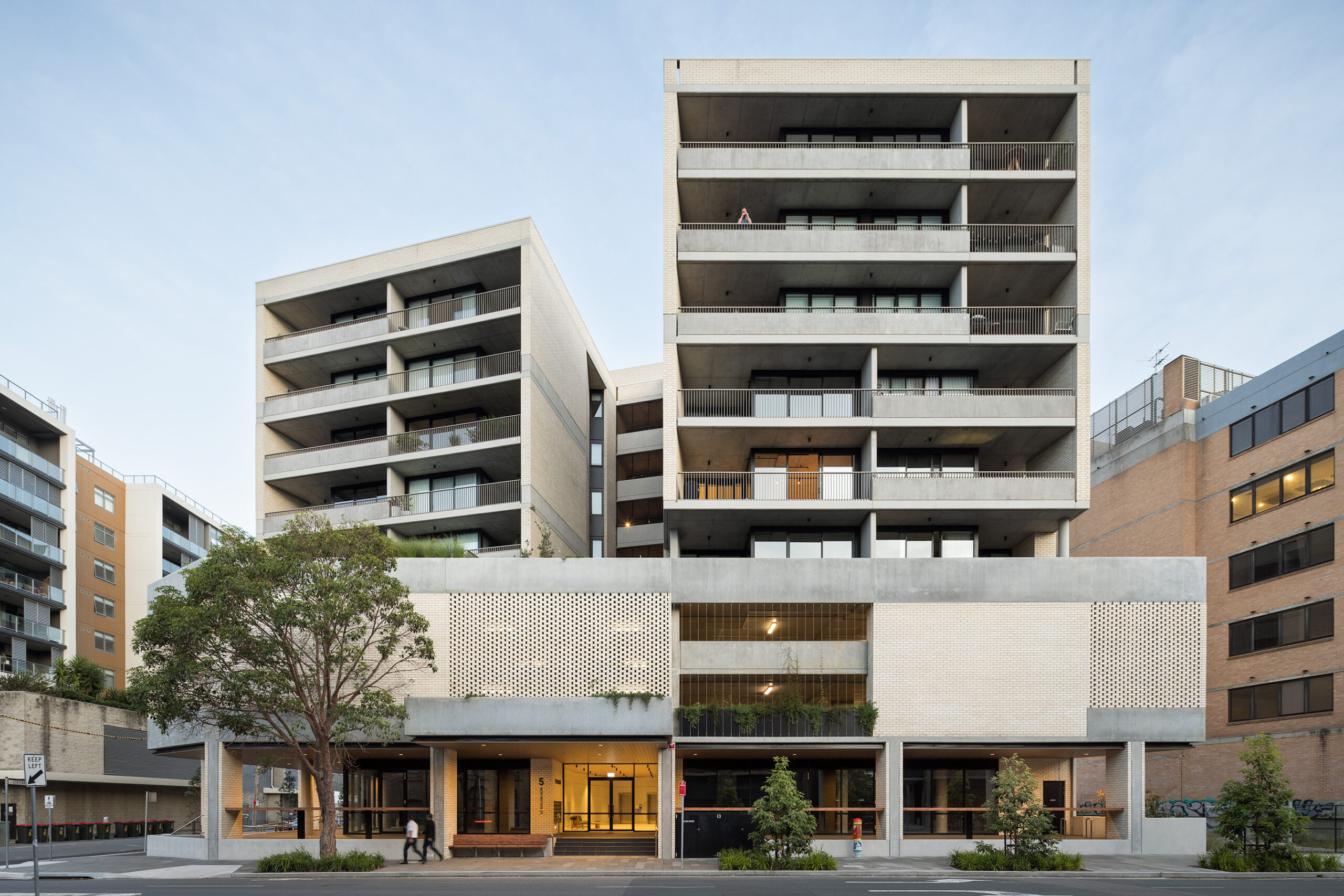
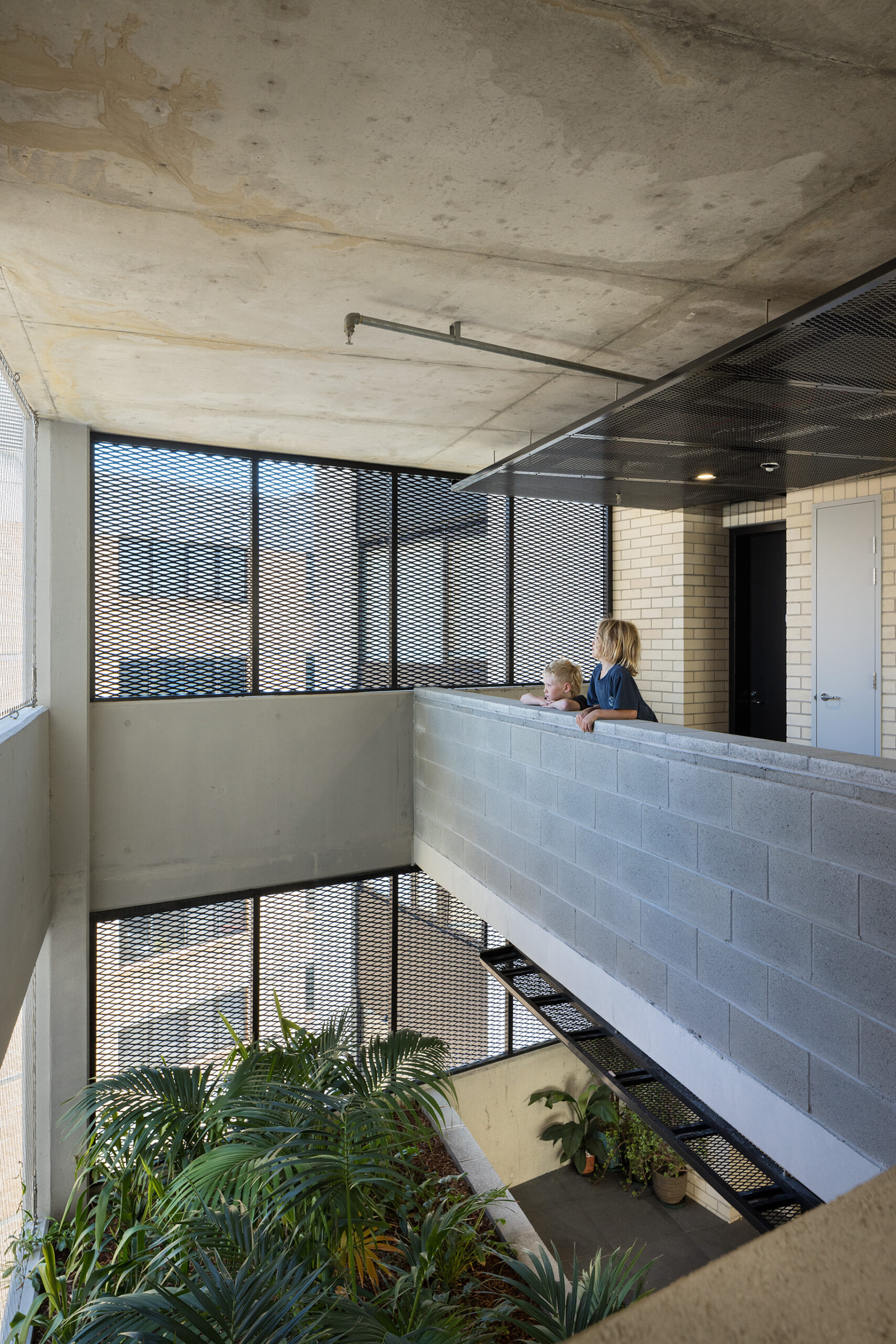
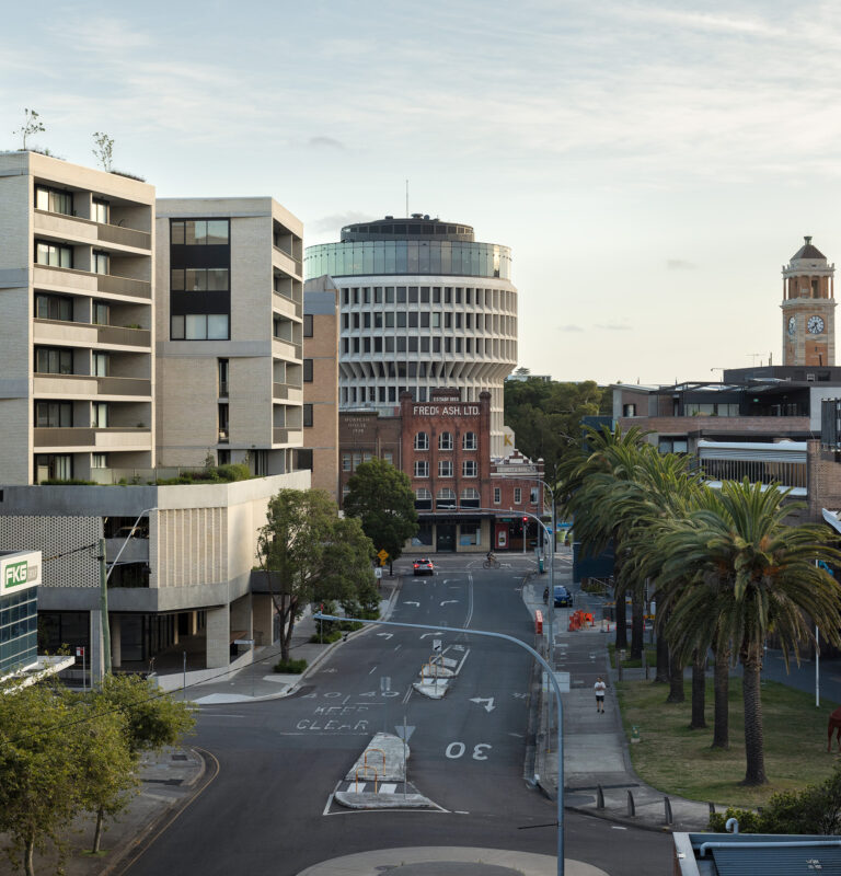
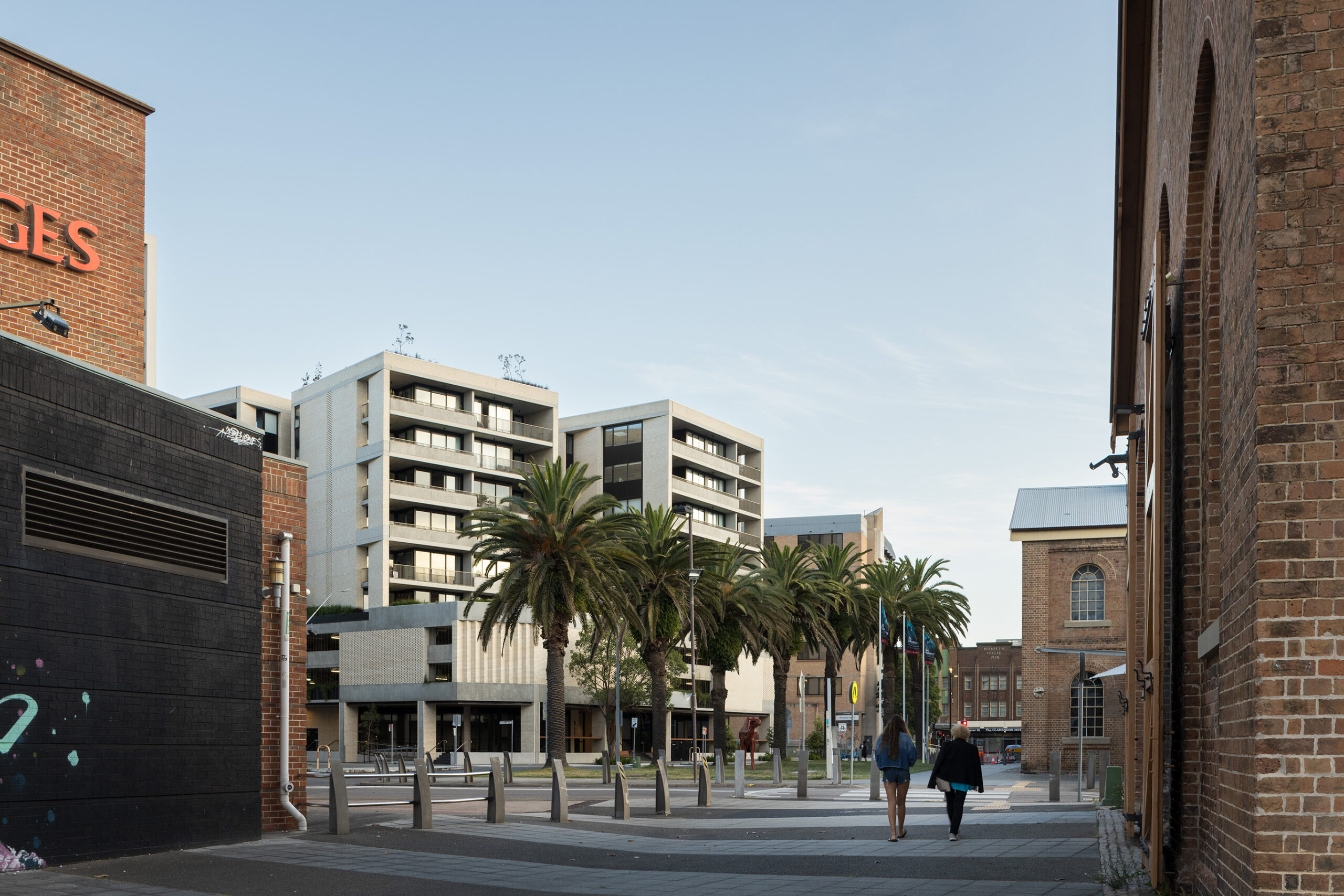
The Crossing is an urban apartment building in central Newcastle that departs from the conventional perimeter block type, instead creating a model of grouped series of smaller blocks set on a car parking and retail podium.
The building occupies a corner site beside the former railway line, with open sides to north and west. The eight apartments per floor are grouped as separate pairs, accessed by open, landscaped accessways, served by a central core with single unpressurised stair. Due to this purposeful arrangement, almost all apartments are cross ventilated, and a high percentage receive good sunlight.
The building has to deal with the problems of inner Newcastle, with flood levels, high water table and mine subsidence. Accordingly the building is raised on a plinth above street level, with colonnades and retail frontages. The parking is above ground, with open screened facades to the streets.
The constructional character is clearly resolved, with strongly expressed concrete bands and balustrades with large panels of infill white brickwork, lightened by panels of perforated brickwork. A communal roof terrace provides all residents with sun and a panoramic outlook over Newcastle’s active working harbour.
AWARD FOR RESIDENTIAL ARCHITECTURE – MULTIPLE HOUSING
Bigge St Liverpool | Turner
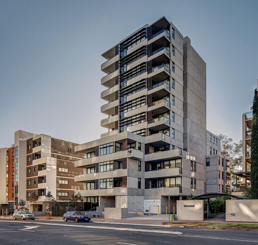
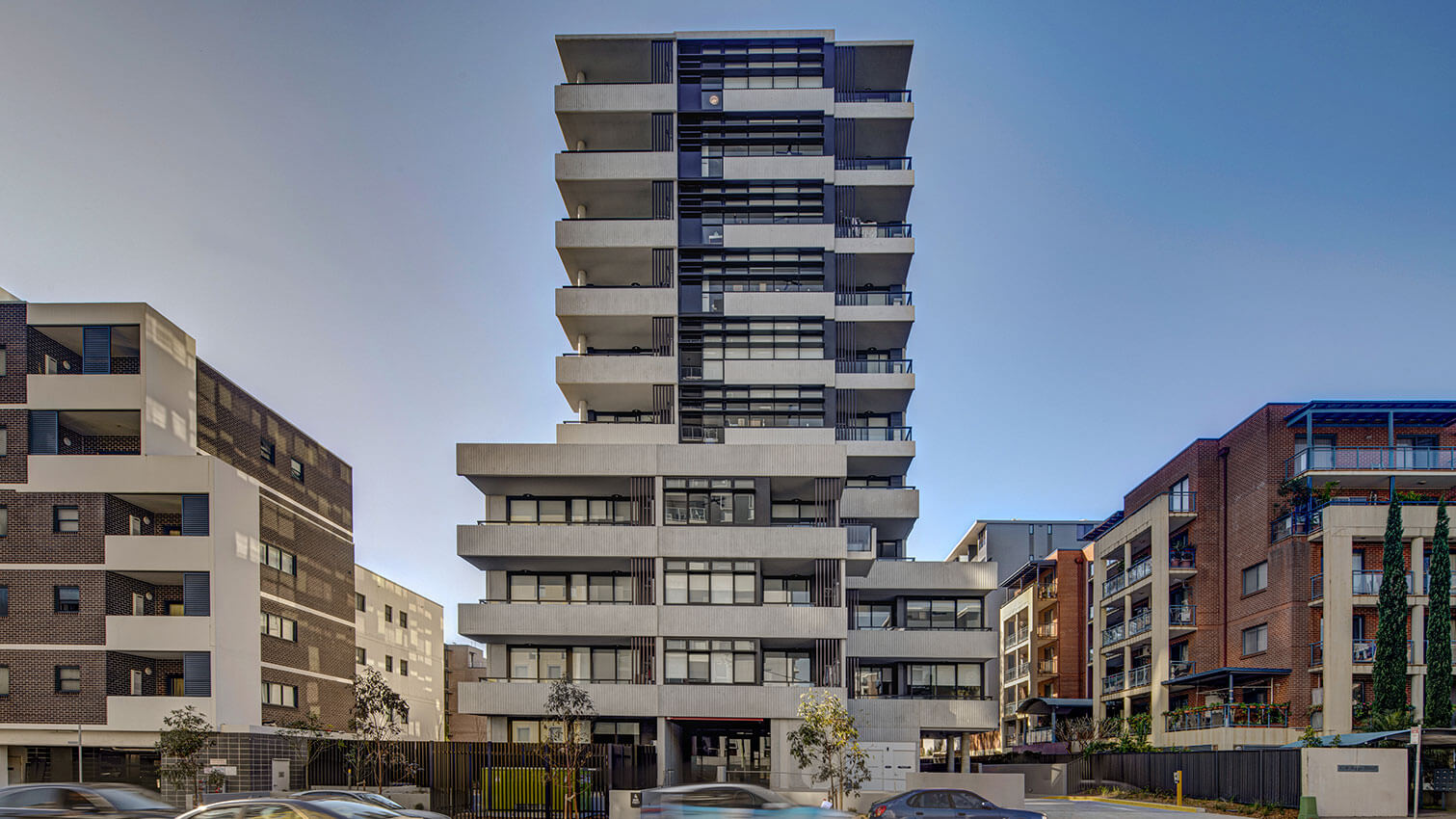
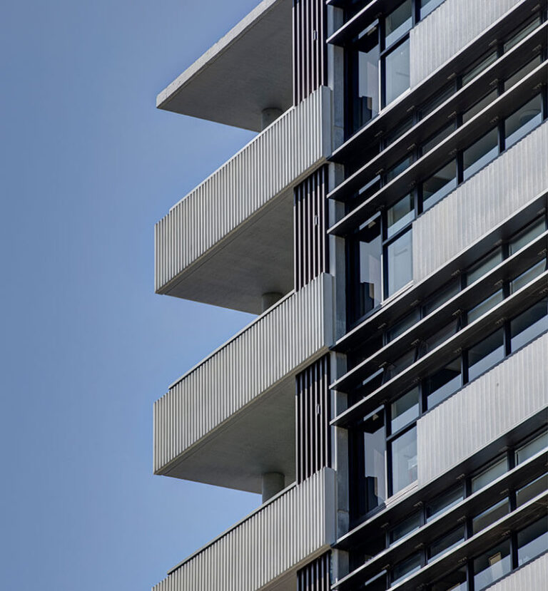
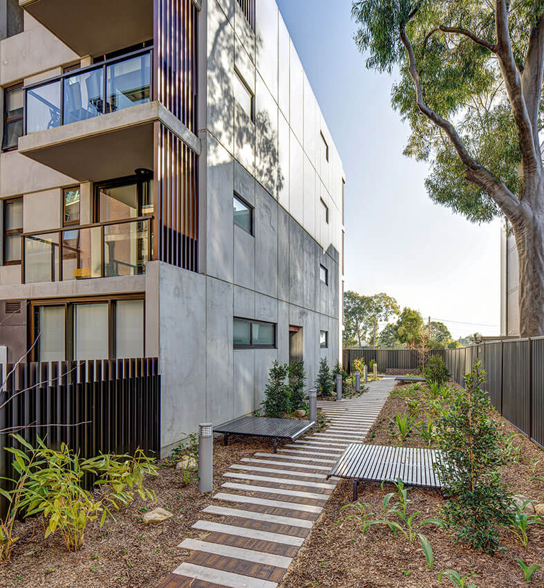
Bigge Street Liverpool is an exemplar of a new and collaborative method of procuring social housing, delivering design quality and equitable living in an evolving outer Sydney centre.
A narrow, setback six-storey tower sits above a four-storey podium, respecting the prevailing setbacks and adjacent buildings. The pared-back palette of striated precast concrete in horizontal bands and vertical and horizontal louvres is modulated to maximise solar access to all aspects. Detailed balconies with level access provide additional living space and amenity.
The apartments are open and light, a model for equitable accommodation on a limited budget. The neutral, robust materials of the interiors feel spacious and generous. Social spaces are created in the open lobbies, providing natural ventilation, casual interactions and resident safety.
Ground level landscaping surrounds the building with varied spaces for gathering and relaxation, defined by materiality, seating and planting.
Designed for durability and longevity, this project is a model for the future of social housing.
COMMENDATION FOR RESIDENTIAL ARCHITECTURE – MULTIPLE HOUSING
The Greenland Centre | BVN with Woods Bagot
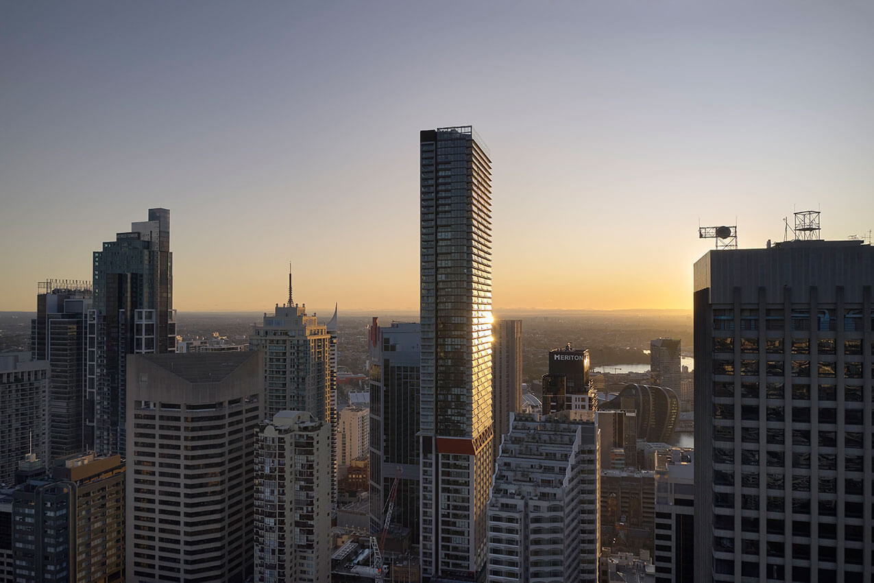
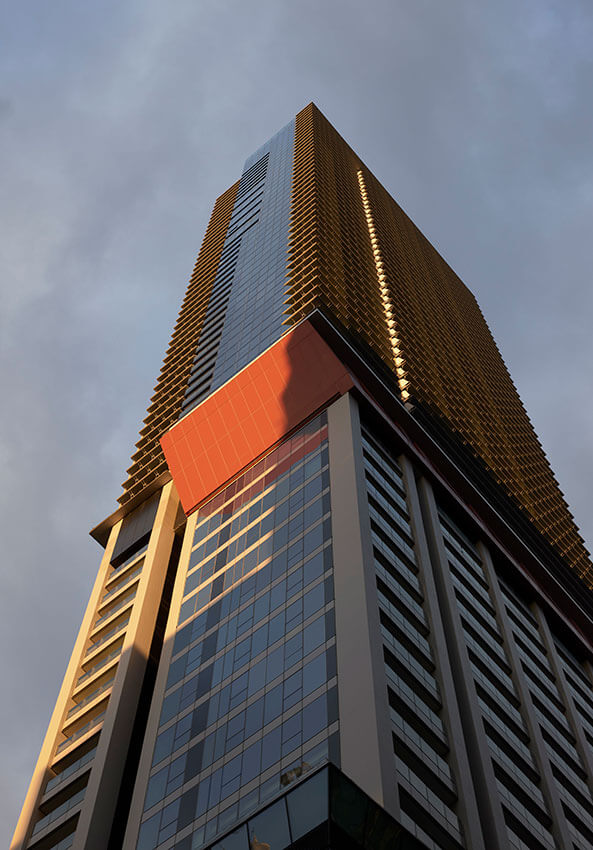
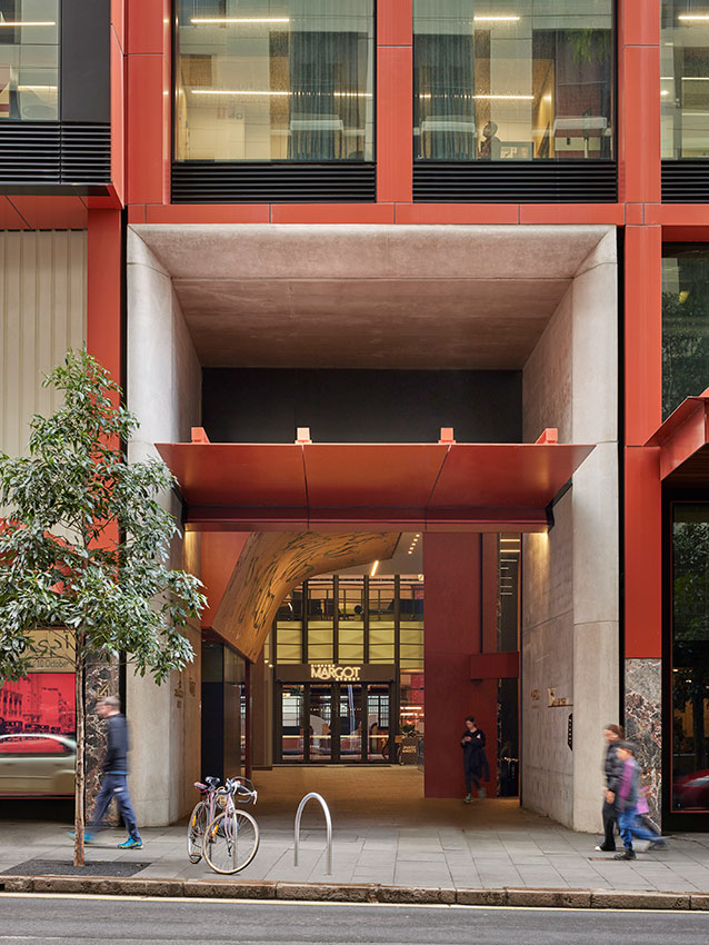
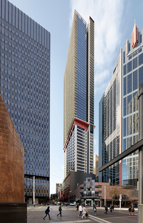
Greenland Centre stands out as much for its towering presence in the city as it does for its ambition. It adds a 40-storeys on top of an existing 27 storey tower, adapted to residential uses. Added to the mix (and complexity) is a new 2 000m2 City of Sydney Creative Hub, above-ground carparking and retail arcades.
The architecture is bold, giving direct expression to the primary ideas that make the project. While the apartments are well planned, it is the “Sydney Balcony” that distinguishes this project, resolving the difficulties of how to make a useable balcony in a high-rise building. This is a genuine, year-round outdoor space, maximising outlook and mitigating wind and rain – a verandah in the sky.
The Sydney Balcony offers replicable lessons, able to be translated to more economical budgets.
COMMENDATION FOR RESIDENTIAL ARCHITECTURE – MULTIPLE HOUSING
Traces | MHN DESIGN UNION
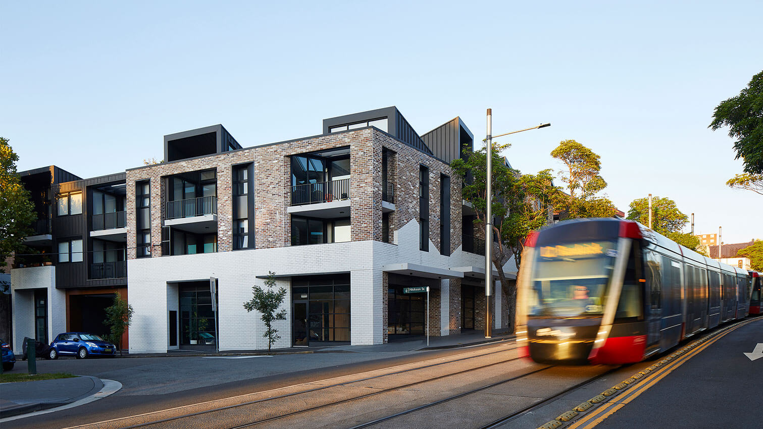
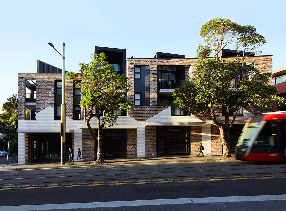
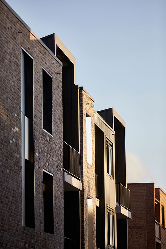
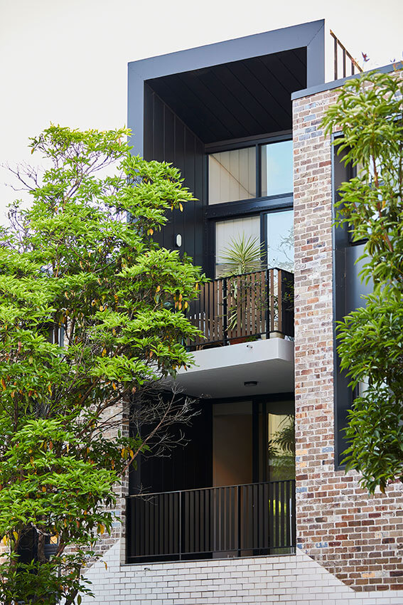
Located overlooking the new tramline, this shop top housing scheme is cleverly organised around a split-level courtyard, taking advantage of the slope of the site and multiple street frontages.
The ground floor is retail, with two split levels of housing above, topped by a communal roof garden. Sensibly it builds to the street boundaries, reinforcing the urban block. The brickwork, deep loggias and an animated roofscape reflect the site’s industrial history, creating airy toplit apartments provide excellent amenity and character for the residents.
COMMERCIAL ARCHITECTURE
The Sir Arthur G Stephenson Award for Commercial Architecture
Poly Centre 210 George Street | Grimshaw
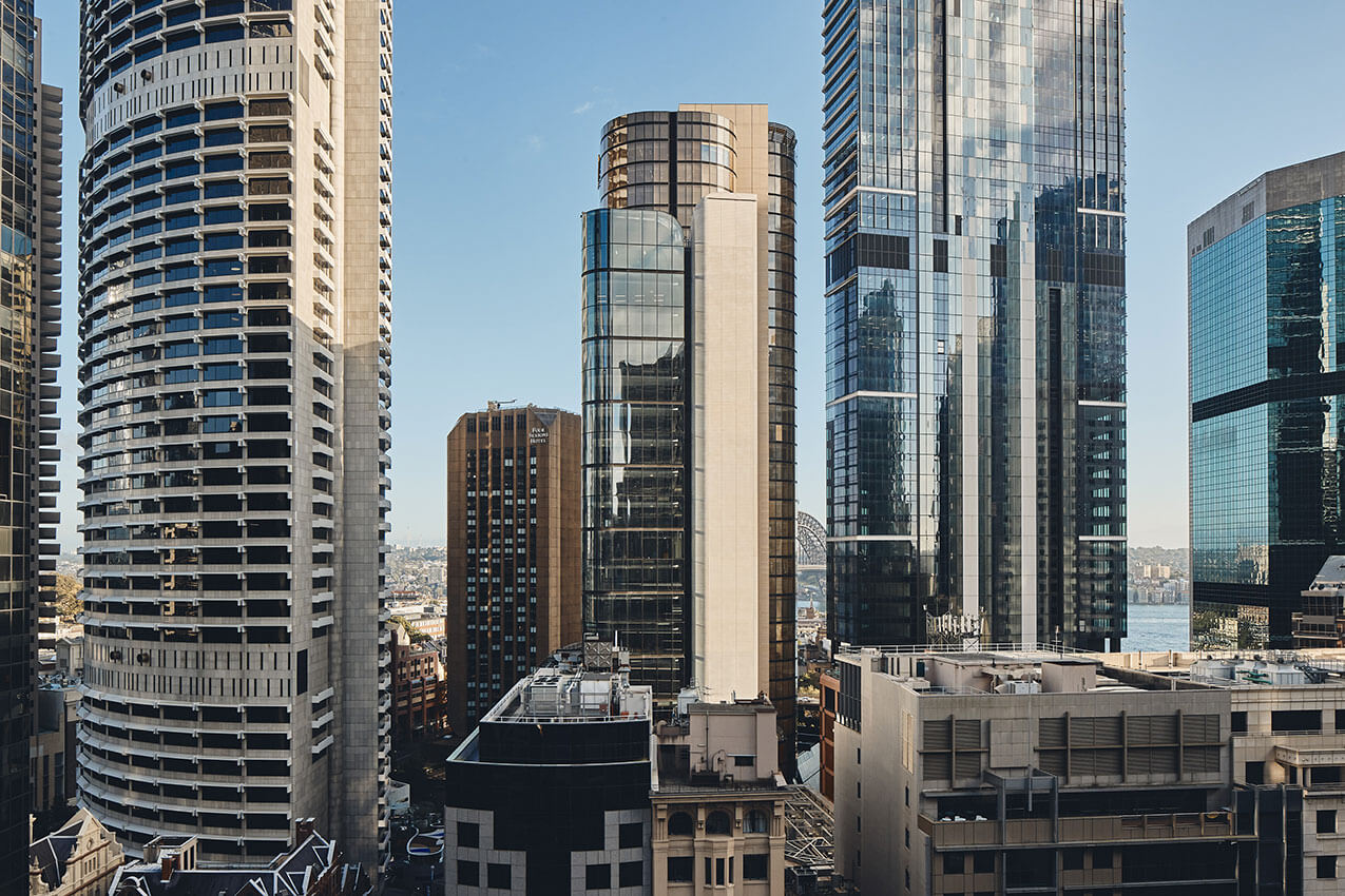
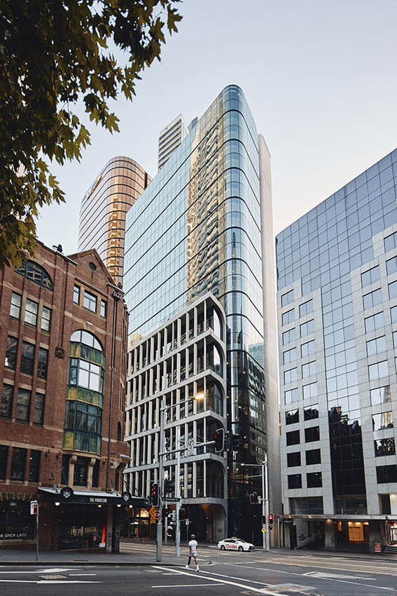
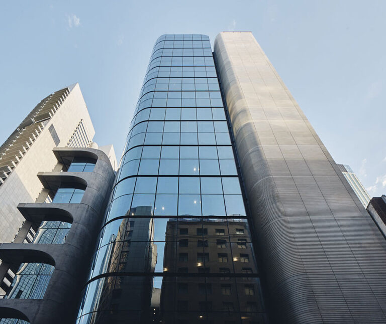
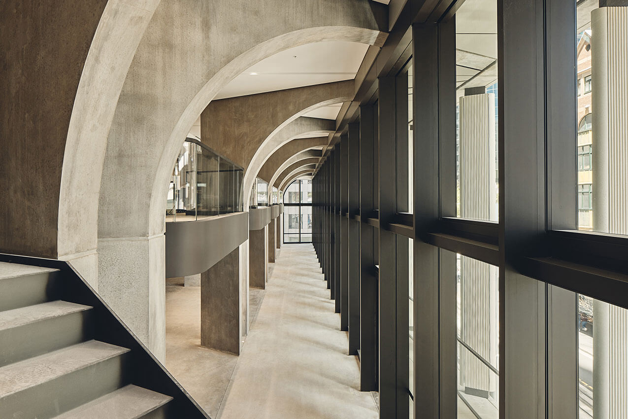
The Poly Centre is a 27-storey commercial tower that sets a benchmark for contextual city making and tall building design in the Sydney CBD.
Weaving itself masterfully into the fabric of the city, the Poly Centre demonstrates a deep understanding of its place, respecting past and present neighbours, while establishing its own distinctive presence. The considered composition of volumes creates an elegant sculptural form expressed through the authentic and judicious use of materials.
With a scale that is carefully balanced between civic and human, a series of vaulted concrete arches embraces the generous public realm at street level. Rising through the podium levels, the arches create a corner presence that anchors the building’s identity within the city. Terraces within the arched volumes activate one of Sydney’s pre-eminent streets.
As a workplace, and in a market striving to entice people back to the office, it offers a diversity of tenancy opportunities, with double-height workspaces, single floor plates, access to outdoor space and a grand, light-filled double-height space at the rooftop level.
The Poly Centre is undeniably contemporary while embodying a strong sense of timelessness and makes an exceptional contribution to the fine grain of the city and the re-thinking of CBD workspace.
AWARD FOR COMMERCIAL ARCHITECTURE
Easy Street Commercial | DFJ Architects
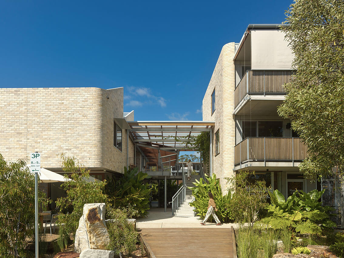
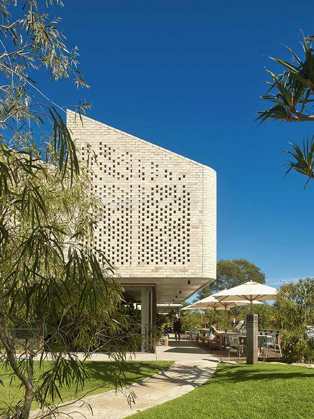
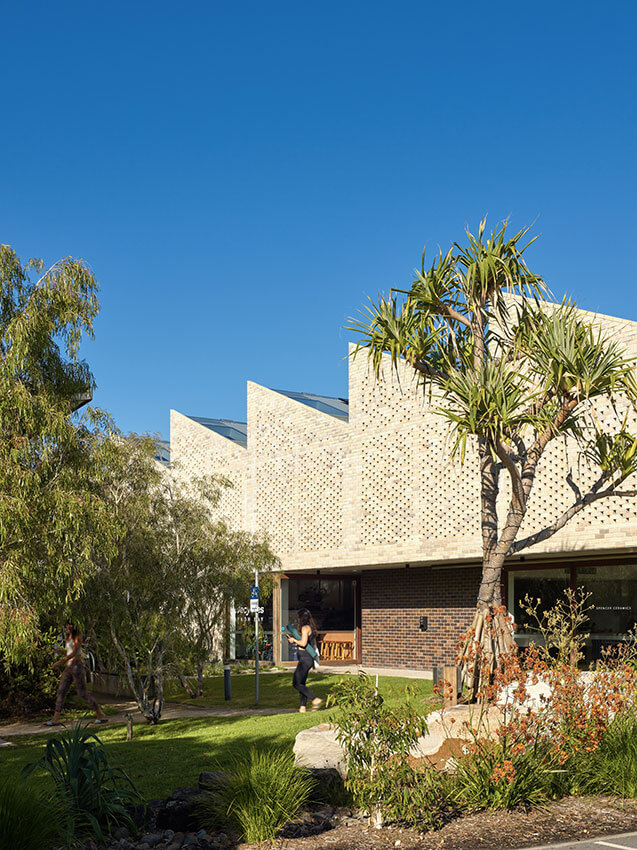
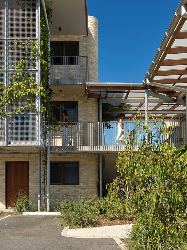
Sited in sub-tropical regional NSW, Easy Street commercial hub expands on the master plan vision of Habitat as a flexible live/work model in harmony with the natural environment.
The new commercial hub activities are interconnected with the life of the community, with diverse offerings including shared communal spaces, encouraging interaction. Workspaces and retail activity spill out onto shaded terraces, and external links and stairs connect indoor/outdoor areas in a landscape of lush subtropical vegetation.
With finely crafted rational construction and detailing, the palette of brick, concrete, steel and timber creates an architecture sensitively attuned to the local climate. Passive design features such as good orientation and deep eaves combine with simple measures for comfort and control: roll down a blind, open a window, or extend your working space out into the open.
Direct, readily adaptable and integrated with its community, Easy Street reminds us of the fundamental design principles in creating sustainable environments, for now and for the future.
AWARD FOR COMMERCIAL ARCHITECTURE
Quay Quarter Tower | 3XN with Executive Architect BVN
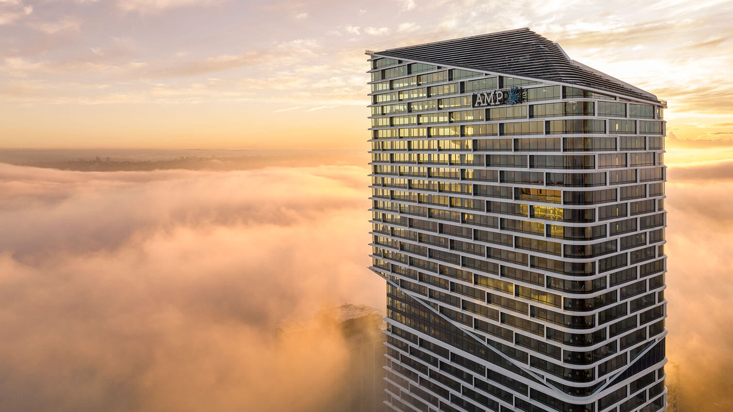
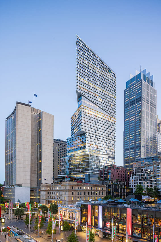
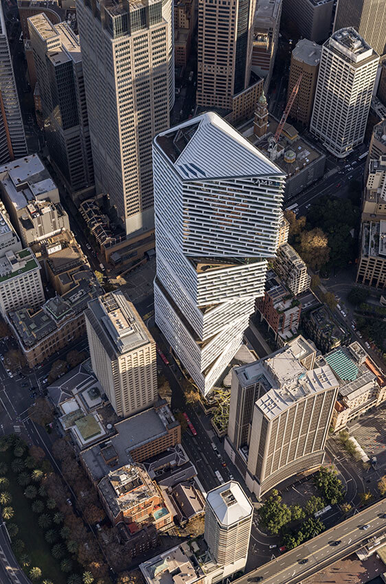
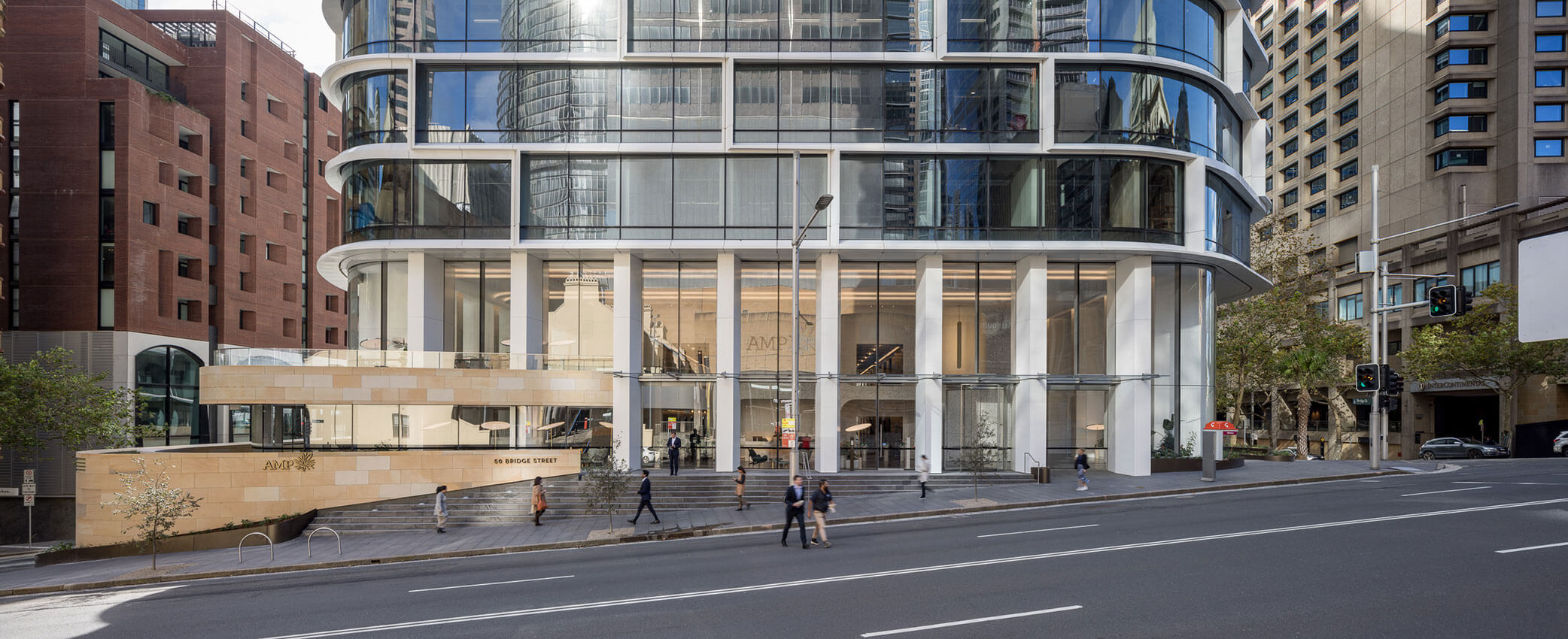
Starting with a brief to retain and reuse an existing structure, 3XN with Executive Architect BVN have transformed a high-rise commercial building near the end of its useful life, to create dramatic new office and retail space and make a bold contribution to the city skyline.
New structure is grafted and interwoven with the existing, almost doubling the building floor space. This upcycling has retained two-thirds of the existing structure, with significant savings in embodied carbon.
A response to the local climate, the capturing of harbour views, and the arrangement of vertical workplace ‘villages’ defines this sculptural tower. Five distinct segments, articulated by rotating the floor plate, break up the tower’s verticality. The highly modelled facades mitigate solar gain and create a shadow play, animating the building’s presence when viewed from near and afar.
Amplified beyond a traditional retrofit, Quay Quarter Tower demonstrates, at a grand scale, the potential to significantly elevate sustainability benefits through creative reuse and regeneration.
AWARD FOR COMMERCIAL ARCHITECTURE
Sub Station No. 164 | fjcstudio (formerly fjmtstudio)
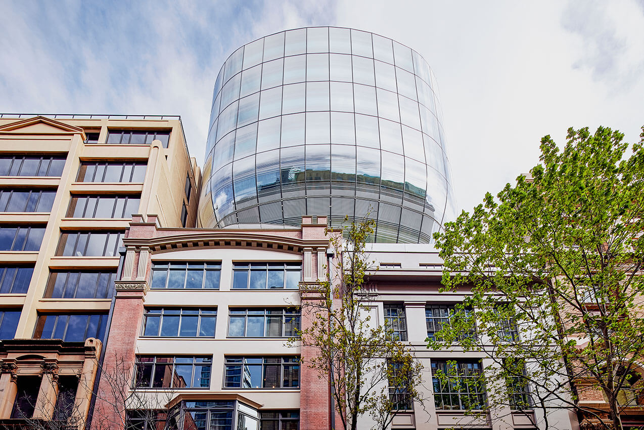

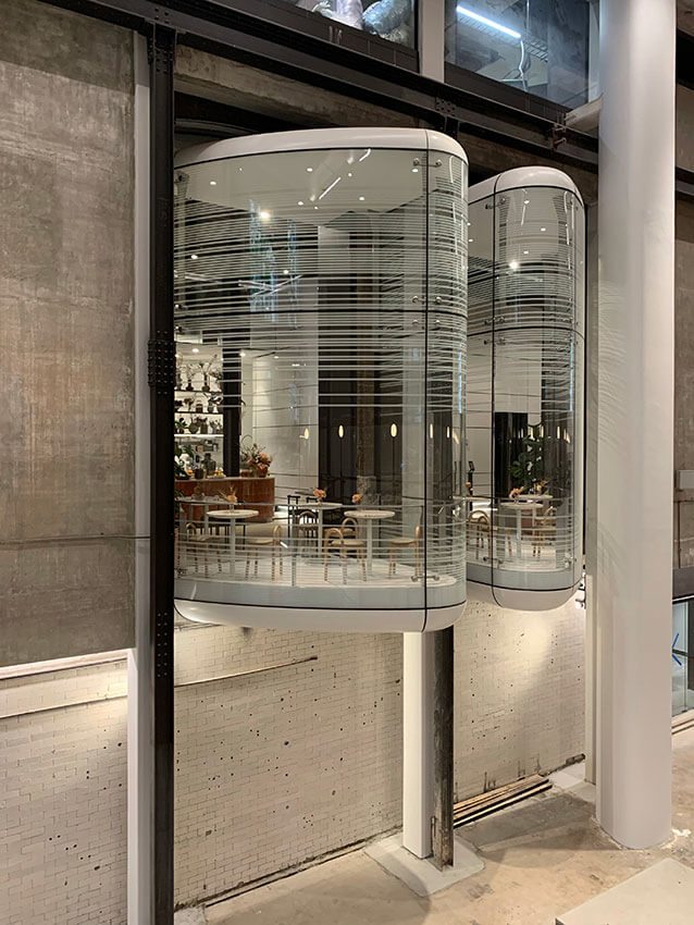
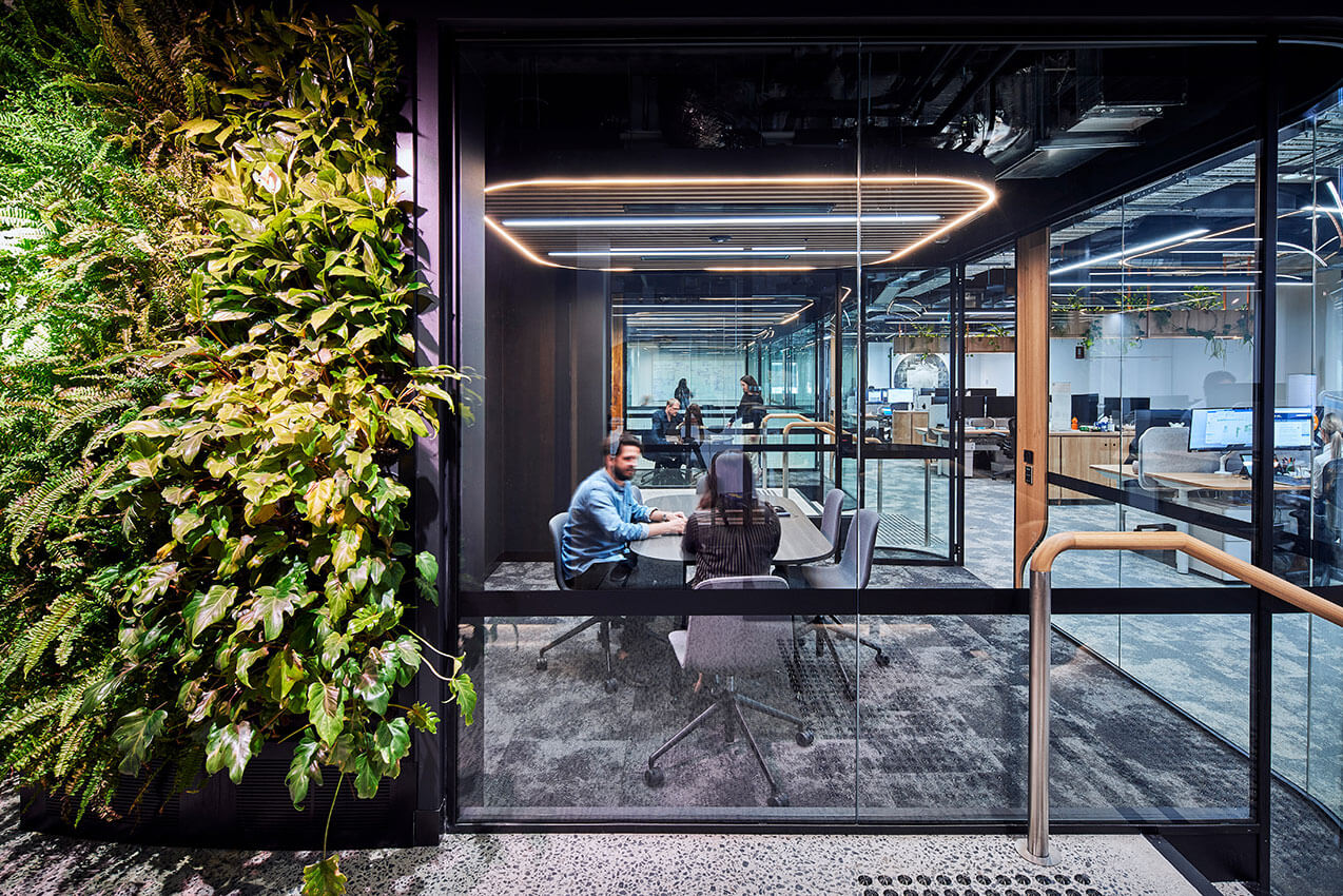
Substation No.164 is a transformational adaptive reuse project in a dense city context. A pair of neglected industrial buildings have been sensitively refurbished, preserving the grand volume of a former machine hall while adding a contemporary commercial tower.
The curvilinear glass tower challenges the idea of an extruded extension following street-wall alignment, using its contrasting form to make clear the distinction between old and new. Its structure is cantilevered over the machine hall, preserving the integrity of the heritage structure below.
New elements – white, glass and curvilinear – continue the strategy of contrast through to the interiors, lacing together the distinctive characters of the former Shelly Warehouse and the electrical substation. Tactile existing fabric is respected, providing the backdrop to warm, intimate-feeling workspace.
A bold approach to regeneration makes this an exceptional development, delivering office space with high sustainability credentials, while also offering a potential cultural destination contributing to the life of the city.
AWARD FOR COMMERCIAL ARCHITECTURE
Yirranma Place | SJB
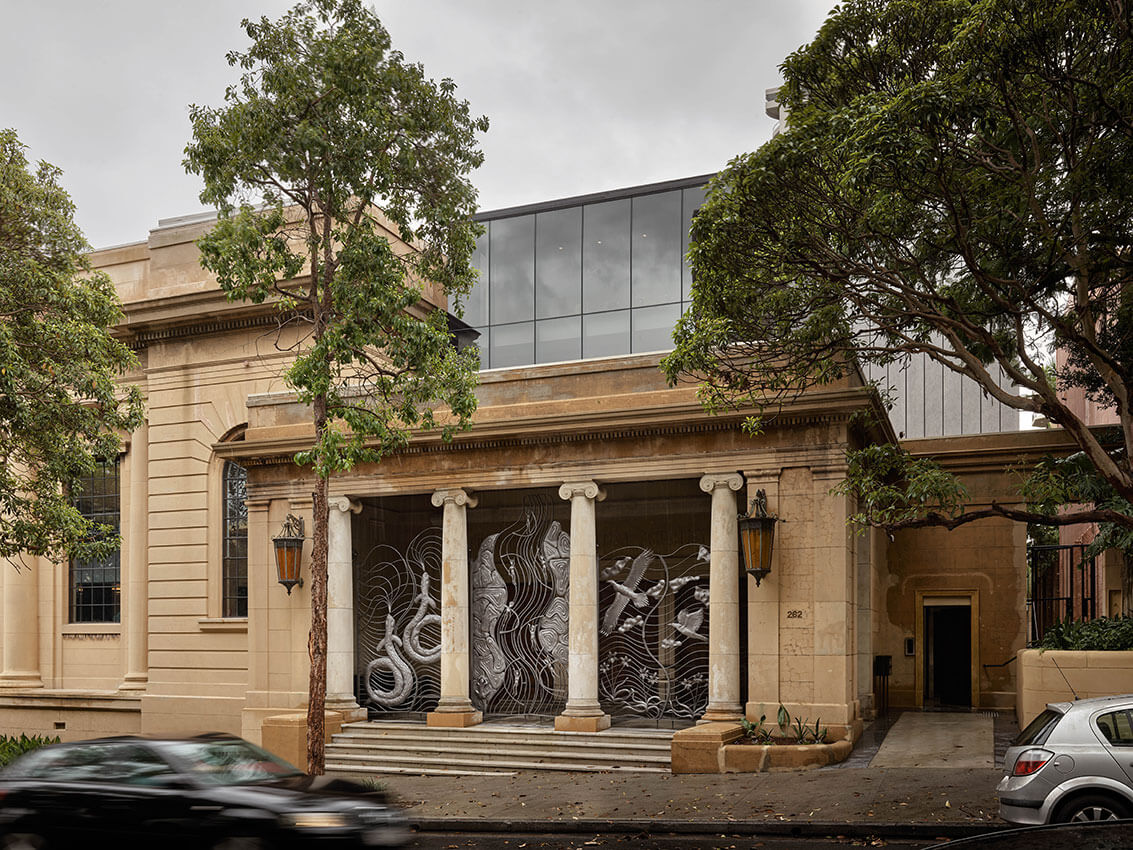

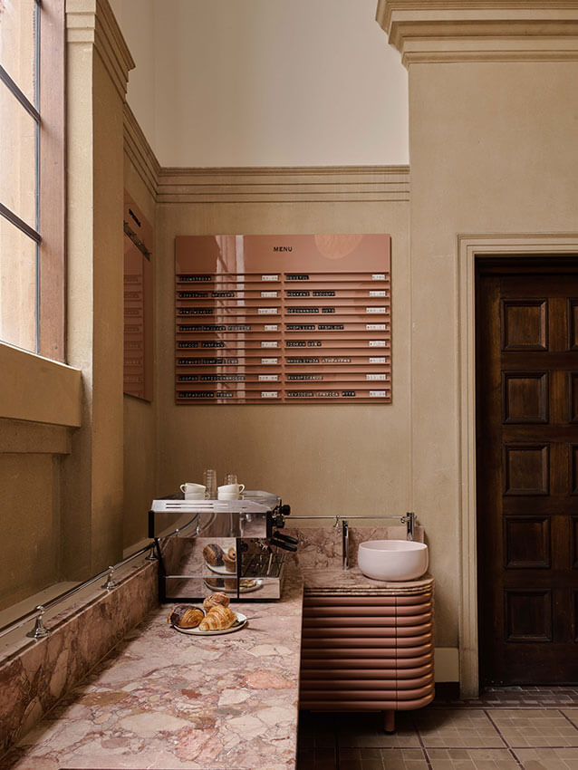
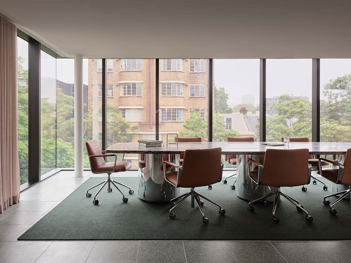
Yirranma Place is an exemplar of lovingly re-imagined adaptive reuse, intertwined with social purpose and First Nations art. Restored and reinvented, Yirranma Place has returned a private residence within a heritage-listed 1920s church back to a wider community. It incorporates a gallery/event space, and flexible offices for not-for-profit organisations.
The sensitively restored heritage fabric is complemented by light touch yet robust additions, respectfully celebrating past forms through a sequence of sublime spaces. When resources are used, they are used with exceptional skill. The result is a place of surprise and delight.
Against a backdrop of increasing environmental pressures, the skilful adaptive reuse of existing building stock, offers possibilities for less resource use and reduced environmental impact.
‘Yirranma’ is Gadigal for ‘many create’, a fitting name for the building’s purpose and for the many hands that created it. Its vision for a 100-year life span sets a benchmark for good design as an investment in our collective future.
COMMENDATION FOR COMMERCIAL ARCHITECTURE
Locomotive Workshop | Sissons Architects with Buchan and Mirvac Design


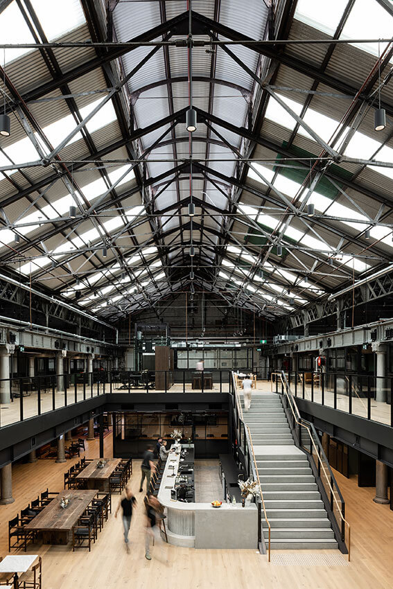
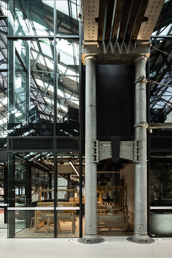
Housing new commercial and retail facilities, the adaptive reuse of this former workshop rescues and showcases its original industrial character and structure. An accretion of unsympathetic additions and barriers has been removed to celebrate the shed’s immense volume, almost the size of 4 football fields, and doors have been thrown open to reintegrate its life with the surrounding neighborhood.
New interventions enable reversibility, are differentiated, and respectfully inserted within the rhythm of structure and sawtooth bays, flooded with natural light. The renewed central axis presents a long vista flanked by new uses, and 100 years of ‘makers’ occupations represented through interpretation, adding to the revitalisation of the South Eveleigh precinct.
COMMENDATION FOR COMMERCIAL ARCHITECTURE
Modus Operandi Brewery | Prevalent
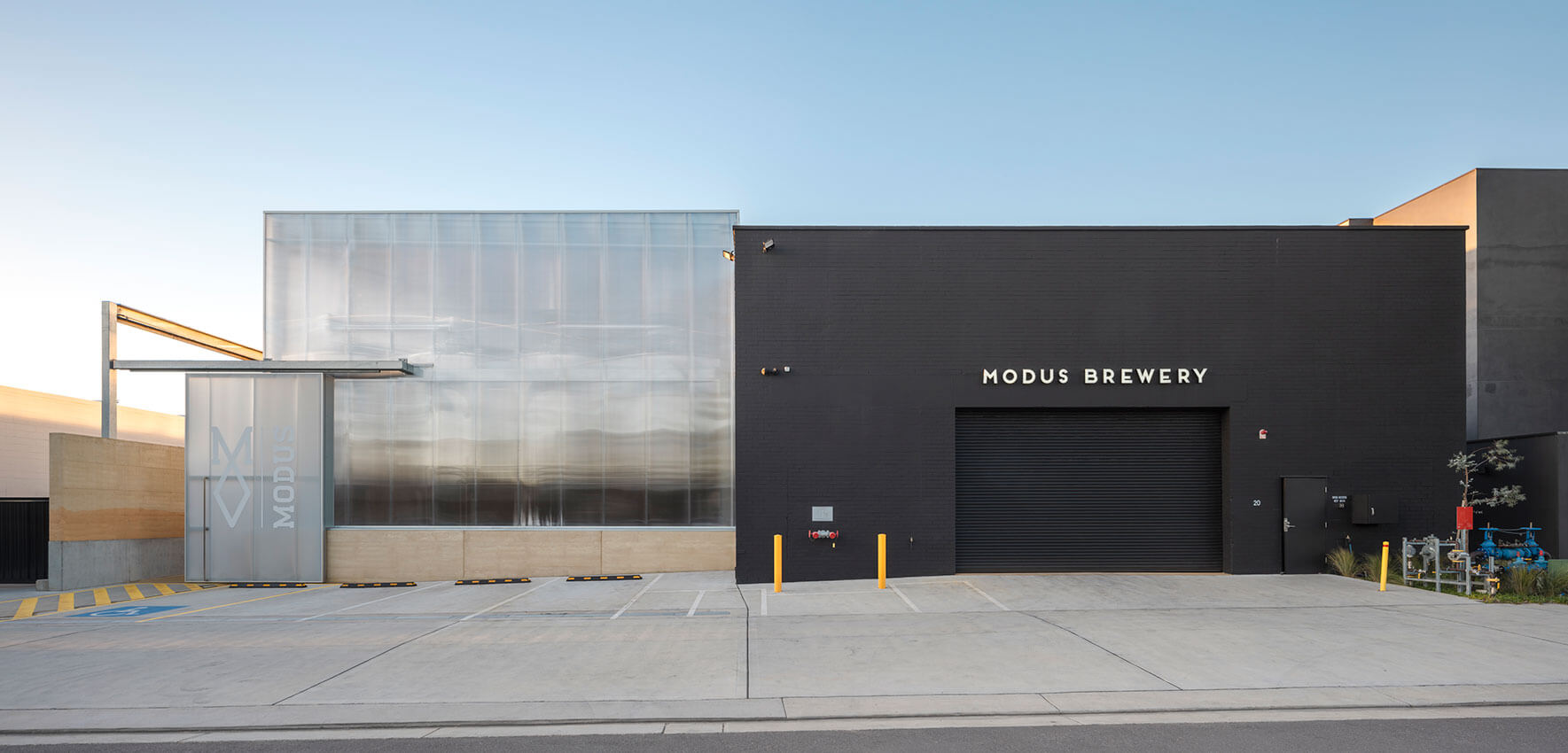
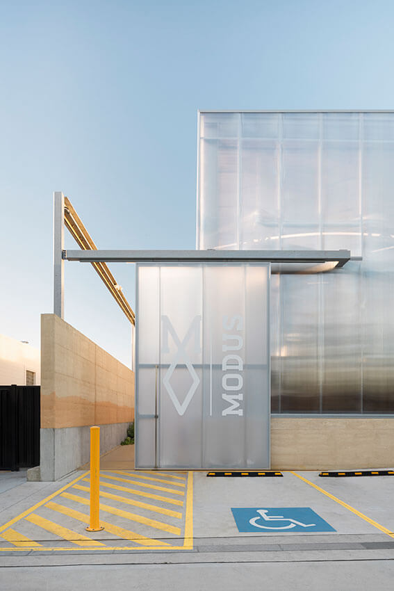
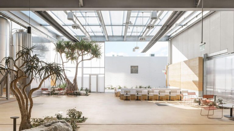
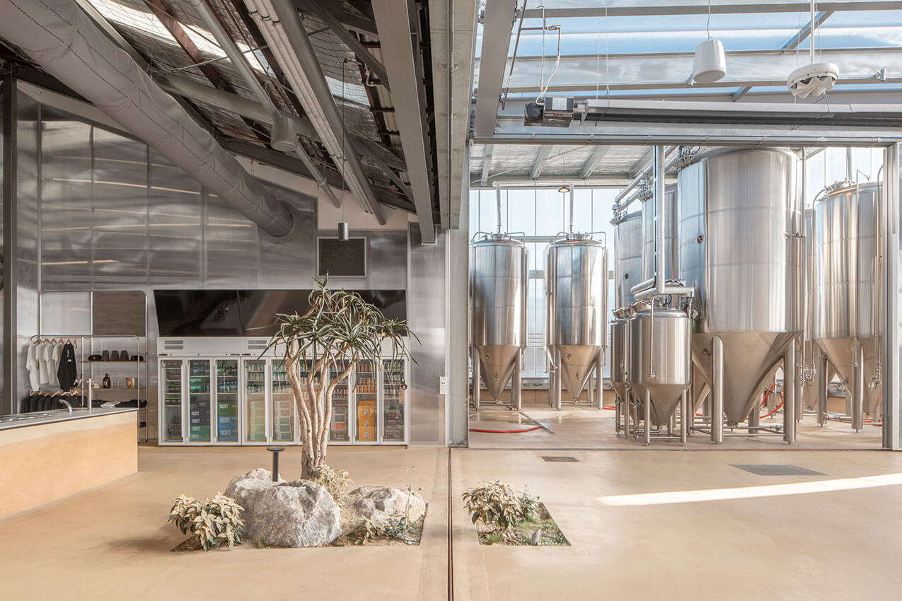
Modus Operandi brewery in Merewether reimagines an existing industrial shed with a new light-filled addition inspired by its location near the beach. Designed to bring people together and for brewery production, the project is a sensitive insertion into a low-scale, mixed-use neighbourhood. The translucent polycarbonate addition is animated by changing light conditions that entice passers-by into the generous interior space.
Low rammed-earth walls, a floor made from local sand, and native planting all draw from the brewery’s context. Together, the meticulous combining of both fixed and operable elements, adaptable prefabricated structure, recycled materials, abundant natural light and cross-ventilation create an architecture that is a delightful celebration of place.
HERITAGE
The Greenway Award for Heritage
Sydney Opera House Concert Hall Renewal | ARM Architecture


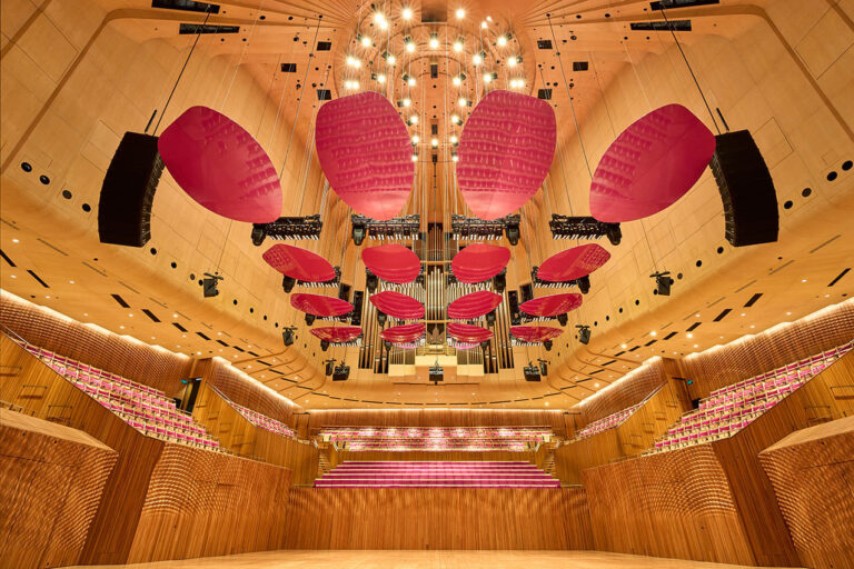

Performing delicate surgery to a much-loved World-Heritage-listed building, this renewal project manages to not only meet, but transcend, all of the project challenges to achieve something truly special. The result is a renewed Concert Hall for the next generation, on par with the world’s great halls.
This is a rare example of a heritage intervention handled with such masterful technical skill, care, craft, creativity and deft precision as to make the interventions almost invisible – all achieved amidst the most complex of heritage, stakeholder and functional controls. Beyond respect and reverence for the original work, the architects have also managed to bring something special and ineffable to the table: a sense of joy, surprise and delight for visitors that resonates so well with the spirit of the original work, and brings the voices of Utzon and Hall into constructive dialog.
The Architects have achieved this very rare and exemplary feat with excellence.
AWARD FOR HERITAGE – CREATIVE ADAPTATION
Bondi Pavilion Restoration and Conservation | Tonkin Zulaikha Greer Architects
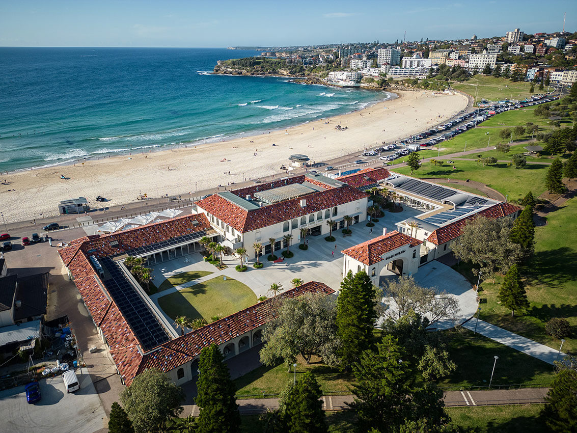
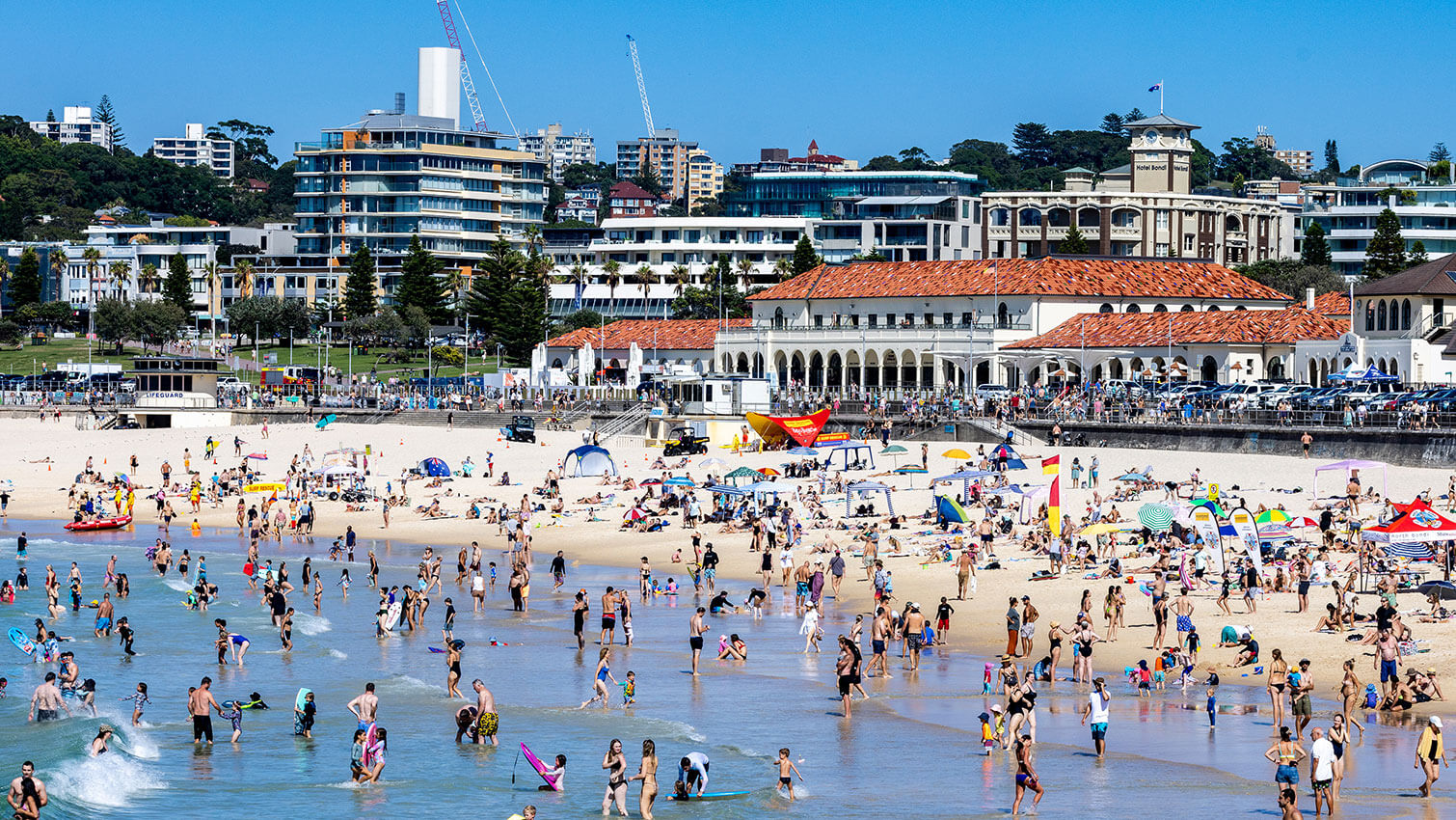
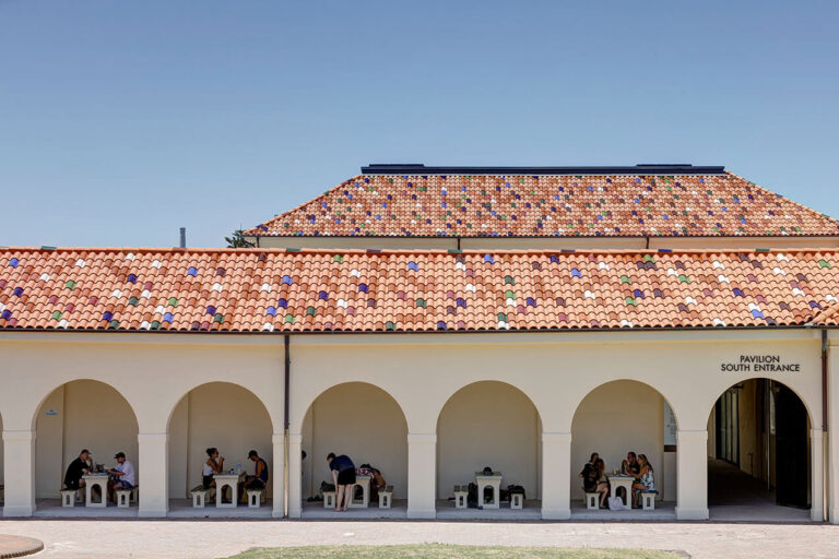
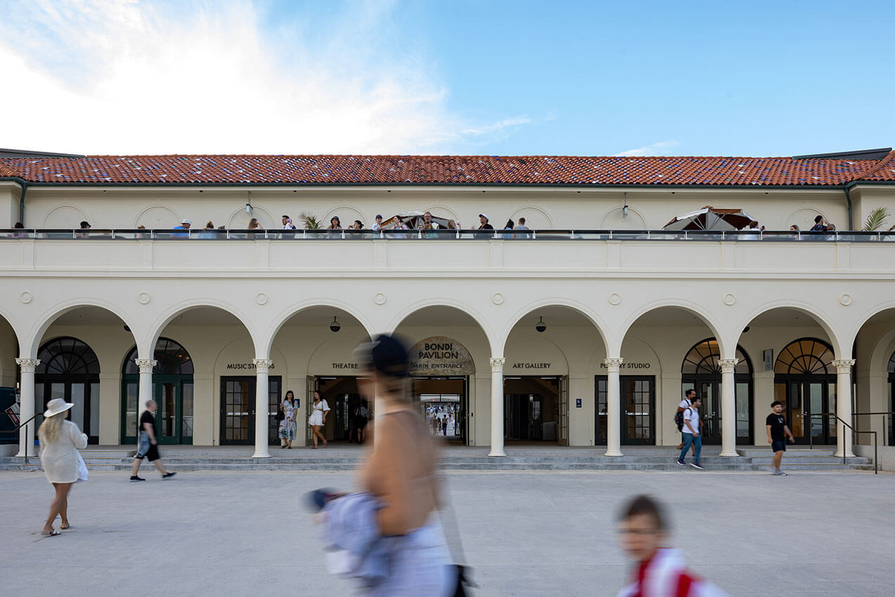
The Bondi Pavilion, designed by Robertson Marks Architects in the Inter-War Mediterranean Style, has been an iconic Bondi Beach landmark since 1929. This restoration project set an ambitious goal to re-establish the visual and physical connection through the pavilion from Campbell parade to the beach; which it accomplishes masterfully. The project features strong architectural moves that together restore the legibility, symmetry and sequence of spaces to the building – re-energising it as Waverley’s unofficial townhall, and community heart.
Incredible care and attention have been paid to the restoration of fabric in this aggressive marine environment. Superfluous accretions have been stripped away and new, whimsical contemporary elements confidently handled. The courtyard space has been transformed from historically demure changing rooms to a generous public piazza activated by community uses. The clarity of the strong proposition and urban diagram is evident throughout, remaining true to the renaissance aspirations of the original design.
AWARD FOR HERITAGE – CREATIVE ADAPTATION
Sub Station No. 164 | fjcstudio (formerly fjmtstudio)
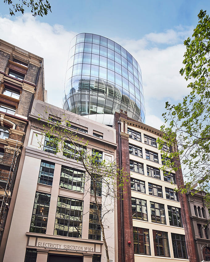
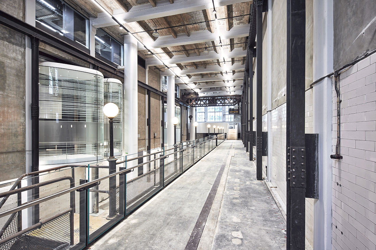
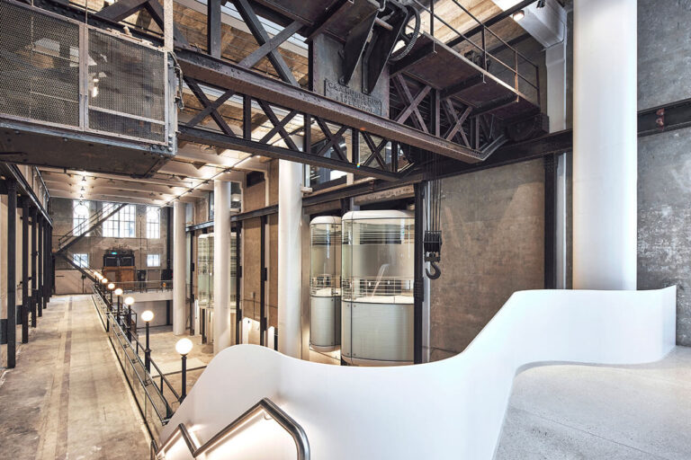
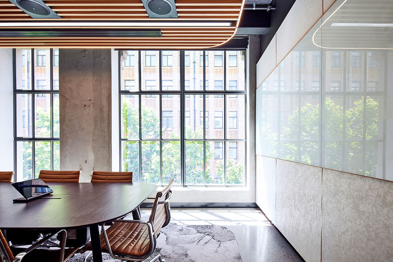
The Substation No. 164 project is a uniquely inventive project, representing a ‘’conceptually innovative adaptive re-use response for commercial projects in inner-city urban settings.
A critical component to the success of this project – and for which it is applauded – is the direct participation between Client/Developer/Builder, Architect and the City of Sydney Planning Authority. Together, they were able to see greater potential than standard planning setback controls would have allowed. This open-mindedness and strategic vision is exemplary.
Resisting the commercial urge to simply maximise commercial floor area, this project offers a feasible alternative that has unlocked a challenging site to benefit both public and private interests. This beautifully crafted project at once respects the heritage fabric, whilst also offering a contemporary counterpoint in the form of a delightfully 21st Century office building hovering above. The project features a restored machine hall for use as a public venue, and masterful detailing throughout.
AWARD FOR HERITAGE – CREATIVE ADAPTATION
The Estate | Luke Moloney Architecture
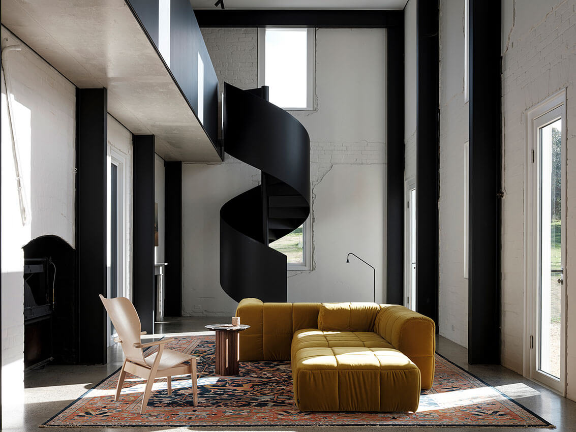
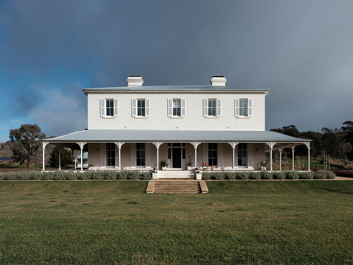
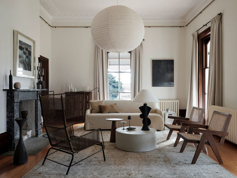
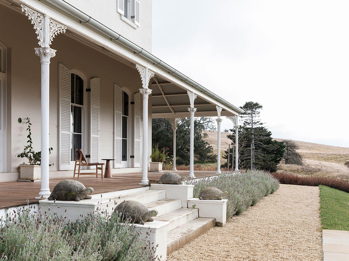
In the remote high country of New South Wales stands The Estate, a regional homestead built for a prominent pastoral family in the late-19th Century.
This project is a rare example of a client and architect who appreciated the qualities of a historic building that was not heritage-listed yet treated it with due care and consideration – because they simply thought it was the right thing to do. Surprisingly, on account of the quality of the work, the house has the rare honour of having been heritage listed after the completion of the new work. This unique outcome speaks volumes in itself, and for which, the project is congratulated.
Respectful, thoughtful and sometimes unconventional solutions outside standard academic restoration exercises, have been used to upgrade the building to contemporary environmental standards. Hand-crafted by local craftspeople, the work shows great maturity: meticulously detailed, spatially confident where needed, and delicately restrained in equal measure.
AWARD FOR HERITAGE – CREATIVE ADAPTATION
The Imperial at Clifton | Welsh + Major
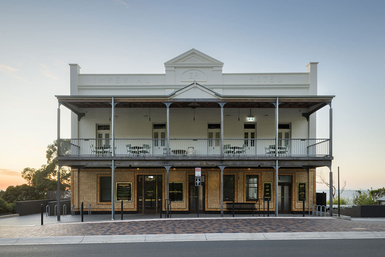
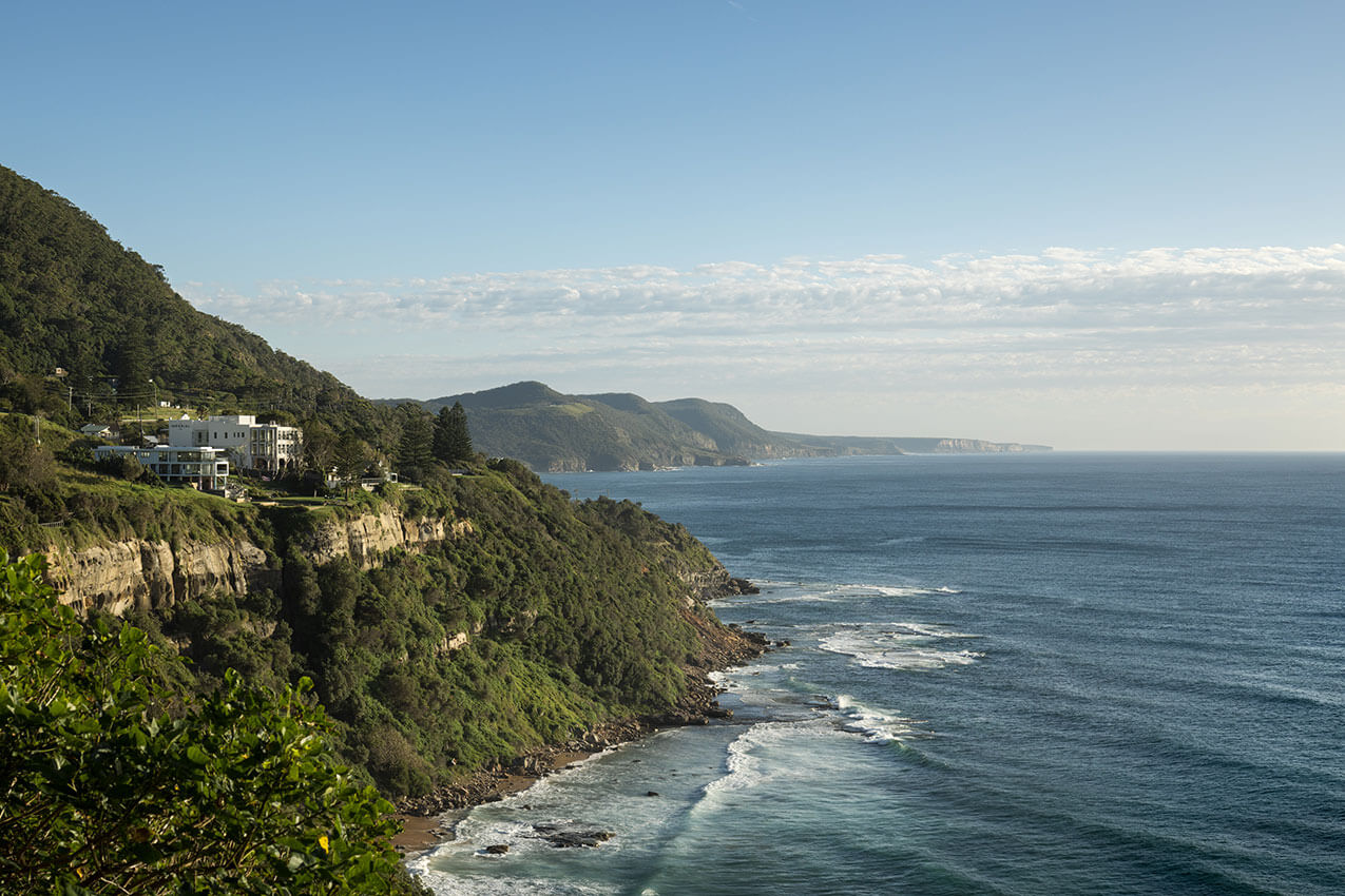
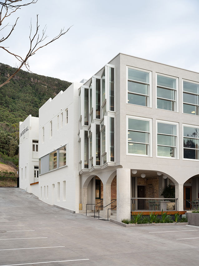
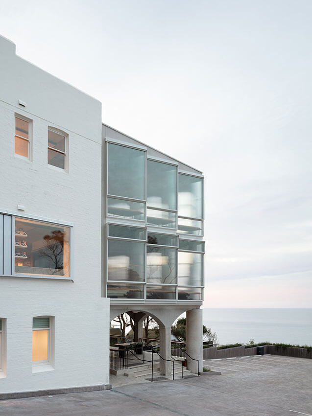
Perched on a seaside cliff since 1911, the Imperial Hotel building in Clifton NSW enjoyed a colourful life until a landslide forced the closure of the main road to the town in 2003 and it gradually fell into neglect.
This project has successfully reinstated this well-loved building at the centre of this regional community. The new work is handled playfully, retaining legibility of the original hotel while making strong and direct interventions. This has allowed the hotel to retain its landmark qualities as an important and active element within the local community. The decision to treat it as a precious archaeological artefact – revealing layers of construction, care, attention and specificity in the demolition – has proved popular with the local community as a much-loved celebration of its role in time and place. The architects commendably resisted the urge to carry out a conjectural reconstruction of the front verandah, and rebuilt it in its known earlier form using contemporary detailing.
AWARD FOR HERITAGE – CONSERVATION
St Saviour's Cathedral | Michael Fox Architects
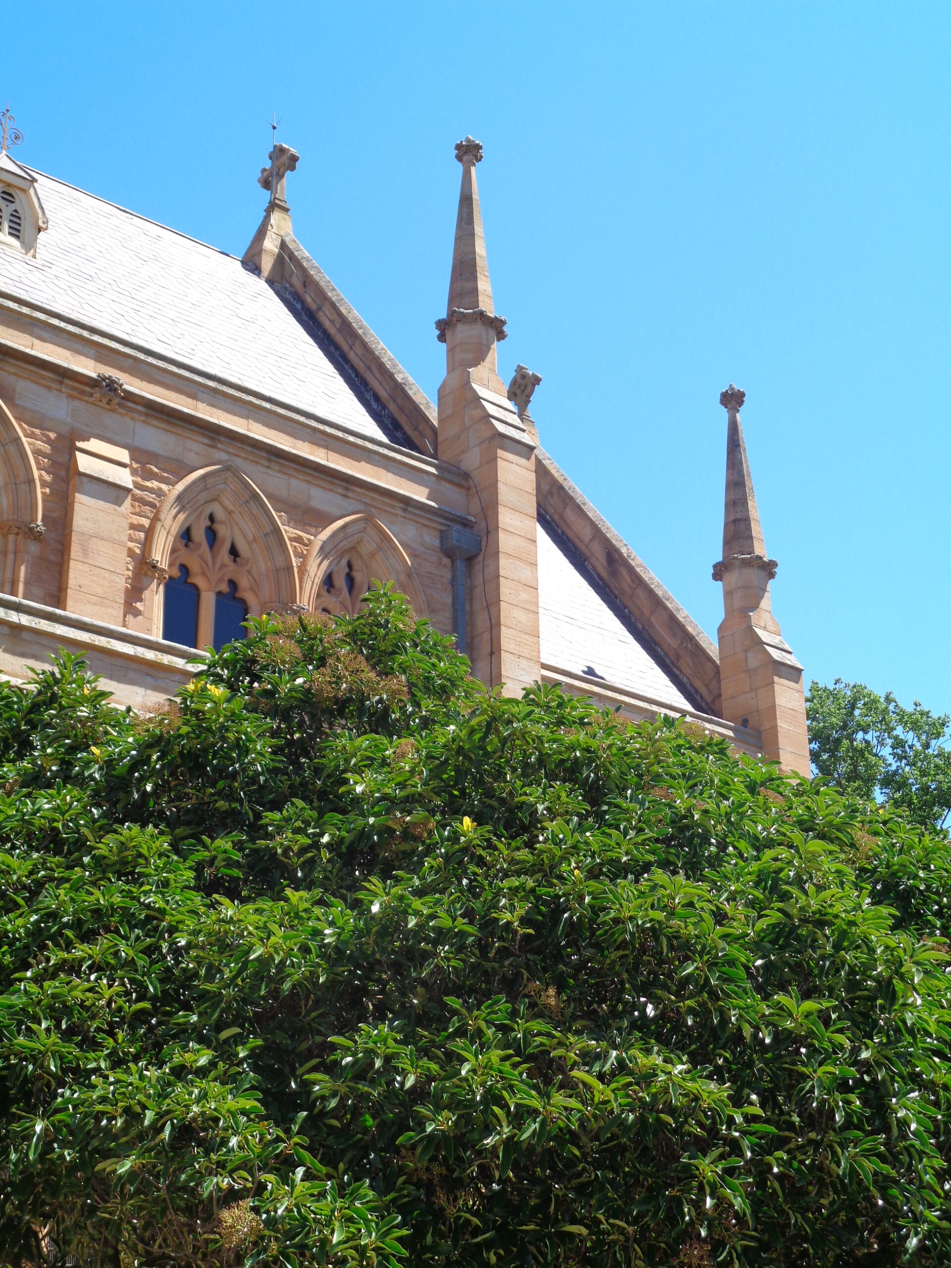
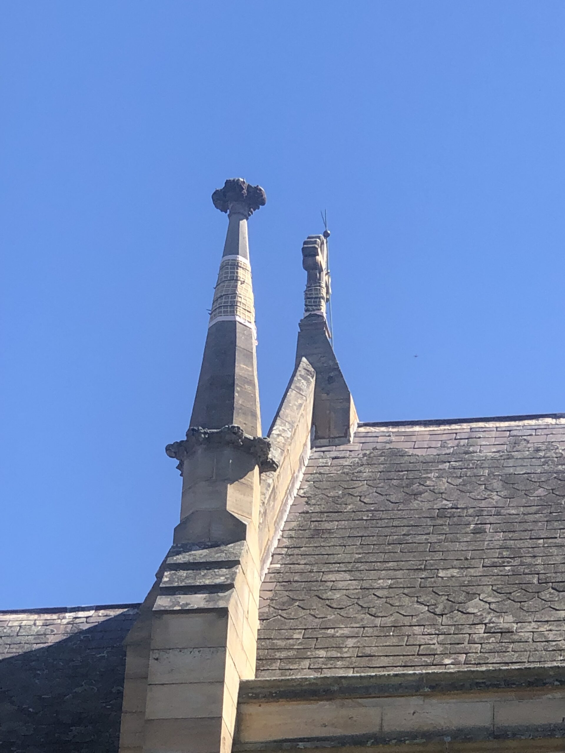
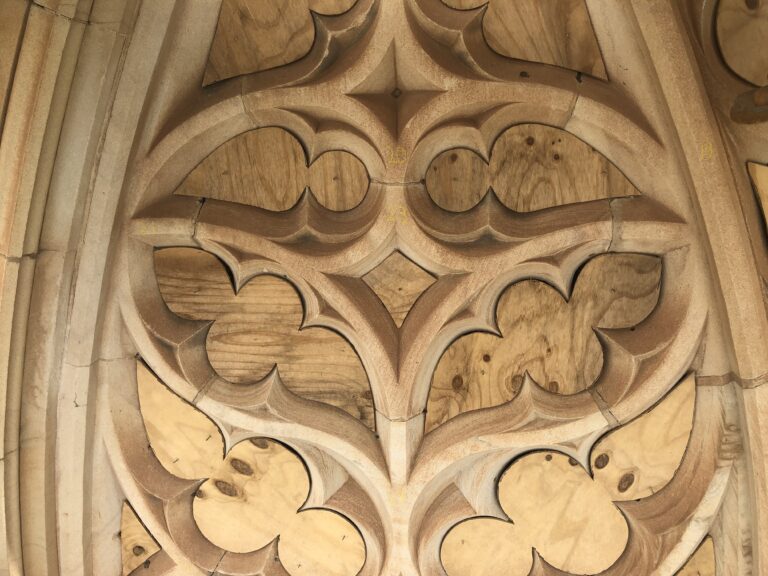
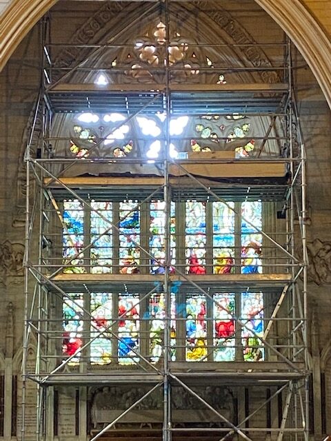
St Saviours Cathedral in Goulburn is an important Edmund Blacket building dating from 1874 with State Heritage Listing. The seemingly modest work that has been undertaken belies the complexity, restraint, important stewardship, and leadership demonstrated by the Community and their Architect. The project exemplifies the ongoing commitment required to protect and conserve important heritage items. Particularly commendable, is that this project has been driven by a local community at a grass-roots level, who simply love this building.
Beginning with a thoroughly researched and comprehensive Conservation Management Plan, the architects have brought an extremely high level of experience and skill to this project. Engaging with exceptionally specialised conservation trades, has produced high quality conservation of stonework and stained glass – altogether a vastly specialised knowledge base within the accumulated team.
This project is truly an ongoing labour of love, and the jury were impressed by the commitment shown to date.
COMMENDATION FOR HERITAGE - CREATIVE ADAPTION
80 Albion | Squillace Architects
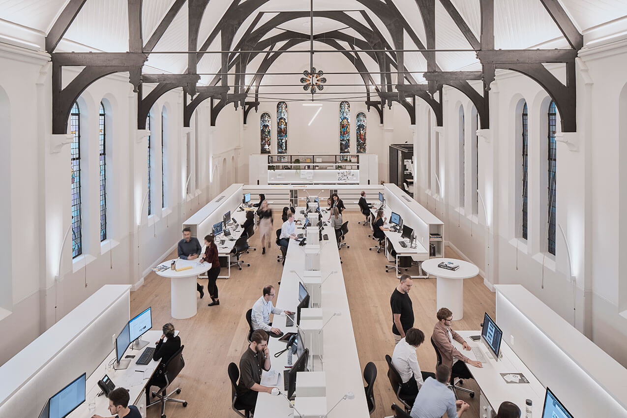
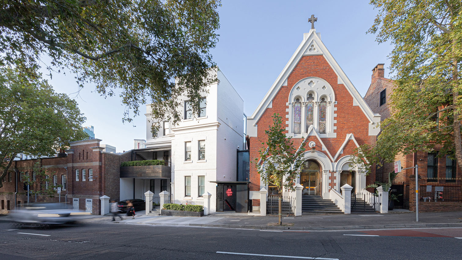
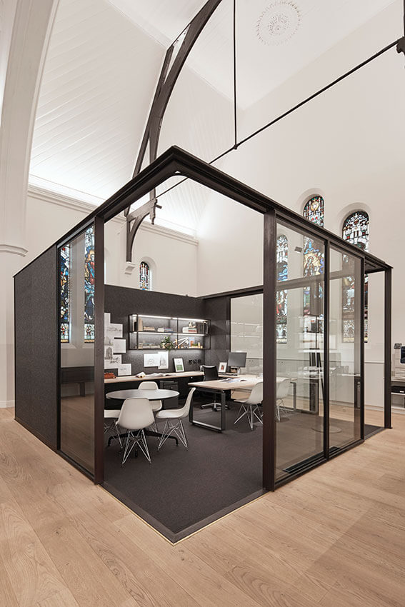
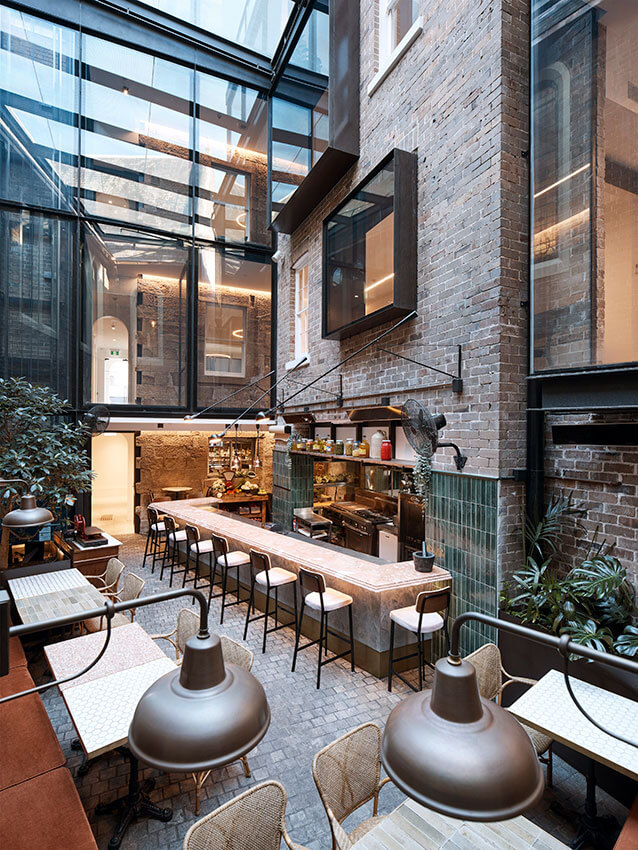
Converting an 1855 church to secular use presents a notoriously difficult brief and the Architects have achieved a successful, lovingly considered conversion into office space. The volume and many details of the original form and function of the building are still clearly legible throughout. The inclusion of a restaurant within the internal courtyard, provides a public life and benefit to this internalised space, and also features a variety of quirky details from the original buildings on display.
COMMENDATION FOR HERITAGE - CREATIVE ADAPTION
Locomotive Workshop | Sissons Architects with Buchan and Mirvac Design
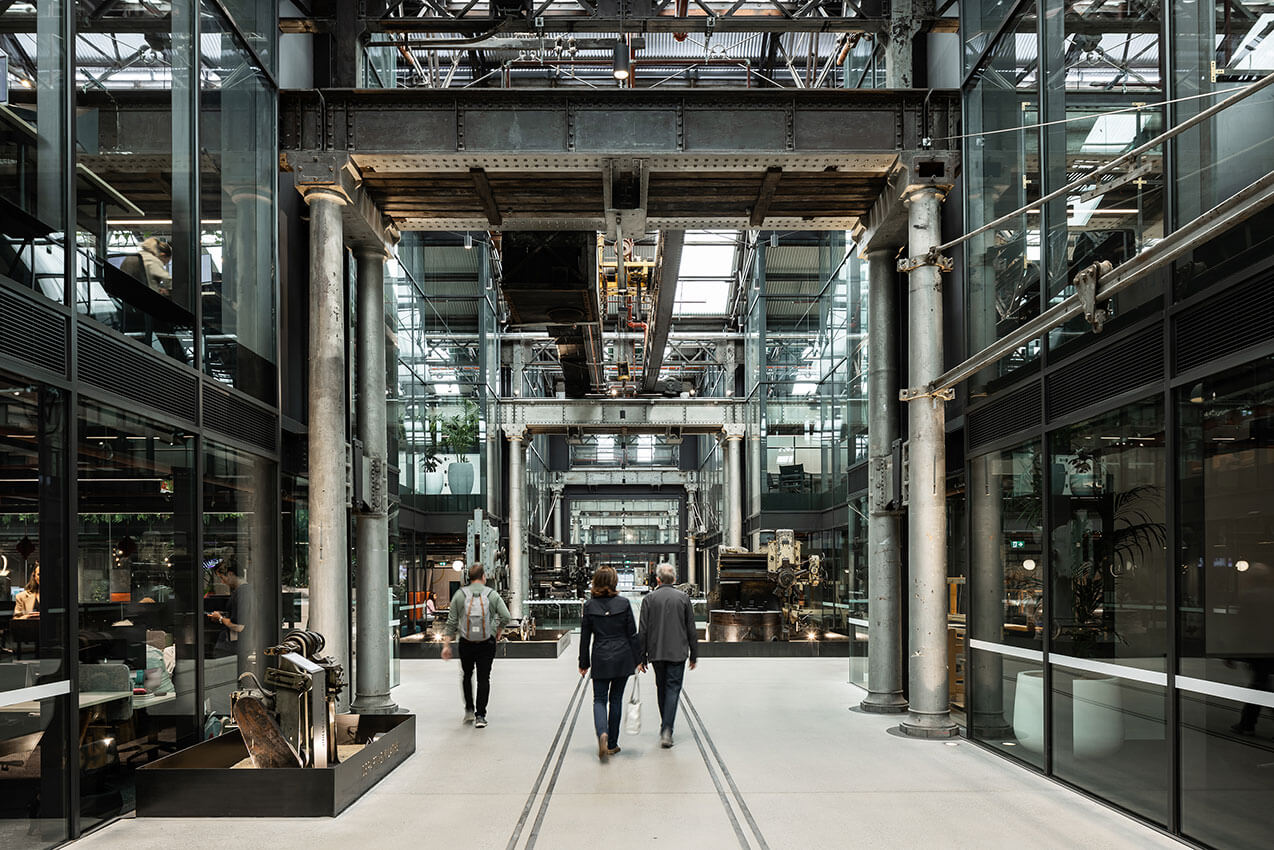
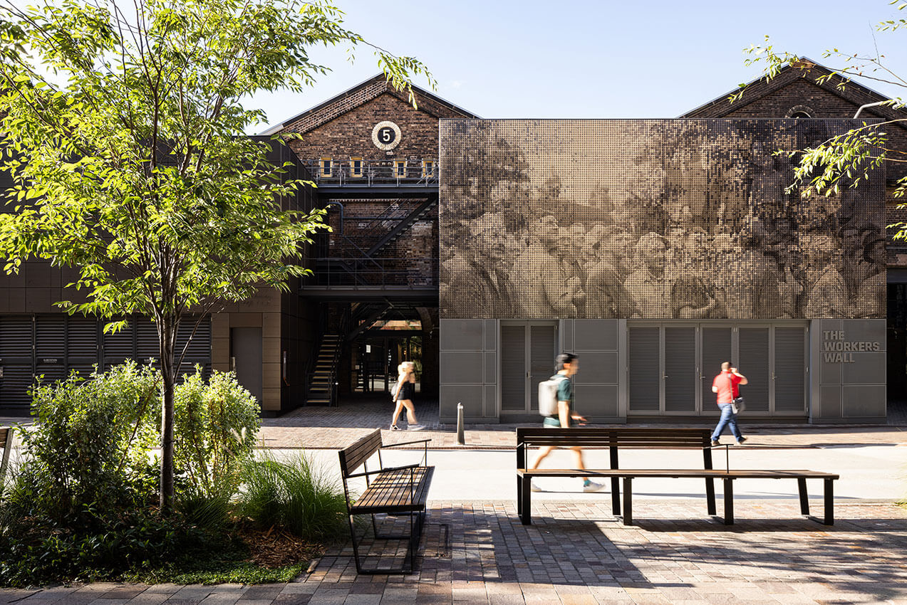
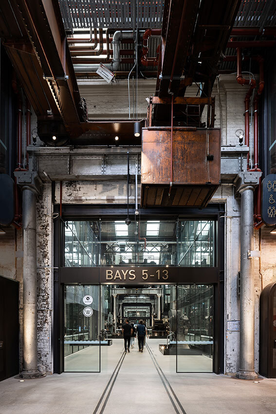
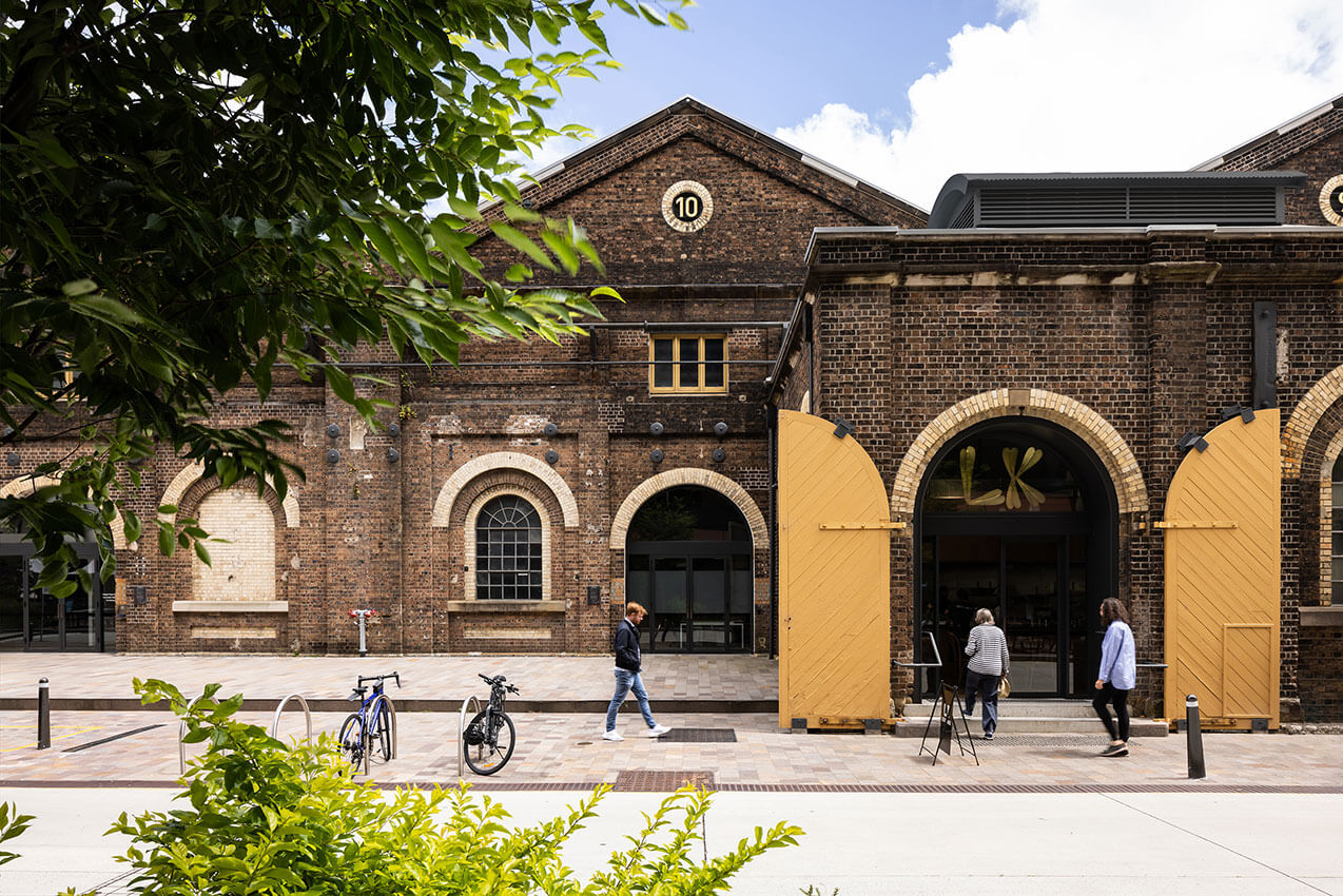
For over 100 years the Locomotive Workshop precinct was the engine room for Australia’s rail network, pioneering technology and advances in industry. Using a deceptively simple architectural strategy, and exacting execution, the precinct has been elevated back to its former status as a technology powerhouse. The Workshops have become a place for organisations of all shapes and sizes to find common ground to collaborate on the jobs and industries of the future. Interpretive museum pieces are thoughtfully integrated throughout.
COMMENDATION FOR HERITAGE - CONSERVATION
Millers Point Townhouse | Design 5 - Architects
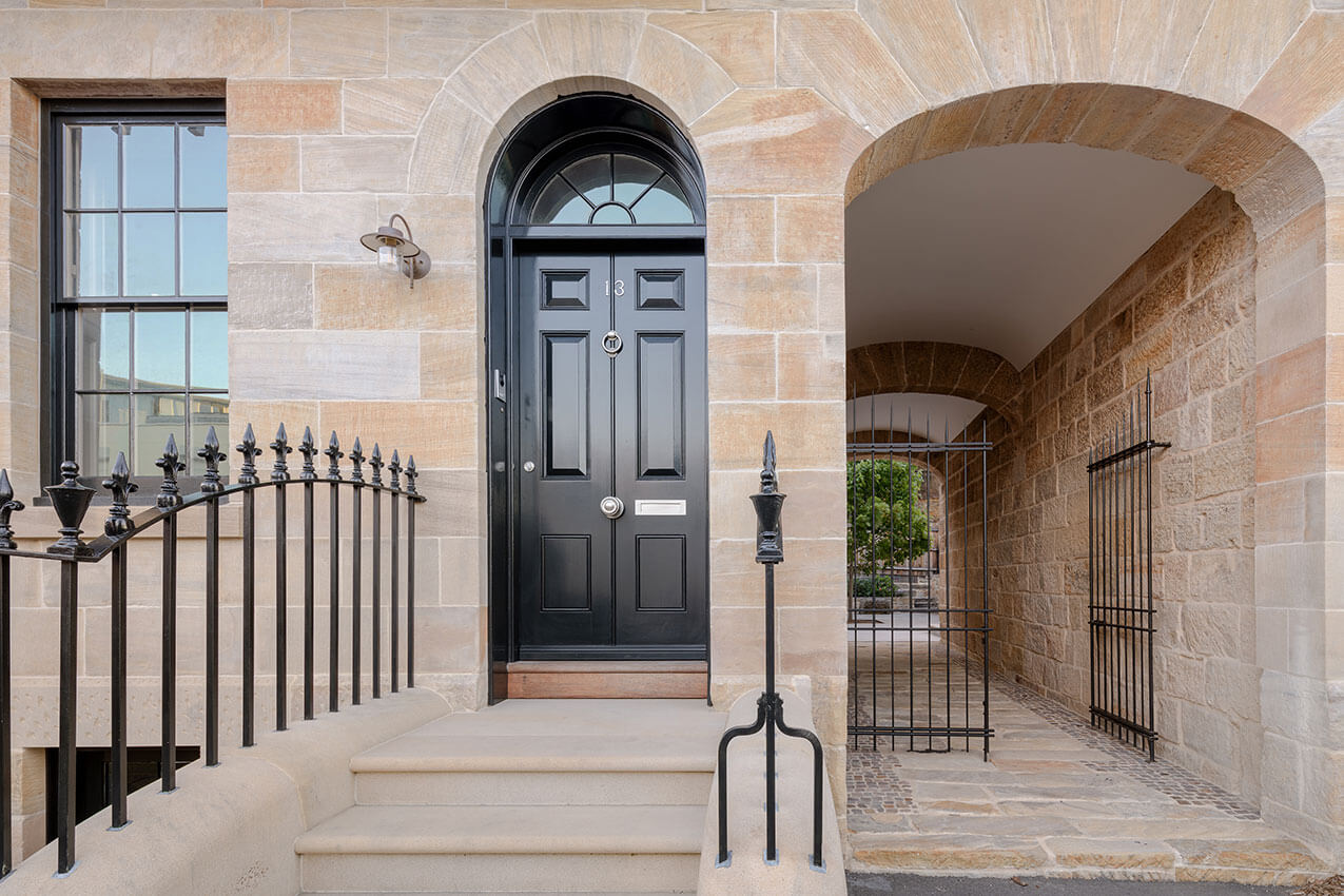
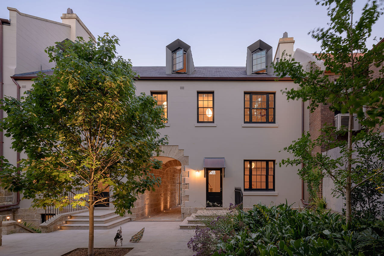
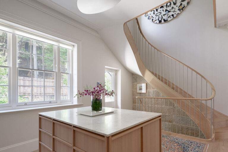
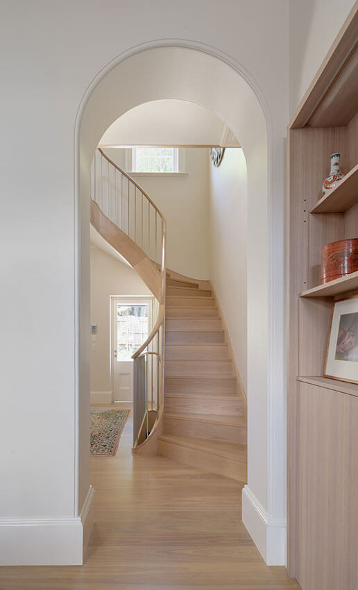
The Millers Point Townhouse, constructed in c1845, was designed by prominent colonial architect John Bibb. A high level of care has been paid to the conservation of the original fabric via attentive documentary research and investigation of physical evidence. This included reinstatement of external stair rails, balcony, and – most significantly – infilled light wells found to be outside the modern-day site boundary. These now adorn the public realm thanks to the support of the City of Sydney.
INTERIOR ARCHITECTURE
The John Verge Award for Interior Architecture
Sydney Opera House Concert Hall Renewal | ARM Architecture

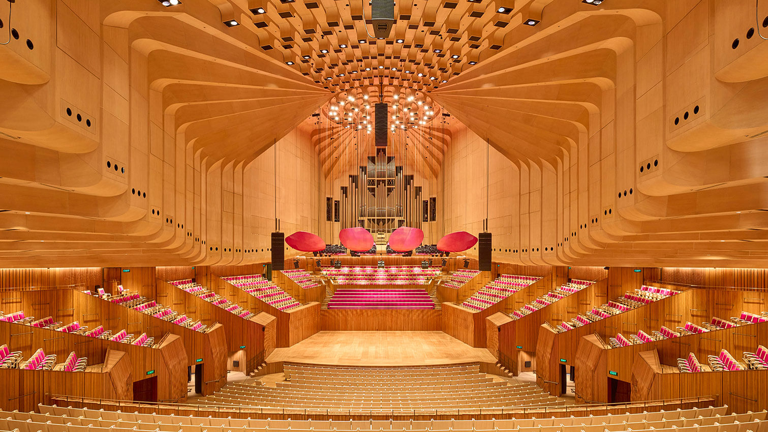

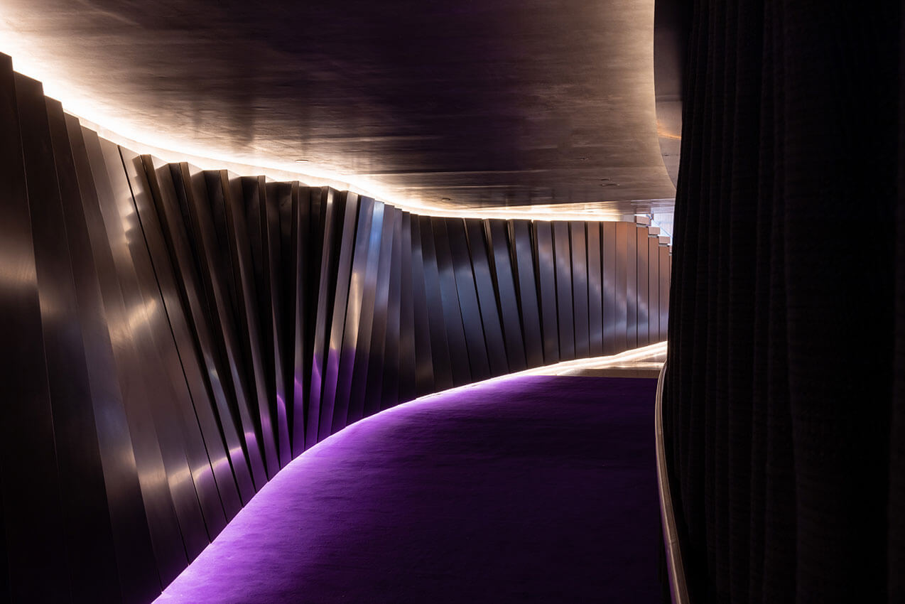
Just as a symphony requires each section of the orchestra to perform in perfect harmony, the refurbishment of Australia’s most beloved performance space seamlessly integrates design, innovation, and technical excellence to create a harmonious environment for both audience and musicians alike.
Respecting the legacies of both Jørn Utzon and Peter Hall, the project demonstrates exceptional virtuosity, striking a delicate balance between preserving the iconic character of the original space, whilst subtly infusing it with contemporary elements. The reconfigured hall and stage now create an orchestral experience, described as both vibrant and intimate, with sound quality that resonates with the brilliance of a Stradivarius violin.
Innovation and attention to detail are evident in every aspect of the refurbishment. Integrated operable wooden acoustic reflectors and sound-absorbing wall panels are meticulously detailed to optimise the acoustic properties of the space, whilst LED lighting creates an immersive visual environment that enhances performance, adding a rich new layer of sensory experience to the interior.
Improvements in seating, sightlines, acoustics, and access further improve the comfort and enjoyment of the audience. The result is an unparalleled concert experience that is technically advanced, visually stunning, and befitting of one of the world’s most celebrated buildings.
Completed in its 50th year, the Sydney Opera House concert hall refurbishment is a masterpiece – a symphony of design, innovation, and acoustic excellence. This is truly an achievement that deserves the highest recognition, and we applaud the entire project team for their remarkable performance.
AWARD FOR INTERIOR ARCHITECTURE
70 George Street_ COX Sydney Studio | Cox Architecture
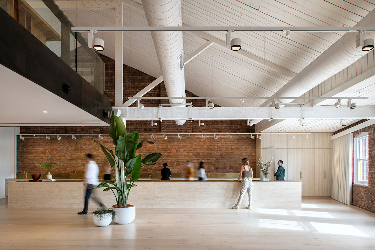
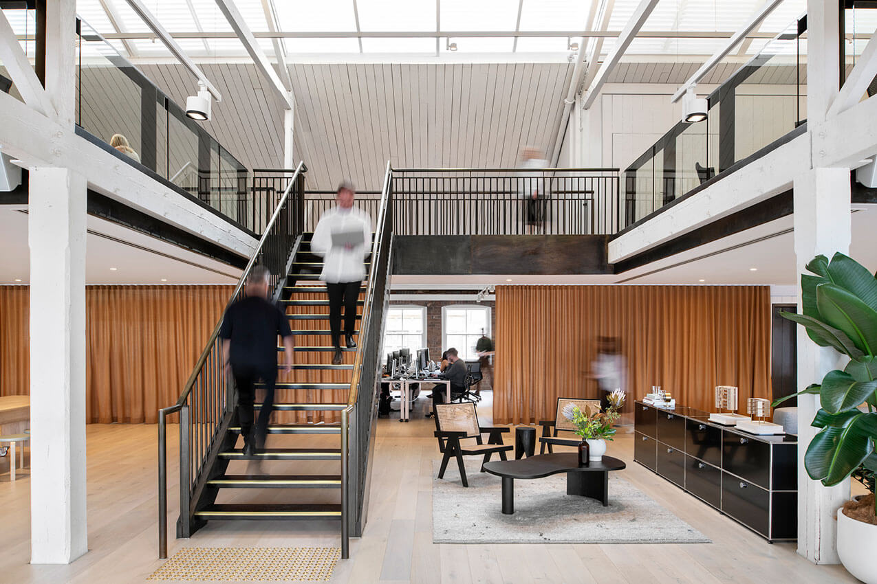
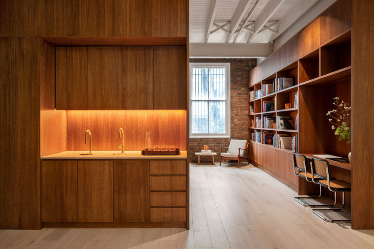
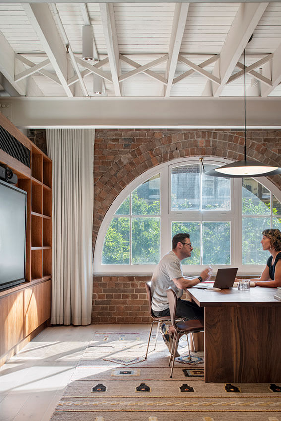
The new Cox Architecture studio is a masterclass of contemporary workplace design, delivering a rich mix of easily adaptable spaces underpinned by a rigorous but pragmatic approach to sustainability.
Built inside an inner-city heritage warehouse, every element of the fit-out can be dismantled and removed without leaving a trace on the existing fabric. A simple and carefully selected palette of materials is supplemented by a curated suite of found, reused, repurposed and recycled furniture. Technology is used in forward-thinking ways, such as automatically shutting off air-conditioning and prompting staff to open windows in good weather.
Avoiding trend-driven over-complication of the workplace, the design instead focuses on providing delightful and adaptable light-filled spaces that staff genuinely enjoy using. The Cox team is commended for delivering a remarkably well considered post-pandemic office design through their attention to detail, and their willingness to experiment with their new home in the city.
AWARD FOR INTERIOR ARCHITECTURE
Amara | SMART DESIGN STUDIO
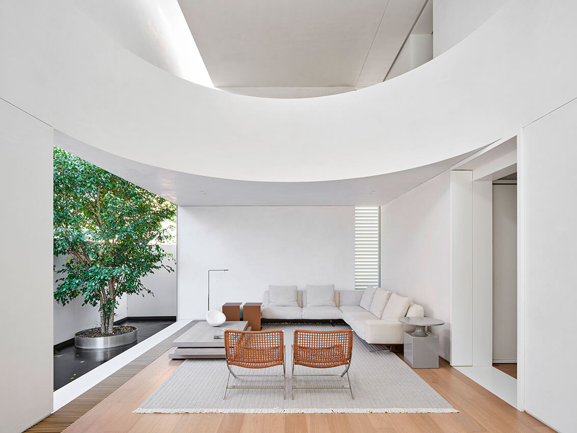
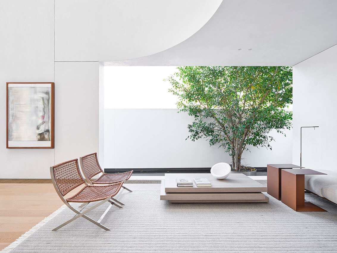
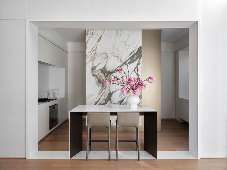
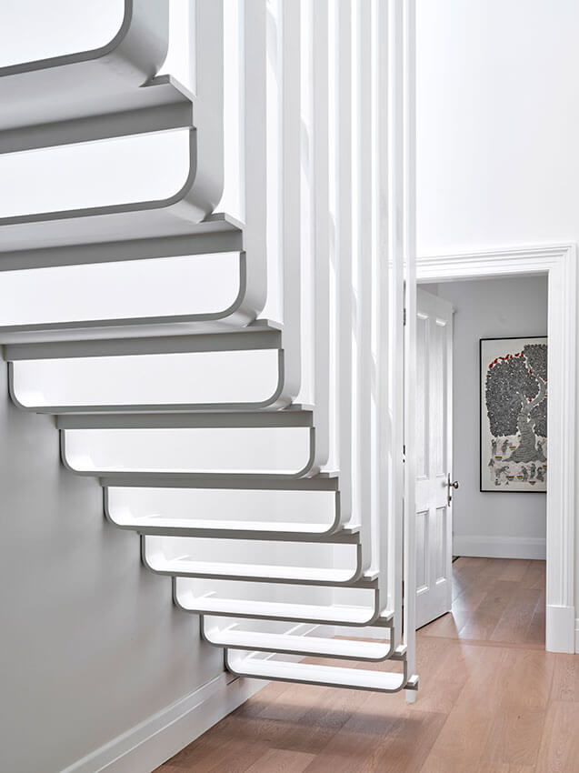
This project demonstrates architectural finesse in its reworking of an historic house with an elegant addition at the rear. The floor plan has been carefully rationalised and the interiors reflect a breath-taking design rigour.
Amara is a beautifully calm residence where each element feels deliberate and purposeful. The interiors of the original house have been reimagined with fabric panelled walls, white timber detailing and a suspended steel staircase. The formal simplicity of the house leads through to a crisp and sculptural double-height lounge room addition with a curved mezzanine. Here, the interiors conclude with a framed outlook to a tree centred in a black granite pond.
The project is remarkable in its confidence, reflecting an architectural practice adept at contemporary and long-lasting transformations of historic properties. The interiors are beautifully crafted, effortlessly minimal and they successfully combine two opposing parts into an entirely contemporary whole.
AWARD FOR INTERIOR ARCHITECTURE
Apartment for an Older Man | Plus Minus Design with Lymesmith
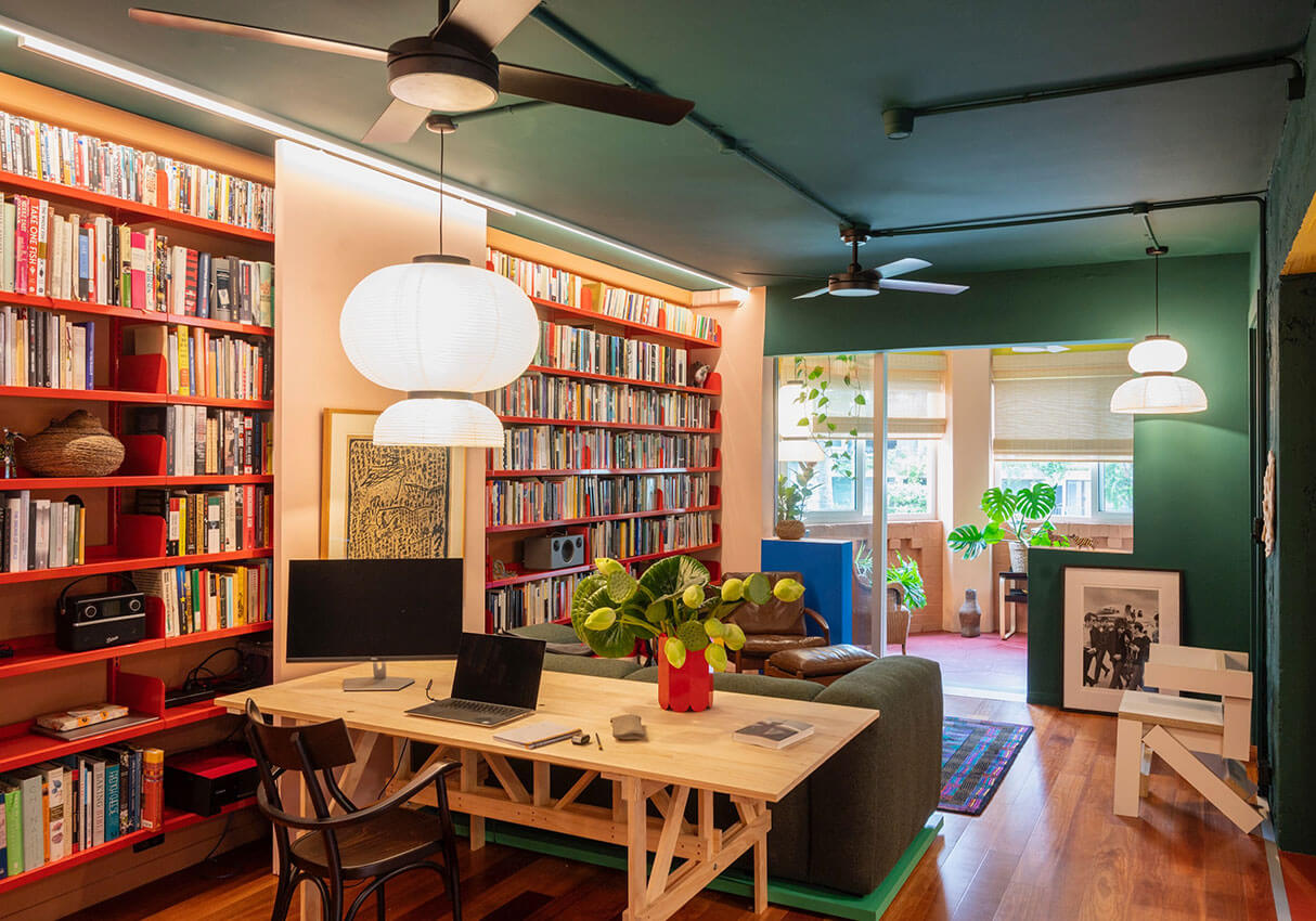
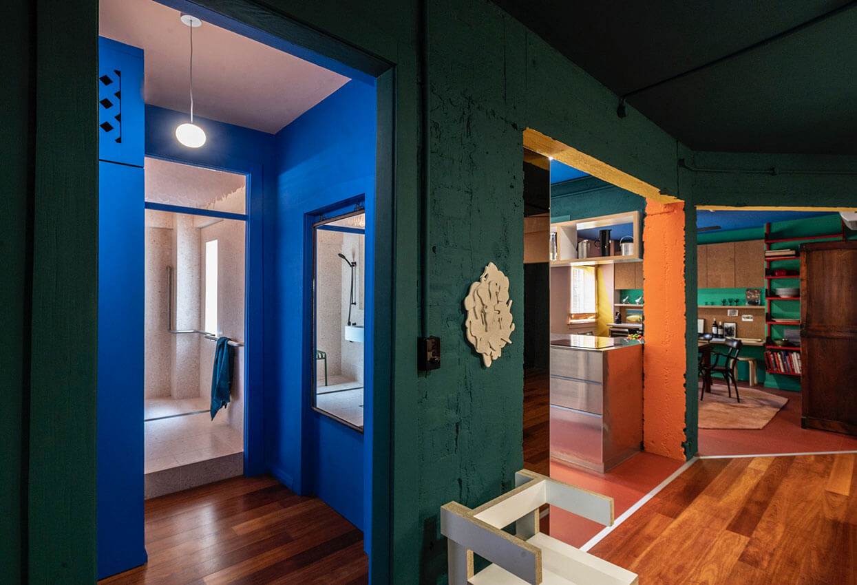
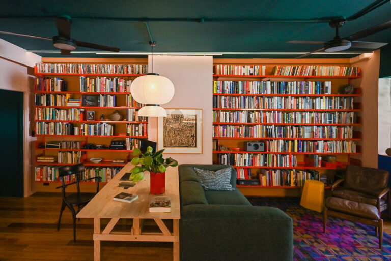
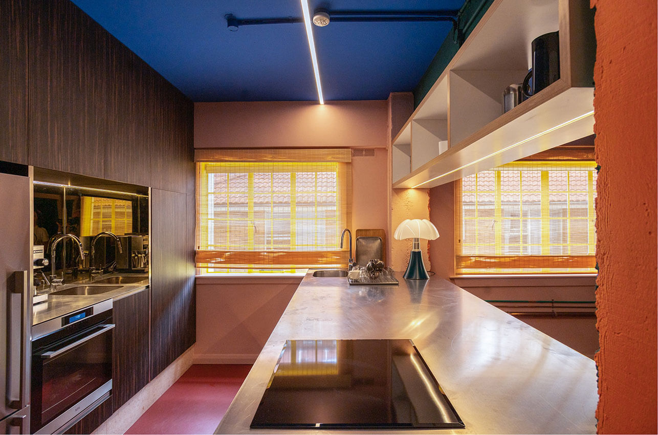
This project is a testament to the power of design to improve quality of life, for people of any age.
An innovative approach to this economical refurbishment has resulted in a complex and nourishing interior tailored closely to the client’s lifestyle, passions, and changing needs.
The result is a compact, visually complex, yet calm and comfortable interior interconnecting dining, kitchen, library, living, and sunroom spaces. The stripping back of layers to expose raw, uneven surfaces and services, as well as the fearless use of bold colours, are daring moves that create a richly nuanced and sensual spatial experience.
The collaboration between Lymesmith and Plus Minus Design on the colour scheme is especially noteworthy. Diverse influences including photography, cinema, Memphis design, and 15th-century paintings have inspired a rich and vibrant palette – the resulting relationship and juxtaposition between saturated colours and materials such aluminium and veneer is masterful.
The sensitivity to the changing needs and priorities of an older single man is commendable, as is an attention to detail in incorporating legacy pieces and age-important details. The result is a functional and vital space celebrating the client’s life and legacy.
AWARD FOR INTERIOR ARCHITECTURE
Art Gallery of NSW, Sydney Modern building, Gallery Shop | AKIN ATELIER
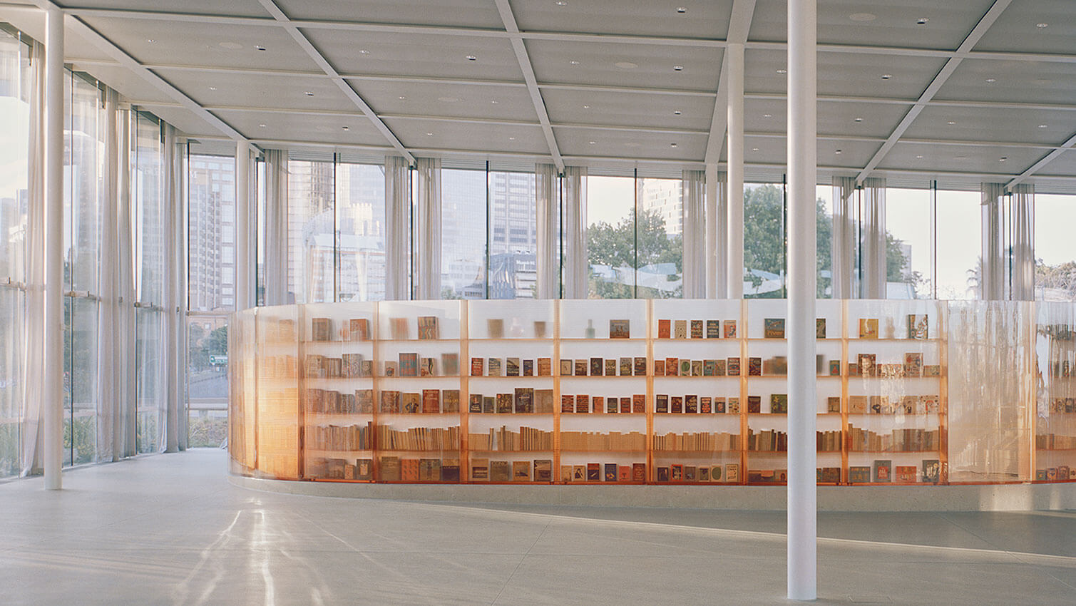
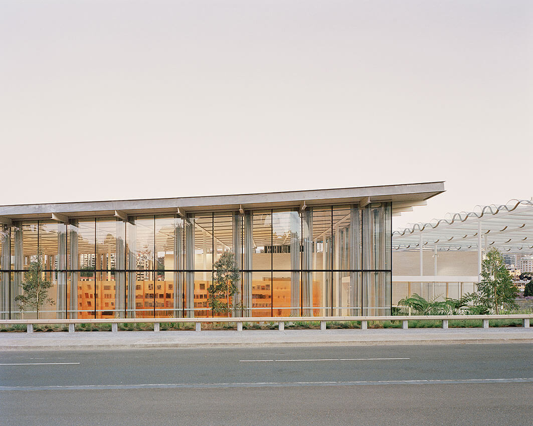
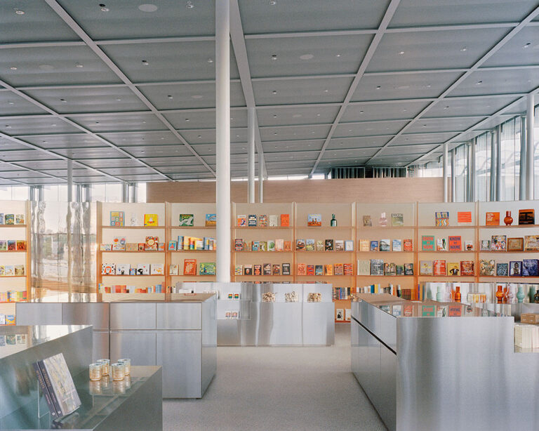
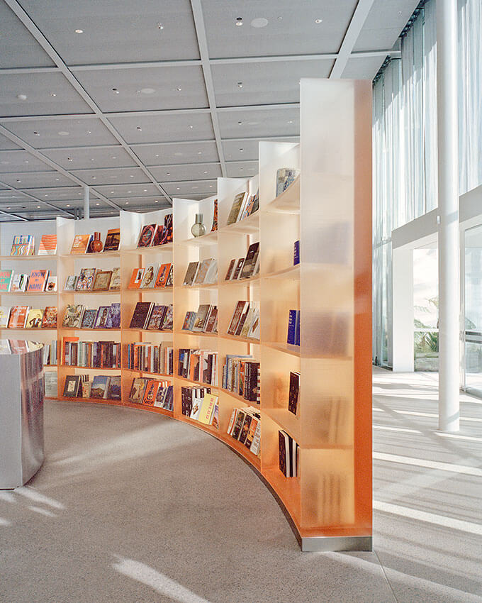
The Art Gallery Shop demonstrates the remarkable outcomes that can be achieved when Architectural ambition is matched by the unflinching support of a committed client. Conceived through a stunning, exactingly and detailed hand-crafted approach to concept and construction, the delightful design of the bookshop is belied by the simplicity of its form.
With both space and display shelves created by 29 individual panels that are composed of hundreds of uniquely coloured bio-resin layers, the project masterfully synthesises Akin Atelier’s own material experiments with know-how from surfboard manufacturer Hayden Cox. The result fits sympathetically with the minimal interiors of the new Gallery, while also playfully brushing in a delicate local essence that captures the sense of Sydney’s unique environment.
Akin Atelier and the client team are commended on committing to a bold experiment in the design and procurement of the Bookshop, which has delivered a remarkable addition to one of the most important public buildings in New South Wales.
COMMENDATION FOR INTERIOR ARCHITECTURE
Art Gallery of NSW Library and Members Lounge | Tonkin Zulaikha Greer Architects
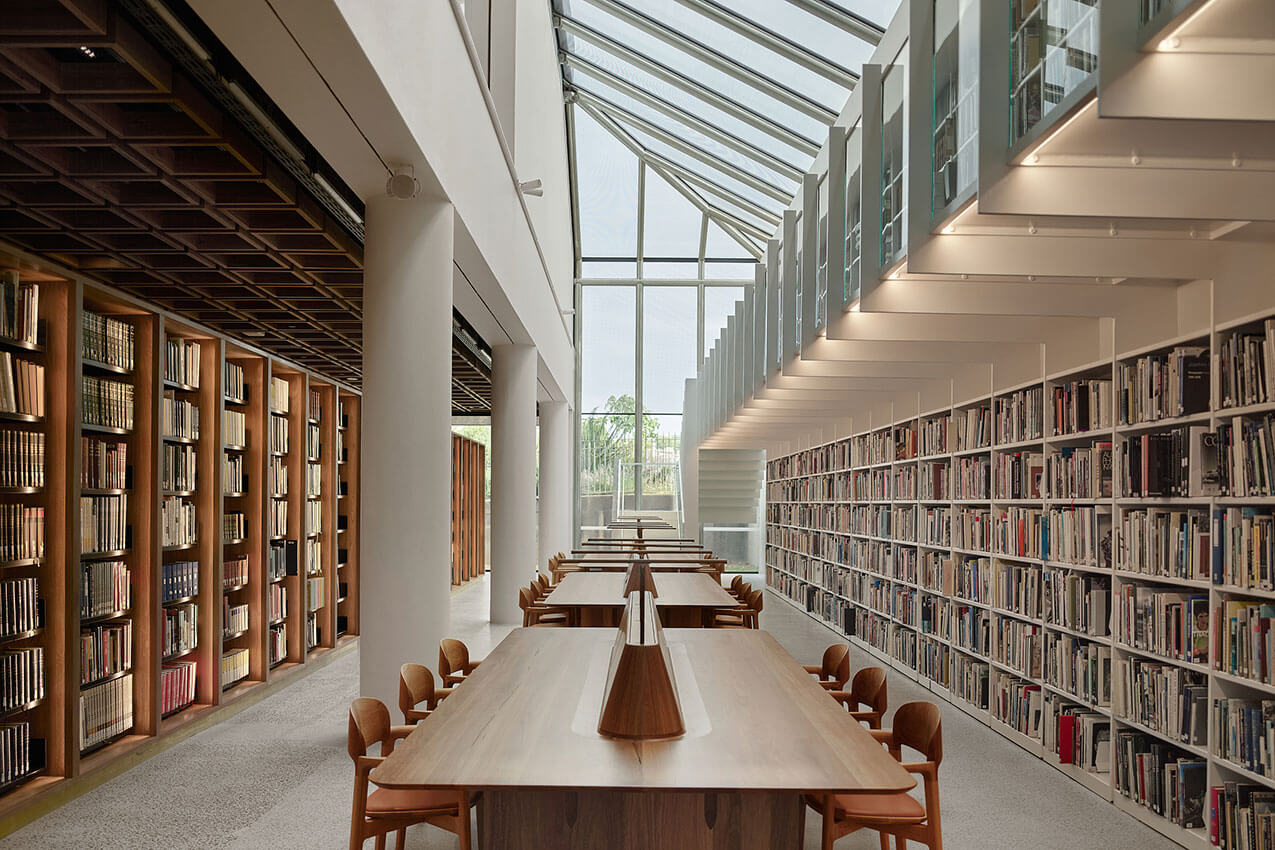
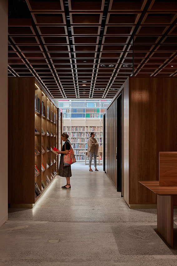
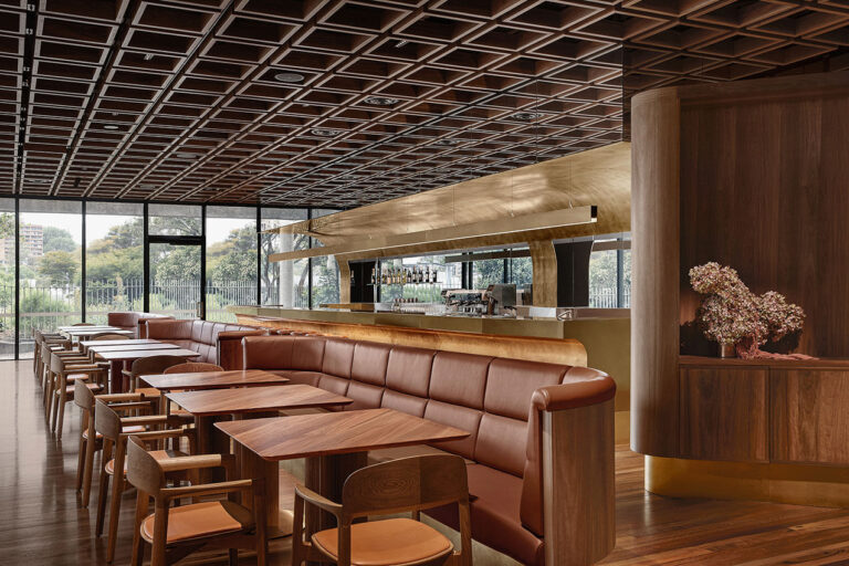
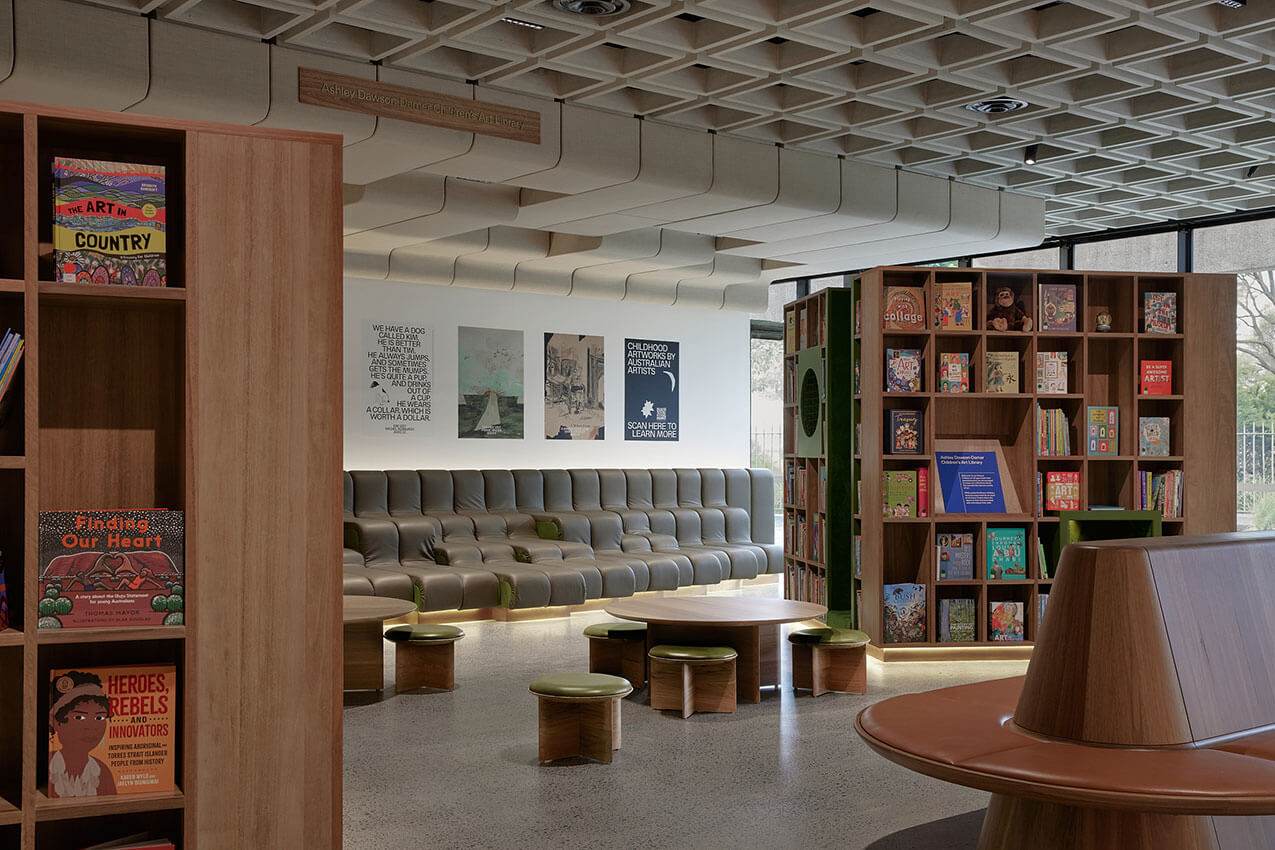
At the Art Gallery of NSW Library and Members Loungen by Tonkin Zulaikha Greer Architects have masterfully created spaces that remind us of the magic and wonder of books – especially art books. Rows and rows of beautifully illuminated timber shelving stacks create an immersive and theatrical experience in the bowels of the gallery.
This is a joyful project that integrates seamlessly with the existing building in its formality and detailing, but also breaks new ground in many ways, not least with a very playful Children’s Art Library. The successful outcome is testament to the relationship between the architects, local furniture design talent Tom Fereday, and a visionary client in the AGNSW.
COMMENDATION FOR INTERIOR ARCHITECTURE
Corrs Chambers Westgarth | Bates Smart
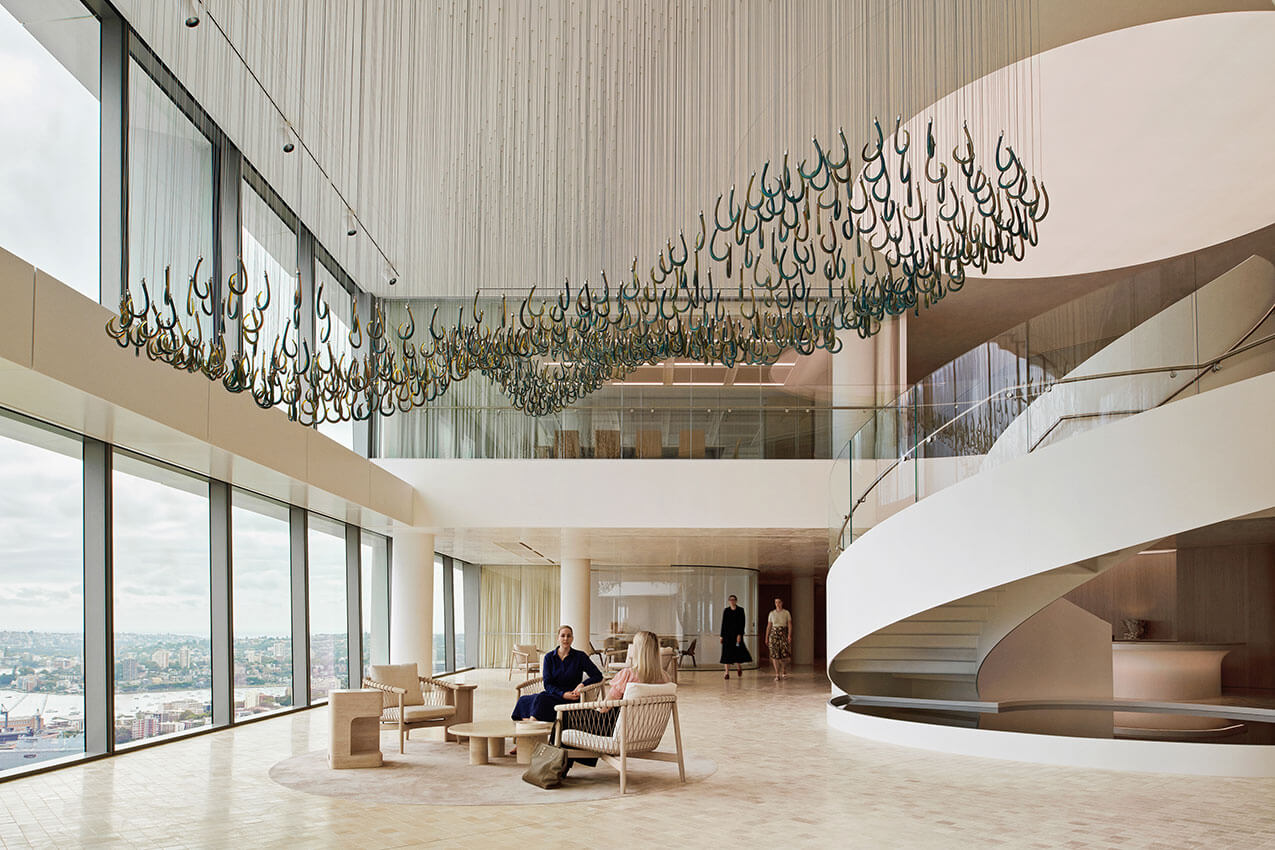
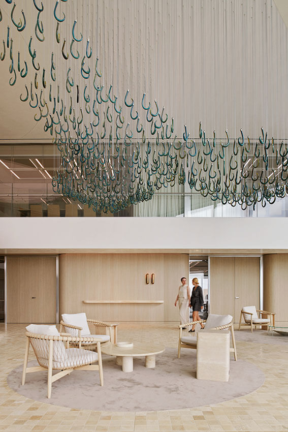
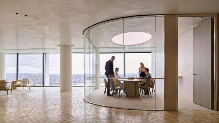
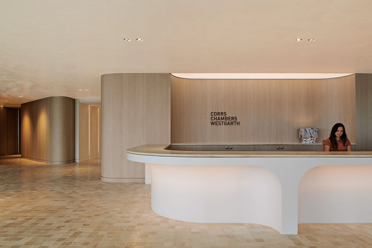
Integrated over 4 floors of the iconic Quay Quarter building, the interior theme of this workplace is reverently inspired by the organic forms of the harbour coastline, creating a place for productivity and wellbeing to coalesce.
The double height entry is a particularly memorable experience. Suspended from the ceiling, the immense delicate glass artwork by Yhonnie Scarce becomes the focal point. Deft planning of each level ensures the sweeping views are shared and equitable throughout. The palette is muted and restrained with richness added through tactility and reflectivity of materials.
A highly refined and resolved interior – an exemplar for staff and client experience.
COMMENDATION FOR INTERIOR ARCHITECTURE
Yirranma Place | SJB
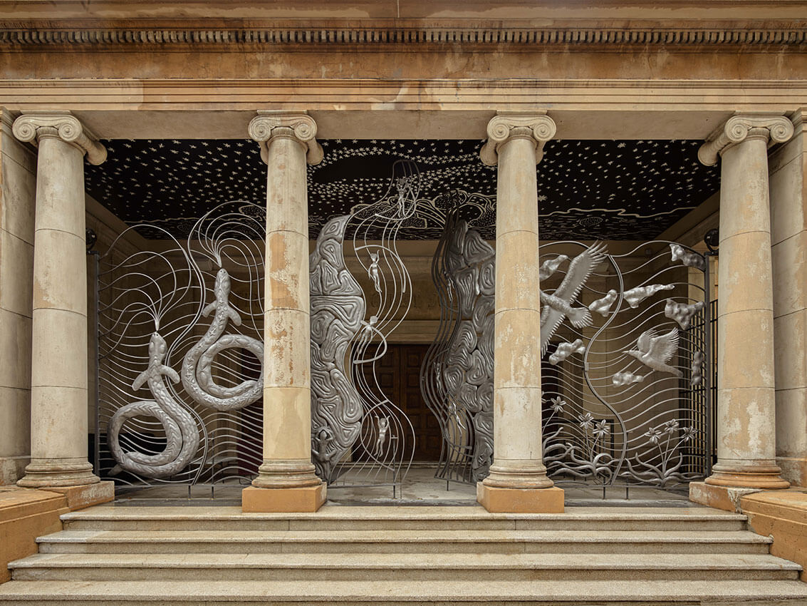
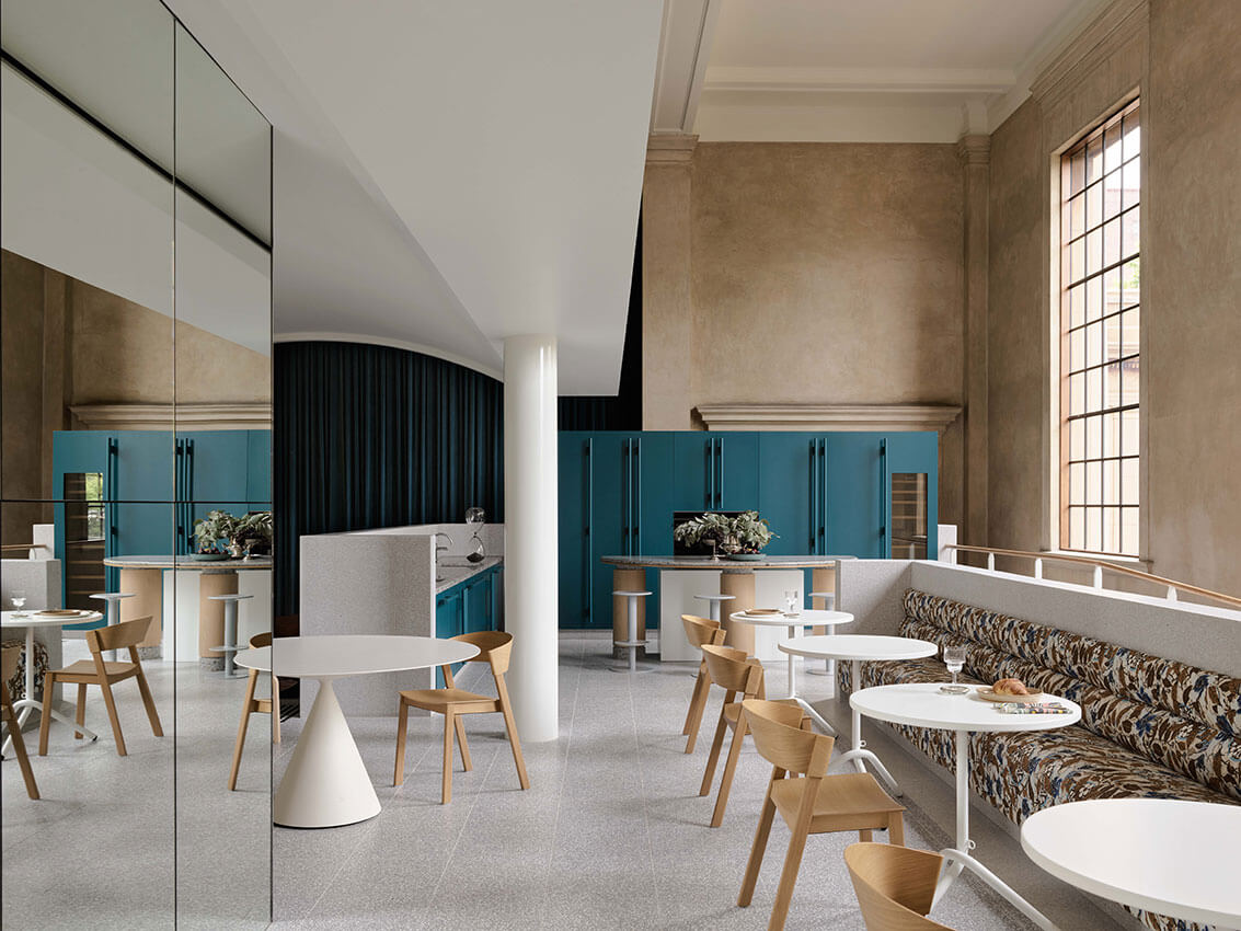
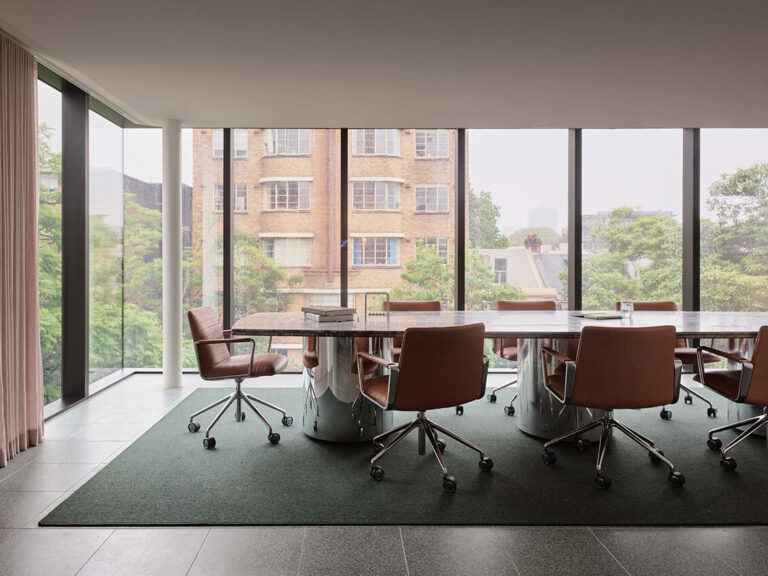

Set within the imposing 1920s Beaux Arts era building and inspired by the Paul Ramsay Foundation’s ethos ‘One team, one dream’, the interior of Yirranma place is a vibrant and sensitive adaptation which navigates a highly complex programme with surprise and delight.
The interiors achieve a level of contemporary craft and detail that is refined and commensurate with that of the original historic building. New additions are sculptural, robust and sit respectfully within – adding a meaningful layer for the next chapter of this historic building.
URBAN DESIGN
COMMENDATION FOR URBAN DESIGN
City of Sydney Street Furniture | Grimshaw and City of Sydney
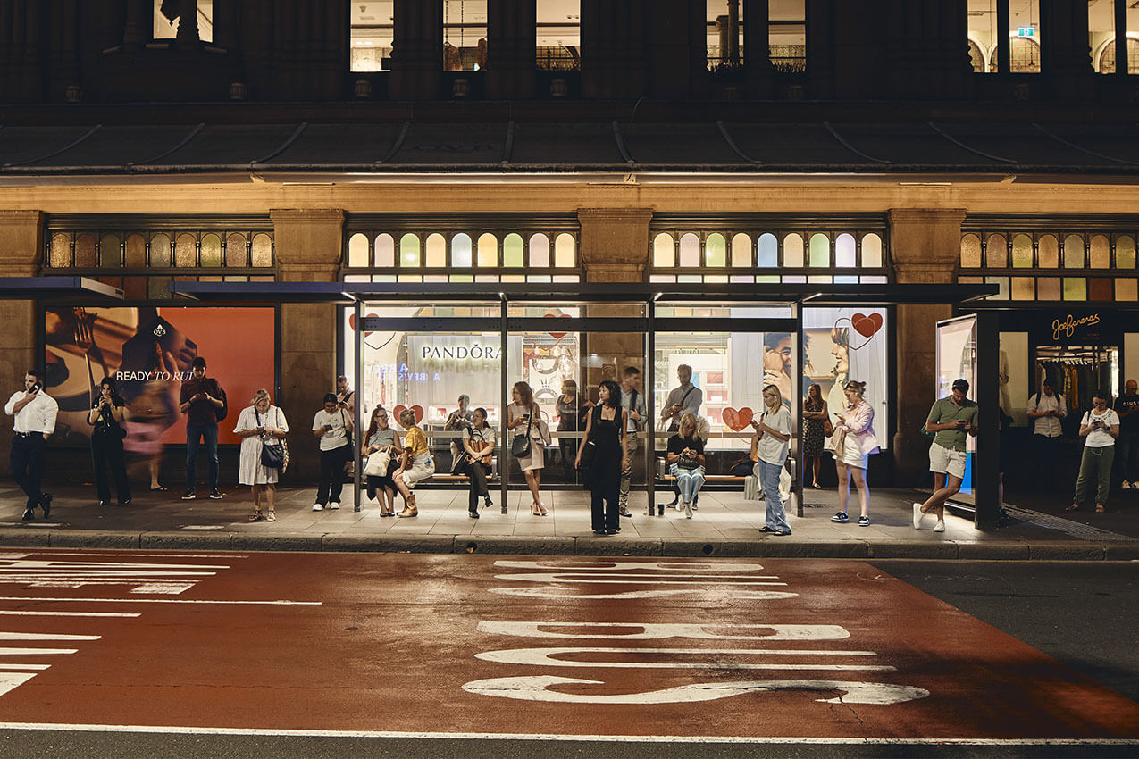
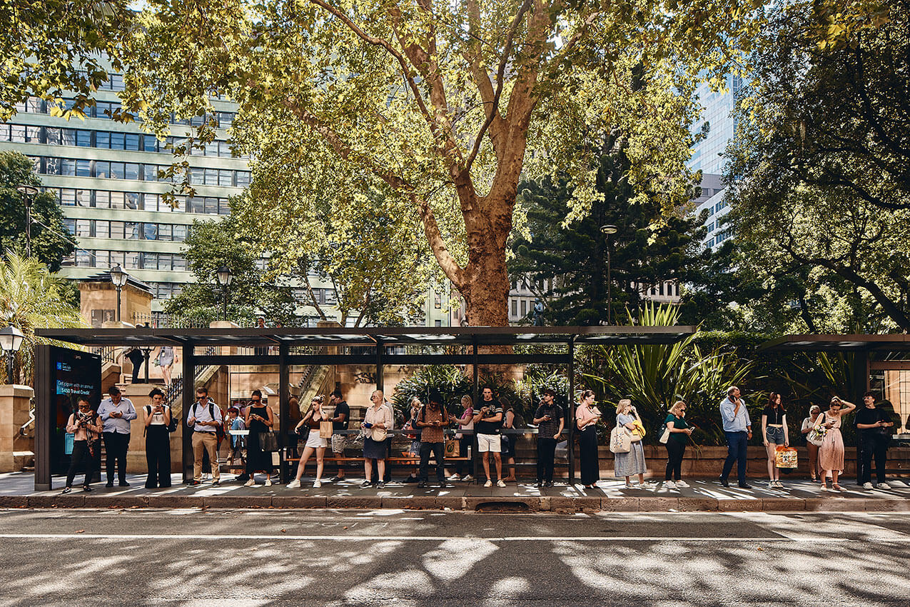
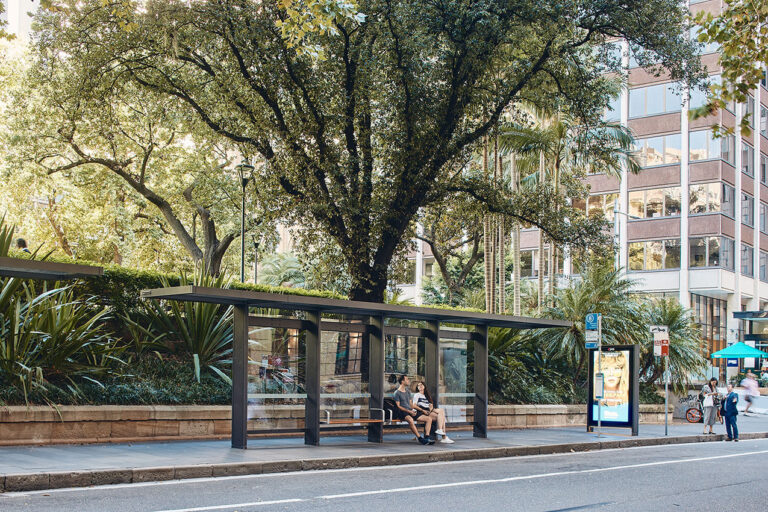
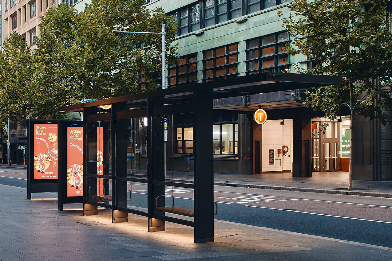
City of Sydney street furniture, is an ensemble of sustainable and energy-efficient amenities designed to make the city more inviting, inclusive and accessible to all. The new infrastructure includes over 300 new bus shelters, new kiosks, communication pylons and a doubling of toilets for the public’s convenience.
The refined furnishings of bronzed aluminium and glass have a timeless and recessive quality. They are unobtrusive, blend into a variety of contexts, and avoid cluttering their setting.
Conceived as a series of modular, interchangeable components with clever interface connections, the structures are readily adaptable. Maintainable, recyclable, and upgradable, this is a system designed for longevity in an ever-evolving city.
COMMENDATION FOR URBAN DESIGN
Opera Residences | Tzannes and Crone (Executive Architect)
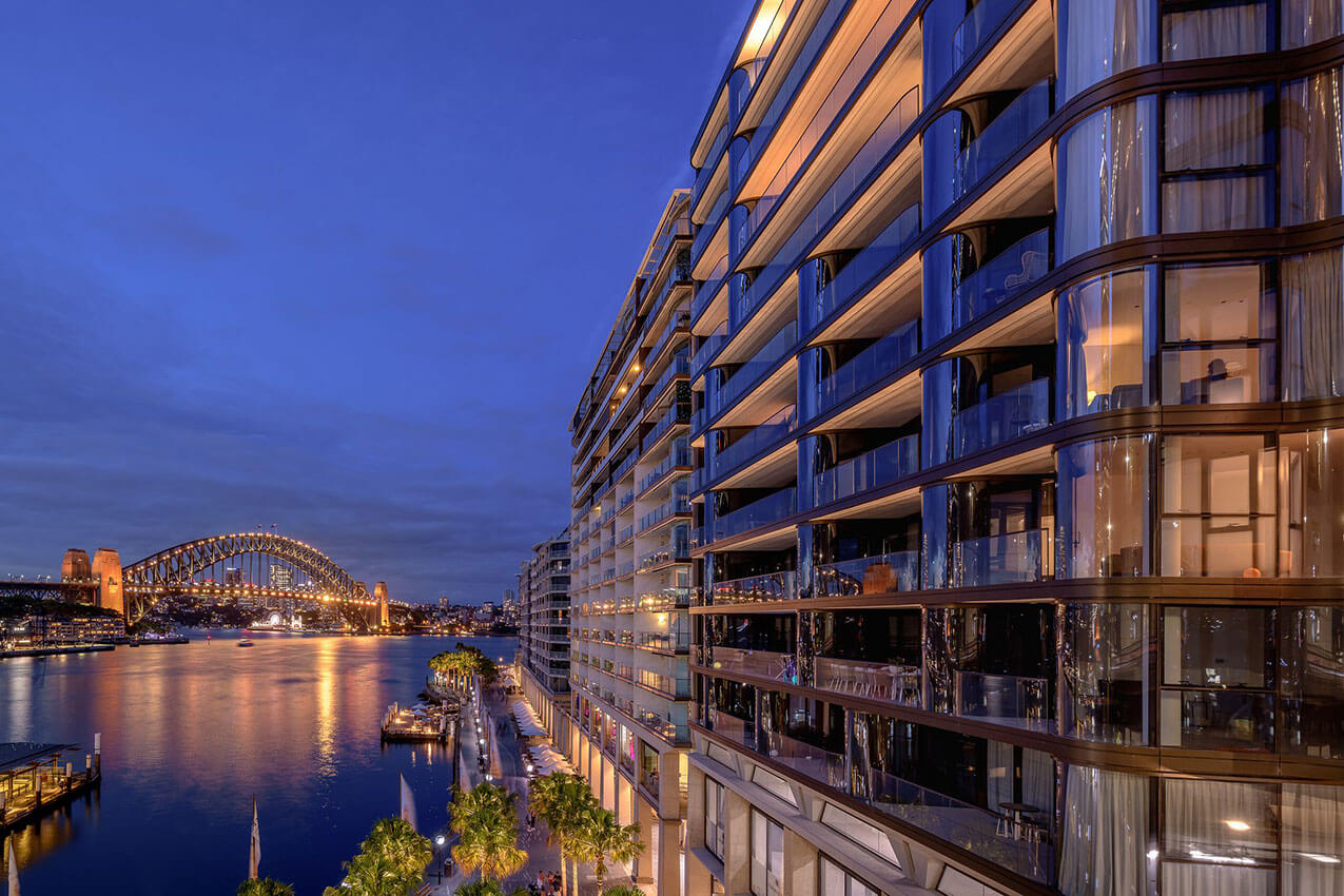
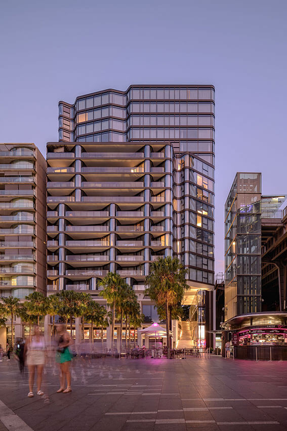
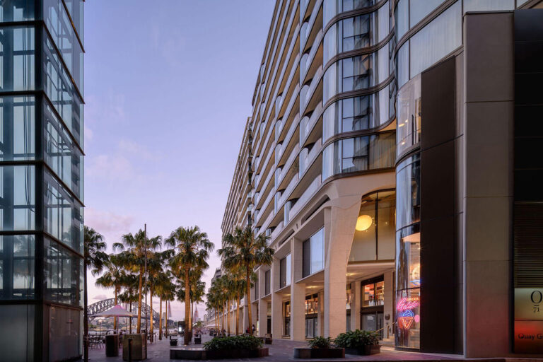
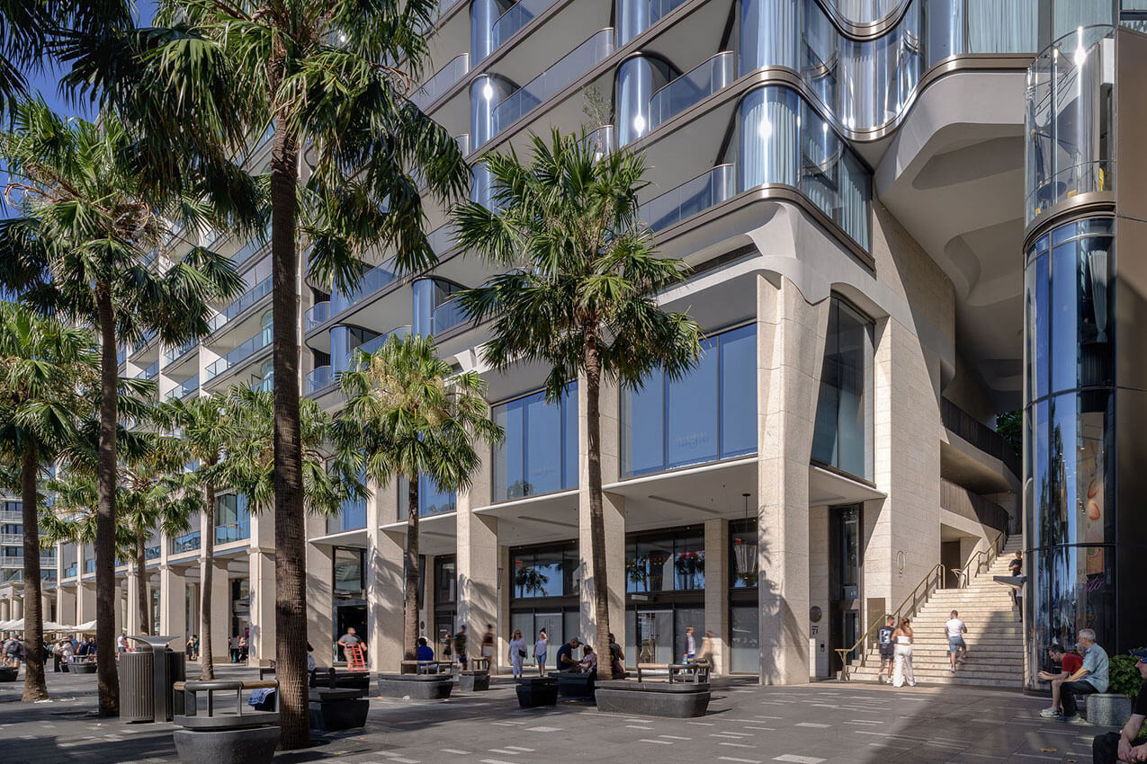
Refining one of Sydney’s most prominent public spaces, Opera Residences completes the urban block of East Circular Quay. Respectfully continuing the rhythm of the adjoining colonnade and signalling a new public stairway connecting the foreshore to Macquarie Street.
The design thoughtfully considers public movement and desire lines through the precise location and geometry of the stairway, kiosk and tree plantings aligned with the colonnade column grid.
The framing of the public stairway along the ferry wharves promenade, makes evident the presence of the Botanic Gardens greenery beyond. Subtle sculptural modelling and meticulous detailing are informed by context, articulating between the grounded podium, tower, lively quayside colonnade, and the more reserved frontage to Macquarie Street.
SMALL ARCHITECTURE
The Robert Woodward Award for Small Project Architecture
Mona Vale Beach Amenities and Lifeguard Facility | Warren and Mahoney
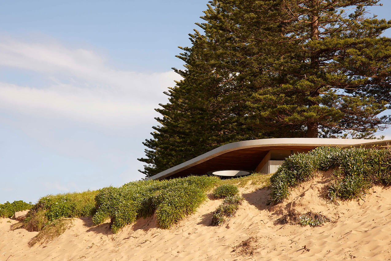
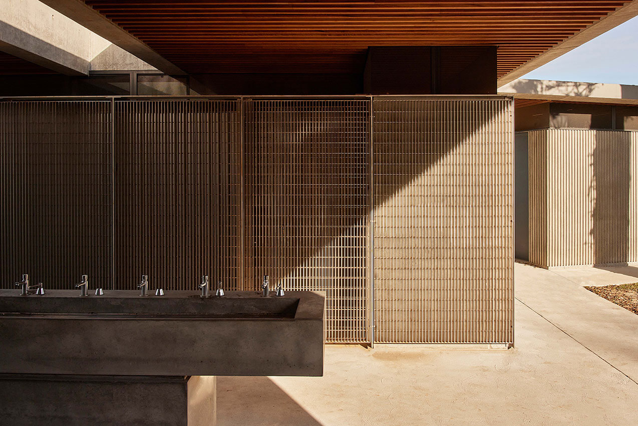
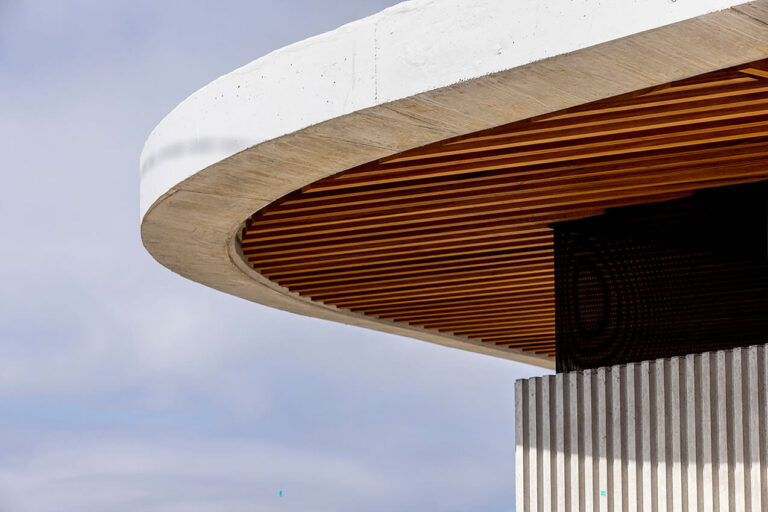
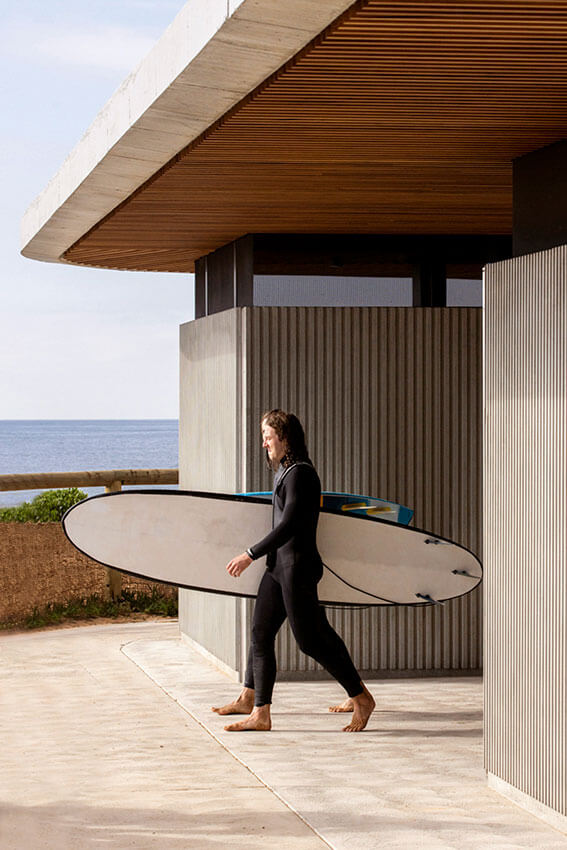
The Mona Vale Beach Amenities and Lifeguard Facility is a robust yet poetic example of small-scale public architecture. It provides essential services whilst creating a positive social place and integrates beautifully into its natural surroundings. Its siting within the landscape is exceptional, providing both visitors and lifeguards with important views of the beach and ocean pool.
The site plan is well considered, with the outdoor landscape using rough-hewn sandstone blocks to create a ‘place to meet’ and a clear demarcation of the space. This area acts as a successful pivot point linking the hand wash area and the outdoor showers. A generous skylight is carved into the heavy roof form, allowing ample natural light to flood the interiors, creating naturally bright, safe and inviting spaces. The materials used in the construction are robust, designed to withstand both vandalism and the harsh ocean environment.
The simple move of rhythmically profiled precast concrete walls breaks down the mass of the form and lends the building a corduroy-like skin. The restrained material palette of the external envelope is well-suited to the Northern Beaches landscape, and creates a stable background aesthetic to contrast with the colourful interiors. Robust civic detailing adds a sense of permanence and significance to the architecture despite the building’s small size.
AWARD FOR SMALL PROJECT ARCHITECTURE
Day01. Gallery | Ian Moore Architects
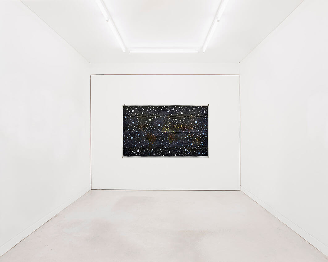
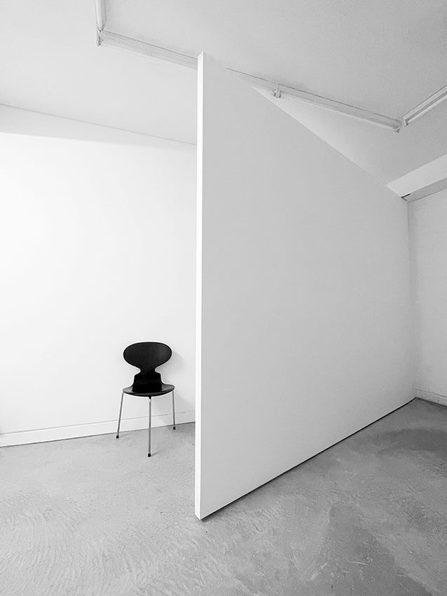
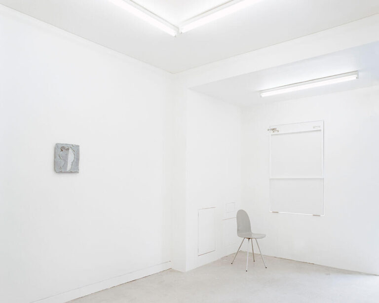
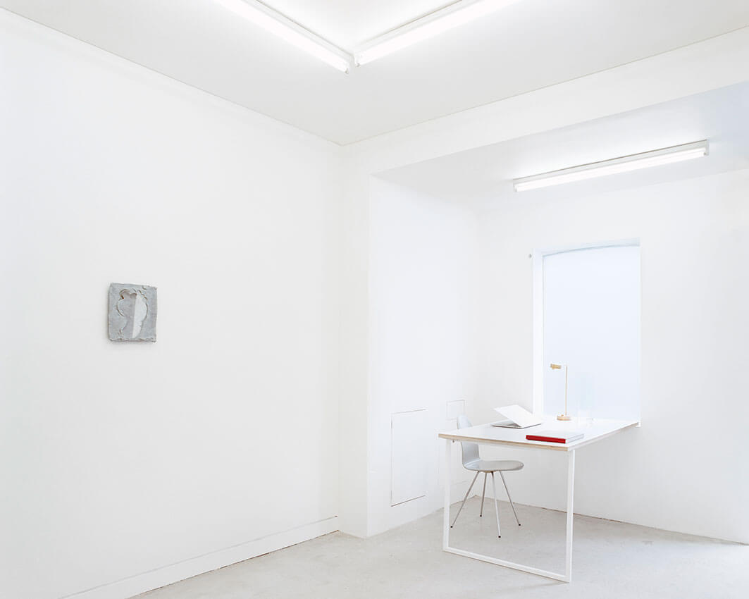
Day 01 gallery on Crown Street is an excellent example of an architectural idea pared down to a radically basic form, but which is nonetheless very compelling and refreshingly unapologetic. The space is tiny, but the clever use of design elements make it feel far larger than it is. To suit a low budget of a jaw-dropping $10,000, the architect adopted a highly targeted approach, only adding what is strictly necessary to create a functional and inviting gallery space, but one which surprises and delights. Two simple moves transform the space: the use of the whole back wall as one large pivot door, which creates an extra display space while hiding back-of-house functions; and the reception desk which hinges up as a display window.
Day 01 gallery is an inspiring example of targeted intervention in architecture. Every decision has been made carefully to maximise functionality and efficiency whilst also maintaining the aesthetic power of the space. The project also exemplifies a type of sustainability which should be talked about more: to employ simplicity and wit to require little in the way of money or materials to achieve ones aims.
AWARD FOR SMALL PROJECT ARCHITECTURE
Dimensions X / Farm Stay | Peter Stutchbury Architecture

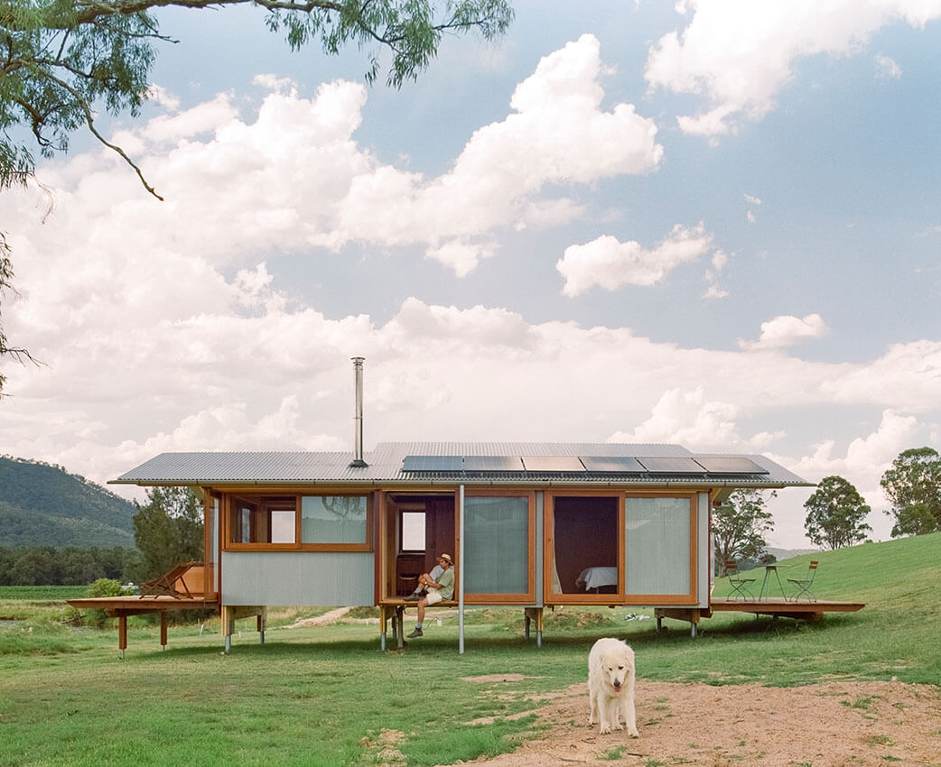
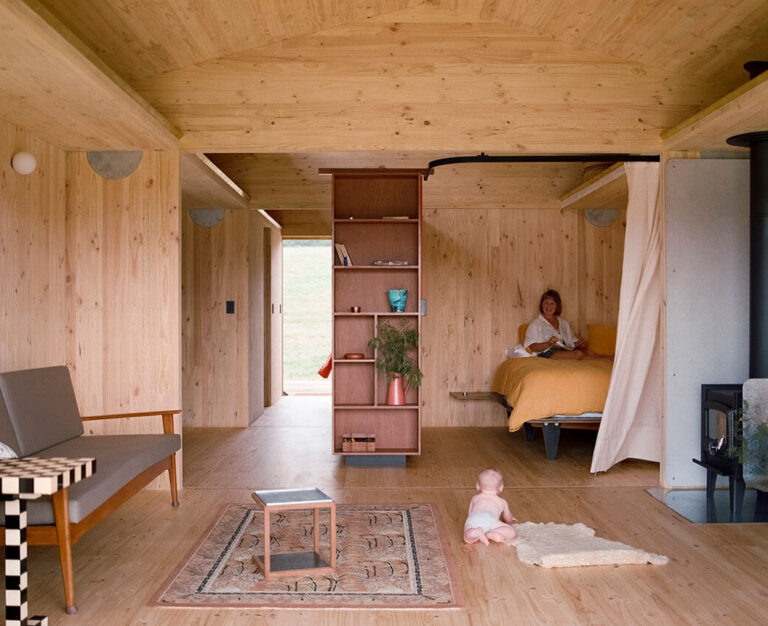
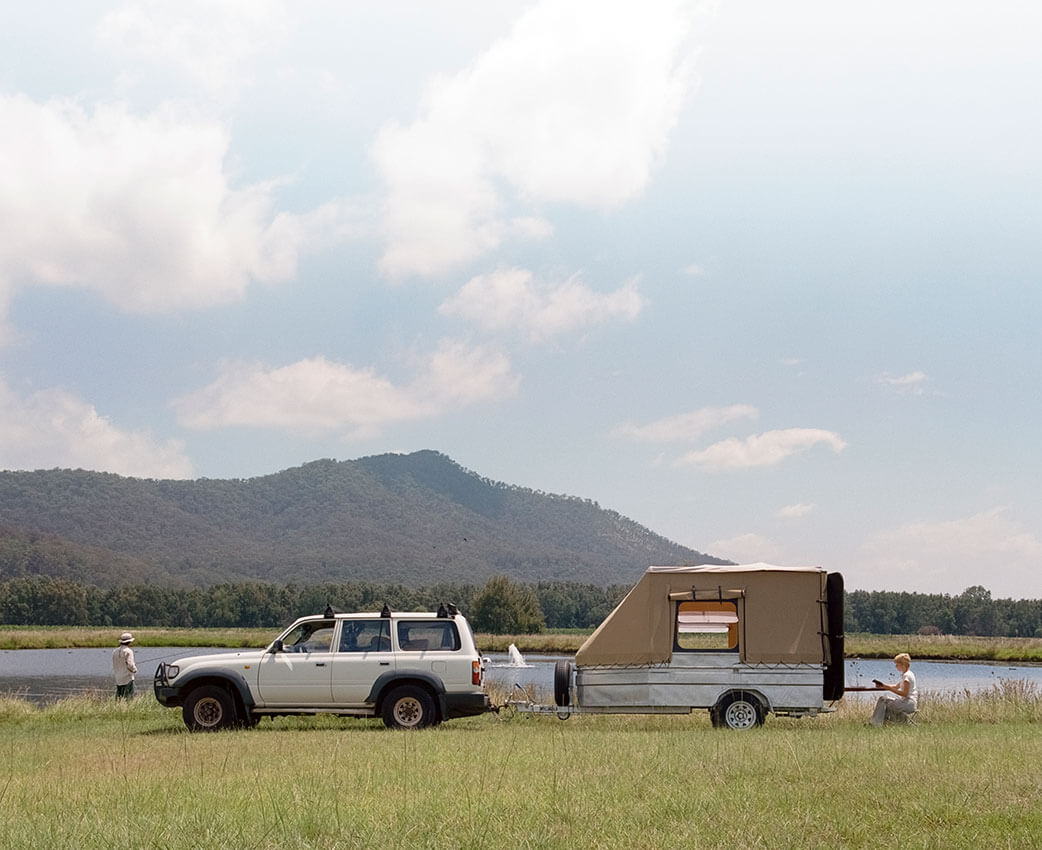
‘Farm Stay’ by Peter Stutchbury Architecture is a prime example of an interdisciplinary, sustainable, and socially progressive approach to prefabrication construction which nevertheless achieves high architectural quality. The project’s design and construction process focuses on an efficient and sustainable economy of materials, happily reaching into and reworking the supply chain to suit its needs. The collaboration between the Stutchbury team, site trades and the Cross-Laminated Timber (CLT) manufacturer has resulted in an impressive outcome that highlights the efficiency, cost effectiveness and creative potential of prefabrication.
The plug-and-play approach to construction is particularly noteworthy, with the project’s prefabricated elements assembled on-site. This approach allows for a flexible integration of the structure’s piles into the natural landscape, minimising its impact on the groundscape.
While ‘Farm Stay’ excels in a rural context, it remains unclear how it might be deployed in a tight urban or suburban context. Nevertheless, the project’s success in rethinking and optimising the supply chain demonstrates the potential for sustainable, cost-effective prefabricated structures more broadly.
‘Farm Stay’ showcases the possibilities of prefab architecture in creating sustainable, elegant buildings with its own compelling architectural language.
COMMENDATION FOR SMALL PROJECT ARCHITECTURE
Stealth Pavilion | Plus Minus Design
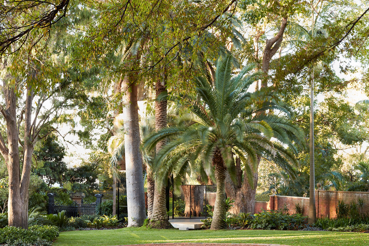
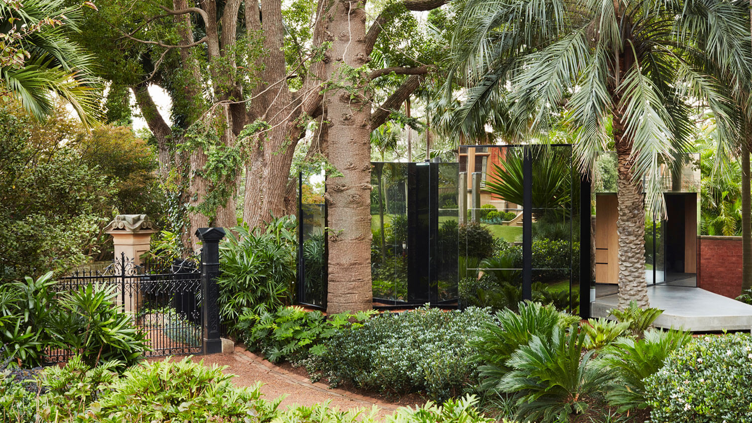
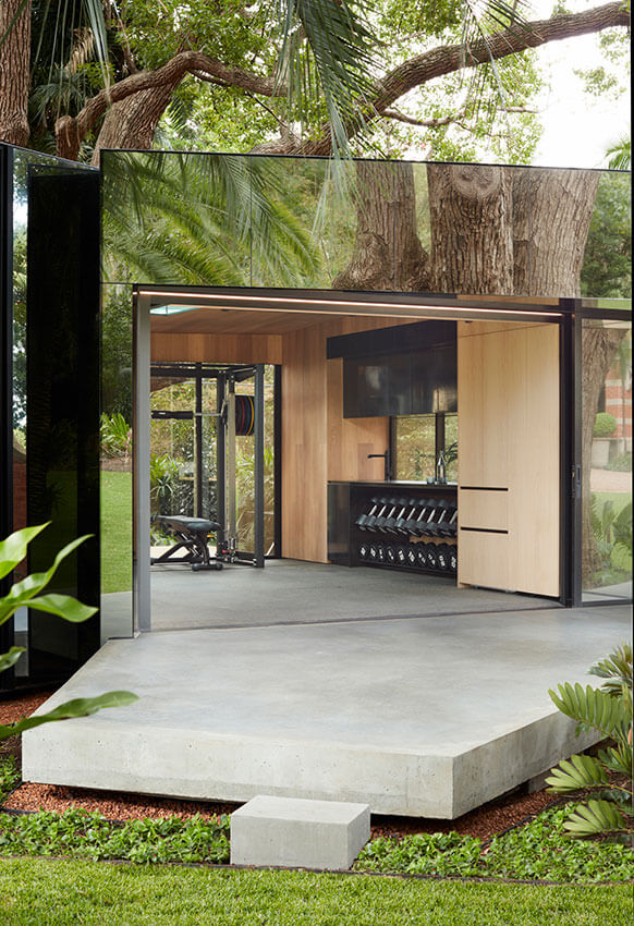
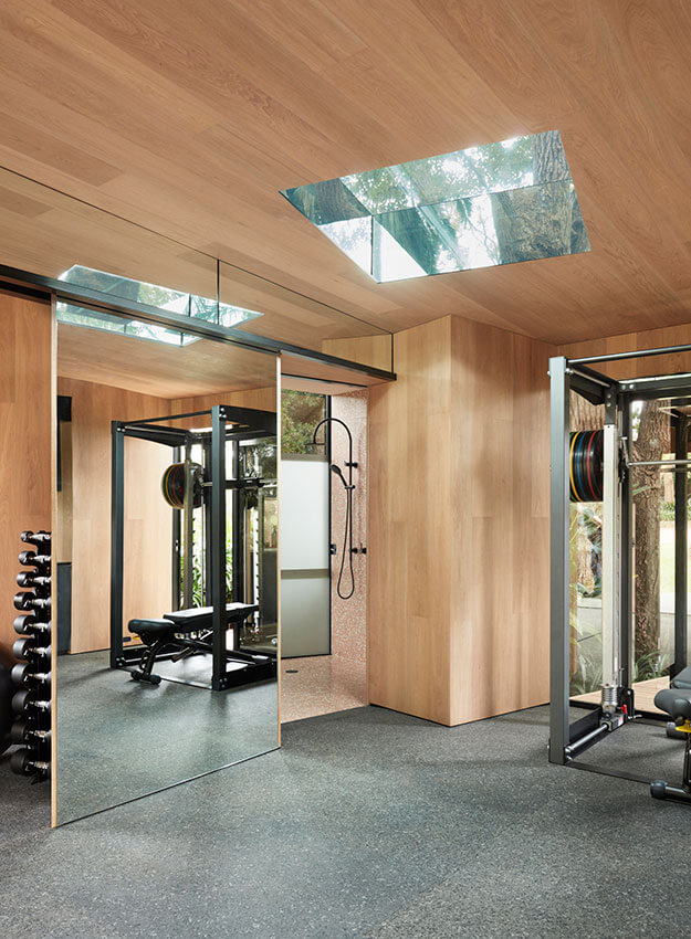
‘Stealth Pavilion’ by Plus Minus Design is an unexpected structure blending into a heritage listed garden. Its mirrored skin weaves through existing established trees, tiptoeing over tree roots within required protection zones.
Construction methods, detailing and materiality has been finely executed, with special mention given to a well-disguised WC. This multifaceted pavilion can be easily converted from a home gym into a guest house, rendering it an unexpectedly sympathetic addition to the adjacent Heritage listed house and garden.
SUSTAINABLE ARCHITECTURE
The Milo Dunphy Award for Sustainable Architecture
Lane Cove House | SAHA


This is a novel approach to a complex challenge: how to keep a growing multi-generational family together – on a modest budget. Rather than default to a knock-down-rebuild or a studio taking over the garden, the inspired move was to create a second home on top of the existing – in a way that is affordable, beautiful, functional, and contributes to the public realm.
Supported by a streamlined and re-glazed ground floor with a new internal stair, the second floor responds to the existing structure and layout. The insertion of courtyards into the plan brings abundant light, air, and nature views to the modest footprint, set within a humble palette of natural materials. The vertical extension has retained the much-loved and well-established gardens which play a central role in the family’s wellbeing.
As a counterpoint to the common assumption that an old home is no longer fit for purpose, the architects have provided an exemplary demonstration of inner suburban density done well, with a respectful urban response, an efficient and affordable build, a wonderfully natural, healthy, and low energy first floor addition, and the significant extension of the existing home’s lifespan. A wonderful synthesis of low carbon and nature-filled living.
AWARD FOR SUSTAINABLE ARCHITECTURE
Bay Pavilions Arts + Aquatic | NBRS with Donovan Payne Architects
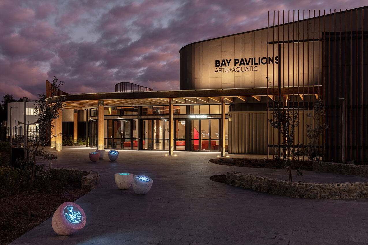
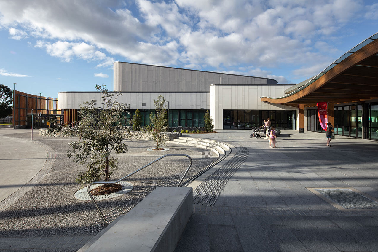
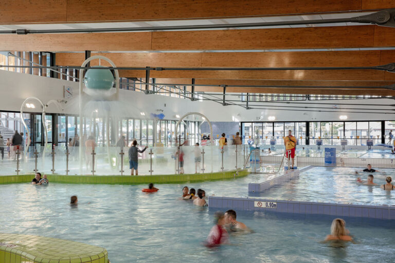
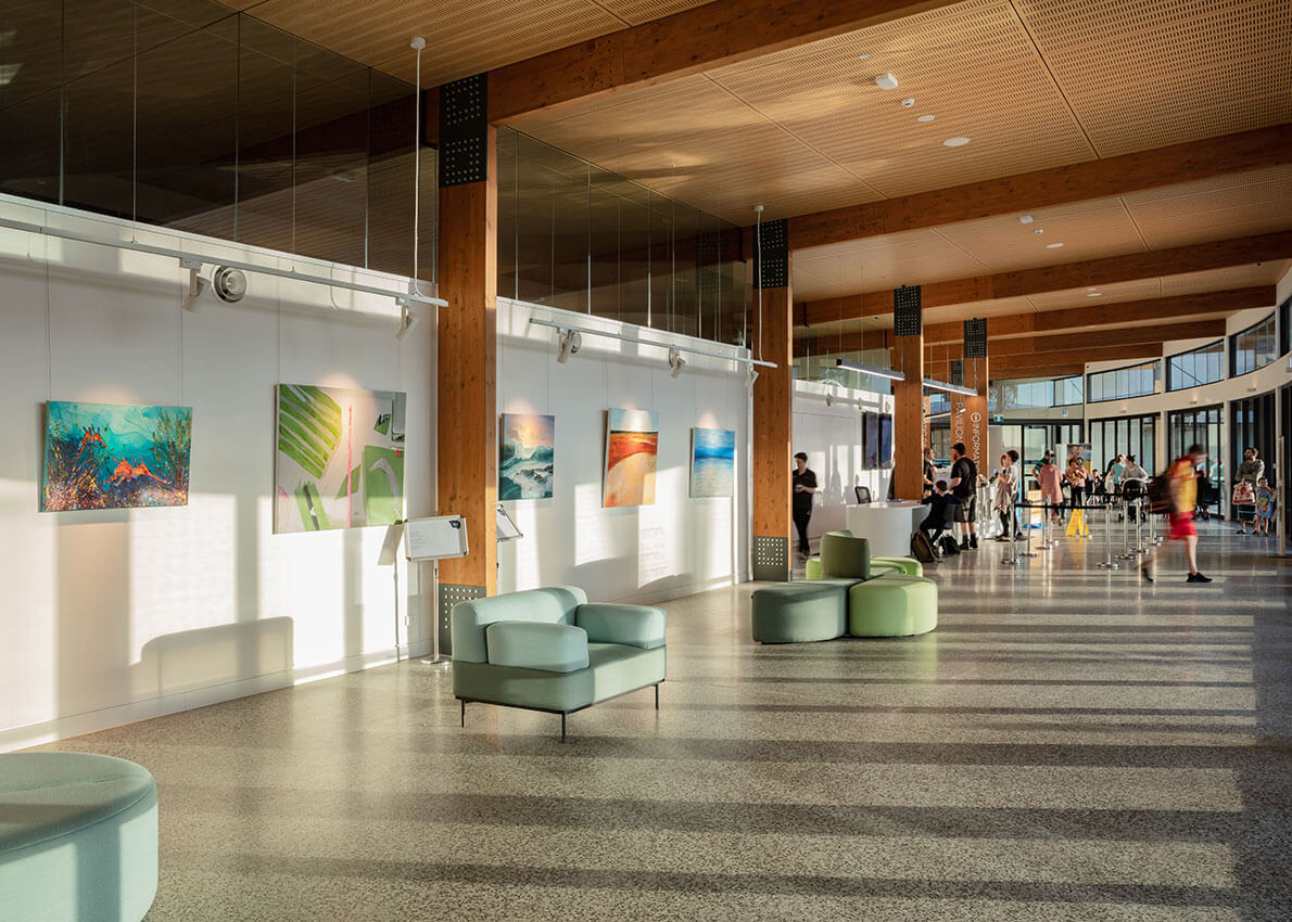
An elegant and efficient floor plan with two distinct programs anchored by the entry hall and café space. On one side sits the impressive theatre with its suite of function rooms and back-of-house spaces to serve a diverse and culturally active community. On the other an aquatic centre with multiple pools, wet play areas and gymnasium to support a broad range of users including the elderly. The functional and efficient configuration using robust and low maintenance materials, delivers operational energy and labour efficiencies for the operator, maximises the use of built space, and promises a long lifespan for this building.
Delivered within the constraints of a tight budget, the demands of a public building, and the complexity of multiple programs, the architects demonstrated commendable engagement with the community, leading to their refreshing and practical approach – including the timber-clad curving forms of the river-side site reflected throughout.
An honest and hard-working result that is well positioned to enjoy an enduring and productive life with the community.
AWARD FOR SUSTAINABLE ARCHITECTURE
Re-Generation House | Alexander Symes Architect with Second Edition and Jane Theau
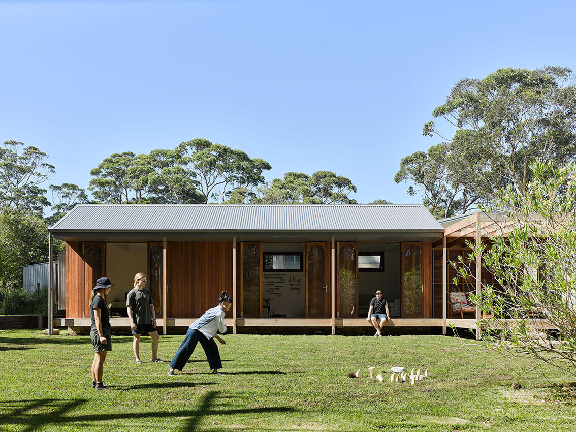
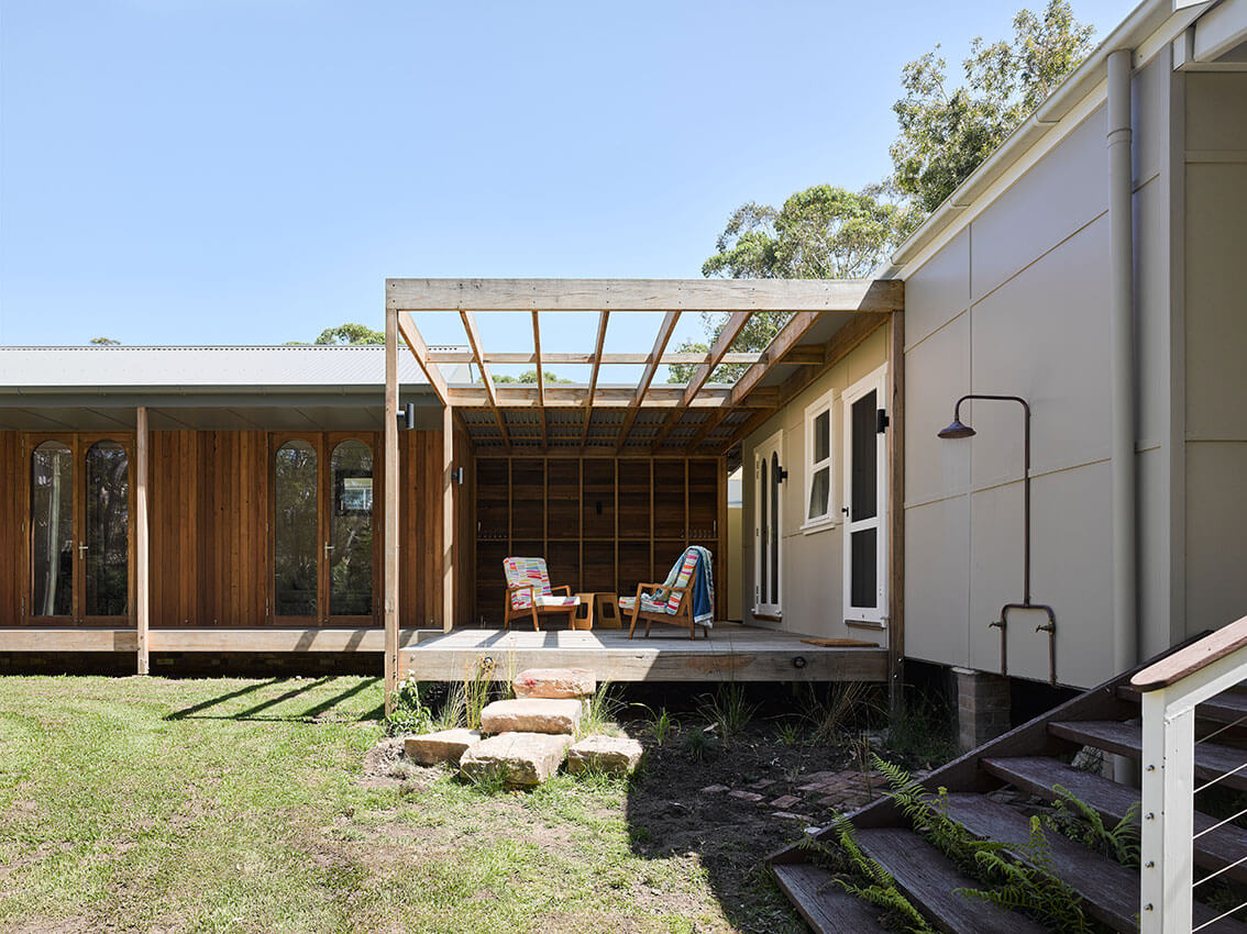
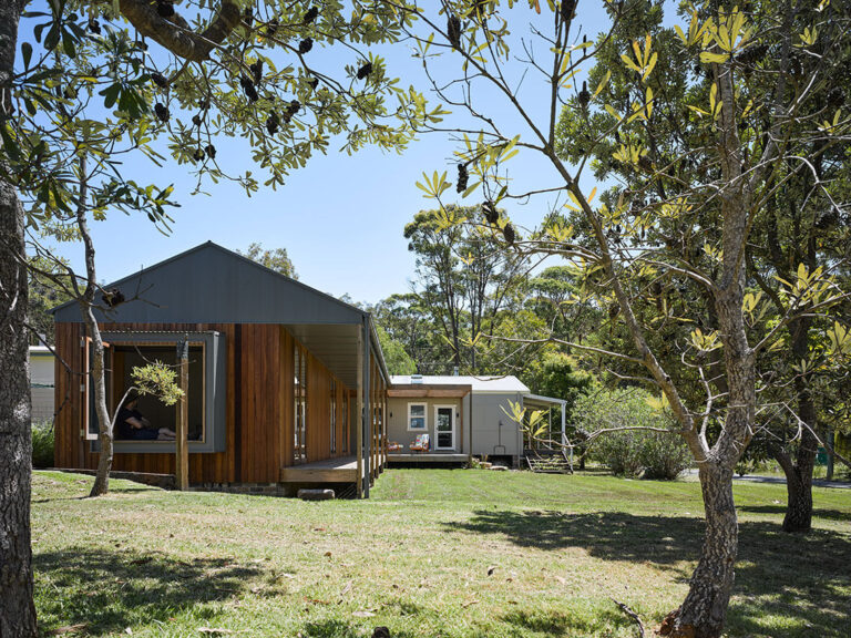
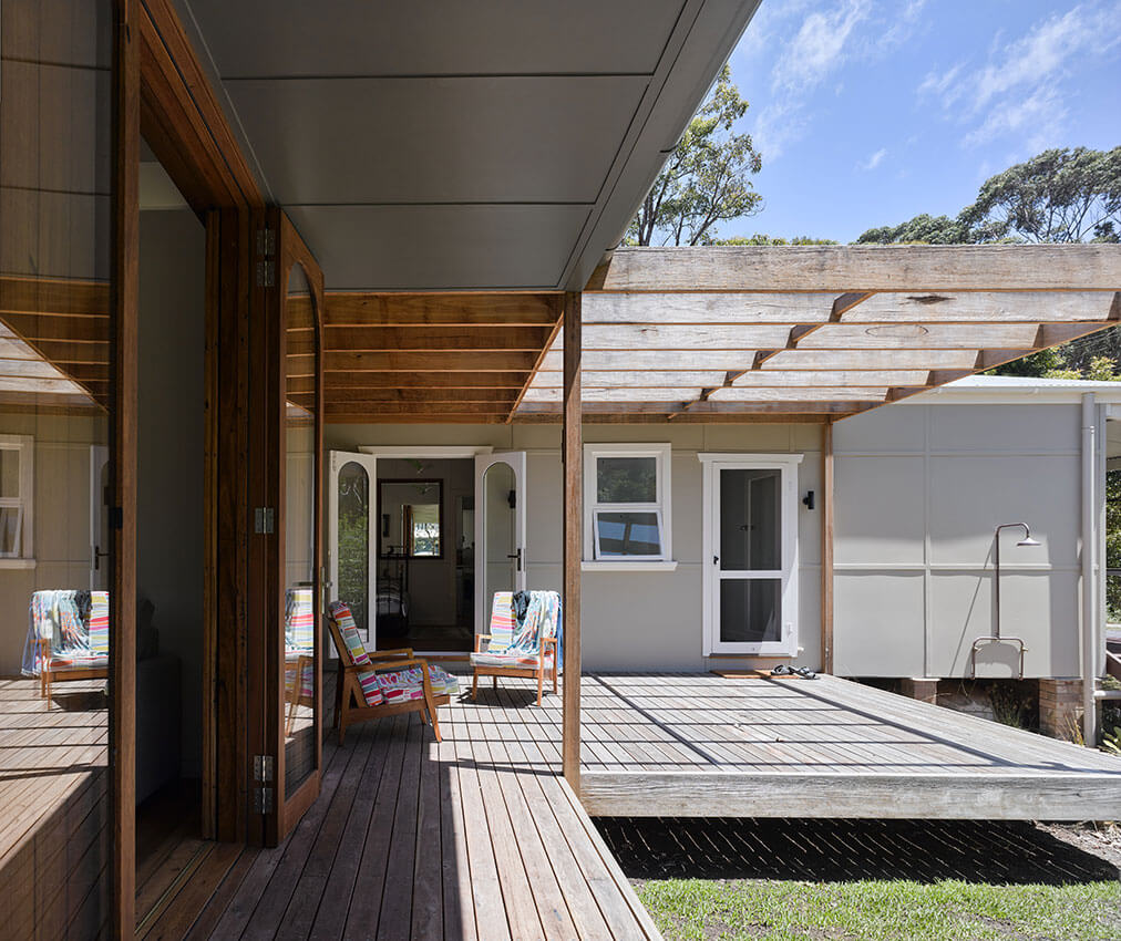
A thoughtful collaboration to retrofit and extend a beach-side shack with minimal embodied energy, innovative re-use and re-lifing of salvaged materials, and care for the neighbours and local fauna.
The shack’s currently part time use was the inspiration for its minimal approach and thoughtful restraint. The wonderfully resolved detailing brings together existing, new, and re-purposed materials in a way that subtly lifts the experience and the quality without raising the cost.
The central porch connects the existing and new, with the linear addition expressed in re-used timber, daylight, and a comfortable relationship with the site. The existing bathrooms are updated using salvaged materials, demonstrating that dedicated sourcing and clever design can deliver sophisticated outcomes without pressuring the planet.
Using only what is necessary for the program and site, the project delivers comfort not only at low cost to the client, but low cost to the planet.
COMMENDATION FOR SUSTAINABLE ARCHITECTURE
PHIVE - Community, Cultural and Civic Hub | DesignInc Sydney, Lacoste+Stevenson and Manuelle Gautrand Architecture


A challenging site with restricted solar access and a complex program have been harnessed to deliver a high-performance outcome that is at once technologically advanced and elegantly simple.
The civic landmark of the red ochre roof provides a careful balance of daylight and views internally, whilst the library stands out for its clarity and utility – open floors set back atop each other, comfortably providing diverse access soaked in ample natural light. Thermal chimneys provide passive components for a well-developed and holistic cooling mechanism.
The carefully considered programmatic distribution and passive climate-control strategies, particularly the hybrid ventilation system, have delivered an environmentally agile public asset that will work long into the future.
COLORBOND® Award for Steel Architecture
COLORBOND® AWARD FOR STEEL IN ARCHITECTURE
Warren Integrated Studies Hub | Mayoh Architects
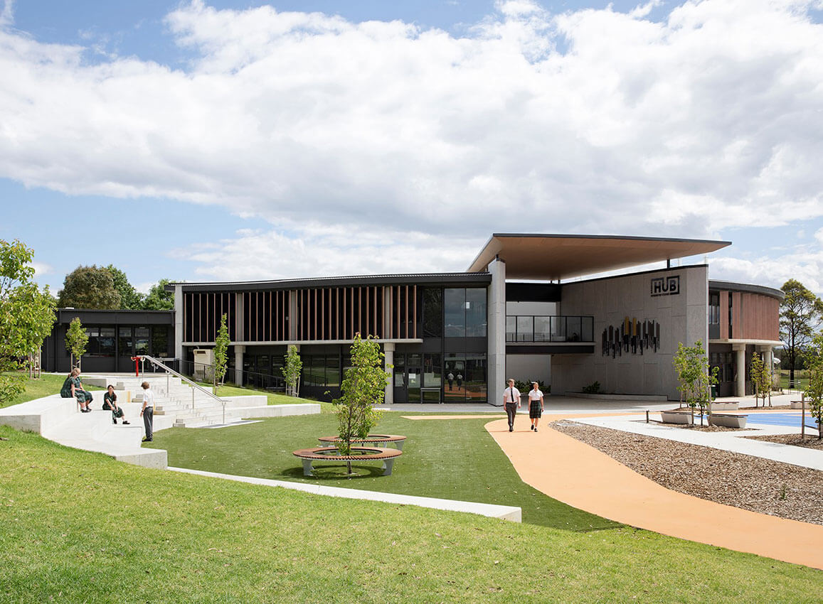
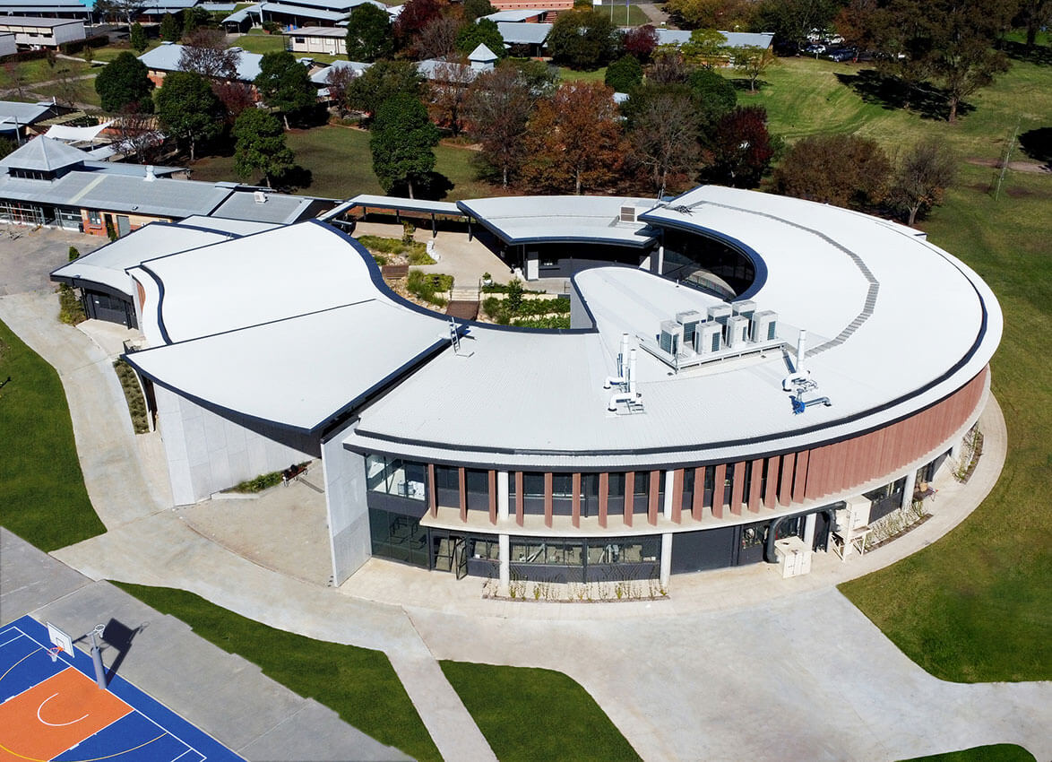
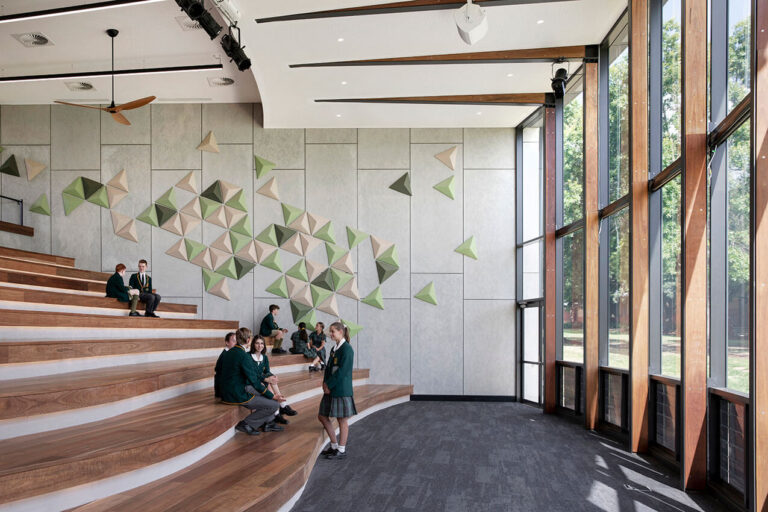
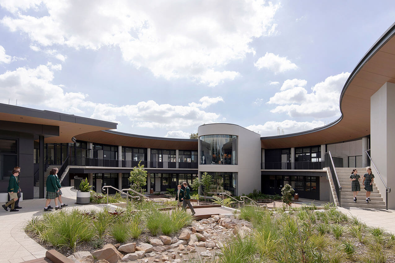
The Warren Integrated Studies Hub is a multi-disciplinary STEAM facility located centrally within the Macarthur Anglican School Campus. The client brief was to design a campus precinct to co-locate Science, D+T, ICT, Maths, Art, and Agriculture in a mixed indoor/outdoor setting conductive to cross disciplinary interactions. The resulting design combines a signature new building together with the adaptive re-use and expansion of an existing building, both of which are seamlessly integrated with redevelopment outdoor spaces which extend both learning and recreation across the indoor and outdoor settings.
Mayoh Architects created an integrated studies hub with a hybrid structure of concrete and steel together with a steel roof. The visually pleasing circular arc roof allows for ease of form, flow of movement, and visual connectivity supported with extensive glazing between all teaching spaces. The space allows for excellent supervision, abundant natural light, and ventilation, which encourages student enquiry and engagement.
The radial primary building form and flow of occupant movement was chosen to maximise cross-disciplinary sightlines and permeability, encouraging casual interaction across related academic departments. The curved form also focuses attention on the new central outdoor space, which acts as a key destination point within the campus.
Commendation – COLORBOND® Award for STEEL ARCHITECTURE
PCYC Wagga Wagga | AJC
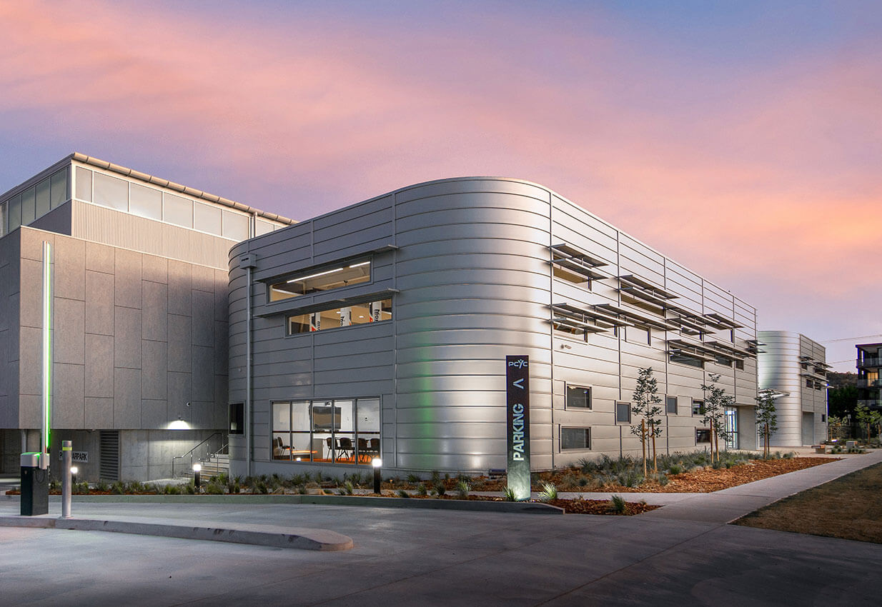
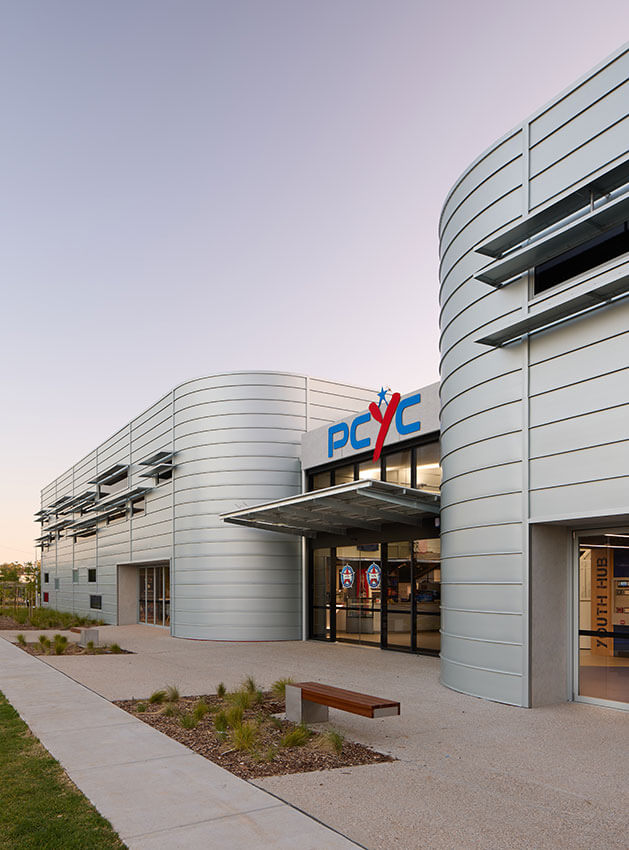
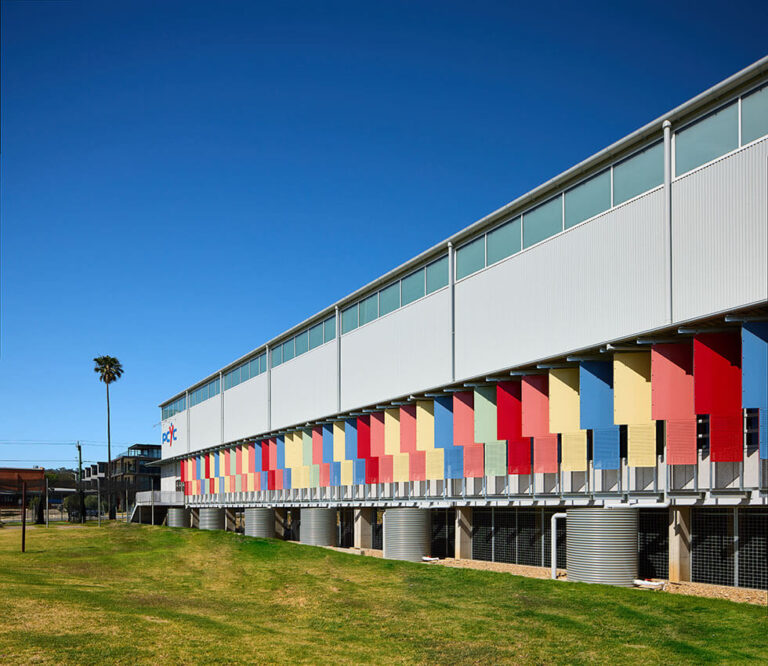
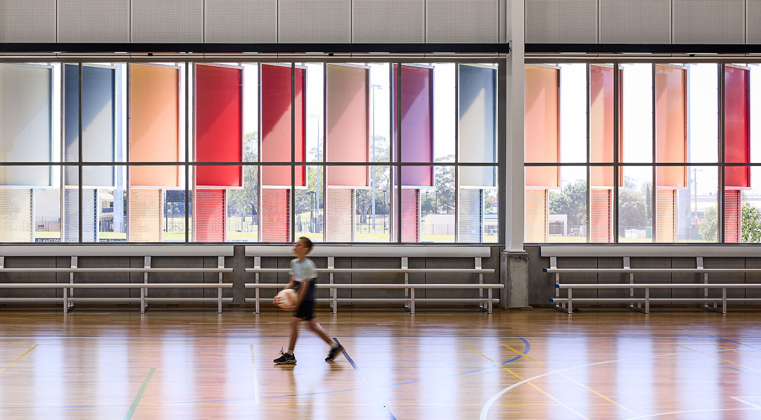
PCYC Wagga Wagga is the largest ever development for PCYC NSW, the registered charity whose remit is to empower young people to reach their potential through Police and community partnerships.
Referencing the farming regions grain silos, the Centre presents as two elliptical buildings clad in Zincalume® steel at its urban edge. They contain a gymnasium, community/staff area, and frame a glass entry atrium, which continues as an internal avenue through to the main sports hall.
The twin steel ‘silos’ wrapped in Zincalume® form a new urban landmark in Wagga Wagga, marking the urban entry point for the new style of club for a new era, combining its mission to empower young people.
COLORBOND® Shale Grey® was chosen for the 3,200 square-metre sports hall for a calm, clean background, and COLORBOND® Surfmist® was used for roofing.
PRIZES
ENDURING ARCHITECTURE PRIZE
Olympic Park Station | Hassell, Ken Maher, Rodney Uren, Geoff Crowe, Robin McInnes, William Smart, Andrew Cortese, John Woodman, Mano Ponnambalam, Vanessa Yee, Adrian Gotlieb, Michelle McSharry, Chris Thomas and Ross de la Motte.
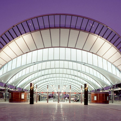
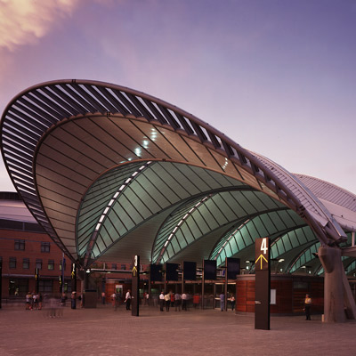
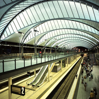

Sydney Olympic Park Station is an enduring illustration of public architecture having a symbolic, functional and generative role in its urban context. Initially the arrival place to the Sydney Olympic Games, the station has become pivotal to the diverse uses and urban character of Sydney Olympic Park.
The initial design brief to accommodate high traveller volumes, is well resolved through station planning and operational management. Sequentially sized spaces, managed pathways, ramps, and lift access deliver large crowds comfortably to and from the station. Glass lifts and wide, long ramps assist in CPTED, equity and universal access.
The concrete and steel structure is refined in its design and execution and has weathered well. This is an enduring piece of well detailed architecture.
The design parti of a canopy roof over a subterranean station connects all levels with light, air and views. Arrival from the tunnel into the space is inspirational. The spatial sequence from station to Olympic facilities is ceremonial. Lines of sight from one end of the station to the other connect the pedestrian to spaces beyond, dissolving the distinction between station object and surrounding urban spaces.
Sydney Olympic Park Station celebrates a memorable cultural event and endures as an exemplar of generative urban architecture.
Lord Mayor's Prize
Quay Quarter Tower | 3XN with Executive Architect BVN


Quay Quarter Tower designed by 3XN with Executive Architect BVN on the block bound by Young, Bridge and Phillip Street Sydney, is an exceptional work of architecture acknowledged around the world for its innovation and design excellence.
In addition to the innovative internal village concept and the significant CO2 savings through upcycling the previous tower, the public domain interface with the surrounding streets makes a significant urban design contribution.
The sculpted podium integrates with the steeply sloping surrounding streets cleverly to ensure a high degree of activation and engagement between inside and outside and breaks the mass down within a unified whole.
In addition, permanent public access has been recreated where Goldsborough Lane once stood between the first AMP Tower and the new tower podium.
Located on the podium, is a significant public artwork by the Icelandic-Danish artist Olafur Eliasson who teaches and works from his studio in Berlin. Titled Roof for Stray Thoughts, this major artwork of overhead interwoven bright yellow and stainless-steel arcs, underscores the importance of public art in the urban design objective of revitalising the northern part of central Sydney at Circular Quay. At grade, permanent public access from the corner of Philip and Bridge streets to the podium ensures the artwork is available to all.
COMMENDATION FOR LORD MAYORS PRIZE
Opera Residences | Tzannes and Crone (Executive Architect)


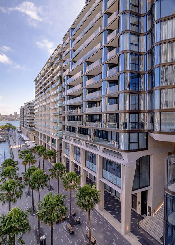
Opera Residences designed by Tzannes at 71–79 Macquarie Street Circular Quay, makes an important urban design contribution to the public vision of Circular Quay.
Completing East Circular Quay and extending the vision of a full-length colonnade from the Opera House forecourt to the Circular Quay viaduct, has taken 30 years since designs were first released by the architect, Andrew Andersons, in 1993.
Alec Tzannes has masterfully completed the three-level colonnade continuing the height and rhythm of the adjoining buildings with his own skilful expression. The City’s requirement for a public through-site link connecting Macquarie Street and Circular Quay forecourt has been well executed, removing cars and service vehicles from the forecourt and connecting all buildings to a single vehicular entry.
The public domain integration extends into the forecourt, where palm trees were reordered and relocated, bespoke seats installed, and a new kiosk built to preserve the view lines to the new grand staircase. Opera Residences is a residential work but with a civic presence and sophisticated public realm outcome.
PREMIER'S PRIZE
Bigge St Liverpool | TURNER


The NSW Premier’s Prize is awarded each year to the project considered to best exemplify commitment to the following criteria; the creation of strong communities, contribution to the public realm, establishing a new benchmark for a local area, innovation in design and designing with Country.
This NSW Land and Housing Corporation (LAHC) commissioned project provides much needed social housing in Sydney’s south west. Bigge St demonstrates a high quality and thoughtful approach to delivering cost effective housing and shows that meeting the needs of our community is not dependent on sacrificing the architectural quality enjoyed by the residents and the community.
The building delivers high amenity with spaces that have excellent natural light, private outdoor space, are well ventilated, and have positive outlooks. The project skillfully meets the enhanced brief requirements for LAHC projects that focus on the long-term performance of the building, reducing maintenance costs and meeting the diverse and sensitive needs of residents. The choice of material and construction methodology, paired with a well-planned layout and a strong façade composition, result in a modern building that makes an important contribution to the local environment while providing outstanding homes for its residents.
BLACKET PRIZE
Goulburn Performing Arts Centre | Brewster Hjorth Architects
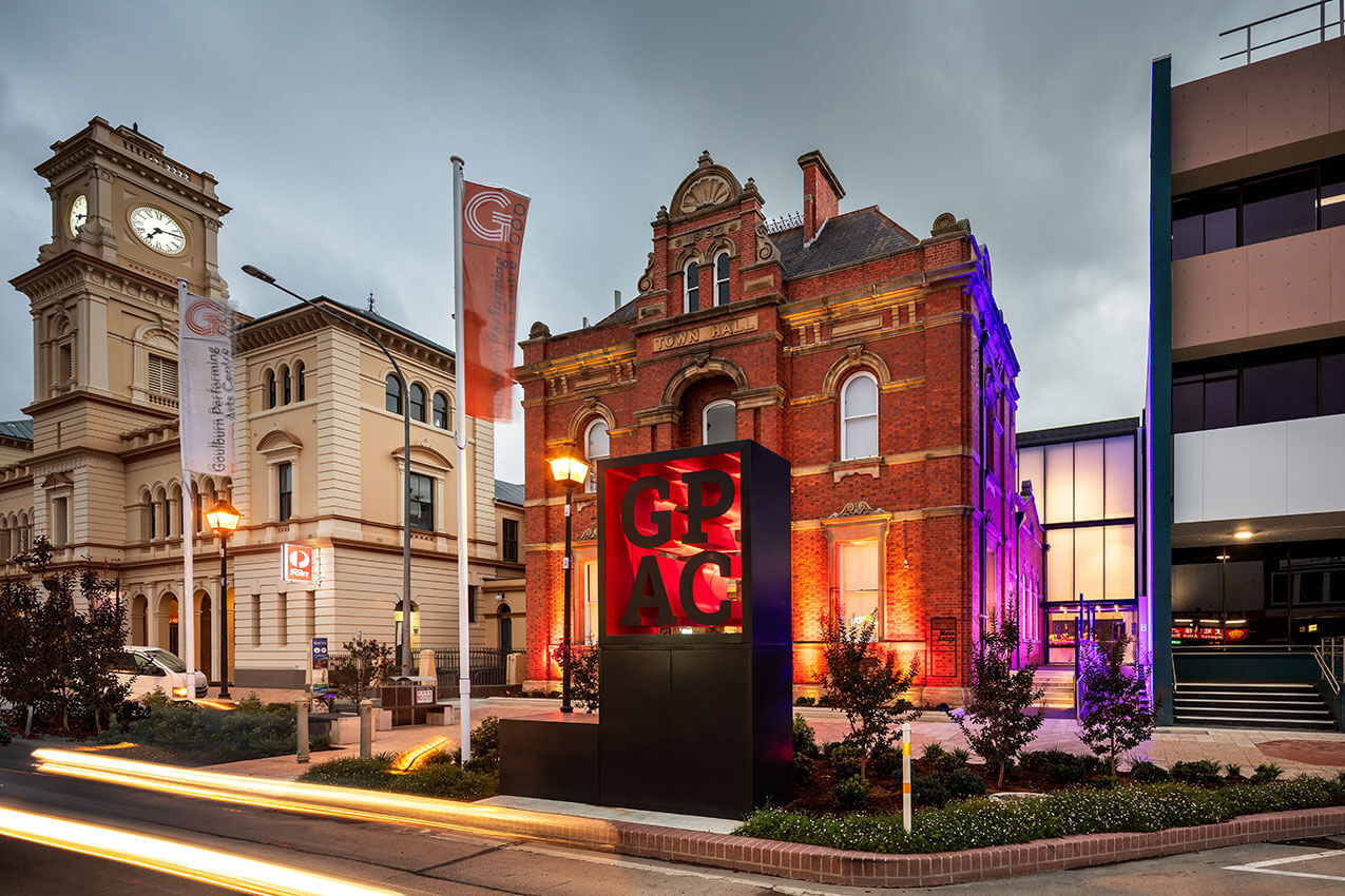
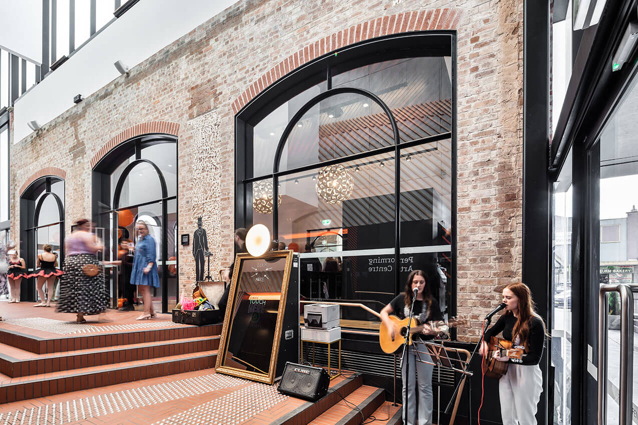
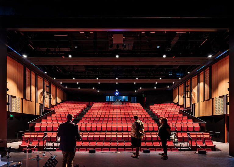
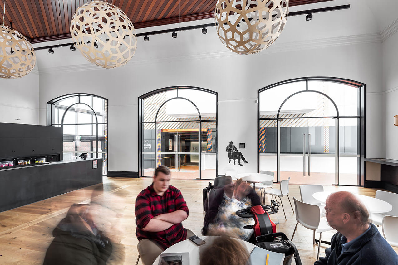
The Goulburn Performing Arts Centre is awarded the Blacket Prize for achieving design excellence in a regional context.
The Goulburn Performing Arts Centre incorporates an adaptive reuse of the original Goulburn Town Hall in providing the city with its first purpose built professional theatre space.
The design incorporates a thoughtful, well resolved and carefully detailed integration of the original Town Hall buildings. It provides the main public spaces with a new and efficiently designed contemporary theatre located behind the heritage buildings. It also provides familiarity for residents with an accessible, vibrant and functional modern facility in the heart of the city, combined with an efficient cost/value outcome.
The complex is comprehensively planned to address functional and technical, heritage, sustainability and budgetary requirements. The planning allows for good access to the facilities from a range of main street and side laneway locations, providing a visible and interactive positive addition to the main street of Goulburn.
The Goulburn Performing Arts Centre is a worthy recipient of the Blacket Prize as it demonstrates an innovative and sensitive architectural solution. It contributes to the streetscape of the main street, providing an accessible key public facility in Goulburn.
EMAGN PROJECT AWARD
Lane Cove House | SAHA


A bold and optimistic response to a brief accommodating three generations within a beloved inner suburban lot, SAHA’s Lane Cove House is a significant project on many levels and a fitting winner of the EmAGN Project Award.
The multi-generational house offers a compelling strategy to address some of Sydney’s broader housing challenges with a solution that is both regenerative and affordable, while also increasing density, and maintaining local character and social ties. It represents a highly considered and nuanced response to diverse household scenarios, while working to a modest budget – doing more with less. Importantly, this delightful multi-generational home has the potential of becoming a model for many families facing similar challenges with the possibility of turning NIMBY’s into YIMBY’s.
The project required a generous dose of can-do naivety and tactical skill to pull off what more established practices might have considered impossible. Through the culmination of Harry Catterns and Sasha Solar-March’s collective experience as young architects, this project has been a true collaboration between the partners and their clients. The Jury sees Lane Cove House as pivotal to the growth of SAHA’s emerging practice and a true reflection of a new generation of architectural professionals.
EMERGING ARCHITECT PRIZE
Ben Peake


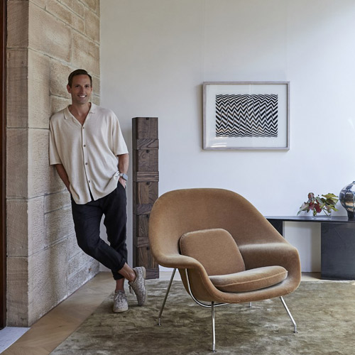
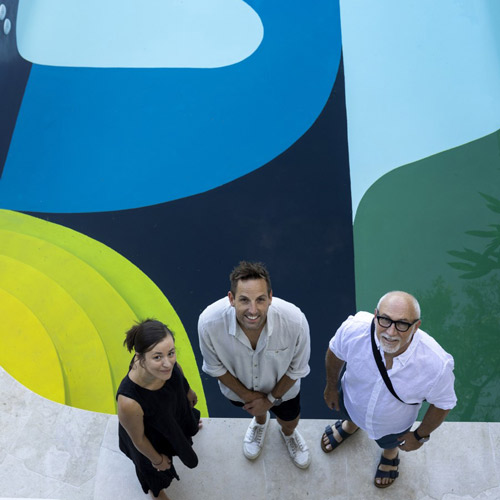
Ben Peake is awarded the 2023 NSW Australian Institute of Architects Emerging Architect Prize in recognition of his extensive leadership and demonstration of the role of architects as agents of social and cultural change.
As Design Director of Carter Williamson Architects, Ben is an esteemed leader and colleague, responsible for many of the firm’s awarded projects and expanding the company’s capability into public architectural projects. He is an important mentor to the next generation of emerging architects and graduates and sits at the forefront of the company’s gender and diversity policies. In 2021, Ben’s contribution to the growth and values alignment of Carter Williamson Architects was recognized on an industry level and was awarded the NSW AIA Best in Practice Prize.
Beyond practice, Ben has been a driving force for social and ethical progress, both within the profession and on a public level. He has advocated for gender equity and diversity through his work with both NSW and National Gender Equity Taskforce committees. Ben was also the Implementation Leader for Architects Champions of Change and Architects with Pride, signalling a new generation of practitioners committed to improving the culture of our profession through diversity and inclusion.
Ben’s advocacy extends further onto a public stage through his instrumental role on the ‘SaveOurSirius’ campaign, shining light onto the significance of brutalist architecture. Ben’s dedication to this campaign is an extraordinary example of how architects can influence social change beyond the realms of traditional practice, be champions for community, and engage with our cities at a political level.
Ben exemplifies the important role architects have within society and is a leader for our profession, making him a worthy recipient of the Emerging Architect Prize.
