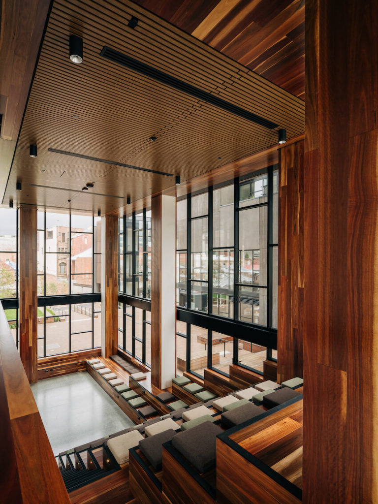
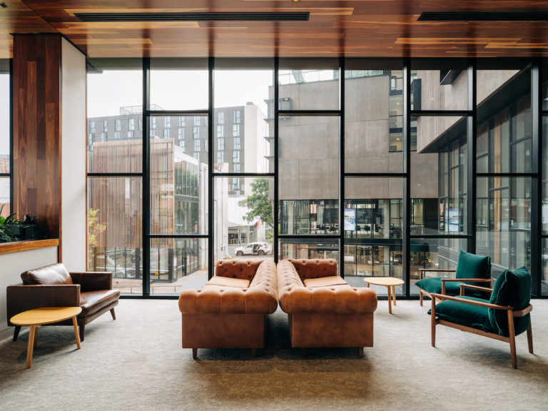
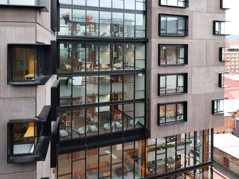
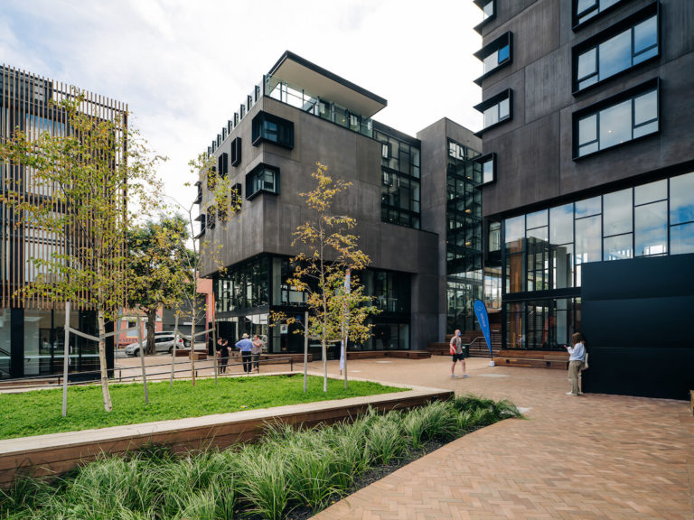
2022 TasmanianArchitecture Awards Winners

2022 National Architecture Awards
2022 TAS Architecture Awards - results
The Australian Institute of Architects Awards program offers an opportunity for public and peer recognition of the innovative work of our Tasmanian architects.
The program also provides the Institute with a valuable mechanism to promote architects and architecture within Tasmania, across Australia and internationally.
Chapter Awards
Tasmanian Architecture Medal
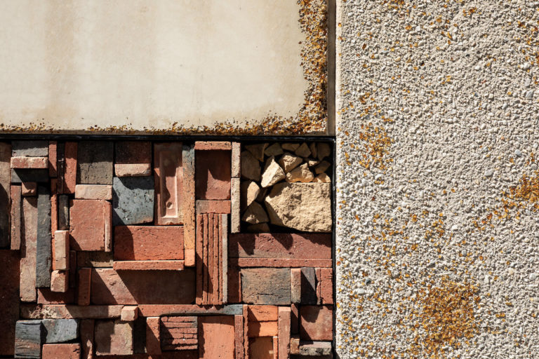
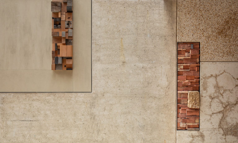
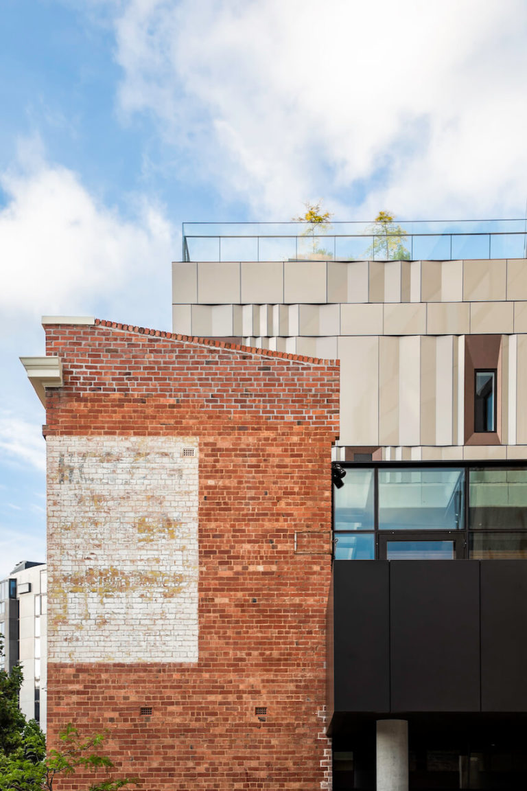
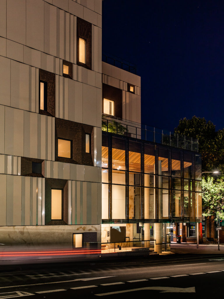
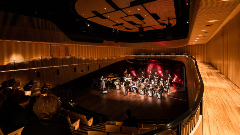
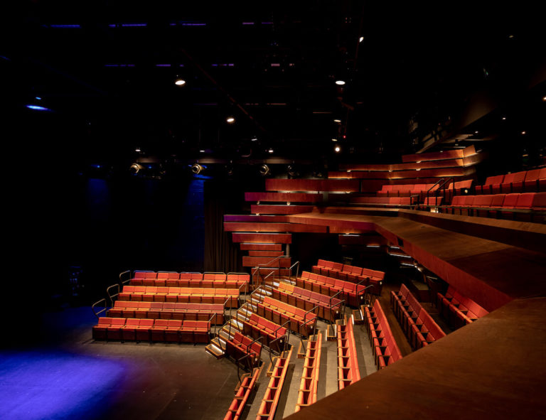
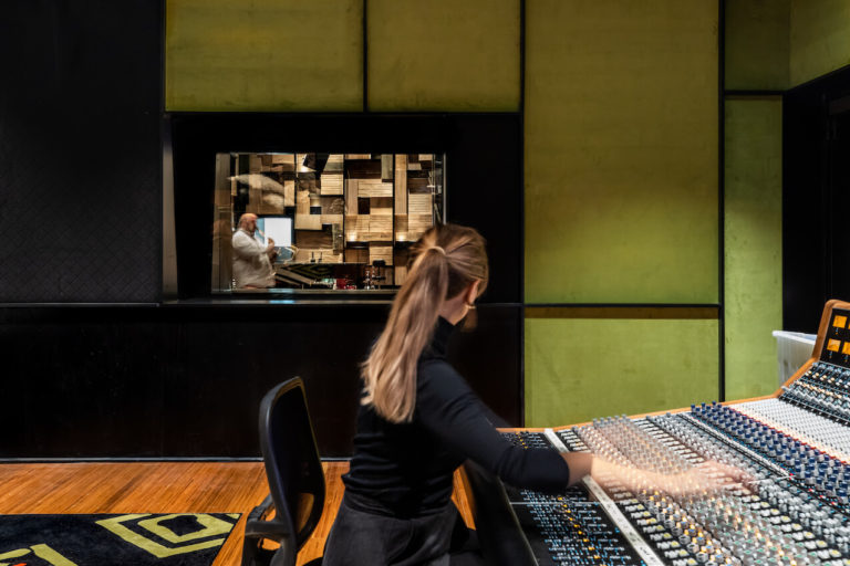
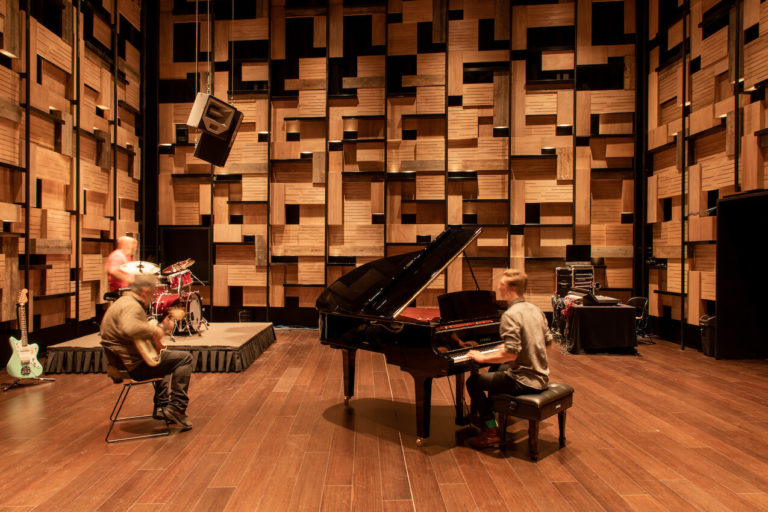
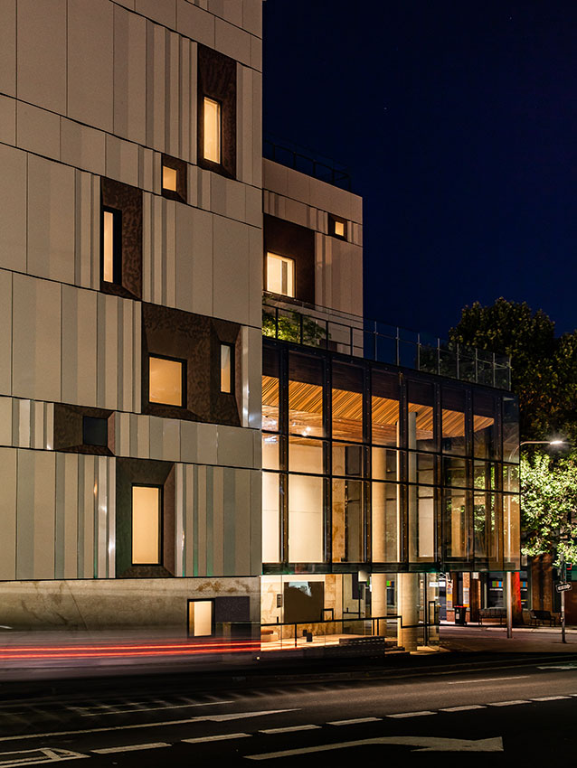
The Hedberg | LIMINAL Architecture with WOHA
Jury citation:
The Hedberg places Tasmania at the forefront of Australia’s performing arts scene and provides opportunities to inspire a generation.
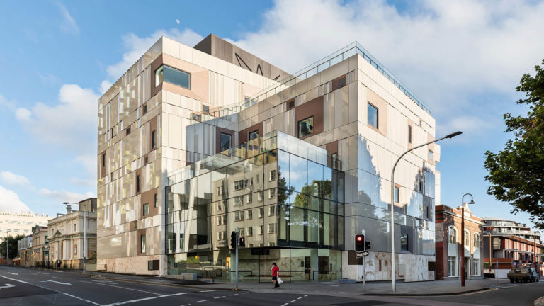
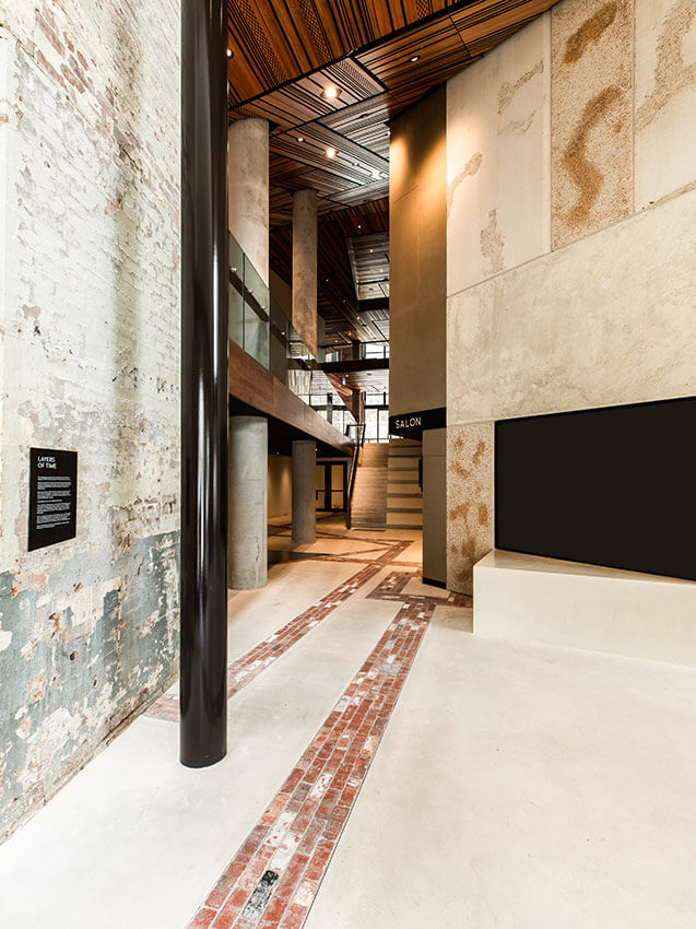
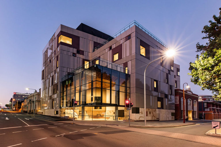
A world class Performing Arts Centre, it brings music and performance hubs, theatre spaces and creative workspaces to the centre of Hobart. The Hedberg is significant not only as a performing arts destination, but also for successfully stitching together its historical past and for its exceptional public access to the building.
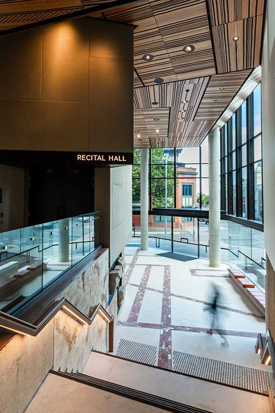
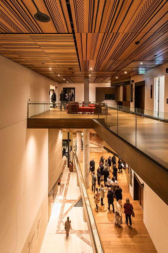
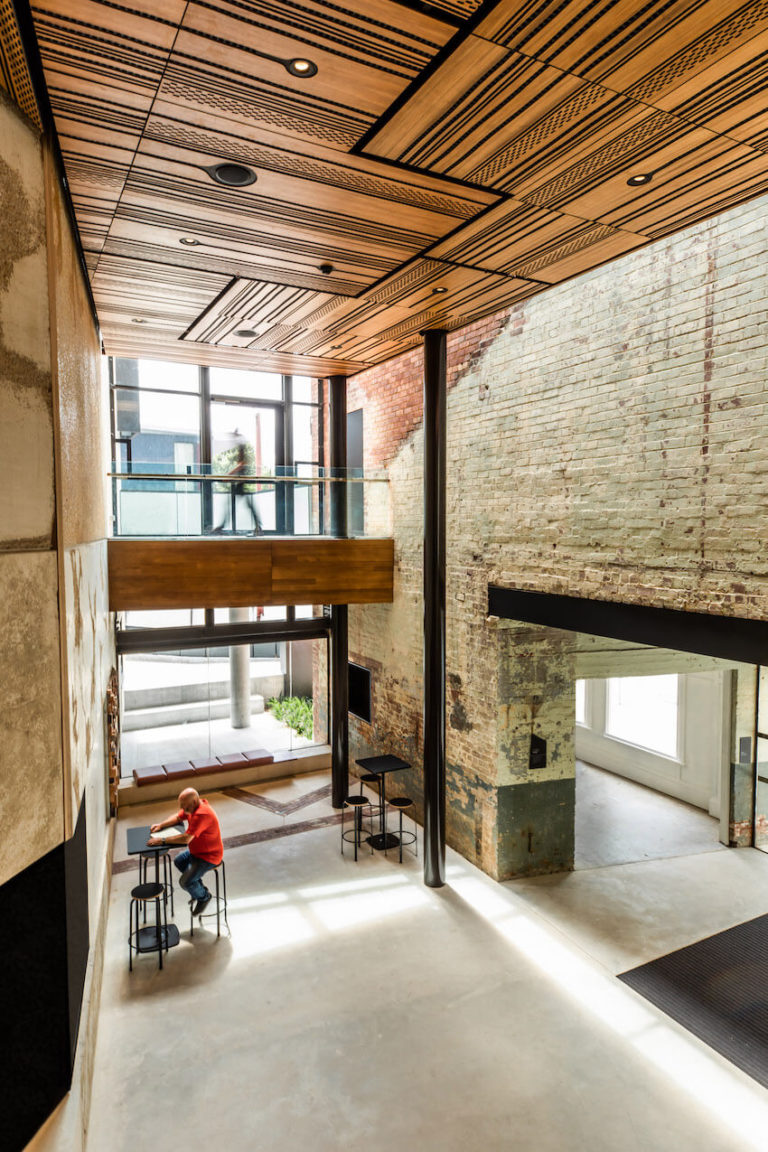
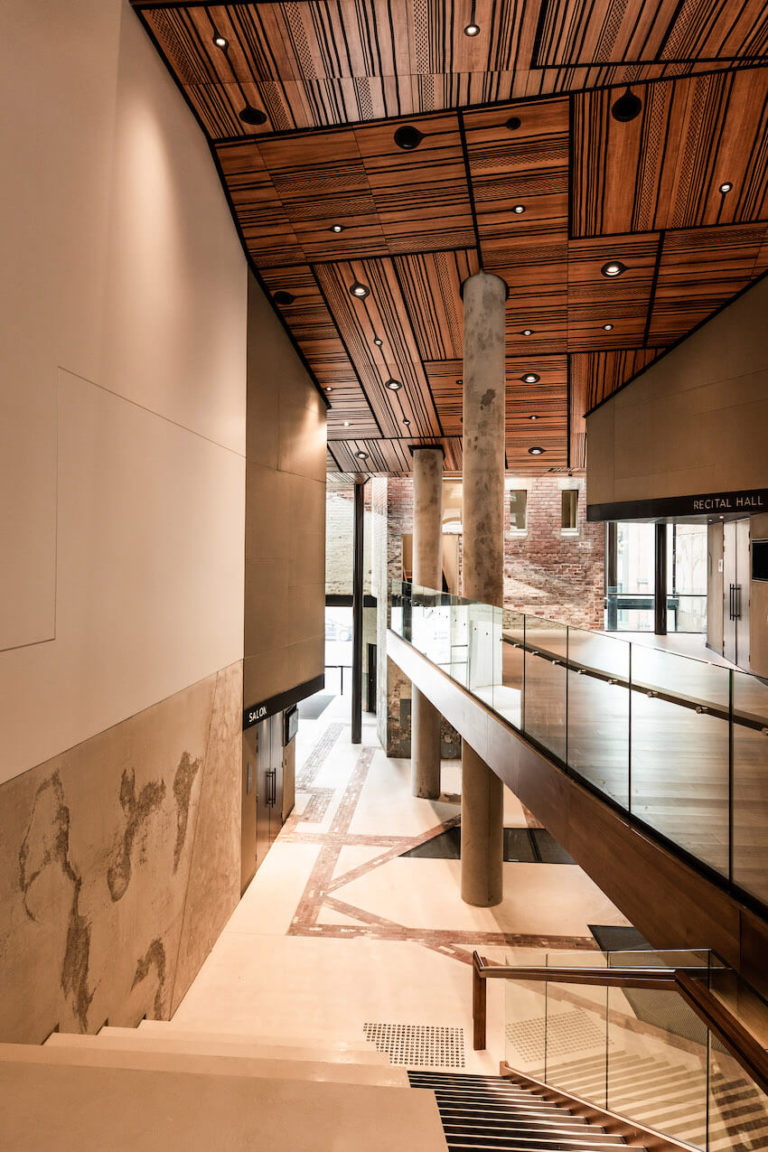
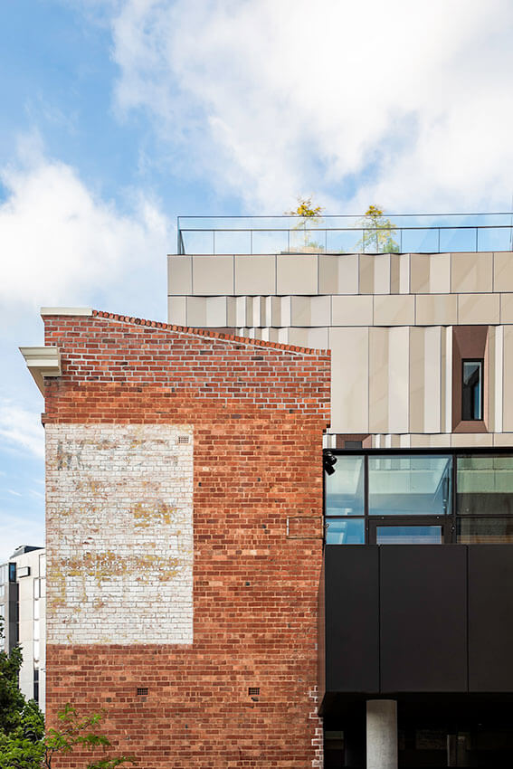
The building’s contextual relationship with key heritage buildings of the Hedberg Garage and the Theatre Royal successfully provides a missing link in Hobart’s cityscape. Internal cavernous entry voids provide a dramatic backdrop for congregations moving through the spaces, whilst highlighting the significant heritage values of the site. The interior consists of a complex collection of volumes and spaces, each with its own personality formed by the specific needs of the program.
The design resolution captures and celebrates perceptions of Hobart and Tasmania as a culturally autonomous and artistically enterprising community, a community now firmly at the centre of the performing arts world. The Hedberg is a wonderful contribution to Hobart’s growing list of successful public and cultural spaces.
SWT Blythe Student Prize
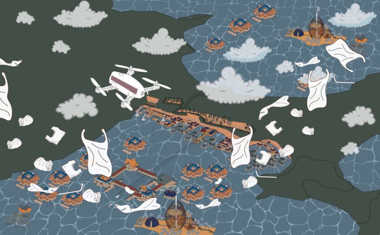
Rui Shen Chong | Neo-Gaya
Jury citation:
Neo-Gaya is a thoroughly developed and inspirational project that uses consistent and thoughtful detailing, supportive presentation graphics, and a well-considered staged master plan.
The project embraces its brief with a complex yet cohesive scheme that addresses the many issues faced by the inhabitants of the Gaya Island, the Sea Nomads. Such issues include the immediate threat of rising sea levels, government classification of the people as ‘stateless’, ongoing waste and resource management issues, and agendas to relocate the people away from the tourism in the area.
Rui Shen Chong has cleverly devised a ‘kit of parts’ that addresses the issues highlighted in the brief, through the provision of a relocation strategy that places key infrastructure, such as waste management, food production and gas recovery, alongside basic community, commercial and residential framework structures. This will encourage occupants to reshape and infill as they inhabit, thus maintaining the informal way of life for the people. The cultural subtleties and nuances emerge as one engages more deeply with this scheme, demonstrating an architectural awareness through the translation of traditional structures into diverse and technologically innovative clusters that remain of their place and people, yet provide for the future.
A sense of place and culture has been threaded through all aspects of the scheme, from the architecture to the rich and visually stimulating graphics using contemporary graphic motifs combined with traditional patterns and sea-life to offer a visual story that supports the project as a whole.
President's Prize
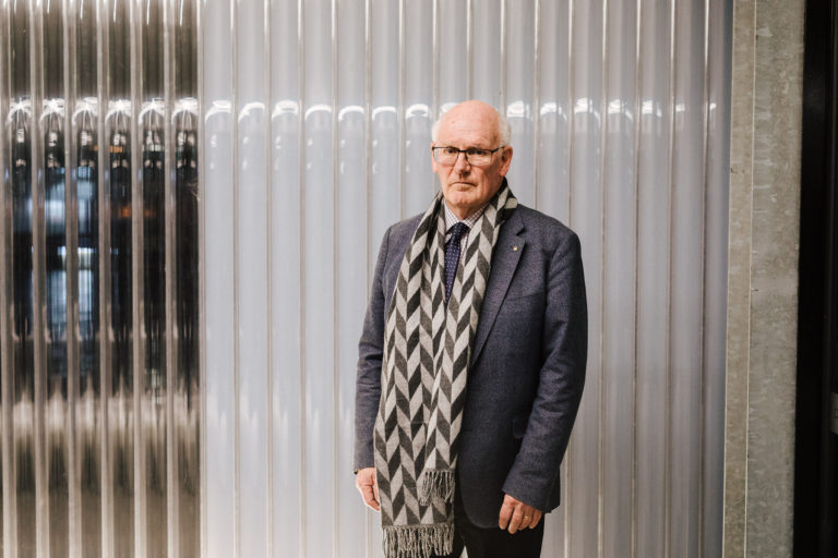
Peter Cripps LFRAIA
Jury citation:
Peter Cripps is an esteemed member of the architectural community. His contributions to heritage preservation and knowledge of building contracts are second to none. Graduating from the Hobart Technical College in 1967, following two years working in England, Peter returned to Tasmania and became a registered architect in 1971, embarking on a career spanning nearly five decades.
Peter is a Life Fellow of the Royal Australian Institute of Architects, Founding Member and Fellow of the Institute of Arbitrators, a Member of Australia International Council on Monuments and Sites and a Life Member of the Society for the Protection of Ancient Buildings. In 1987, he received the RAIA Award for Conservation of the Port Arthur Penitentiary and Bake House; and in 1995 he was recipient of the National Trust Award of Merit (Hobart) for the Restoration of Bishopscourt.
Peter’s services to the Institute, the Board of Architects, and other organisations including Rotary are extensive, spanning from 1974 to the present. Particularly, he has only recently stepped down from the Tasmanian Building Appeals Board and RMPAT, on which he sat for a total of 35 years, while also being a member of the Institute’s National Contracts Committee for over 15 years, 10 of those as Chairman. In this latter role, Peter has been instrumental in the development of the ABIC Contract suite. This alone has elevated and strengthened the way the entire profession operates and, as a consequence, Peter has lectured on building contracts and architectural practice throughout Australia.
Notably Peter’s earliest practice of which he was a partner of Crawford, De Bavay and Cripps, had a direct lineage to the practice of Henry Hunter; critically, the original drawings for Hunter’s public buildings and cathedrals were preserved and handed over to the Tasmanian Museum and Art Gallery.
Peter Cripps has been essential to the Institute for many years in the role of Senior Counsellor. In the architectural community, Peter is a living treasure, quietly doing much of this behind the scenes with humility and grace. Peter applies a straight, thoroughgoing approach to complex issues. Utterly professional, his calm, erudite and kind nature complement his outstanding career. Through the President’s Prize, the Institute’s Tasmanian Chapter acknowledges Peter as an exceptional practitioner.
Emerging Architect Prize - Tasmanian Chapter winner
Jason Licht RAIA | Licht Architecture
Jury citation:
Jason Licht has made outstanding contributions to Tasmania’s architectural community. He has worked continuously on award-winning projects, both in his former role as associate at Cumulus Studio and as director of his own practice, Licht Architecture. Jason has made a significant contribution to Tasmanian regional tourism developments, including the Derby Floating Sauna, Dove Lake Viewing Shelter, Devils Corner Cellar Door, and the Cradle Mountain Visitor Centre.
Highly professional and a leading voice for Emerging Architects in Tasmania, Jason has proven himself to be a supportive and collegial member of the architecture community, where he has acted as EmAGN Chair, Chapter Councillor and Vice President of the Tasmanian Chapter of the Institute. Jason has also been recognised as a future leader, through his involvement in the Tasmanian Leaders Program and SKAL/TCIT Future Tourism Leaders Scholarship, which supported his ongoing research into regional tourism architecture in Tasmania.
This opportunity was leveraged to promote the value of architecture to broader stakeholder groups within the community, including Tourism Tasmania and the State Government. As both a community leader and architect, Jason has a clear trajectory toward developing an enduring architectural practice with a high design and innovation ethic at its core.
COLORBOND® Award for Steel Architecture
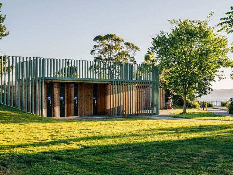
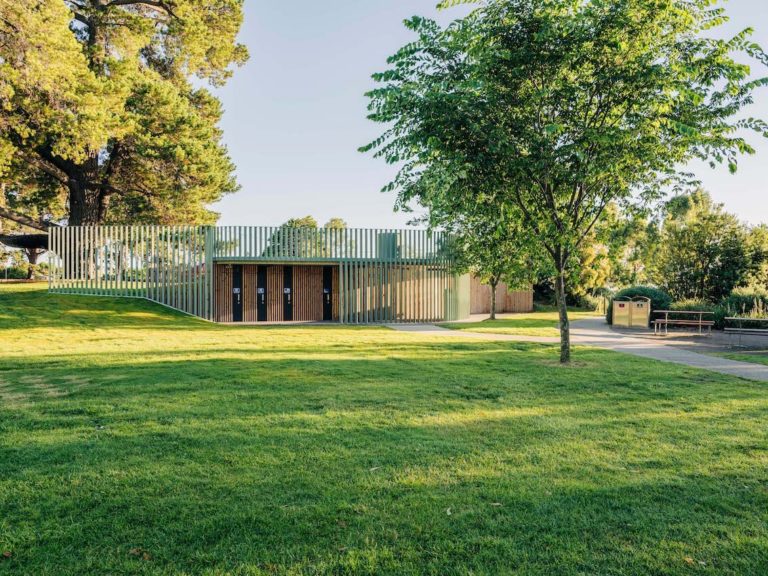
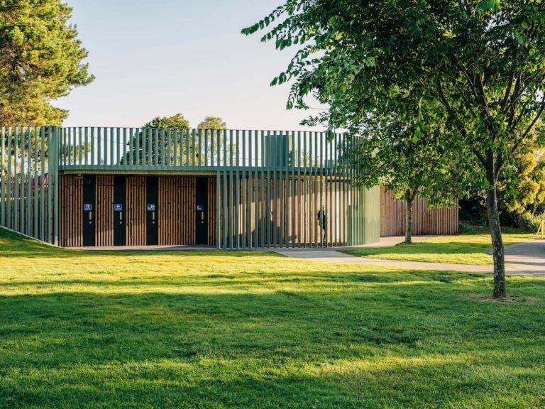
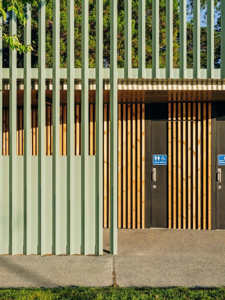
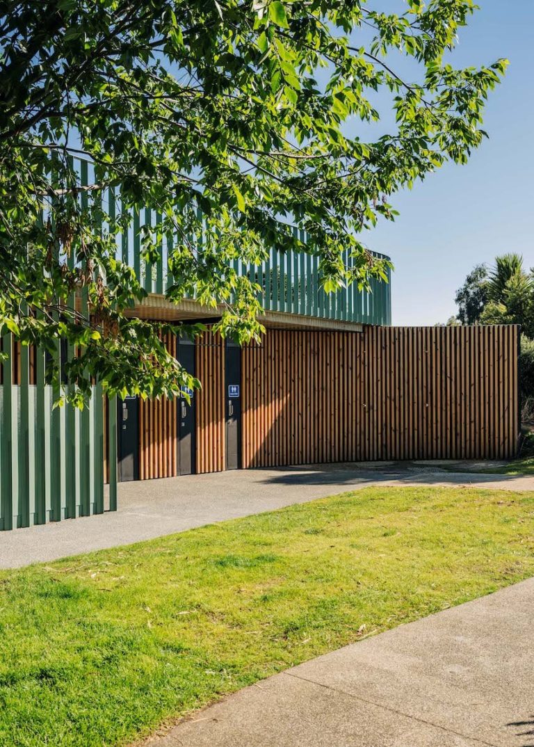
Long Beach Amenities | Preston Lane
Jury citation:
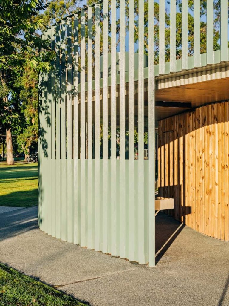
Long Beach Amenities explores the implementation of robust, enduring materiality with playful interpretation.
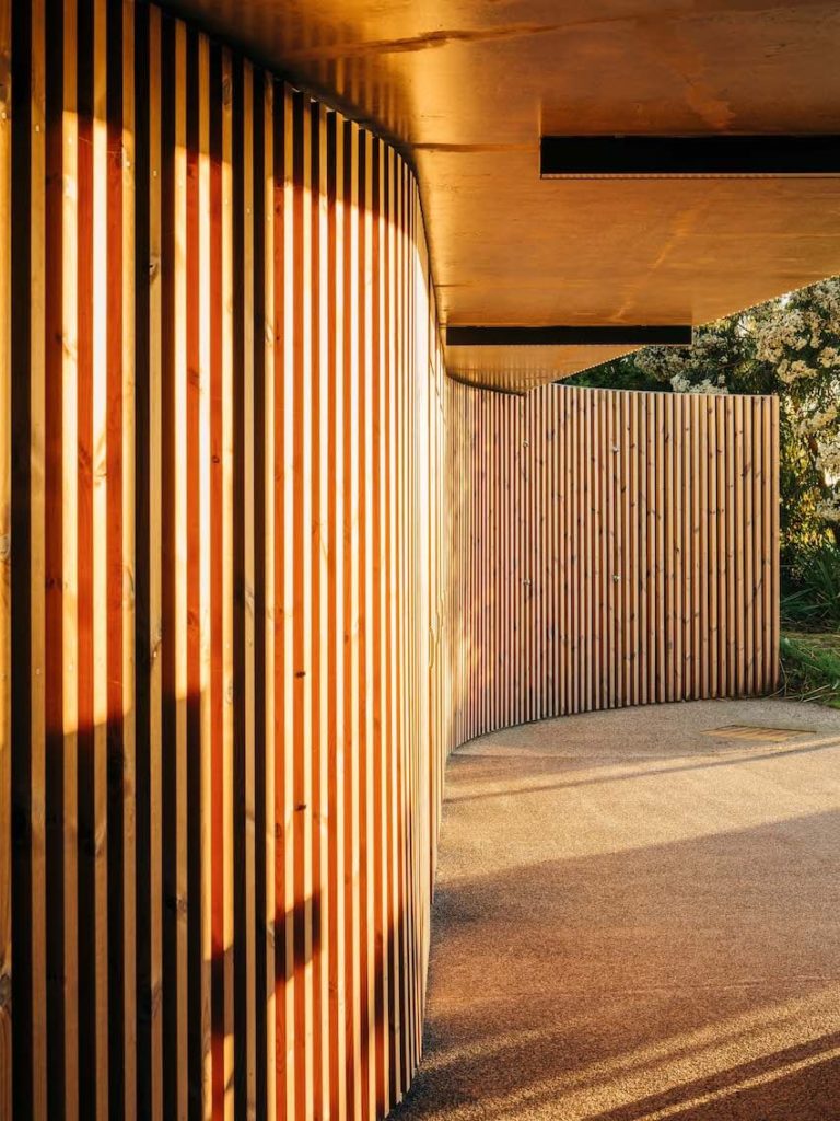
Equal-angle steel uprights adorn the main façade forming a visually permeable curved screen. The screen wraps over the building creating a protective threshold delineating the exterior washbasin space, while also offering a sense of surveillance and, in turn, a sense of security for users. Subtle colour variations of vertical elements help the building bleed into the surrounding landscape.
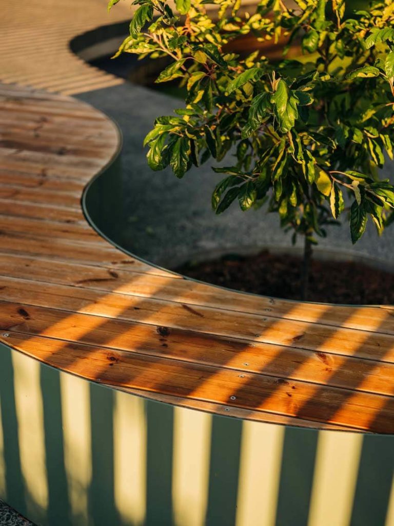
COLORBOND® custom orb formwork used in the creation of the roof slab provides a soft, moulded finish to the robust concrete lid. The vertical curves created by the formwork reference the verticality of the timber and steel cladding as well as the curvaceous form of the building. This curvaceous aesthetic is further consolidated through the playful interpretation of seating and landscape elements bounded by flowing steel plates.
Long Beach Amenities is a playful, durable and adorable addition to our community, and is a wonderful demonstration of how a simple building can add enormous community value.
Commercial Architecture
Award for Commercial Architecture
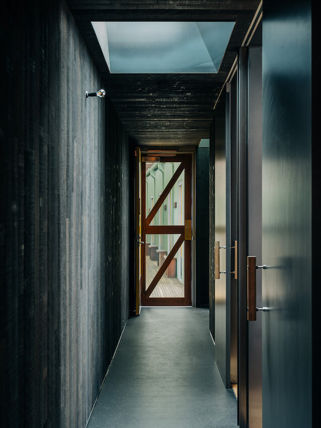
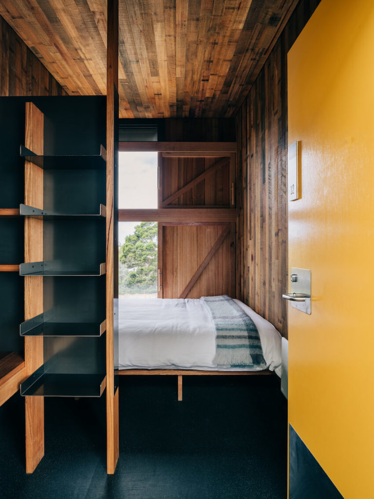
Spring Bay Mill Ridge Quarters | Gilby + Brewin Architecture
Jury citation:
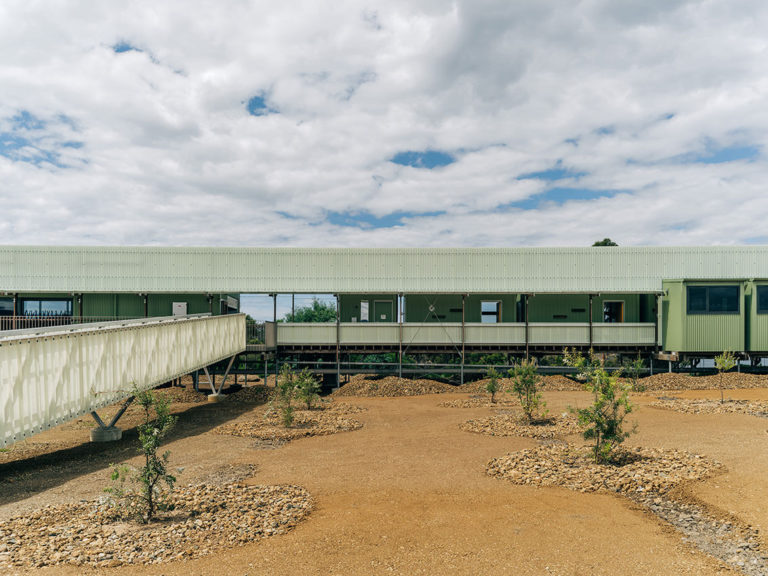
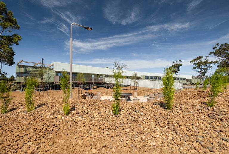
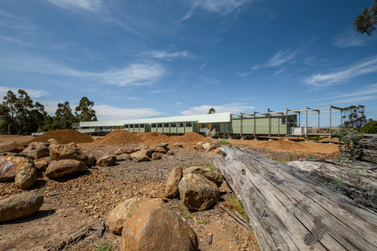
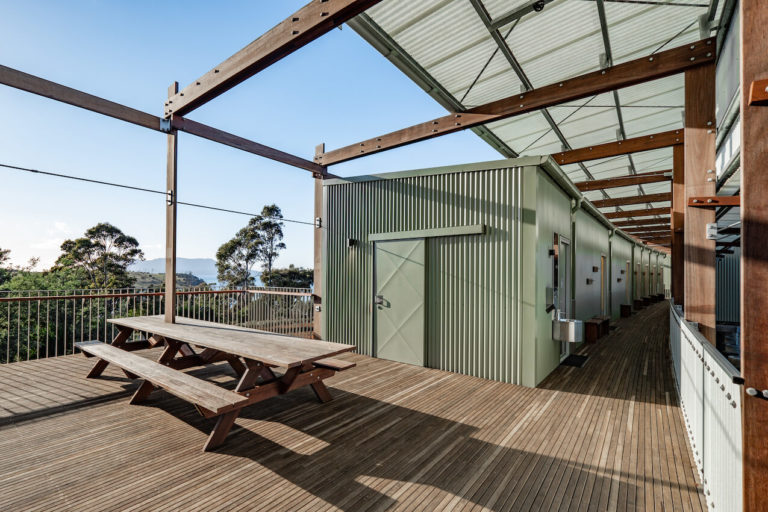
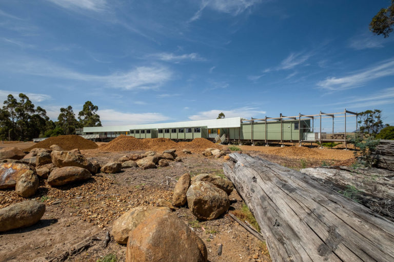
Appearing as the remnants of a runaway train separated from its engine, accommodation at the former Woodchip Mill merges into the landscape as a discarded relic of the abandoned site. Matching the mint-green COLORBOND® of the original buildings, the steel-sheet livery of the complex further evokes its industrial heritage.
A series of factory-assembled, prefabricated accommodation modules, in linear arrangement with intermediate buffer zones, are located to the north and. A timber slatted floor reinforces the subtle geometry, with service rooms, including all bathrooms, appended on the south side.
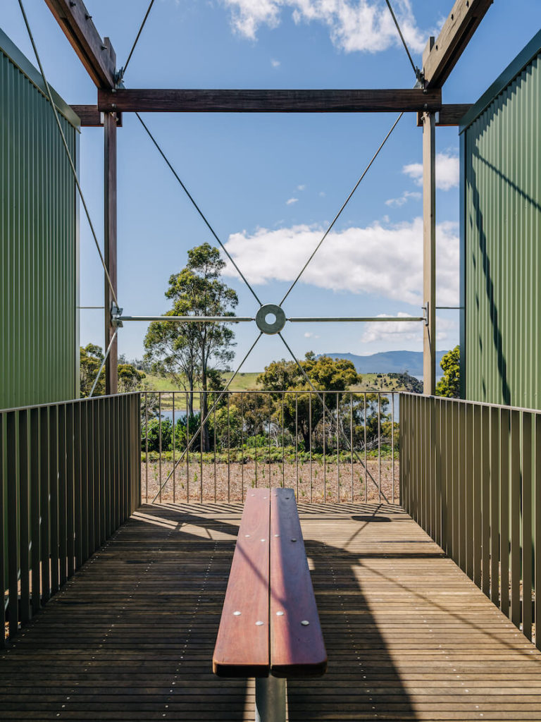
Interspersed are breakout hospitality and reception areas, and at the ends generously planned and appointed suites. The whole assembly is elevated one metre above the ground on steel struts and approached by a heavy steel and polycarbonate gangway that echoes transport references.
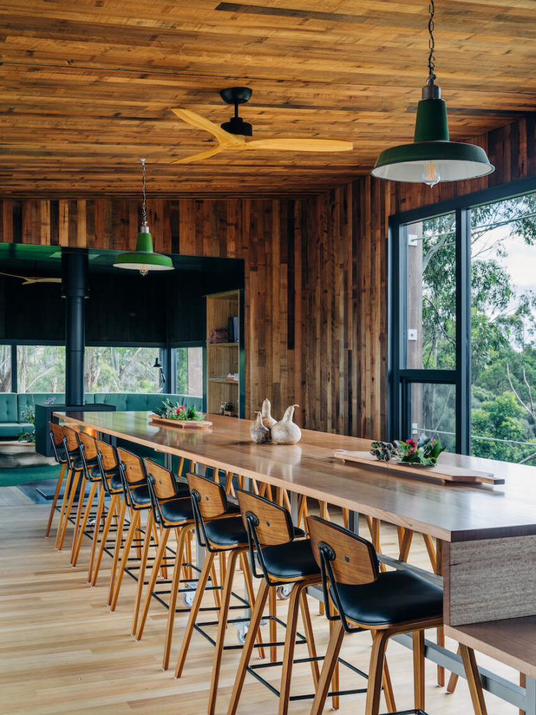
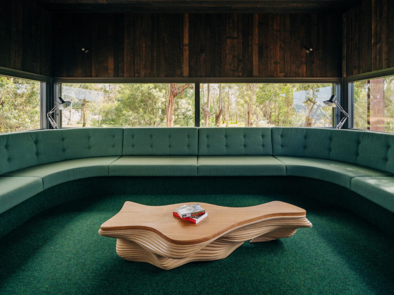
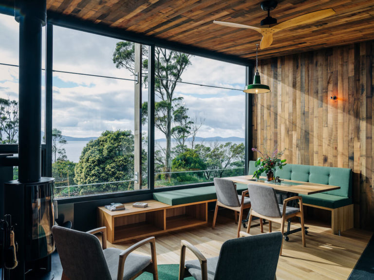
A palette of minimal-maintenance, neutral-coloured finishes includes the extensive use of recycled materials. The utilitarian nature of some factory detailing and bedroom planning reinforce the site’s ‘glamping’ prospectus (there is also accommodation in two person ‘luxury’ tents) on this now significantly repaired and restored site.
Educational Architecture
Award for Educational Architecture
Cradle Coast campus at West Park, University of Tasmania | John Wardle Architects in collaboration with Philp Lighton Architects & Room 11
Jury citation:
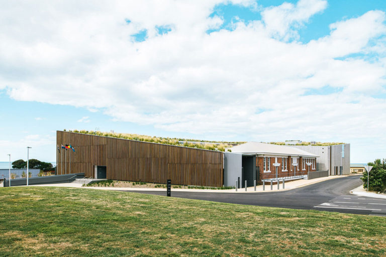
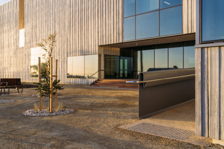
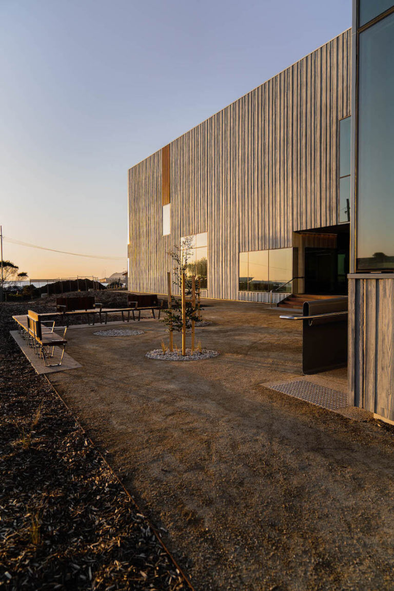
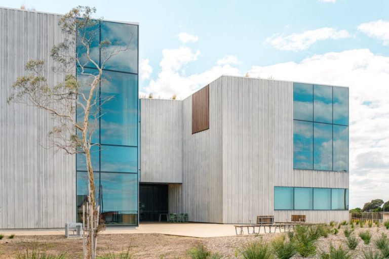
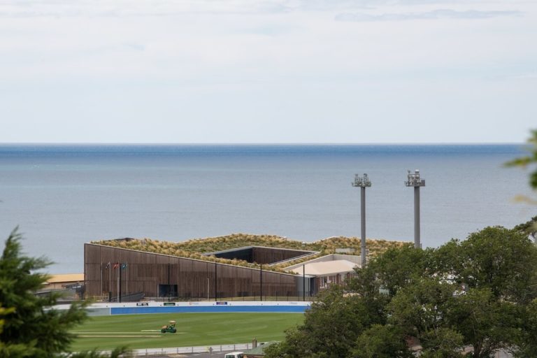
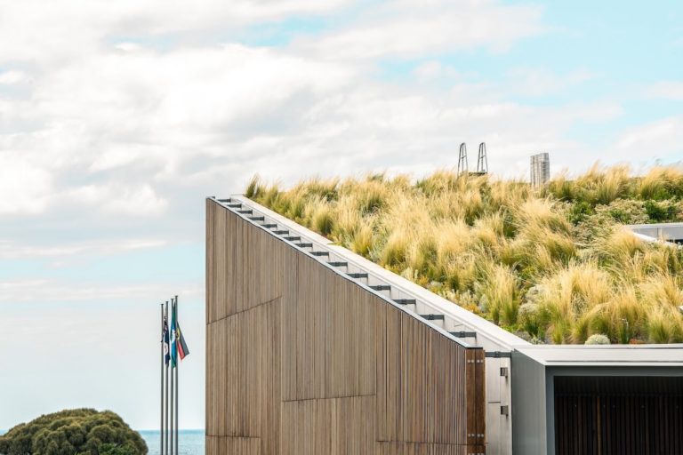
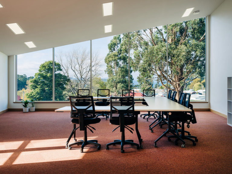
Located within an existing coastal carpark, the Cradle Coast campus manages its barren, windswept siting via a generous planted internal courtyard, which provides relaxed recreation spaces and a focus for dual levels of teaching, offices, and support facilities.
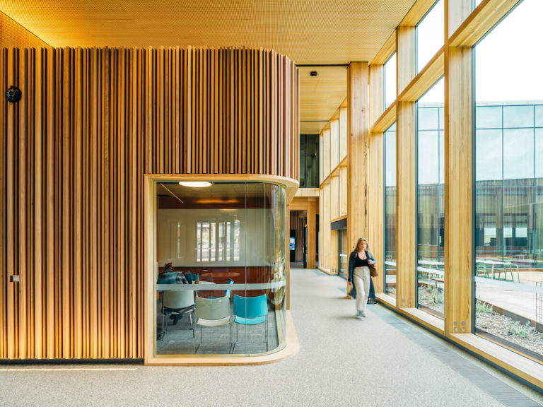
Also incorporated is a registered but modest former 1930’s single-storey education building facing the road to the south. Its redbrick rear wall forms the backdrop to the courtyard via a generous glazed gallery. Its west and east ends are articulated from the new building which ‘absorbs’ it and its single-storey scale is incorporated within the overall volume by the skillion ‘green’ roof form dropping down to one level over the gallery. Jury concerns over the contextual relationship between old and new buildings were reconciled by the retention of the former arts building, its renovation, and integrated repurposing.
Interiors are sumptuously finished in an amalgam of Tasmanian oak—structure, ceilings, finishes, and furnishings—together with polished concrete floors, woollen carpets, and subtle colourings. The simple modest exterior includes off-white patterned precast concrete, clear and coloured opaque double glazing, and timber-battened, west-facing sun screening. All assist to descale the building on its prominent site.
Commendation for Educational Architecture
Dover District School Year 11/12 Redevelopment | Bence Mulcahy
Jury citation:
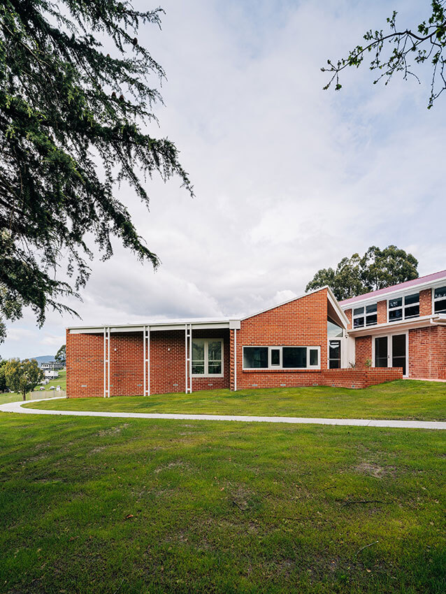
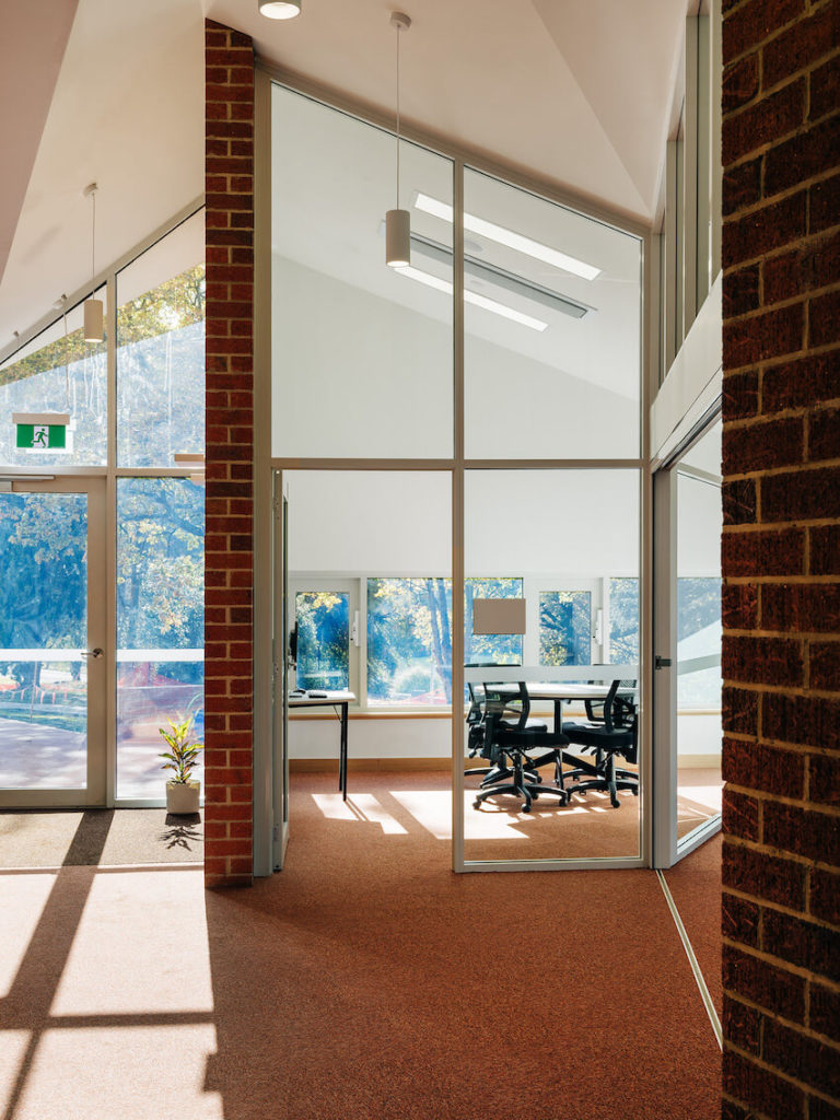
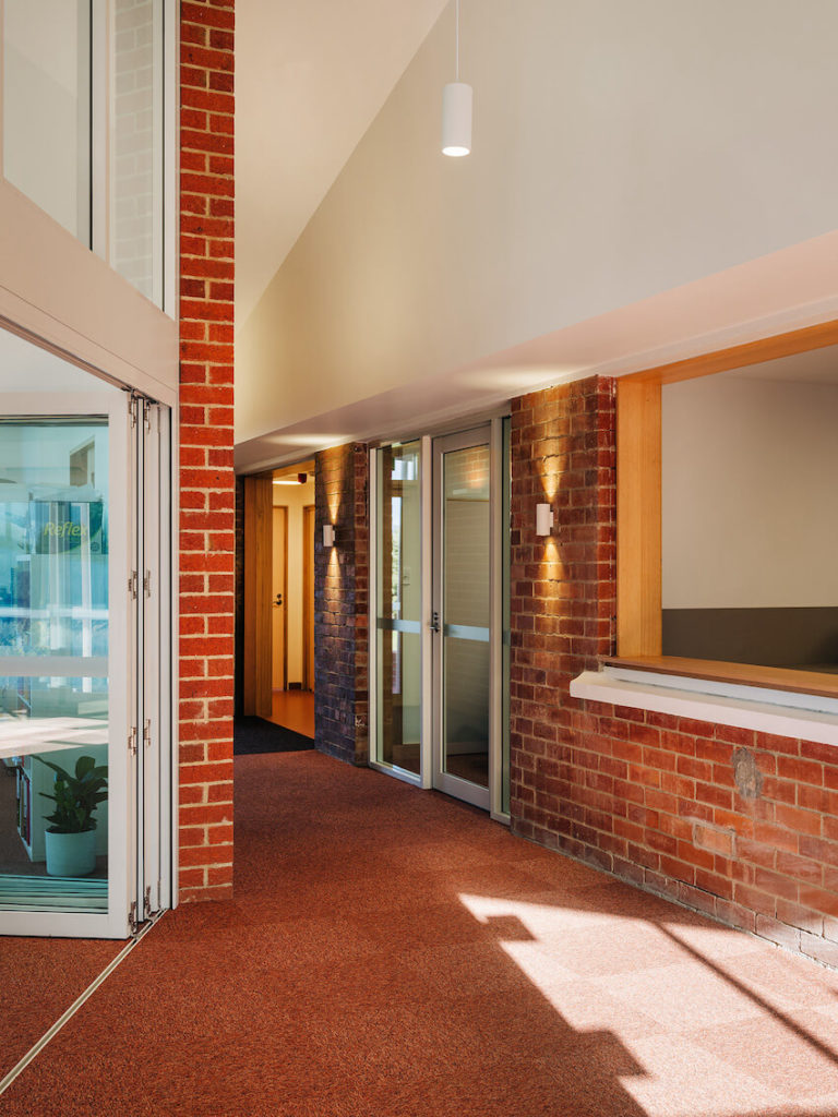
Evocative but modest form-making captures the typology and materiality of the original 1950’s district school. Skillion forms activate a new classroom and ancillary spaces and also inform the external silhouette. Opening to the existing kitchen engages both the new classrooms and the school hall, while simultaneously enhancing student experience.
The jury were sympathetic to the project being executed under Covid restrictions and applaud the architects for delivering a spirited redevelopment of this remote school.
Enduring Architecture
Award for Enduring Architecture
Clarence Council Chambers | Bush Parkes Shugg & Moon
Jury citation:
In the late 1960s, the then Clarence Commission initiated the move toward relocating the municipal government from its historic site in the Bellerive village to Rosny Park. The old town hall and offices were too small for the growing municipality. The chosen site, on rising ground north of the new Rosny Regional Shopping Centre, was flanked by a ‘civic parkland’ on the eastern side, with an outlook to the Rosny Golf Course to the west.
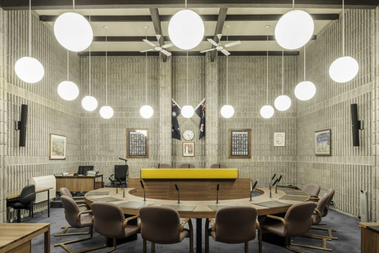
Opened in 1974, the Clarence Council Chambers building is comprised of two distinct elements, linked by a clearly defined entry foyer accessed from a small forecourt fronting the civic parkland, reflecting the functional distinction between municipal administration and the machinations of local government. The massing of the elements and materiality gives expression to this distinction.
The administration wing, extending above ground over two levels and basement as the site falls away, is of an open rectangular plan surmounted by an expressed steel structure, with a glazed wall surround set back from the perimeter steel supporting columns. Beneath a central lantern light, the ground-level public foyer gives open access to council services, echoing the neighbouring shopping mall. In contrast, the council chambers and related areas are housed in a vertically ribbed concrete masonry structure set into the ground, providing an expression of solidarity and contrasting texture.
The overall form and material vocabulary is a fusion of modernist Miesian influence meeting up with the 1960s emergence of the ‘Besser block’ in Tasmanian architect vocabulary as the ‘stone of the 20th Century’. The vertically ribbed concrete blocks were custom-produced for the project in collaboration with the Tasmanian concrete masonry industry. Aside from their textural quality, the ribbed blocks assisted in attenuation of acoustic reverberation in the Council Chamber.
Founding partners Lew Parkes and Pat Bush teamed with young architects Ray Heffernan, Bevan Rees and Charlie Voss to deliver the project, which received an RAIA Triennial Award in 1976. Nearly fifty years on, the building stands with only minor alterations, and continues to perform its civic, administrative and ceremonial duties.
The Clarence Council Chambers is distinctively Tasmanian while embracing universal modernist ideas. The design utilises local materials, and the careful articulation of building, space and landform to produce an architecture of civic identity—in a manner that would characterise Tasmanian architecture in the coming decades. It is an enduring building representative of an important phase in Tasmanian architecture evolution.
Heritage Architecture
The Roy Sharrington Smith Award for Heritage Architecture
The Hedberg | LIMINAL Architecture with WOHA
Jury citation:
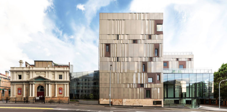
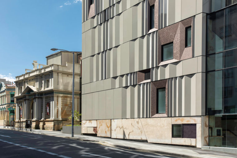
The project adaptively reuses the early 20th century Hedberg Brothers Garage together with an infill development which wraps the prominent streetscape corner connecting the historic Theatre Royal.
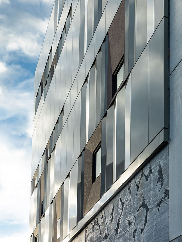
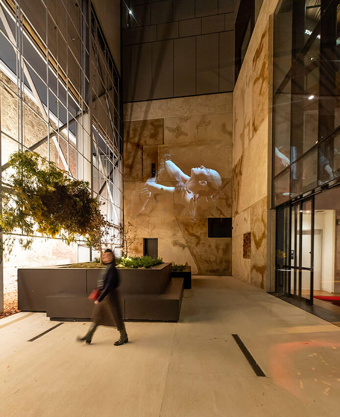
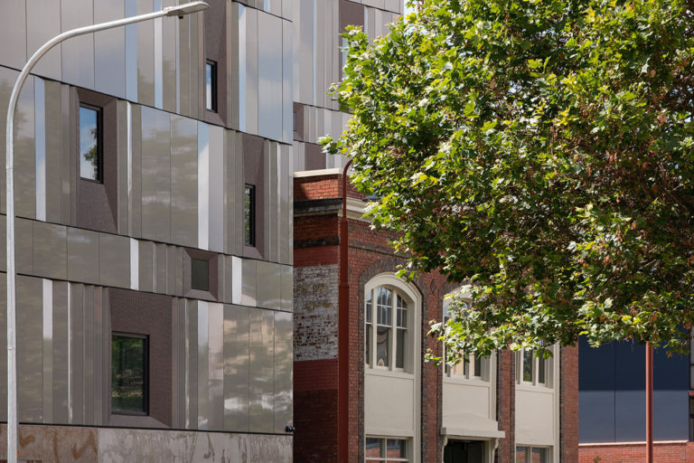
Artefacts retained from site excavations have been integrated in an interpretative program both internally and externally, providing tangible connections to the layered and continued history of the place. Importantly, this extends beyond the colonial occupation of the site with the external cladding being evocative of the opalescence of abalone shells, traditionally used by the Muwinina people of nipaluna to carry fire. Together with glazed walls, the pattern of external cladding is successful in breaking the mass of the building form, which may otherwise have detracted from the streetscape prominence of the historic buildings. This sensibility is also evident in the reduced form and visual permeability of the street corner, and the continuation of plinth base and pediment line of the Theatre Royal.
The project stands as an exemplary response to contemporary design within historic precincts. It is significant not only in its contribution as a world-class performing and creative arts destination and education precinct, but for ensuring the continued use of the Theatre Royal, the oldest operating Australian Theatre.
Award for Heritage Architecture
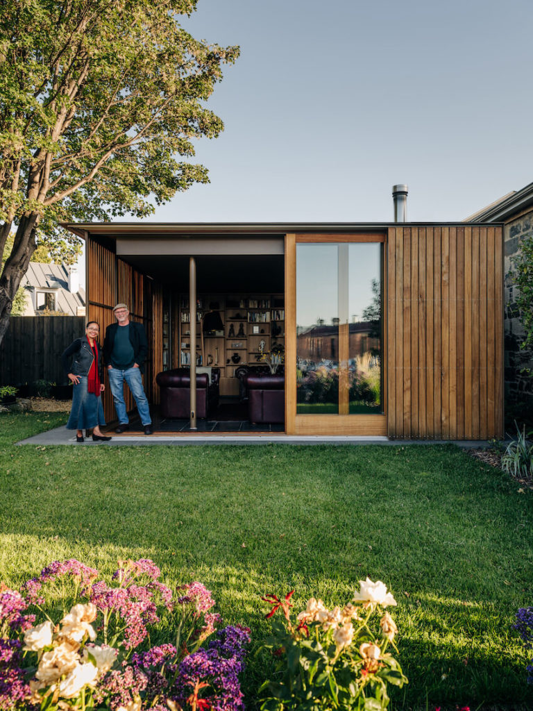
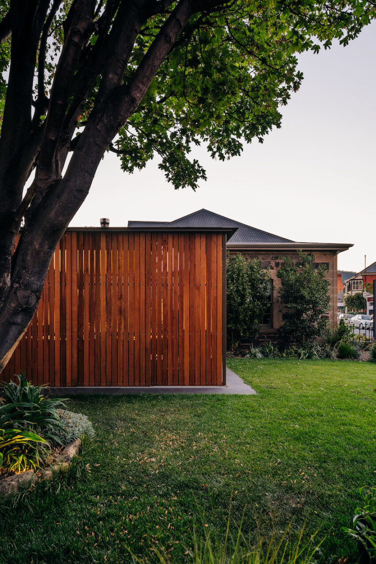
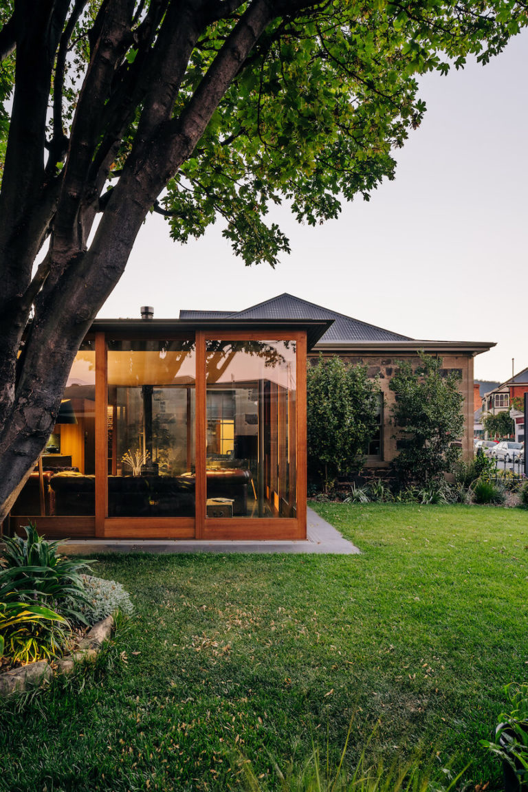
Fusilier Cottage | Bence Mulcahy
Jury citation:
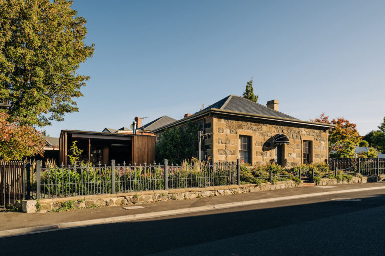
The 1830s Georgian Fusiliers Cottage is situated on a prominent corner within the Battery Point Heritage Precinct.
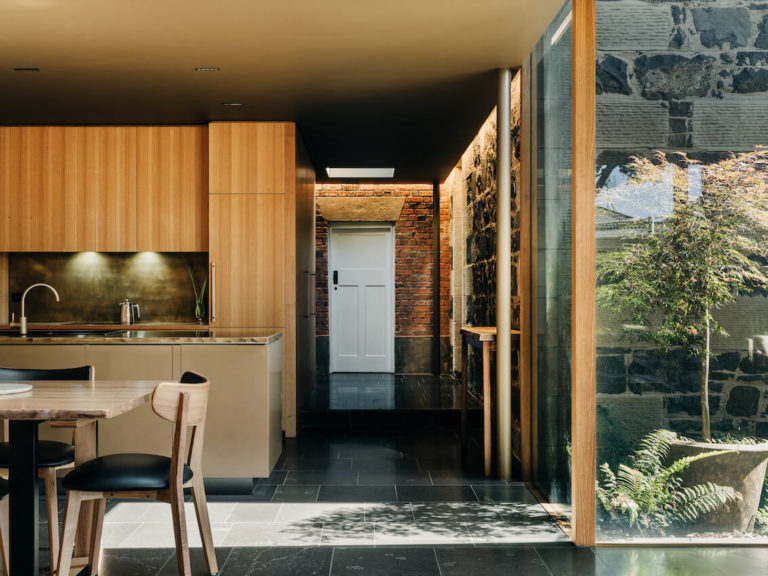
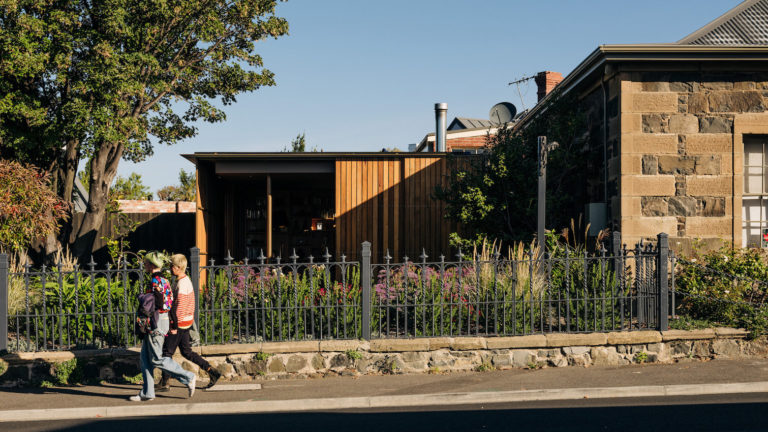
The extension delivers a flexible and contemporary program of bathroom, kitchen, dining and living spaces within a compact form. The resolution of the design is successful in mitigating impact to the Cottage and integrates and retains the significant streetscape qualities of the building, its garden and large sycamore tree.
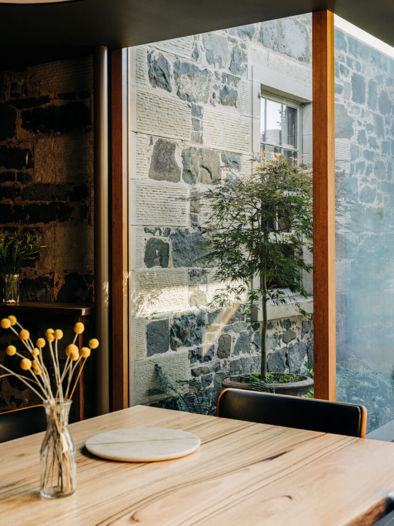
The building form sits below the roof of the Cottage, ensuring its retained prominence within the streetscape. It is separated from the main elevation by a glazed wall, which showcases the historic elevation within the interiors.
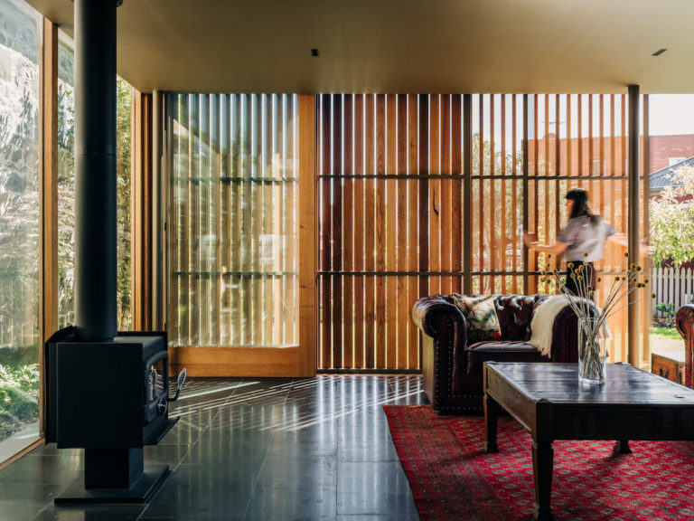
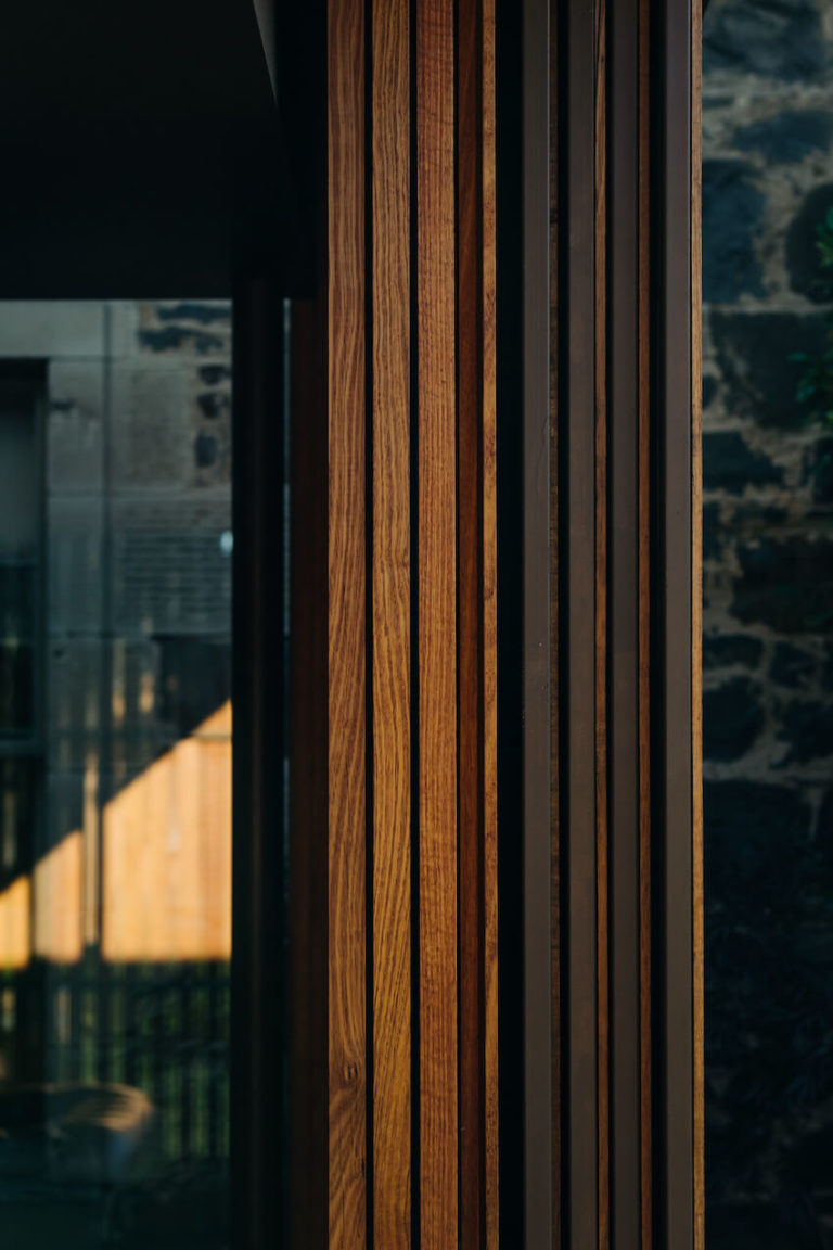
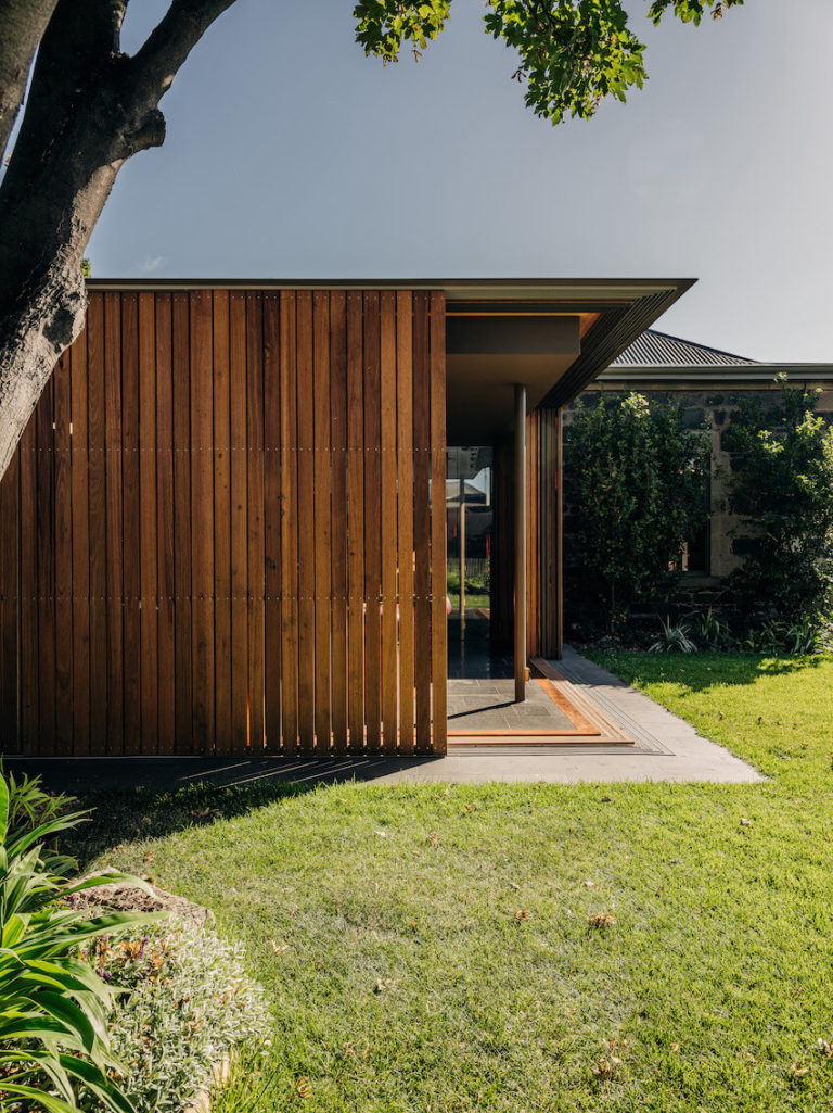
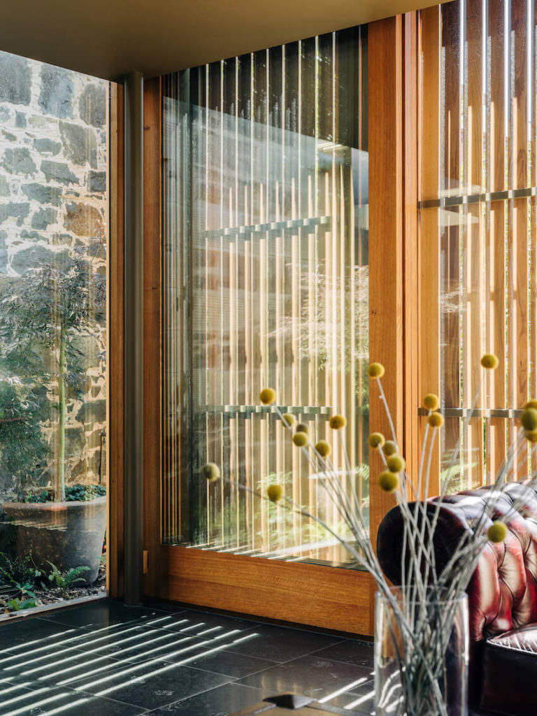
External timber screens afford privacy, while evoking the dappled shade of the tree canopy. The screens subtly break the form and bulk of the elevation when viewed from the exterior. The timber screens are recognisable as a material vernacular to contemporary Tasmanian architecture, while being recessive to colonial masonry construction. Internally however, the prominence of bluestone and brass delivers a quality finish befitting a colonial building of this status.
Interior Architecture
The Alexander North Award for Interior Architecture
The Hedberg | LIMINAL Architecture with WOHA
Jury citation:
While the Hedberg makes a significant contribution to its urban and historic context, its interiors are central to the creation of this world-class creative arts destination and education precinct.
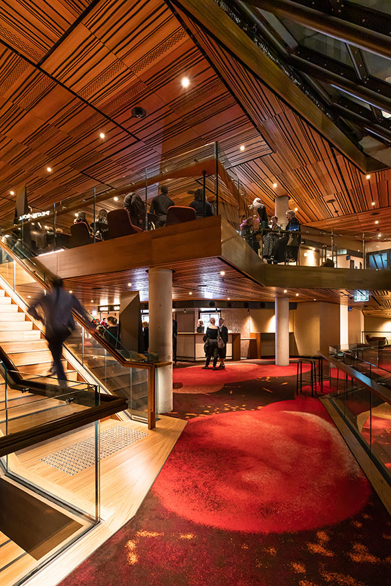
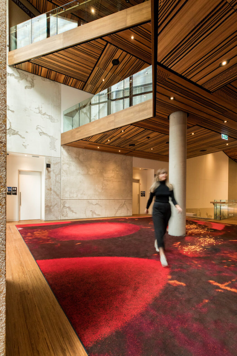
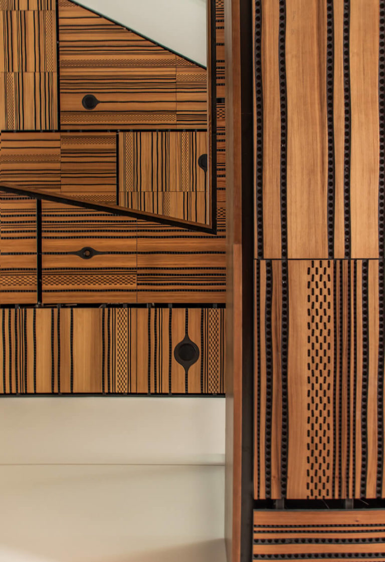
The interiors program is fully integrated with bespoke furniture, wayfinding and event signage, and a complex technical and performance brief. Material investment and craftsmanship is evident in elements such as the foyer carpet, designed by First Nations Tasmanian artist Michelle Maynard. The opalescence of the cladding material is evocative of abalone shells, traditionally used to carry fire and representing the theatre of storytelling. The project weaves reclaimed historic material of the site together with contemporary materials, embellishing and elevating them as appropriate to a place of performance.
The plan resolves the complex integration of public and back-of-house circulation and delivers universal access to the Theatre Royal. The facility provides world-class educational facilities within an environment directly connected to the practice of art and performance. In doing so, educational outcomes will be enhanced.
Internal voids provide connectivity for patrons over multiple levels of performing and creative arts spaces. This enhances opportunities for the activation of public spaces for flexible programs extending their use in a way which will enrich a patron’s experience of both performance and the building itself.
public architecture
The Alan C Walker Award for Public Architecture
The Hedberg | LIMINAL Architecture with WOHA
Jury citation:
Despite a changing brief over seven years, having a multitude of stakeholders of different disciplines, and needing to stitch different historical elements together, the Hedberg succeeds in creating a new performing and creative arts location that enmeshes its programmatic elements clearly and dramatically.
The performance spaces are both technically impressive and beautiful. Each has its own personality and is shaped by the various needs of the intended program and technical requirements.
The building’s façade contributes positively to the streetscape, tying together the old garage and theatre with respect and appropriate grandeur. Performance spaces on the rooftop, and connectivity of its production technology elsewhere, help break the ‘black box’ typology typical of theatre spaces.
The exceptional public access to the building, and inherent legibility of the spaces, contribute to Hobart’s growing list of successful public and cultural spaces.
Commendation for Public Architecture
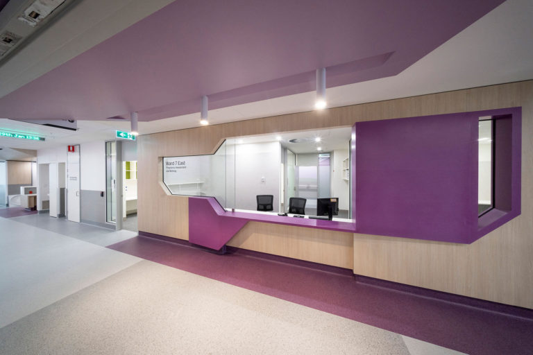
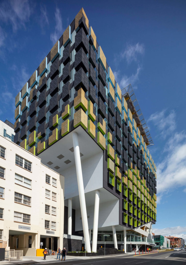
Royal Hobart Hospital Redevelopment | Lyons with Terroir
Jury citation:
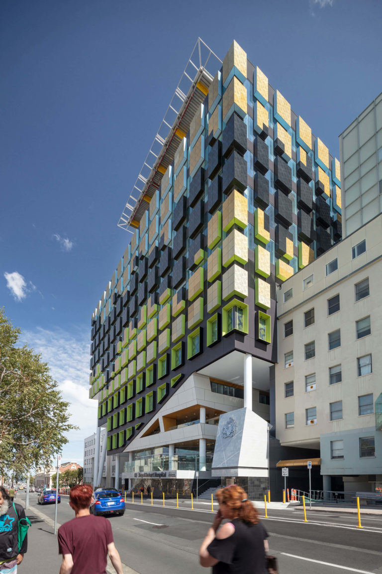
This new 11-storey redevelopment is a technological juggernaut. Skilfully linking its three surrounding streets through the centre of the site, the building was constructed in multiple stages allowing the hospital to operate throughout the build.
Its massive bulk, clad entirely in a mosaic of variously coloured, two-metre square-framed ‘tiles’ colourfully reinterprets the surrounding landscape. The interiors are carefully crafted and planned to maximise natural light to inpatient wards, specialist areas being not typically windowed, and to main corridors providing surprise Hobart views.
Residential architecture - Houses (alterations and Additions)
Edith Emery Award for Residential Architecture - Houses (Alterations and Additions)
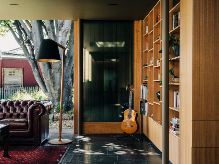
Fusilier Cottage | Bence Mulcahy
Jury citation:
This alteration to Fusilier’s Cottage is a sensitively placed, contemporary lean-to that offers a uniquely sociable living condition within the heritage context of Battery Point.
The cottage occupies a key corner of the Hampden Road retail strip, and the new work has retained its role as a village shop in the two front rooms. While the existing cottage has had minimal work, a small complex of spaces has been added to the rear, culminating in a spacious living room opening onto the grassy garden featuring an established Sycamore tree. The new work is clearly delineated as a servant to the main house, sitting under the existing eave line and thereby retaining a clear reading of the original heritage fabric.
With Georgian homes of this era, there can be a heightened sense of interiority, as thick walls and cut-out windows establish a strong threshold between inside and out. Here, the garden-room extension offers a new condition. The occupants can still enjoy the enclosed feeling of the cottage, but they can also open their home, via sliding screens and glazed doors, to connect with the passing traffic of tourists, locals and slow-moving vehicles.
Residential Architecture - Houses (New)
The Esmond Dorney Award for Residential Architecture - Houses (New)
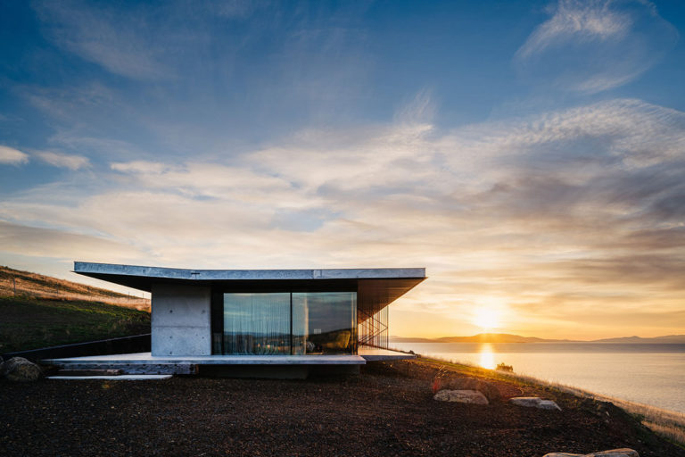
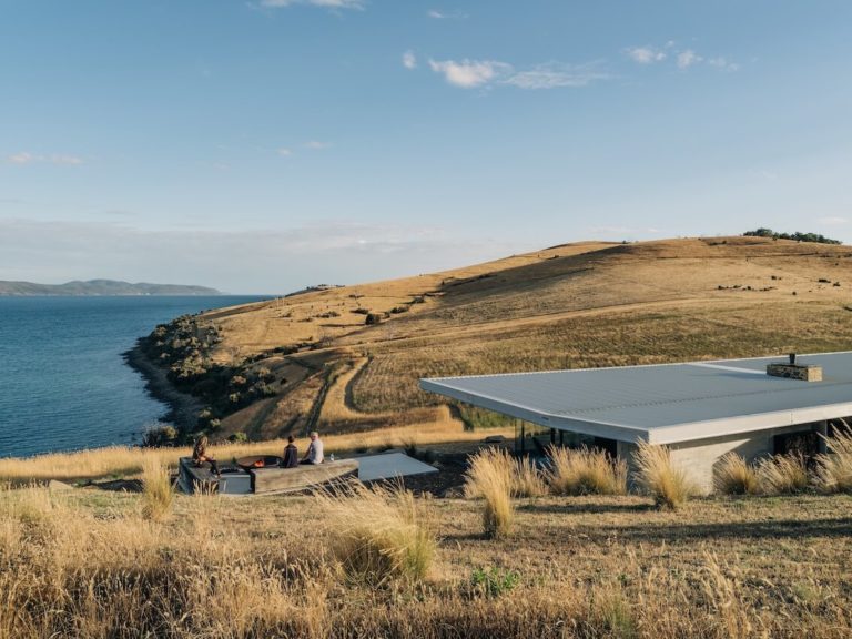
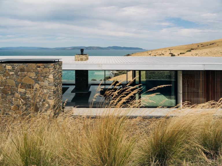
Mays Point House | TANNER ARCHITECTS
Jury citation:
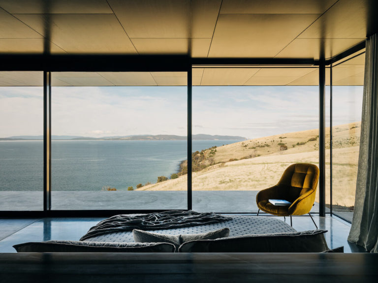
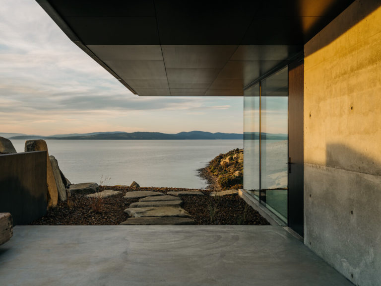
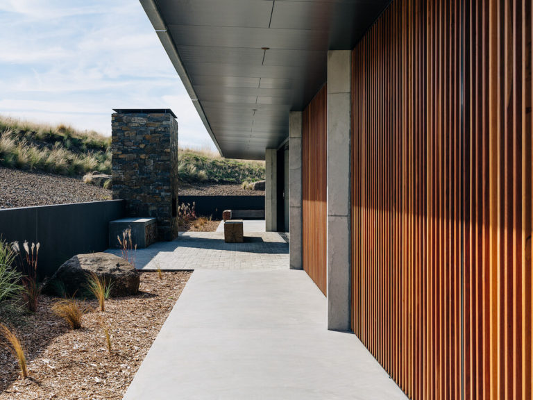
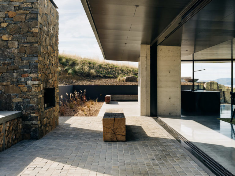
Benched into a broad slope running into Frederick Henry Bay, Mays Point is a sleek, concrete pavilion that has a weighty yet quiet presence.
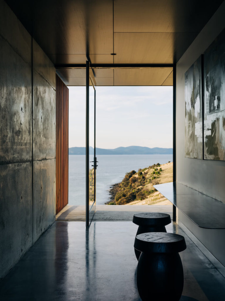
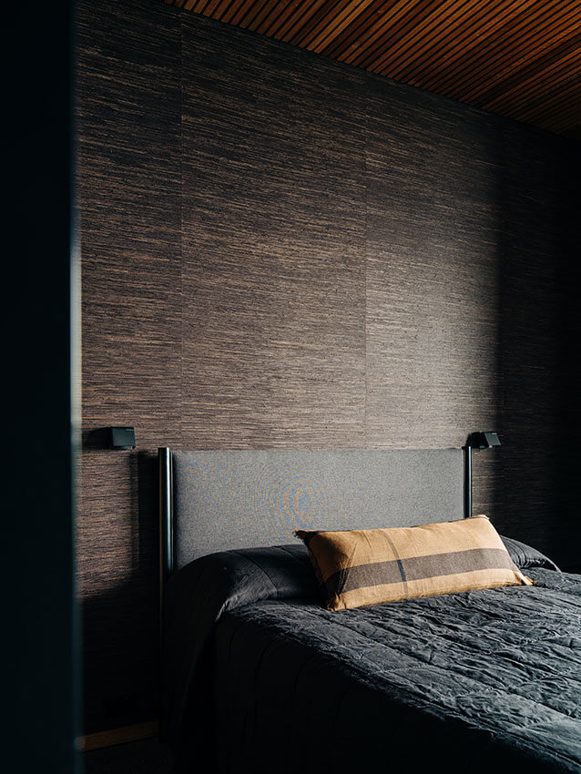
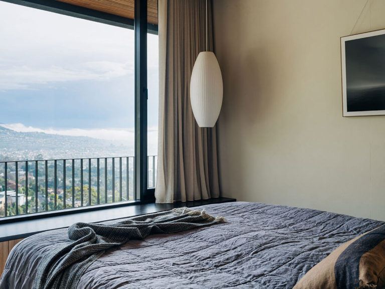
A series of sleeping, sitting and living spaces stretch along a single level under a winged roof, each focussed on the extraordinary southerly views across the large rural property. With the home facing strong winds, planning allows the occupants to find refuge where needed, with the outdoor space around the hearth to the rear capturing north sun. Consistency of detailing and material use throughout the design offers a rich yet minimalist experience.
While every effort has been made to align, set down, and run through, there is depth and lustre in the material selection that make the home much more than a simple frame for a view.
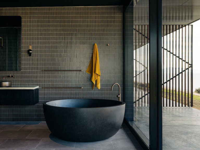
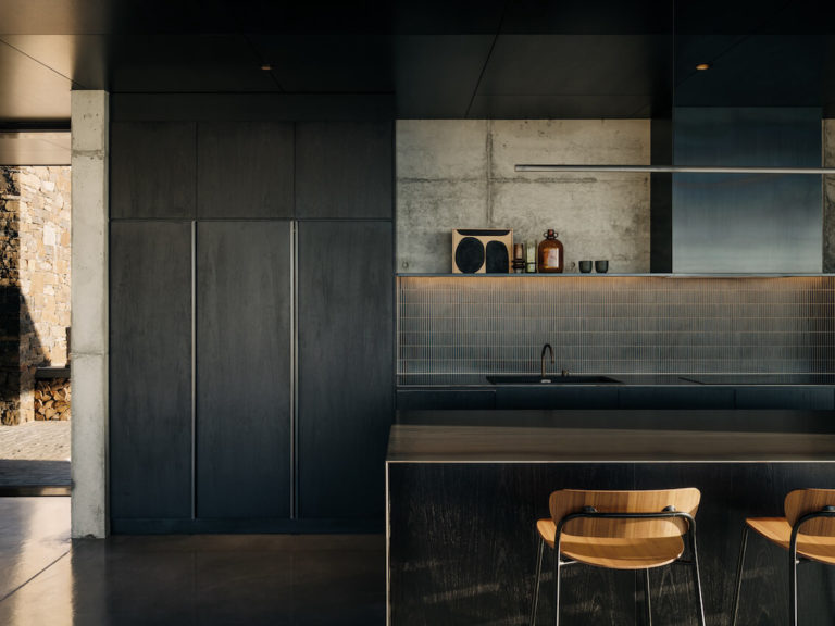
Waxed steel benchtops, deeply stained timber and honed concrete floors play against the irregularity of the in-situ panels. This is a building that shows the cumulative effect of years of detail refinement across multiple Tanner Architects projects, and reflects the obvious benefits of a long working relationship between architect and builder.
Award for Residential Architecture - Houses (New)
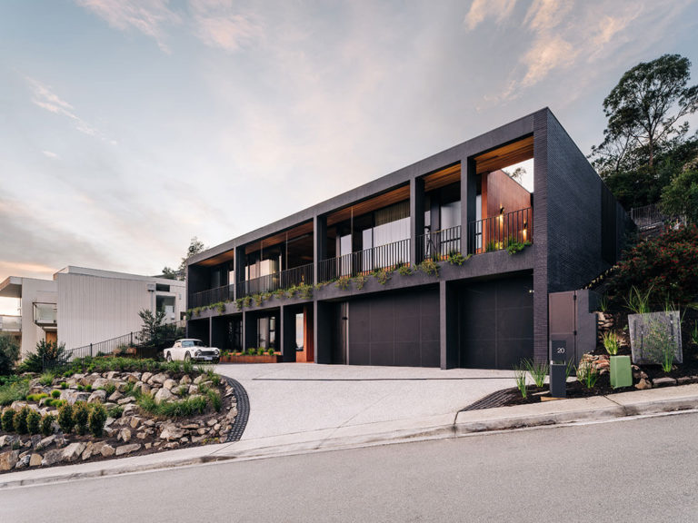
View House | Archier
Jury citation:
On a suburban hillside that has seen the slow creep of panelled and rendered residences, often insensitive to their context, View House offers an alternative architecture.
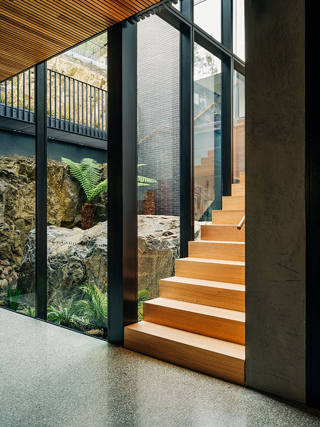
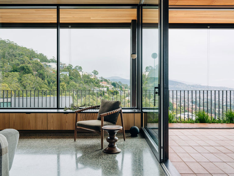
Firmly anchored into and taking advantage of its steeply sloping site, the dark brick frame of this home hides a complex series of spaces allowing occupants to dwell throughout the day, over time, alone or surrounded by family. While long views back to the city are easily enjoyed from the north-facing rooms, views within the house are equally enjoyable.
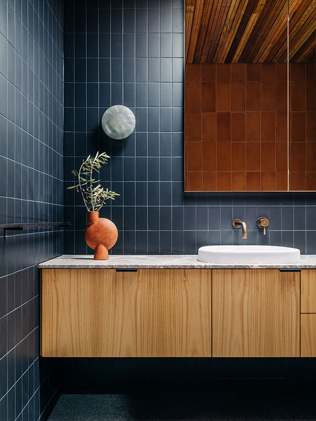
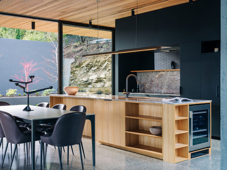
Vistas to a large, captured boulder; a cluster of Japanese maples; an immaculate workshop; and an array of carefully selected interior textures offer an aesthetically lush experience against a baseline of deep grey brick and terracotta. It’s quite easy to imagine spending time here, from the self-contained ground-floor flat—a built-in plan for future care—through to the spacious upper-level terrace that splits living and sleeping and could be occupied from morning till night.
The greening of the front yard and upper level will eventually complete the picture, creating some connective tissue with the original bushy hillside.
Commendation for Residential Architecture - Houses (New)
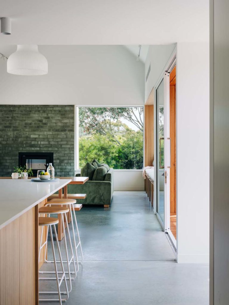
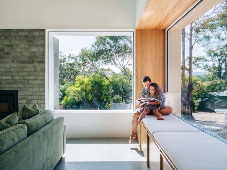
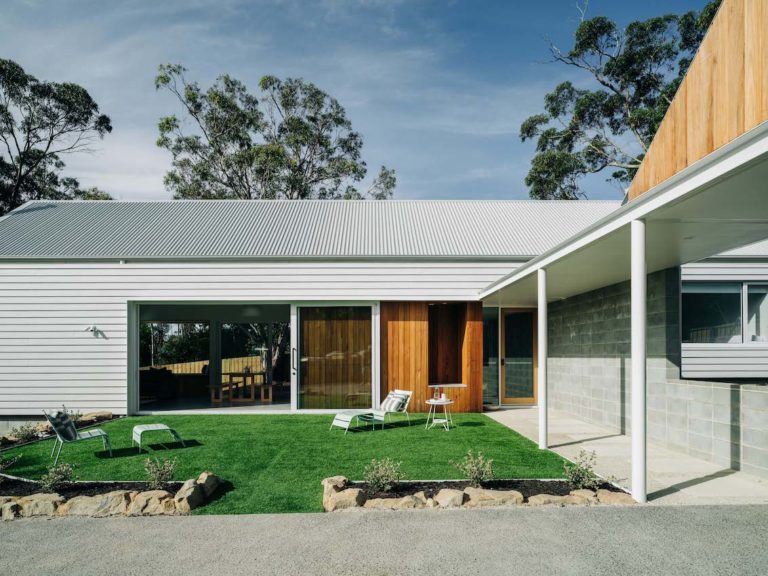
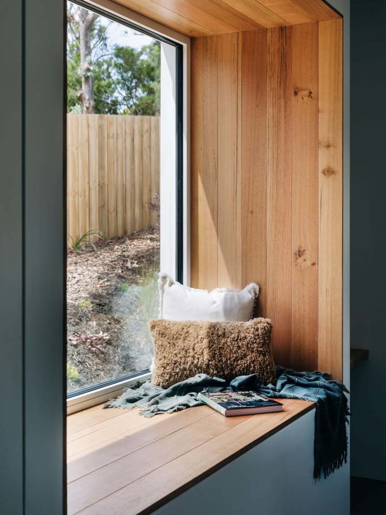
Bluff House - Spring Beach | Preston Lane
Jury citation:
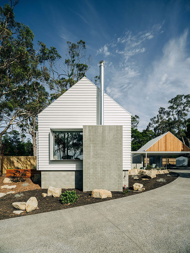
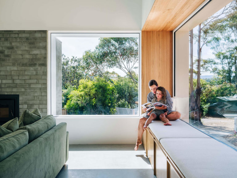
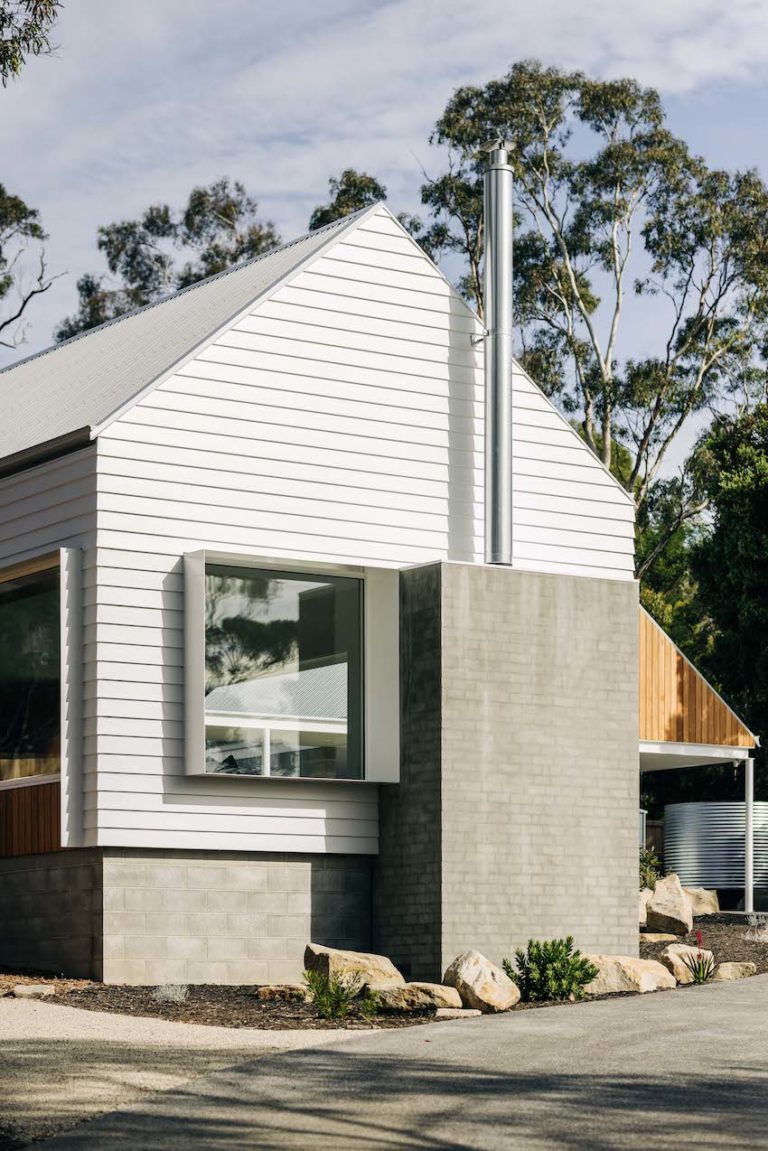
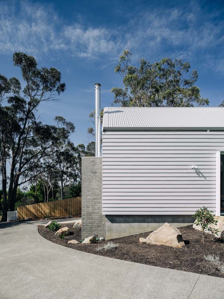
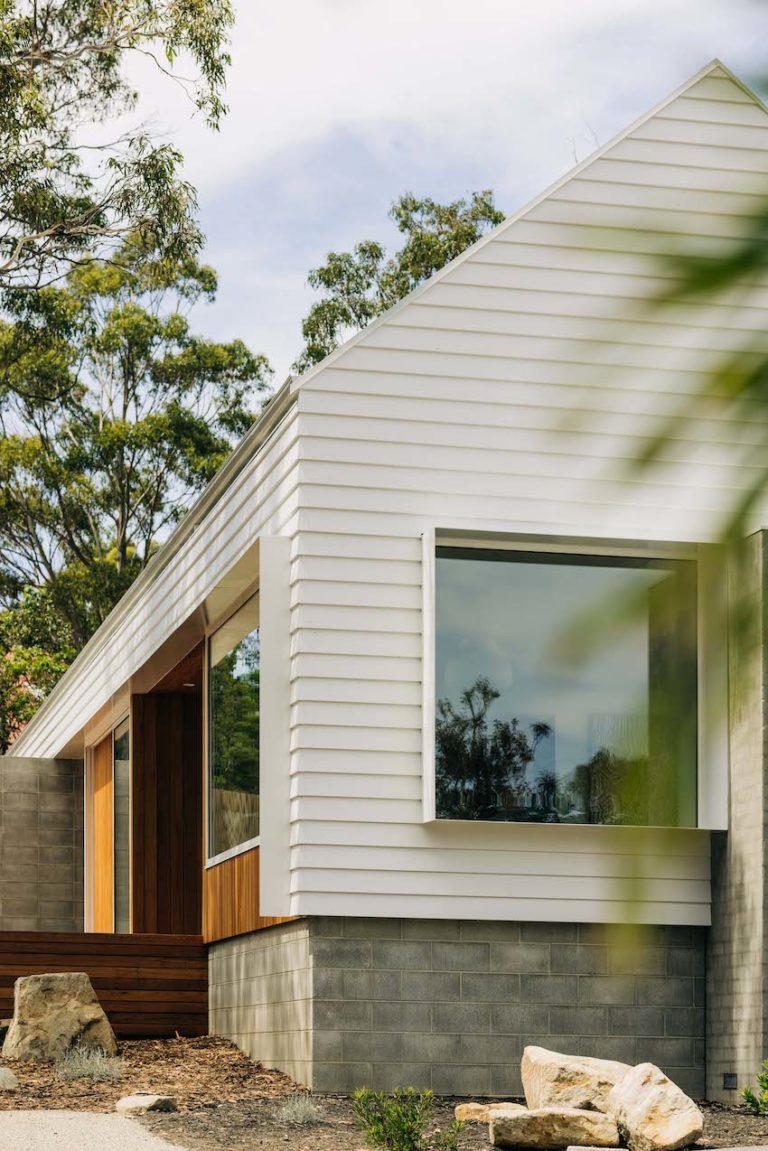
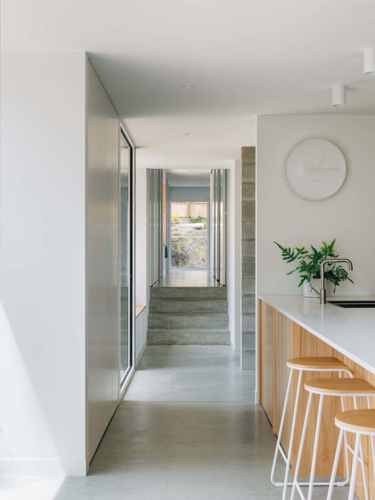
Bluff House is a crisply detailed pavilion responding to the changing weather and needs of the client. All spaces are potentially occupiable, allowing a growing family to spread out, with the naturally lit corridor bringing in orienting views, allowing for plentiful storage and spaces to sit as it steps down the gently sloping site.
While it is inarguably luxurious, the white weatherboard gable, anchored by the solid mass of its fireplace, sits unobtrusively on the site, fulfilling the client brief for an unassuming addition to the locality.
Commendation for Residential Architecture - Houses (New)
Casa Acton | Archier
Jury citation:
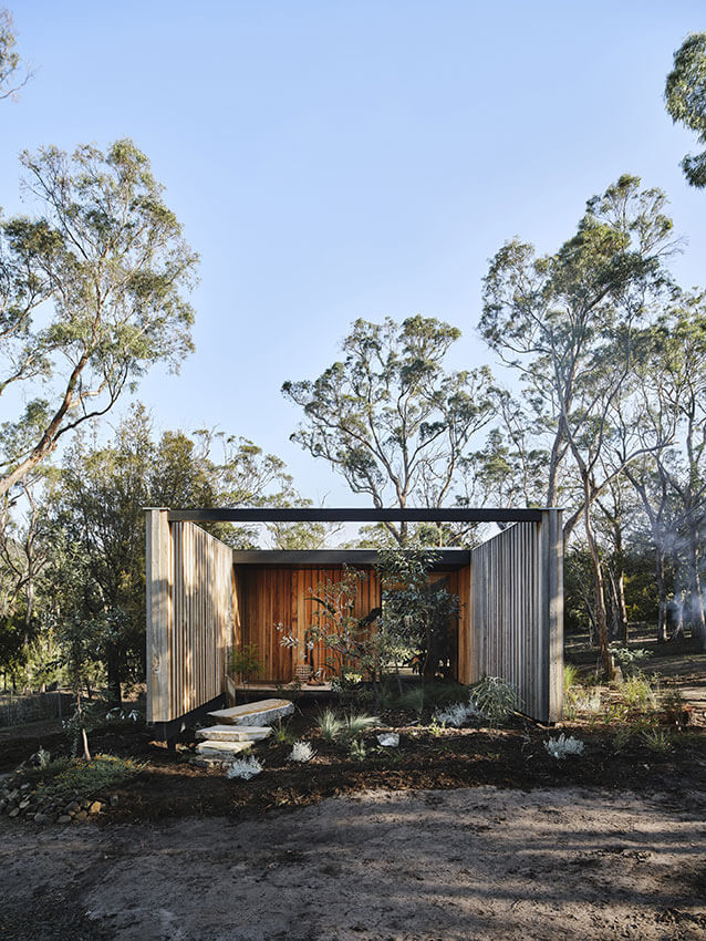
Casa Acton emerged as one elegant possibility for a housing conundrum: funds were available for a build, or the land, but not both. This ancillary dwelling does much within its small plan.
Extending blade walls and care in siting create private, liveable outdoor spaces. A blade wall and split level define the interior, allowing for clear or implied separation between service, sleeping and living spaces. While the jury had lingering doubts about a future relocation, they commend the architect (and the in-laws!) for this approach to housing affordability.
Residential Architecture - Houses (Multiple Housing)
The Ray Heffernan Award for Residential Architecture - Multiple Housing
GOULBURN STREET HOUSING | CUMULUS
Jury citation:
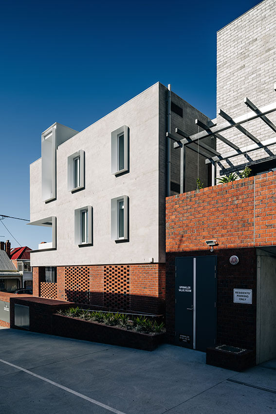
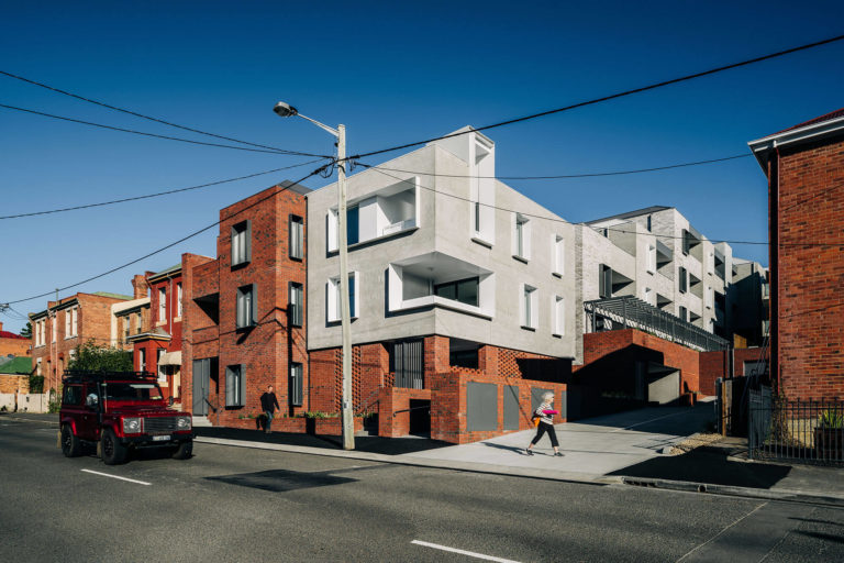
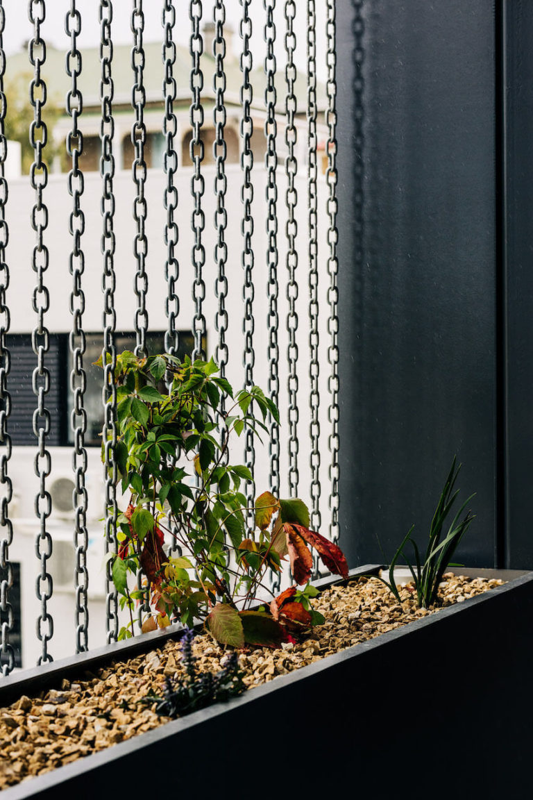
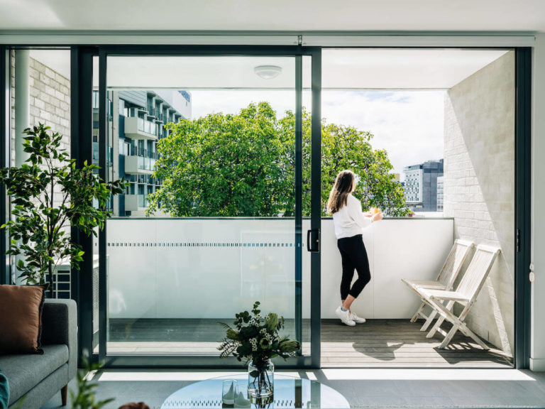
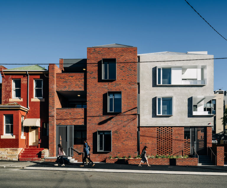
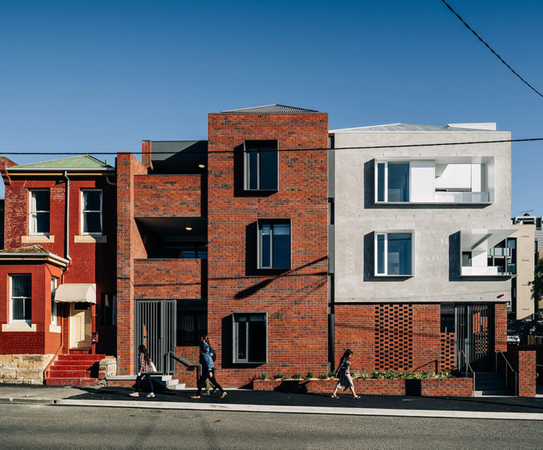
This large multi-residential development successfully achieves its aim to sit comfortably within a much smaller residential context. This is achieved by the use of local materiality and nearby fenestration precedents interpreted in new and playful ways. The use of internal pathways, heavily articulated with planters, furniture, and changing forms, punctuated with curated views, create an inner world that is still connected to the city around it.
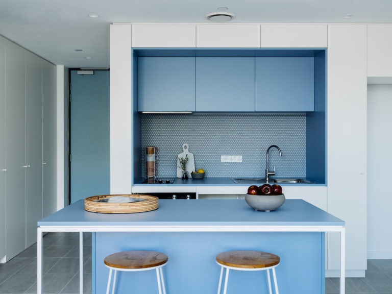
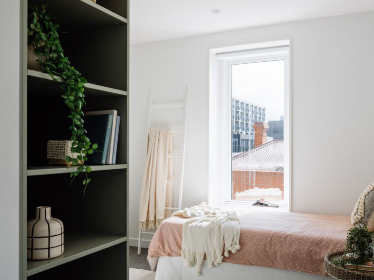
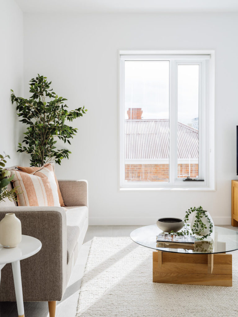
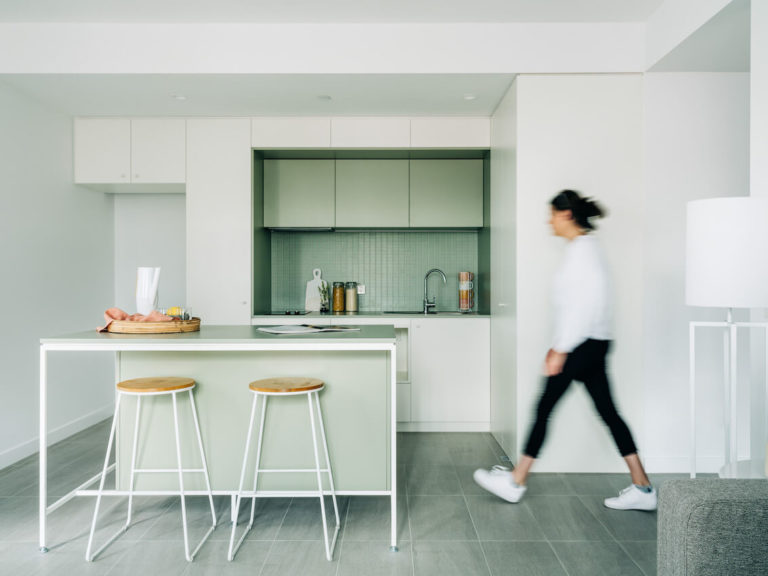
Each apartment, although necessarily modest in scale, feels larger than its floor area might suggest due to clever planning, and connection to its own private external space. Due to the ever-changing layout of the project, each apartment has its own sense of identity within the complex. The use of block colour in kitchen gives the spaces a visual lift, balancing the copious natural light. These spaces are often mundane in these typically risk-averse projects, but here the risk was taken and the result is worth it.
The jury felt this was an excellent example of dignified housing for both the elderly and the disabled in much needed proximity to the city.
Award for Residential Architecture - Multiple Housing
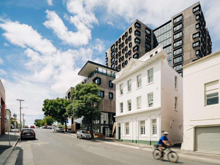
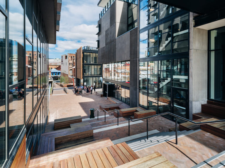
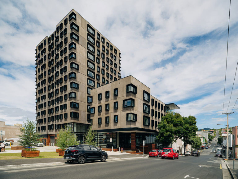
UTAS Melville Street | Nettletontribe
Jury citation:
The first thing one notices when approaching this complex is the generous ground-level public spaces and connective pathways. Designed to connect to future UTAS buildings on other sites, these groundworks hint at the positive influence the university may have in moving to the city.
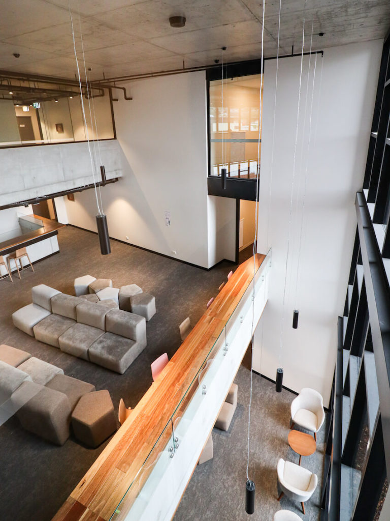
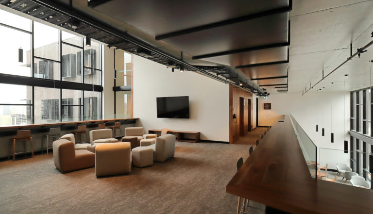
Within the main residential building, the generosity of space continues in the shared spaces by providing multiple zones for study, play and social engagement. These spaces have soaring ceilings and great views into the city of Hobart. While ensuring student safety, this visual connectivity really makes the spaces feel part of the city and the city part of them, helping promote a town-and-gown relationship rather than being a potential ivory tower.
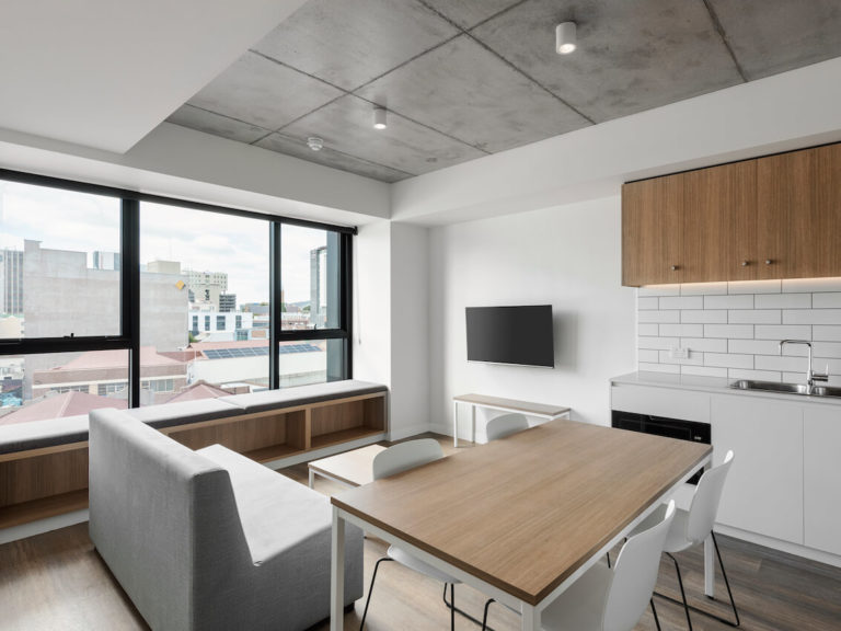
In the student dormitories, fenestration and room sizes reduce to an appropriate scale with simple yet elegant furnishings. Overall, this is a very positive contribution to Hobart providing large-scale quality accommodation.
Small Project Architecture
The Peter Willmott Award for Small Project Architecture
Long Beach Amenities | Preston Lane
Jury citation:
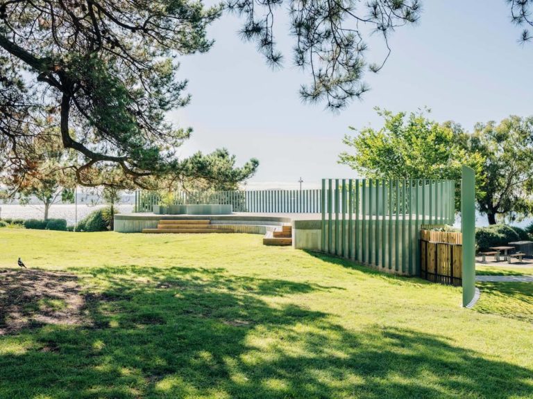
Hugging the contours of the playground at Sandy Bay’s Long Beach, this new amenities facility provides a delightfully subtle interpretation of the toilet block typology.
Careful colour selection and delicate articulation of the building envelope allows the building to bleed seamlessly into the landscape. This integration is enhanced by the earth of the playground extending over the building to form the roof, which in turn doubles as a performance stage.
The introduction of the stage, a wonderful extension to the brief initiated by the architect, affords unexpected opportunities, with moments of delight such as those via a reflective porthole to the level below and regular occupation by local musicians.
Long Beach Amenities is a wonderful example of how a small building can have a widespread and generous community impact, making it a sustainable typology for the future.
Sustainable Architecture
Award for Sustainable Architecture
Spring Bay Mill Ridge Quarters | Gilby + Brewin Architecture
Jury citation:
The design contributes significantly to the enhancement of this vast, rejuvenated industrial site. Its elegant gently curving ‘bogey and wagons’ railway typology arranges elevated double bedrooms and suites in a linear arrangement to the north side of a central spine, while service elements are to the south. Off-site prefabricated production is used throughout to reduce construction time and minimise further disturbance to this previously highly damaged site.
The building fulfils all the primary sustainable criteria: its demountable, relocatable, reusable structure ‘touches the ground lightly’ and could simply be relocated and repurposed at any time. Passive credentials include north-facing orientation for most habitable spaces, and the strategic deployment of service spaces to the south of the central corridor.
Its industrial aesthetic, echoing the materiality of the original structures, is emphasised by its sturdiness and utility, with internal materials made from recycled sources. Stored water used for toilet flush adds considerable ecological value to the site, and is an effective cost- and energy-saving measure.
Urban Design
The Dirk Bolt Award for Urban Design
The Hedberg | LIMINAL Architecture with WOHA
Jury citation:
The six-level Hedberg located on a prominent city corner, abuts and extends the iconic two-level Theatre Royal heritage landmark. A series of orthogonally derived interlocking forms establishes a contextual relationship with its surroundings, augmented through deliberate materiality and colour choices.
Within the constraints of the brief, the design expertly manages its relationships with the theatre by setting back the entire north face, only returning behind the theatre stage. The ground- and first-floor connections are managed behind a conventional but well resolved glazed link.
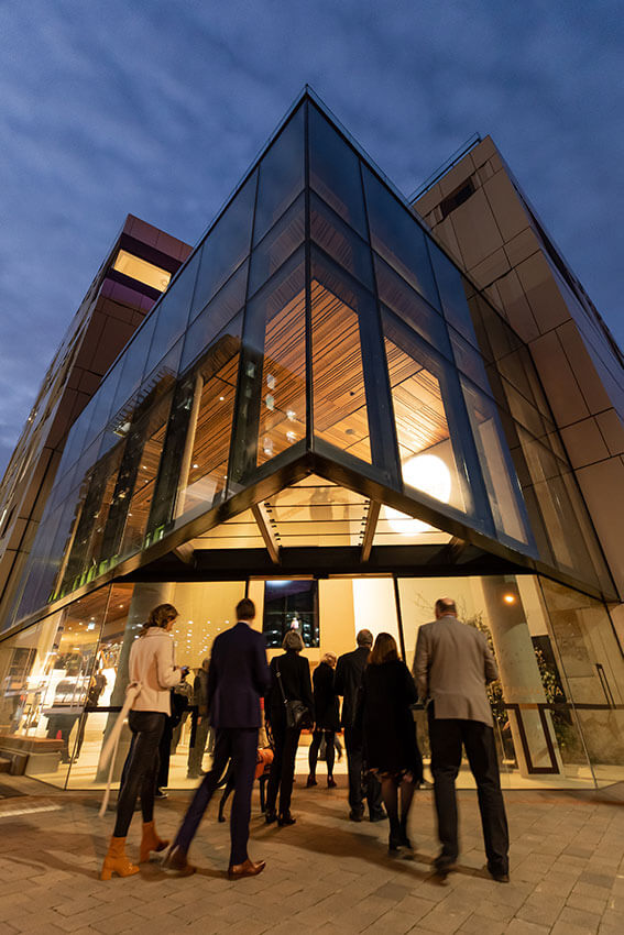
Similarly, the potentially bulky and dominating mass of the new building has been avoided by the introduction of the two-storey glazed corner entry with accessible roof terrace. This provides a low-scale transition from Campbell Street to Collins Street and assists the incorporation of the former Hedberg motor garage around the corner.
The new superstructure—in contrast to the almost 200-year-old sandstone-and-render theatre—is entirely clad in lightweight, gloss-finished, metal material in a variety of detailed treatments. The overall impact of these devices—striping, subtle colour changes, contrasting dark panels, and the reflectivity of the panelling—assists to masterfully deconstruct the visual bulk of the Hedberg on this iconic Hobart site.
Award for Urban Design
Goulburn Street Housing | Cumulus
Jury citation:
The street and internal laneway façades of the three-storey Goulburn Street development are carefully informed by the scale, materiality and fenestration of the adjoining streetscape. The modelling of the building’s form is used to establish contextual relationships augmented through material, colour and detailing choices.
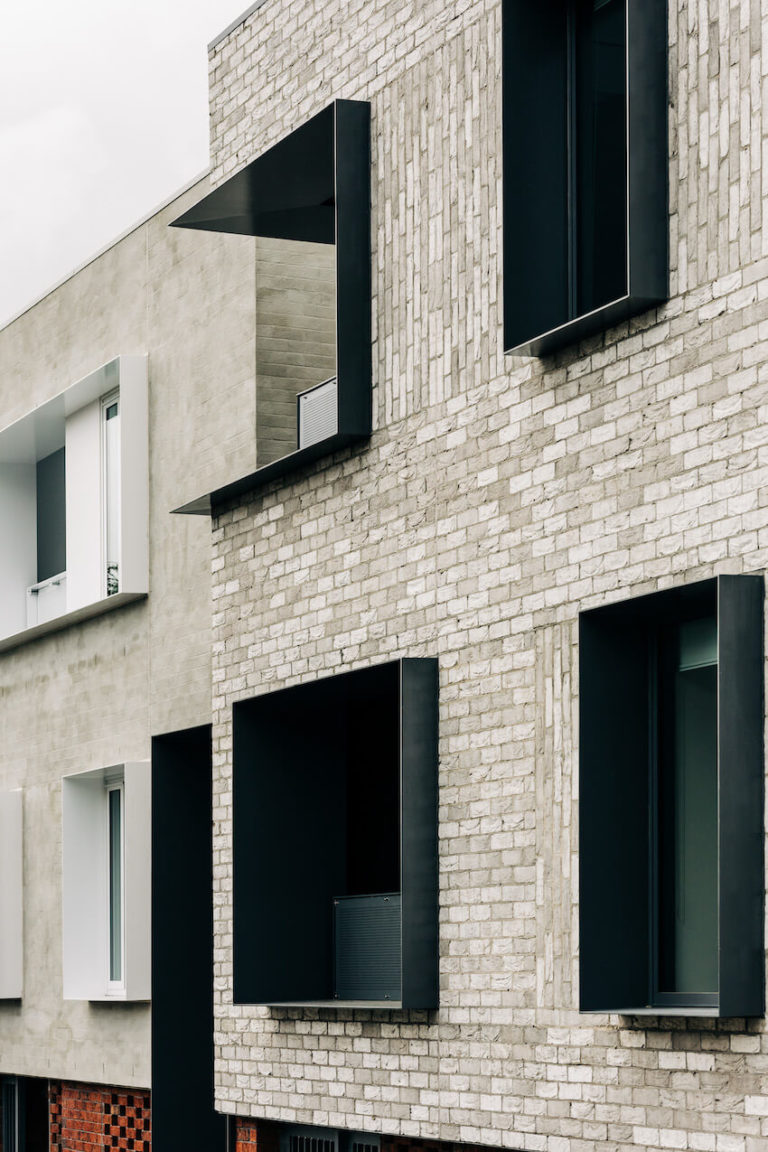
Red and textured pale-grey brickwork clad the entire complex, together with painted framed windows: charcoal in red brick walls, and white in grey walls, and similarly framed deeply recessed balconies. These erode the building’s form reducing visual bulk and, through repetition, provide an arresting and consistent façade reading.
Commencing with a redbrick ‘anchor’ block on the uphill side of Bathurst Street, the balance of the complex, including the Goulburn Street elevation, are all in greys, with the redbrick relegated to ground-floor conditions. The use of pyramidal pitched roof forms with severely clipped eaves echoes the pitched roof modelling of some of the earlier buildings of this neighbourhood. This is a meticulously crafted example of contemporary contextualism.
Commendation for Urban Design
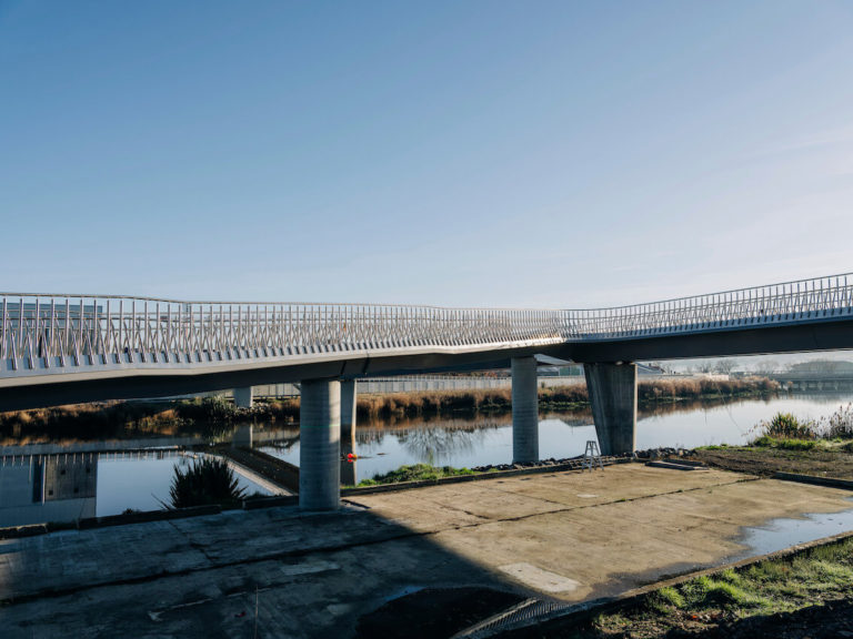
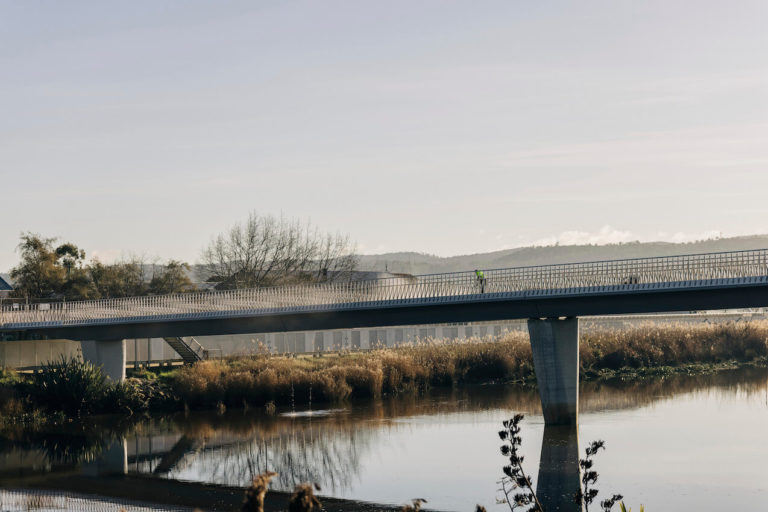
North Esk Pedestrian Bridge, University of Tasmania | John Wardle Architects
Jury citation:
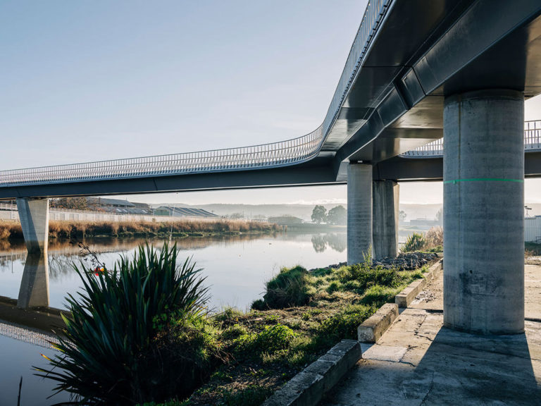
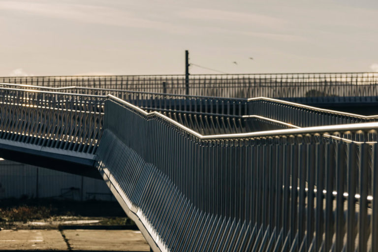
This project has expertly organised its key functional components of precast concrete bridge structure, stainless steel balustrade, and concrete and grid mesh stairs into a minimal encompassing narrative.
The balustrades are a highly resolved industrial design feature with technical needs reconciled using a small number of sophisticated, locally manufactured, interchangeable members and components.
The architects are to be praised for their continuous engagement with the construction agency throughout the build, underpinning a high-quality outcome.

