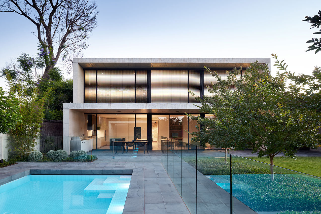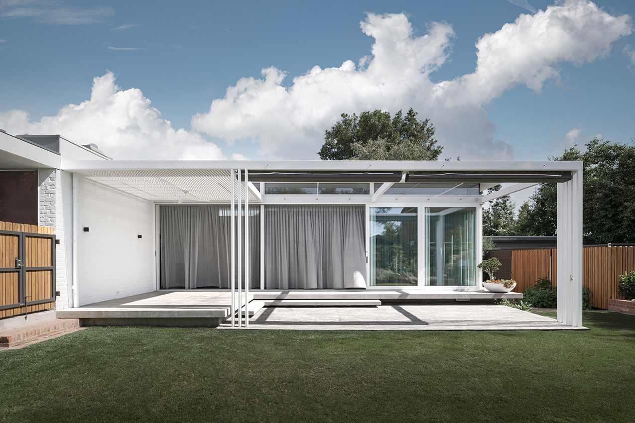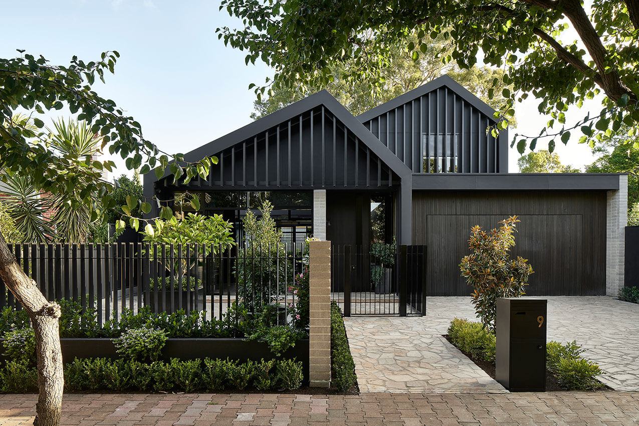
Entrant Gallery:
SA Chapter
SA Chapter
2022 National Architecture Awards
2022 SA Architecture Awards
entrant gallery
2022 SA Architecture Awards – Entrant Gallery
city of Adelaide Prize
Jury:
Chair Felicity Sando (Mulloway Studio)
City of Adelaide Representative Councillor Helen Donovan
AILA Representative Daniel Bennett
DIA Representative Anna Brown
PIA Representative David Bills
Guildhouse Representative Emma Fey
Project descriptions
Adelaide Railway Station – ARM Architecture
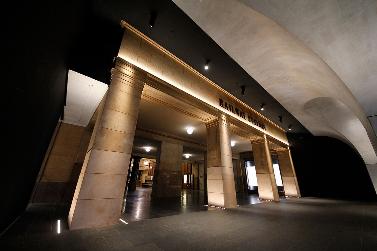
Our Adelaide Railway Station Entry Concourse project delivers an immersive pedestrian concourse connecting the Adelaide Railway to the Riverbank. It is the first delivered element of ARM’s Festival Plaza Design within the Riverbank Masterplan.
The station concourse interior was conceived as an organic vaulted arcade, a carved interior space from the rocky escarpment, reminiscent of the Garlick and Jackman Neoclassical interior of the Adelaide Railway Station Hall. The vaults were sculpted organically, but also pushed and pulled to align with an integrated structural column design supporting the SkyCity building above. This allowed the arches to touch down to ground around each column, resulting in a rhythm of intersecting vaults and an immersive experiential collection of volumes.
The design recognises form as function, utilising architecture as sculpture to create a space that transforms a previously forgotten part of the Riverbank, resulting in a new sense of pride in place for Adelaide.
Adelaide Festival Pavilion – CO-AP Architects
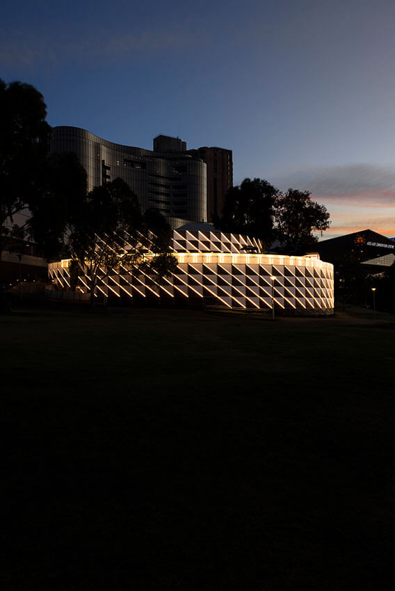
Adelaide Festival, with Artistic Directors Neil Armfield AO and Rachel Healy, commissioned CO-AP to design the new Adelaide Festival Club – a temporary pavilion for events during the 2021, 2022 and 2023 festivals – situated in Kaurna Country along the banks of Karrawirra Pari (Torrens River).
Drawing design cues from the nearby Elder Park Rotunda, a distinct circular form has been adopted to house the beating heart of Adelaide Festival. It is to provide a space for new and exciting acts both nationally and internationally, becoming a meeting ground for audiences of all generations and backgrounds to watch and listen, to perform, to eat and drink, and to share memories over the festival period.Drawing design cues from the nearby Elder Park Rotunda, a distinct circular form has been adopted to house the beating heart of Adelaide Festival. It is to provide a space for new and exciting acts both nationally and internationally, becoming a meeting ground for audiences of all generations and backgrounds to watch and listen, to perform, to eat and drink, and to share memories over the festival period.
Lot Fourteen Canopy – Oxigen + Tridente Boyce + Arup
Lot Fourteen, an initiative of the South Australian Government, provides a vibrant, collaborative ecosystem focussing on innovation, entrepreneurship, research, education, culture, and tourism. The brief was to provide a sheltered outdoor space, adjacent to the Australian Space Discovery Centre entry, allowing groups to assemble while being protected from the elements
The narrow passage between the imposing State Heritage buildings required a sensitive insertion with minimal impact. The structures configuration is derived by aligning the structural grids of the two existing buildings and is independently stabilised with a series of strategically located cables. For protection from the rain, a sloped glazed plane is suspended at a lower level from the overhead structure with cables.
The project illustrates the benefit of true collaboration between parties, with different expertise, and in many ways communicates the innovative spirit of Lot Fourteen.
Bice Building Refurbishment – HASSELL, PURCELL AND BAUKULTUR
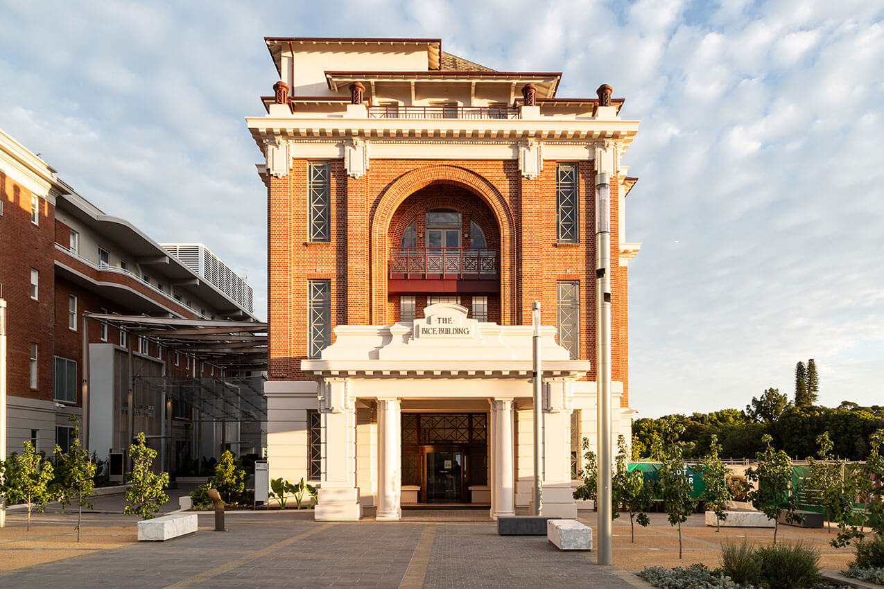
The four-storey Bice Building (c1927) stands as a highly valued heritage building on the edge of Adelaide’s exciting new innovation and technology precinct, Lot Fourteen. Part of the original 1921-22 Masterplan for the Royal Adelaide Hospital, the newly refurbished building forms an important gateway for North Terrace facing site.
The removal of previous alterations and reinstating original design intent of associated architectural elements with a modern approach was key to the adaptive re-use of the building. The project sought to conserve and reinstate much of the exterior building envelope, either to conserve original fabric or replace previous alterations in a contemporary, visually sympathetic, and complementary manner. By working with the previously modified, original built form and optimising the size and flexibility of the floor plates and ground plane, Bice has been transformed into an innovative, collaborative, and accessible building, fit for the reactivated precinct for many years to come.
JamFactory Tarnanthi Exhibition 2021 – Grieve Gillett Andersen
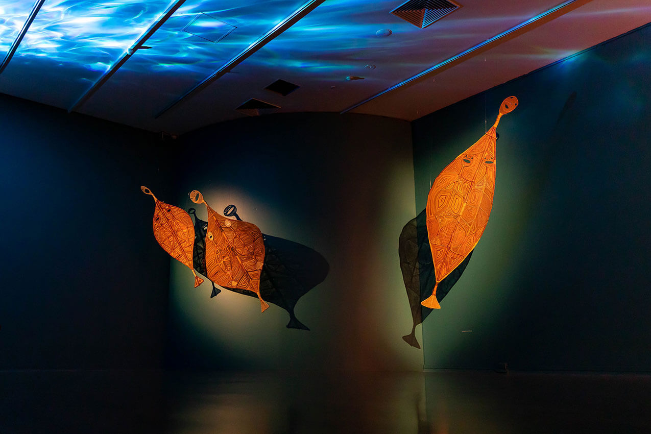
The transformation of the gallery space at Jam Factory for the 2021 Tarnanthi Festival of Aboriginal and Torres Strait Islander Arts is inspired by the waterholes and landscapes of Western Arnhem Land and West MacDonnell Ranges. Each space is reimagined to provide an abstracted but contextual backdrop of Country where the artwork originates.
Two curved walls shape a body of watery darkness where Anniebell Marrngamarrnga’s yawkyaws (mermaids) swirl and dance in the gentle glow of moonlight. In a warmly-lit alcove, a series of outfits by Yarrenyty Arltere Artists rests on elegant metalwork ‘figures’. In a tight, low-ceilinged space reminiscent of a cave the carven punu artworks from the Maruku Arts collective sit suspended at eye level over the brilliant orange of central Australia.
The final exhibition outcome is a testament to the collaborative process and contributes to the city-wide festival, of which it was a highlight for many.
The Foundry – Architects Ink
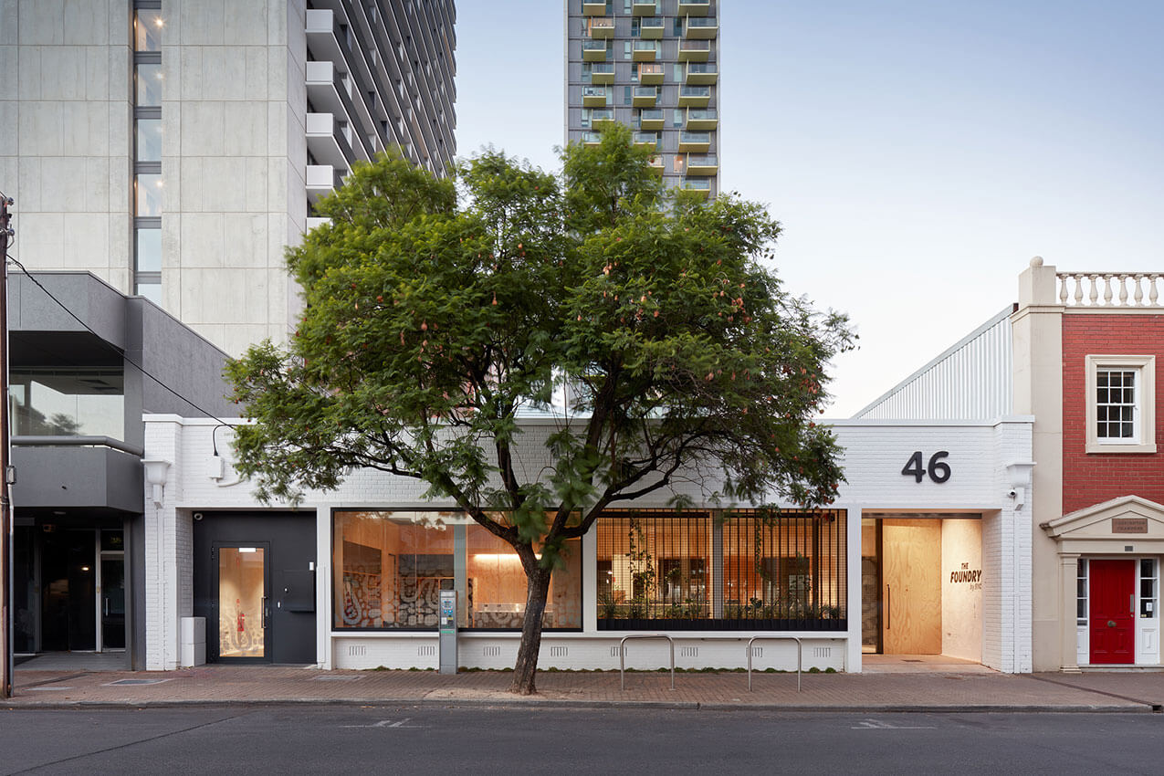
SYC is a non-for-profit organisation that relocated their mission facilities to new premises, south of the city. The Foundry provides specialised assistance to disadvantaged, homeless and disengaged youth.
Architects Ink provided a new environment to facilitate services to youth in a welcoming, ‘non-corporate’, fun, accepting and secure fashion.
The building was an empty brick warehouse shell with high level windows and exposed steel trusses. Original items remain exposed yet new connections to the existing structure were minimised emphasising connection to natural light in all areas but not compromising the warehouse volume.
Honest materials rich in texture, durability and colour were selected, creating calm yet engaging spaces for clientele. A display of warmth, simplicity and durability.
Youth were involved in all stages from design to construction including the themed works of well-known young Adelaide artists
Th Foundry provides a ‘safe place for immediate connection’ for Youth in a non-traditional environment.
Fugazzi – studio-gram
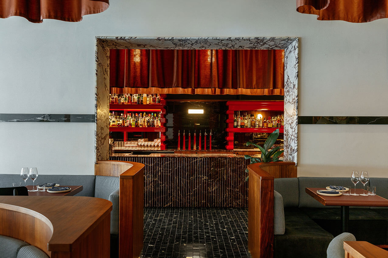
Fugazzi is an Italo-New York inspired bar and dining room that blurs the line between today and yesterday. It’s that moment of deja vu that begs the question, have I been here before?
An overnight institution where velvet, leather, marble, inlaid geometric scraps, and custom joinery shelves are layered to create a decadent and luxurious atmosphere designed to invoke a sense of nostalgia.
A romantic, textural representation of the past, that simultaneously manages to remain firmly rooted in the contemporary. Is its bold character a physical manifestation of the Italians’ age-old gift of making art out of life, or is it just Fugazzi?
Australian Space Discovery Centre – JPE Design Studio
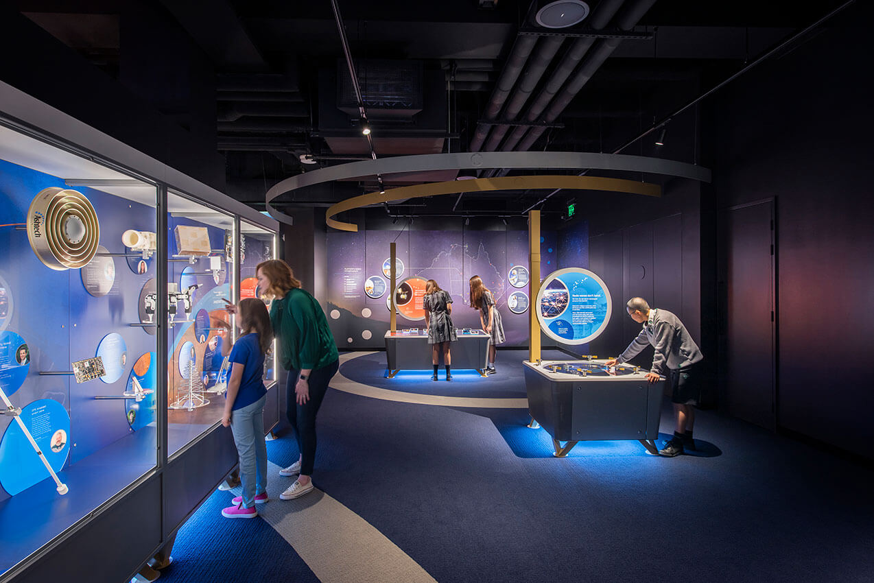
The Australian Space Discovery Centre is as a catalyst project that captures hearts and minds, sparking inspiration for South Australians to participate in careers and pathways in the ever-growing space sector. Within the context of the broader Lot Fourteen site, it was important for this project to reflect the same values and overarching vision for this precinct, creating a place driven by innovation. Designed with a key focus on the visitor experience, the Centre creates an engaging and sensory environment that is sophisticated, technical and interactive. With key program objectives to provide access to careers in space and a working Mission Control, the experience of digital interaction and raw materials are designed to coexist and create the feeling that the visitor is between two worlds.
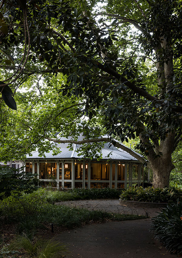
Restaurant Botanic – Williams Burton Leopardi
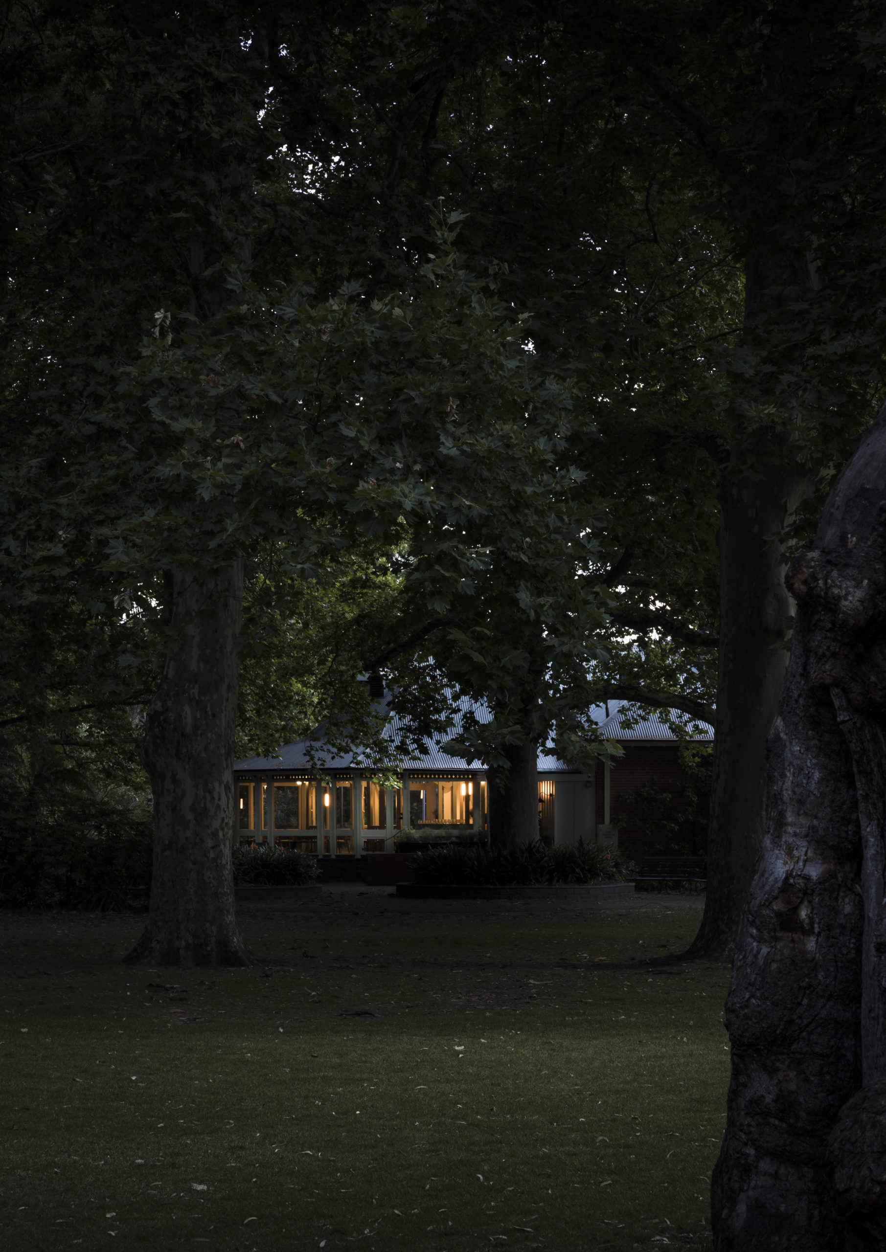
A respectful honouring of place, heritage and produce, Restaurant Botanic is reimagined as a naturally warming harbour within which to savour and embellish the senses. While its connection and ingrained sense of nostalgia carry forward, the changing of its custodians sees a matched rebirth of the spatial experience.
A light-touch ensures the existing exterior character, heritage fretwork and detailing are restored and enlivened, while the carving of a new entry experience reinforces a sense of arrival. Inside, the previously traditional restaurant space is opened up to bring guests into the preparation experience, with a Japanese-inspired front row seat to the action. In the centre of the space, around a carefully crafted bar and under arched framed timber details, guests are invited to partake in the finery of creation, while dining. In reimagining the Botanic Garden Restaurant, the space becomes deeply and richly immersive, and balances smells, sights and sounds idyllically.
Commercial Architecture and small Project Architecture
Commercial Architecture
Jury:
Chair Kristy McMillan (JPE Design Studio)
Katica Pedisic (University of South Australia)
Brendan Le Var (Cox Architecture)
Guest Juror Marina Aburas (Fielders)
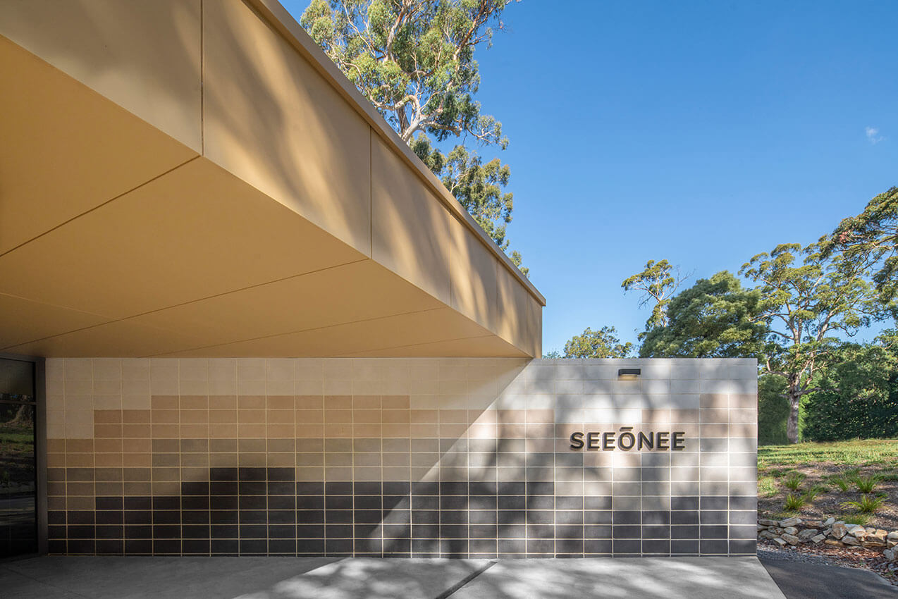
Seeonee Bushfire Refuge - Das Studio
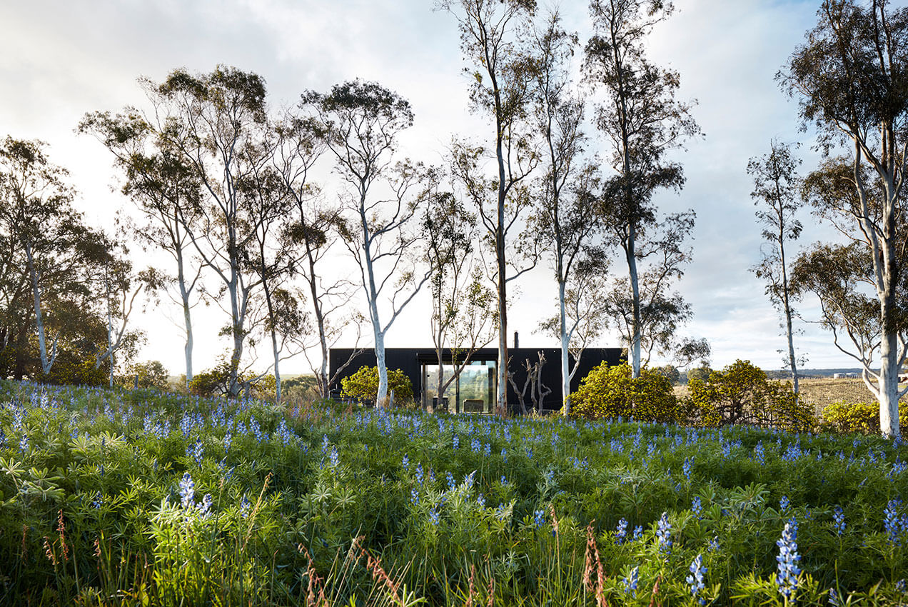
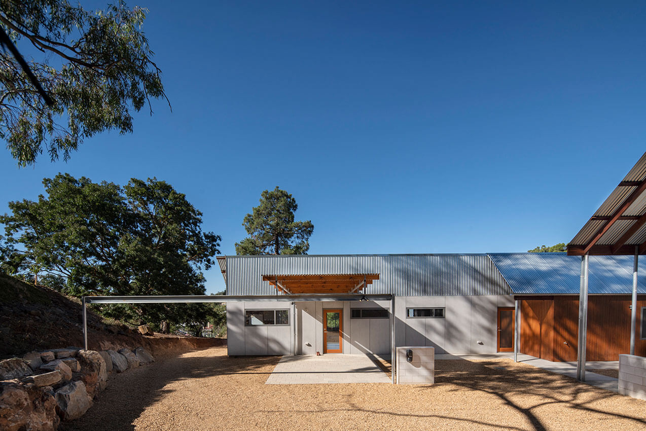
The Seeonee Bushfire Refuge & Activity Centre is an important piece of infrastructure at Scouts SA’s home, Woodhouse, in the Adelaide Hills.
Following the devastating 2019-20 fire season, a fast-tracked refuge was sought to enable safe operation of the Piccadilly site.
Das Studio’s expertise with modular construction methodologies facilitated a solution that utilised off-site and in-situ works to be carried out in parallel to reduce the project program by months.
The resultant bunker-like building form and siting responds to the sloping context of the hillside, cranking along contours and focussing sightlines to Cox Creek below, encouraging northern sun to encroach in cooler months and be shielded in summer.
A variety of grey concrete blocks are layered to echo the patterning of adjacent tree trunks, with greens and yellows referencing the surrounding native leaves and flowers applied to internal finishes to create a built outcome that is of the natural environment.
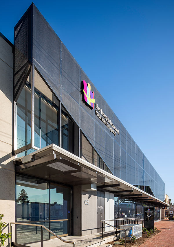
The Hospital Research Foundation New Office - Greenway Architects
Woodville’s thriving industrial past was the reference point for the design of this modern office for this vital not-for-profit organisation.
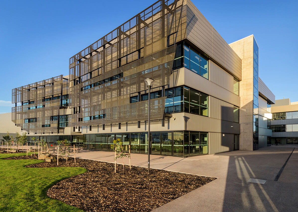
The perforated metal screen in front of the full height glazing tackles the site’s orientation, solar gain and glare control with the raking bottom edge providing a dynamic rhythm evocative of the old saw tooth factory roofs from the area. The selected palette of materials act as a subtle nod to the past, used in a relevant contemporary way.
The design is carefully considered to provide a collaborative and light-filled environment for its occupants. Outdoor decks leading from the Work Café and the Boardroom provide additional breakout for clients and staff. A variety of both informal and formal meeting and work spaces, with high levels of acoustic treatment, are provided for flexibility.
Greenway is very proud of our involvement in this great charity’s journey and helping them achieve their goals.
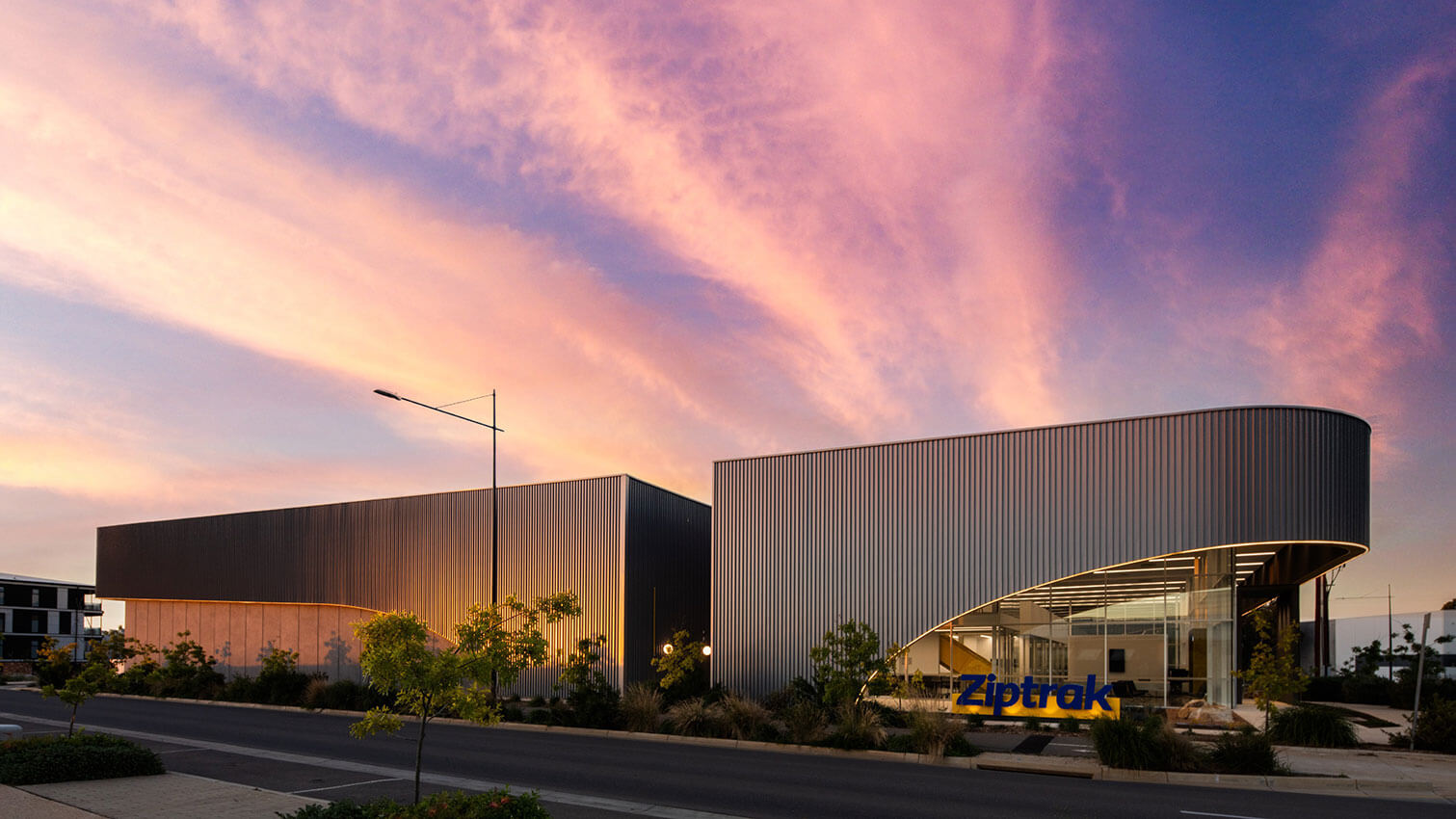
Ziptrak - Tridente Boyce
Ziptrak is the manufacturer of a patented track guided outdoor blind system, developed in South Australia. Previously located within four separate sites the brief was to develop a facility which would house manufacturing, assembly, research, distribution, and offices as well as creating a unique identity for the brand.
The concept was developed as a singular composition, scaled to reflect the functional requirements for high bay storage.
The required proportions of the building, and the decision to adopt a singular composition, resulted in an enormous, scaled building. Different materials were introduced on displaced planes as a mechanism to reduce the bulk and scale of the building, naturally ventilate the assembly area and provide protection to the glazed office volume. The curves were adopted to further soften the hard edges of this exceptionally large building.
The result is a facility that forges a unique identity for Ziptrak.
Small Project
Jury:
Chair Richard Woods (Habitable Places Architects)
Amanda Rebbeck (DWP Hardy Milazzo)
David Brown (BB Architects)
Ryan Horsnell (Troppo Architects)
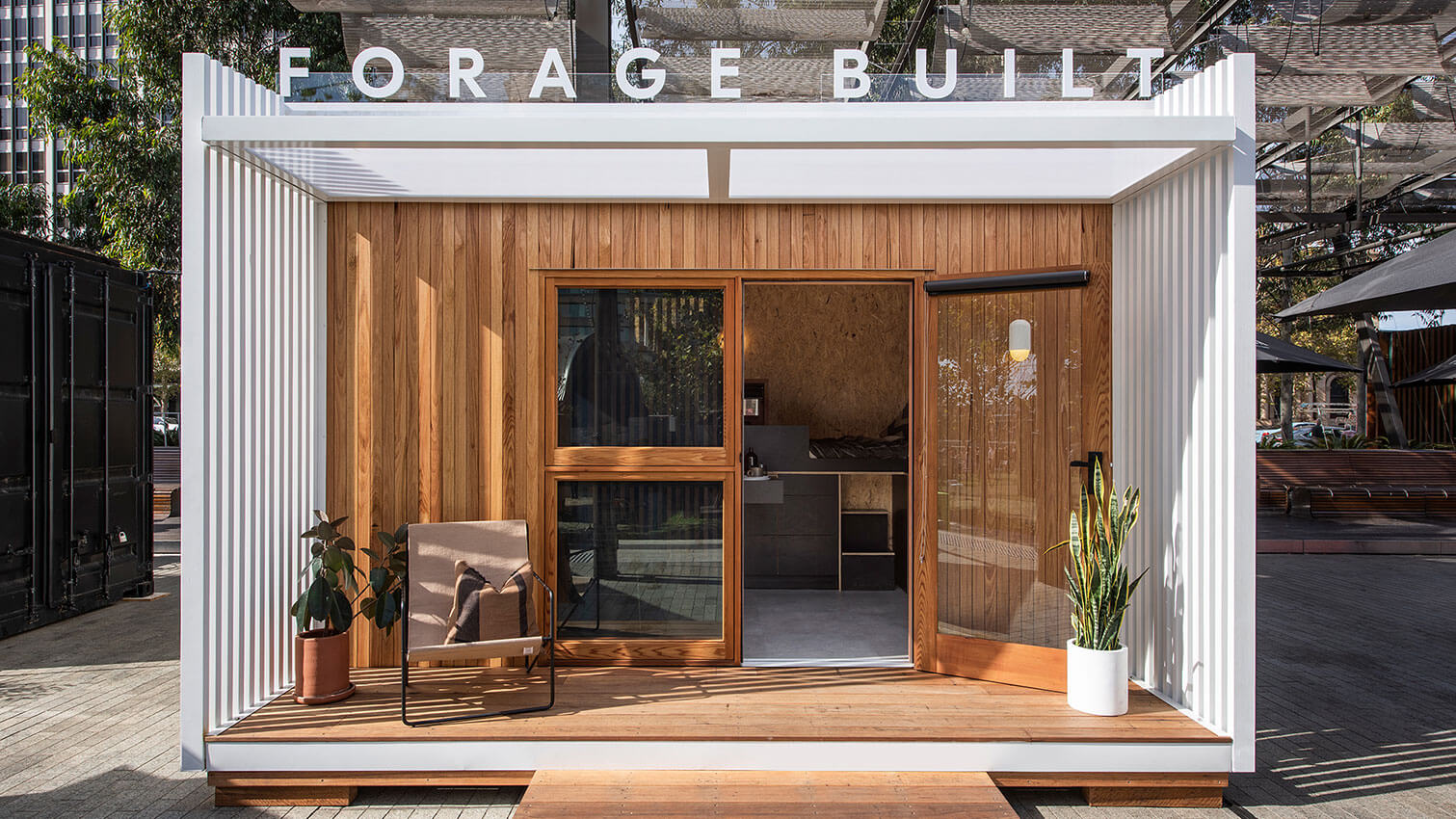
The Calyx Project - Studio Nine Architects
The Calyx Project aims to break the cycle of homelessness, providing meaningful change through an innovative housing solution with a community focus.
The solution begins with the design of a 16sqm, safe, affordable, transportable, energy efficient and eco-friendly dwelling —a dignified place to call home. The single-occupant homes are designed to be built within larger villages to foster community. A village intends to include 4+ pods and an onsite case worker for every 4-5 residents, with a larger central pod for communal amenities.
In-kind donations, financial contributions and strategic partnerships have been crucial, resulting in the construction of the prototype pod. The built form has led to ongoing fundraising and awareness campaigns, community partnerships and displays, endorsement from industry bodies and key entities, and monetary contributions.
The project has succeeded in raising awareness of the issue of homelessness, demonstrating how people can get behind a cause that has purpose.
Over The Hedge - Arcuate Architecure
Old Government House is an historic gem hidden deep within Belair National Park in a State Heritage Area of exceptional natural beauty. Lack of public toilets has discouraged visitors in the past, but the recently installed facilities now provide potential new visitor opportunities.
Simplicity and use of natural materials were the keys to the design’s sensitive integration within the National Park.
Thanks to off-site pre-fabricated construction with minimum waste, and careful choice of sustainable materials, the building has a small whole-life carbon footprint and should have a design life in excess of 30 years.
The volunteer group, Friends of Old Government House, who manage visitors to the venue and attend to the garden daily, has grown significantly since the new toilets were installed, and one lady volunteer with multiple sclerosis is particularly pleased because having use of the new facilities has enabled her to help in the garden again.
Esca Blewitt Springs - Das Studio
Esca Blewitt Springs was a pilot undertaken by a group of Adelaide professionals including Das Studio Directors Dino Vrynios and Sara Horstmann.
Located on a working vineyard in the McLaren Vale wine region, Das Studio delivered twin prefabricated 55m2 premium, offgrid, luxury accommodation suites.
With the aim of designing an experience, not simply a building, every element was considered to provide curated access to the amenity of the vineyard and farmland site – from the door handle on arrival to the bed location for morning sunrises.
The suites are off-grid with harvested water from across the site used along with a shared wastewater system. Solar panels located throughout the winery infrastructure are the primary supply, with grid power provided for backup.
The endeavour has subsequently attracted two rounds of capital investment and is set to deliver approximately 30 new suites across the next 12 months around regional South Australia
Educational Architecture
Educational Architecture
Jury:
Chair Simon Frost (Greenway Architects)
Matt Rundell (Stallard Meek Flightpath)
Mark Berlangieri (Walter Brooke)
Shae Taylor (Grieve Gillett Andersen)
Whyalla Secondary College - Cox Architecture
Designed by Cox Architecture in collaboration with Thomson Rossi, the new Whyalla Secondary College combines three existing government schools in the region; Edward John Eyre, Stuart and Whyalla High Schools. Located on one of the city’s main thoroughfares, and in between the UniSA and TAFE campuses, the new school forms an integral part of and education precinct striving to provide students with local, national and global pathways. The design embraces the history of the existing schools, simultaneously creating an exciting and educational contemporary facility with a strong sense of place and identity.
A rich array of specialist facilities allow engagement with all facets of the Whyalla community, creating an important community hub and an outstanding asset of learning for the City of Whyalla for many generations to come.
Murray Bridge High School Redevelopment - Cox Architecture
The new Sturt Building and wider Murray Bridge High School redevelopment is a key step in the advancement of the school’s aim in establishing a modern pedagogy, whilst creating a space for students to learn, challenge and discover. Instilling a sense of inclusivity and innovation, the central plaza and atrium allows all students to benefit from the space and encourages interaction across the entire cohort. This sense of shared ownership and responsibility to the student’s environment was core to the brief, design ethos, and the school’s ongoing culture.
Creating a deep connection to the landscape, the interior built form was inspired by the River Murray and its power in shaping the town and land around it.
The redevelopment aids in advancing educational developments within the school and will continue to inspire for generations to come.
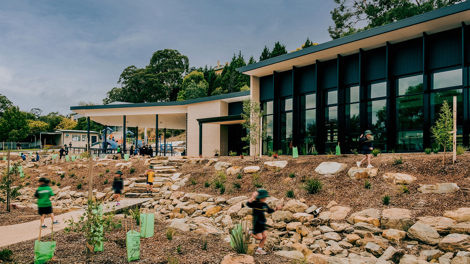
St Francis de Sales Alive Early Learning Centre & Reception to Year 6 Primary School - Brown Falconer
Insert media summary
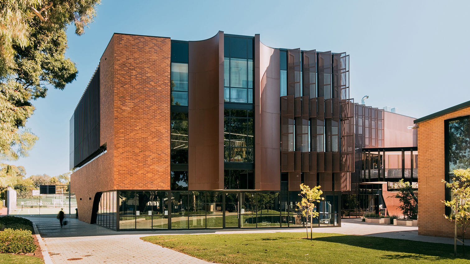
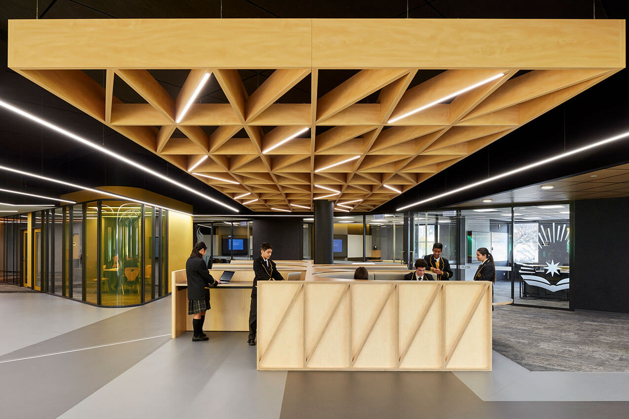
Westminster School Inquiry and Innovation Hub - Brown Falconer with Hayball Architects
Brown Falconer and Hayball Architects have designed the Inquiry and Innovation Hub which provides bespoke new spaces supportive of inquiry based, collaborative learning and which embrace the strong school community culture at Westminster with social spaces that invite the community in. The Hub provides a blank canvas for inquiry, with materials and food tech facilities on the ground floor, fashion, computational design and science on the upper floors.
The facility was designed to provide a rich and varied environment with different kinds of spaces, a complex of interrelated opportunities to provide a diversity that responds to different teaching and learning modalities and encourages students to use multiple intelligences and expressive languages – all in an integrated, purposeful model providing the “stuff” of learning.
Building on these themes, the facility includes a central, vertical commons which forms a central heart with break out spaces that integrates the cross disciplinary functionalities
Flinders University Modern Biodiversity Facility - H2o Architects & Phillips/Pilkington Architects In Association
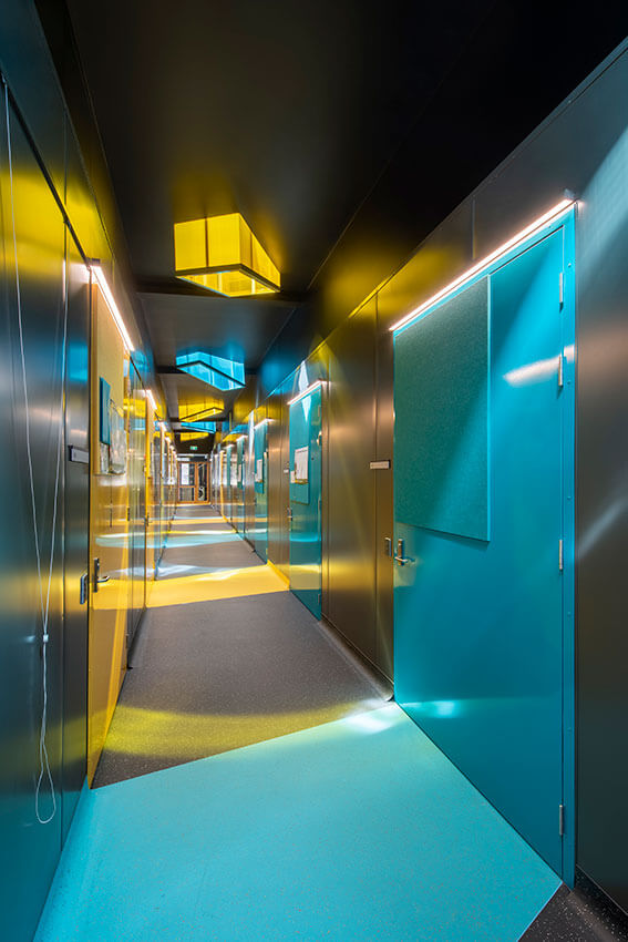
The Flinders Biodiversity Facility is a futuristic container housing fish and lizards for conservation, educational and research purposes, located adjacent Biology Road in the South Ridge precinct of the Flinders University campus. The externals of the Facility are deliberately container-like, with the main section enclosed in earthy tones, to ground the facility in its landscaped location. Interface areas, including entries and delivery portals have the outer surface of the building accentuated in vibrant highlight colours, referencing the vibrant highlight colours of the fish and lizards within the Facility. Inside, the use of vibrant highlight colours continues, indicating entries and movement, set within a background of darkened walls and ceilings to develop a theatrical appreciation of the Facility, akin to a fish being under water or a lizard underground. Brightly coloured skylights litter the ceiling of the central corridor like flotsam and jetsam floating on the surface of the water above.
Hamilton Secondary College Performing Arts Centre - Totalspace Design
The New Performing Arts Centre at the Hamilton Secondary College includes a full dome planetarium along with a 150 seat auditorium, general learning areas and rehearsal rooms, and canteen. A new plaza space provides a link to other school buildings and offers outdoor learning and socialization opportunities amongst a beautiful green landscape.
The Performing Arts Centre’s sculptural aesthetic makes it an exciting addition amongst the traditional educational buildings, while providing a visual marker from Marion Road.
The planetarium represents the importance of space research and the government’s commitment to developing expertise in SA and is a valuable addition to the schools existing Space Program, which is open to students across the state. The auditorium provides high quality theater facilities allowing the school to present professional performances. The quality of the build itself is equal to the unique nature of the facility, and the College is delighted with the end result.
Nazareth Catholic College: St Gabriel Centre - Russell & Yelland Architects
Despite an inflexible, nine-month project schedule, and the complexities of converting a commercial building, the St Gabriel Centre has proved liberating as a satellite senior campus for Nazareth Catholic College. At six minutes’ walk across the River Torrens from the Flinders Park campus, the Underdale facility prepares Year 12 students for more tertiary-like learning environments. The design demonstrates maturity is rewarded with additional freedoms.
Deploying a contemporary, highly sociable program within a two-storey concrete shell required extensive acoustic treatments to hard surfaces. With this approach, the design team proposed a progressive, now popular, STEM laboratory on the first floor, completely open to expansive breakouts.
Just three months remained for construction at the premises’ acquisition, so a complex new corner entry to the ground floor student hub proved challenging. Nevertheless, successful prior Nazareth project collaborations with the builder ensured the architects were trusted to bring their full vision to life.
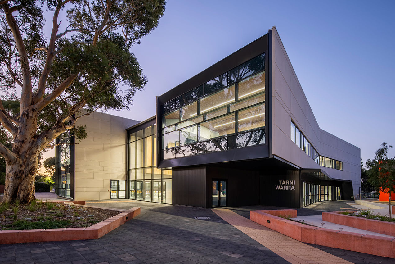
Tarni Warra - Thomson Rossi
Tarni Warra is a dedicated New Middle School that supports the school’s vision to create 21st century learning environments for year 7 and 8 students that are flexible, dynamic and conducive to the schools values of curiosity, courage and citizenship. The early adolescent community is provided a sense of belonging and positive learning identity by strategically locating the majority of their core subjects within a purpose-built learning environment for their ownership.
Informed by the existing materiality of the School site at North Brighton, the building fosters strong elements of precast panels and metal cladding whilst still visibly a separate identity for the middle school. These high quality finishes alongside extensive glazing elements attuned to the buildings orientation provide strong views over the whole school precinct.
Tutuyarlu Performing Arts, Ocean View College - Studio Nine Architects
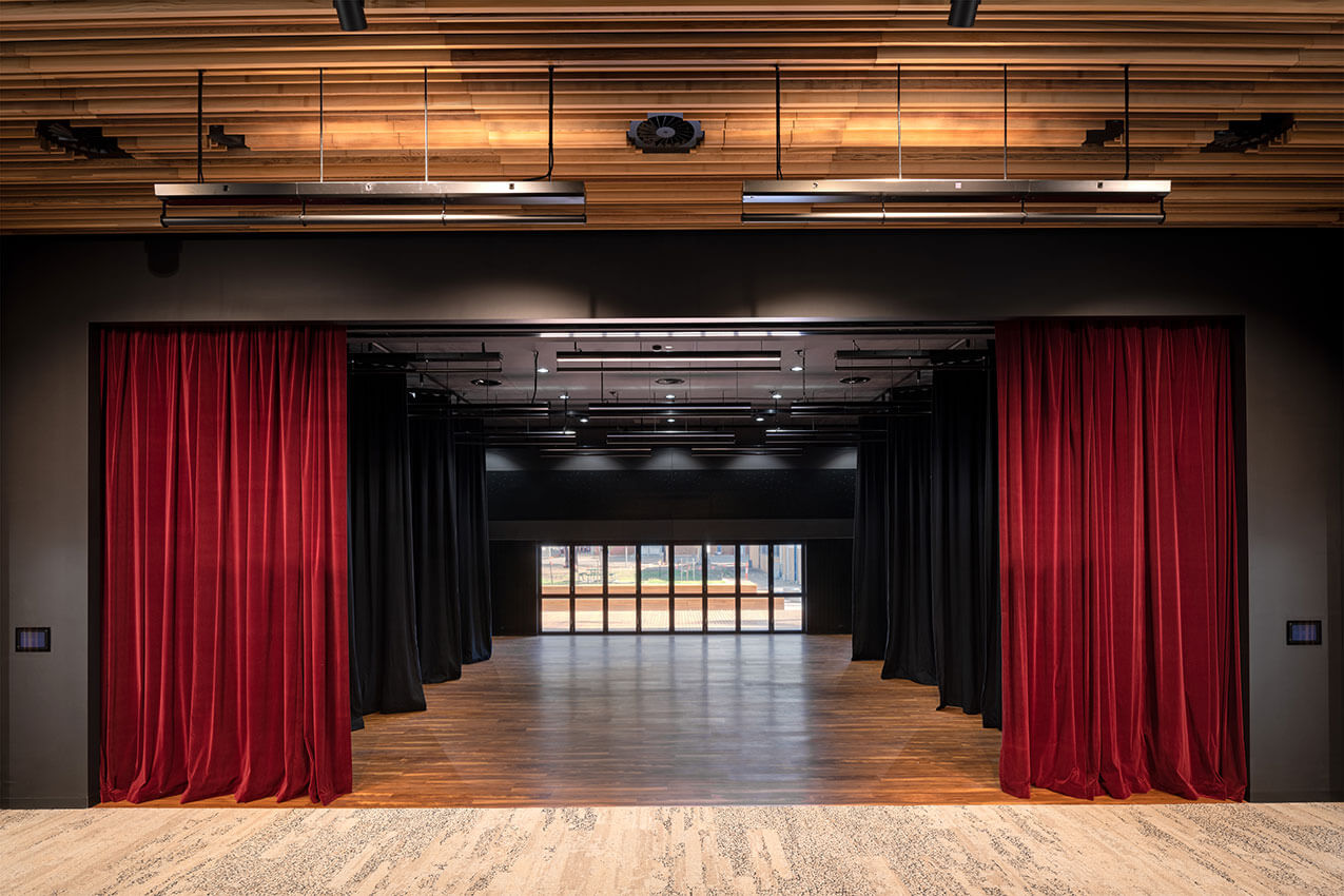
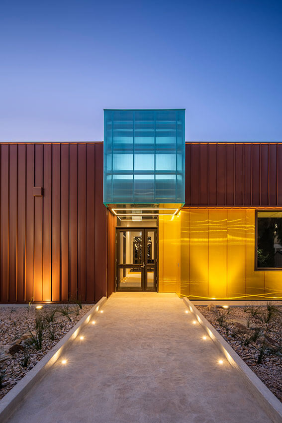
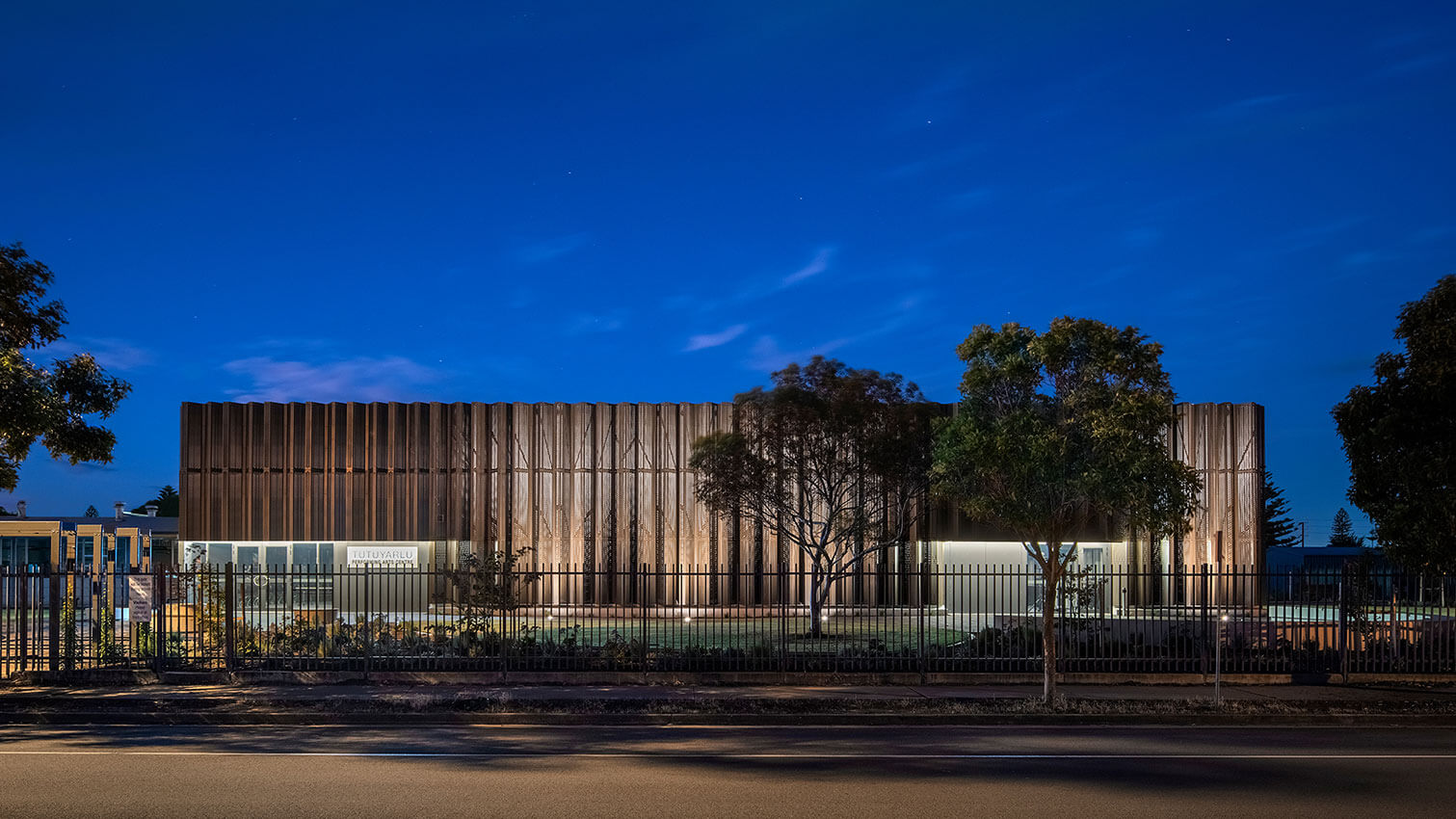
Ocean View College’s Tutuyarlu Performing Arts Centre was designed as part of the Capital Works Program, filling a void within the school’s offering to provide a new drama and music teaching and performance facility.
Taking inspiration from a stage curtain, the building’s form creates a dynamic and striking façade that acts as a beacon at night. The design is influenced by place with strong connections to indigenous heritage and dreamtime stories.
Clever and efficient spatial planning provides the school with a flexible and adaptable facility within a small footprint, with multi-use spaces utilised for both teaching and performances.
Challenging the notion of what DIT facilities typically look like and how they are constructed, the bold architectural statement has created a new focal point for the school, increasing community connection and making a positive statement about public education.
Interior Architecture
Interior Architecture
Jury:
Chair Stephen Ward (University of South Australia)
Rua Hashlamoun (Brown Falconer)
Thomas Masullo (Woods Bagot)
Guest Juror Keith Dougal (Studio Nine)
Iron Chef - Das Studio
Iron Chef house is the result of a highly successful collaborative relationship between Architect and client.
Located on a leafy, no-through road surrounded by an enduring suite of character bungalows, the new home pays homage to the ghost of the structure that once stood in its place.
Receding in height from the street yet generous in internal scale, a double height void running the length of the home creates a generous connection between levels while framing a view to the incredible red gums to the sites rear.
Much of the homes public interior takes a warm, neutral approach, while pops of colour and pattern, surprise and delight behind hidden doors and within private spaces.
A series of glazed operable walls open the home entirely from front to back, while the external materiality of fluted timber and soft sandy masonry wrap inward creating a seamless connection between inside and out.
The Foundry - Architects Ink
SYC is a non-for-profit organisation that relocated their mission facilities to new premises, south of the city. The Foundry provides specialised assistance to disadvantaged, homeless and disengaged youth.
Architects Ink provided a new environment to facilitate services to youth in a welcoming, ‘non-corporate’, fun, accepting and secure fashion.
The building was an empty brick warehouse shell with high level windows and exposed steel trusses. Original items remain exposed yet new connections to the existing structure were minimised emphasising connection to natural light in all areas but not compromising the warehouse volume.
Honest materials rich in texture, durability and colour were selected, creating calm yet engaging spaces for clientele. A display of warmth, simplicity and durability.
Youth were involved in all stages from design to construction including the themed works of well-known young Adelaideartists
The Foundry provides a ‘safe place for immediate connection’ for Youth in a non-traditional environment
Restaurant Botanic - Williams Burton Leopardi
A respectful honouring of place, heritage and produce, Restaurant Botanic is reimagined as a naturally warming harbour within which to savour and embellish the senses. While its connection and ingrained sense of nostalgia carry forward, the changing of its custodians sees a matched rebirth of the spatial experience.
A light-touch ensures the existing exterior character, heritage fretwork and detailing are restored and enlivened, while the carving of a new entry experience reinforces a sense of arrival. Inside, the previously traditional restaurant space is opened up to bring guests into the preparation experience, with a Japanese-inspired front row seat to the action. In the centre of the space, around a carefully crafted bar and under arched framed timber details, guests are invited to partake in the finery of creation, while dining. In reimagining the Botanic Garden Restaurant, the space becomes deeply and richly immersive, and balances smells, sights and sounds idyllically.
Adelaide Railway Station Entry - ARM Architecture
Our Adelaide Railway Station Entry Concourse project delivers an immersive pedestrian concourse connecting the Adelaide Railway to the Riverbank. It is the first delivered element of ARM’s Festival Plaza Design within the Riverbank Masterplan The station concourse interior was conceived as an organic vaulted arcade, a carved interior space from the rocky escarpment, reminiscent of the Garlick and Jackman Neoclassical interior of the Adelaide Railway Station Hall. The vaults were sculpted organically, but also pushed and pulled to align with an integrated structural column design supporting the SkyCity building above. This allowed the arches to touch down to ground around each column, resulting in a rhythm of intersecting vaults and an immersive experiential collection of volumes.
The design recognises form as function, utilising architecture as sculpture to create a space that transforms a previously forgotten part of the Riverbank, resulting in a new sense of pride in place for Adelaide.
Australian Space Discovery Centre + Mission Control - JPE Design Studio
The Australian Space Discovery Centre is as a catalyst project that captures hearts and minds, sparking inspiration for South Australians to participate in careers and pathways in the ever-growing space sector. Within the context of the broader Lot Fourteen site, it was important for this project to reflect the same values and overarching vision for this precinct, creating a place driven by innovation. Designed with a key focus on the visitor experience, the Centre creates an engaging and sensory environment that is sophisticated, technical and interactive. With key program objectives to provide access to careers in space and a working Mission Control, the experience of digital interaction and raw materials are designed to coexist and create the feeling that the visitor is between two worlds.
...number 14 - Black Rabbit
Sophisticatedly playful and a little ‘grown up’….number 14 is a home, designed to walk-in-step with the busy lives of a young professional couple, their three daughters and one very cheeky pooch! Capturing a lifestyle and asserting itself amongst the traditional housing typology of a leafy Adelaidean streetscape. With classic and timeless materials and finishes, rich spaces come together to create an ‘interior architecture’ that is to be lived and loved throughout its life. …number 14 reveals itself as a striking, bold contemporary house but within, is a warm and inviting home, making day-to-day living easy – this is a place where partners, grandchildren and friends will always feel welcome, both today and in the years to come!
Aurecon Adelaide Office Fitout - Hodgkison Pty Ltd
Using consistent design language referencing Aurecon’s ‘DNA’, this creative and sustainable fitout celebrates all that Aurecon Adelaide has to offer.
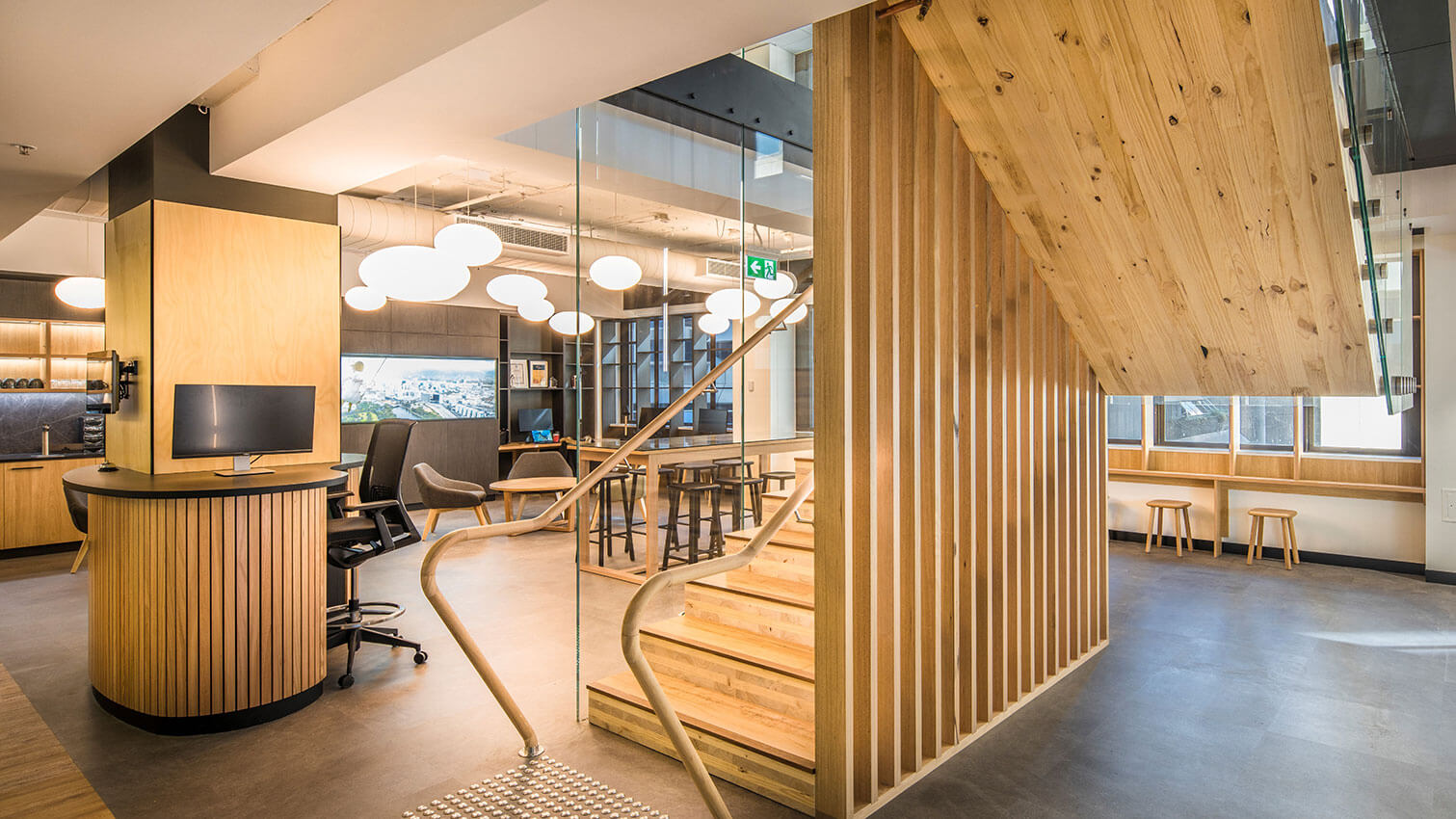
As a feature of the arrival experience, the innovative cross-timber laminated ‘floating’ stair connects all three tenancy levels. Architecturally, walls are only used where required for privacy or functionality, with large open expanses allowing insight into Aurecon at work. Plants provide a softer screening element where some privacy is required.
Warm, textured timber walls and bulkheads draw staff and visitors towards the central core creative zones. Lighting is used as a wayfinding element, or to anchor collaborative spaces.
With a largely mobile workforce, two floors are dedicated to agile working spaces. Embracing Aurecon’s values, bespoke graphics, found in unsuspecting places, a bench to make paper planes, curved writable wall and calming background of timber and biophilia set against a semi-industrial palette, allowed our designers, to “be playful with serious intent”.
Restaurant Botanic - Williams Burton Leopardi
A respectful honouring of place, heritage and produce, Restaurant Botanic is reimagined as a naturally warming harbour within which to savour and embellish the senses. While its connection and ingrained sense of nostalgia carry forward, the changing of its custodians sees a matched rebirth of the spatial experience.
A light-touch ensures the existing exterior character, heritage fretwork and detailing are restored and enlivened, while the carving of a new entry experience reinforces a sense of arrival. Inside, the previously traditional restaurant space is opened up to bring guests into the preparation experience, with a Japanese-inspired front row seat to the action. In the centre of the space, around a carefully crafted bar and under arched framed timber details, guests are invited to partake in the finery of creation, while dining. In reimagining the Botanic Garden Restaurant, the space becomes deeply and richly immersive, and balances smells, sights and sounds idyllically.
Rose Park House - studio gram
The Rose Park House is best described as a project of discovery from commencement to completion. From the street this early 1900’s Queen Anne Villa appears like any other, however beneath the surface lies a series of spaces designed to be unique in their function and expression, yet consistent in their approach, resulting in an Architecture that is completely unexpected.
Kingswood Residence - Williams Burton Leopardi
Transforming a dark and highly ornate home into its light-filled contemporary, Kingswood Residence is endowed a new chapter to its storied past. Opening up and forming framed views between each previously segregated zone, an overhaul of the existing planning sees the reorientation of the experience of the home out toward the surrounding landscape.
A series of new gestures ensure the home is reprogrammed in its entirety. Although restrained and contained to within near the exact previous built outline of the home, the alterations have a compounding affect.
At the heart of the transformations of Kingswood Residence, is an ingrained sense of flow and connection. Through pushing out toward the west and aligning the functions of the home, the rich character details of the home continue to be celebrated amongst the more contemporary insertions. By making sense of the planning, the family home now reflects how its occupants live.
Hamilton Secondary College Performing Arts Centre - Totalspace Design
The New Performing Arts Centre at the Hamilton Secondary College includes a full dome planetarium along with a 150 seat auditorium, general learning areas and rehearsal rooms, and canteen. A new plaza space provides a link to other school buildings and offers outdoor learning and socialization opportunities amongst a beautiful green landscape.
The Performing Arts Centre’s sculptural aesthetic makes it an exciting addition amongst the traditional educational buildings, while providing a visual marker from Marion Road.
The planetarium represents the importance of space research and the government’s commitment to developing expertise in SA and is a valuable addition to the schools existing Space Program, which is open to students across the state. The auditorium provides high quality theater facilities allowing the school to present professional performances. The quality of the build itself is equal to the unique nature of the facility, and the College is delighted with the end result.
Norwood House - Con Bastiras Architects
This two storey residence designed for a young family, is located in the chic inner Adelaide suburb of Norwood.
Being located in the heart of a Historic Conservation Zone, meant that strict planning regulations were required to be satisfied. The form and materials used, respectfully take cues from the neighbouring buildings, even though the resulting design is uncompromisingly contemporary.
From the street, the house takes on the appearance of a single storey building, as the second storey is discretely tucked into the roof space. Hints of upper floor accommodation are revealed through narrow window openings carefully sliced into the hipped roof.
The bluestone brick used for the ground floor walls and fences was selected for its texture and depth of colour. It’s a timeless material that sits comfortably alongside its historic neighbours, adding warmth and sophistication to the streetscape.
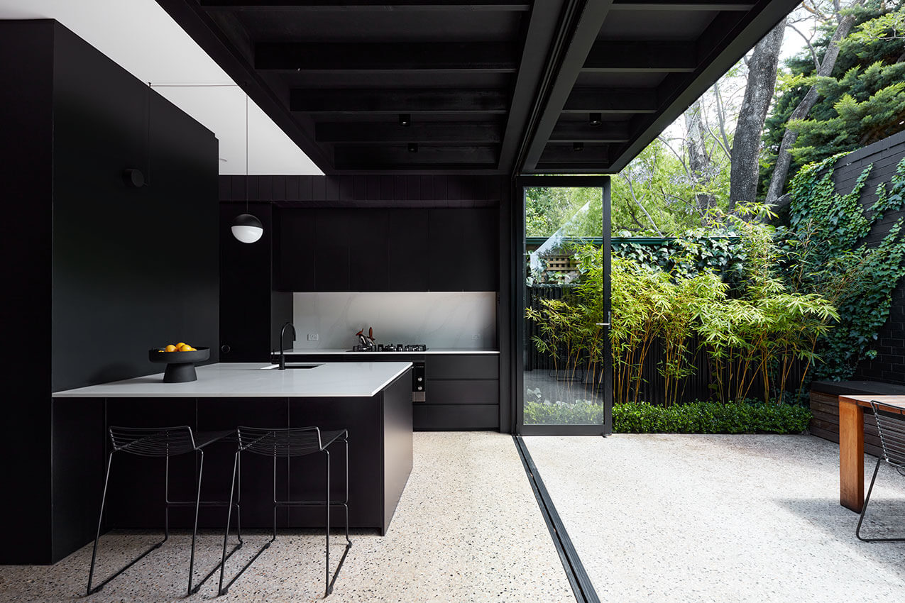
Jacaranda House - Architects Ink
Our clients’ sought private and gathering spaces with a strong connection to outdoors. Centred around an existing tree, Jacaranda House is a beautifully nuanced family home. The interiors reveal the building, and whisper rather than shout, allowing layered experiences to unfold.
The interior philosophy centres around simplicity, material selection and appreciating the effects of light, volume and landscape on the living experience. The same materials are used inside and out, with blocks of joinery inserted into the spaces. Simple forms disguise intricate workings and problem solving.
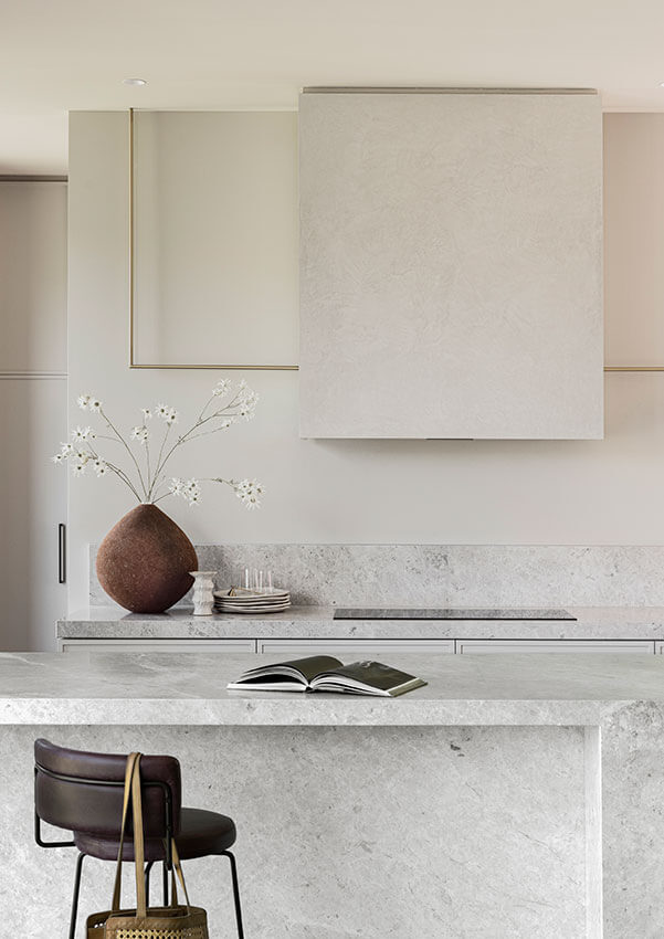
The kitchen stone, chosen for its grey variegated tones, is warmed by timber joinery, and lifted by crisp white detailing, that also brings out the warmth of the sundrenched wall of bricks. Touches of terrazzo in emerald green and soft blush are dropped into the spaces.
Jacaranda House is a home to be enjoyed by family and friends alike.
Soi38 - Walter Brooke + Simon Lobianco
The relocation of Soi38 to Pirie Street provided an ideal opportunity to present an adventurous menu of regional Thai dishes in a more sophisticated setting. The design of the restaurant centres around the patron’s sensory experience, a space that celebrates the theatre of Thai cooking.
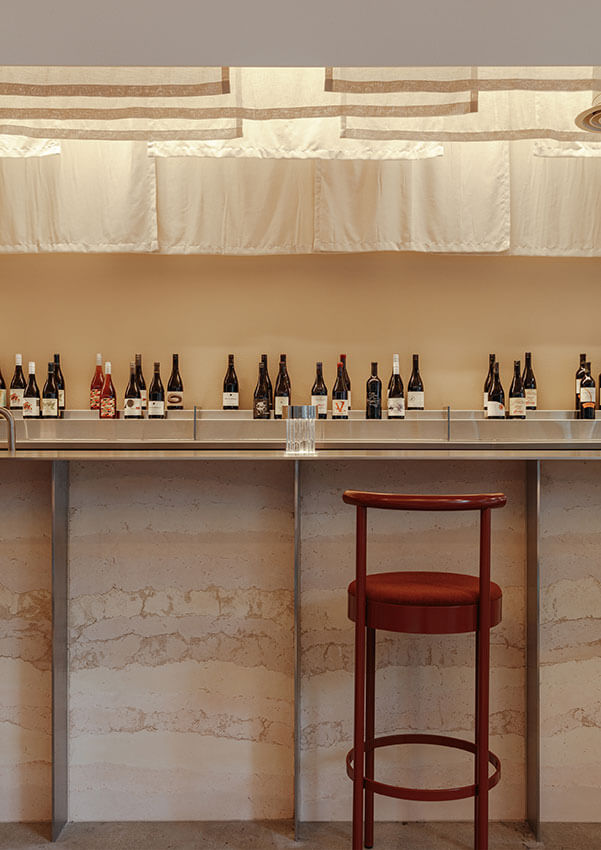
The clients including head chef Terry Intarakhamhaeng clearly articulated a wish to present a refined space which also referenced their history. Terry’s Buddhist monk past formed a guiding reference point for the concept. The sheer linen curtains arranged loosely are suggestive of temple prayer flags while the profiled ceiling is reminiscent of a temple. Plush and textured fabrics paired with sheer drapery evoke an ethereal beauty.
Flinders University Modern Biodiversity Facility - H2o Architects & Phillips/Pilkington Architects In Association
The Flinders Biodiversity Facility is a futuristic container housing fish and lizards for conservation, educational and research purposes, located adjacent Biology Road in the South Ridge precinct of the Flinders University campus. The externals of the Facility are deliberately container-like, with the main section enclosed in earthy tones, to ground the facility in its landscaped location. Interface areas, including entries and delivery portals have the outer surface of the building accentuated in vibrant highlight colours, referencing the vibrant highlight colours of the fish and lizards within the Facility. Inside, the use of vibrant highlight colours continues, indicating entries and movement, set within a background of darkened walls and ceilings to develop a theatrical appreciation of the Facility, akin to a fish being under water or a lizard underground. Brightly coloured skylights litter the ceiling of the central corridor like flotsam and jetsam floating on the surface of the water above.
Arkhe - studio gram
Cooking over fire is a ritual, and one of the most human things you can do. It is a raw and authentic method of cooking. Fire allows chefs to exploit the natural characteristics of an ingredient.
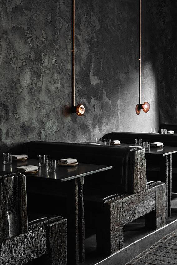
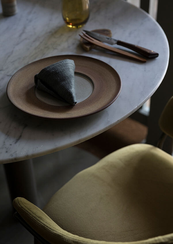
Arkhé is a bar and dining room that responds to the ritual of cooking over fire through the ephemeral nature of time and decay with an acknowledgment of the beauty in everyday life. Time-worn objects and natural materials are the key to attaining balance.
Inspiration is taken from the colours and textures of nature, imperfections are celebrated. There is a respect for the authenticity of objects and materials, a frayed fabric, worn ceramics, knots in wood and the wrinkles in the linen are celebrated.
Fugazzi - studio gram
Fugazzi is an Italo-New York inspired bar and dining room that blurs the line between today and yesterday. It’s that moment of deja vu that begs the question, have I been here before?
An overnight institution where velvet, leather, marble, inlaid geometric scraps and custom joinery shelves are layered to create a decadent and luxurious atmosphere designed to invoke a sense of nostalgia.
A romantic, textural representation of the past, that simultaneously manages to remain firmly rooted in the contemporary. Is its bold character a physical manifestation of the Italians’ age-old gift of making art out of life, or is it just Fugazzi?
Public Architecture & Urban Design
Public Architecture
Jury:
Chair Kristy McMillan (JPE Design Studio)
Katica Pedisic (University of South Australia)
Brendan Le Var (Cox Architecture)
Guest Juror Marina Aburas (Fielders)
Adelaide Railway Station Entry - ARM Architecture
Our Adelaide Railway Station Entry Concourse project delivers an immersive pedestrian concourse connecting the Adelaide Railway to the Riverbank. It is the first delivered element of ARM’s Festival Plaza Design within the Riverbank Masterplan.
The station concourse interior was conceived as an organic vaulted arcade, a carved interior space from the rocky escarpment, reminiscent of the Garlick and Jackman Neoclassical interior of the Adelaide Railway Station Hall. The vaults were sculpted organically, but also pushed and pulled to align with an integrated structural column design supporting the SkyCity building above. This allowed the arches to touch down to ground around each column, resulting in a rhythm of intersecting vaults and an immersive experiential collection of volumes.
The design recognises form as function, utilising architecture as sculpture to create a space that transforms a previously forgotten part of the Riverbank, resulting in a new sense of pride in place for Adelaide.
Adelaide Festival Pavilion - CO-AP (Architects)
Adelaide Festival, with Artistic Directors Neil Armfield AO and Rachel Healy, commissioned CO-AP to design the new Adelaide Festival Club – a temporary pavilion for events during the 2021, 2022 and 2023 festivals – situated in Kaurna Country along the banks of Karrawirra Pari (Torrens River).
Drawing design cues from the nearby Elder Park Rotunda, a distinct circular form has been adopted to house the beatingheart of Adelaide Festival. It is to provide a space for new and exciting acts both nationally and internationally, becoming a meeting ground for audiences of all generations and backgrounds to watch and listen, to perform, to eat and drink, and to share memories over the festival period.
Whyalla Airport - Katanoo
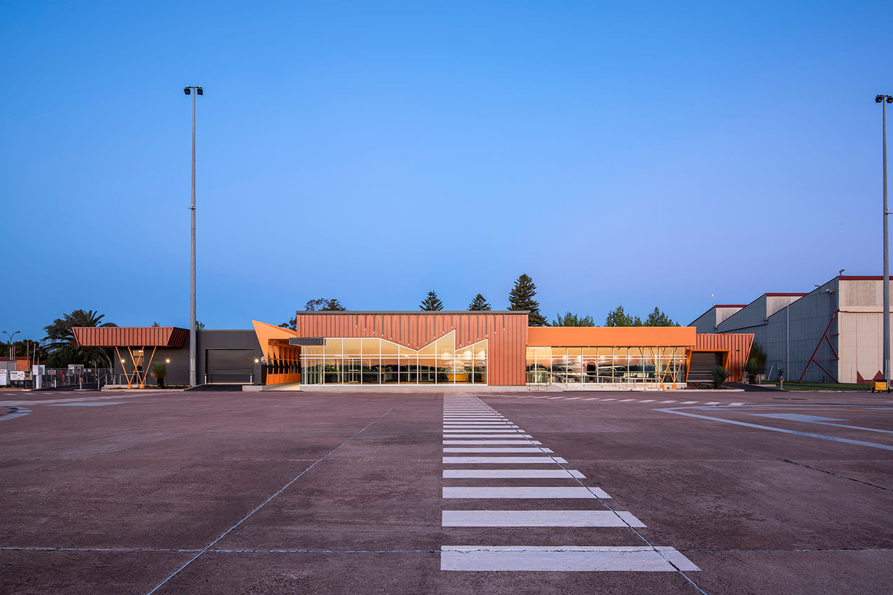
Federal Legislation mandates security screening for passengers at regional airports. Therefore, the existing Whyalla Airport Terminal was extended to accommodate the required new screening equipment. It also includes new areas for Incoming & Outgoing Baggage, Departures Lounge, Café, Amenities and Administration.
New baggage carousels streamline entry, check-in & exit for passengers. Adult change facilities provide dignity & privacy to disabled users. A history wall pays tribute to local aviation and people. Important visitors are also featured.
Aviation influenced the design. It is evident in the Deltawing Arrivals Walkway, baluster details, plane graphic, loose furniture and wall clocks, enhancing this unique place of arrival and departure. Colours reflect the hues of local sand and locally produced minerals.
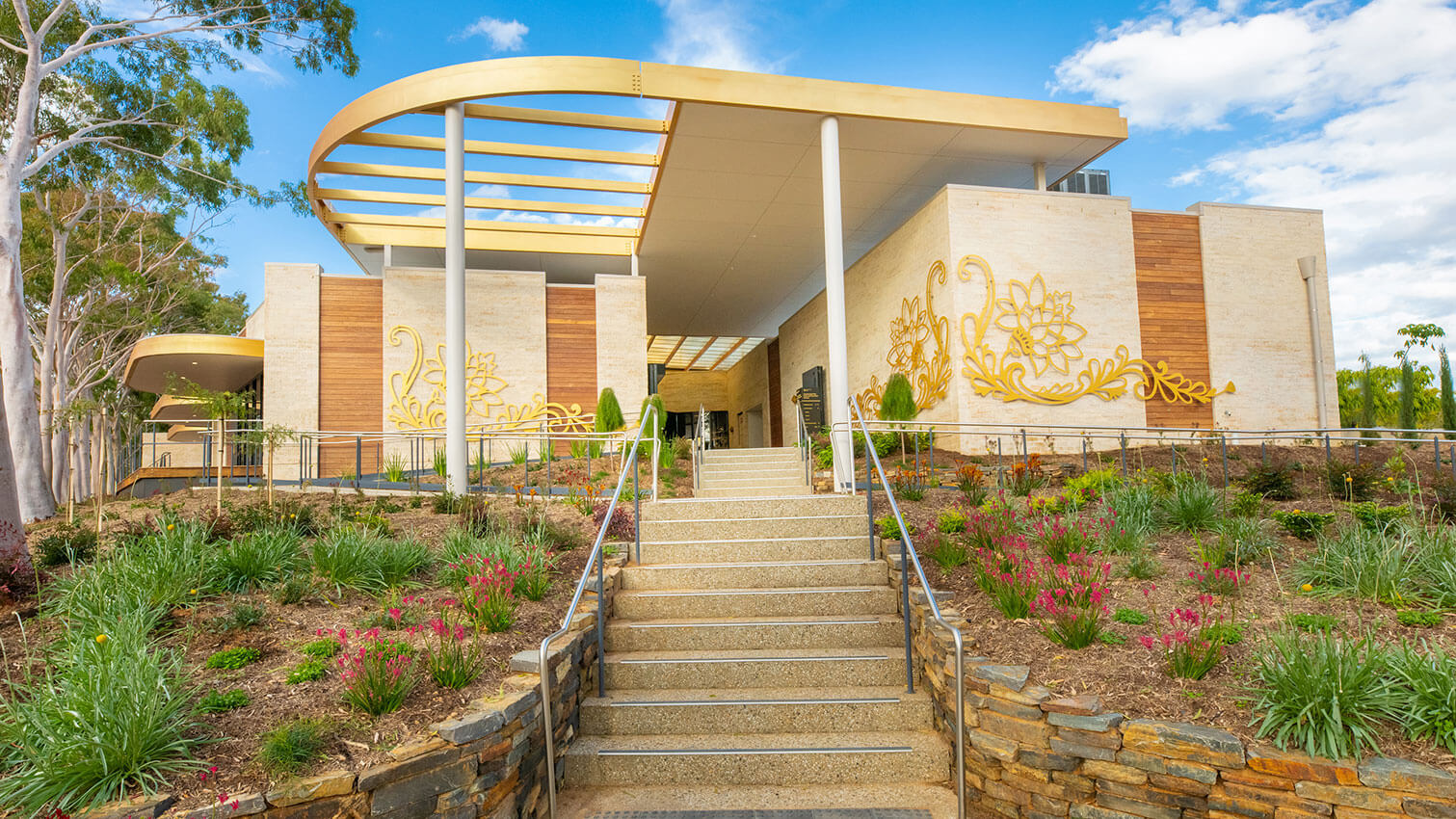
Centennial Park Cafe and Function Centre - Studio S2 Architects
Australia’s first garden cemetery at Centennial Park is more for the living than the dead, and with Studio S2 Architects they have created a bold statement – a place that changes public perception of cemetery.
Designed to celebrate life, the building embodies a simple, uplifting melody. Like music, it ebbs and flows, raises the spirit and tells a story in a universal language. It is art in its own right, and integrates artwork into its fabric with artist designed climbable ‘playground’ sculpture, custom light fixtures and planters, screening and ceiling features.
Prominent in the park, it is adjacent the state heritage listed Jubilee Complex, which inspired materials and building form. Inside are private but intimate function spaces, an airy and light terrace, serene café and gift shop. From its garden setting, it rises above its surrounds, yet settles beautifully in the landscape.
Mount Gambier Regional Airport - Ashley Halliday Architects
The architectural approach is innovative and unexpected, designed to optimise travelers connection and experience with the Limestone Coast. The architecture immerses travelers in the regions unique natural, geological and cultural features, creating a memorable experience that makes people want to visit, re-visit and engage with the regions diverse environment, culture, and commerce.
Referencing the regions predominant sustainable forestry industry, travelers pass by an abstract forest of radiata pine columns upon arrival and once inside the terminal are immediately immersed in the regions spectacular geological wonders. What’s beneath the region is defining – a spectacular labyrinth of limestone caves and sinkholes. Linking this identity with the terminal is a dramatic circular skylight over the arrivals hall, abstractly reminiscent of the atmosphere created at the Umpherston Sinkhole. Lined in charred timber and surrounded by a curtilage of black mesh, day light will filter through the hole and create a dramatic and unexpected atmosphere.
URBAN DESIGN
Jury:
Chair Richard Woods (Habitable Places Architects)
Amanda Rebbeck (DWP Hardy Milazzo)
David Brown (BB Architects)
Ryan Horsnell (Troppo Architects)
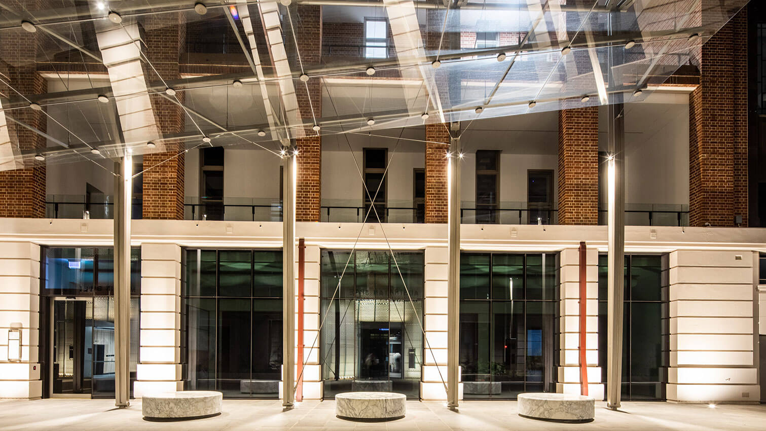
Lot Fourteen Canopy | Oxigen + Tridente Boyce + Arup | Photographer: Simon Cecere
Lot Fourteen, an initiative of the South Australian Government, provides a vibrant, collaborative ecosystem focussing on innovation, entrepreneurship, research, education, culture, and tourism. The brief was to provide a sheltered outdoor space, adjacent to the Australian Space Discovery Centre entry, allowing groups to assemble while being protected from the elements.
The narrow passage between the imposing State Heritage buildings required a sensitive insertion with minimal impact. The structures configuration is derived by aligning the structural grids of the two existing buildings and is independently tabilised with a series of strategically located cables. For protection from the rain, a sloped glazed plane is suspended at a lower level from the overhead structure with cables.
The project illustrates the benefit of true collaboration between parties, with different expertise, and in many ways communicates the innovative spirit of Lot Fourteen.
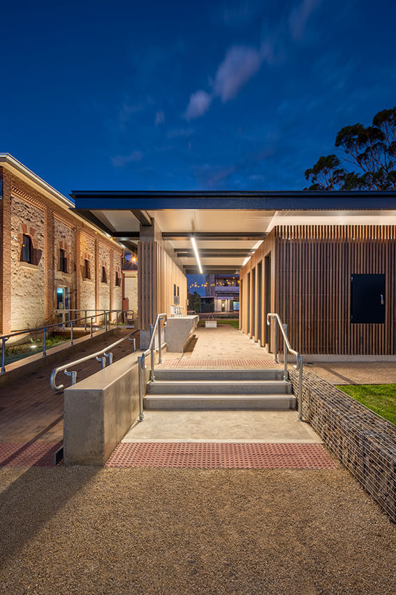
Two Wells Public Toilets & Village Green - Phillips/Pilkington Architects Pty Ltd
The New Village Green at Two Wells including the public toilets creates an important new civic place, right in the heart of the town. Careful placement of the toilets immediately adjacent to the existing historic Institute Building now the local library, emphasizes a walking trail to the west towards the town’s historic two wells.
Particular material choices create a balance of design considerations, such as ESD, prefabrication, comfort, privacy and durability and promote a sense of place responding to the materiality of the many historic buildings in Two Wells and promoting the beauty of sustainably harvested Australian materials.
Houses Alterations and Additions and heritage
RESIDENTIAL ARCHITECTURE - HOUSES (ALTERATIONS AND ADDITIONS)
Jury:
Chair Sean Humphries (Black Rabbit Architecture and Interiors)
Con Bastiras (Con Bastiras Architects)
Tessa Sare (Phillips/Pilkington Architects)
Jon Lowe (Jon Lowe Architect)
Guest Juror Katrina Swiatczak (AWS)
Casa del Bambino - Grieve Gillett Andersen
Like its namesake, the Casa del Bambino is compact, stylish and built for today’s city sophisticate. The design brings the old world charm of a Heritage listed Adelaide cottage into the twenty first century with an edgy and sleek design solution. The Casa del Bambino is big on personality and small on footprint. The house comprises two bedrooms, living, kitchen, bathroom and outdoor space with generous views and abundant natural light in a modest 160sqm site footprint. Like the Bambino in the driveway, the house is as much about its history and beauty as it is about its clever efficienci
The station concourse interior was conceived as an organic vaulted arcade, a carved interior space from the rocky escarpment, reminiscent of the Garlick and Jackman Neoclassical interior of the Adelaide Railway Station Hall. The vaults were sculpted organically, but also pushed and pulled to align with an integrated structural column design supporting the SkyCity building above. This allowed the arches to touch down to ground around each column, resulting in a rhythm of intersecting vaults and an immersive experiential collection of volumes.
The design recognises form as function, utilising architecture as sculpture to create a space that transforms a previously forgotten part of the Riverbank, resulting in a new sense of pride in place for Adelaide.
Adelaide Residence - Williams Burton Leopardi
As both a renovation and repurposing, Adelaide Residence is the return to base principles of what it is that comprises ‘home’ and the individual experience of retreat. The home becomes a showcase of a layered and storied life through treasured items and collected gems. In a previous life, the property formed the surgical consulting rooms for its owner and was utilised as a commercial place of business and healing.
The resulting home echoes the quiet, calm demeanor of its owner, deliberately discreet and expanded through a modest lens. Sentiment is integrated throughout, with a focus on diffused light and a muted neutral palette. Bookmarking the home sees the repurposing of the rear stable structure into its own bespoke entertaining area. While the formality of the original front rooms is retained, the rear is opened to create a connected place for family, without feeling overwhelming for one.
Gilbert - A Goodwood House | RADS
Turning off Goodwood Road onto Gilbert St there is a buzz in the air. The Art-Deco Capri Theatre stands statesman-like on one corner while a former adult shop turned new hip local wine bar energises the other.
Firmly embedded within a suburban community boasting cafes, bottle shops, dessert bars, restaurants, local schools and shops, Gilbert embraces its locality.
The Capri Theatre prompts deco-inspired curves into the dwelling, while dramatic geometric roof forms capture natural light.
Midcentury materiality sets its mood externally.
Playful interiors are connected with the lush public and private garden surrounds where established trees are considered among new plantings.
Hidden offerings are discovered; wine storage subfloor, the warm pop of vinyl, fresh herbs straight on a pizza and framed views throughout.
Fond memories of the past are referenced, although the house itself celebrates a vibrant lifestyle for the future of a young family.
Gladstone - Cycad House - RADS
Kilburn, rich in cultural diversity welcomed us to a project brief unlike any that had landed in our inbox. Being the only architect to provide a quote we were quickly engaged and befriended by a wonderful human, Ngoc.
Upon first visit we were instantly blown away by a collection of plants spanning decades of commitment. We had been thrown into subculture of horticulturalists bringing exotic greenery to the backyards of Kilburn.
Our response: Vietnamese brutalism. A gallery for garden. A space for Ngoc to continue her pursuit of the perfect living space. Monolithic blocks embed the addition with static details providing kinetic visuals to the community.
Social spaces weave through a series of courtyard gardens, linked with translucent internal greenhouses, meandering planting inside and out.
The Cycad house diffuses and screens light, connects with sky, and adds tranquility to a building designed to endure with nature.
Rose Park House - studio gram
The Rose Park House is best described as a project of discovery from commencement to completion. From the street this early 1900’s Queen Anne Villa appears like any other, however beneath the surface lies a series of spaces designed to be unique in their function and expression, yet consistent in their approach, resulting in an Architecture that is completely unexpected.
Kingswood Residence - Williams Burton Leopardi
Transforming a dark and highly ornate home into its light-filled contemporary, Kingswood Residence is endowed a new chapter to its storied past. Opening up and forming framed views between each previously segregated zone, an overhaul of the existing planning sees the reorientation of the experience of the home out toward the surrounding landscape.
A series of new gestures ensure the home is reprogrammed in its entirety. Although restrained and contained to within near the exact previous built outline of the home, the alterations have a compounding affect.
At the heart of the transformations of Kingswood Residence, is an ingrained sense of flow and connection. Through pushing out toward the west and aligning the functions of the home, the rich character details of the home continue to be celebrated amongst the more contemporary insertions. By making sense of the planning, the family home now reflects how its occupants live.
Medindie House - Architects Ink
Medindie House is a two-storey addition to a grand old sandstone villa.
Our client sought a contemporary lifestyle and a strong connection to the spacious north facing rear yard, whilst also accommodating extended family.
The site’s location directly under a flightpath, led to the selection of insitu concrete construction for the walls, floors and roof.
The solidity of the concrete is balanced with warm, natural materials and the play of light throughout the addition. Windows, frameless skylights and voids, are strategically located in walls and roofs to capture the sun, natural light, breezes and the garden views.
The addition is minimal, yet warm and functional with an understated luxury; a contemporary but enduring addition to the beautifully restored villa.
Parkside House - BB Architects
The Parkside House addition is a variation on the theme of contemporary additions to historic houses with a slight twist. From the front it is not possible to view the rear addition, and from the rear, the old house is barely visible. The new garage with studio above forms the visual divide between front and rear. While there are hints of new things at the rear, these are only apparent once entering the house through the side door.
The brief was for a forever home for the family with two children. An addition at the rear to contains a contemporary livingspace, and three bedrooms and a large living room in the old house. The garage is more of a workshop, with the daily driving cars stored under the minimalist carport. The upper level of the garage contains a studio apartment for visiting family and friends.
heritage
Jury:
Chair Richard Woods (Habitable Places Architects)
Amanda Rebbeck (DWP Hardy Milazzo)
David Brown (BB Architects)
Ryan Horsnell (Troppo Architects)
Bice Building Refurbishment - Hassell, Purcell and Baukultur
The four-storey Bice Building (c1927) stands as a highly valued heritage building on the edge of Adelaide’s exciting new innovation and technology precinct, Lot Fourteen. Part of the original 1921-22 Masterplan for the Royal Adelaide Hospital, the newly refurbished building forms an important gateway for North Terrace facing site.
The removal of previous alterations and reinstating original design intent of associated architectural elements with a modern approach was key to the adaptive re-use of the building. The project sought to conserve and reinstate much of the exterior building envelope, either to conserve original fabric or replace previous alterations in a contemporary, visually sympathetic, and complementary manner. By working with the previously modified, original built form and optimising the size and flexibility of the floor plates, Bice has been transformed into an innovative, collaborative, and accessible workspace, fit for the reactivated precinct for many years to come.
Restaurant Botanic - Williams Burton Leopardi
A respectful honouring of place, heritage and produce, Restaurant Botanic is reimagined as a naturally warming harbour within which to savour and embellish the senses. While its connection and ingrained sense of nostalgia carry forward, the changing of its custodians sees a matched rebirth of the spatial experience.
A light-touch ensures the existing exterior character, heritage fretwork and detailing are restored and enlivened, while the carving of a new entry experience reinforces a sense of arrival. Inside, the previously traditional restaurant space is opened up to bring guests into the preparation experience, with a Japanese-inspired front row seat to the action. In the centre of the space, around a carefully crafted bar and under arched framed timber details, guests are invited to partake in the finery of creation, while dining. In reimagining the Botanic Garden Restaurant, the space becomes deeply and richly immersive, and balances smells, sights and sounds idyllically.
residential architecture houses new and Multiple Housing
Residential Architecture - Houses (NEW)
Jury:
Chair Heather Griffin (Snøhetta)
Tain Patterson (Troppo Architects)
Melanie Ford (ODASA)
David Handsaker (Williams Burton Leopardi)
Jury:
Chair Andrew Steele (Studio Nine)
Gianni Francisco (Cox Architecture)
Esther Chew (Grieve Gilliett Andersen)
Greg Bond (Atelier Bond)
Iron Chef - Das Studio
Iron Chef house is the result of a highly successful collaborative relationship between Architect and client.
Located on a leafy, no-through road surrounded by an enduring suite of character bungalows, the new home pays homage to the ghost of the structure that once stood in its place.
Responding to the rhythm, forms and detailing of the street’s heritage style, Iron Chef offers a contemporary interpretation of the angled tiered and pitched roof forms.
Receding in height from the street yet generous in internal scale, a double height void running the length of the home creates a generous connection between levels while framing a view to the incredible red gums to the sites rear.
A series of glazed operable walls open the home entirely from front to back, while the external materiality of fluted timber and soft sandy masonry wrap inward, creating a seamless connection between inside and out.
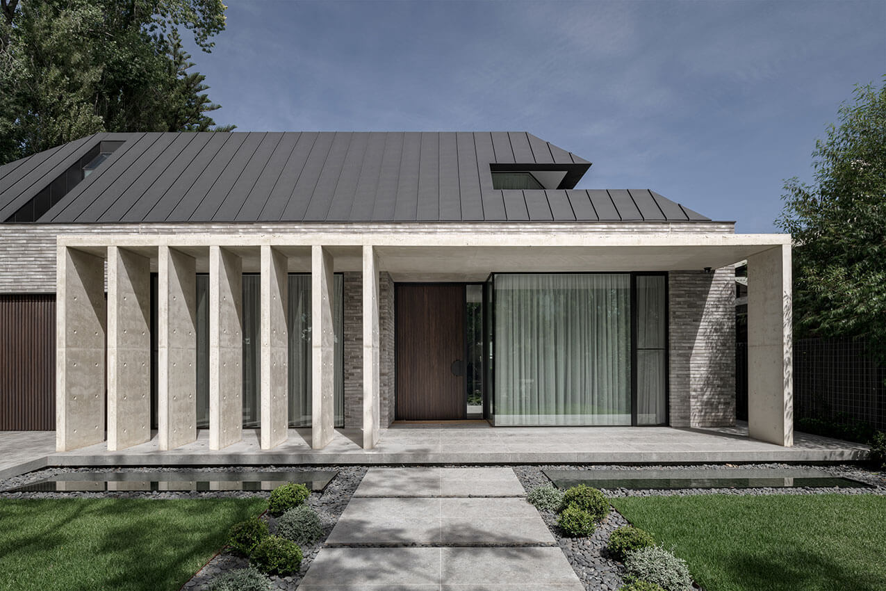
Jacaranda House - Architects Ink
Centred around an existing tree, Jacaranda House offers a robust family home in Erindale where the layering of space, texture, and light nurture interaction between nature and each other.
The clients sought a low maintenance home designed for entertaining, with abundant access to functional outdoor areas to facilitate an active lifestyle.
Like a Roman village, it is formed from a series of masonry volumes that radiate around an existing jacaranda tree. The variation in floor levels and ceiling heights, along with the carefully considered placement of courtyards, voids, openings and skylights create a dynamic series of interconnected spaces.
Bespoke detailing coupled with a disciplined palette of honest and durable materiality, rich in texture are integral to the personality of the home. An appreciation and manipulation of light allows a daily performance of dancing light across the architecture, showcasing the textural and tonal variances of the materials, enriching the spatial experience.
The Big House on the Hill - Atelier Bond
On a site deep in the Adelaide Hills, amid a rolling treescape of valleys and horizons, sits a “forever home” for present and future generations to share. Orientated to the north but favouring the east to capture light, the 65m-long building boasts uninterrupted views from every room. An internal 6m-high structural rammed earth spine provides strength and temperature stability as well as fire resistance, an undeniable asset in a renowned bushfire zone. The layout is divided into three distinct pavilions. The shared living spaces serve as the central anchor of the home and are enhanced by 12m of operable double-glazed windows and a substantial stack bond fireplace. The roofline is increasingly pitched, folding upwards to capture the full morning sun. A carefully considered textural mix softens and warms the interior as the eye is drawn outward, helping to create an intimate experience on a grand scale
Parkside Residence - Ashley Halliday Architects
Taking cues from the adjacent 1880’s Villas – form, scale, set-backs, roof profiles – a simple, contemporary palette of complimentary materials and finishes was introduced. House and garden were orchestrated to reflect the owner’s generosity of spirit, modern taste, dynamic family lifestyle and desire to engage with their suburban community.
The two gabled pavilions sit perpendicular to one another, pulled apart and inflected to create interstitial spaces between that provide veiled views in and out whilst creating pockets for the surrounding landscape to infiltrate and break down the mass of the house. The main living pavilion embraces the gabled roof form with a portal steel frame allowing the roof form to continue internally. Tasmanian oak ceiling linings add warmth and scale whilst the textured oak battens give a rhythm to the spaces, enhancing the sense of perspective that is directed to the garden to the south.
...number 14 - Black Rabbit
…number 14 captures the lifestyle of the young family that calls it home, asserting itself amongst the traditional housing typology of a leafy Adelaidean streetscape. Keeping within its context by subtly nodding its head to the original bungalow that previously occupied the site. The monochromatic combination of texture and form, simultaneously stand watch over the street, beckoning one to explore what’s inside.
…number 14 reveals itself as a striking, bold contemporary house but within, is a warm and inviting home to an amazing young family …and a cheeky pooch! Making day-to-day living easy, this is a place where partners, grandchildren and friends will always feel welcome, both today and in the years to come!
...number 106a - Black Rabbit
Situated on the busy foreshore strip between Brighton and Hove…number 106a is very much in the public eye. A private residence on display to the ‘hub-dub’ of daily beachside life. Presenting itself to the street and coast, it opens its doors and does not shy away.
Breaking down the formalised ‘edge’ of the building envelope… pushing and pulling, it blurs between two domains. As part of the steady redevelopment of the Adelaidean foreshore, number 106a, doesn’t try to be beachy, it plants it feet firmly and says, hey ‘look at me’…I’m a little bit different!… a home that both watches and is there to be watched…‘not a beach house’ but a beachside home…
Brook Bridge - Max Pritchard Gunner Architects
The elusive dream of living over running water is realised in this unique bridge like home located in a picturesque heritage village.
Two homes were located on the site. One a heritage listed cottage, the other an inefficient modern structure that didn’t provide adequate accommodation for the multi-generational family.
The solution was a simple linear house spanning across the site over the creek.
Energy efficiency was central to the design, large north facing windows utilise winter sun but are protected in summer by the roof overhang. Double glazed windows and well insulated structure provide a healthy environment requiring little artificial heating and cooling.
Our client works from home, and has remarked often how much joy it is to live and work in the house. Two children and a visiting mum can share this joy.
Henley Residence - Tridente Boyce
Henley Residence was originally conceived as a second storey addition to an existing 1940 ‘s home on a steep, elevated sandhill. Due to certain circumstances, an all-new construction was required.
As an addition to a single storey home, there were concerns with the overall composition of the second storey addition when viewed from the street. The adopted approach to address this was to ‘cloak’ the existing building to allow the two-storeyelement to be compositionally viewed as one element. This methodology was maintained with the new home.
The home is comprised of three zones which relate directly to the prevailing topography. The main living areas are located within zone two. A choice of external areas offer relief from the varied climatic conditions experienced next to the sea.
Henley Residence demonstrates how compact, yet challenging site conditions can be developed to provide contextually positive and responsive outcomes for a home.
Aldinga Beach House - BB Architects
The project is for a new family home, that in the shorter term is to function as a holiday house, but longer term will be the owners main place of residence.
The brief was for a generous home with space for their two adult children, and to entertain friends. The planning of the house naturally took shape with the main living areas taking the north and west views on the first floor, the main bedroom having the southern and western view. At the rear were two guest bedrooms for extended family and friends which could be closed off from the rest of the house. On the ground floor a large living and games area with the views out west, and the bedrooms for the children. The swimming pool and spa are nestled in to the north side of the house to avoid the prevailing winds, and capture the winter sun.
Norwood House - Con Bastiras Architects
This two storey residence designed for a young family, is located in the chic inner Adelaide suburb of Norwood.
Being located in the heart of a Historic Conservation Zone, meant that strict planning regulations were required to be satisfied. The form and materials used, respectfully take cues from the neighbouring buildings, even though the resultingdesign is uncompromisingly contemporary.
From the street, the house takes on the appearance of a single storey building, as the second storey is discretely tucked into the roof space. Hints of upper floor accommodation are revealed through narrow window openings carefully sliced into the hipped roof.
The bluestone brick used for the ground floor walls and fences was selected for its texture and depth of colour. It’s a timeless material that sits comfortably alongside its historic neighbours, adding warmth and sophistication to the streetscape.
Residential Architecture - Multiple Housing
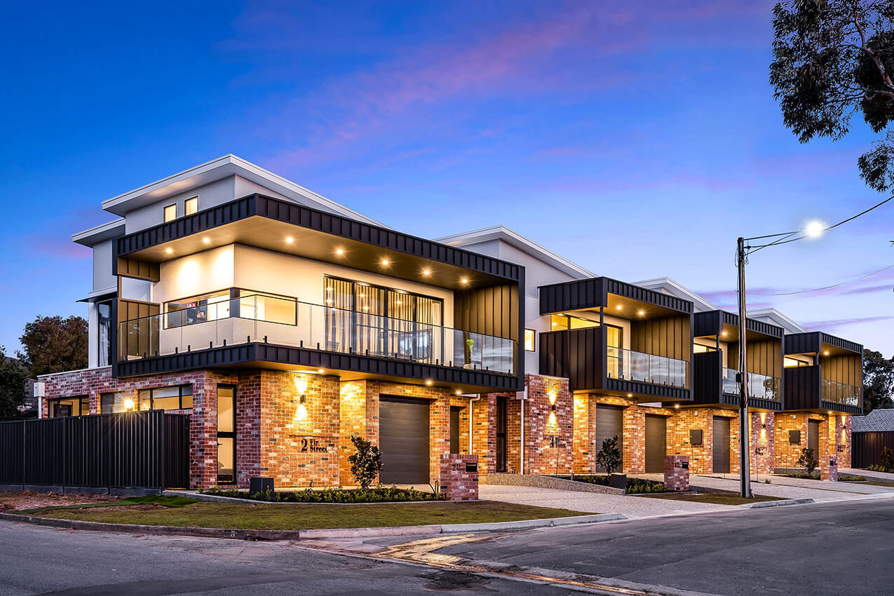
Fir Street Development - Think Architects
Inspired by the sunflower which naturally waves in the sun and captures light and energy in the most efficient way, the Fir Street Development pays homage to the history of the land and the previous custodians of the site. The development redefines townhouse medium density living by locating all living spaces on the first floor. The striking northern aspect roof captures the sun and delivers perfectly controlled light deep into the heart of each of the four homes. The floating roofs depict a field of flowers, all beautifully capturing light and energy in their need to thrive.
Located adjacent the Fourth Creek Trail, Think Architects framed views of both the tree top canopies and Adelaide’s growing cityscape skyline. This results in a perfect combination of the quintessential Australian lifestyle – in touch and connected with nature, yet only a stone’s throw away from a vibrant cosmopolitan life.
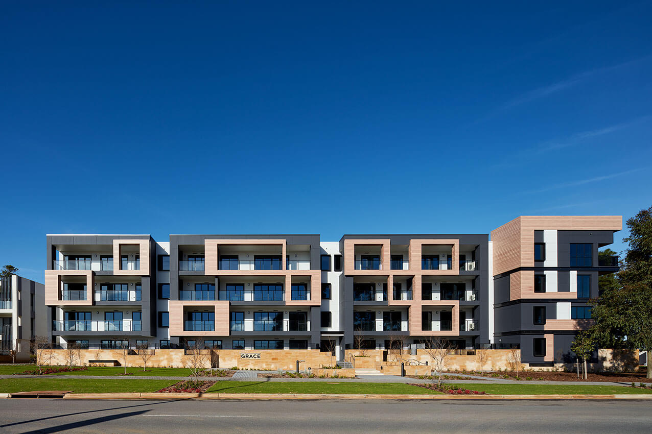
Grace Apartments - Hames Sharley
Grace Apartments at Glenside was designed by Hames Sharley with deep consideration of its historical, contemporary, and future contexts, and deep commitment to this urban renewal site’s ambition for community inclusivity and diversity.
Situated on one corner of Glenside’s entry boulevard, the apartments frame vistas inward, recasting the boulevard as a civic square centred on a prominent heritage building.
Drawing on elements of that building’s form and facade, Grace succeeds in balancing prominence and deference, inviting a complementary response from the yet-to-be-developed opposing corner.
Although Grace functions as a notional gateway to Glenside, its permeability was paramount; the community within and beyond needed the right to roam freely—without compromising resident privacy.
Designing for legibility provided the solution. By making wayfinding intuitive and the delineation between private and public, clear but not forced, interaction, exercise and the enjoyment of nature is encouraged throughout the integrated green spaces and surrounding parklands.
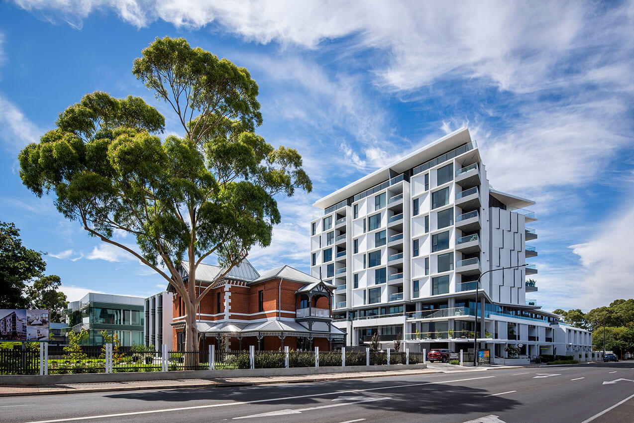
One On The Park - JPE Design Studio
The presence of the grand State-listed residence provided the context to create a unique urban community – a mixed-use project that combined the restoration and adaptive reuse of a culturally significant existing building with a taller and elegantly articulated contemporary residential building.
The sculptural façade of the new residential building explores the relationship between external expression and internal program. The alternating angular walls signify apertures for framed views of the expansive Park Lands and Adelaide Hills while creating a dynamic exterior facade composition of light and shade that changes throughout the day.
The verticality of new office building takes cues from the heritage while referencing the taller building behind through its materiality and grouping of elements, creating a consistent new building identity across the site.
The project is intended to be experienced by its occupants and visitors as a single mixed-use community, with shared garden spaces, interconnected access, and circulation.
The Brougham - PACT architects
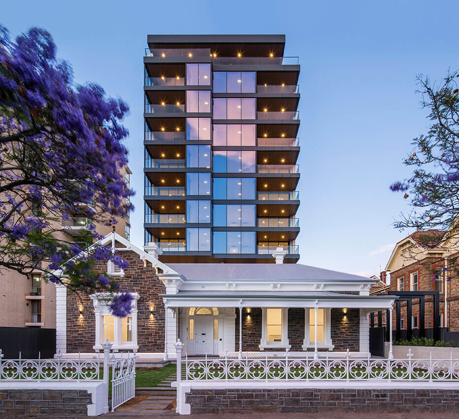
The Brougham represents the pinnacle in North Adelaide living.
This exclusive lifestyle development features 18 spectacular dwellings replete with resident amenities such as wine cellars, yoga studio, resident lounges, bar and terrace.
Located on historic Brougham Place, The Brougham incorporates and reactivates the state heritage listed house and stables. The elegant tower respectfully sits behind the heritage structures and its high quality materials of zinc and stone reference the adjoining heritage buildings.
With only two apartments per floor, each dwelling has been designed to ensure the best possible levels of natural light, cross ventilation and exceptional views are achieved. Working closely with Williams Burton Leopardi, the interiors display refined details and high quality finishes, resulting in beautiful and functional spaces.
Every space and every detail has been thoughtfully designed to instil a feeling of relaxed luxury.
Angaston Hill - Taylor Buchtmann Architecture
A cluster of dwellings housing four generations, Angaston Hill explores ideas of prospect and refuge, providing spaces for gathering and solitude.
The three houses are organised as a series of plateaus connected by ramped and stepped circulation, around a central linear axis. Angaston Hill incorporates universal accessibility at every level.
Contextuality was a significant consideration. A series of pavilions in the landscape respect the wider context. With traditional forms rendered in a contemporary interpretation.
Elongated forms, with a slender cross section, are central to the architecture. The plans accommodate maximum northern exposure, and views, with the slender section achieving good cross ventilation and natural lighting.
Roof forms take their cue from surrounding local buildings. Views are both framed of the township middle ground, and open vistas to the distant hills.
Whilst a very specific response to site and client, Angaston Hill provides a concept that could be successfully deployed elsewhere
Encore Apartments - Walter Brooke + ACG
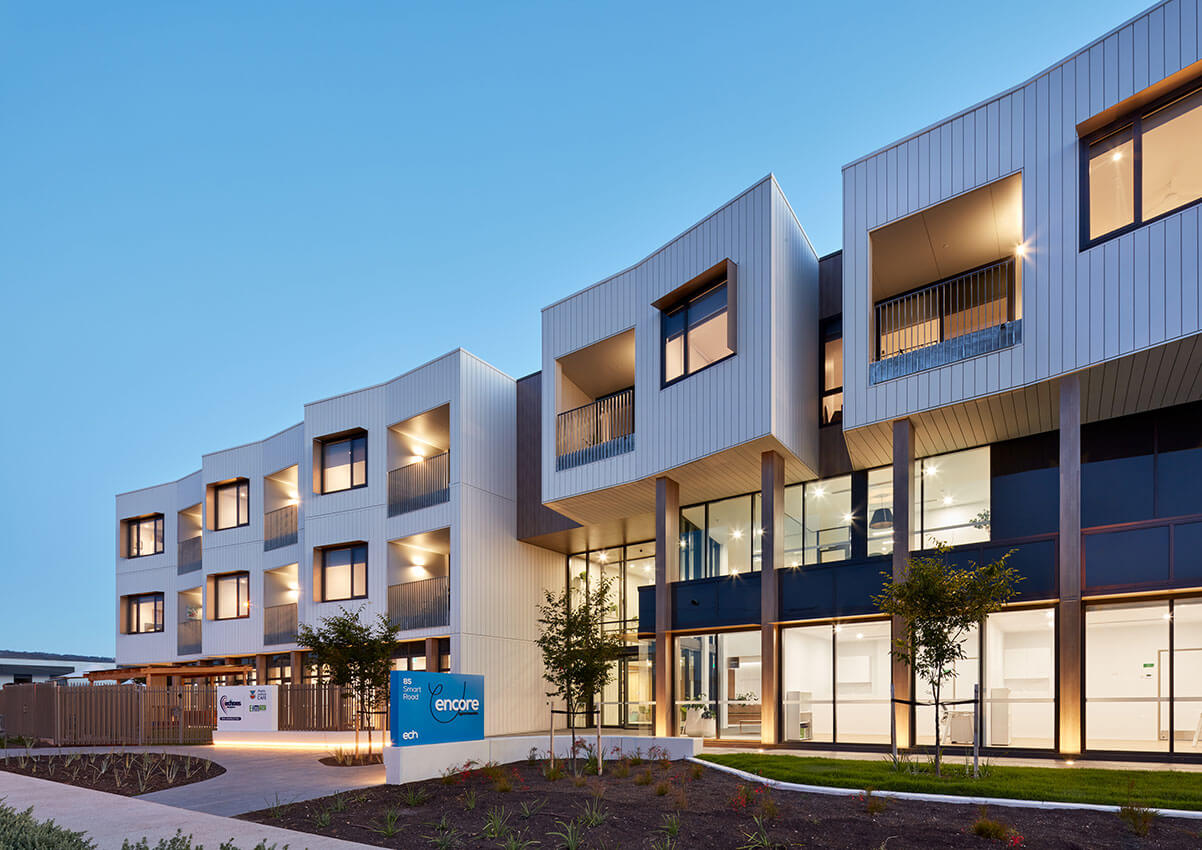
Encore Apartments is a vertical village for older people that is affordable, age friendly and encourages community.
A strong sense of place consistent with Council’s desired character is realised as an expression of wellbeing in architecture and a quality benchmark for future development within the locality. The project realises legible, and accessible places that are appealing, uplifting and integrated to the existing landscape character.
The response to context is deliberately angular to direct attention to the entry and provide a sense of expansion to Smart Road. The frontage engages with the streetscape and invites participation. The architecture presents in a timeless aesthetic inspired by the local Melaleuca and Spearwood setting.
Encore Apartments is an affordable and intergenerational environment which places liveability first and recognises the valuable contribution that genuine connection between people can have on quality of life.
Penny Place - Woods Bagot
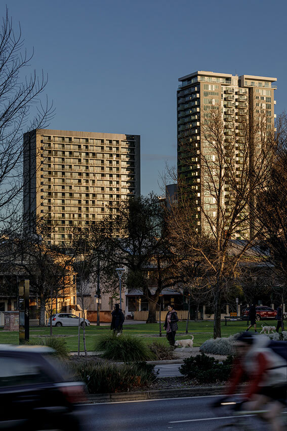
Penny Place is a 24 storey residential building conceived as part of new urban precinct in the centre of Adelaide. Situated near Victoria Square, Penny Place residents enjoy the advantages of inner city living whilst maintaining an individual and private home. Noting that good design can have a value greater than its cost, Penny Place leverages the skills and experience of the project team to develop a smart, flexible and affordable outcome.
