Entrant Gallery:
SA Chapter
2021 SA Architecture Awards
2021 SA Architecture Awards
entrant gallery
Projects in each category listed in alphabet order.
city of adelaide Prize
city of Adelaide Prize
Jury:
Stephen Ward (Uni SA)
Cllr Arman Abrahimzadeh OAM (City of Adelaide)
Simon Lee (ODASA)
Elinor Walker (ESD Planning)
Jaana Bithell (Studio Nine Architects)
Project descriptions
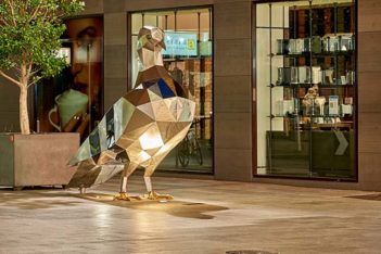
Gawler Place Upgrade – Home of the Pigeon by City of Adelaide, ProcurePM, WGA, URPS, BMD
25,000+ daily pedestrians travelling between Grenfell Street and North Terrace, makes Gawler place one of Adelaide’s busiest streets. It connects city workers, students, visitors, tourists, delivery and private vehicles to key cultural and retail destinations and public transport.
Gawler Place Upgrade creates an important link to the heart of Rundle Mall precinct.
A street that was once dominated by vehicles and taxis, is now a people-focused street, providing high-quality retail and outdoor dining experiences. Generous footpaths, flush-paved surfaces, a green arbour, tree planting throughout, integrated lighting and artistic furniture and public art has transformed Gawler Place into an inviting and attractive destination.
It is also now home to the Pigeon. The Pigeon artwork builds on Adelaide’s reputation as a place of culture, creativity and innovation. Carefully located to surprise and delight, this engaging artwork has attracted many admirers.
Her Majesty’s Theatre Redevelopment by COX Architecture
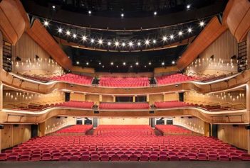
Constructed in 1913, Her Majesty’s Theatre is Adelaide’s oldest continually operating performance venue, staging world class performances and performers.
COX Architecture and project partners were engaged to redevelop Her Majesty’s Theatre to deliver a contemporary performance venue that honours the integrity and character of the iconic original building.
Historic fabric and new built form are seamlessly integrated through careful design and detailing, and a considered and crafted interior captures the delight and celebration of a night out at the theatre.
COX Architecture, The Adelaide Festival Theatre Trust, Department of Premier and Cabinet and Hansen Yuncken have been instrumental in bring HMT back to life. ‘Her Maj’ achieves best practice design principles paired with exceptional built outcomes. The public and media acclaim to date, and successful performances, point to a significant improvement in the performing arts and cultural life for South Australia and installs the next chapter in the HMT legacy.
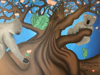
Hidden Gem at dwell East End Adelaide by dwell East End Adelaide in collaboration with the local artist Tapiwa Hwata
dwell East End Adelaide, home of 300 international and domestic students, opened in January 2019 and, since then, had been looking to add some personality to its building, creating a vibrant space that its residents and visitors love. They were soon delighted by the vibrant, colourful, friendly and meaningful style of the young local artist Tapiwa Hwata.
In the summer of 2019-2020 Australia was deeply hit by the bushfires. dwell was committed to help to alleviate some of the pain the community was feeling; the team organised several campaigns and dwell community response was so emotive, that they decided to honour their commitment with a mural that expresses the significance of Australia’s unique flora and fauna.
The strong message contained in the image is very close to the heart of all Australians and visitors. The design captures the famous Australian Eucalyptus tree and the most beloved Australian animal: the koala.
Modernist Adelaide by Stuart Symons
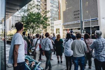
Modernist Adelaide, founded by mid-century architecture historian Stuart Symons, enhances the public experience of the city and activates and enlivens our streets through regular city walking tours, house tours, publications, exhibitions, presentations, media appearances and online.
Profiling the architects, clients, design and history of Adelaide’s modernist buildings of the 1940s–70s, Modernist Adelaide has unearthed a richness and value in these buildings and our city – raising the community profile of Adelaide’s modernist architectural heritage and bringing it to new audiences.
More than 2,000 people have attended 70 Modernist Adelaide tours and events, the book Modernist Adelaide: 100 Buildings 1940s–1970s has sold more than 1000 copies, and dozens of media appearances, talks, panel discussions, exhibitions and a large online following have engaged the community about Adelaide’s architectural history, contributed to the economic growth of the city and built public appreciation that influences heritage preservation and retention/reuse of heritage fabric.
Sheridan Kiosk by BB Architects
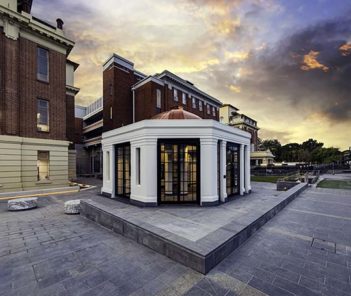
The Sheridan Kiosk is located at the front of Lot Fourteen, the former Royal Adelaide Hospital site on North Terrace, which is be being redeveloped into a world-class innovation neighbourhood for work, study, and exploration. The building acts as an entry focus and the prime food and beverage service location to the Lot Fourteen site.
The Sheridan Kiosk was built in 1925 with a bequest to be both a kiosk to the hospital and a memorial to Keith Sheridan. The money was donated by Sheridan’s two daughters, Alice Keith Sheridan, and Violet Simpson.
The project was to restore, conserve and adaptively reuse the building, returning it to its original function and as close to its original form as possible. This involved stripping the structure back to the remaining original significant historic elements, and only introducing minimal contemporary elements to make the building functional and comply with modern standards.
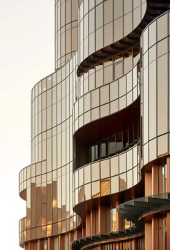
SkyCity Adelaide Expansion Project by BUCHAN
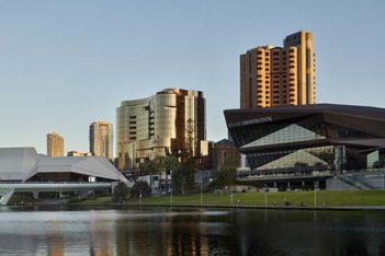
A grand sculptural gesture, SkyCity Adelaide is at the heart of the commercial and cultural rejuvenation of the Riverbank Precinct. Ethereal and translucent, sinuous and fluid glass curtains flow and shimmer like a sequinned gown. Its bold form and confident identity statement create an enduring and sophisticated international icon for Adelaide.
A series of interconnected entertainment and hospitality spaces and 24/7 activated public realm entices and delights visitors to this dynamic and memorable place.
The project realises the full potential of its siting; it restores, unifies, celebrates and revives a previously disjointed assortment of underutilised and isolated buildings and spaces, integrating both the heritage and expansion buildings with each other and with the renewed public realm.
The new building’s design creates a contemporary glittering architectural jewel that highlights the grandeur of the existing heritage building. SkyCity Adelaide is a city-shaping catalyst development, elevating the urban fabric of its surrounds.
Vietnamese Boat People Monument – ‘Guiding Light’ by Rosella Badios
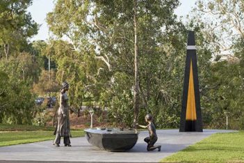
The Vietnamese Boat People Monument designed and created by Adelaide Artists Tony Rosella and Ash Badios is the latest public artwork to be unveiled in the City of Adelaide.
Situated along the Torrens river on Victoria Drive the Monument reflects the experiences and story of the Vietnamese Boat People and their remarkable journey. The work tells of a generational story born from oppression and is reflected upon by two Vietnamese figures, a young woman and boy. Their conversation describes a journey, marred with peril and fuelled by hope for a better future.
The Monument honours those that did not survive the journey and is also a symbol of gratitude for welcoming the boat people to Australia. It was made possible after four years of dedication and fundraising by the Vietnamese Boat People Monument Association and community.
Commercial Architecture and small Project Architecture
Commercial Architecture/ small project
Commercial
Jury:
Kirsteen Mackay (Government Architect ODASA)
Shae Taylor (Grieve Gillett Andersen)
Andrew Steele (Studio Nine Architects)
Waleed Moughraby (Woods Bagot)
Shawn Stevens (Revolution Roofing)
Project descriptions
Adelaide Oval Hotel by COX Architecture + Carr
In September 2020, COX, with interior design partners Carr, completed The Oval Hotel for the Adelaide Oval Stadium Management Authority (AOSMA). The first hotel in Australia completely integrated into the footprint of a stadium, this project was a unique opportunity for our team to build on the success of the much-loved Adelaide Oval Redevelopment that COX, AOSMA and project partners opened to the public in 2014.
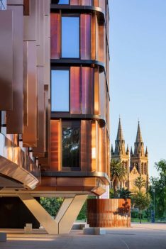
The Oval Hotel provides accommodation and a central reception pod arranged as a series of considered elements that integrate seamlessly with the existing scale and context of the Eastern Stand. New materiality compliments and enhances the existing building identity, celebrating its parkland setting and providing a new chapter in the legacy of the Adelaide Oval.
AWL Wingfield Redevelopment by Cheesman Architects
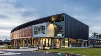
Located along the busy industrial corridor of Adelaide’s Northern suburb Wingfield, the new Animal Welfare League Redevelopment sits proud amongst its hard industrial context.
The new state-of-the-art facility is the culmination of a 10-year journey for AWL. Commanding a strong street presence, the development is befitting of the significant public contribution the organisation has provided in rehabilitating and rehoming South Australia’s vulnerable, sick, surrendered, and abandoned animals over the past 57 years.
The revolutionary facility incorporates international best practice Fear Free design principles to support the well being of animals and its carers. Seamlessly integrating surgical, adoption, clinical and behavioral assessment functions previously delivered within a disconnected model.
The architecture delivers a positive, unified work environment to accommodate the dedicated and selfless staff/ volunteer team constantly faced with challenging and emotional situations. Significantly improving the consumer experience and cementing the AWL as a destination for connecting people with animals.
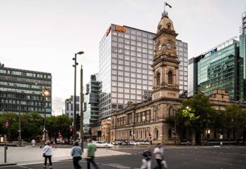
GPO Exchange Hassell and Fitzpatrick+Partners with Baukultur
GPO Exchange takes its inspiration from the classical and modernist heritage of Adelaide’s Victoria Square.
Revealing past hidden areas of the GPO precinct, the tower integrates the State Heritage listed Telephone Exchange Building as a feature of the development, especially in the main foyer where the restored heritage brickwork is revealed.
The depth of the main Franklin Street entrance reflects the solidity and shelter of the entrances to adjacent heritage buildings. The sculpted panels behind glass on the Franklin Street elevation are an artistic interpretation of the switchboards in the former Telephone Exchange building.
Enclosed in a gridded façade system, the tower combines double glazing set into a solid metal skin, maximising views and natural daylight while managing heat and glare. Visible from all directions and drawing on the simplicity of the buildings in this part of Victoria Square, it is deliberately simple, refined and consistent on all four sides.
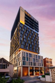
Hotel Indigo by Loucas Zahos Architects
Just as no two neighbourhoods are alike, no two Hotel Indigos are the same. Loucas Zahos Architects designed Hotel Indigo with Adelaide and its rarity and individuality in mind. The 145-room hotel has been designed as a distinctive landmark to the Market precinct, inspired from deep connections to the neighbourhood and Adelaide City. Sixty years of Adelaide Festival posters underpin the interior hotel room design. A ground floor urban street welcomes visitors with materiality and movement.
Housed on a former textile factory site, the property’s “Raw and Refined” design celebrates the neighbourhood’s commercial past with a blend of heritage inspired and modern architecture. Contemporary design features, copper fixtures and red brick archways are a nod to SA’s copper mining history and Adelaide Central Market’s historically rich facade. In a joint collaboration, Loucas Zahos provided interior design to guest areas, with studio-gram, to the food and beverage areas, lobby and mezzanine.
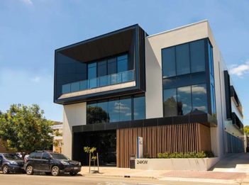
Kent Town Boutique Office by Matthews Architects
Matthews Architects decided that the best reaction would be to lean in hard to the size and programming that planning policy aspired to. The client and future tenants were on board with this idea, happy to make a statement that came with the size, appearing even larger due to the low heights of the immediately adjacent buildings. There was already a strong language of glass façade amongst the adjacent existing buildings which we extrapolated and applied tastefully into our fabric. We chose to play and experiment with textures for the skin of the building, using a range of different cladding materials all coated in neutral colours to encourage a sense of growing curiosity as pedestrians walked closer.
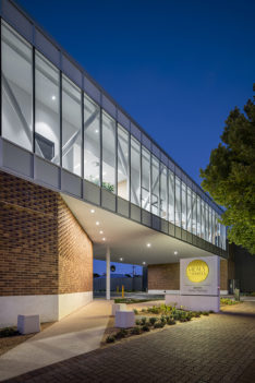
Meals on Wheels SA Head Office by JPE Design Studio
The Meals on Wheels SA Head Office brings together administrative, office and commercial kitchen functions together in a consolidated cook and chill facility. Representing the expansion and modernisation of Meals on Wheels South Australia, this new two storey commercial building expresses a sense of warmth, openness, and approachability that reflects the heart of this non-for-profit organisation. The design utilises a refined materials palette of robust feature brickwork and bold transparent forms which frame the activity within to the street. The design priorities efficiency, diversity and connectivity with environments that offer a contemporary workplace and nurture social interaction. The new central hub better caters to the organisation’s future, with a flexible environment that allows for more effective working whilst providing a contemporary environment focussed on people and the role Meals On Wheels has in supporting our community.
SkyCity Adelaide Expansion Project by BUCHAN
A grand sculptural gesture, SkyCity Adelaide is at the heart of the commercial and cultural rejuvenation of the Riverbank Precinct.
Ethereal and translucent, sinuous and fluid glass curtains flow and shimmer like a sequinned gown. Its bold form and confident identity statement create an enduring and sophisticated international icon for Adelaide.
A series of interconnected entertainment and hospitality spaces and 24/7 activated public realm entices and delights visitors to this dynamic and memorable place.
The project realises the full potential of its siting; it restores, unifies, celebrates and revives these spaces, integrating both heritage and expansion buildings with each other and with the renewed public realm.
The new building’s design creates a contemporary glittering architectural jewel that highlights the grandeur of the existing heritage building. Conceived as dance partners – masculine and feminine, traditional and contemporary – the buildings are caught in a delicate embrace.
Small Project
Jury:
Kirsteen Mackay (Government Architect ODASA)
Shae Taylor (Grieve Gillett Andersen)
Andrew Steele (Studio Nine Architects)
Waleed Moughraby (Woods Bagot)
Shawn Stevens (Revolution Roofing)
Project descriptions
Futuro at Naiko Max Pritchard Gunner Architects
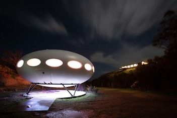
Walkers following the Heysen Trail along the rugged coast of the Fleurieu Peninsula may be astonished to see what appears to be a flying saucer landed in a small cove adjacent the award winning Naiko Retreat.
The prefabricated structure is a Futuro designed in 1968, by the Finnish Architect Matti Suuronen for the snow fields.
This Futuro initially ‘landed’ and resided at a site in North Adelaide before flying to its present site for use as a holiday home.
Whilst the exterior shell was largely intact, window replacement and steel corrosion protection was required. The interior appeared to have never had the complete fit out for a home so, unhindered by conservation considerations, we were able to further enliven the unique space and emphasize the segmented nature of the structure. This has been achieved with radiating plywood flooring panels defined by hardwood battens. These follow the original structural joints.
Old Government House – Coach House by Arcuate Architecture
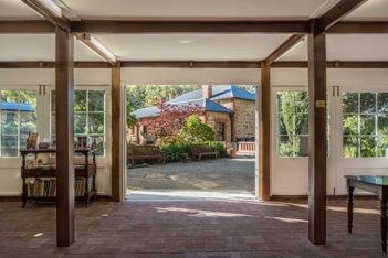
This project in Belair National Park saw upgrades to the Coach House to provide more flexibility in its use as a Visitor Centre and Museum for the former Governors’ summer residence, Old Government House.
Adaptions extended the kitchen and gallery spaces by two metres into the garden, and provided new external storage along the rear elevation. Repairs included renewal of the galvanized roof and repointing of stonework. Simple contemporary details incorporated within the adaptions to the building’s fabric focused on the relationship with the garden setting, using natural materials and colours.
Due to the very limited budget, Arcuate worked to the philosophy of doing ‘as much as necessary but as little as possible’. Redundant original fabric was recycled, such as the old timber glazed screens that were repaired and re-located to open out along the front elevation, creating a stronger relationship with the garden and with Old Government House beyond.
Walford Design & Technology Centre by Matthews Architects
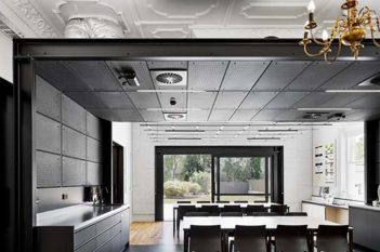
Walford Design and Technology Centre – an ode to the past and the future. The new Design and Technology Facility provides a unique space on the campus, combining the ornate historic shell that has the home-like feel of a residential building with modern features and the latest technology.
The word ‘crafted’ can be applied to the project starting from its conception, on paper first, then on site, knocking down walls to reveal soot-covered brickwork, ripping off tiles to breathe new life into them later and literally bringing existing ornamental ceilings to light. Ornate pressed metal, green glaze, galvanised steel, brass chandeliers, and pegboards – this building combines the incompatible, making the old highlight the new and the new highlight the old. One has to merely pay attention to the details to be inspired. And remember to look up.
Educational Architecture
Educational Architecture
Jury:
Lisa Martin (Detail Studio)
Simon Frost (Greenway Architects)
Rhiana Bell (Russell & Yelland)
Justin Cucchiarelli (Studio Nine Architects)
Project descriptions
Acoustics & Vibrations Laboratory by Matthews Architects
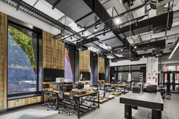
Vibrations and acoustics are such intense fields of science and engineering that the most important part of the test equipment is the building itself. In the case of the University of Adelaide’s Vibrations and Acoustics Laboratory there are three test chambers, each with a technical sounding name, which the design introduces as characters, “Shout”, “Echo” and “Hush”. As part of the process of humanizing the engineering and making the science visible, we created opportunities for the usually hidden wizardry to be showcased.
Blackfriars Priory School Aquinas Centre by Swanbury Penglase
In 2016, Blackfriars Priory School engaged Swanbury Penglase to develop a twenty year capital works masterplan. The School had identified the need to significantly upgrade and replace outdated building stock; no stand-alone buildings had been developed on the site since 1980.
In 2018, plans were put in place for Stage 1: a new Senior Science Building in the south west corner of the School.
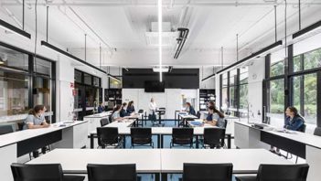
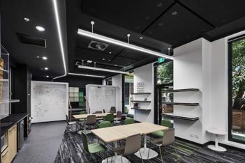
The brief was to provide contemporary learning and teaching, including laboratory, breakout and collaboration spaces for the senior student cohort; a tertiary-style education environment.
The interior spaces support a variety of learning types, fostering an environment of self-directed and individual learning and encourage collaboration between the students and teachers by providing connected spaces and opportunities for co-teaching.
The building has been enthusiastically received by the Blackfriars community, particularly by the senior students who are now proud to have a place of their own within the School.
Breda Byrne Wing Upgrade, Loreto College by MPH Architects
The Breda Byrne Wing upgrade within Loreto College senior campus is a significant step in the implementation of the campus masterplan. On ground floor the Old Scholars’ Science Centre upgrade include five science laboratories and a range of new informal and outdoor learning areas. The first floor included the Information Resource Centre comprising the library, a lecture theatre and associated learning spaces.
Due to ad-hoc development the Wing was introverted and cellular, undermining contemporary learning philosophies. Extensive new openings between functional areas and major circulation areas created transparency and light penetration into the heart of the building. Functionally, spaces were designed to be flexible and adaptable for the future. The building’s structure and services were exposed as part of the building’s role as a demonstrator facilitator, contributing to the learning experience of staff and students.
Johnson Laboratories by Matthews Architects
Where are the invisible lines that divide programming within a University? The objective of the Johnson Laboratory project was to examine this question and ask where SHOULD these lines be?
We found our answer to the questions in the broad strokes of how to arrange the space. We took to erasing all these lines within the space itself. Opening classrooms, punching penetrations through the long corridor ramp to allow light and vision to pass through as well as upgrading and reorganising the laboratory space to contemporary standards. A chemistry laboratory aimed towards the undergraduate program required a vast number of services that had to be accessible on demand. Through great co-ordination with our services engineers at WSP we were able to craft these pipelines and ducts in a way that would be visually interesting, not just to those who worked within the lab but to passers-by, filling them with wonder.
Mangiri by Built Design Architects
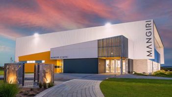
Mangiri Centre provides Navigator College students and our extended community with an innovative, functional and practical facility for a number of events from sporting to formal dining functions. The wall to wall window that span down both sides of the centre ensure that the outside environment is clearly visible, giving a seamless connection to our outdoor sporting areas, including oval and outdoor courts. The Staff and Students have welcomed the addition of this facility at the College with open arms, allowing them to deliver a more authentic and hands on curriculum in both the Sports and the Arts Faculty.
McAuley Community School by Swanbury Penglase
The 6 Green-Star rated, McAuley Community School with associated ALIVE Early Learning Centre has revitalised the original Marymount Middle School to create a rich and contemporary learning environment that inspires educational and pedagogical change, for children from Birth – Year 6.
The dynamic buildings with their flowing and Reggio-Emilia inspired interiors provide a variety of sub-divided, purposeful and inclusive spaces that provide opportunity for children to further create, explore and discover as part of their resource rich, student centred, social and supportive environments.
The surrounding adventurous and natural external environments that include a connection to the existing shared community oval can be easily expanded to and help to improve the children’s connection to nature, beauty and wonder, that is also available after hours for public use.
The intent of the development is to create a connected and engaged community of inquiry with the built environment itself, to further enhance educational outcomes.
St Thomas School Ecology & STEAM Centre by Grieve Gillett Andersen
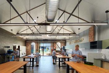
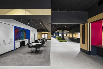
St Thomas School wished to establish a new Ecology & STEAM Centre to deepen their environmentally focused philosophy. The school’s purchase of the adjacent character buildings – former signage workshops – allowed additional classrooms and a multipurpose centre for specialty subjects, while addressing Goodwood Road for the first time.
The industrial past informed the versatile workshop, accommodating hands-on curriculum including science, technology, art and cooking. The revived Dance Hall celebrates another chapter in the building’s history, providing a space for performing arts classes and intimate performances. Beyond the original walls lies the undercover ecology hub. The courtyard forms an outdoor learning area, featuring tiered seating and productive garden, while serving as a link to the main campus.
Original materials were retained and left untouched where possible, including the character shopfronts, exposed concrete, brickwork and trusses. Modest in scale and intervention, this unique revitalisation strengthens ties to the community – both present and past.
Walford Design & Technology Centre by Matthews Architects
Walford Design & Technology is a project that revolves around the concept of combining heritage and innovation; by clashing modern and historic elements within an existing space, inspiring users to be more adventurous and explorative and think outside the proverbial box.
The original building boasted many elements of the bygone era such as creaking Baltic pine timber floorboards, brass chandeliers, fireplaces clad in ornate glazed tiles and pressed metal ceilings. While beautiful in their own right, we felt these elements needed to be highlighted in order to demonstrate the genius loci – spirit of the place. What better way to highlight something historic than to put it against something shiny and new?
Existing walls removed in favour of flow and flexibility, ornate ceilings uplit from galvanised cable trays, original fireplace masonry exposed against crisp white plaster – one only has to pay attention to details to get the inspiration flowing.
Wilderness School Learning Commons by COX Architecture
The ‘Learning Commons’ is a quantum step forward in the progressive pedagogical journey the Wilderness School has undertaken since its establishment, embodying the ambitions it holds for its students’ education and the values which have defined the school as a unique educational institution.
The Learning Commons is a ‘transformative place’ intended to lead educational developments within Wilderness School, and to challenge thinking about the nature of campus-based learning. It places an explicit research emphasis on ‘learning’, understood as a process involving active enquiry, discovery, collaboration, applied knowledge, innovation and entrepreneurship – which is pursued through the school’s focus on STEM programs and the areas of Science and Health studies.
At its core, this building delivers an innovative, creative and curious platform for the students; now and well into the future.
Interior Architecture
Interior Architecture
Jury:
Sean Humphries (Black Rabbit Architecture + Interiors)
Graham Charbonneau (studio-gram)
Chris Morley (Echelon Studio)
Susanna Bilardo (Enoki)
Project descriptions
Adelaide Oval Hotel by COX Architecture + Carr
In September 2020, COX, with interior design partners Carr, completed The Oval Hotel for the Adelaide Oval Stadium Management Authority (AOSMA). The first hotel in Australia completely integrated into the footprint of a stadium, this project was a unique opportunity for our team to build on the success of the much-loved Adelaide Oval Redevelopment that COX, AOSMA and project partners opened to the public in 2014.
The Oval Hotel provides accommodation and a central reception pod arranged as a series of considered elements that integrate seamlessly with the existing scale and context of the Eastern Stand. New materiality compliments and enhances the existing building identity, celebrating its parkland setting and providing a new chapter in the legacy of the Adelaide Oval.
AWL Wingfield Redevelopment by Cheesman Architects
The new state-of-the-art Animal Care Centre delivers a refreshing and spatially dynamic space that responds to the unique challenges associated with the delivery of high quality animal care. At the core of its design, is the adoption of international best-practice ‘Fear Free’ design principles to support the wellbeing and safety of animals and their carers.
Taking inspiration from the natural environment, the facility seamlessly integrates indoor and outdoor spaces at all user interfaces. Successfully incorporating a playful and organic approach to areas usually not achieved in a clinical environment.
The journeys of the vulnerable and surrendered animals and the dedicated staff/ volunteer team have been carefully considered throughout the design of the interior spaces. The design injects a fresh new approach to traditional animal shelter design and cements AWL as a destination for connecting people with animals.
Blackfriars Priory School Aquinas Centre by Swanbury Penglase
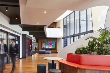
With a focus on learning through connection and transparency, the Aquinas Centre celebrates the visibility of learning through creating connections to provide future-thinking learning opportunities that encourage staff and students to stay, learn and connect with each other and the campus and community beyond.
Planned from the inside out, both formal and informal learning spaces are agile and readily accessible from the central spine, supported by an integrated and seamless approach to technology.
Forms are curved and organic, steering students on a journey through the building and the finishes palette is warm and welcoming, evoking a feeling of sophistication, reinforcing the school’s belief in their learners and engendering a sense of ownership and pride in their environment.
CAA Higher Courts Redevelopment by Hassell with Baukultur
The Higher Courts Redevelopment Project (HCRP) required a design that solved many functional, operational and safety concerns for the Sir Samuel Way Building (SSWB) and Supreme Court.
The requirement for an additional three criminal courts within SSWB was to meet operational demand. This required an upgrade to the Supreme Court facilities to accommodate the civil courts displaced from the SSWB. In order to meet this fundamental requirement, other challenges needed to be resolved in a clear and logical design. These included DDA compliance, single point of public access and security, separate circulation paths between judicial officers and the public, provision for contemporary modern court environments including technology rich court rooms and public spaces. Works have vastly improved the standing of the Supreme and District courts through the incision of functional and innovative design within heritage constraints.
Can:Do South by Matthews Architects
Can:Do is an organisation that supports an amazing array of people and needs. More importantly, Can:Do is a community. They bring families together, they support individuals through difficult challenges and they provide care with a deeply embedded humanity. Matthews Architects partnered with Can:Do to develop both the initial aspirations for a communalised hub and the final realisation of the vision. Central to the design is the idea that people with sensory impairments should be able to feel comfortable and welcomed in spaces that natively support them and their loved ones. The success of the design outcome rests in the idea that the entire facility can be experienced and enjoyed by any combination of human senses.
EOS by SkyCity by Walter Brooke & Associates + Hecker Guthrie
The $330 million expansion by SkyCity Entertainment Group has delivered a world-class entertainment destination centred around the luxury five-star hotel, Eos by SkyCity.
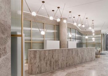
Walter Brooke, in collaboration with Hecker Guthrie, sought to complement the iconic curved glass facade in the building’s interior, where sweeping walls and fluted glass screens provide a consistent reference point to the architectural language. The timeless aesthetic is represented through a warm palette of metallics and marble. Eos by SkyCity will truly bring a new generation of luxury to Adelaide.
The brief called for a world-class, unique, and exclusive boutique five-star hotel, which would attract hotel and casino patrons. Our aim was to design a timeless and glamourous aesthetic to ensure an experience of the highest quality.
Finlaysons Lawyers Workplace Fitout by Hames Sharley (SA) Pty Ltd
Finlaysons is regarded as one of Australia’s most well-established law firms. The firm is headquartered in Adelaide, with an office in Darwin, and their continued success, for over 150 years, is a testament to their outstanding legal knowledge, client relationships and modern, forward-thinking approach that are both respected and amplified in their new workplace fit out design by Hames Sharley.
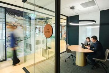
The new workplace addresses all relevant acoustic, privacy and confidentiality concerns whilst encouraging increased collaboration. It features open, yet intimate meeting areas and a welcoming destination kitchen, replacing many traditional office spaces with interactive nodes that promote movement and knowledge sharing.
Natural materials, warm colours and greenery lend a domestic edge to a professional space where lawyers often spend long hours. Feature artwork echoes the firm’s history, brand and the head office’s South Australian location.
The resulting space deftly fulfils Finlaysons’ future focussed vision for greater productivity and employee engagement.
Her Majesty’s Theatre Redevelopment by COX Architecture
Constructed in 1913, Her Majesty’s Theatre is Adelaide’s oldest continually operating performance venue, staging world class performances and performers.
COX Architecture and project partners were engaged to redevelop Her Majesty’s Theatre to deliver a contemporary performance venue that honours the integrity and character of the iconic original building.
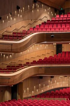
Historic fabric and new built form are seamlessly integrated through careful design and detailing, and a considered and crafted interior captures the delight and celebration of a night out at the theatre.
COX Architecture, The Adelaide Festival Theatre Trust, Department of Premier and Cabinet and Hansen Yuncken have been instrumental in bring HMT back to life. ‘Her Maj’ achieves best practice design principles paired with exceptional built outcomes. The public and media acclaim to date, and successful performances, point to a significant improvement in the performing arts and cultural life for South Australia and installs the next chapter in the HMT legacy.
iTL Italian Kitchen by Walter Brooke & Associates + Genesin Studio
iTL Italian Kitchen headed up by chef Luca Guiotto presents uncomplicated and contemporary Italian dining, centred around the love of food. Located on the edge of the festival plaza iTL Italian Kitchen connects the SkyCity entertainment precinct with the redeveloped plaza providing a vibrant and active restaurant experience.
The brief called for a restaurant that was definitively unique, that was approachable, and that fostered communal dining. Our design references post-war Venice and Italy of the 1950’s. A modernist undertone celebrates this unique and iconic Italian era and provides the aesthetic frameworks of a lively and engaging interior. We felt it was fitting to capture this period in time when lifestyle was the focus and modernism was the way of the future. Materials from a bygone era make the experience familiar yet new, including Venetian referenced Palladiana flooring and gloss stucco rendered walls against burnished concrete bars.
Kingswood House by Archaea Architects
Kingswood House both restores and re-imagines a return verandah villa that was previously disconnected from its deep block, to a now light filled extension bound by north facing landscape and enhanced through richly detailed interiors.
The free reign of timber over the curving walls and ceilings is supported and brought to ground with bold slimline brickwork appearing both inside and out. A curving double brick wall leads you to the living room, delineated by a slate plinth, moulding space for lingering with your favourite paper companion or beverage.
Kingwood house radiates warmth and holds a clear sense of home through a collection of spaces that foster restorative living and a lifestyle away from the demands and clinical spaces of our clients daily lives. It delivers textural spaces, rich in material and customised interior detailing which is cherished by the family who call it home.
Margie’s Dream by Architects Ink
Margie’s dream is designed to create a tranquil oasis in a suburban context. The vision of light and simplicity, achieved via a disciplined palette, encourages the user to reset, reflect and engage with the same materiality, whether internal or external. The tactile and textural engagement with objects and surfaces is also intrinsic to the design philosophy.
At the threshold between the historic villa and addition, there is a captivating moment of transition into an abundance of white, light, levels and volume. Indoor, outdoor and from room to room the spaces connect and flow. The kitchen and larder are concealed from the living zones in a central ‘white’ pod, allowing the primary experience to be the connection to the outdoors.
Margie’s dream is an integration of spaces flowing through and extending from the existing home. The unifying limestone floors, walls and joinery seamlessly connect to form one homogeneous experience.
North Adelaide Residence by Williams Burton Leopardi
Mark and Sarah’s brief sought not to maximise accommodation, but was framed around a question of “opportunity” …what to do?
The State Heritage listed cottages on Mackinnon Parade have a pleasing conformity, but a wide variety of interpretation of what is appropriate at the back. In this case a generous footprint with a never-ending lean-to!
Appearing as a sensitive restoration of the historical cottage, new detail and materials take on a hand crafted and unexpectedly high-end bespoke quality. The footprint at the rear may remain, but the volume of the north facing addition is drastically and functionally re-imagined taking a long and skinny space and exploding it into the outlook. Marble and timber bring a warmth to interiors that could double as an art gallery but still feel accessible as a home.
It’s the secure and stately comfort of Victorian proportion mixed with the delight of contemporary compression and release.
Royal Australasian College of Surgeons Fit Out by Matthews Architects
The Royal Australasian College of Surgeons is an institution with history and tradition. It also supports a profession that is at the proverbial and the literal cutting edge of science and medicine. The design of the College’s new headquarters in Kent Town is a significant milestone and provides the organisation with a venue that has allowed them to better connect with long standing members and new aspiring surgeons. The design speaks to classical styling, with occasional soft touches of homely warmth. It also includes spatial experiences and natural light befitting a community of professional peers.
SkyCity Adelaide Expansion Project by BUCHAN
A grand sculptural gesture, SkyCity Adelaide provides a rare spatial experience at the heart of the rejuvenated the Riverbank Precinct.
Ethereal and translucent, sinuous and fluid glass curtains flow and shimmer like a sequinned gown while soft amorphous forms invite the public to explore the lightness of its volumes. A series of interconnected entertainment and hospitality spaces and 24/7 activated public realm, entices and delights visitors to this dynamic and memorable place.
The seamless transition from the stately heritage building to the new, through existing narrow openings in the heritage façade, creates a sense of grandeur and elegance, and a lyrical relationship between the existing heritage Adelaide Railway Station and the new SkyCity Adelaide expansion.
The attention to detail, bespoke finishes and touchable elements create a collection of engaging gathering spaces, from intimate pockets to theatrical atriums, providing guests with a captivating interior experience on the Riverbank.
Skye Residence by Williams Burton Leopardi
This 1990’s house had hidden potential.
The relationship to the views was underdone. Living spaces were ill defined and separated. It wanted not for extra space, but for warmth, flow, and emotional connection – the beauty that exists in conscious curation together with the haphazard nature of the everyday – a life on display
Our physical program was functional clarity – but also to imbue a “Sinatra attitude” with an “Eames purposefulness”. For Eames, the purpose drives the design, while Sinatra does it his way.
The result visually lifts the house, emotionally connects the client, creates an exacting interior to delight, enhances those epic views, and reengages the living spaces with the heart of Louise’s every day, her kitchen.
A materially rich amalgam of interior design and re-imagined planning, encapsulating a 20th century modernist principle of purpose in design…with attitude!
Sol Bar and Restaurant Walter Brooke & Associates + Genesin Studio
Perched atop Eos by SkyCity, Sol Bar and Restaurant offers contemporary South Australian cuisine with an emphasis on locally-sourced artisanal produce. Sôl is Adelaide’s immersive rooftop bar and restaurant destination, celebrating the best of South Australia from its spectacular location. Curated by Head Chef Kane Pollard, Sôl Restaurant’s dining has a strong focus on sustainability with all key ingredients locally sourced.
The light, bright and refreshing colour palette draws inspiration from South Australia’s natural landscape and the design references the materials and forms of our coastline and foothills. Featuring locally-sourced Mintaro slate and Balmoral granite, the spaces celebrate our local region through the use of natural materials and form.
Walkerville Residence by Williams Burton Leopardi
Despite being the last one with the arm up at the auction, Belinda was sceptical – she was not especially taken with the house. We saw real potential.
A narrative that sought to create considered connections between old and new, revel in detail and provide classic contrast, was developed to “test” and frame all decisions. This has resulted in an extensive reworking of the existing plan, and an addition of uncommon volume, luxury and sophistication.
The interior resolution has as much informed the exterior as the latter has the former. A classical elegance is present in the detailing of joinery and finishes, with materiality the thread that knits comfortably the contemporary new work and the traditional older spaces.
It may have started with an unintentional purchase, but a creative approach and narrative realised unseen potential and has provided an unexpectedly loved result
Public Architecture & Urban Design
Public Architecture
Jury:
Alex Hall (Woods Bagot)
Felicity Sando (Mulloway Studio)
Sam Aukland (Catholic Education Office)
Wayne Grivell (Swanbury Penglase)
Project descriptions
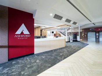
Ashford Hospital Redevelopment by Wiltshire Swain
The Ashford Hospital Redevelopment expands and augments the existing Hospital’s facilities with additional Operating Theatres, new Day Surgery Unit, private in-patient wards and relocated Reception and Administration services.
The project’s mission was to provide first-class facilities and address the tension between the ‘clinical’ aspects of healthcare delivery and the ‘human dimension’ of the patient experience.
CAA Higher Courts Redevelopment by Hassell with Baukultur
The Higher Courts Redevelopment Project (HCRP) required a design that solved many functional, operational and safety concerns for the Sir Samuel Way Building (SSWB) and Supreme Court.
The requirement for an additional three criminal courts within SSWB was to meet operational demand. This required an upgrade to the Supreme Court facilities to accommodate the civil courts displaced from the SSWB. In order to meet this fundamental requirement, other challenges needed to be resolved in a clear and logical design. These included DDA compliance, single point of public access and security, separate circulation paths between judicial officers and the public, provision for contemporary modern court environments including technology rich court rooms and public spaces. Works have vastly improved the standing of the Supreme and District courts through the incision of functional and innovative design within heritage constraints.
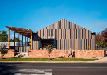
Conyngham Street Depot by Greenway Architects SA
The importance of “place” is evidenced in the Conyngham Street Depot.
Determined to create shared facilities, existing Council depot services were replaced by a multipurpose building, community garden, and nursery. Site programming encloses a reorganised depot at the rear, whilst activating the street frontage.
The building addresses the street with a steel-framed café window, and is open, flexible and adaptable. Internally spaces for the “Men’s Shed” program and conservation nursery combine with workshops, shared common and community spaces. Its form is inspired by the familiar feel of an old backyard shed.
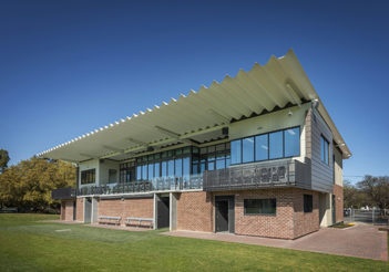
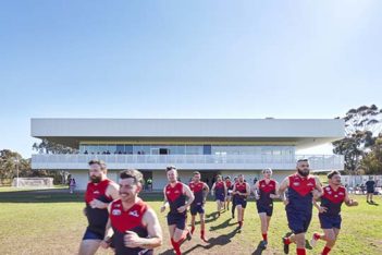
Goodwood Oval Grandstand by Wiltshire Swain
The new Goodwood Oval Grandstand and Clubroom facility sits proudly overlooking the picturesque Goodwood Oval.
The building provides updated facilities for the football club, cricket club and local broader community. The project faced numerous design challenges due to residential zoning and resulting design considerations, sport facility standards and club requirements.
Facilities provide an improved aesthetic street appeal, universal access for those with impairments, inclusive and flexible community facilities including new bar, kitchen, canteen, toilets and scenic viewing and seating area.
The design is influenced by its local context and is sensitive to its predominantly residential location. The materiality reflects its surroundings and acknowledges the former grandstand it has replaced.
Our collaborative approach and community mindfulness enabled the successful completion and building approval, that addressed the residents’ concerns without compromising the design outcome. The new facility caters to the sporting clubs growing needs, including increasing junior and female sporting involvement.
Her Majesty’s Theatre Redevelopment by COX Architecture
Constructed in 1913, Her Majesty’s Theatre is Adelaide’s oldest continually operating performance venue, staging world class performances and performers.
COX Architecture and project partners were engaged to redevelop Her Majesty’s Theatre to deliver a contemporary performance venue that honours the integrity and character of the iconic original building.
Historic fabric and new built form are seamlessly integrated through careful design and detailing, and a considered and crafted interior captures the delight and celebration of a night out at the theatre.
COX Architecture, The Adelaide Festival Theatre Trust, Department of Premier and Cabinet and Hansen Yuncken have been instrumental in bring HMT back to life. ‘Her Maj’ achieves best practice design principles paired with exceptional built outcomes. The public and media acclaim to date, and successful performances, point to a significant improvement in the performing arts and cultural life for South Australia and installs the next chapter in the HMT legacy.
Lockleys Oval Redevelopment by Walter Brooke & Associates
The design creates an impressive focal point and social hub and with the consolidation of key sporting facilities has attracted a broader demographic than through the former individual sporting facilities. The multi-purpose nature of the facility ensures the long-term sustainability of the building, offering a range of elements and spaces for the sporting clubs as well as the wider community. Individual sports operate independently or collectively dependent upon the nature of the activity. In its short time in operation, the facility has prompted growth in sport and recreation participation and the sense of community pride has been enhanced.
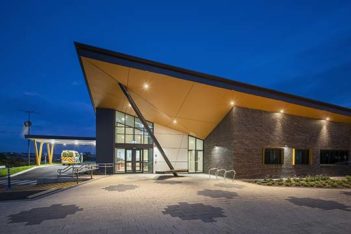
Murray Bridge Soldiers’ Memorial Hospital Emergency Department Redevelopment by Wiltshire Swain
The MBSMH ED Redevelopment’s key driver was to provoke a sense of pride within Murray Bridge. With the layout and program being strictly dictated by the operational parameters, the design team has emphasised that the Hospital is a public building that serves to strengthen the sense of community. Health facilities are ultimately function-led, clinical environments – but it doesn’t inhibit us from creating a building with an engaging public presence.
The project provides a bespoke, state-of-the-art facility that addresses its location within the wider public realm. It provides a ‘meeting place’, that acknowledges traditional owners and preserves the integrity of the war memorial monument.
The redevelopment resolves wayfinding and access, offering a plaza to be shared by the community for ANZAC day functions. Consultation with traditional owners sought references from the Ngarrindjeri nations flag acknowledged within design of the external seat, angled column and paving pattern representing 17 Laklinyeris (tribes).
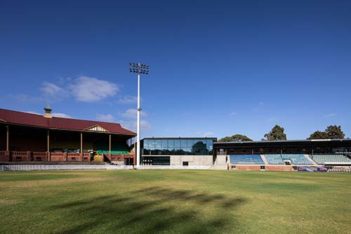
Norwood Oval Redevelopment by Tridente Boyce
Originally constructed in 1901 and the home ground of the Norwood Football Club, the Norwood Oval is a significant element in both the rich history and urban fabric of Norwood.
Tridente Boyce undertook extensive consultation with The City of Norwood Payneham and St Peters in conjunction with the Norwood Football Club so this important development could be realised.
The major upgrade has brought the existing buildings and site into compliance and provided facilities required to satisfy the requirements of the AFL, SANFL and SANFLW.
Along with major refurbishment the work included the introduction of a new two-story community centre with bars, function areas and a commercial kitchen.
URBAN
Jury:
Alex Hall (Woods Bagot)
Felicity Sando (Mulloway Studio)
Sam Aukland (Catholic Education Office)
Wayne Grivell (Swanbury Penglase)
PROJECT DESCRIPTIONS
AWL Wingfield Redevelopment by Cheesman Architects
Located along one of Adelaide’s busiest industrial corridors, the Animal Welfare League Wingfield, has been responsible for the rehabilitation and rehoming of South Australia’s vulnerable animals. It has operated from a notionally concealed and insular site to manage the existing environmental and noise pollution issues endemic with its locality.
With a focus on creating an environment to improve staff and animal well-being, the redevelopment has been crafted with the purpose of promoting community interaction. Achieved by incorporating extensive green zones, preserving existing site flora and fauna and its resident possum population.
By effectively opening the site for staff and public use, casual interaction, as a lunch setting or for reflection within the specially designed memorial garden space, the development has seen the injection of new life and renewal in its urban context.
SkyCity Adelaide Expansion Project by BUCHAN
A grand sculptural gesture, SkyCity Adelaide is at the heart of the commercial and cultural rejuvenation of the Riverbank Precinct.
Ethereal and translucent, sinuous and fluid glass curtains flow and shimmer like a sequinned gown. Its bold form and confident identity statement create an enduring and sophisticated international icon for Adelaide.
A series of interconnected entertainment and hospitality spaces and 24/7 activated public realm entices and delights visitors to this dynamic and memorable place.
The project realises the full potential of its siting; it restores, unifies, celebrates and revives a previously disjointed assortment of underutilised and isolated buildings and spaces, integrating both the heritage and expansion buildings with each other and with the renewed public realm.
The new building’s design creates a contemporary glittering architectural jewel that highlights the grandeur of the existing heritage building. SkyCity Adelaide is a city-shaping catalyst development, elevating the urban fabric of its surrounds.
Houses Alterations and Additions and heritage
RESIDENTIAL ARCHITECTURE HOUSES ALTERATIONS AND ADDITIONS AND HERITAGE
residential architecture houses alterations and additions
Jury:
Liz Vines (McDougall & Vines)
Tessa Sare (Phillips Pilkington Architects)
Brent Dowsett (C4 Architects)
John Byleveld (Renewal SA)
Project descriptions
Kingswood House by Archaea
Kingswood House both restores and re-imagines a return verandah villa that was previously disconnected from its deep block, to a now light filled extension bound by north facing landscape.
The upper storey addition is concealed on the western façade. Sloping rooflines transform into a central timber lined container and are anchored to the ground by the black slimline brick. The double height living room is delineated by a slate plinth, curving internally, moulding space for lingering with your favourite paper companion or beverage.
Kingwood house radiates warmth and holds a clear sense of home through a collection of spaces that foster restorative living and a lifestyle away from the demands and clinical spaces of our clients daily lives. It delivers textural spaces, rich in material and customised interior detailing which is cherished by the family who call it home.
Margie’s Dream by Architects Ink
Margie’s Dream was inspired by the client’s Mediterranean living experience and their desire for a resort style addition and lifestyle, seeking peace and tranquilly.
The restored villa opens to stippled white walls, natural light, and limestone. Transparency and connectivity, as well as the play with light and volume, are recurring themes in this home that is hard to leave.
Four courtyards draw on ancient principals to capture the light and the passing of time. There is always a place to suit the occupants’ needs. These courtyards enable the spaces to connect and flow, from old to new, from indoor to outdoor and room to room.
Unashamedly refined, the house offers seclusion and solitude to retreat and reflect. There is a connection with nature assisted by the sound of water, natural materials, and the abundance of sky. It is the home’s ability to affect your mood, that makes Margie’s Dream special.
North Adelaide Residence by Williams Burton Leopardi
Mark and Sarah’s brief sought not to maximise accommodation, but was framed around a question of “opportunity” …what to do?
The State Heritage listed cottages on Mackinnon Parade have a pleasing conformity, but a wide variety of interpretation of what is appropriate at the back. In this case a generous footprint with a never-ending lean-to!
Appearing as a sensitive restoration of the historical cottage, new detail and materials take on a hand crafted and unexpectedly high-end bespoke quality. The footprint at the rear may remain, but the volume of the north facing addition is drastically and functionally re-imagined taking a long and skinny space and exploding it into the outlook. Marble and timber bring a warmth to interiors that could double as an art gallery but still feel accessible as a home.
It’s the secure and stately comfort of Victorian proportion mixed with the delight of contemporary compression and release.
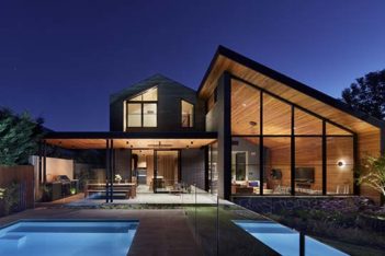
number 78 by Black Rabbit Architecture + Interiors
…casually taking up position along a classic adelaidian streetscape, …number 78 cheekily shies away from the limelight, taking up position ‘out back’! A contemporary but classic addition to a very much-loved symmetrical cottage is where this story starts…
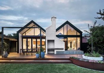
Maintaining the romance of the existing build whilst accommodating the functional requirements of a modern home – complimenting the original form, the paired black gables capture the Northern light, bringing a peaceful calm to the heart of the home, whilst the raw texture of the off-white brickwork hails its red-brick forebears as a pillar of solidity, but not without a cheeky sense of play!
Reading the View by Mulloway Studio
This small alteration project is built around three key principles; a love of reading and books as symbols of personal and professional life, a progressive series of views and spatial expansion, and an emphasis on outdoor living and minimising built footprint.
The project sits within the lexicon of many alterations that adapt the rear of 19thC. villas, offering layouts suited to a more contemporary use of living spaces, and a stronger relationship to the garden.
It celebrates the relative freedom of this back-end typology and incorporates a ‘pavilion’ tower as a casual nod to these types of verandahs and lean-tos. A reference to a James Turrell work, this roofline culminates in a sky-window over the main space. In contrast, two reading/sitting rooms with bi-fold windows are placed on the perimeter of the living areas, encouraging closer interaction with the outdoor and distant hills.
Skye Residence by Williams Burton Leopardi
The relationship to the views was underdone. Living spaces were ill defined and separated. It wanted not for extra space, but for warmth, flow, and emotional connection – the beauty that exists in conscious curation together with the haphazard nature of the everyday – a life on display
Our physical program was functional clarity – but also to imbue a “Sinatra attitude” with an “Eames purposefulness”. For Eames, the purpose drives the design, while Sinatra does it his way.
The result visually lifts the house, emotionally connects the client, creates an exacting interior to delight, enhances those epic views, and reengages the living spaces with the heart of Louise’s every day, her kitchen.
A materially rich amalgam of interior design and re-imagined planning, encapsulating a 20th century modernist principle of purpose in design…with attitude!
The Garden Pavilion by Atelier Bond
At The Garden Pavilion, everyday life is experienced through a lens of garden, light and sky. The compact 55sqm addition accentuates every inch and includes a kitchen, living room and dining area that’s abundant in both sunshine and space thanks to its soaring ceilings and oversized stacking windows. Nestled between two opposing landscapes – an intimate courtyard punctuated by stepping stones to the south, and a well-clipped lawn to the north – the black-clad pavilion offers a constant connection to a vista of green. The windows’ many cross beams enable the owners to experience the sun’s movement and shadows through the living space, almost as if sitting beneath a tree’s canopy. A link provides a physical connection between the original character villa and the new extension, and is tied together effortlessly through a cohesive palette of natural stone, stacked white brick, terrazzo and polished concrete.
Walkerville Residence by Williams Burton Leopardi
Despite being the last one with the arm up at the auction, Belinda was sceptical – she was not especially taken with the house. We saw real potential.
A narrative that sought to create considered connections between old and new, revel in detail and provide classic contrast, was developed to “test” and frame all decisions. This has resulted in an extensive reworking of the existing plan, and an addition of uncommon volume, luxury and sophistication.
The interior resolution has as much informed the exterior as the latter has the former. A classical elegance is present in the detailing of joinery and finishes, with materiality the thread that knits comfortably the contemporary new work and the traditional older spaces.
It may have started with an unintentional purchase, but a creative approach and narrative realised unseen potential and has provided an unexpectedly loved result.
heritage
Jury:
Liz Vines (McDougall & Vines)
Tessa Sare (Phillips Pilkington Architects)
Brent Dowsett (C4 Architects)
John Byleveld (Renewal SA)
Project Descriptions
CAA Higher Courts Redevelopment by Hassell with Baukultur
The Higher Courts Redevelopment Project (HCRP) required a design that solved many functional, operational and safety concerns for the Sir Samuel Way Building (SSWB) and Supreme Court.
The requirement for an additional three criminal courts within SSWB was to meet operational demand. This required an upgrade to the Supreme Court facilities to accommodate the civil courts displaced from the SSWB. In order to meet this fundamental requirement, other challenges needed to be resolved in a clear and logical design. These included DDA compliance, single point of public access and security, separate circulation paths between judicial officers and the public, provision for contemporary modern court environments including technology rich court rooms and public spaces. Works have vastly improved the standing of the Supreme and District courts through the incision of functional and innovative design within heritage constraints.
Her Majesty’s Theatre Redevelopment by COX Architecture
Constructed in 1913, Her Majesty’s Theatre is Adelaide’s oldest continually operating performance venue, staging world class performances and performers.
COX Architecture and project partners were engaged to redevelop Her Majesty’s Theatre to deliver a contemporary performance venue that honours the integrity and character of the iconic original building.
Historic fabric and new built form are seamlessly integrated through careful design and detailing, and a considered and crafted interior captures the delight and celebration of a night out at the theatre.
COX Architecture, The Adelaide Festival Theatre Trust, Department of Premier and Cabinet and Hansen Yuncken have been instrumental in bring HMT back to life. ‘Her Maj’ achieves best practice design principles paired with exceptional built outcomes. The public and media acclaim to date, and successful performances, point to a significant improvement in the performing arts and cultural life for South Australia and installs the next chapter in the HMT legacy.
Sheridan Kiosk by BB Architects
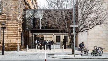
The Sheridan Kiosk is located at the front of Lot Fourteen, the former Royal Adelaide Hospital site on North Terrace, which is be being redeveloped into a world-class innovation neighbourhood for work, study, and exploration. The building acts as an entry focus and the prime food and beverage service location to the Lot Fourteen site.
The Sheridan Kiosk was built in 1925 with a bequest to be both a kiosk to the hospital and a memorial to Keith Sheridan. The money was donated by Sheridan’s two daughters, Alice Keith Sheridan, and Violet Simpson.
The project was to restore, conserve and adaptively reuse the building, returning it to its original function and as close to its original form as possible. This involved stripping the structure back to the remaining original significant historic elements, and only introducing minimal contemporary elements to make the building functional and comply with modern standards.
residential architecture houses new and Multiple Housing
Residential Architecture Houses New & Multiple Housing
Residential Architecture Houses New
Jury:
Sally Wilson (Archaea)
Adrian Kenyon (Baukultur)
John Adam (John Adam Architect)
Jon Lowe (Jon Lowe Architect)
Project descriptions
Eyrie House by Max Pritchard Gunner Architects
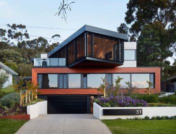
The challenges of a steeply sloping site in the Adelaide foothills were resolved with this dramatic three level house.
An upper level black framed glass pavilion housing the main living area daringly cantilevers over the bedrooms on the mid level. Timber cladding forms a strong frame around the bedroom windows.
The upper level relates back to an extensive outdoor area with a swimming pool, timber decking and landscaping.
The orientation of the upper level maximises passive heating in winter and takes in the expansive views from the city around to the coast.
Burnished concrete floors on this level help stabilize temperature extremes and the adjustable external louvres help to balance the incredible view with privacy and shading from the unwanted summer sun.
Concrete, black framing and black fittings balanced with refined timber detailing achieve a raw but warm industrial aesthetic.
First Creek House by Troppo Architects
A home for a timber merchant. A home for an active family, with 2 teenage boys (+friends) who love entertaining/sport/music/art. A home for being together in, for being apart in. Spaces that join, that separate, at will. A home of destinations, inside and out. A home that wraps its site, that opens to the long view. A landscaped court as ‘hearth’, changing with the seasons, always accompanying.
A site drastically confined by flood-line, bounded by a busy road and a north-neighbouring 4m-high hedge. This is a house that must step carefully. Its forms rise/twist/ peel to find northern-light, whilst also rising and opening to the wonderfully tall treetops creekside; then sit low for northern-sun to the central court. Materials are earth/timber/rust, acknowledging the creekside location, and its sense of ‘bush’ in the inner suburbs.
Designing never stopped. Always reviewing what we had, through-to-occupancy, to get to best fit best result.
Hillside House by Architects Ink
Located by the foothills, with prestigious housing on grand allotments, providing views over the Adelaide plains. The earlier housing characterised by Edwardian and Georgian architectural styles have been diluted with the passing of time.
The program was to establish a house for a large growing family and be as robust as living in a masonry barn. Starting with a single gabled barn presented to the street. The concept split the volume along the ridge and by separation, two skillion forms created dual passive and active zones with various courtyards in-between.
A continuous operable glazed façade opens onto the terrace enabling sweeping views and capturing northern light whilst integrating the landscape. The brick material is defined both inside and outside of both main volumes. Finished with roof shingles and ceilings with exposed oak rafters and siding.
Hillside house incorporates the past without replicating it, asserting its own identity, resonating longevity.
House One by Architects Ink
Observing a gap in the project housing market, Architects Ink partnered with building firm, Krivic, to create six Krivic House designs.
House One plays on turn of the century housing design themes and aspirations with it’s flexibility and modular arrangement. It is a modern take on a body of mid century wisdom, with an architect by your side.
For this project we worked on detailing for building efficiencies. Coupled with streamlined processes for selections and approval, we significantly reduced both the development timeline and cost. The client joins us for the design development stage, where the architect responds to the specific site and conditions thereby avoiding the ‘sales person’ approach and maintaining the design intent and integrity.
House in the Hills by James Allen Architect
Greenfield commissions are rare. Rarer still are greenfield projects actually located in picturesque green fields.
As a first commission for the architect’s emerging practice by the architect’s sister and brother-in-law, this was a homecoming opportunity to put into practice the years of experience working on residential projects interstate.
The timber and stone house steps out along the topography of the rolling Adelaide Hills site making the most of its picturesque setting.
With the statement stone garden wall greeting you on arrival, this defines the entry to the house and establishes a private space in an otherwise open landscape. You enter through this wall and via an entry space that quickly turns to living spaces with high pitched ceilings with the view beyond large sliding glass doors that open past the line of the wall.
The house is comprised of three interlocking pavilions oriented to take in the site’s view.
One KI by Built Design Architects
A small dent in an otherwise long stretch of coastal dune provided the site for this home. North facing, the roof form follows the contours of the terrain with dark muted colours settling into the landscape. Simple materials and timber frame construction used in slightly different ways, extensive use of insulating glass and careful attention to shading, ventilation and weather protection allows the home to touch the ground lightly, use minimal energy while providing a living environment transparent to the surrounding sea and land but protected from the sometimes harsh natural beauty. In the words of our clients the home has ‘achieved a blend of beach and bush, combines functionality with minimalism, amazing tranquil outlooks through every window and embraces energy efficiency’.
Rentoul – A House on Two Stones by RADS
Situated just one street back from the Waite Conservation Reserve this house looks to embrace the relationship with nature rather than its suburban context.
Two monolithic blocks are lodged into the site heavily grounding the architecture while weightlessly, the upper level suspends between the two stones creating a connection to both the hills to the east and the gulf to the west.
Careful program carefully separates, utility, private and public spaces. Simple folds in the the facade allow the building to capture gully breezes to. Passively ventilate the house, articulated facades and layers control natural light and privacy to its suburban context.
A minimal and bold response to the site is reminiscent of harsh Australian conditions. The external rigidity of the architecture is softened by its natural contexts and subtle moments of natural forms.
St Peters House by Con Bastiras Architects
This house is located in a Historic Conservation Zone in the Adelaide suburb of St Peters. Here the streetscapes remain pretty much intact, hence one would expect that the insersion of a new house with a contemporary aesthetic into this area would be met with much opposition.
However, after close consultation with the council Planners and heritage Architects, our design surprisingly almost received unanimous approval at the DAP council meeting.
The original 120 year old cottage on the site was in a dilapidated state and beyond repair that demolition was easily achieved following an Engineer’s assessment.
The size, scale and materiality of the house has been carefully considered so that it convincingly maintains the textures and rythm of the adjacent homes.
Our design has been well received by the council Planners to the point where they use it as an exemplar of appropriate modernist architecture built in historic residential locations.
Tennyson Residence by Enzo Caroscio Architecture
A sanctuary within a suburban scale setting. The Tennyson Residence starts with a gate entry from a narrow harsh street and progresses through a series of crafted and textured spaces created by the built forms and the negative spaces in between.
To create a relaxed and retreat style home that captures the beach side setting, the concept was to compose a series of forms that framed views, screened spaces from the neighbouring houses, and generated visual and usable spaces off a informal open-plan living.
The off-set of building forms from one another create courtyards, undercover terraces and internal spaces all connected to produce a variety of environments enriched by the textured materials, natural light and sculptured landscapes that surround them. The design allowing for a flexible home for the young family of five to enjoy together, isolate from one another, or share with their large extended families.
Multiple Housing
Jury:
Sally Wilson (Archaea)
Adrian Kenyon (Baukultur)
John Adam (John Adam Architect)
Jon Lowe (Jon Lowe Architect)
Project Descriptions
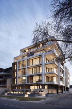
217 East by ACG Studio
217 East is an exclusive boutique apartment located on East Tce overlooking Victoria Parklands. The building is a testament to excellence in design and clever use of textures and finishes.
Key principles to the design were quality materials, resolved functional planning responding to the local environment and relationship of built form to context. The building addresses scale and mass with setbacks, vertical design elements and reinforces its corner location with dual street frontage. 217 East draws on local materiality and the use of high-quality robust materials results in enduring Architecture. Sliding screens on the façade provide privacy and gives a moving and changing detail and shadows.
The high-quality design outcome resulted in a strong interest from purchasers reflected in the sales of the apartments. ‘I inspected the apartment and could see that the quality and attention to detail was there’ resident Joanne said.
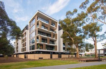
Botanica Glenside by Hames Sharley (SA) Pty Ltd and DKO Architecture
Thanks to the successful collaboration between Hames Sharley and DKO Architecture, the wider consultant team and Cedar Woods, Botanica’s outcome is contextually driven with a strong identity, rooted in its attention to detail, management of space and relationship with its natural surrounds.
One of the driving concepts was to absorb the park context through sensory experience. The building’s form and details are heavily influenced by the existing eucalypt groves and vegetation on site. The resulting shade and dappled light from the tree canopy are emulated in the design through shading devices and material selection.
Through-site links at ground level and an integrated pocket park and square encourage the wider community to interact with the building and residents by offering spaces for chance encounters while maintaining key pedestrian links to the parkland beyond.
Botanica goes above and beyond the commercial brief while sympathetic to the site’s heritage, history, and landscape.
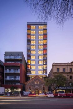
Spence on Light by Tectvs Australia with Mulloway Studio and Hosking Willis Architecture
Co-located amongst other Housing Choices Australia facilities surrounding Light Square, Spence on Light provides a further 75 dwellings over 14 stories, including a community space, mix of independent, affordable, aged care, high physical support (NDIS) and accessible apartments.
Mulloway and Hosking Willis helped integrate the remaining heritage fabric and create a contextual spatial experience based around the stories of *Place*. The rich history of this part of the city, the site’s continued social enterprises and the people that drove them are woven into the courtyard that operates as both entry and café space, and forms a place of reflection. A type of ‘picturesque ruin’, this courtyard connects the new building to its history and the broader site narrative as well as managing its physical urban context.
The relationship of built form to context is manifested through historic and urban principles, materiality, formal alignment and critically, the colours of Light Square.
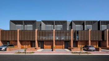
Third Avenue by Studio Nine Architects
Third Avenue sets a new benchmark for urban infill development.
Client, Architect and Builder shared a vision to redefine typical medium-density living, focussing around strategic masterplanning, quality in built form outcomes and an inclusive sense of community.
Consisting of 27 two and three storey townhouses, the development realises the transformation of a key metropolitan site.
Four varying typologies offer deliberately different and legible forms of living, attracting a range of residents including first home buyers, downsizers and families.
Leveraging off the unusual shape and varying context of the site, the existing constraints were embraced to create an outward facing development that links surrounding sites through pedestrian permeability and connectivity.
Third Avenue demonstrates what can be achieved within a contextually varied and geometrically challenging site to deliver a successful project – with 100% of homes sold off the plan six months prior to completion.
