2020 WA Architecture Awards Results
2020 National Architecture Awards
2020 WA Architecture Awards - results
The Australian Institute of Architects Awards program offers an opportunity for public and peer recognition of the innovative work of our WA architects. The program also provides the Institute with a valuable mechanism to promote architects and architecture within Western Australia, across Australia and internationally.
WA CHAPTER AWARDS
George Temple Poole Award
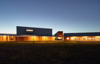
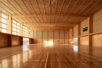
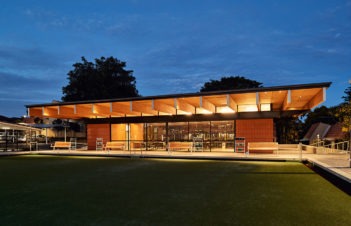
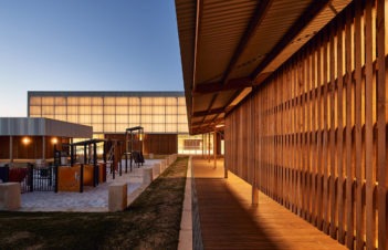
Pingelly Recreation and Cultural Centre | iredale pedersen hook architects with Advanced Timber Concepts Studio
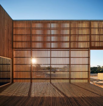
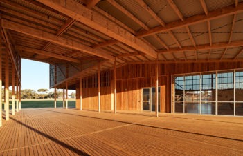
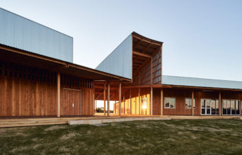
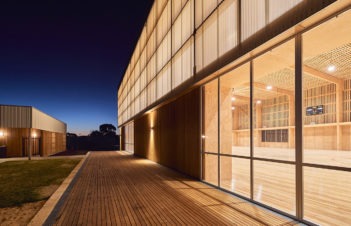
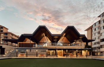
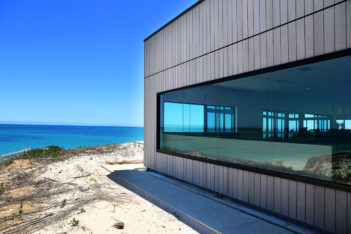
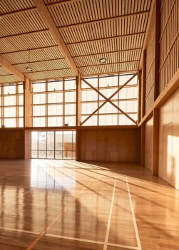
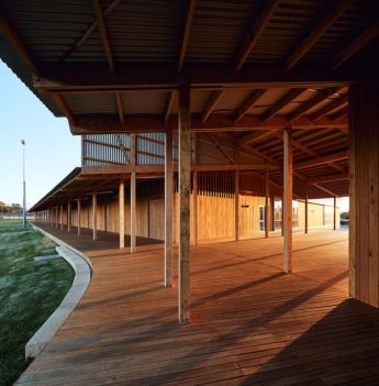
The 2020 winner of The George Temple Poole Award is the Pingelly Recreation and Cultural Centre by iredale pedersen hook architects with Advanced Timber Concepts Studio.
The jury found the Pingelly Recreation and Cultural Centre [PRAC] to be an exemplar demonstrating excellence in design and community impact. While the conceptual framework may be simple the project demonstrates an outstandingly resourceful, sustainable design, exercising initiative well beyond the programmatic requirements of the brief.
Working closely with engineering fabricators and the sawmilling team the design team created a practical, economically competitive, and disarmingly beautiful prefabricated engineered timber structure.
PRAC demonstrates high value performance in its operational energy demand and low embodied energy. Using the highly seductive materiality of timber internally and externally, combined with exemplary technical execution, refined detailing and a significant community development programme centred around Pingelly’s long history of aboriginal AFL players, the centre is contributing to the economy of the wheatbelt community and long-term reconciliation.
The elegance of the economy of means executed in this project is captured in the words of Patrick Beale from Advanced Timber Concepts Studio, “…what you see is exactly what you get.” The ultimate nod to country town life.
WA Lighting Award
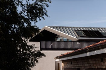
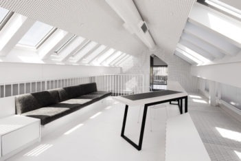
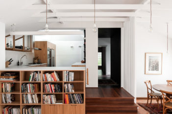
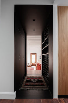
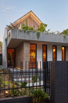
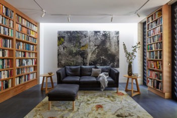
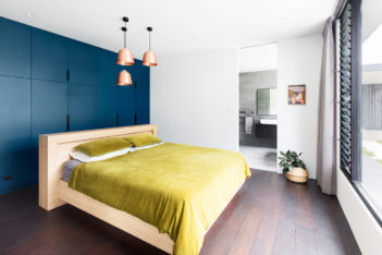
South Terrace Mezzanine House | Philip Stejskal Architecture
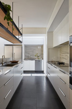
The lighting for this project consists of task and ambient lighting. Task lighting is functional and located to offer uniform illumination. Ambient lighting has been concealed around structure to foreground those elements which speak softly during the day. The same lighting allows the project to glow discreetly toward the outside, offering subtle illumination of the adjoining side street through external louvres and apertures. We would be delighted to show the jury through the project at night to showcase the lighting design.
WA Lighting Award - commendation
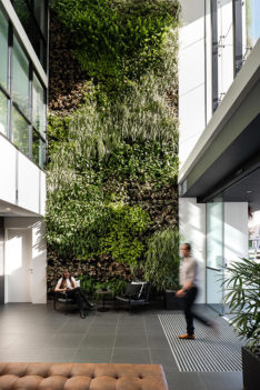
125 Murray Street | COX Architecture
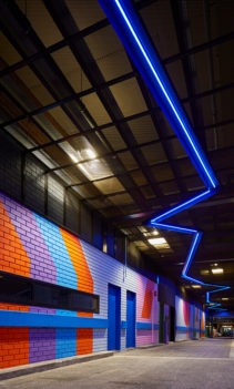
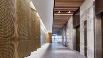
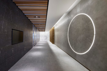
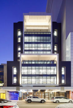
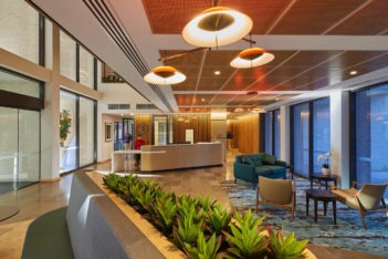
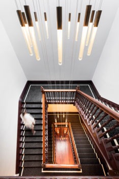
The lighting strategy focused on two elements – harvesting natural light and celebrating newly introduced elements and materials. New façades incorporate floor to ceiling glass and punched windows that deliver natural light deep into the building. Artificial lighting is astutely selected to expand the visual volume of the open ceiling services and extrapolate spatial reading. Lift lobbies are lit as a focal point, emphasising the tones of the walls and floors. The foyer is simply lit in expressive fittings with low level lighting to accentuate the vista and draw focus to the lift lobby, where a circle of LED embedded into a polished plaster wall denotes arrival. Creative lighting on the front facade accentuates the building form, with up lighting at the crown providing dramatic shadow play. Laneway lighting invites pedestrians in, with RGB LED wayfinding and motion detection security lighting increasing safety and complementing the energetic the laneway artwork.
WA Lighting Award - commendation
South Perth Foreshore Connect South Canopies | iredale pedersen hook architects with Place Laboratory and ETC
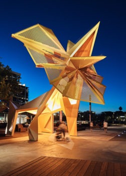
The lighting has been integrated within the canopy structures and responds directly to its prime riverfront location while complementing the diverse spaces of the new public piazza with which the canopies sit.
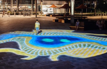
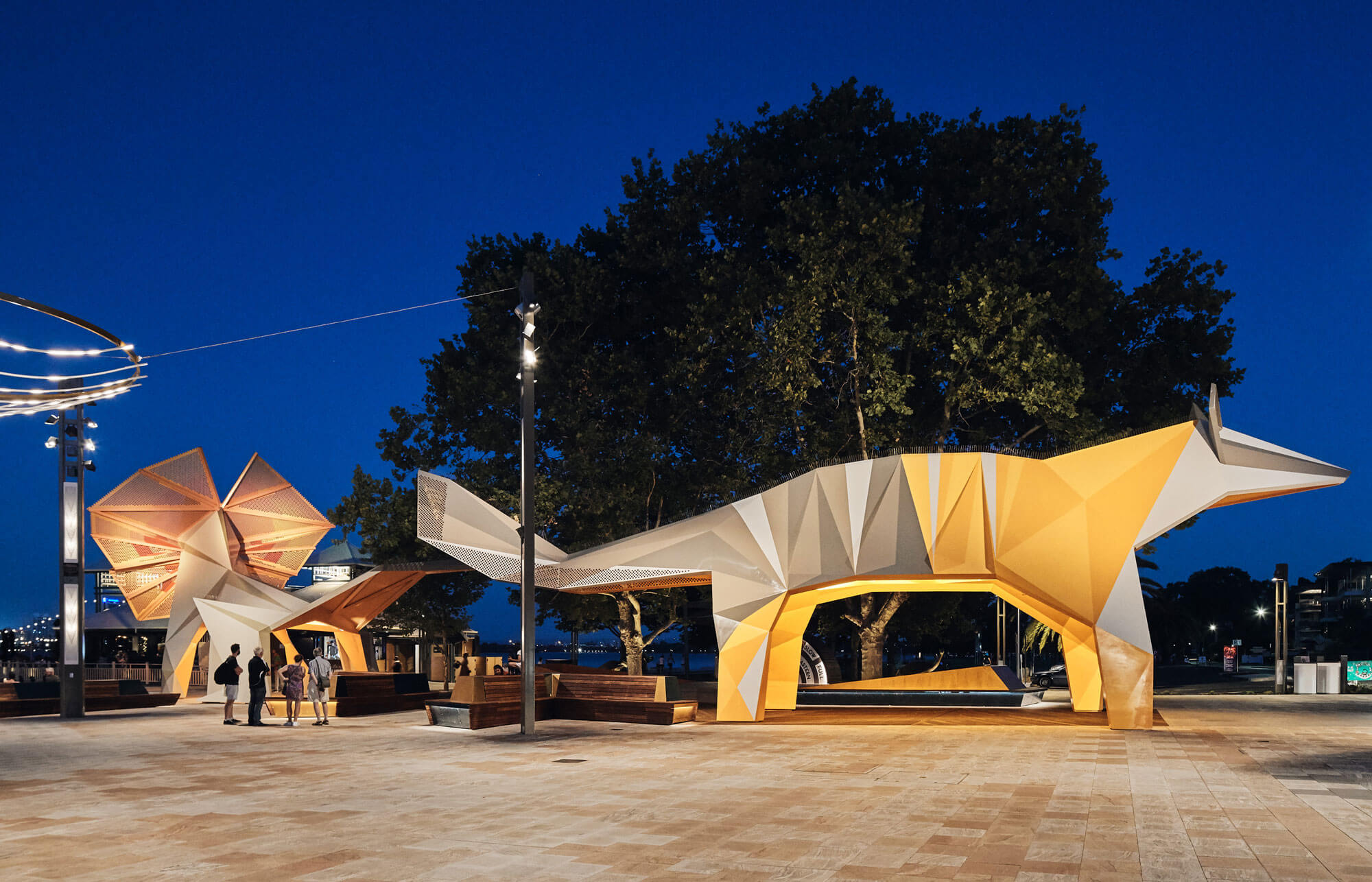
The lighting on the frill neck lizard has been sequenced to evening ferry arrivals, with subtle colour changes in the light creating a focused and hospitable approach for passengers. Lighting has been strategically selected to accompany the surrounding spaces with aims to minimize glare in order to preserve the unique vista from the foreshore across the river, to the Perth City skyline.
Automated dimming programs adjust the lighting to suit specific events such as the Australia day skyshow and after hours for energy and maintenance minimization.
The lighting contributes to the engagement with the public and creates a safe and welcoming space for all.
WA Lighting Award - commendation
SwanCare New Leisure Precinct | iredale pedersen hook architects
Lighting in a retirement village requires sensitive and subtle implementation.
A number of factors influence the design:
• A sense of safety without the need to be over-lit, residents wish to feel safe but not feel as though they are being unnecessarily exposed or highlighted.
• Reduction of direct lighting in eyes, aging eyes can be sensitive to light and cause dis-orientation
• Clear identification of pathways, even lighting washing across surfaces to identify colour contrast of materials and always being able to see what is ahead
• Strong up-lighting to evenly illuminate spaces
• Avoiding shadows that appears as steps, these cause residents to trip and potentially break bones
• Create atmospheres that foster social interaction
• Create flexible lighting spaces that can accommodate a game of bingo or the intimacy of a band playing to an audience
• Create an environment that celebrates space and increases ones’ sensory engagement and response, one that celebrates being alive.
Emerging Architect Prize
Sandy Anghi | Historic Heart of Perth Inc
Sandy Anghie is the recipient of the 2020 Western Australian Emerging Architect Prize in recognition of her leadership and contribution to the promotion of architecture within the community.
Sandy is recognised as being instrumental in the establishment of the Historic Heart project, seen as a catalyst for the revitalisation of the east end of Perth. Her leadership and contribution to the project is commendable and has helped promote meaningful community engagement with heritage architecture and its value.
commercial
The Ross Chisholm and Gil Nicol Award for Commercial Architecture
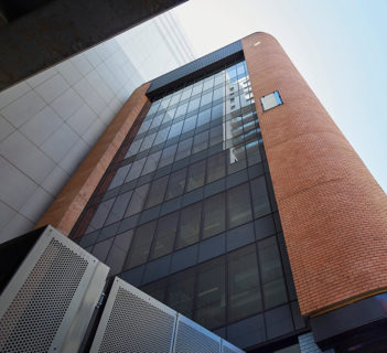
125 Murray Street | COX Architecture
Success of an architectural endeavour is often the ability it has to provide the client with more than they asked or expected. The detailed and considered refurbishment of 125 Murray St, a once tired building in the eastern end of Perth, has achieved just that. New life has been breathed into the fabric and flow of this commercial space through a few key deliveries of a number of driving concepts.
By opening the laneway-street corner, a revitalised interface with the lobby was achieved and not only was the potential vibrancy of a busy street bought inside, but the rich glimpses of the lobby interiors added to the street experience.
Whilst this was a vast improvement on the existing condition the jury was most impressed by the transformation of the interior spaces and the overall value add to the project.
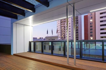
The explosion of light within a previous dark, aging environment is testament to the architect’s vigorous pursuit of improved commercial space for the client. Added floor area, increased volume and generous light penetration through significant façade changes, removal of ceilings and service exposure, a light material palette and a wonderful skylight all contribute to the restrained, yet delightful, contemporary office spaces.
A strong statement in the value of an architectural vision for a space well delivered.
commendation for commercial architecture
Juniper Chrystal Halliday | T&Z Architects
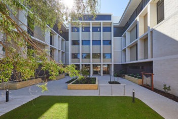
The new Chrystal Halliday residential care facility represents the current shift toward higher density facilities within inner suburban areas to service the increasing need for residential care that allows residents to stay within their own community close to family, loved ones and friends during one of the most vulnerable periods of life. The goal for Chrystal Halliday was to eliminate obvious references to institutional design by creating an environment that is familiar, comfortable, warm and friction-free in order that the anxieties often associated with aged care facilities for both residents and loved ones are reduced, and ideally eliminated. T&Z have sought to create an environment where residents, staff and visitors feel comfortable, secure and welcome.
commendation for commercial architecture
The Amberton | MODE
We have created not only a key piece of community infrastructure for our client, but a place for families to meet, for the community to gather and a venue that will have a lasting impact on the growing neighbourhood. This has been a 4-year project for MODE’s Perth Studio and we’re all so pleased to see our work completed, utilised and appreciated by the client and the local community.
Educational Architecture
The Hillson Beasley Award for Educational Architecture
Curtin University Midland Campus | Lyons with Silver Thomas Hanley
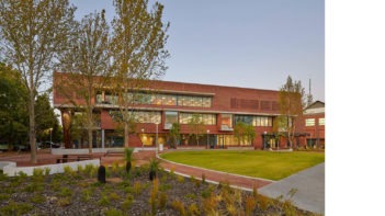
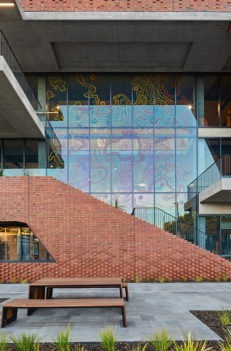
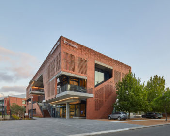
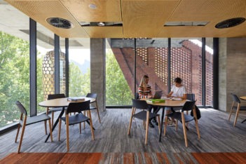
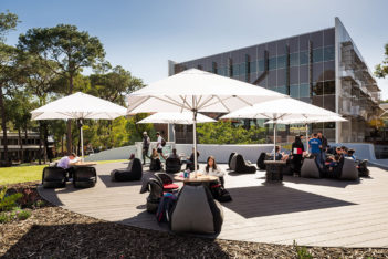
As a project that successfully weaves a bold new campus architecture into the contextual fabric of an historical town centre and with deep connection to indigenous culture and place, the new Curtin University Midland Campus Health Sciences educational facility defines a benchmark for educational architecture in Western Australia.
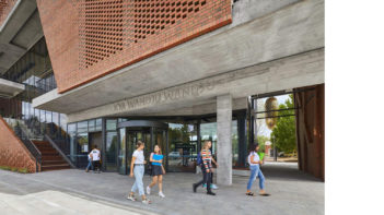
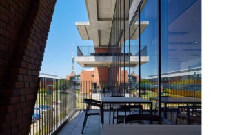
Careful consideration of the culturally rich indigenous and industrial context is skilfully interwoven with the Curtin Bentley built form and materiality to create a building that is unmistakably West Australian, unmistakably Midland and unmistakably Curtin. Both subtle and strategically placed artwork and signage play homage to and welcome its indigenous connections, and the richly patterned brick envelope celebrates the craftsmanship of the adjacent Midland Rail Workshops.
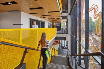
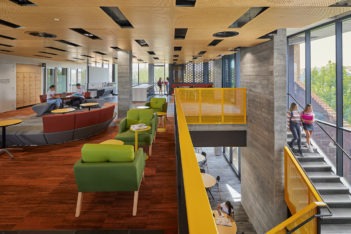
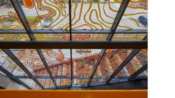
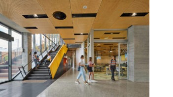
Internal spatial relationships have been configured around the vertical circulation space that serves as break-out space for incidental congregation and engagement, visually connected to the rich Midland context behind a 3 storey glazed artwork mapping indigenous connection to site.
Embracing both environmental and cultural sustainability, the architecture, landscaping and graphic artwork result from a successful collaboration between the Architects, the University and local indigenous community, resoundingly integrating language and culture into the Curtin architectural typology.
A truly remarkable project and worthy recipient of The Hillson Beasley Award for Educational Architecture.
Award for Educational Architecture
City Beach Residential College | iredale pedersen hook architects
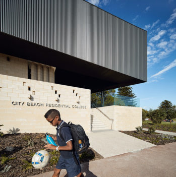
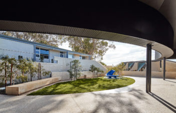
The project is an exquisite example of architecture defined through careful consideration of place, site and context. As a facility with little precedent, the architects have successfully defined a new type of student accommodation that maintains the need for safety and surveillance whilst feeling homely and liveable.
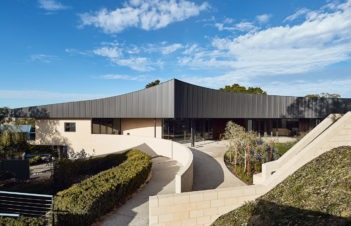
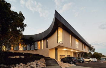
The bold sweeping gestural form of the roof is in response to a large ficus tree on the site that the architects have skilfully used as a lid under which they have been able to distinguish different faces to the building to respond to the programme and context. The subtle shift from the Iwanoff informed residential language that addresses the residential street context, to the rural language of rustic timber and tin shed is a sophisticated reference to the duality of place for the residents. An experience of place that is both new and familiar.
Quirky design responses, such as the rainwater tanks articulated on the façade further this connection to place for the residents, whilst defining a variety of internal spaces which allow the residents to find their own place and develop their sense of self within the facility.
This is an exceptionally conceived and executed project whose inherent response to Beach and bush has defined an engaging architectural language
Commendation for Educational Architecture
Northshore Christian Grammar School | Taylor Robinson Chaney Broderick
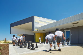
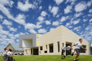
This project provides accommodation for growing children and has been designed to provide a flexible, playful and enriching learning environment.
The site is on coastal sand dunes; you can smell and almost hear the ocean but you can’t see it from the sitea. We liked the idea of yearning for water and designed the buildings to make the flow of water visible to encourage children to interact with the falling rain.
This connection is further developed by entrances to buildings being reminiscent of lighthouses; vertical elements featuring coloured glass that captures the sun by day and radiates coloured light in the evenings.
Each classroom opens directly onto a generous breakout space designed with furnishable alcoves, which can adapt to allow for smaller group learning, presentations, display of student work, assemblies and community events.
heritage architecture
The Margaret Pitt Morison Award for Heritage
Aquinas College Chapel | John Taylor Architect
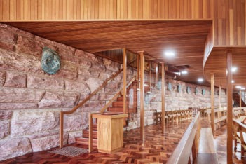
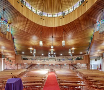
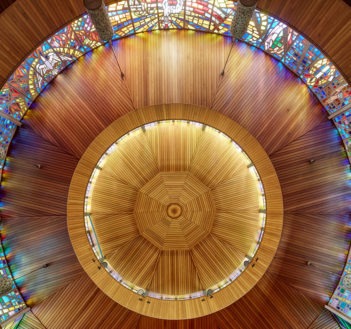
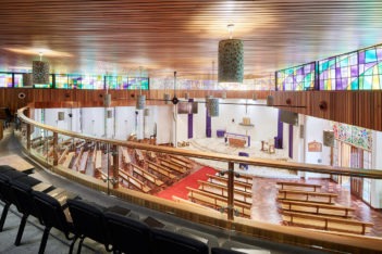
The Aquinas College Chapel project is an exemplar for heritage architectural practice. It seamlessly retains complete integrity with the original design of this acclaimed 20th Century chapel whist adapting it to 21st Century needs.
The additions to the Chapel nearly double its capacity from 355 to 665 and has been achieved by moving the north wall out, eliminating some internal columns for uninterrupted sightlines and extending the existing mezzanine. The outcome increases the functionality and useability of the place, whilst not only retaining but enhancing the quality of the space and light within.
Faced with significant structural challenges, the engineering solutions have been elegantly incorporated into the design along with meticulous attention to detail throughout. The new work maintains the continuity of the existing fabric and finishes, subtle in their differences, but discernible on close inspection. Original stained-glass highlight windows, of modernist design, were carefully reused and continue to illuminate the interior, timber panelled walls and ceiling.
The architect has avoided the temptation to impose a new architectural language in preference to a subtle approach that infuses a deep appreciation and respect for the original chapel. Intrinsically, the place in its setting remains essentially unaltered and continues to play an important role in the heart of the College campus.
Commendation for Heritage Architecture
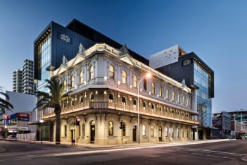
The Melbourne Hotel | Buchan
The Melbourne Hotel is a striking mid-rise boutique hotel development which expands the capacity of the original late 19th Century ‘Gold Rush’ building, seamlessly unifying heritage fabric and contemporary design.
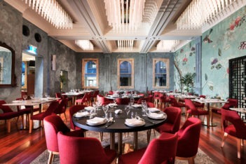
The completely refurbished hotel comprises 22 refurbished heritage rooms and 51 new rooms which share a circulation ‘street’ space woven through and around the heritage building. Within, the materiality expressed contrasts the rustic and textural rear of the building with a contemporary internal façade.
In addition to its namesake boutique accommodation, hotel guests and visitors alike are enticed to the venue by an option of five different food and beverage offerings, which each serve as a compelling destination unto itself.
The Melbourne Hotel offers patrons a unique experience in the Perth CBD, which both engages with the history of the locality and creates a new energy from the contemporary facilities and spaces.
interior architecture
The Julius Elischer Award for Interior Architecture
Curtin University Midland Campus | Lyons with Silver Thomas Hanley
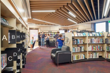
The building is recognisable as belonging to the Curtin University while responding to place.
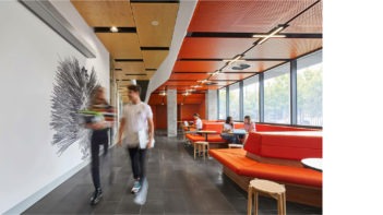
The measures taken in the design to ensure that the exterior of the new building is integrated with the existing surrounding buildings of the campus are equally legible within the building’s interior. Sensitive carving out of a simple form enhances permeability, highlight the activity within areas of interior circulation and enliven student experiences.
Juxtaposition of interior with exterior is well resolved through the materiality, light and shadow, occupant motion, integrated decorative art works, views and reflections, as well as permeable structural elements.
The University community benefit from the very clear communication system and way finding strategies incorporating with a strong graphic language; and the inclusion of local fauna, indigenous text, and a strong unified colour way.
The architects strove to enhance contribution to design education through attention to contemporary learning philosophy and activities, including the need for interdisciplinary interactions during real life simulations.
The buildings interiors strike the right balance between the institutional requirements of the University while bringing a sense of joy to the student’s everyday experiences within the building.
Award for Interior Architecture
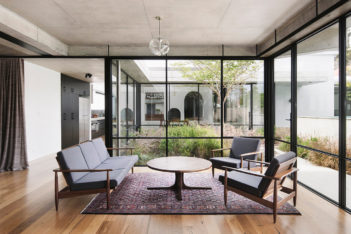
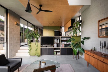
North Perth House | NIC BRUNSDON
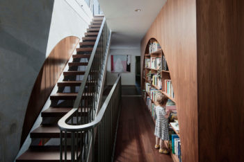
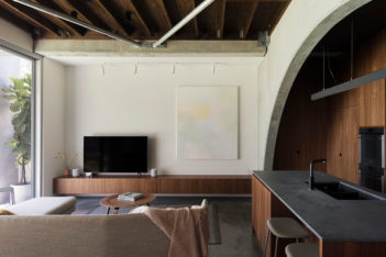
This project challenges the design of small residences through the well-defined and ordered interpretation of a home in response to the client brief.
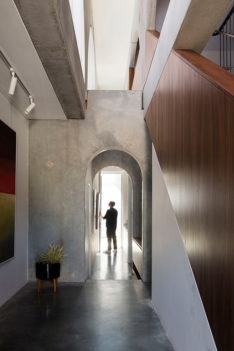
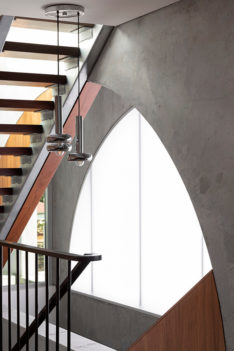
The rigid grid of the expressed concrete structural wall panels has been successfully integrated with the demands of a relatively small new house. The architect’s cleaver manipulation of scale and volume to interior spaces weaves between the exposed concrete wall panels.
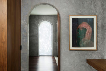
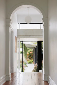
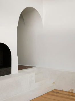
Unifying elements such as the use of the arch to openings within the concrete wall panels are integrated into passage openings, framing for cabinetwork and vistas though the spaces. A restrained material palette balancing the warmth of timber with the rawness of the strong concrete finishes is another unifying factor. The raw and robust finish of the exposed concrete ground floor slab and precast concrete walls are contrasted with the dark timber of the cabinetwork and the timber flooring at first floor.
Further drama results from the combination of the compression and release of spaces when coupled with areas of light and dark.
The project delivers a sophisticated living environment relative to the projects scale and budget.
public architecture
The Jeffrey Howlett Award for Public Architecture
Curtin Bicycle Hub | Coniglio Ainsworth Architects and Place Laboratory with Curtin University
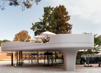
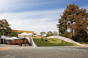
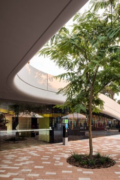
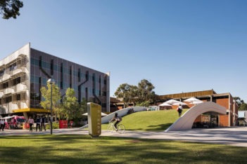
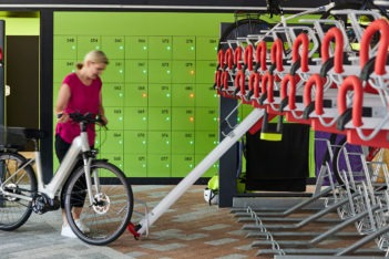
A free form sculptural insertion which is innovative in its contextual response to the public space of the campus. There is clarity in its resolution of the idea through to the function and detailing. The Curtin Bike Hub extends the design beyond a simple response to brief. By embracing the roof as a useable fifth façade, a trafficable and sustainable green roof has been established. This creates both visual impact from within the adjacent buildings and a universally accessible public space for gathering, learning, socialising and connecting. The seamless resolution of services, the clarity of expression within a singular fluid form and its transparent envelope, places on show the main function of the building itself. Incorporating and expressing the alternative bike parking system promoting alternative modes of transport to the campus. The Curtin Bicycle Hub acts as an informal public gathering place within an engaging campus precinct. It is a respectful and sculptural counterpoint to its context and its precise design deservedly holds its place within the canon of highly considered Curtin University architectural responses.
Award for Public Architecture
Pingelly Recreation and Cultural Centre | iredale pedersen hook architects with Advanced Timber Concepts Studio
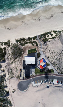
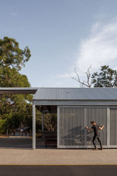
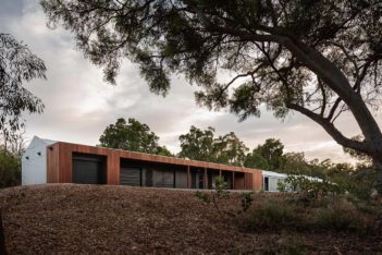
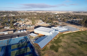
Pingelly Recreation Centre is a crafted architectural response, which focussed on a specific material application utilising locally sourced timber. The design team is to be commended for their endeavour in implementing an alternative construction methodology to what is commonly afforded in this typology. Traditional construction techniques have been understood and applied to precisely detailed functional elements. Creating spaces which can be used all year round by all members of the community for a range of both planned and spontaneous events. The engagement of the community in the conception of the buildings is highlighted by its precise siting, such that it forms a gateway to the town’s sport centre, and frames a view to the community surrounding it. The connection of various buildings to the sports field is enhanced by the uninterrupted and appropriately scaled veranda, which in turn uniting the development as a whole and reinforcing the community aspect of the buildings. Incorporating recycled material from buildings demolished on site, utilising a first principle approach to passive ventilation and resourceful detailing are examples of the sustainability initiatives applied to the project, all of which add a layer of richness to this innovative project. A crafted holistic composition of architectural form, function, materials and detailing – each contributing to a whole which is greater than the sum of its parts.
Commendation for Public Architecture
SwanCare New Leisure Precinct iredale pedersen hook architects
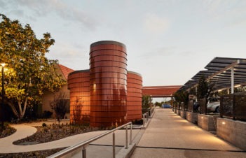
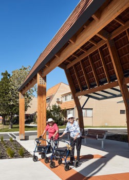
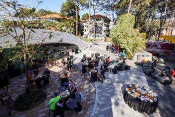
The New SwanCare Leisure Precinct aims to improve the health and wellbeing of residents by reducing isolation, encouraging safe movement and socialisation and to welcome friends, family and the surrounding community.
Vehicles and Roads were removed and replaced with a wide and clear pedestrian boulevard. The boulevard extends from the primary SwanCare entry street to the new Leisure Precinct and continues to the aged care facilities beyond.
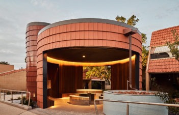
Sensory design manifests continually in external and internal. A constellation of sensory pavilions allows occupants and visitors to socialise, the pavilion of light and the Pavilion of sound increase awareness of senses and each other.
In a world where the value of architecture is questioned, a recent visit included residents openly discussing how these facilities ‘have changed their life”. They discussed now feeling part of a ‘community’, a community that is part of SwanCare but also one that engages with society.
Residential architecture - Houses (alterations & Additions)
The Peter Overman Award for Residential Architecture – Houses (Alterations and Additions)
Reed House | Beth George, Architect
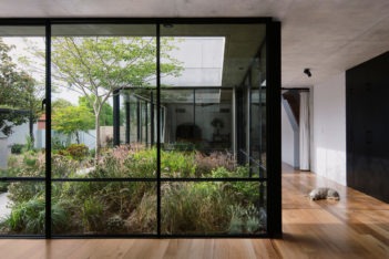
Reed House is a highly considered addition to an existing house built in 1908. The project explores ideas of memory and interpretation through a series of thoughtful interventions and new additions. The extension is positioned sensitively to retain the dignity of the existing house, while simultaneously asserting itself through a robust material palette and sculptural, monolithic forms. The planning is clear and logical, responding to the site and balancing beautifully the requirements for enclosure and the connection to external garden spaces. Delicately detailed window openings frame views and draw the textural garden deep into the interior spaces. The excavating of the dining space and arrangement of the new roof masterfully dovetails the new addition to the existing house. This junction of two distinctive parts is cleverly resolved and executed. The integration of the structural and landscape design is significant to the success of the project. A sense of play operates within the interior, through the inventive use of colour and material textures, inviting nooks and window ledges.
The Reed House is both a sophisticated architectural response and a beautifully crafted family home.
Award for Residential Architecture - Houses (Alterations and Additions)
Marine | David Barr Architects
‘Marine’ is conceptually and physically incisive, multi-dimensional and purposeful. The extension’s proportions facilitate its standing alone in the street setting, like an eyrie nested between two weather-worn cottages – entirely appropriate to the particular setting of modest coastal houses. The extension is physically scaled and connected to one of these houses (containing bedrooms), but its primary reconciliation is to the street’s pattern, using stratified layers of brick and concrete to engender scale. An additional, third-order of material is used within the extension – pale timber spandrels – which further reinforce subtle connections to the original cottage in height, grain and quality. The combined material palette is unmistakably coastal.
The interior is concise, edited, and continues the sense of one’s dwelling within limestone country, where rooms borrow a dry landscape to its south, claim a distant south-western beach view and on its north, seeks the sun and relief from the relentless wind. As a final act, a landscape strategy has been employed around and across the building’s exterior where local and introduced landscape will claim the house in time. This project is an exemplar which balances direct and hard-working ideas of architectural making with a small scope and a modest budget.
Commendation for Residential Architecture – Houses (Alterations and Additions)
Megalong | MDC Architects
An alteration & addition to a mid-war worker’s cottage with a 90’s add-on to the rear.
On early observation our interest surrounded the poor circulation through the original 1940’s dwelling due to the number of changes the rear had endured. The 90’s addition to the rear created a ‘stop end’ to the sequence through the site and provided little to no connection to the rear laneway. We felt there was opportunity in trying to link the front of the site to the rear of the site through what was, in effect, a ‘mega long’ hallway and visual axis.
Along this axis through the dwelling our aim was to make small interventions to some of the existing spaces that either required an upgrade or a change of use.
Residential Architecture - Multiple Housing
The Harold Krantz Award for Residential Architecture - Multiple Housing
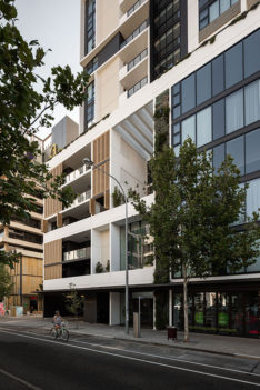
Verdant Apartments | MJA studio
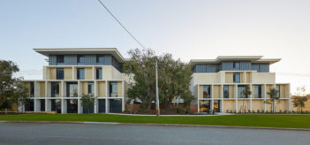
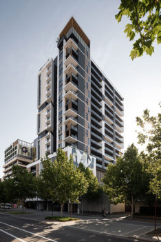
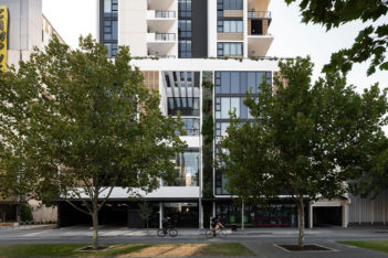
Verdant Apartments has achieved a high standard of architecture, elevated well above a typical commercially competent outcome. In an apartment market where saleability is governed by finishes, inclusions, features and branding, MJA Studio’s aspirations in Verdant go beyond commercial feasibility and market appeal, to create an apartment tower of enduring architectural quality.
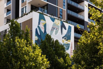
The building is well composed, both at street level and expressed from a distant view. Future adjacent development is anticipated, ensuring relevance into the future.
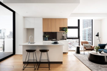
Apartments are well planned, coherent and articulate, making clever use of space and external walls to give an aspect, a sense of design, and liveability that is not typical. Balconies are well arranged and detailed to provide privacy and amenity; operable screening and sun shading incorporated as both compositional and functional elements. The standard of architectural detailing and craftsmanship differentiates this building from many of its peers.
Communal areas are well considered for their capacity to adapt to emerging and future living patters and lifestyle expectations.
Verdant is a well-executed, disciplined, thoughtful and affordable apartment development designed to appeal to younger and more forward-thinking occupants. It sets a new standard in Perth and will contribute to improving design as well as community perception and attitude to high density apartment living.
Award for for Residential Architecture - Multiple Housing
The Crest | Woods Bagot
Crest Apartments in an ambitious undertaking, in which Woods Bagot have delivered an impressive piece of architecture.
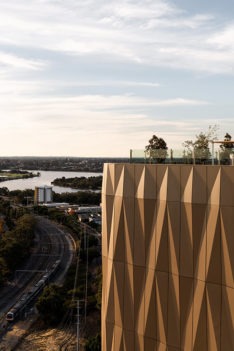
The location is visually prominent on a major gateway to the city, and in close proximity to an emerging high-density residential precinct, but is a challenging site. Topography, adjacent land uses, urban interfaces and site geometry have required a thoughtful and sensitive approach.
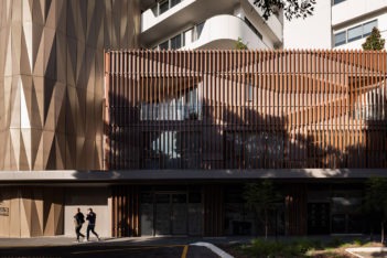
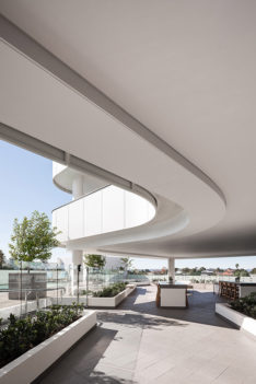
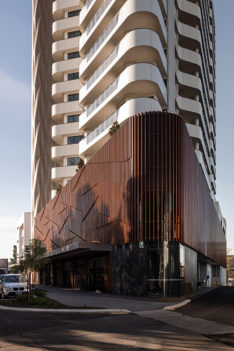
The building’ heroic stature is appropriate for this landmark location, being largely visible in the round. The fluid forms of the balustrading, varied balcony setbacks and simplified, abstracted geometry have been handled with care and consistency, and contribute to the reading of this building.
Difficult street level and podium interfaces in this unusual transitional industrial location are treated with a level of generosity that helps ameliorate the unforgiving context; the playfulness of shadow patterns cast by the sunshade screen providing an interesting and engaging contrast with the form of the building.
Overall, this is a well-executed contemporary apartment building which makes the most of its opportunity, provides an appropriate response to the existing transitional context, and sets a productive pattern for the further development of this precinct.
Award for for Residential Architecture - Multiple Housing
Stock Road Grouped Housing | MJA studio
In this project, MJA Studio have sought to explore a typology which is often not the domain of architects. The opportunity of townhouses in triplex form on a medium density suburban site is a common one, and one for which exploration is warranted.
The approach of individual townhouses each with its own street frontage addressing the corner has been a productive strategy, avoiding interruption of the streetscape by blank walls and communal vehicle access. The adoption of visually permeable carports and fencing to the street contributes further to connecting these dwellings to the public domain, and giving the sense of individual ‘house’ rather than triplex ‘unit’.
The dwellings themselves are simply, logically and coherently planned, with spaces arranged to anticipate different household structures and lifestyle patters. Flexible spaces, provision for working from home, and a blurring between carports and courtyards, are future-looking and will provide clues to other designers seeking to work in this typology.
The resulting building is confident and adept, with a sense of an underlying architectural idea informing the design from planning through to detailing, interior design and finishes.
MJA has successfully departed from the typical look, feel and function of a familiar typology, and achieved a distinctive built outcome on a tight budget.
Commendation for Residential Architecture - Multiple Housing
Element 27 | Hillam
ELEMENT 27 is located in a redeveloped light industrial area at the heart of Subi Centro, in the Australian Fine China precinct.
Sentinel Real Estate Corporation saw an opportunity to bring their experience creating and operating multi-family residential communities to Western Australia. With 93 apartments, ELEMENT 27 is the first purpose-made “build-to-rent” development in Australia.
The apartments on offer range from compact studios, to one, two and three bedroom types. All units include a full appliance package, with highly durable materials and a consistent range of finishes.
With a focus on customer service, the BTR housing model increases the level of convenience for renters. The building incorporates a Leasing Office and Management Office to ensure tenants have direct contact with staff.
Given its landmark location and the heritage of the site, the architectural response is a contemporary industrial aesthetic with simple but bold forms.
Residential Architecture - Houses (New)
The Marshall Clifton Award for Residential Architecture - Houses (New)
Floating House - Hancy Ellies Residence | Architects Perrine
The Floating House creates an immediate visual impression and reflects the architect’s intention to produce a bold metaphorical composition where form becomes the fundamental structure – a pair of longitudinal volumes in stone presented as one on a compact area of land.
Set at the end of a cul-de-sac the house is masterfully planned to address the street and provide a focal point to the area. A refined play of light and space balance the constraints of privacy with those of function on a tight site. The innovative use of car lifts means garages do not dominate, whilst providing an efficient solution to the brief. Materiality and detail are elevated to an art form – a new dry clad stone system (patent pending) being developed for the house.
Architects Perrine expanded the client brief to explore thinking about architecture and the way we live, structure that changes with changing needs and conditions, flexibility to respond and take advantage of seasonal changes, innovations in material systems – a matrix of possibilities prevalent at the time we live.
The jury were captured by the originality of the forms, the attention to detail and the skill in delivery of this intelligent project – a standout for residential design in 2020.
Award for Residential Architecture - Houses (New)
North Perth House | NIC BRUNSDON
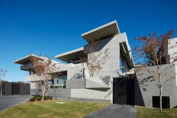
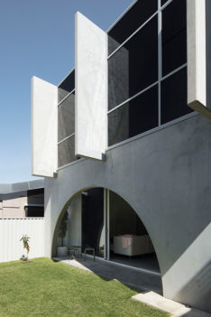
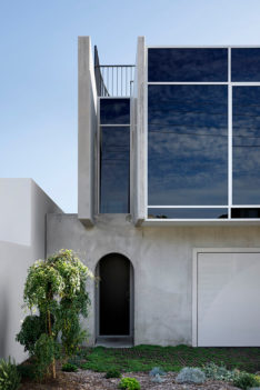
This innovative and original response to a small residential site (9.5mx23m) in North Perth provides a new benchmark for small lot development. A pragmatic concept of interlocking precast panels to build both economically and efficiently has resulted in a harmonious union of space, light and structure.
Using a methodology usually reserved for the commercial realm, Post Architecture has rigorously refined the design to two panel types comprising of ‘Grand’ and ‘Pedestrian’ arches which define functions of habitable and circulation spaces. The upper floor panels are set at right angles to the panels below. The ‘negative’ spaces in the raw concrete panels are always legible and are either left for circulation, or infilled with rich walnut cabinetry to define rooms, or a specially developed insulated translucent polycarbonate sandwich to invite light whilst maintaining privacy. The result is dramatic and surprising.
Planning is not compromised by the overriding structural concept. Although primarily inward looking, there is a breakout roof terrace to survey the surrounding neighbourhood. The interior detail throughout is simple; a limited palette of raw concrete, warm timber tones and fine metalwork enhances the purity of the concept.
Innovation with design rigour is applauded.
Award for Residential Architecture - Houses (New)
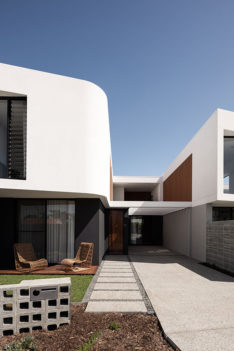
RZB House | Carrier and Postmus Architects
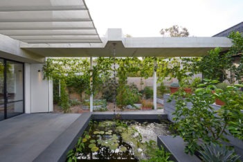
RZB House is a finely crafted and sensitive response to its suburban setting. The integration of layered landscape into the conceptual framework of the house has resulted in a design that is clever in its use of a constrained site.
Both architecturally and spatially the house draws its inspiration from more traditional influences. Arranged as a series of inter-related spaces and designed with the client’s way of living foremost in mind, RZB house goes beyond this by inviting various modes of in habitation for aging in place and for future owners.
A carefully considered palette of materials is well composed and will endure as the house ages within its landscape. The attention to detail is skillful and execution impeccable.
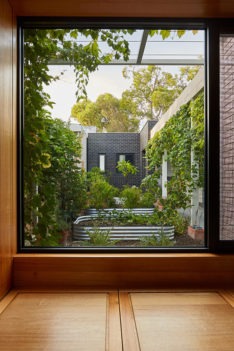
The sustainability credentials of the house are applauded. The innovative use of a thermal chimney to draw cool air through the building has eliminated air conditioning. The use of water, local ecology and productive landscape, all contribute to a model of housing that paves the way for a more sustainable future.
CAPA have created a house that is beautifully detailed, fundamentally sustainable and innovative in it’s conception.
Commendation for Residential Architecture - Houses (New)
Trapezoid House | Lisa McGann
This house’s form is dictated by a response to orientation and a desire for connectivity – between inside and outside, and between the house and the community.
The programme is arranged into 2 linear volumes, one house, one carport. The focus is on the space between which acts as circulation spine, providing entry to the house and linking the ‘front’ and ‘back’ garden into a single, connected space.
The house volume is pushed hard up to the southern laneway boundary, allowing it to open itself up to the north, and to the garden. The footprint is minimised in order to maximise outdoor space.
This house is transparent, front to back, prioritising connectivity to the outside and to the street, over privacy. A low chainlink fence and open carport promotes neighbourhood interaction and community.
Commendation for Residential Architecture - Houses (New)
Little River Residence | PTX Architects
In the natural landscape of Western Australia’s southern coast, PTX Architects have crafted a residence that draws the past into the future.
For over a century the ‘Bonnie View’ farm cottage has overlooked the stunning vistas of Denmark’s Wilson Inlet. After it fell into disrepair, new owners called on PTX Architects to bring this slice of history into the modern age.
The brief was simple: to integrate the old and the new. Alongside the restored cottage a new residence was crafted – a contemporary twin to its vintage neighbour, built to the latest in sustainable design principles.
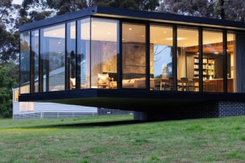
The new dwelling features a distinctive cantilever design that sees the living space floating breezily over the landscape below. Charred timber and metal cladding make for a striking contrast to the farm cottage’s white weatherboard frame, and a sleek walkway between the two houses provides a gentle transition from the past to the present.
Small Project Architecture
The Iwan Iwanoff Award for Small Project Architecture
South Perth Foreshore Connect South Canopies | iredale pedersen hook architects with Place Laboratory and ETC
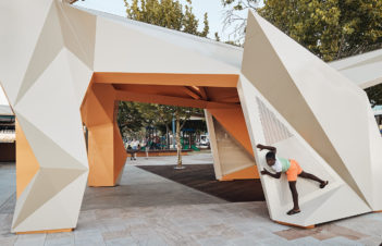
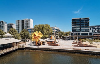
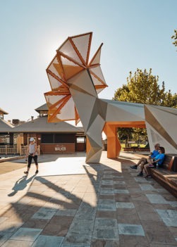
These delightful canopies by Iredale Pederson Hook bind together the narrative of the river, the high street and the Perth Zoo through their figurative language. The structures speak of the past; the street parading of exotic animals and the spectacle associated with the much-anticipated arrival of these extraordinary creatures across the water on barges. Whilst the canopies give a nod to the histories of their place they also convincingly celebrate the future role of the Zoo in their appreciation and custodianship of Western Australian fauna through the selection of the numbat and frill neck lizard, their siting and positioning, colouration and their fabrication.
They are brave realisations of a rigorous process – of interweaving historical research through a making process of testing, folding and pleating these charismatic creatures into existence. Although small in footprint, these structures are civic gestures and compelling components of the upgrade to this premier foreshore landscape. The South Perth Foreshore Connect South Canopies are playful and bright objects, visible from afar – from other prominent Perth places that add to the cultural artefacts of our evolving cityscape. The mark a moment in our collective history, where a shift in dialogue has been expertly handled by Iredale Pederson Hook and captured in these structures in a most joyful way.
Commendation for Small Project Architecture
Wanju Marr | MJA Studio
Kings Park Volunteers have deep love for the Park and desire to share their passion with visitors. Recognizing the nature of their work, Whadjuk name Wanju Marr meaning “welcome hand” has been warmly given to this building.
The building promotes social benefits of learning, health and diversity. It enhances volunteer and visitor experience.
Conceived as a building of simple forms expressed through devices of joining and separation to itself and adjacent Garden Staff quarters. The two buildings relate through companionship. Existing gable and truss forms provided a common reference that the buildings separated by time and function relate to. They function together, not competing on scale or embellishment.
Refinement is evident in the restrained treatment of parapets. Cappings shed water whilst soaking in austerity.
A simple material palette is presented. Rigorous execution and refinement of edge/junction details promote a clarity to the building that remains strong on closer approach.
Commendation for Small Project Architecture
Crown Perth - Metropol Water Pump Upgrade | Maze Architects
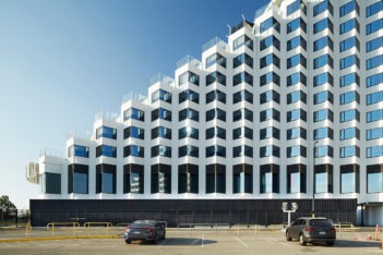
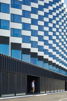
When it opened in1985, Burswood Island Casino (as it was then known) was the largest in Australia, and third-largest in the world. The Metropol Hotel with its zig-zag profile and bold sculptural form certainly stood out in Perth at the time and has maintained that iconic presence up to the current day.
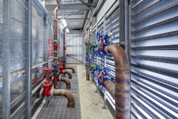
So when we were asked to design a shed at its base, our response was of course, how do we do that in the most practical and efficient way, but also very importantly, how do we design a building that looks like it has always belonged at the feet of this grand and memorable building.
A simple pallette of materials and colours, a nod to the angular prickliness and zigerat form of its neighbour and a design that was quiet in its contemplation of its bigger and bolder backdrop were all important considerations in the design.
Urban Design
The John Septimus Roe Award for Urban Design
The Rocks Laneway | Taylor Robinson Chaney Broderick with UDLA
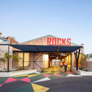
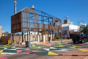
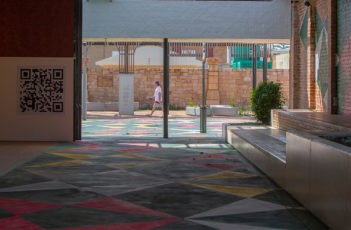
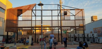
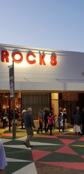
The Rocks Laneway establishes a new linear pathway of movement through Geraldton City centre connecting Geralton Regional Art Gallery to its waterfront esplanade. Geralton’s waterfront precinct recently received a significant public realm upgrade but lacked connections back into the CBD area. Adaptive re-use of buildings, recycling of materials and use of an expansive Trevor Richards public artwork as a guiding as well as unifying element all display a low cost, inventive approach to the project. A new three quarter scale ‘ghost’ structure referencing a lost element of the town’s history, in the form of the demolished Victorian era Post Office, also contributes to this objective. The new pathway has been orchestrated as a ‘journey’ in close proximity to a series of public spaces accommodating a diverse range of public events and activities. These public spaces act as a catalyst for previously unimagined community use. The Rocks Laneway expanded upon the original brief to deliver an outcome which plays a strong role in revitalising the Geralton CBD. This highly successful project generates maximum impact through a series of subtle, strategic interventions and in doing so delivered a meaningful outcome for the local community.
Award for Urban Design
SwanCare New Leisure Precinct | iredale pedersen hook architects
SwanCare Leisure Precinct displays a level of thoughtfulness and innovation rarely achieved within the aged care typology. Establishing a legible new Porte Cochere entrance, wide pedestrian boulevard spine through the site and removing vehicle access all play a role in activating the sites generous, but previously under-utilised, open spaces. Sculptural architectural forms and use of materials possessing sensory, tactile, audible, fragrant properties have been cleverly employed as memory triggers to orientate elderly resident’s day to day movements on the site. The materials palette also achieves a fine balance remaining sensitive to the surrounding existing built form. Re-purposing existing buildings as well as the introduction of carefully organised new buildings and veranda spaces, including a sound and light pavilion, encourage social interaction. A number of recreational facilities have also been added to the site. SwanCare Leisure Precinct is the result of rigorous contextual analysis to understand the surrounding connections and identify opportunities for re-organised use of existing spaces and buildings. The overall ambition of the project is to promote positive mental health benefits, for both residents and visitors alike, through a carefully considered architectural response.
Commendation for Urban Design
Curtin Bicycle Hub | Coniglio Ainsworth Architects and Place Laboratory with Curtin University
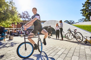
The Curtin Cycle Hub demonstrates Curtin’s ongoing commitment to sustainable transport and supports Curtin’s strategy to promote well-being, liveability, accessibility and inclusion. The Hub was designed with Curtin’s community’s needs in mind and has resulted in a thriving precinct. The hub includes secure storage for 200 bicycles, all access end-of-trip facilities and an accessible green roof and open deck. The facilities have made active transport a more attractive and convenient option for students and staff. Since its completion, it has hosted numerous community events, attracting thousands of people. The project has also had a wide reaching impact on cycling promotion in Perth and internationally, having been used as an events venue for the DOT “Ride2Curtin” day, being a catalyst for the inclusion of two tier bicycle parking systems at METRONET rail projects and being selected as one of 15 projects worldwide for the 2019 Bicycle Architecture Biennale hosted in Amsterdam.
Sustainable Architecture
The Wallace Greenham Award for Sustainable Architecture Award
Pingelly Recreation and Cultural Centre | iredale pedersen hook architects with Advanced Timber Concepts Studio
The Jury has nominated the Pingelly Recreation and Cultural Centre and views it as a vibrant addition to the local public infrastructure. It sets new parameters and offers great potential for expansion. In essence, this project unifies elements with an elegant response to a multi-purpose requirement. Country towns that currently suffer from economic downturn and social limitations can greatly benefit from a sophisticated development such as this centre and it has undoubtedly enhanced civic pride.
The use of material is a shift from the normal for this type of building in similar locations. The jury highly commends this choice, though the designers have relied on imported structural timber. The jury feels that its demand may boost local manufacture of engineered timber that can rely on precision and cost efficiency. The architects have demonstrated how timber construction, rather than more traditional use of steel and concrete, can excel in its aesthetic along with providing natural shading/ventilation/natural lighting indoor and outdoor under the generous veranda.
The jury feels that the success of this project will be proven in its creation of a popular new attraction in Pingelly and as a steppingstone to further expansion for additional cultural events.
Award for Sustainable Architecture
RZB House Carrier and Postmus Architects
The jury’s decision to award this suburban house is based on the belief that the ambitions and the aspirations set by the complex brief have been met in an exceptional way, resulting in a robust example of sustainable design. Whilst the home is spatially organized around traditional use, it demonstrates an integrated approach to the creation of a living environment, internal and external, where architects, landscape designers and engineers have successfully shared the design process.
Ideologically, the designers have responded to the local wetland and emulated it by creating a microcosm of the surrounding environment. The clients have facilitated this process by renouncing mechanical thermal control and relying instead on a series of ponds, food/foliage growing, garden roofs, deep verandas and solar energy. This philosophy has allowed the designers to achieve the goal of the house and the garden being fully integrated.
The project has surpassed expectations of solar passive design principles and merits congratulations for its experimentation and exploration of design, rainwater harvesting, active landscaping and allowing for future enhancements of natural energy sources. The connection between rooms and landscape is crafted specifically to nurture the user and the private natural environment resulting in a delightful architectural experience.
COLORBOND® Award for Steel Architecture
COLORBOND® Award for Steel Architecture
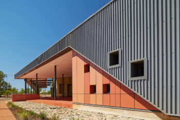
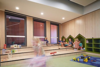
Wickham Community Hub | Gresley Abas
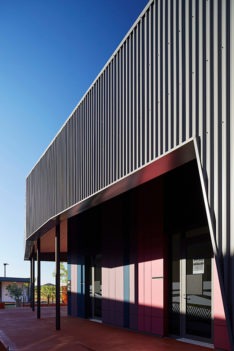
A carapace made of steel, both roof and wall is the protective shell that provides shelter for the occupants of the Wickham Community Hub from the harsh sun and cyclones which frequently cross this landscape. Beneath the monochromatic corrugated skin lies a beautifully coloured core which becomes an oasis of life for this small Pilbara mining town, providing a softness and vibrancy not usually found within this frontier desert environment.
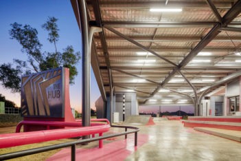
The use of steel allowed the building to provide safety within its Category D Cyclonic Area efficiently, whilst providing a beautiful sculptural expression grounded within the landscape. The design of rolled and bent ‘tree’ columns enable the creation of large expansive column/free spaces for recreation and congregation. The exposed steelwork underbelly in some areas ties back to the raw industrial nature of mining, and provides a glimpse of the steel structure that usually remains unseen.
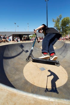
Brightly painted rolled steel elements are tied back into the ground plane as edges for skateboarding on and playfully morph into building signage, and perhaps are the steel tree roots that anchor this building beautifully into its community. Iron ore dug from the ground completes its long journey home.
COLORBOND® Award for Steel Architecture - commendation
City Beach Residential College | iredale pedersen hook architects
COLORBOND and Zincalume Steel act as familiar and comforting elements to country boarders temporarily removed from their home and family.
On arrival Monument COLORBOND steel greets the resident and visitor with a dramatic undulation that unfolds to embrace a mature tree connecting the building with the site. The COLORBOND facia continues around the entire façade binding all parts of the building in a fluid and dynamic manner, influencing the relationship of the interior and exterior, defining all exterior qualities.
The fluidity continues from the macro scale (embracing the Ficus tree) to the selection of profile (fluid Custom Orb) and the detailing of cappings. Double curvature cappings were developed with the roofing contractor to achieve the desired curvature and seamless continuity.
A collection of zincalume pods cantilever from the main building, a subtle reference to water tanks and silos, another object of familiarity and comfort for country students and boarders.
Enduring Architecture
The Richard Roach Jewell Award for Enduring Architecture
Hackett Memorial Buildings | Rodney Alsop and Conrad Sayce
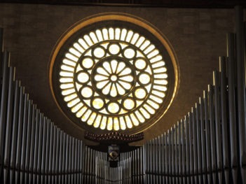
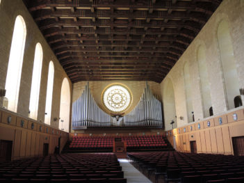
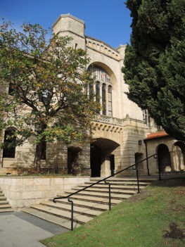
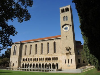
The University of Western Australia’s Hackett Memorial Buildings have been selected by the jury as an outstanding example of ‘enduring’ buildings. Winthrop Hall, the Clock Tower and Great Gateway (1932) play an important traditional role as the ceremonial hall and symbol of the University – and have done so, for the last 88 years.
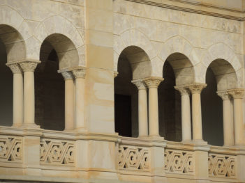
The concrete and Donnybrook stone buildings were designed by Melbourne architects Rodney Alsop and Conrad Sayce after an international competition. The Hackett Memorial Buildings as designed, were awarded the Royal Institute of British Architects Bronze Medal in 1931, the first for a building in our State. This was also the first building in Western Australia, constructed by A T Brine and Sons, to feature off-form concrete. The original intent, to cover the concrete with stone, was amended as part of cost reduction measures required at the time.
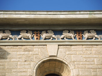
The Hackett Memorial Buildings, referencing the Renaissance Romanesque style of Southern Italy and Sicily, are named in honour of the University of Western Australia’s first chancellor and generous benefactor, Sir John Winthrop Hackett.
Winthrop Hall was originally designed, and is still in use for; graduation ceremonies, performances, concerts and official University functions.
