Wangaratta District Specialist School: Sibling Architecture
Words by Amelia Borg
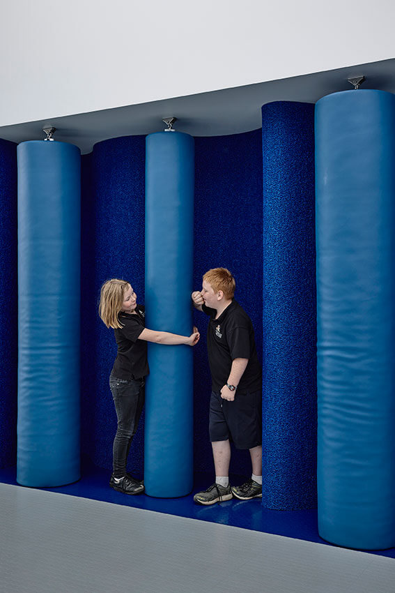
In recent years, the Victorian school building boom has seen a profusion of impressive architectural outcomes. While these projects are sensitive to site, address the functional brief, and express the identity of their community, not all specifically address the accessibility or sensory needs of their users. The recent addition to the Wangaratta District Specialist School’s ageing buildings from the 1980s and mostly relocatable classrooms, provided an opportunity for Sibling Architecture to design for wellbeing through creating tactile and tranquil spaces in a new learning hub.
This addition delivers the first new building of a long-term masterplan to transform and upgrade the existing, underutilised campus. The school caters to students with diverse needs and with wide ranging intellectual and physical disabilities ageing from 5-18. The facility occupies the former site of a neighbouring school with a key aspect of the project involving the realignment of boundaries between these campuses. This adjustment became necessary due to the heightened demand and rising enrolment numbers. The new building offers a range of learning environments including six general purpose classrooms, allied health support areas, facilities to strengthen domestic skills, collaborative staff workspaces, sensory spaces, and supported amenities.
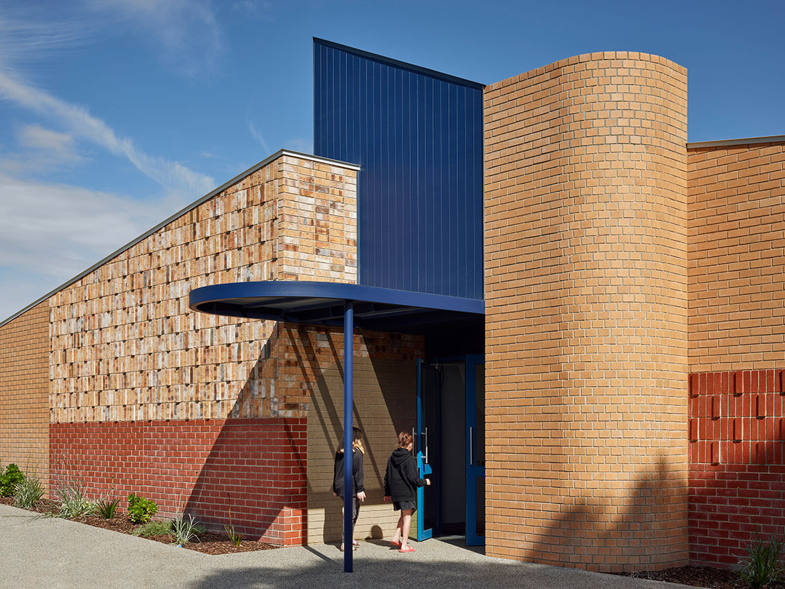
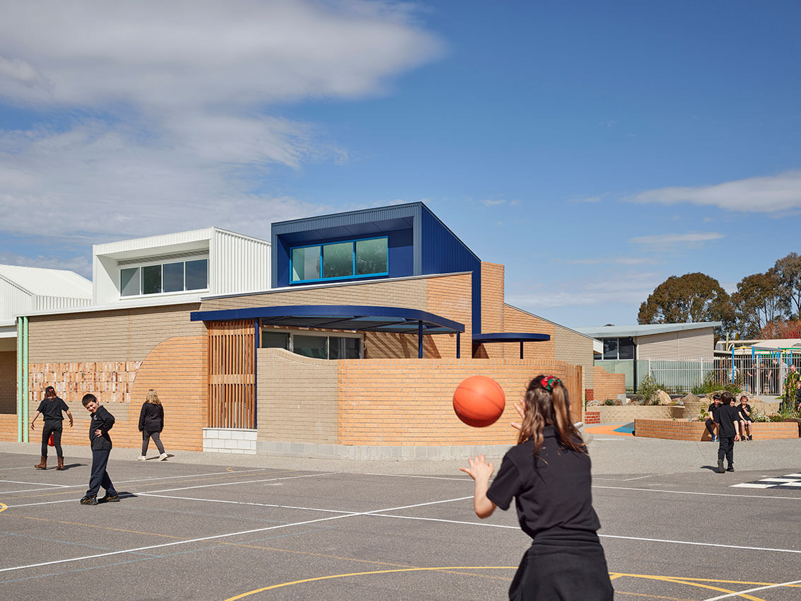
Due to budgetary constraints and the limited area allotted by the Victorian School Building Authority (VSBA), the building is conceived as two mirrored modules linked through a warm sensory breakout space. Each module’s roof is split to allow natural light into the deep interior spaces through southern clerestory windows, and a series of large pop-ups provide northern light and views to the sky from special areas within the centre of the building. The external form is broken down to allow for the building to read almost as a collection or village of buildings to assist with legibility. Further, distinct and inviting entrances assist with wayfinding within the precinct.
The siting of the building required a complex mitigation of existing site levels to ensure graded wheelchair entry on all sides. The adjoining landscape plays an important role in the mitigation of levels, providing integrated accessibility in the context.
The design response is heavily guided by providing spaces that cater to, and support the needs of, the students. This was grounded in a design process that allowed multiple voices to be incorporated into the brief. An extensive consultation process with staff, allied health professionals (including occupational and speech therapists, physiotherapists, social workers) and community informed the design, and helped in determining what kind of activities would take place in the building.
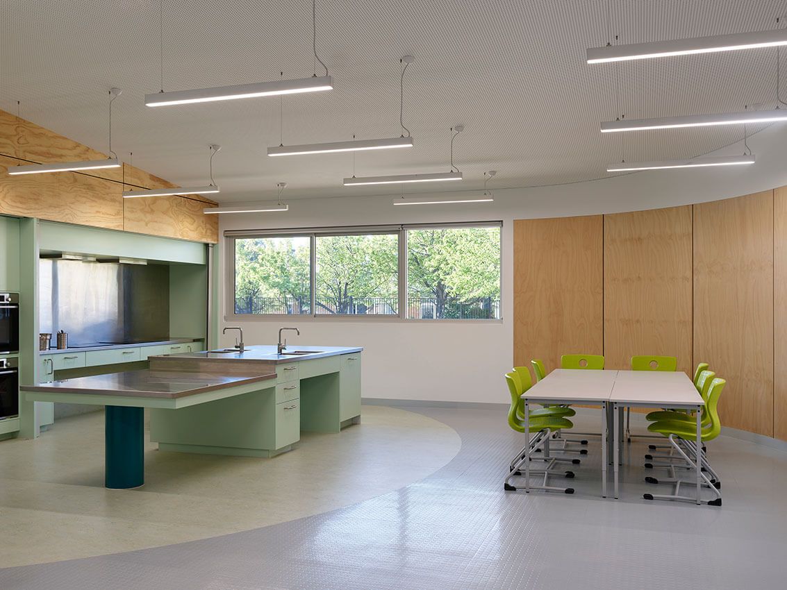
The briefing focus strengthened the design response, such as identifying the importance of the school kitchen. A central kitchen space in the heart of the building assists students with cooking lessons and acts as a social space in the building. A significant part of the curriculum is centred around growing skills that encourage independent living. Flexible spaces that teach skills like personal grooming are provided to accommodate this.
Focused learning environments with minimal distraction were also integral to the school community. Views from within the classroom out to the corridor and out to the surrounding yard are tightly curated and can be closed off to create minimal distraction. In tandem, classrooms have multiple exits always visible to reduce distress alongside an adjoining outdoor breakout space, which provides an immediate relief for students requiring self-regulation or wanting to remove themselves from the larger group setting. The fences enclosing breakout spaces throughout the rest of the school campus are typically high steel-palisade bars, creating a layered, pronounced language of security and enclosure. For this building, there is a deliberate choice to move away from this dominant form by introducing a warm timber tone, with a playful extent.
Colour is used throughout the design to create identity and familiarity for students. Each classroom within the building is assigned a unique identity that is visible from the main corridor which enables rooms to be easily distinguished. Doors and windows have robust timber reveals framing them to help visually separate openings from the walls they sit within. Close attention was also given to the services design of the building to ensure the mechanical design was not visually or acoustically disruptive. Ceiling-mounted hoist systems allow students with severe mobility issues to be carried from the learning spaces into the amenities by way of a discreet corridor to allow a dignified approach off the main thoroughfare of the building.
Through a lengthy engagement process, the diverse sensory needs of students came to light, in particular, that some students become over-stimulated very quickly, and conversely some students crave more sensory stimulation. In response, a sensory map for the building was created, to overlay opportunities to engage with each of the senses across the spaces.
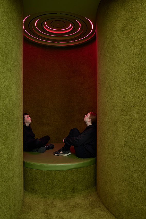
Taking the place of what is typically provided through some plug-in devices, a variety of sensory spaces are provided, including smaller intimate nooks, dedicated rooms, and an outdoor sensory garden. Sensory design devices are employed including colour, tactility, and atmosphere. Such devices are an integral part of the pedagogical experience. These are manifested in several sensory-considered spaces, spaces for quiet, spaces for wonder and spaces for respite.
Visual stimulation is provided through custom light features and ceilings: there are nooks for listening to sounds, and apparatuses that engage with the vestibular system. The material choices echo this interest through a selection of tactile finishes both inside and out. Internally, soft spaces are lined with carpet, and textured rubber and timber, while externally a patchwork of different brick textures are laid to create a tactile and undulating surface.
The project acknowledges, celebrates, and embraces the different lived experiences in sensory perception of the students at the school. It was important for the design team to challenge the cold and clinical aesthetic that is often associated with spaces that provide care; in response, the building provides a warm and inviting atmosphere that is supportive but also encourages the student cohort to physically engage with the built fabric.
Amelia Borg is an internationally experienced architect. She brings a deep knowledge of complex design and construction to Sibling overseeing key civic projects for government and cultural organisations.
Published online:
11 Sep 2024
Source:
Architect Victoria
Radical inclusion + Melbourne’s next identity
Edition 2 / 2024
Forthcoming

