Arts Centre Melbourne | Location: Wurundjeri and Boon Wurrung Country | Designers: Roy Grounds and John Truscott | Photographer: Tope Adesina
Sensory design is an emerging area within architecture, but can we make a case for its longer term existence within the context of theatre in the 40th anniversary year of Roy Grounds’ Theatres Building in Melbourne? The official opening of the Theatres Building was in 1984, three years after the death of Grounds. His original design was never fully realised, as the commission for the interior fit out was awarded to John Truscott in 1980. Truscott was a costume and set designer who learned his trade through years spent in a Melbourne theatre workshop.
"The official opening of the Theatres Building was in 1984, three years after the death of Grounds."
Given the relatively short duration and dynamic nature of a live performance, theatre production designs must almost immediately resonate with audiences. Using both the tactics of theatre and the textural qualities of material, Truscott makes the vast building interiors an immediate and visceral experience through a complex visual, aural and haptic environment. Being in the Theatres Building is thrilling. Beyond an early example of sensory design, the Theatres Building has become a local icon over its 40-year life. We can however also look under the symbolic 162-meter-tall spire to find the relationship between the senses and memory, the latter which is manifest through the collective experiences of patrons and visitors.
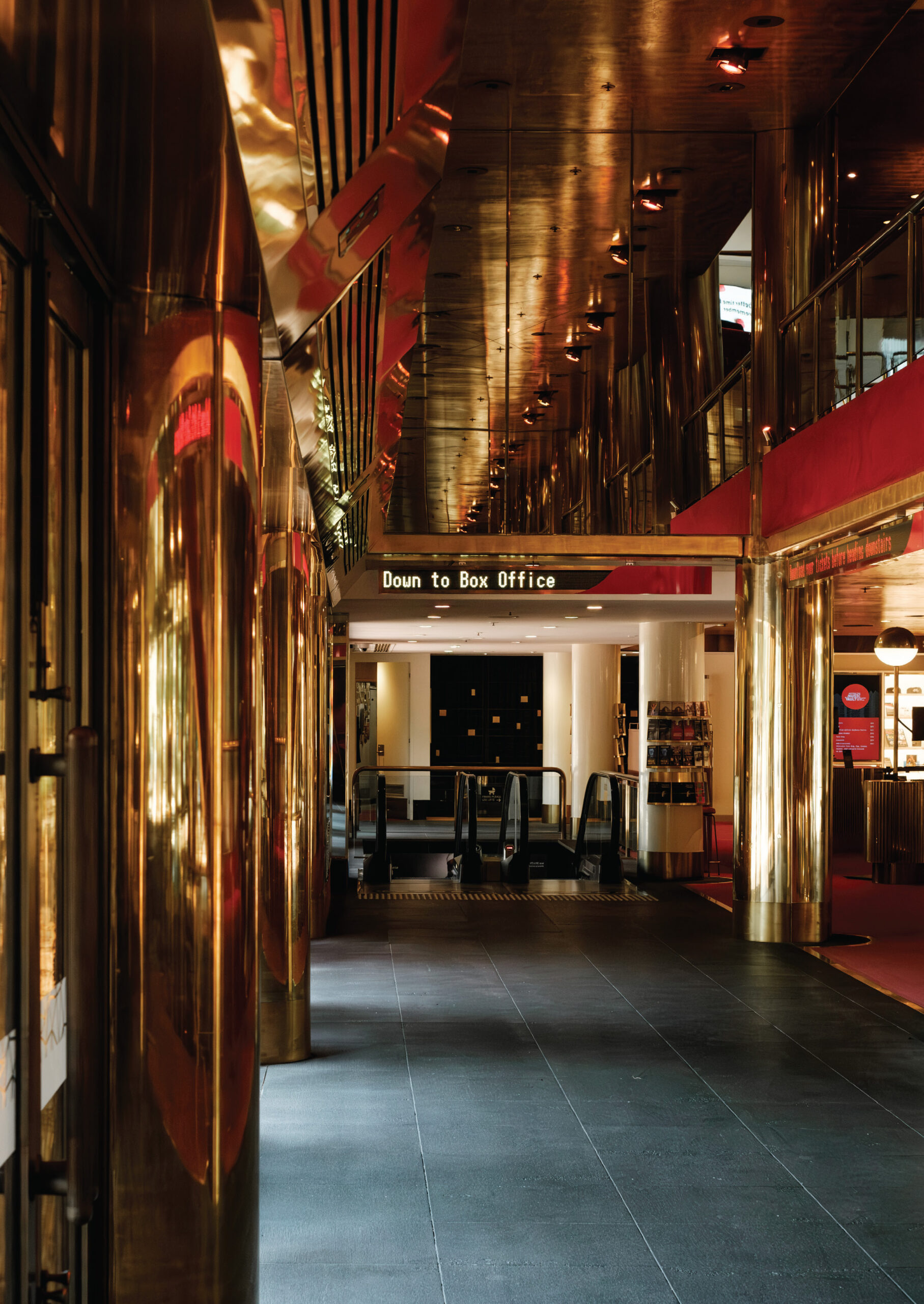
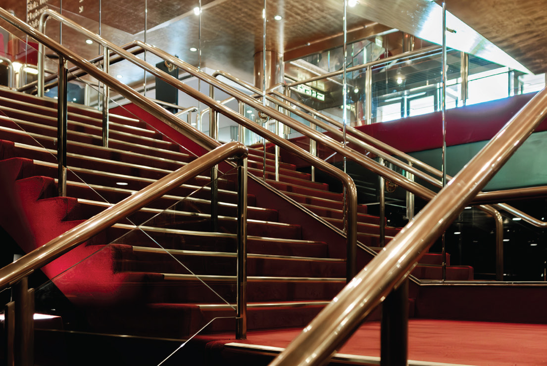
Stepping into the Theatres Building is stepping into another world. Daylight recedes quickly as one descends the escalator, and the night becomes immediate through a shiny black and chrome interior, the sparkle of reflected light on the surfaces reminiscent of a starry sky. Black soon becomes red and sparkling stars reappear as bursting bubbles in flute glasses. All glitz and glamour. When almost everything has fizzled out, any last remaining sounds are dampened by a vast expanse of velour and carpet, you wouldn’t hear a pin drop. The curtain rises. In order to achieve this outcome perception is deliberately warped and played with. Reflection and other tricks of perceptions are rife.
"Stepping into the Theatres Building is stepping into another world."
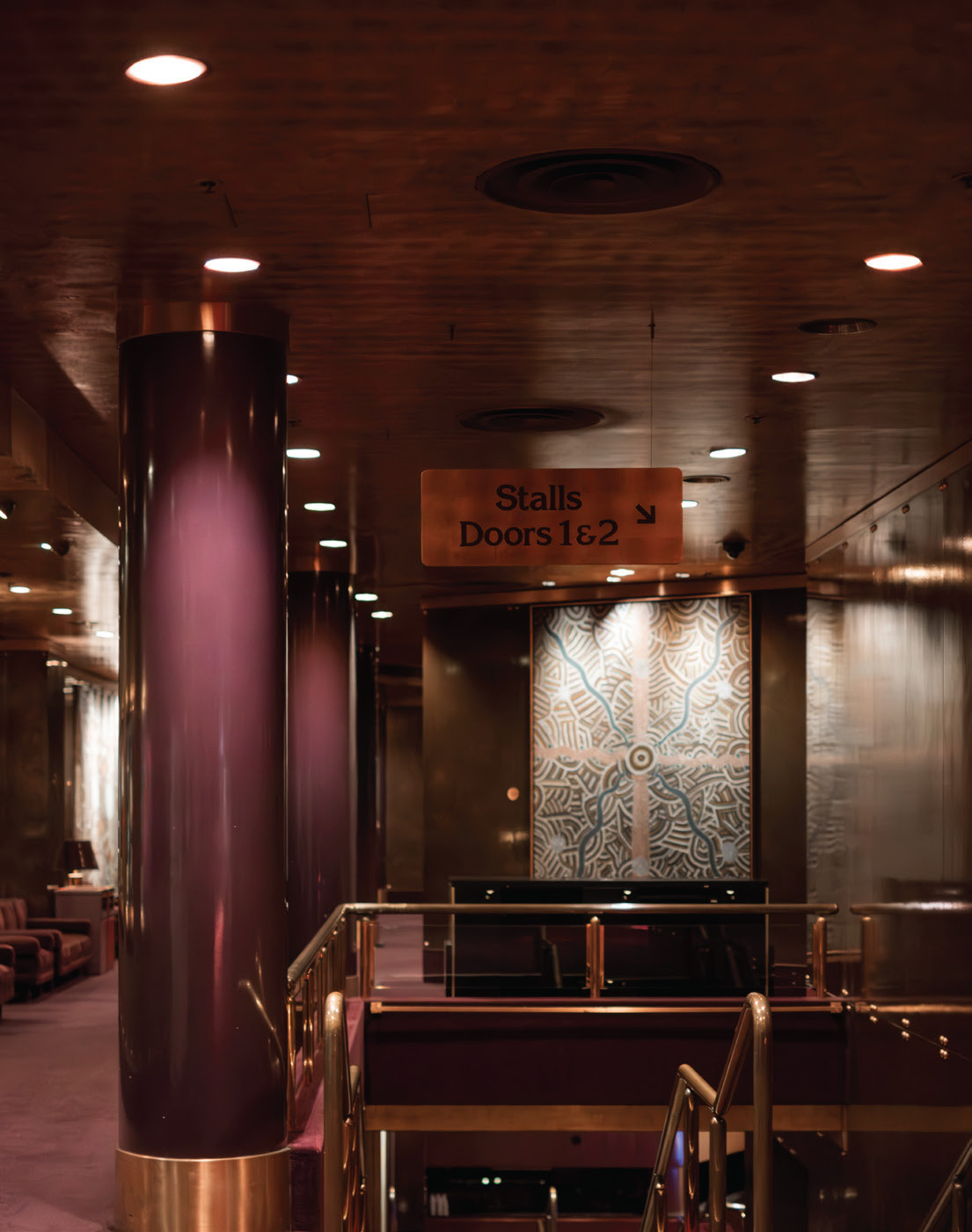
The medium here is affected, manipulated through tactics of theatre. This kind of project is best understood through first hand experience rather than studied on paper. It is well documented that Truscott worked tirelessly, inventing detail after detail, using the tools and techniques of theatre to manifest a labyrinth of subterranean spaces for the venue. The use of paint to imply both space and material is more akin to frescos of past centuries than a late-20th century theatre. Columns that appear to be marble are in fact paint, as are foyer walls. Inside the State Theatre auditorium, a deep red stain suggests Jarrah. Splendour by illusion was Truscott’s motto. The proportions typical to set design are also seen in Truscott’s bespoke furniture designs. The velour sofas are low, and seem somewhat miniaturised alongside oversized lampshades. Truscott warps and distorts material and surface, exaggerates proportion to cast doubt on our normal and accepted perceptions and causing the senses to re-calibrate to the order of the interiors. This makes the built environment immediate and memorable in this moment when perception adjusts to the new order.
"Truscott warps and distorts material and surface, exaggerates proportion to cast doubt on our normal and accepted perceptions and causing the senses to re-calibrate to the order of the interiors."
The interior schemes of both the Theatres Building and Hamer Hall are based on a geological theme, inspired by an exposed basalt rock face Truscott saw while driving along Melbourne’s Eastern freeway. The palette is defined by various minerals (metallics) and precious stones (colours) which each characterise and delineate a unique venue within the building. For example, the State Theatre foyers and auditorium have a combination of brass and red. While the reference is direct, the application is more nuanced than just representation, resemblance or abstraction. Truscott translates his own experience into material with surprise and delight is taken from the freeway to the theatre.
The formal characteristics of theatre have a long lineage. One example of this is the use of the colour red in theatre and opera design, which originated in 18th century Italy. The colour red has a learned meaning and symbolism in cultural and historical consciousness. Within the traditions of architecture, there are practices and theories which enshrine meaning through rhetoric and symbolism, others who either reject or embrace history some appropriate or re-contextualise, and others privilege formality above all else. Truscott’s theatrically based practice doesn’t fit easily in architectural traditions. Effect and illusion are employed above all else in service of experience, red has no prescribed meaning.
The interiors of this building were designed under an unusual set of circumstances, whereby the tactics and skills of set design were writ large on a complex performing arts venue. This building does something that the tradition of architecture is perhaps afraid of, which is to emphatically pursue effect and trickery at the expense of material clarity. While a 40-year-old design can’t adequately account for an emerging awareness around diverse sensory needs, it does give an example of how design can profoundly affect the senses. It makes a case for experience as a universal base from which we can collectively hold an idea of place in our memories.
"This building does something that the tradition of architecture is perhaps afraid of, which is to emphatically pursue effect and trickery at the expense of material clarity."
Leona Dusanovic RAIA is an architect and senior associate at NH Architecture, where she has contributed to the design of the interior spaces on the Reimagining Arts Centre Melbourne project. Leona is also a design studio leader at RMIT University in Melbourne.
Published online: 8 Apr 2025
Source: Architect Victoria Sensory Design in Architecture + Perceptions of an Architect Edition 1 / 2025
Many of us will have memories of bustling school corridors: throngs of students pushing their way through elbows and school bags under bright white lights. ...
This article explores two KTA projects: the Melbourne Holocaust Museum, using humane design to address sensitive content, and Bundanon, where climatic discomfort connects visitors to ...
The University of Melbourne’s New Student Precinct (NSP) is not an unfamiliar place for Melburnians, particularly, among architects. It holds ground as a dynamic towering ...
This website uses cookies to improve your experience. We'll assume you're ok with this, but you can opt-out if you wish. Cookie settingsACCEPT
Privacy & Cookies Policy
Privacy Overview
This website uses cookies to improve your experience while you navigate through the website. Out of these cookies, the cookies that are categorized as necessary are stored on your browser as they are as essential for the working of basic functionalities of the website. We also use third-party cookies that help us analyze and understand how you use this website. These cookies will be stored in your browser only with your consent. You also have the option to opt-out of these cookies. But opting out of some of these cookies may have an effect on your browsing experience.
Necessary cookies are absolutely essential for the website to function properly. This category only includes cookies that ensures basic functionalities and security features of the website. These cookies do not store any personal information.