This year’s Venice Architecture Biennale is titled “The Laboratory of the Future” and, as set out by Biennale curator Lesley Lokko, “architects have a unique opportunity to put forward ambitious and creative ideas that help us imagine a more equitable and optimistic future in common”. Overwhelmingly central to many exhibitions we saw was the intent to elevate First Nations and marginalised people’s voices. It was refreshing, affirming and strong.
At the Giardini, we visited the Australian, Canadian and Nordic (Finland, Norway and Sweden) pavilions, each with exhibitions directly addressing in different ways architecture and its relationship with colonial histories and First Nations Peoples.
We – Bradley Kerr (Quandamooka) and Ellen Buttrose – sat down together to discuss what we had seen. We encourage you to read this conversation in full, as these conversations are always nuanced, delicate, and explore themes in depths that cannot be covered in sound bites. Indeed this is at the heart of the criticism of the Australia’s exhibition. Also read the full, unedited transcript here.
We’ve included four themes below we that have unintentionally framed and are central to our yarn:
- Knowledge systems and extraction
- context and grounding
- object and objectification
- voice.
31 May 2023 – tiny bar in Venice, sunny, blue skies, cool breeze and four spritzes.
Bradley Kerr: What do you think you were expecting to see when you went to the (Australian) exhibition?
Ellen Buttrose: I didn’t really have any background knowledge of what it was, or what the exhibition was about. I initially thought it was about New Zealand, I thought maybe Australia and New Zealand had combined forces and were exhibiting something about Queenstown in New Zealand, I hadn’t realised it was about Australia and First Nations histories and extractive resources.
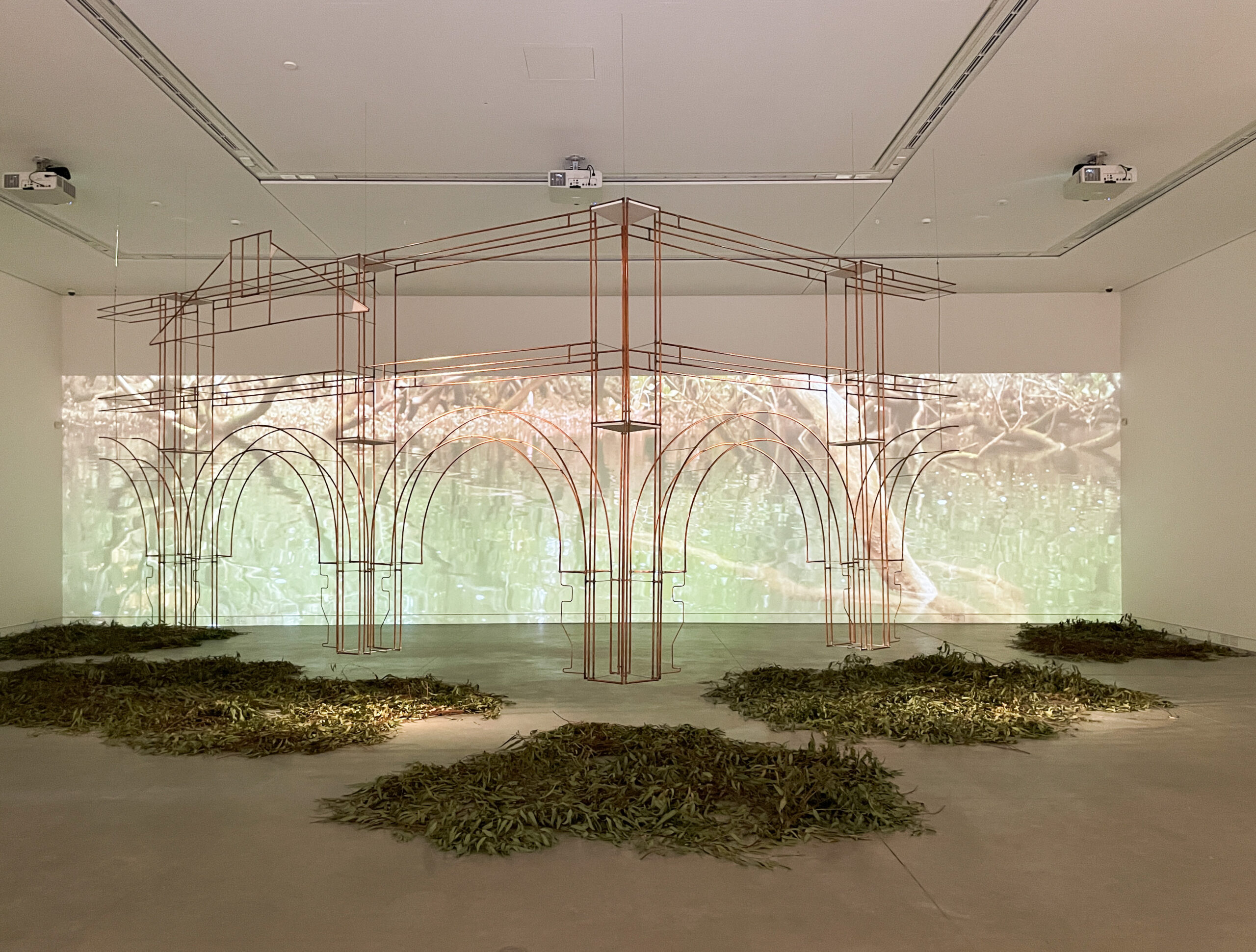
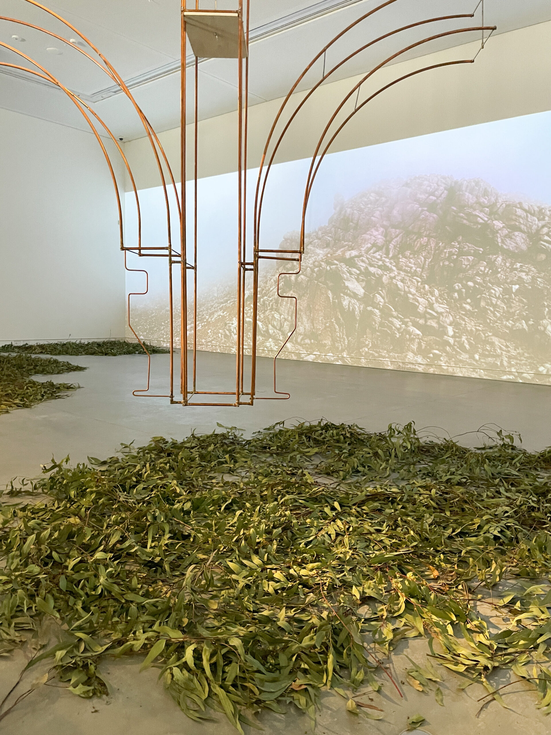
BK: I didn’t know what I was expecting. When I first saw – [an outline of] a colonial building float above eucalypt leaves, it felt a little bit confronting, this big dominant thing that feels familiar, elevated above something that is inherently associated with Australia. It is uniquely rich the way, the smell and the feel of a gum, and the way that it feels under your feet. With that whole experience, I think I was a little bit apprehensive at first.
After reading [the description on the wall], it didn’t help with my understanding. I was still really confused. I don’t think it was until we heard an explanation what it all was doing that it helped me understand more.
EB: Yes the explanation was helpful in piecing it together. I agree it wasn’t immediately obvious. When I read the first blurb as you walk in the door. I thought, Oh, this is going to be interesting. Cool themes to explore and talk about.
I enjoyed the photography and the background. The copper structure is pretty dominant.
BK: And it’s quite reflective and I know the exhibitors have been playing with the lighting. The day that we were there at least, both lights were focused on the belvedere. If the themes are about extraction, why are we not highlighting the material on the ground and not the object floating above it? I thought it felt a bit confused.
EB: In what it was trying to convey.
BK: I also thought the smells just weren’t there.
EB: If you walked into that space and it was filled with the smell of eucalypt, or the smell of the bush, it would have been completely different.
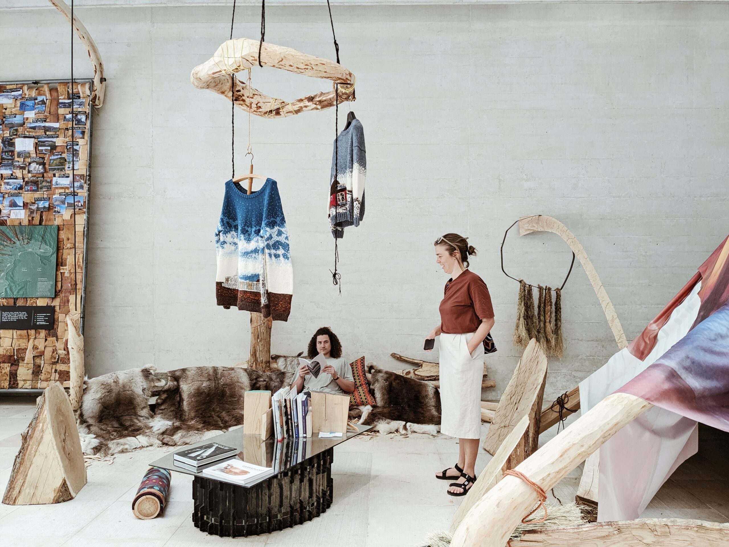
BK: The smell would hit you immediately, it would smell of home. If you contrast that with the Nordic exhibition, Girjegumpi – The Sámi Architecture Library, as soon as you walk in, you are hit with a very distinct smell in a very positive way.
It almost would have been cool if you could walk on the gum leaves and feel them, I didn’t understand why we couldn’t walk on them? They have such a distinct crunch, and I think that would have contributed to the experience.
EB: Or if the whole floor was filled with them.
BK: I was really intrigued and excited to pull sheets off the wall. It was like an invitation to share knowledge.
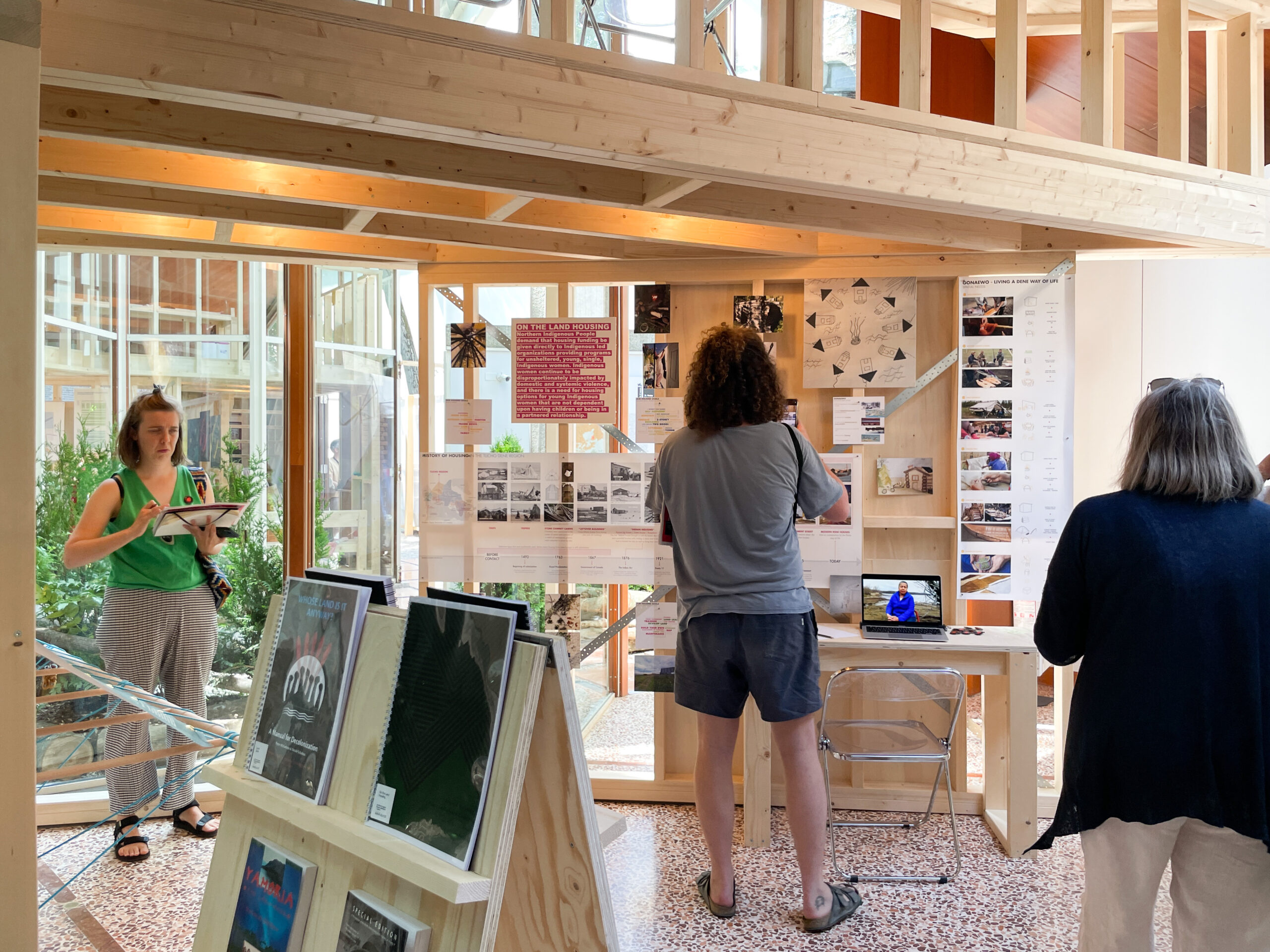
But then, when we visited the Canadian and the Sámi exhibitions, these places are just inviting you to sit, stay, be there and be present. There were hundreds of books, as much context as they could give you, as many reference projects as they could give you. It was very clear and direct, and at the same time, free-form in the way that you want to experience and read it all.
EB: Yes, I thought that was super strong in the Canadian and Nordic pavilions. There was dialogue and an invitation to sit and engage with it in a completely different way. Just sitting at the front in the little courtyard [in the Canadian pavilion], before you move in it was like an acknowledgment [of Country].
And the fact that the information was layered and that there were people actively researching (in the space). That the information that was there was gathered by the people it was wanting to serve, it felt very collaborative.
I think both the Sámi and the Canada exhibitions’ authorship felt a bit different, it felt very dispersed in that there were lots of authors and lots of contributors and that no-one really was the sole holder of knowledge. And I guess you probably would get that from the Australia exhibition too but in a different way. The Canada and Sámi exhibitions almost felt more open source and that you were invited to engage in a conversation a bit more. And maybe that’s what the Australia Pavilion was intending to do with the pamphlets.
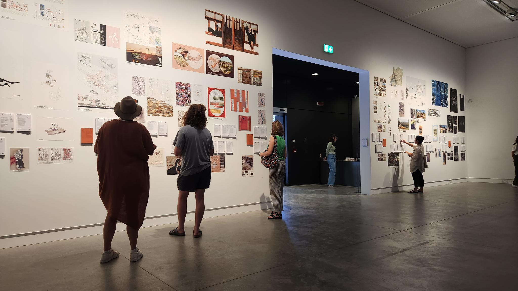
BK: I was pretty excited to go and see the Biennale, I have never been before, never been to the Giardini, and never seen the Denton Corker Marshall-designed pavilion. And then we get there and there is a huge wall of projects that includes work with Indigenous peoples and knowledge. The interaction was quite fun, I think that was a good idea. I think making your own book is pretty fun.
The Biennale has a really strong theme of giving a platform to Indigenous voices and marginalised voices globally. At every exhibition we went to, there was a really strong generosity and a sense of material identity.
The Australia Pavilion was so manicured and so precise. It felt like it was on display rather than interactive. So many things we saw were interactive, you could sit on it, you could move it around, you could put your feet in the ground and tickle your toes.
The stories in the headphones were really great. I think that’s one of the most successful things, because it gave distinct space and voice to the Indigenous people.
EB: The Sámi exhibition, felt like an invitation into someone’s room.
BK: And the generosity and the knowledge sharing, and also in the identification that Australia has an Indigenous history. In both the Sámi and Canadian exhibitions, there were Indigenous Australian books and Indigenous Australian voices, and there was a collective understanding and appreciation. Whereas, Australia was hyper-focused on Australia.
EB: And hyper-specific, in referencing one building and one particular place, even though it was intended to be anywhere. I don’t know if that was clear.
I think in the Nordic and Canadian exhibitions, in showcasing what is happening and what has been happening, there were a lot of texts, books and a lot of information. And in the Australia exhibition there was too; it only seemed to be referencing what was happening now and not necessarily the stuff that has gone before, and I think that, in the space that we work in, there is often a lot of reinventing what happens in that space, rather than building on what has happened before, I don’t think that was communicated: that there is a linage of this type of dialogue.
BK: It just feels like there is a lot of context missing. Like how the Brazilian pavilion was focused on de-colonisation, as did so many other countries’ exhibitions. Brazil introduced the context at the very start in a non-abstract way, and a very easy-to-understand way. They were quite clear on who the audience is.
I feel there is three audiences: First Nations Peoples, architects and tourists.
EB: And who do you think the audiences were?
BK: I can’t tell for the Australia Pavilion….
EB: I would say it’s architects, I wouldn’t say it’s First Nations Peoples and maybe does include everyone else. Whereas the Sámi and Canadian exhibitions ticked all three in my opinion. What do you think?
BK: Yeah I would agree. The Australia Pavilion, now I think about it more, if the whole idea is of extraction and harmful extractive processes, then the notion of a wall, and taking things off of the wall, feels like it is in contrast with the point of the exhibition, like one single paragraph worth with one little theme. It’s not a whole collection of knowledge, it’s an abstract.
I think maybe because the space feels like it was designed to move through quickly rather than a space to spend time in, which is in itself a contrast to the ideas of deep listening and cited in articles on the wall.
EB: Yeah and to occupy.
BK: It felt much more like art in a museum.
EB: Which – I don’t know how you feel about this – but I think, that’s a dangerous space for those conversations to sit in, because it turns it into an object and an objectification rather than something that is engaged with and discussed and active and ongoing.
Whereas I think you got that more from the Canada and Sámi exhibitions, it exists within a in a whole context.
One thing I was also missing from the Australian Pavilion, which you spoke beautifully about before, is the idea of terra nullius. The representation of Country in Queenstown was very one dimensional perhaps, and I think there is a disservice in not representing Country in a more multidimensional way.
BK: There was a full spare white wall. A big map of First Nations Australia would have made a big difference, with this work is from this place (or Country). They talked a lot about extraction, but where was the history of that extraction? What species of eucalypt was used and why? If Queenstown is representative of colonisation then where is a world map of the Queenstowns, and all of the First Nations Peoples that were affected. Where is the context to this thing?
I feel like the strongest idea was that colonised countries have a Queenstown, super obvious at first, but it’s not just Queenstown in Tasmania, its actually everywhere you go.
EB: It’s like their introduction was missing. Whenever we start a project and whenever we’re talking with Traditional Owners and First Nations Peoples, and the conversations will often start with where are you from?
BK: Yes, absolutely.
EB: And none of that was in it.
BK: Yes, it always starts like that. Whose your mob? How are you going? Who do you know?
EB: Where do you fit in the web?
BK: In Melbourne the Wurundjeri Woi-wurrung word for welcome is Wominjeka. It means like come with purpose. But the way I’ve heard people say it is: Welcome, what are your intentions for being here, what are you doing here? Why are you here?
It’s such an appropriate way of thinking about moving onto someone else’s Country. What are we doing and why? What are our intentions? And having that context at the start would have made a world of difference.
They could have positioned something in the pavilion that was the welcome or the why you are here, [outlining] the contextual issues in Australia and what the country is going through, what we are facing at the moment and how it relates to architecture. We are about to go through a tumultuous time for First Nations Peoples given the Voice to Parliament referendum – I don’t know how this or the Uluru Statement wasn’t included.
EB: I think that would have really changed it, and grounded the project. I think you can tell, to me it felt academic.
BK: The thing that strikes me most about the Australian exhibition, is that how when we went to the Arsenale, the introduction was all about giving voice to emerging and marginalised Indigenous and First Nations practices and communities. We have those groups and communities in Australia. We have First Nations practitioners and First Nations artists, who do specific place-based work and from what I understand of Australia, there is only one Indigenous contributor (on the curatorial team).
The whole Biennale and everything we have been thinking and learning, is from the perspective of, and voice of First Nations Peoples, whereas the Australian exhibition wasn’t, and it felt like that.
EB: Absolutely. I think you’ve hit the nail on the head.
Read more of the 2023 Dulux Study Tour Blog
Dulux Study Tour participants are invited to share their experiences in blog and editorial content as part of the program. Opinions expressed are those of the authors and not necessarily the Australian Institute of Architects. The Institute encourages a space for conversation and continued dialogue so there can be meaningful change and progress across the built environment and our wider community.
2024 Dulux Study Tour – Shortlist Announced
30 emerging architects have been shortlisted for the 2024 Institute’s Dulux Study Tour. Five individuals will be selected for their contributions to architectural practice, education, design excellence and community involvement.

101 Lessons We Learned on the 2023 Dulux Study Tour
It’s been an incredible ten days, filled with visits to more than 50 buildings and meeting with approximately 20 architects across several cities: Helsinki, Lisbon, Vals/Zurich, and Venice. On our
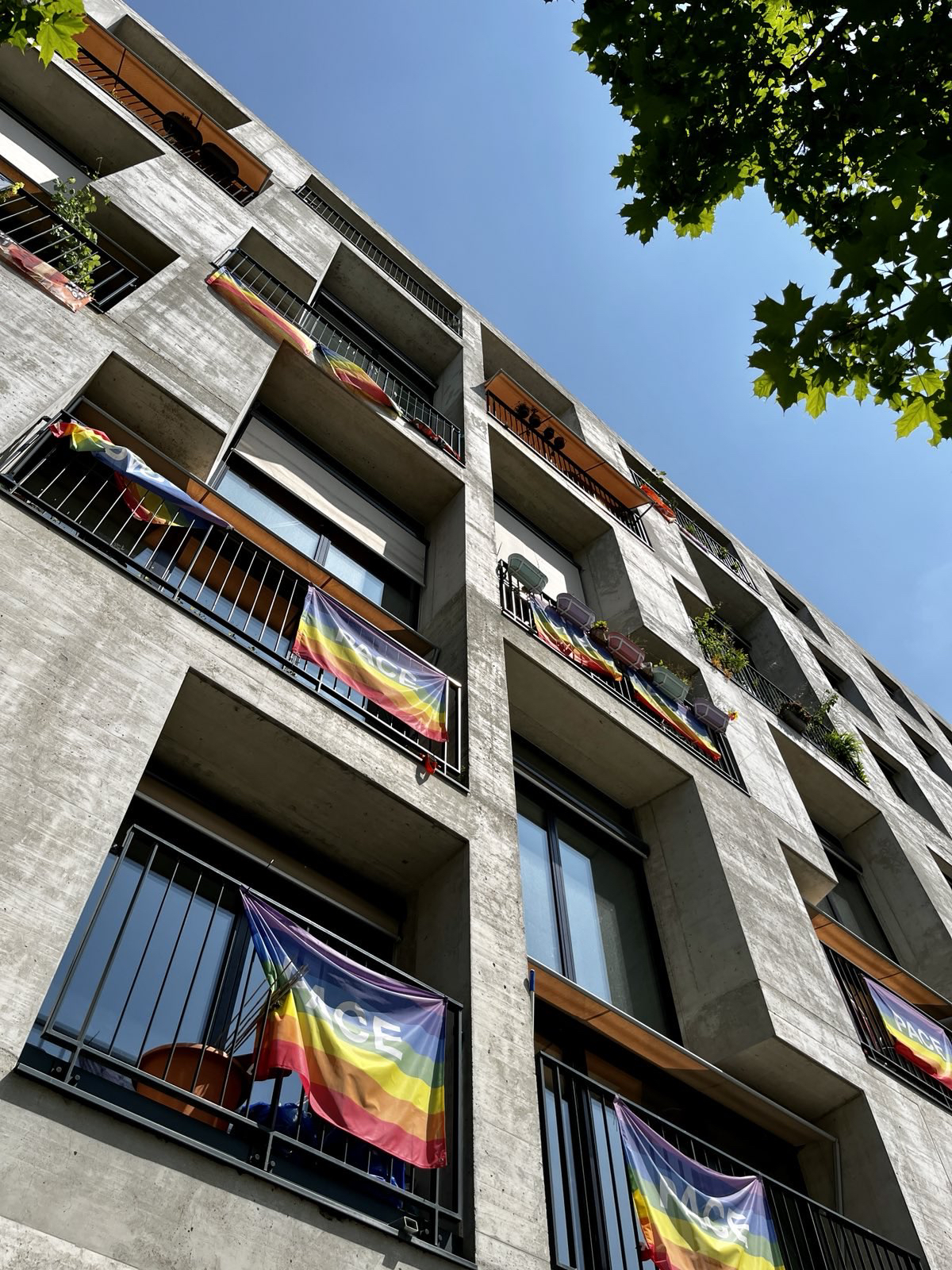
2023 Dulux Study Tour, day 8 – Zurich: A full cup
It’s midnight in Vals – a quintessential Swiss mountain village – and you’re floating in a warm pool, looking up at the night sky, in a silent night-time bathing experience.
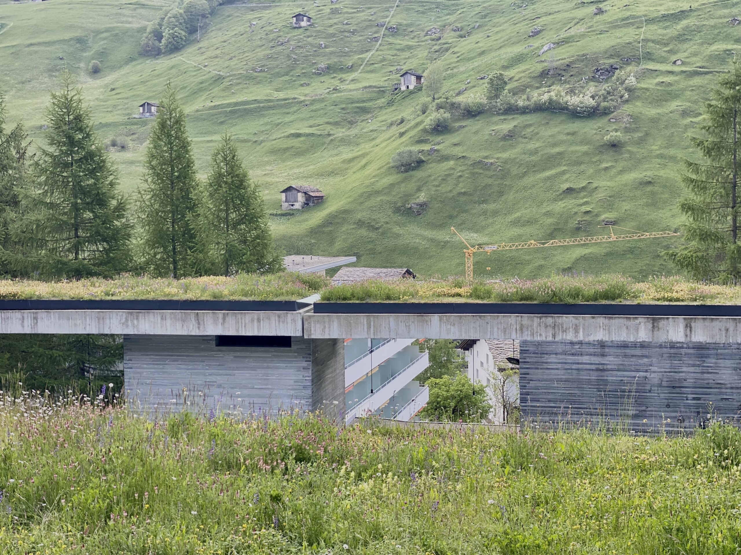
2023 Dulux Study Tour, Day 7 – Vals: Venerating Peter Zumthor
I remember feeling vividly – Holy shit, I won a place on this tour. I don’t know that I’ve earned this, but I’m going to embrace it. The Institute invited
2023 Dulux Study Tour, Day 6: Lisbon’s ‘foreign object’
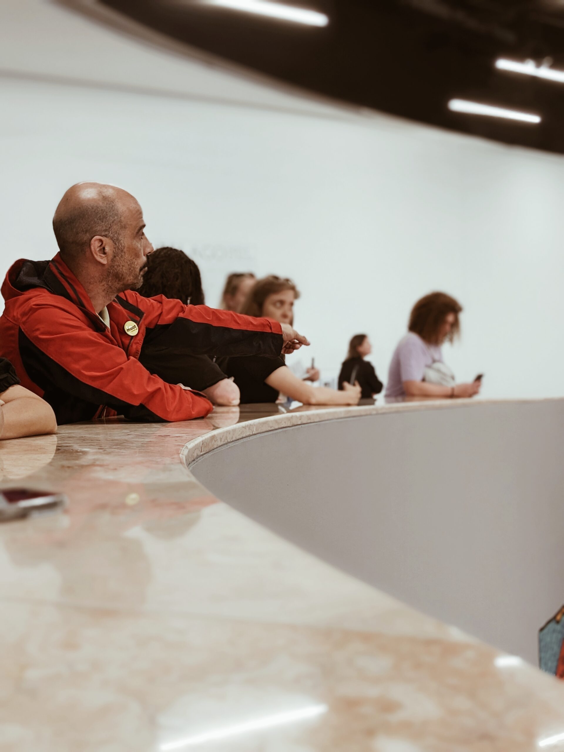
I was pretty sure I won’t like the Museum of Art, Architecture and Technology (MAAT) by Amanda Levete Architects, but am trying to be open minded. A big conceptual gesture
2023 Dulux Study Tour, Day 5 – Lisbon: Beyond the fresco
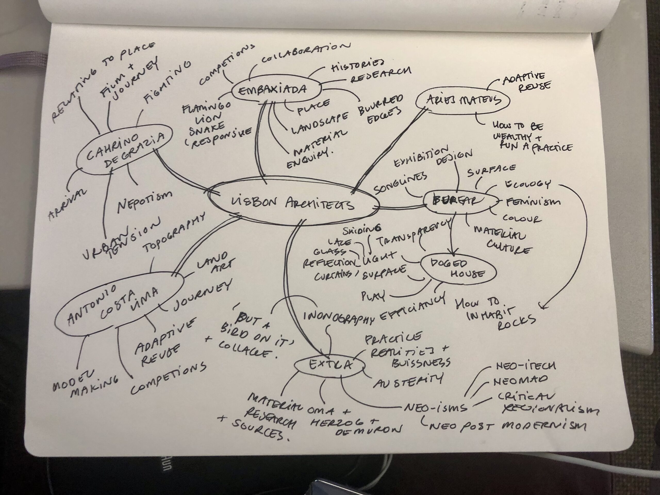
I’ve just spent the last hour and three watery coffees drawing out mind map in an attempt to untangle the many threads of thought covered yesterday. We ping-ponged across Lisbon
2023 Dulux Study Tour, day 4 – Lisbon: Urban Alchemy
Lisbon is a living museum – a city that reveals a rich tapestry of historical and political aspirations through its architecture. Layers of time coexist in the stratum of the
2023 Dulux Study Tour, day 3 – Helsinki: “Between humanism and materialism”
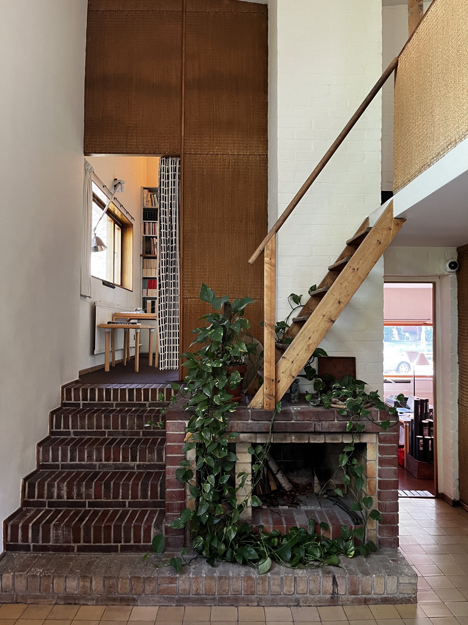
I’ve always thought that people who cried at architecture took their job way too seriously… but I must confess I had a little moment standing in the Aalto House today.
2023 Dulux Study Tour, day 2 – Helsinki: ’Sing like a choir’
Day 1, we situated ourselves in the city of Helsinki. We passed through various shades of grape, an unconscious obsession of the city, all the textures imaginable and 100 different
2023 Dulux Study Tour, day 1 – Helsinki: Architecture in Helsinki: Contact High
Finish your emails, set your out of office. Quickly flick off a fee proposal and remember to get back to Jamie about that competition entry you can’t submit. Apologise to
