Architect at Home: Nick Harding
What does the concept of home mean to you?
A house is a place, home is an experience – knowing I can escape the world outside when I need a break; watching my kids Harry and Viv do their best to tear the place apart; sharing moments big and small with family and friends; building memories over time, through routine and tradition.
How would you describe your home?
Calm. This is the feeling we wanted to evoke, and it is the word that comes up again and again when people visit our home. It’s also ideal in its proximity to both nature and culture.
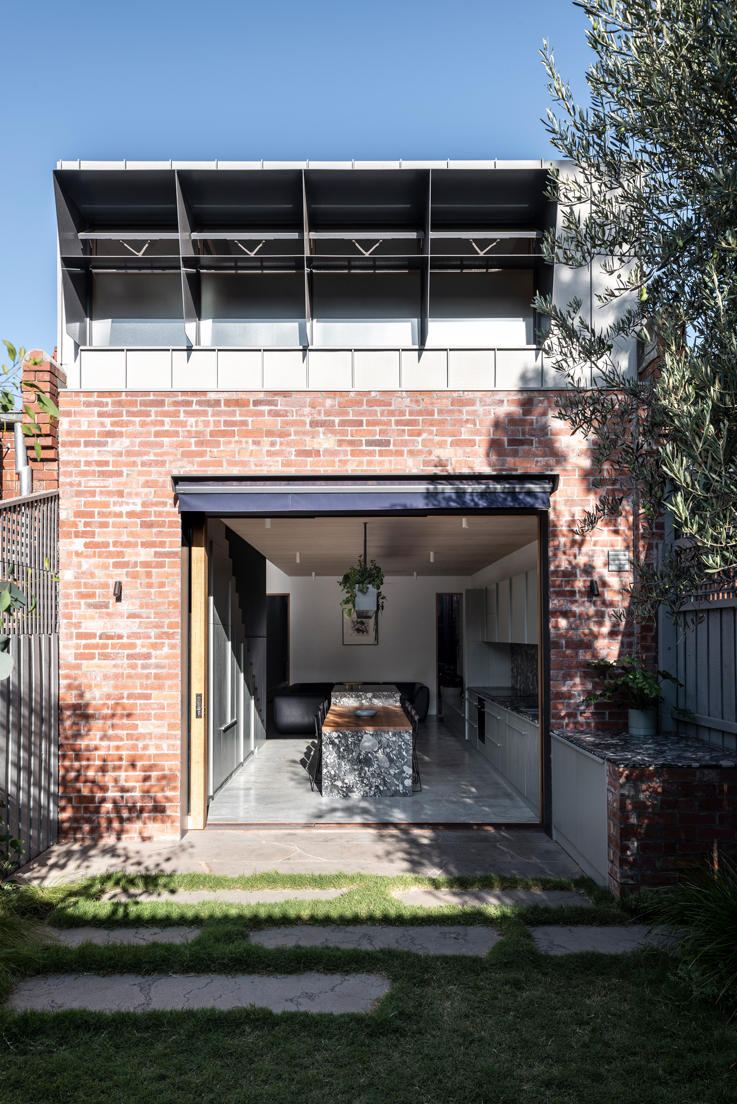
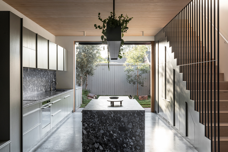
Architecturally, we wanted to test whether a 150-metre-square house with a 5 x 8-metre rear yard could become our spacious family home. On a relatively modest footprint, the key gesture was to borrow space from both the courtyard itself and the nearby Yarra River and Abbotsford Convent precinct. The coalescence of kitchen, dining and courtyard into one outdoor room defined the design process and, ultimately, lived experience in the home.
How do you choose items to fill your space with?
For the most part it has been a very organic process.
Right now, Harry and Vivi’s lives dominate. The front two rooms are theirs – one shared bedroom, one playroom – so ideally the worst of the chaos is in that section! But of course, their belongings spill down the hallway and beyond.
I’m fortunate to have personal connections with some talented local photographers, and we have a growing collection of beautiful shots by friends including Dan Hocking, Kristoffer Paulsen and Kate Ballis. In a small inner-city home, a framed photo is like a window to the imagination.
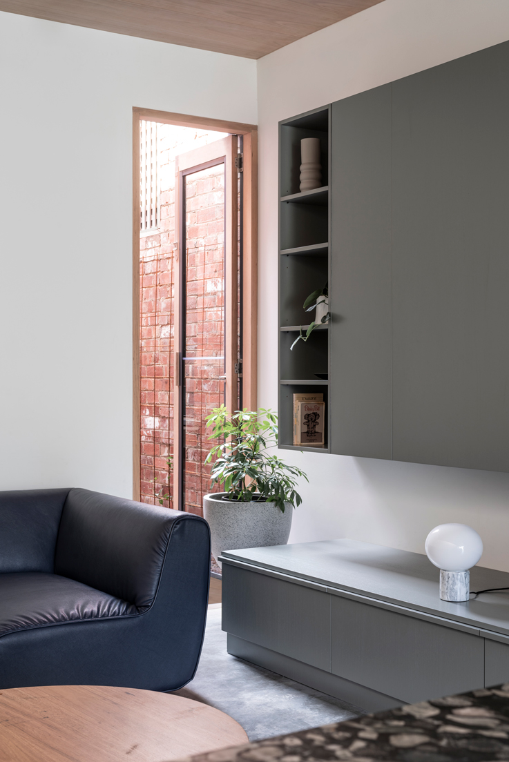
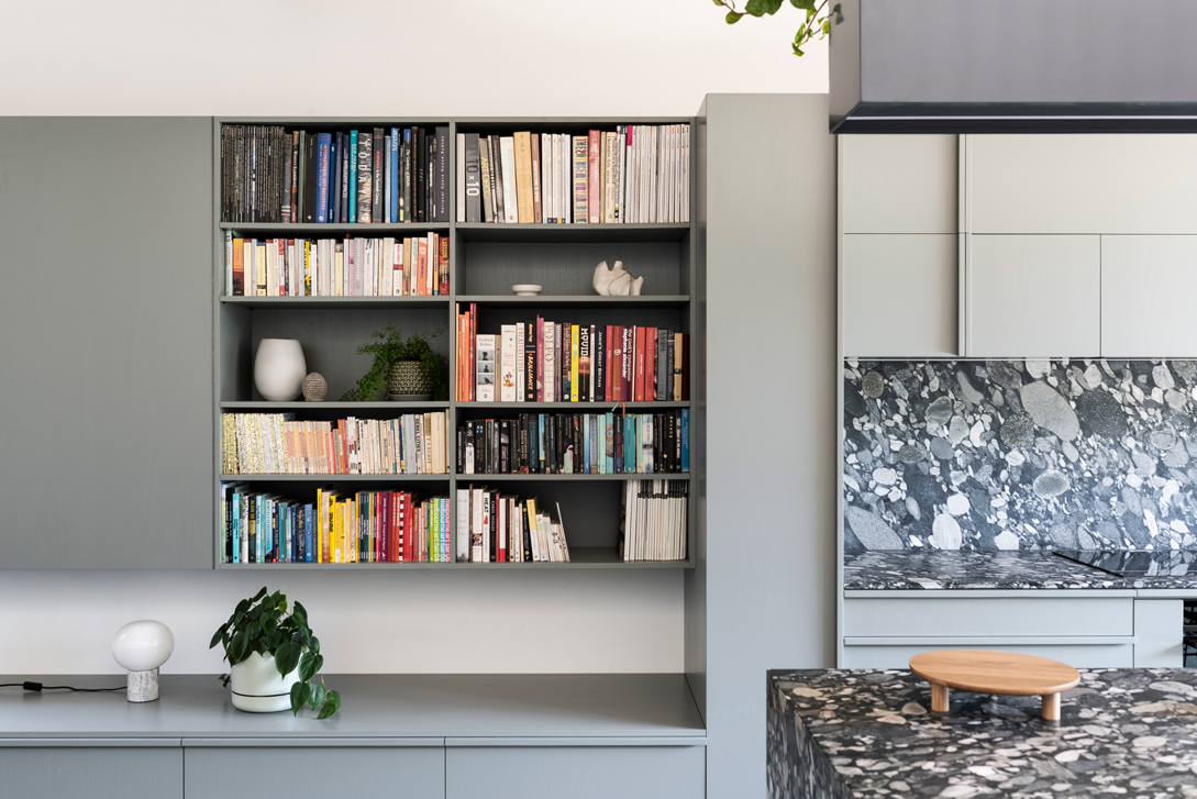
Indoor plants help build the association with the natural environment and connect inside and out. A hanging planter above the kitchen island cements this as very much the heart of the home. Elsewhere, the living room shelves house our favourite books – as well as a few decorative objects from the Jam Factory in Adelaide, my hometown.
What role do materials play within your home?
Within a small home, robustness and tactility are very important to me.
Precise joinery was required to make the living, kitchen and dining area both functional and attractive. To help deliver the outdoor room effect, we used a deep green stain that echoed the tones of the native garden and existing olive trees.
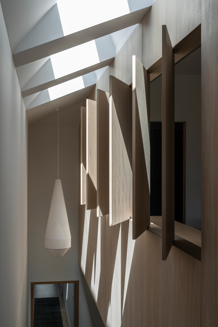
Moving upstairs, heritage concerns ensured the main bedroom needed to be very contained. It’s an intimate loft and, to me, felt very much like a boat cabin — so we saturated the experience in natural timber to create an intimate sleeping compartment.
Finally, the kitchen is celebrated with bold granite that is both functionally bulletproof and visually relaxing. The volcanic river stone aesthetic is not for everyone (we call it pastrami!) but, once we developed the custom colour for the joinery, it was a last-minute decision that brought everything together.
You talk a little bit about designing from the inside out, why do you think this is an important way of approaching a building, especially a home?
Too often people end up squeezing their lives into an architecturally designed box. Surely design should unfold organically around the experience, not the other way around?
In a home that is 4.8 metres wide there really is no choice: it is essential to design around ergonomics that make a space work. I tested many, many options to deliver our brief, and even then, we did compromise. In some ways there was not much architecture involved – just a second-storey extension with one west facing, 5-metre-wide facade. This project called for a very internal strategy where the exterior was driven by the interior planning.
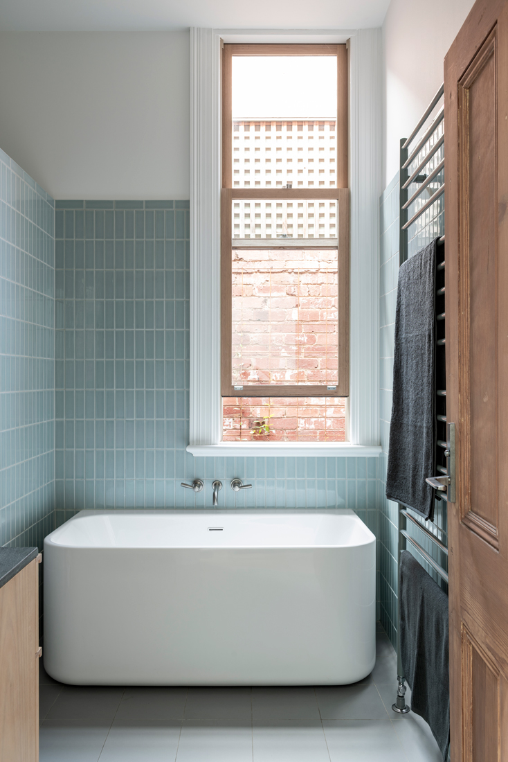
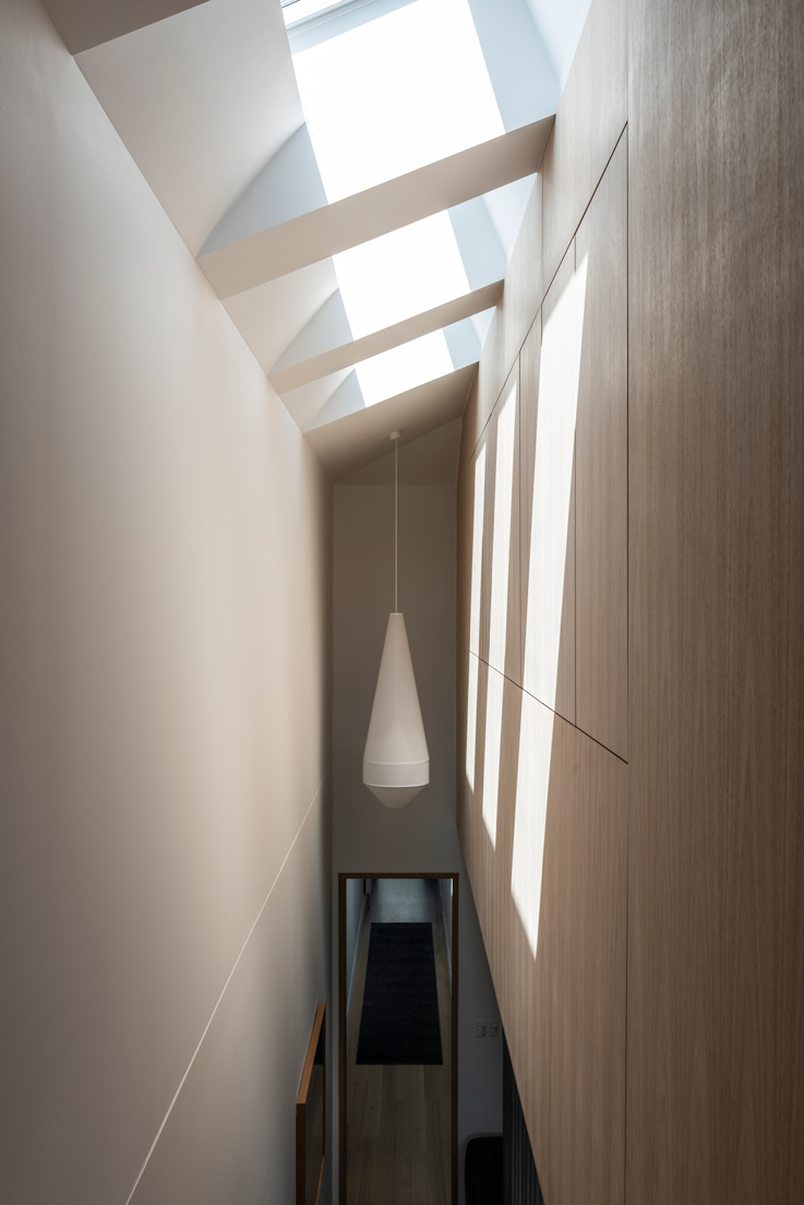
Design from the inside out also involves a considered approach to orientation, passive design, and outward views to nature. The latter is especially important. My friend Fran Hale from Peachy Green helped us create a native garden space that is both as green as possible and functional for the kids. The side lightwell is a modest but important outlook, providing natural light and ventilation to the secondary rooms.
At Ha_arc we believe bigger is not better. With creativity and precision, you can often resolve an outcome that delivers everything required in much less space than you imagine. This approach is increasingly important in an ever-growing city like Melbourne.
How do you approach sustainability within your own home?
We approach sustainability with a sense of urgency and ambition! It was exciting to see what we could achieve when designing our own home. We aimed for the maximum possible outcome, assuming that as owner occupiers we would be there for 20 years.
To us, maximum achievable sustainable design is assumed in every project – so we embedded it throughout the old and new house. Key features are east and west-facing external sun-shading; well-sealed, double-glazed windows and thorough insulation; concrete slab for thermal mass; hydronic heating with electric heat-pump; a 3.3-kilowatt solar array that consumes the entire north-facing roof; openable windows for natural ventilation, and ceiling fans. Across a small footprint of 150 metres-square, thermal comfort was achieved with no air-conditioning required.
What role do you think the home has within the wider context of the neighbourhood?
Hopefully it doesn’t stand out too much! The goal was to preserve the heritage character of the row, with the rear extension blending in as seamlessly as possible. In a modest way, I think our home demonstrates respectful contemporary design within strict heritage control – and also small footprint living that relies on adjacent community amenity.
Nick Harding is principal of Ha Architecture.
Elizabeth Campbell is a project architect at Kennedy Nolan with broad experience across single and multi-residential, cultural and commercial projects. She is a researcher, writer and contributing editor of Architect Victoria.
