2020 queensland Architecture Awards Winners
2020 National Architecture Awards
2020 Queensland Architecture Awards - results
The Australian Institute of Architects Awards program offers an opportunity for public and peer recognition of the innovative work of our Queensland architects. The program also provides the Institute with a valuable mechanism to promote architects and architecture within Queensland, across Australia and internationally.
CHAPTER SPECIFIC AWARDS
THE QUEENSLAND ARCHITECTURE MEDALLION
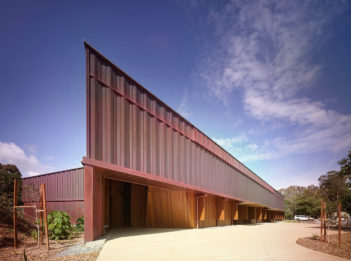
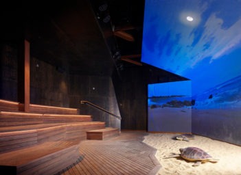
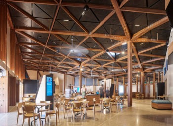
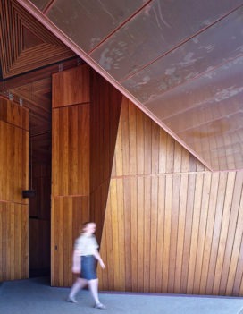
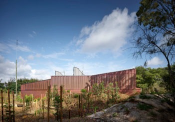
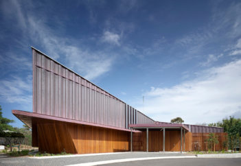
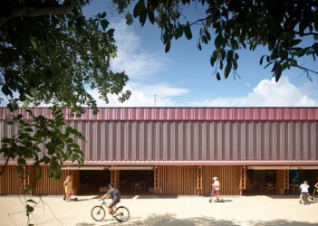
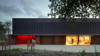
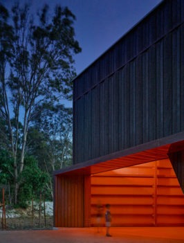
Mon Repos Turtle Centre | KIRK
This year is the inauguration of the Queensland Architecture Medallion, awarded for a project of an exemplary standard that will be the highest honour in the awards program each year and is selected from all the named Awards.
In 2020 the Medallion is presented to KIRK for the Mon Repos Turtle Centre.
It is fitting that in this inaugural year the award goes to a project that reflects our architectural responsibilities to not just to the community but the wider environment.
The Mon Repos Turtle Centre reflects the highest level of architectural thinking, craftmanship, technology and art, all responding to an imbedded commitment to sustainability.
It is also appropriate that the building has an inherent Queensland character in terms of response to context and climate and that its fundamental structure is made of Queensland materials by an innovative local Queensland manufacturer.
The building’s commitment to quality of materials and construction should mean this building will be enjoyed and highly valued for many years to come.
The architects, the broader team and the client, (Queensland Government) should be congratulated on a shared commitment to excellence.
Emerging Architect Prize
Ellen Buttrose | People Oriented Design
As an emerging architect Ellen Buttrose has already executed some of the nation’s highest performing and most innovative sustainable projects amidst challenges of extreme climatic conditions, remote delivery and intercultural engagement.
Ellen brings a local lens to global issues including climate change, indigenous empowerment and housing affordability.
The jury was inspired by Ellen’s energy, ethics and competence. The 2020 Queensland Emerging Architect Prize is awarded to Ellen Buttrose in recognition of her unique accomplishments across all facets of practice, research and education and to provide a platform for the kind of leader the profession desires in its next generation of architects.
Congratulations Ellen!
commercial
THE BEATRICE HUTTON AWARD FOR COMMERCIAL ARCHITECTURE
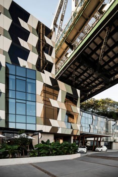
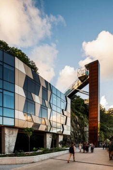
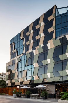
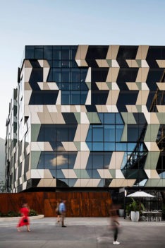
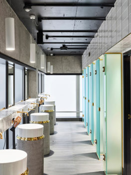
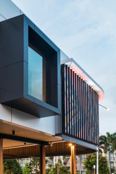
The Fantauzzo | SJB
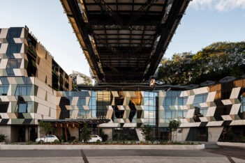
Located in the revitalised urban setting of the Howard Smith Wharves, The Fantauzzo Hotel sits comfortably flanked by the Brisbane river and cliff face, neatly tucked beneath the Story Bridge. The building seamlessly negotiates a constrained site, servicing, acoustics and access, are each integrated with clear and clever resolution.
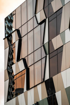
Part of The Art Hotel series, it offers a playful formal expression while contributing a camouflaged backdrop to the heritage of the Howard Smith Wharves. The façade is a tectonic composition of its location, coalescing the geometry of the Story Bridge and richness of the cliff face. The building aims to recede into its surrounds with colour compositions following the hues of the landscape and the incorporation of planting at many levels. The building actively contributes to the new precinct with an engaged ground plane stepped between cast concrete piers and an expansive publicly accessible roof deck.
The 160-room hotel takes advantage of the double loaded room configuration to curate a variety of visitor experiences. Rooms to the river offer expansive views and balconies, while rooms to the cliff face offer an intimate and deliberate framing of the rockface. The material expression enhances and reflects this dual environmental setting- exposed concrete, and deep tones are set next to clean gloss finishes bouncing light deep into each room.
Award for Commercial Architecture
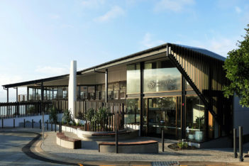
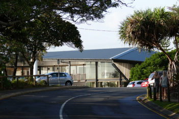
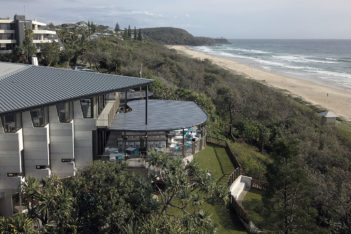
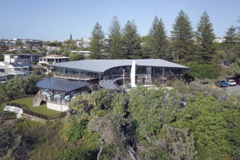
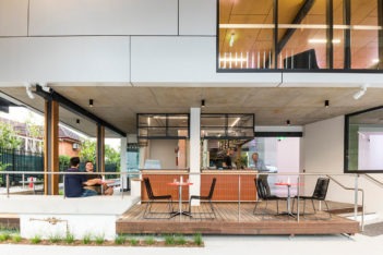
Sunshine Beach SLSC | Push and Andrew Bock Architecture
The Sunshine Beach Surf Lifesaving Club offers a revitalised heart on the surf coast. Nestled into the dunes the building negotiates a tight site and strict planning restrictions. The finished project is created by a series of carved roof forms that consider views out to the ocean and from in it.
Strong forms are broken down with a fineness of material and the building sits proudly on the site while offering a tactility at a human scale. A rich palate of cast concrete, hardwood screening and series of light canopies sets a new cultural and material tone for the club.
Internally the dining spaces address the challenge of giving all diners views to the ocean. The result is a stepped floor plate broken down into a variety of indoor and outdoor experiences, from cosy booth seating to sweeping stepped terraces and bar seating straddling the indoor and outdoor window line.
The new building has created a sophisticated yet casual offering and a revitalised experience for a broader public. All while embodying the community spirit of club and connection to the coastline.
Commendation for Commercial Architecture
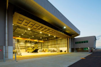
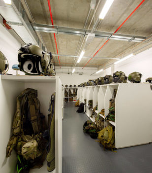
Replacement Chinook Facilities | Jacobs
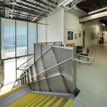
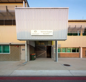
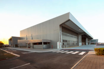
The new facilities offer a clever and efficient planning approach to this highly technical facility. The jury commends the hard working passive design principles that create a responsive and comfortable working environment in the dry tropics.
The material palate of raw and prefinished materials creates a neutral and considered backdrop to the workings of the facility. The project’s success is evident in the active personalisation of gathering spaces.
Commendation for Commercial Architecture
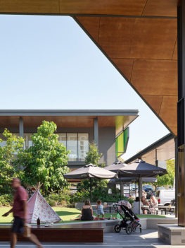
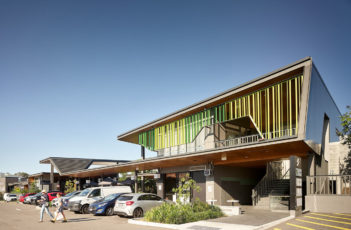
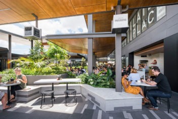
Camp Hill Marketplace | Arkhefield
Camp Hill Marketplace offers an alternate retail typology in prioritising generosity of public space and pedestrian movement. The precinct actively seeks to slow visitors down and invites the public to linger.
By challenging the notion of high yield and high turn over, the precinct instead places value on the quality of spaces to increase the quality of the offering.
Educational Architecture
THE JENNIFER TAYLOR AWARD FOR EDUCATION ARCHITECTURE
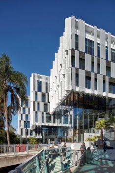
Queensland University of Technology, Peter Coaldrake Education Precinct | Wilson Architects and Henning Larsen Architects, Architects in Association
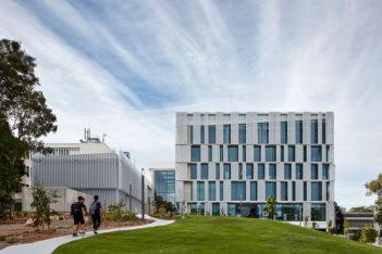
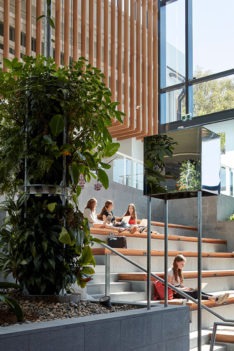
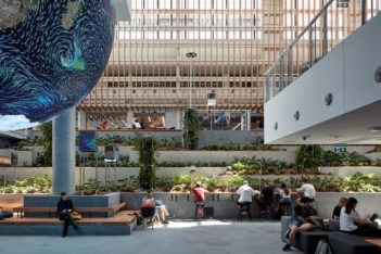
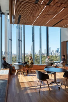
The Peter Coldrake Education Precinct continues QUT’s commitment to high quality buildings within the Kelvin Grove Campus. This impressive building, accommodating the education department, is located next the existing library where together the two buildings establish a new social and academic focus.
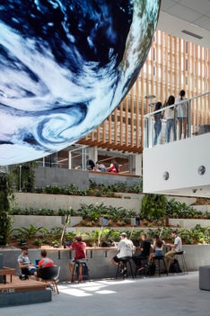
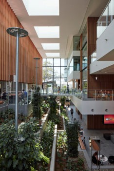
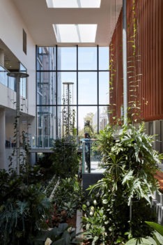
Wilson Architects in association with Henning Larsen Architects, challenged the original siting of the building to not only create an important connection to the existing library, but to also manage a number of level changes across the site. The covered internal garden, connecting the buildings richly integrates landscape and architecture in a way we have come to expect from Wilson. In an otherwise highly technological building, the biophilic design of this space creates a wonderful relief for students and academics.
Planning of the internal spaces seeks to enables learning in all forms, creating flexibility that is dynamic and effortless.
While the partnership between the two practices required separate roles within the design process, these role are not apparent in the building which is seamless between the external expression and the internal resolution.
AWARD FOR EDUCATION ARCHITECTURE
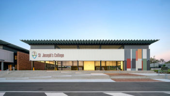
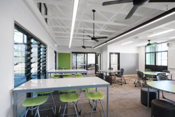
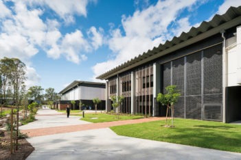
St Joseph's College, Coomera | Macksey Rush Architects
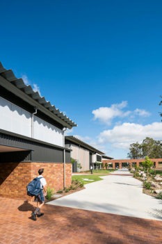
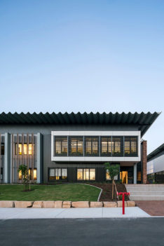
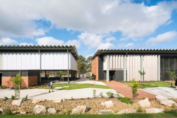
St Joseph’s College is a new Catholic prep to 12 school within an emerging community, south of Brisbane. This first stage of the five stage masterplan includes classrooms, assembly areas, staff areas and library, and establishes a high-quality built environment to reflect the school’s high ambitions for its students.
While a common architectural language has been developed in this first stage each building type is given an appropriate hierarchy. The large multipurpose and administration buildings that forms the entry, are public in nature. A clever use of a common wide-span roof sheeting creates a striking first impression. The material selection including face brickwork, embody the principal’s desire that the College should offer a sense of permanency and safety to its students.
Heritage Architecture
Commendation for Heritage
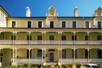
Adderton: house & heart of mercy | Wilson Architects
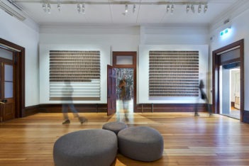
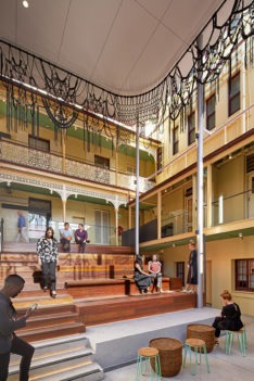
Adderton House is at the centre of the All Hallows’ School campus and a strong part of the site’s history. This work centred on a conversion of the convent building to a Centre for Contemporary Art.
The architects have employed considerable skill in revealing the essential character of the building while addressing the challenge of insertions to achieve current building compliance in terms of safety, vertical circulation and accessibility.
The insertion of a shading element to the courtyard provides additional functionality and drama. The addition of technology and strategies for flexible installation whilst maintaining the original building fabric and legibility are successfully explored.
Commendation for Heritage
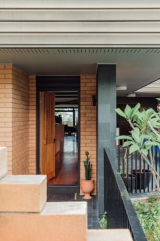
Bardon House | NIELSEN JENKINS
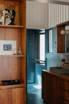
This project entry serves an interesting provocation to the notion of architectural heritage generally and for the Awards particularly.
The project consists of well handled, sensitive modifications and additions to a considered original 1971 residence by architect Gavin Litfin.
The architects have identified the value in the original architectural conception and have amplified these ideas skilfully without an obvious insertion of their own hand.
The project identifies that a good relationship to site and consideration of views and natural ventilation have been a part of Australian modernism for many decades and that there is hidden richness in the suburbs.
Commendation for Heritage
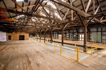
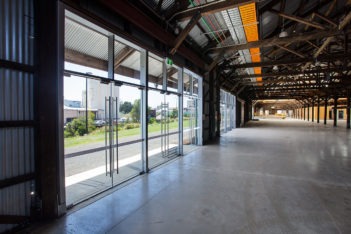
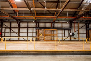
The Goods Shed - Toowoomba | Sims White Architects in Association with Shane Thompson Architects
The Goods Shed is representative of a key role rail played in the formation of the State of Queensland. Part of a larger masterplan connecting the city to future recreational space, the restrained redevelopment of the Goods Shed provides functional flexibility for a range of uses.
The investigation into the timber truss forms and their structural rectification is a key part of the project and the resolution of this work is accomplished. Insertions are modest and do not detract from the impressive scale of the building. The retained and revealed rail tracks and associated infrastructure adds significant insights to this heritage listed building for future generations.
interior architecture
THE G H M ADDISON AWARD FOR INTERIOR ARCHITECTURE
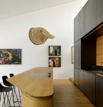
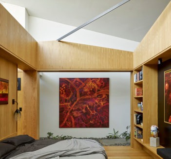
Art Box | Sparks Architects
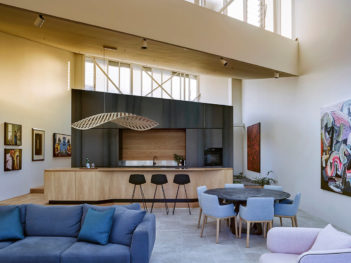
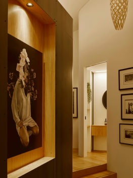
The Art Box challenges the typical design of a wool store interior and delivers an unanticipated set of spaces. This is a small second home in the city for the client, which allowed the architect the freedom to push beyond typical domestic planning preconceptions. The design brief was to maximize the space, provide a showcase space for their art collection and bring landscape to the interior.
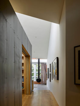
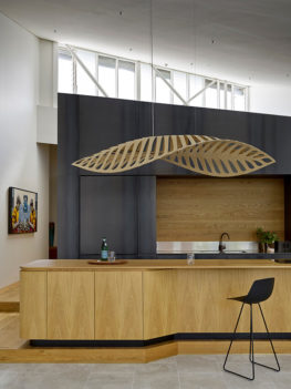
The design solution leaves the perimeter walls of the apartment free for a flexible gallery space, with private rooms in the centre of the plan created by a cocoon of black steel. The rooms are lined in finely detailed timber, creating quiet and comfort throughout.
The architect has deftly choreographed movement through the apartment via level changes, materials, beautiful light and volume.
An exterior space within the interior is cleverly created using an internal rock garden and through the use of floor treatments around the bedroom pod. Within the garden is an open shower, which further challenging the notion of internal and external space.
The jury commends the bold planning strategy, which is complimented with exceptional detailing.
Award for Interior Architecture
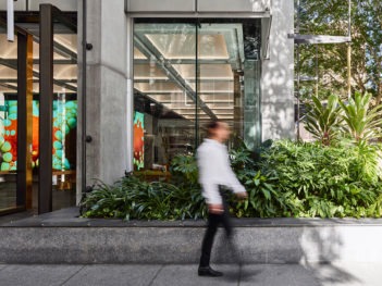
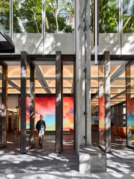
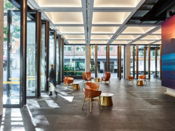
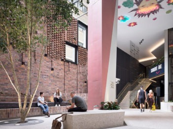
100 Creek Street Redevelopment | Cameron & Co Architecture
100 Creek Street Lobby refurbishment reimagines a typically private environment into a public realm and generously opens to the street. Pivot doors operate to actively engage the corner site. The street and passers-by are invited to occupy the edge on civic seating or move through the interior, drawn in by the curated large digital art screen.
The bold rhythm of the existing building structure is respected and reflected in the formal expression of the interior, formality of new doors, and internal ceiling intervention. The civic treatment of the internal space is broken down by a curved coffered ceiling, fine brass screening and delicately detailed external feature lighting.
Valuing the original building fabric, a material strategy of exposure was deftly undertaken, removing the years and layers of previous refurbishments to expose the raw building elements. New layers of marble, mirror, and brass, with the concrete of the original structure exposed honour the original building fabric and offer luxurious and hard-wearing material expression.
Award for Interior Architecture
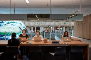
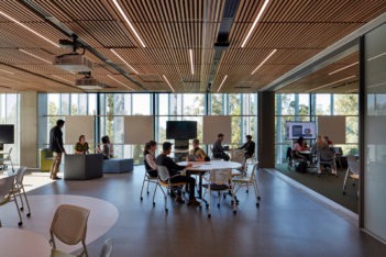
Queensland University of Technology, Peter Coaldrake Education Precinct | Wilson Architects and Henning Larsen Architects, Architects in Association
The Peter Coldrake Education Precinct provides a future ready learning environment. The interior planning aims to create a variety of spaces through enabling academics and students to choose how to use them. Through a number of different devices the spaces are dynamically flexible. Material selection is necessarily robust but unexpectedly warm.
The function space at the top of the building provides a state-of-the-art training and entertainment areas for the whole campus. The space is cleverly designed to again provide maximum flexibility, and showcase spectacular city views.
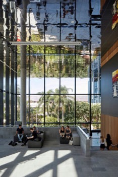
The hero of the interior space is the tiered internal garden connecting the existing library to the social learning spaces and assists with managing the levels across the site. Both intimate and group study spaces are created within the atrium space, encouraging all the benefits provided by being visually and physically connected to nature.
The Peter Coldrake Education Precinct makes a significant contribution to Kelvin Grove campus and has exceeded the client’s expectations.
public architecture
THE F D G STANLEY AWARD FOR PUBLIC ARCHITECTURE
Mon Repos Turtle Centre | KIRK
Mon Repos is a conservation park on the Queensland coast and part of the larger community of Bargara. It is the most important turtle nesting ground in Australia.
This unique condition has inspired a project that explores structural, sustainable and expressive strategies to produce a modestly scaled but significant Queensland building.
The project, a visitor centre, serves as a preparation point to witness the happenings on the beach after dark during turtle season.
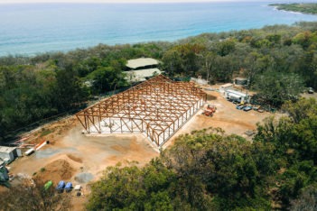
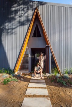
The turtle season calendar informed the design procurement strategies including the modular laminated timber structural system. Arranged as a diagrid, the system uses Queensland timbers manufactured by a local Queensland manufacturer. The timber language informs the interior and sets up planning strategies responding to the triangular grid.
The capacity for the building to be open to daylight but avoid light spill in the evening has prompted a series of static and operable solutions that are clever and thoroughly integrated with the structural diagram.
The perimeter cladding of folded copper is rich and memorable and a continuation of the aim for an extended design life in a coastal condition.
The research component of the project mean that this site can continue to contribute to both the awareness and science of the endangered loggerhead turtle.
Commendation for Public Architecture
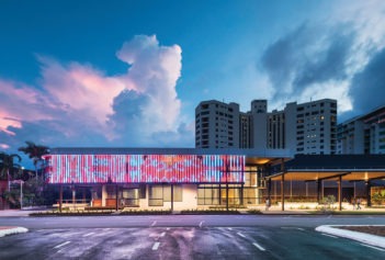
Bulmba-ja Centre of Contemporary Arts | TPG Architects
Bulumba-ja Centre of Contemporary Arts is the outcome of a collaborative process with artists and traditional owners to authentically embed indigenous perspectives in design. The centre’s art offering is brought into the public domain in a curated LED canvas sitting proudly over the street edge. The jury commend the generosity to the street edge in creating an active frontage that integrates a yarning circle, gathering spaces and landscape.
Residential architecture - Houses (alterations & Additions)
THE ELINA MOTTRAM AWARD FOR RESIDENTIAL ARCHITECTURE - HOUSES (ALTERATIONS & ADDITIONS)
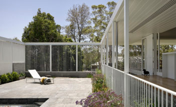
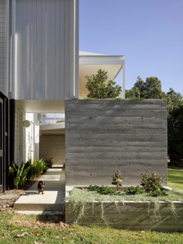
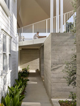
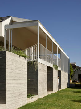
Park Road House | LineburgWang
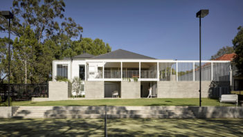
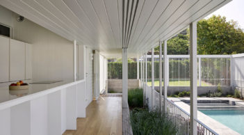
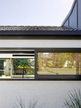
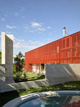
LineburgWang have truly created a sophisticated and elegant revitalisation of an existing Queenslander home. The landscape-led response has reconfigured the home’s relationship to the outdoor spaces cleverly redirecting the movement through the site. The result is a series of inhabitable edge conditions that are each formally expressed to create a contrasting set of spatial experience. The Jury commends the rethinking of the spatial planning in tackling the disconnection double storey Queenslanders often face in their relationship to the activities of the outside.
The result is in an enhancement of both the indoor and to outdoor experience and an increase in ventilation and light to existing and new rooms. The central room of the house has been removed with a degree of care, to open and extend the upper level to meet the pool area. The light steel structure that marches through the site is balanced with planting. At the lower level, a colonnade of monolithic concrete planters brings the landscape up to the first floor, while creating a series of solid frames and intimate inhabitable openings.
Award for Residential Architecture - Houses (Alterations and Additions)
Wooloowin House | NIELSEN JENKINS
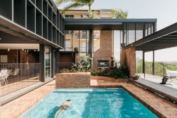
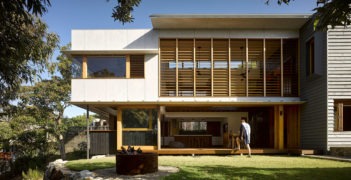
A stunning addition to an existing Queenslander, situated on a particularly challenging, steep and west facing site. Nielsen Jenkins have skillfully designed a generous platform for living and enhanced the significant views across the Samford Valley.
The steep site has allowed the architects to test contrasting ideas of heaviness and lightness, grounding and outcrop. This resulted is inherent tensions and dynamic outcomes.
Through a series of economical and inventive solutions, the architects have upgraded the houses undercroft space. This new heart of the home provides privacy from a neighbouring six-pack apartment block, shades and maximizes western views across the Samford Valley, and creates a flexible space for family life that reflects a relaxed subtropical lifestyle.
To manage the heat of the western sun, the living area includes a series of entertaining spaces strategically designed to be occupied at different times of the day and seasons. A clever strategy that suits the growing family perfectly.
Nielsen Jenkins have an in-depth know of materials and construction, which is clearly visible in the ingenious mesh arbour, the highly crafted doors and the custom-made hardwood cabinets.
Award for Residential Architecture - Houses (Alterations and Additions)
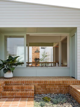
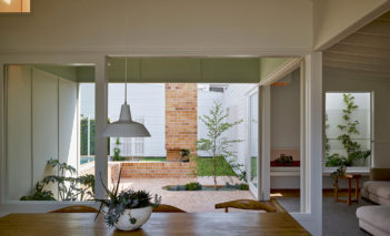
Cantala Avenue House | ME
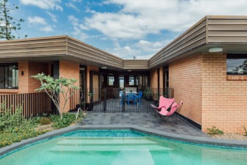
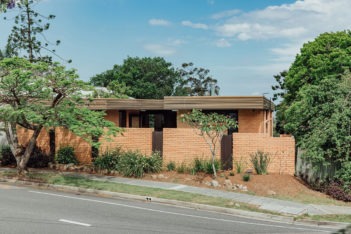
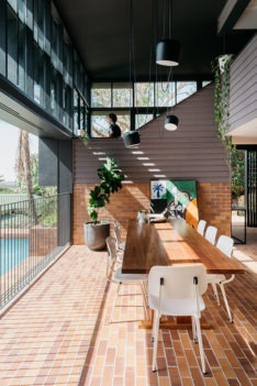
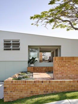
ME has delivered another intuitive design based on research of place, culture and memory. The house at Cantala Avenue proudly enhances and reinforces our collective memory of 1970’s Gold Coast.
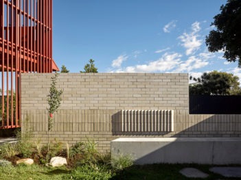
The architect’s design strategies that contribute to the neighborhood prioritising landscape over cars, low fences, views to the street and simple roof forms. An overlaid courtyard gardens, pastel tones and crafted details create a new benchmark for this residential area.
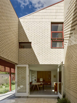
The entry to the house is via a carefully orchestrated sequence of turns, courtyards and framed views. The modest plan offers flexibility in use and curated insertions provide a depth in visual experiences making the home feel generous.
The main addition is a new internal courtyard and bedroom wing that is sited to screen the numerous neighbours.
This accomplished addition builds on ME architects’ impressive portfolio of buildings that use the past to offer a future for architecture on the Gold Coast.
Commendation for Residential Architecture - Houses (Alterations and Additions)
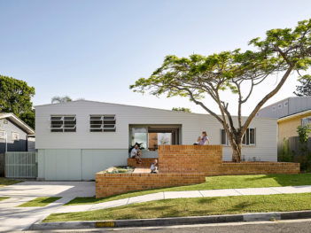
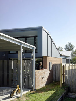
JB House | Reddog Architects Pty Ltd
The alterations and additions to the JB House pursue a better social outcome for existing suburban housing. Reddog Architects have transformed an existing garage into a new generous light-filled living room. Extended by a new carport and covered terrace, their strategy cleverly minimises the cost of new building work.
The intervention creates a new garden courtyard and connects previously closed frontage out to the everyday activities of the street.
The materials are robust and raw, proudly celebrating conventional materials of suburban housing. JB House creates a positive community interface and champions a clever typology for suburban renovations.
Residential Architecture – Houses (New)
THE ROBIN DODS AWARD FOR RESIDENTIAL ARCHITECTURE - HOUSES (NEW)
Casuarina House | Vokes and Peters
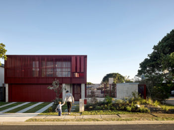
Casurina House is a beautifully crafted, bold and responsive beach house located in a coastal suburban street. Vokes and Peters have crafted a home centered around garden, place, and climate. The house is a platform for the daily rituals of this young family.
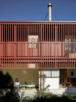
The simple gesture of siting the house to flank the side boundary creates a deliberate long view from street to rear boundary. The siting challenges the traditional front and rear yard diagram of a freestanding house and instead offers a thoughtful response to landscape and street. The gardenscape and long timber screened elevation becomes a generous offering to be shared from the street and the home.
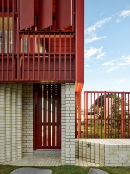
Refined architectural detailing is what we have come to expect of Vokes and Peters and Casuarina House offers an exemplar in both brick and timber detailing. These materials feel at home in their setting, referencing many architectural traditions, yet deliberately articulating its own revised language.
The Casuarina House offers a clear diagram, clever detailing can create sophisticated architecture as beautiful inhabitants of our beach side suburbs.
Award for Residential Architecture Houses (New)
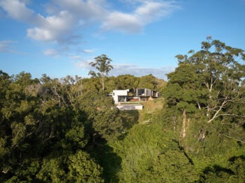
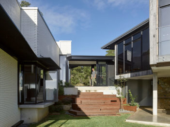
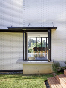
Mill Hill Retreat | phorm architecture + design
Mill Hill Retreat is a thoughtfully curated family home carefully positioned on a remarkable site. The architecture reflects a strong conceptual framework explored through a series of mapping and site studies, aiming to embed the home within the greater landscape.
phorm architecture and design undertook in-depth research into the site conditions, so the house grounds itself comfortably with the escapement, site levels, distant views and microclimate.
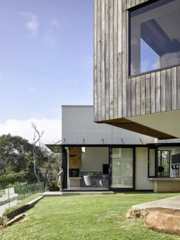
Carefully positioned on the edge of a steep embankment, the house is broken into pavilions allowing each part of the house to frame and curate its own relationship to the site. The varied experiences are enhanced in the adjustment of materials and details.
The journey through the house is carefully choreographed along landscaped platforms, so connections between interior and exterior expand and contract.
Award for Residential Architecture Houses (New)
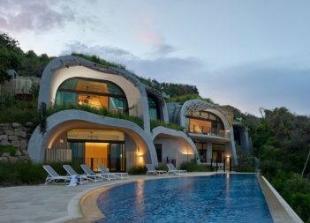
Domik | Noel Robinson Architects
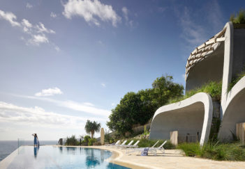
Domik is a truly unique home located on a spectacular site next to Noosa National Park. Tasked with a once in a life time brief and budget, Noel Robinson Architects has delivered a highly bespoke and sophisticated home. This house challenges the typical beach side house and pushes the envelope of unique architectural luxury.
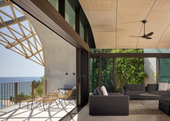
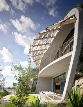
Sited adjacent to the significant natural asset, Domik is burrowed into the steep and challenging site. The monolithic curving concrete structure is finished with delicate timber hoods reflecting natural formations found in the coastal location. The building is dressed in camouflaged landscaping which cloaks the building at all levels.
The interior planning directs all views to the ocean and a circular stair offers an oculus skylight to draw light deep into the floor plate. Perforated and vaulted timber linings soften the interior and offer comfort and retreat from the coastal condition.
The original forms, spectacular volumes and integration with landscape make Domik a remarkable design along Sunshine Beach.
Commendation for Residential Architecture Houses (New)
Corymbia | Paul Butterworth Architect
Corymbia House reflects the coastal lifestyle and deep connection to nature that the island embodies. Informal planning offers a relaxed and adaptable set of spaces articulated with finishes that suit sand, ventilation and operable levels of enclosure. Considered detailing and rich timbers and sustainable material selections form a tactile backdrop designed to prioritse lifestyle.
Commendation for Residential Architecture Houses (New)
Cooinda House | Counterpoint Architecture
The Cooinda House is a beach house on Magnetic Island for an extended multi-generational family. A large central room surrounded by a series of living pavilions offers a flexible plan arrangement to suit many modes of use. Clever planning and restrained material palate create a house that is relaxed; community focused and is an exemplary model for coastal family living.
Residential Architecture – Multiple Housing
THE JOB & FROUD AWARD FOR RESIDENTIAL ARCHITECTURE - MULTIPLE HOUSING
Lucent | Plazibat Architects
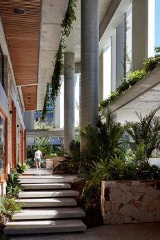
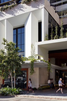
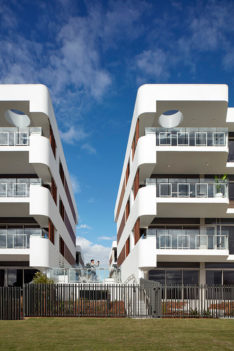
Working closely with the client, Plazibat Architects has created a mixed use apartment building that seeks to be more than just a place to live in the vibrant Newstead. As the first stage in the masterplan, Lucent sets an incredible standard of detailing and resolution rarely seen in this typology. The choice of quality finishes and the finely detailed retail and communal spaces is evidence of the client’s ongoing commitment to the development.
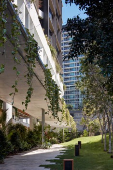
The ground floor, which accommodates retail spaces, is dominated by the memorable floating concrete awning that supports a flourishing, subtropical hanging garden providing much needed relief in the urban neighbourhood. The integration of these landscaped elements as well as the urban pocket park, the lush communal rooftop space and vertical gardens that articulate the north and south façade, are a testament to the collaborative relationship between the architect, landscape architect and structural engineers.
Lucent skilfully sets a new benchmark for subtropical design in higher density living. Through the architect’s commitment to simple, good passive design principles it has enabled the development of a residential community and ground plan that generously contributes to the neighbourhood.
Every element of the project pushes the boundaries for a multi-residential project that is genuinely working to support the health and wellbeing of its residents and contribute to the city.
Commendation for Residential Architecture - Multiple Housing
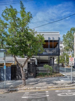
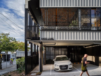
Trio on Amos | REFRESH*DESIGN
Trio on Amos is located on a tight and challenging inner city site that negotiates the traditional ‘timber and tin’ houses and the light industrial. As part of an ongoing body of work to explore densification solutions on a smaller scale, REFRESH*DESIGN has sensitively created three apartments on a site zoned for one two storey house while incorporates the existing 15 carparking spaces.
The compact plan works very hard to deliver light and airy interior spaces that are naturally ventilated and lit. The clever planning creates generous private outdoor spaces, extending the living spaces both visually and physically, minimising the perennial problem of overlooking existing neighbouring backyards.
Commendation for Residential Architecture - Multiple Housing
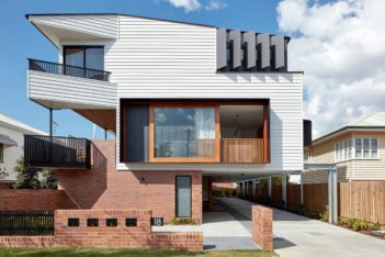
Smallman Street Townhouses | Reddog Architects
Smallman Street Townhouses demonstrate the high quality of space and detail that can be achieved through strong collaboration with client, architect and builder. The four townhouses are located in a middle ring suburb and provide a generous contribution to the streetscape and the wider neighbourhood through careful consideration of materials and scale.
With clear internal planning, the townhouses are beautifully but simply detailed to provide warmth and personability to this speculative building type. It is a measure of the success of the project that the client decided to retain one of the apartments and become part of the small community.
Commendation for Residential Architecture - Multiple Housing
The Boatyard | BVN
The Boatyard is a high-end, boutique residential project on the spectacular north facing waterfront site at Bulimba. BVN have masterfully created a connection to the history of the site which through the nautical analogy which goes beyond the obvious and focuses on the tradition of craftmanship and luxury.
The project explores apartment living rarely seen in Brisbane where each apartment has the sophisticated detailing and spatial arrangement of a high-end single dwelling. The predetermined site planning of four individual buildings, encouraged the skilful exploration of buildings within a shared subtropical garden advancing the Queensland apartment living options.
Small Project Architecture
THE HAYES & SCOTT AWARD FOR SMALL PROJECT ARCHITECTURE
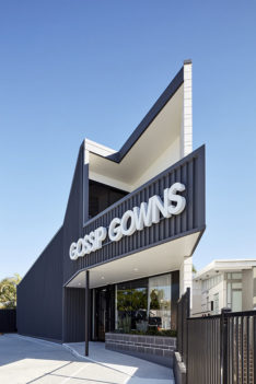
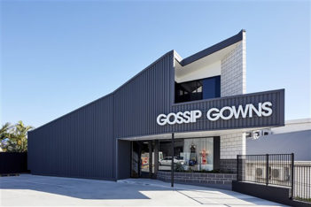
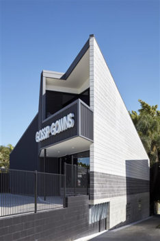
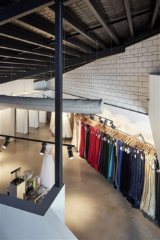
Gossip Gowns | Reddog Architects
Gossip Gowns is an innovative architectural response to a complex and previously underutilised corner site. The seemingly contrasting programs of gown store and petrol station co-exist on the site to form an unusual and exciting tension.
Reddog Architects has developed a clever diagram to solve a tricky triangular site to create a unique and adaptable retail space. The simple floor plan negotiates a confluence of existing levels, neighbours, service station and laneway access.
The space bows the roof line to the west, acknowledging the residential neighbours. And towards the street, the roof rises generously creating a civic marker among its varied neighbours.
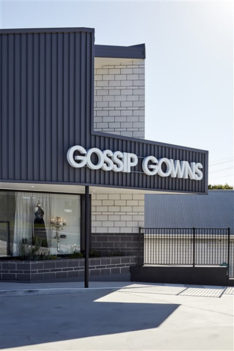
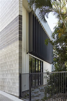
A minimal palette of robust and raw materials unexpectedly works with both delicate formal dresses and the existing condition of the service station. The formal expression is restrained yet playful with block coursing marching down the lane and crow’s nest balcony saluting to the street to offer joy in a most unexpected corner. Gossip Gowns is fine example of architecture providing innovative and interesting solutions that are beyond the initially obvious.
Urban Design
Commendation for Urban Design
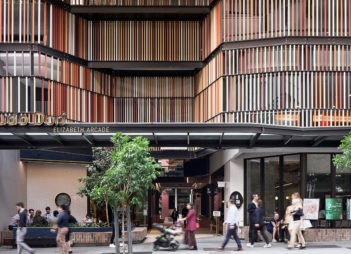
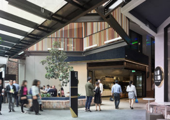
Elizabeth Arcade | Arkhefield
The old Elizabeth Arcade was hard to love. Its level changes and artificial lighting delivered little joy. This project has thoroughly reconstructed the Arcade and substantially improved the urban offering whilst accommodating the complexity of two student accommodation towers above. The introduction of daylight, landscape and a diverse materials create a richness through the depth of the site. Provision for future linkages means this project has the opportunity to assist in creating a wider network of laneways. Integrated considerations of food and beverage and student users are geared towards fostering constant day time and night time activity.
Commendation for Urban Design
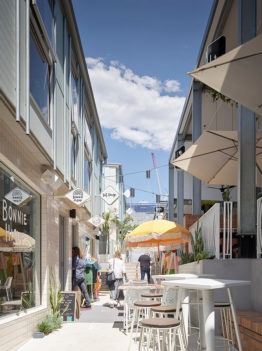
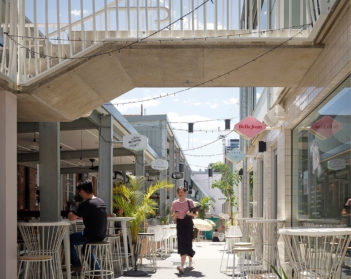
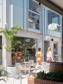
California Lane | Guymer Bailey Architects
Some lanes require simple curation and reveal, others like California Lane are a wholesale creation from almost nothing. This project tackles a complex program that feels greater than the sum of its parts. The new north facing terraces to the rear of restaurants on the harsh environment on busy Brunswick Street, assist in creating significant intensity in a relatively small space. Double height, shallow, start-up retail offerings on the north of the Lane create more granular activation with a complexity of scale and character that fits within the Valley’s eclectic design language. Visual references to the client family’s long history and association with the place are quirky but delightful.
Commendation for Urban Design
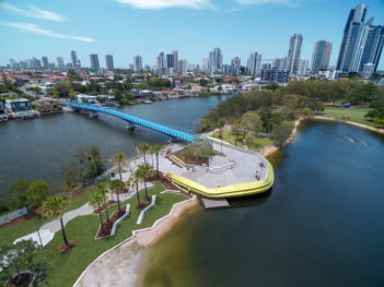
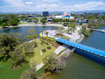
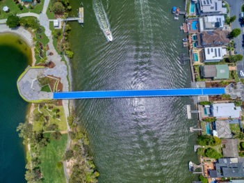
HOTA Green Bridge | ARM + Archipelago
The HOTA Green Bridge continues both the expansion of this major cultural precinct on the Gold Coast but also the architects’ own exploration of form and the connectivity of art, architecture and landscape with their wider team.
The bridge is modest in scale and engineering, but the architectural strategies associated with the bridge balustrading in particular, continue to unify all elements of the precinct.
The southern landing is a clever handling of the requirement for change in grade, expressed as a land form rather than a ramp. The thoroughly integrated sculptural form is a testament to the artists, architects and fabrication team’s collaborative process.
Sustainable Architecture
THE HARRY MARKS AWARD FOR SUSTAINABLE ARCHITECTURE
Mon Repos Turtle Centre | KIRK
Sustainability strategies permeate the Mon Repos project that begin with the thoughtful site response, compact building footprint and removal of cars from the site.
The building then develops parallel strategies that minimise the effect on the turtle nesting and migration, prioritises a construction system that minimises waste and disruption to the site, a building skin that minimises energy use, and materials that focuses on building life span.
The overall affect is of a building that is in harmony with the site.
The pre-fabricated, locally sourced, glulam timber diagrid structure inspires a rigour through the building design that removes the unnecessary.
Operable passive systems allow natural ventilation and mixed mode conditions which are resolved cleverly in response to the desire to reduce light spill in the evenings.
The copper cladding is chosen for an extended life span and to respond to the harsh coastal conditions. Its patina will assist the building to age in place.
Recycled tallowwood screens and cladding further the inclusion of sustainable materials.
Award for Sustainable Architecture
Queensland University of Technology, Peter Coaldrake Education Precinct | Wilson Architects and Henning Larsen Architects, Architects in Association
The Peter Coaldrake Education precinct holistically integrates sustainability into the building fabric, social spaces and servicing strategy of the building.
The central atrium and the building’s social heart is intrinsically connected and responsive to its sub-tropical location. Naturally lit and passively ventilated the abundant garden spine creates an active and climactically curated hub for the student and academic community.
Integral solar screening to the building’s facade articulates and celebrates the curation of sun, reducing solar gains while allowing daylight to illuminate deep into the floor plate.
The building design incorporates a commendable commitment to modelling and reporting on predicted and reduced energy and emissions targets. Servicing is designed with sustainability at its core with considered investment in a substantial solar array, water harvesting, and bioretention.
Commendation for Sustainable Architecture
Replacement Chinook Facilities | Jacobs
In a typology led by strict function, the Chinook Facilities step beyond to actively promote passive cooling, a commendable achievement for the dry tropics of Townsville. It takes advantage of its orientation and seamlessly integrates thermal chimneys, fans, and seasonal operability to effortlessly cool the large and highly technical structure, keeping occupants comfortable year-round.
Commendation for Sustainable Architecture
St Joseph's College, Coomera | Macksey Rush Architects
The Jury commends the wholistic integration of education and the environment, from site diagram, through to electrical and mechanical strategy. The extensive revegetation forms a backdrop to the site while integrated landscape and bio retention create a central spine pairing seasonal habitats with play. Hardwearing and raw and prefinished material strategy prioritises integral durability negating the requirement for ongoing maintenance.
COLORBOND® Award for Steel Architecture
COLORBOND® Award for Steel Architecture
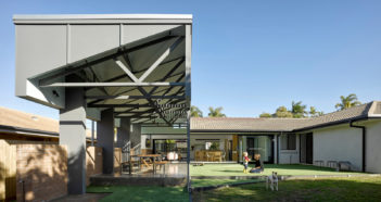
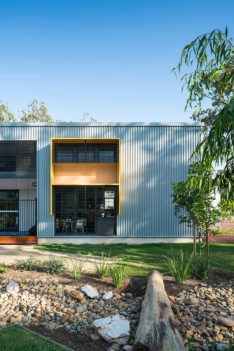
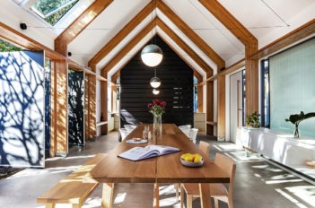
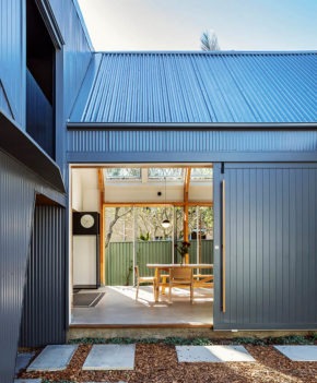
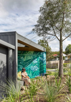
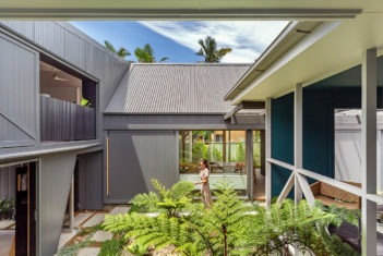
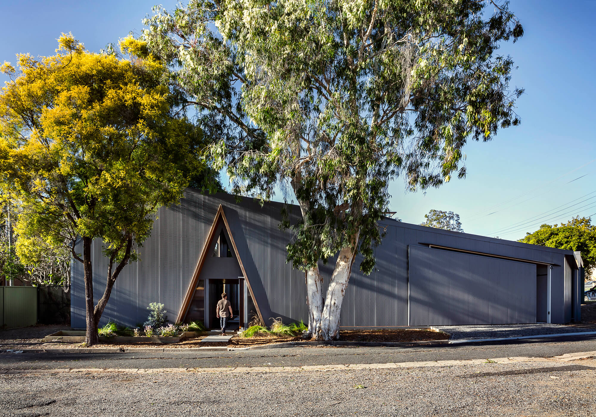
Peakaboo House | Alcorn Middleton
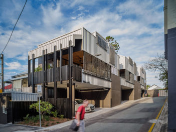
The Peakaboo House explores a fresh typology for multigenerational living in a suburban setting and a fresh approach to the use of steel building materials.
Located within a middle ring suburb of Brisbane, the compact site accommodates two related couples plus space for visitors, a surprising communal living area and a studio for their emerging architectural practice. The clever site planning allows both couples to retain privacy while experiencing the physical, emotion and financial support of living with family.
The additional space is accommodated in two new steel clad pavilions that wrap around the original, unremarkable but well-built house and create private communal garden. The collection of buildings and the location of the semi-public space provide a rich spatial layering.
COLORBOND® roof and wall sheeting is used to wrap the new pavilions. The practical and cost effective metal sheet solution deals with the tough exposure to the North West and conjures up the romance of the Australian bush. The Lysaght Panelrib profile material provides a brilliant backdrop to the native trees the architects carefully retained. The dramatic shed-like façade addressing the laneway has created much interest and intrigue in the neighbourhood.
The precision of the steel material accentuates the strong formal proposal.
Enduring Architecture
THE ROBIN GIBSON FOR ENDURING ARCHITECTURE
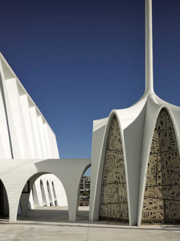
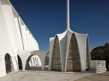
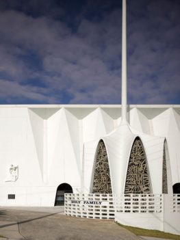
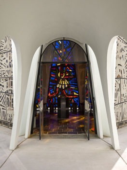
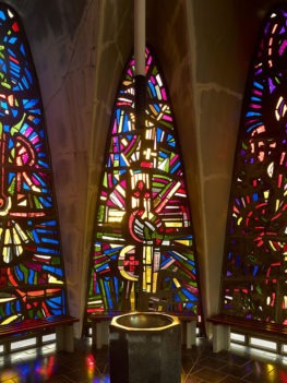
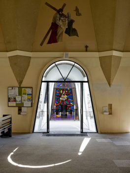
Holy Family Church, Indooroopilly | Douglas and Barnes Enduring Architecture
“The Holy Family Catholic Church at Indooroopilly is a dramatic piece of International Modernism that retains its drama and nuance today.
Commissioned by the Church under the direction of Archbishop Duhig, the design was one of the last churches completed during his 48 years tenure. Completed in 1963 by architects Douglas and Barnes, the project was led by Brisbane architect William (Bill) Douglas.
The church has two formal parts, the folded concrete roof and wall system of the main church and the separate round baptistery building.
These linked buildings are as impressive as they are distinct from each other.
The folded plates of the church were constructed with a giant mobile form that was unique in Queensland at the time. The church’s recent external repainting has reinstated the boldness and sharpness of these folded planes to again catch Queensland’s bright sunlight.
The baptistery’s coloured glass walls are breathtaking.
The church – now approaching sixty years of age – has ambitious architectural characteristics that would still present construction challenges today. There are certain aspects that still defy conventional wisdom for thickness of material.
The richness of the church is enhanced with inclusions of major artistic works by artists Ray Crooke, Andrew Sibley and Erwin Guth.
The church sits comfortably on a national stage and it is hoped this award will allow for greater recognition and potential contribution to its ongoing maintenance.”
Citation written by Lisa Daunt
(Many people have contributed to the information supporting this submission, but in particular the Jury would like to acknowledge Lisa Marie Daunt, Catherine Baudet and John Robertson. Lisa Daunt’s published articles on the church are extensive and detailed.)
