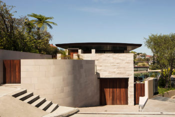
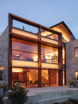
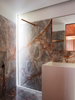
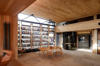
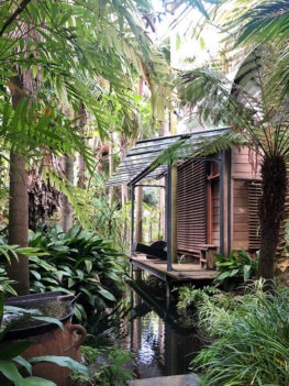
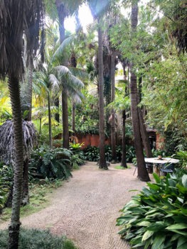
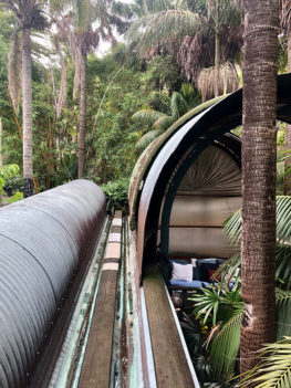
2020 NSW Architecture Awards Winners
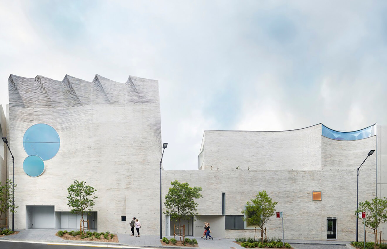
2020 National Architecture Awards
2020 NSW Architecture Awards - results
The Australian Institute of Architects Awards program offers an opportunity for public and peer recognition of the innovative work of our New South Wales architects. The program also provides the Institute with a valuable mechanism to promote architects and architecture within New South Wales, across Australia and internationally.
New South Wales Chapter Awards
Lord Mayor’s Prize
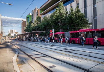
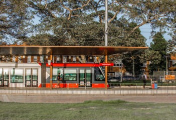
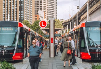
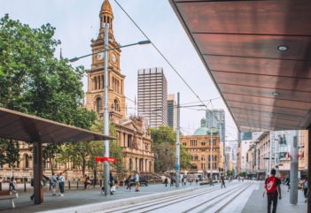
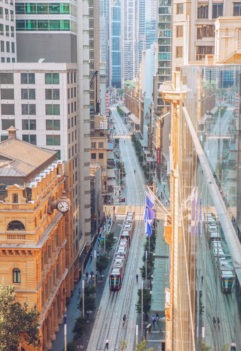
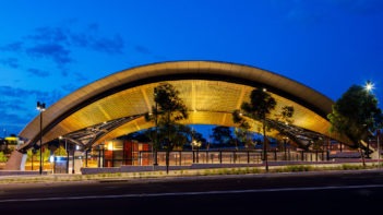
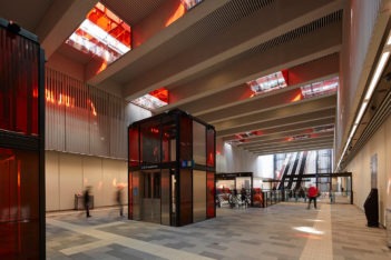
CBD and South East Light Rail | Grimshaw with ASPECT Studios, on behalf of Transport for NSW, project collaboration with City of Sydney and Randwick City Council
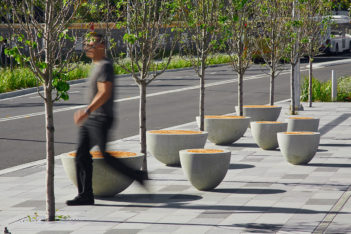
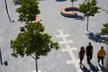
The 2020 Lord Mayor’s Prize goes to the CBD and South East Light Rail. This project has led one of the most significant transformations in the history of our city’s centre. Rather than simply adding or removing a transport service as in the past, it has enabled an expansion of the public domain as a pedestrian boulevard. It has prioritised people over buses and cars, and reclaimed George Street – arguably Sydney’s most historic street. It will be the backbone that connects the centre’s three future public spaces at Circular Quay, Town Hall and Central Station.
The realisation of the public domain will come in stages, with the first stage from Hunter to Bathurst Streets, already pedestrianised. The next stage, from Bathurst Street to Rawson Place, is likely to start in the near future.
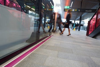
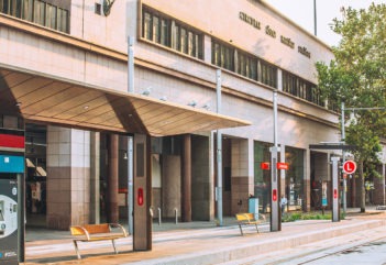
The urban design creates real amenity, with street trees, seating, lighting, paving, public art and bronze-clad stops. This will inspire civic activation and we have already seen private investment anticipate what it will become – a boulevard to stroll and take in the city both day and night.
Premier's Prize
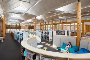
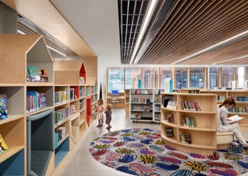
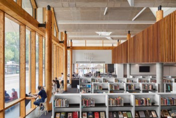
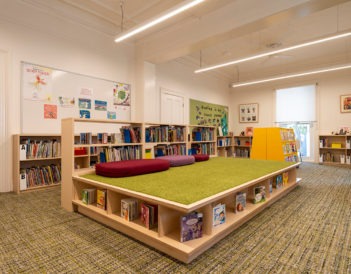
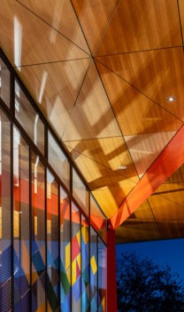
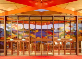
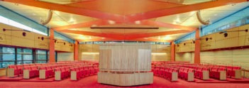
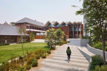
Marrickville Library | BVN
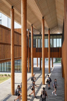
Situated on the site of the old Marrickville Hospital, the new Marrickville Library and pavilion reuses an important piece of the suburb’s history to create a place for Marrickville’s diverse community to meet, work, learn and play.
Blacket Prize
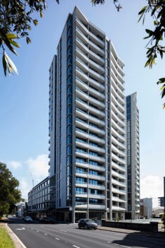
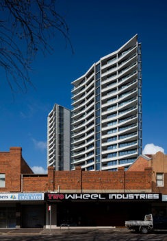
Verve Residences | CKDS Architecture with Hill Thalis Architecture and Urban Projects
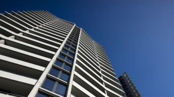
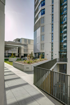
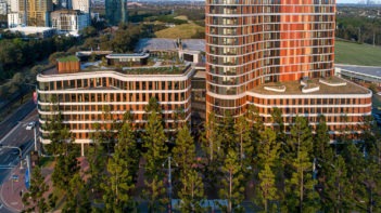
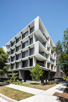
Verve Residences is an exemplary approach to high density living and a worthy recipient of the 2020 Blacket Prize. CKDS Architecture with Hill Thalis Architecture and Urban Projects have generously seized the opportunity to create a six metre wide public laneway following Cottage Creek., allowing public access along the north east perimeter of the development. Activating pedestrian and bicycle access, the project enhances connections to Newcastle’s foreshore and contributes new public space to the city.
This active ground plane facilitates and promotes the diversity of inner-city community living. Located within walking distance of local and regional public transport nodes, active retail and commercial precincts, Verve places value in civic spaces, activating the public realm and creating desirable residential living.
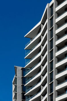
A low rise mixed-use podium level anchors two slender fan-shaped towers. Orientated to the north-east, the design maximises access to sun, fresh air and harbour views while maintaining privacy. A naturally ventilated, four storey carpark is embedded within the centre of the site, screened from the street by the apartments and topped with a communal roof garden providing outdoor communal space. Generous soft landscaping combined with mature tree planting and vegetable gardens create a space that will continue to grow with its new-founded community.
Emerging Architect Prize
Matthias Hollenstein | Studio Hollenstein
Matthias Hollenstein is the recipient of the 2020 NSW Emerging Architect Prize in recognition for his significant contribution to the architectural profession and the advancement of architecture within the public domain. His practice, Studio Hollenstein, is already the recipient of extensive recognition and accolades through architectural awards. However Matthias should also be commended for his personal commitment to urban design, education, practice and design excellence. In a very short period Matthias has broken down traditional barriers for young, emerging architects – locally, nationally and globally – and redefined the role and relevance of a younger generation of architects.
Matthias has achieved a remarkable amount in the years since graduating from the University of New South Wales. In particular, his Green Square Library project has been awarded and published through numerous stages and has offered the opportunity to create a globally relevant architecture and urban design studio that place human experience at the heart of everything.
Matthias has returned this knowledge to the profession through his various roles as a tutor at the University of New South Wales and the University of Sydney as well as being the youngest member of the NSW Government’s Design Review Panel, demonstrating commitment to the professional development of both future emerging architects as well as the profession as a whole. His work demonstrates how entering an architectural competition can create a new chapter for an emerging architect. Matthias’s achievements are a true inspiration for the next generation of architects.
Commercial Architecture
Sir Arthur G. Stephenson Award for Commercial Architecture
Phoenix Central Park | Durbach Block Jaggers with John Wardle Architects
Behind every great commission there is a great client, but more importantly there is a great architect working at their best. In these instances an architect is given a hard-earned freedom after incrementally producing countless reputable works in their lifetime. In the case of Phoenix Central, two great architects are working at their best; an enlightened collaboration inspired by a deep mutual respect and even deeper desire to exceed the aspirations of the other. This sort of collaboration is the only one that seems to work.
Many would say that it is easy to create a work of architecture for those that are offered such an opportunity; but this is the deceit of inexperience. There is a deep suffering in all good work, borne out of an understanding that technical detail must eclipse abstract desires for any work to be a lasting one. Enormous skill is required to navigate the privileged position of honouring a great client.
And Phoenix is a work that exists in this realm, relying on the client’s judgement, benevolence, kindness to our profession and an ability to let the intent unfold. What is certain has been imagined. More importantly, ‘what is uncertain’ has also been allowed to emerge, and in this space alone, exists enormous architectural potential and the possibility for real design excellence.
Some projects form part of the collective consciousness of our profession. Whether they are liked or not, they are works that are respected without doubt worthy of the merit of all time. Phoenix Central is just such a work.
Award for Commercial Architecture
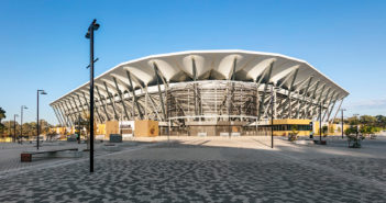
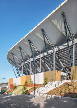
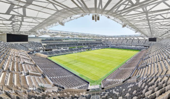
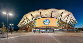
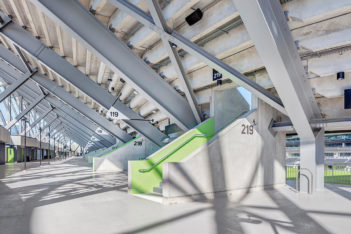
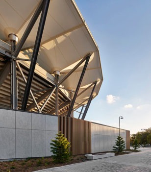
Bankwest Stadium | Populous
It is often lamentable when public buildings fall short of all that they could be. Stadiums, museums, art galleries and libraries are too often presented as ‘commercial’ developments; frequently lacking the enduring, universal qualities that make a truly civic project. It is therefore unsurprising in this context that a public stadium, such as Bankwest Stadium, was not also entered in the public architecture category of these awards. This attitude of public buildings being regarded as developments rather than offerings to the future impoverishes our cities and speaks poorly to the values of our time.
The stadium in Parramatta sits humbly within this context and yet delivers a project with an unexpected intimacy, humanity and tactility. Designed with a sophisticated understanding of stadia, every attempt has been made to offer humanising spaces, capable of traversing wide-ranging programmatic requirements, from a local weekend game to a full capacity star-studded concert. The decision to work with Australian steel inspired visual cues to memories of our city, exposing that an intimate experience is possible in this important civic building. The detail too, in the use of only local sections, is masterfully executed.
The architect has made this a work of clear and public dimension by providing the possibility of a personal experience through adroit plays of structure, repetition, proportion and careful physical dimension at every turn. Such attentiveness to these important architectural tools has become rare in this typology and in our profession generally; this project delivers all these things beautifully and with grace.
Award for Commercial Architecture
Daramu House | Tzannes
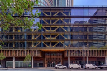
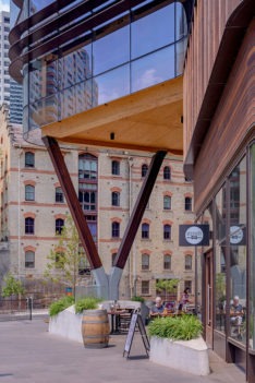
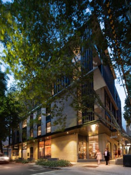
This remarkable building is a development of an already important neighbour by the same architect. What is most laudable is the continuing evolution of the ideas that are brought to a measurably higher level of resolution in this second work. This course is rare in commercial developments and rarer still in commercial developments within its precinct. It shows a developed ability on the part of the architect to persist with improvements upon their own excellent work without the propensity to embellish the narrative with the present fashions of workplace outcomes.
The building’s nuanced regard to its corner position and the gentle delivery of its skin in response to entry, shelter and ground floor program imbue the work with elegant confidence and a refinement not often seen in commercial buildings. This approach is particularly noteworthy at the level of the public domain where too often the detail and finesse required to make a great city is lost. Daramu excels at both the micro scale of human touch and the macro scale of providing a street wall to an emerging precinct. It is perhaps not too grandiose a statement to posit that works like this reflect the hand of each individual who lovingly commits to making something great. The work is incredibly personal and masterful and should be regarded as a relevant precedent in this sector for many years to come.
Commendation for Commercial Architecture
44A Foveaux Street | Hill Thalis Architecture and Urban Projects
One part at a time, our city is made of everyday buildings that join to create streets which offer a backdrop to our daily life. Then there are everyday buildings that invite incredible interest and intrigue and propose a frame of reference for future possibility. In this work, an alterations and additions project, the consistency of intention throughout is evident. Cast in a manner which characterises it as a highly considered, exceptional project in all of its parts, this building lifts the character of the street in a manner that also raises the expectation for what may come next.
Commendation for Commercial Architecture
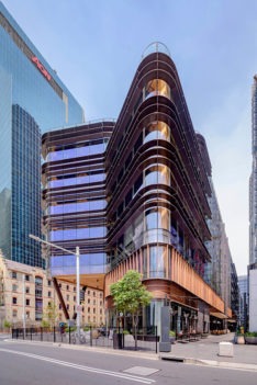
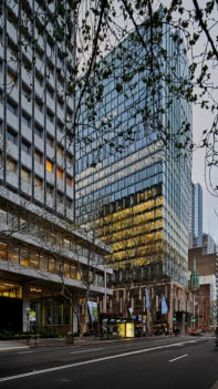
Sixty Martin Place | Hassell
Commercial buildings often hold boring silhouettes on the city’s skyline, but the nuanced and reactive play of this tower to heritage has been the impetus of a sculptural form that is a welcome addition to our city’s towerscape. In contrast, the building’s urban judgements at the ground plane – amplified by the details used in its facades, public thoroughfare, service areas and entry points – are secondary to the nature of the tower’s silhouette. The building should be commended for a unique approach to balancing heritage with a client’s commercial objectives.
Educational Architecture
William E Kemp Award for Educational Architecture
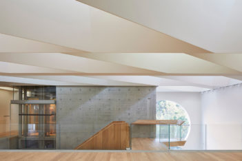
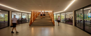
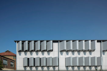
MLC School Senior Centre | BVN
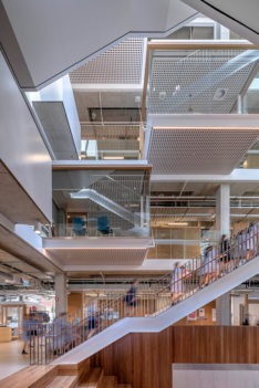
With an eye on the future of collaborative work-place environments the Senior Centre enhances learner-centred design principles by providing daylight-illuminated spaces that enable students to take increasing responsibility for their own learning and be more self-directed in how they shape their learning experience. Open areas have successfully blurred the boundaries between spaces such that staff and students are often working side by side in their preparation time. The glass pods suspended throughout the building encourage senior students to make the most of the opportunity for private study, small group study or meetings with teachers. There is a harmonious and successfully realised balance between open collaborative spaces, performance, practical and more traditional spaces.
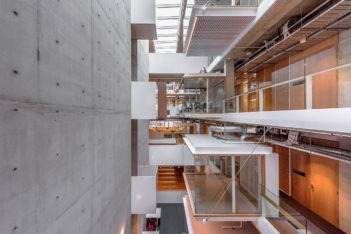
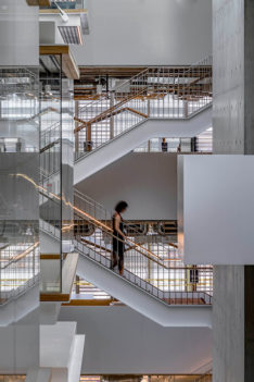
At the heart of the Senior Centre is a central atrium that functions as a lightwell with a large skylight above illuminating each level, including the ground floor amphitheatre. The pop-out meeting and quiet rooms addressing the atrium energise its volume with the activities clearly visible within. Careful consideration for the staging of small but important moments of human activity are enabled with the inclusion of Juliette balconies within the large volume interior.
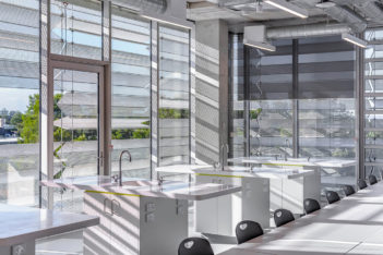
The simple yet sophisticated facade of the Senior Centre is composed of a full height, double glazed, high performance envelope, which maximises access to daylight. A skin of perforated folded aluminium panels wraps around the glazed facade, providing a combination of sun-shading and privacy. The automated louvre windows naturally ventilate the building. In instances the Senior Centre facade is pierced by large pop-out windows, which offer views and vignettes of the learning experience happening within the building. The immediacy of raw concrete is framed throughout with sharp detailing and the management of natural and artificial lighting that imparts warmth and delight to this high quality place of learning.
Award for Educational Architecture
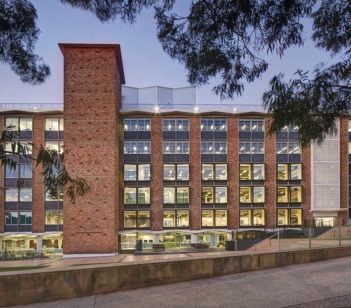
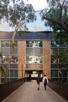
Electrical Engineering Building | Hassell
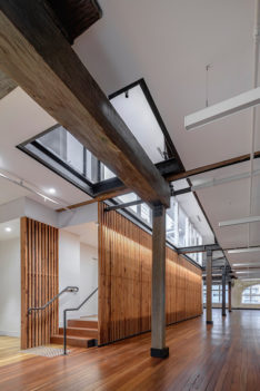
The project involved the thoughtful refurbishment of the existing UNSW Electrical Engineering Building, a highly expressive building located in the academic heart of the UNSW’s Kensington Campus.
The project team balanced the functional needs of 21st century learning and research environments with an appreciation of the original building character and an ambition to ‘reveal electrical engineering through transparency, materials and light’.
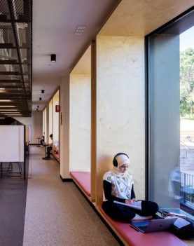
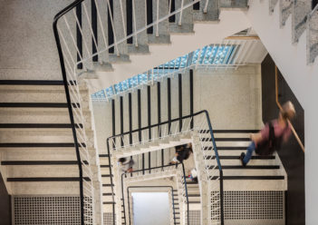
This approach guided a series of careful interventions in the building fabric that removed double loaded corridors and replaced them with a variety of both fixed and flexible teaching, research and social environments. Large window reveals reinforce the building’s character, allow daylight deeper into the interior and provide both informal study areas and better access to views of University Mall. Building services are upgraded and the roof is crowned with a reflective and transparent veil that screens the necessary plant rooms, while at the ground level the interior spaces are augmented by a new informal outdoor learning amphitheater.
The project has enabled the building to efficiently service future generations of learners in contemporary spaces that support UNSW’s ambition for academic excellence, social engagement and global impact.
Award for Educational Architecture
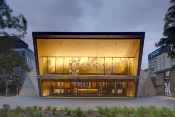
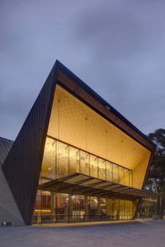
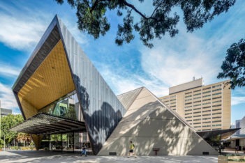
University of New South Wales Sir John Clancy Auditorium | lahznimmo architects
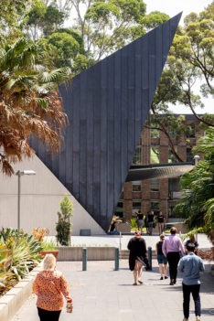
In a time of destruction and redaction of many brutalist buildings due to a lack of public understanding, a refurbishment which elevates the legibility of a building of this style is extremely salient. lahznimmo architects’ alterations and additions to the UNSW Sir John Clancy Auditorium do just that, contemporising the legibility of this typically difficult style by cracking open its shell to reveal a jewel-like centre.
Originally designed by Fowell Mansfield Jarvis and MacLurcan Architects, this building withstood the typical decline of many brutalist buildings through insensitive additions, subtractions and lack of maintenance. In an erudite move, the university chose to rehabilitate this auditorium rather than replace it.
Standing as an imposing sentry to the Upper Kensington Campus Gate Nine Arrival Precinct, lahznimmo have reestablished its address by folding open its entrances to a gold, purple and royal blue interior. This rich interior takes its cues from the existing tapestry Banner, installed by the artist Mona Hessing and spanning 20m across the northern foyer. These sonorous colours and textures are juxtaposed against the cool off-form concrete walls and soffits, which have been painstakingly restored, elevating the intended brutal beauty of this modernist monument.
Commendation for Educational Architecture
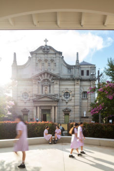
Bethlehem College Ashfield | Neeson Murcutt+ Neille
In a carefully choreographed set of interventions and deletions, a tired, crowded and disjointed collection of heritage and aged buildings are transformed here into a connected series of learning environments that suits the needs of future focused learning and creates a new focus for the school around a central courtyard. A connective spine through the heart of the school reestablishes the visual link to the church, provides efficient orientation and circulation to learning areas, and enables the life of the school to percolate through its arched feet, breathing new life into the campus.
Commendation for Educational Architecture
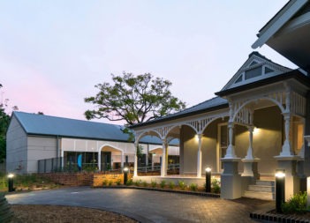
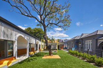
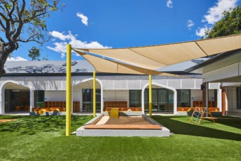
Meriden School – Lingwood Campus | Allen Jack+Cottier
The Meriden School Lingwood Campus is home to a heritage listed Federation house set to the rear of a large block. Rather than dominate the site with new development, Allen Jack + Cottier have sensitively wrapped their new passive house designed classrooms around the rear boundary, retaining the house as the key site address. In doing so, the remainder of the site is given over to landscape and play. All interventions in the site are sensitive to the Federation house form, while scaled for their occupants, preschoolers and kindergarteners.
Heritage Architecture
Greenway Award for Heritage Architecture
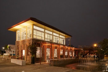
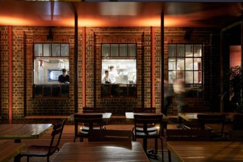
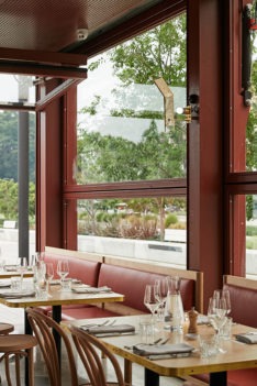
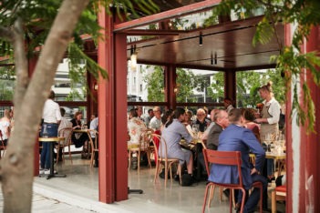
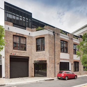
The Signal Box Restaurant | Derive Design
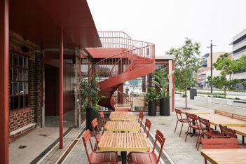
The Newcastle Signal Box Restaurant is an inspiring example of adaptive reuse. The Signal Box is one element of the State listed heritage item, Newcastle Railway Station Additional Group., One of the few remaining operational signal boxes, it is also the only one of its type. The intact lever switch gear, which demonstrates the important technical innovations introduced at the time the Signal Box was constructed in 1936, along with the sightline connection to the former Newcastle railway station, generated the design brief and dictated the form, character and detailing of the new pavilion.
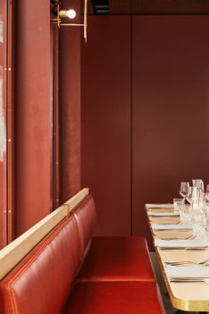
The new café pavilion is deliberately modest, light and finely detailed, in deference to the strong aesthetic of the masonry Signal Box. A new spiral stair, which takes its cues from the existing interior stair, provides visual public access to the mezzanine housing the lever switch gear and the rooftop. A steel awning delicately connects old and new and its axis guides visitors moving eastward to the pavilion dining room echoing an arriving train. The pavilion’s dimensions are based on the longitudinal geometry of the Signal Box interior and the facades are divided into three glazed door partitions to reflect the imperial proportion system commonplace in railway geometry. The hydraulic operation of the windows emulates the miniature hydraulic lever gear and the circular rooftop enclosure makes reference to a former turntable structure uncovered during ground works that remains concealed underfoot. The steel structure is finished in a matte red oxide in tribute to the old ‘red rattler’ carriages and nearby shipping containers.
The success of this project is due to the architect’s thoughtful interpretation and response to both the tangible fabric and intangible meaning of the original.
Award for Heritage Architecture
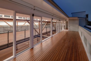
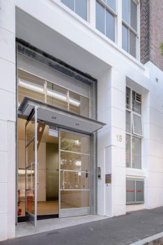
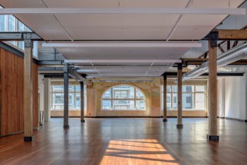
Level 5 Ballarat House | Hill Thalis Architecture and Urban Projects
This award recognises a project where every clever thing has been done to recognise culture and interpret it into the future.
Ballarat House is a tall Edwardian warehouse building by the eminent practice Morrow & De Putron, long ago converted to office use and now a heritage item. It has been fully investigated, understood and made more useful by the designed inputs of Hill Thalis over two decades. The intelligence, craft and originality of the result are matched only by its subtlety.
Today, commercial office space is complex. In this project everything from its floor space offering, natural light, and fire strategies to urban address have been boosted with minimal impact. Architect and client have worked together to achieve more than compliance. The creation of a second urban address significantly augments the commercial viability of the building.
The use of engineered fire safety solutions has left a surprisingly small list of interventions. For example, in the new foyer to Foster Street proudly stands the retained and functioning Ordinance 70 Booster Pump Set.
If all buildings in our environment were given this manner of architectural attention ours would be indeed a sophisticated, sustainable and enriched culture.
Commendation for Heritage Architecture
Emanuel Synagogue | Lippmann Partnership
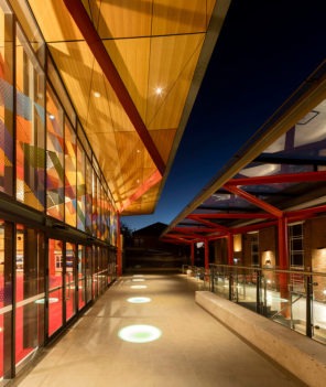
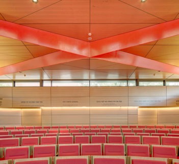
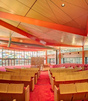
The new sanctuary for 700 worshipers adds an exciting contemporary layer to the Emanuel Synagogue, identified as a local heritage item. The site includes the beautiful original Synagogue building designed by Samuel Lipson in 1941 and the Neuweg Sanctuary designed by Aaron Bolot in 1962. The new sanctuary is a bold and vibrant addition which has been thoughtfully inserted into the site, responding to and complementing the existing architectural language in an exciting contemporary way.
Commendation for Heritage Architecture
Wellington Street | SJB
This award recognises the worthy adaption of a contributory item in a heritage conservation area by minimal interventions and a very well-judged addition.
Normally we add vertically to buildings using set back facades, but here the architects have accepted the higher challenge to build on the line of the façade at the prominent north end, in a controlled aesthetic based on direct treatment with sheet steel.
The internal interventions have interpreted heritage significance and its own contribution intelligently and creatively.
interior architecture
John Verge Award for Interior Architecture
Phoenix Central Park | Durbach Block Jaggers with John Wardle Architects
Phoenix sits somewhere deep in memory; a mnemonic dimension of the project which delivers great freedom away from experience while concurrently being influenced by the familiar deceit of our eyes. The street offers insights to interior spaces and despite the belying blank wall (where even vents are hidden in the detail) there exists an implication of enormous volumes beyond the street. Anticipation of what lies within is as important to the interior as it is to any urban offering. Activation in this sense is by form alone.
The bespoke, the implied and the anecdotal are often lost in contemporary work. This project imports all of these in the course of its crafting with precise and subtle terms; a rarity in projects of this scale.
There is something to be said about collaborations in architecture. In the most part, they are arenas of compromise, egos, and delivery of perfunctory outcomes. Occasionally a collaboration produces a masterful outcome where enormous generosity is evident, with each architect ‘working at one’s best’ in full sights of their respected colleague. Such collaborations are usually not required by the client but are volunteered by the authors with a deep commitment to the work rather than to themselves. Such a partnership leads the project with trust in each other and an understanding that the whole is better nurtured by the team. In these partnerships the love for the work eclipses egos. Phoenix is such a work.
Award for Interior Architecture
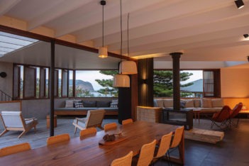
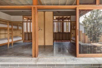
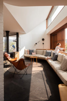
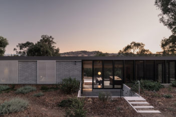
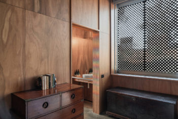
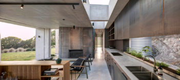
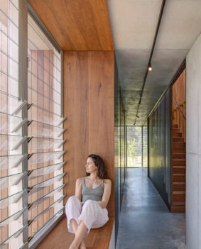
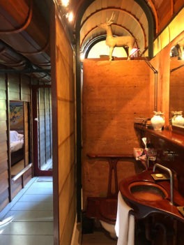
Breezeway House | David Boyle Architect
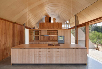
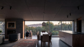
Breezeway House is highly evocative, drawing on signals of summer retreats past to provide a space that embeds serenity alongside joyful anticipation. This dual interaction with nature and companionship unfolds masterfully in the hands of an experienced and talented practitioner.
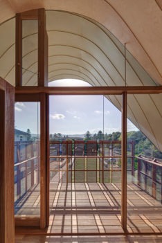
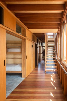
The house is composed from a simple structure of room and corridor. The corridor is almost externalised, connecting the occupant to the outside environment mostly through feeling rather that sight. Understanding with precision the nature of this decision, the architect develops a particularised approach to habitation. The bedrooms are like cloisters whilst the living spaces are nuanced and persistent, shaping their use and prospect to light and view. Such persistence applies to the private nature of the public uses of this house. A prime example is the intimate look-out balcony on the roof which allows for one person alone to be in the landscape.
This house provides an exemplar of interior experiences that are precisely related to their function. It also provides an important apprehension of the significance of a spirituality in habitation. It does all these things by elevating the everyday requirements of light, colour, material, detail and furniture by proffering a residual love of the tasks to hand with every element, seen and unseen.
Award for Interior Architecture
Grant Pirrie House | Virginia Kerridge Architect
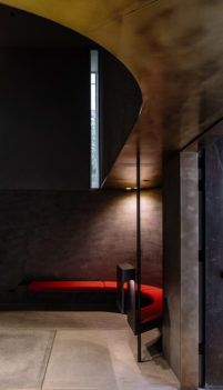
It is rare that a house can provide a cinematic experience. Grant Pirrie House frames the second chapter of a client’s life with art and architecture with the adaptation of space that originated with the already highly accomplished work of Graham Jahn. Jahn’s work acts as a springboard to a further developed interior to suit a new stage of life. The return-movements upon one’s own paths is reminiscent of Pierre Chareau’s Maison de Verre in Paris. Concurrently the design develops into a contemplative piece work of darkness and shadow as it does a work of light and detail. The masterful play of colour and materiality originally developed by Jahn are progressed by Kerridge, who acknowledges the composition’s dual authorship, providing a respectful deliberation into the earlier work. The life and loves of the client are evident as you sequence through space, reminding us that a rich palette is as much the client’s animation as it is the hand of a great architect. Pragmatic at times but mostly artful, this interior develops the idea of working over the respected achievements of a peer, honouring their mastery and feeling comfortable to edit as required. It also considers that the entirety of the architectural profession may indeed be ‘one’ if it embodies respect, reverence and reticence in everything that it does as a whole. This is the work of a culture and profession at its best.
Award for Interior Architecture
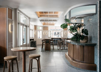
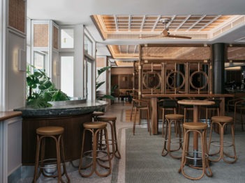
Hotel Rose Bay | Richards Stanisich
Influenced by the desire to be at the vanguard to capture an untapped market, the lifecycle of hospitality interiors is often short-lived. What is refreshing about Hotel Rose Bay is its untapped market was already there; a proliferation of locals waiting to feel welcome.
The Hotel Rose Bay provides a repeatable example of the gentrification of a traditional pub and marks a time in history when pubs have become outward-looking, engaged with the street, and offer a restaurant-like family experience. In considering this course, the architects have engaged in delivering an outcome in the form of a theatre set, responding to historical precedent in contemporary ways to reveal a sustainable and durable position in its universal theme. The compartmentalisation of uses appears seamless and yet there is a retention of the old-pub values and program of ‘drinking at the bar’.
This work is one of detail; precise consideration of colour; and composition of spaces in relation to these elements. Some locals may lament the missing model-train which once adorned the old pub’s ceiling, but it is better lived in folklore – a memory of a time when the hotel needed trinkets to draw patronage. Today the interiors spill onto the streets, welcoming all who walk by and the trinkets are of another time.
Commendation for Interior Architecture
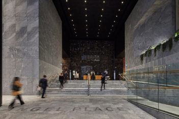
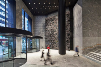
AMP Angel Place Lobby Refurbishment | Hassell
The feel of a space is often an undervalued concept, yet this work embodies the notion of the imperceptible by creating a repeating series of rooms within a room. The matryoshka approach to interior space creates the requisite bump or overlap of interaction, which makes for lively space further emphasised by the layering of warm, rich patterns and materiality. At its best, this typology typically results in the now familiar attractive ‘pass-through’ space; a space one could contemplate visiting without having business in the building above. This represents a rarity in the city that could easily be replicated as another layer of our city’s detail.
Commendation for Interior Architecture
Bismarck House | Andrew Burges Architects
If landscape is to be prioritised in any house, often what is then left over is a compromise of internal spaces difficult to reconcile. In this narrow site, internal spaces engage masterfully with the very garden that has hollowed them out. The gardens are developed as part of the interior, providing the fourth wall of every room. Tiny, impractically shaped spaces are made purposeful via an engagement with gardens which often offer the third wall to the interiors presented. This is difficult to read in plan but clear on closer inspection. Surprisingly, the prioritisation of the landscape has formed a residue for very engaging interiors.
Commendation for Interior Architecture
CBA ‘Axle’ South Eveleigh | Woods Bagot with fjmt
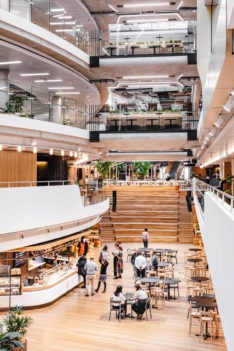
Appreciation for a workspace as a place of choice is embodied in this commercial interior. The joy in the work is borne out of the broad architectural decision to provide an internalised atrium of light engaging a society of highly adaptable rooms. The interior atrium is a well considered move in the plans that is perhaps a result of an acknowledgement that the urban street form of the precinct may be flawed, and that the interior may need to compensate. This is a highly accomplished work that can be lauded for providing a joy filled internalised public environment, redressing what is deeply lacking in the street with a superior interior outcome.
Commendation for Interior Architecture
Emanuel Synagogue | Lippmann Partnership
A contemporary addition to the faith community, this work purports to provide a contemporary and radical expression of an interior for one of the most ancient forms of worship. Its expressions are bold, constructional and humane within the context of a structural pattern that considers the importance of architectural hierarchy and order. The room is a surprising colour and the transformative experience of this colour provides an intrigue and rareness to the traditional forms of this building type.
public architecture
Sulman Medal for Public Architecture
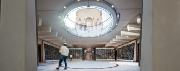
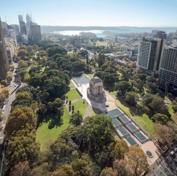
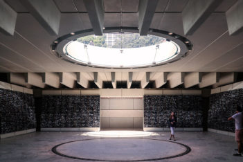
Anzac Memorial Centenary Extension | Johnson Pilton Walker with the Government Architect NSW
The Sulman Medal is a prestigious award, recognising projects that have attained an exceptionally high level of architectural endeavour and public amenity. The Anzac Memorial Centenary Extension is a fitting recipient of this award.
The original project by Dellit in the 1930s is well known and admired in its position at the head of Hyde Park, but the original vision of cascading fountains to the south of the memorial remained unrealised until this project, which was first conceived in 2007.
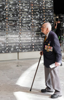
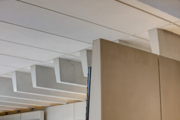
Neither a replica nor a pastiche of the original idea, the Centenary Extension looked beyond the brief to transform a subterranean education extension into an, integrated experience. It takes the visitor on a journey from the bustling street, down through to the Hall of Service and facilities beyond, at all times connected physically, visibly and metaphorically to the Hall of Memory and Hall of Silence in the original memorial. This is very much a journey of the senses; the absence of city noise, the light and shade, and the texture through the interplay of a well-orchestrated palette of materials that, while modern in their execution, seek a respectful conversation with the original memorial.
In the truest sense this project speaks of collaboration. In an echo of the original pairing between Dellit and Rayner Hoff, the collaboration between Fiona Hall and Richard Johnson of PTW results in a single experience of art and architecture. Collaboration between JPW and Government Architect NSW made the project possible, including the artful execution of the enormous community project to gather soil from all corners of NSW and battle sites overseas in under 18 months.
The Anzac Memorial Centenary Extension has connected the people of NSW with the ANZAC story once more, respectfully interpreting Dellit’s vision and embodying the spirit of collaboration and community in a suitable living memorial to service, sacrifice and courage.
Award for Public Architecture
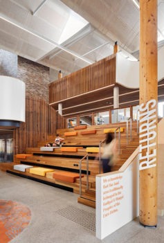
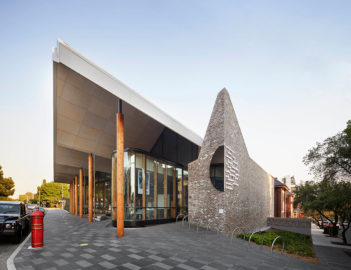
Marrickville Library | BVN
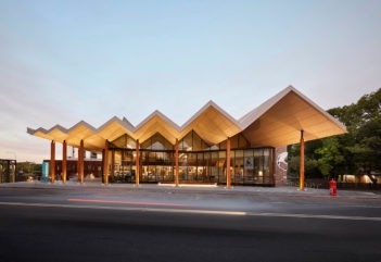
As intended, Marrickville Library and its entry courtyard successfully form a gateway to the suburb. However, additionally and more importantly BVN have created a new heart for the Marrickville community. The Library, in form and program, represents this diverse community. The roof mirrors then bounces away from the existing heritage listed Marrickville Hospital, tying in with the pattern of two-storey housing to Marrickville Road, while presenting at a warehouse scale to the entry courtyard.
Internally, the variety of spaces caters to the diverse range of uses and people welcomed in this contemporary library setting. Users can sit on tiered seating below a soaring ceiling, in cushioned nooks, or on the open balcony of the refurbished hospital. The new addition celebrates this hospital by wrapping around it to enable the heritage brick facade to remain a feature in the new timber- and concrete-lined space. The multi-peaked roof takes on a further role by providing generous natural light while controlling acoustics and venting hot air.
This project represents a true vision for the future of public architecture which must be more than a monument to its purpose or its maker. It achieves this by being a facilitator of community engagement, a positive contributor to and representation of its contextual fabric, and a celebration of its historic and natural environment.
Commendation for Public Architecture
Metro North West | Hassell with Turpin Crawford Studio and McGregor Westlake Architecture
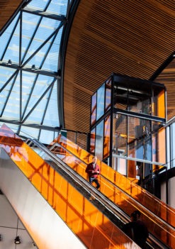
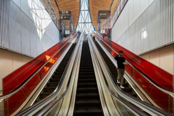
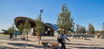
The North West Metro includes eight new stations, five furbished stations and the associated precincts, carparks and service buildings. A pattern book of structures and materials unites the series of stations that each adjust to suit the local conditions along a 31km corridor in Sydney’s northwest. The stations and complementary plazas and gardens of North West Metro offer an elegant, yet robust architecture that both expresses an engineering logic and frames considered, artful spaces.
Commendation for Public Architecture
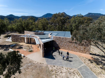
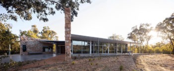
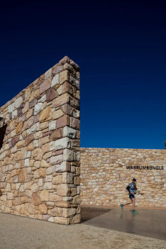
Warrumbungle National Park Visitor Centre | TKD Architects
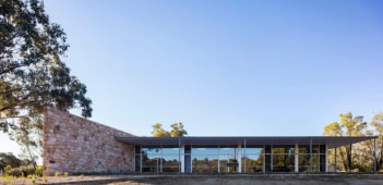
The challenge of inserting a new built environment within a dramatic and ancient landscape is here realised with apparent ease and respect. Rather than compete with the spectacular silhouette of the Warrumbungle National Park escarpment, the solution for the new Visitor Centre – replacing the previous one destroyed by bushfire – has been centred on striking a strong horizontal roof line that contrasts with the undulating nature of the surrounding landscape.
In plan the new Visitor Centre engages positively with its immediate landscape through the use of curving, stone-clad walls that celebrate the iconic volcanic dykes and rock formations, while offering a strong sense of arrival that intuitively guides visitors to the heart of the centre.
Residential architecture - Houses (alterations and Additions)
Hugh and Eva Buhrich Award for Residential Architecture – Houses (Alterations and Additions)
Bismarck House | Andrew Burges Architect
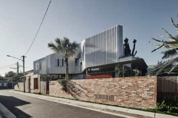
Bismarck House is a richly layered and exquisitely crafted transformation of a semi-detached dwelling. Breaking with the expected sequencing of rooms, the building form pinches to introduce a courtyard space between dining and living areas, inserting greenery and light at the centre of the plan. The house masterfully embraces the opportunity of the corner site to address the side lane along its length. This move offers activated screens to the living spaces and softly planted landscape edges to the beachside suburban backstreet.
The chosen materials are raw yet heightened by their combination and treatment. Exposed concrete floors and soffits are balanced with fine frames of galvanised steel and glass. White-washed brickwork to the ground floor living rooms modulates into polished plaster walls for first floor bedrooms and bathrooms, the materiality shifting to reflect departure from the public realm of the house. The first floor is draped with a screen of perforated aluminium pleats. This produces the impression of a floating form above the monolithic ruins of the ground floor, its own rooms being engulfed by an equally considered and textured garden. Bismarck house achieves a completeness in its consideration of the existing building, new addition and garden. Architecture is generously gifted to the street to the same degree it is afforded to its inhabitants; playful, elegant and enduring in its expression.
Award for Residential Architecture — Houses (Alterations and Additions)
Grant Pirrie House | Virginia Kerridge Architect
It is a brave architect who takes on a renovation of a Robin Boyd awarded house. Virginia Kerridge Architects have done just that, successfully altering the already highly awarded design by Graham Jahn.
The house needed to adapt to a changing family and, rather than starting afresh, Virginia Kerridge Architects have carefully worked with the existing fabric to create an entirely renewed dwelling. Demolishing select walls and rearranging a kitchen space, shading certain areas and providing new external spaces for the living rooms; the design is considered and respectful of the existing house.
This project demonstrates that an evolving family can renew and subtly transform their existing house to accommodate changing needs. Virginia Kerridge Architects are to be congratulated on their elegant and meticulous alterations.
Award for Residential Architecture — Houses (Alterations and Additions)
JJ house | Bokey Grant Architects
This project celebrates the existing form of the inner-city Federation bungalow with an alteration that chiefly retains and transforms the traditional nature and organisation of the house. With thoughtful detailing the alterations contain a playfulness that celebrates its occupants to provide an individual sense of home to an otherwise familiar building typology. The original hallway form is retained as an organisational spine for the traditional layout of bedrooms; bathroom and living areas are accommodated within a rear lean-to structure.
With retention of the existing building form, the alterations are thoughtfully conceived to maximise the latent qualities of the house. The minimal approach to the new interventions steps quietly to find a balance in renewing the home yet finding a place of belonging in history. Heritage light fittings, cathedral glass, tiles and joinery are transformed in their detailing to belong in a contemporary setting. The kitchen area is cleverly twisted to address the side boundary of the property providing an often ignored connection to garden along the side passageway. JJ House is exemplary as an approach for altering and establishing a sense of individuality in the recognisable housing stock of our suburbs.
Award for Residential Architecture — Houses (Alterations and Additions)
Redwood | Chenchow Little
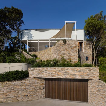
Architecture can sometimes feel linear in its problem solving and extrapolation from plan to section, to elevational form. Sometimes the parti-diagram can be so clear as to dictate the terms of how the architecture is created. This certainly didn’t happen here.
Chenchow Little’s Redwood is an architectural wonderland of creative invention. Beautifully crafted, curved forms in plan and section hidden behind a sandstone street wall that make spaces of such resolved delight that it is easy to forget the parti had long been satisfied. Essentially Redwood’s main requirement is as a linking building between street, garage and heritage listed house that needs to straddle a steep slope and several levels. It does all this before breaking out into a controlled and focused cantilevered living room that neatly turns it back on the towering residential flat building next door to focus on the harbor view and protect the privacy of the gardens of the home.
Big budgets don’t always bring such joy and delight as this work does. Chenchow Little’s material restraint and subtle and sublime detailing set against the deliberately playful spaces makes this highly skilled architecture. Their talent is further emphasized by the disciplined and respectful planning and restoration of the heritage building so that it happily plays its programmatic part for this grand home.
Award for Residential Architecture — Houses (Alterations and Additions)
Waterloo House | Anthony Gill Architects
Wonderful architecture is made of the best story telling. Where the architect so completely understands the story of the building they inherit and that of the clients they seek to design for that they can gather all the strands together and recompose them into a compelling new narrative.
Anthony Gill’s deep affection for this grand row of rudimentary but intrinsically special terraces of a ‘cricket pitch’ sized roof along with a second level datum that allows the spatial arrangement of terraces to change as the street rises and falls provides a rich foundation from which to craft his careful, but minimal interventions to make sublime spaces.
Rarely do you see such an unpretentious and client-focused work deliver such outstanding architecture. Every move appears so appropriate it is hard to imagine this work is not part of the original intent of the terrace house project.
Materially rich and crafted alterations and additions make each room not only functionally satisfying but joyful moments simply just to be in. An ideal for every home, but an ideal rarely realised. This is highly skilled and disciplined architecture that is characterised by knowing exactly what to do but, importantly, knowing what to leave alone.
Commendation for Residential Architecture — Houses (Alterations and Additions)
Courtyard House | Joe Agius Architect
Sophisticated ideas of intergenerational living, palimpsest, and allowing the home to engage with an urban street corner are all realised at Courtyard House.
Joe Agius Architect’s rich, nuanced and sophisticated design response for this old Victorian terrace, long since bastardised, was both a delight and a relief. A delight in how it designed and made a lovely architecture, and a relief in that it embraced these bigger ideas with real effect. This home adds to the conversation of what home and architecture can be.
Commendation for Residential Architecture — Houses (Alterations and Additions)
Exoskeleton House | Takt Studio
Exoskeleton House is a skilled extension of an existing bungalow. The exposed steel structure addition re-orientates the house to the garden and provides open plan living areas that appear to float in the trees. The internal alterations to the existing bungalow show care and restraint with timber details repeating throughout. Through simple and expert planning, Takt Studio have revitalised the existing house, readying it to welcome large family gatherings.
Commendation for Residential Architecture — Houses (Alterations and Additions)
House RV | Plus Minus Design
An exercise of removal rather than addition is employed to make legible rooms and connections to an enlarged garden within a former project home. The existing built form is chiefly retained with the repositioning of garage and pool the primary interventions redefining the two storey home. Detailing and materiality is unfussy, placing the importance of the inhabitants and the functions of the individual rooms at the fore. The approach shows skilful restraint to amend the previous disconnect between house and site.
Commendation for Residential Architecture — Houses (Alterations and Additions)
Lindfield House | Polly Harbison Design
Soaring ceilings and deep thresholds define this elegant addition by Polly Harbison Design. The alterations successfully combine simple and robust materiality with vibrant interiors by Arent & Pyke. The carefully detailed addition uses generously proportioned living spaces to take full advantage of the oasis-like garden.
Residential Architecture – Houses (New)
Wilkinson Award for Residential Architecture (New)
Glebe House | Chenchow Little
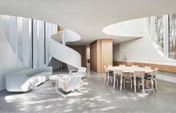
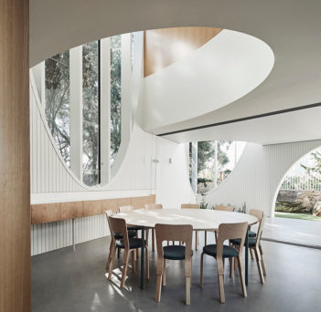
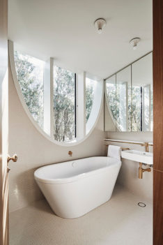
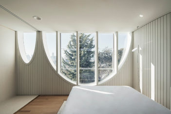
Behind its enigmatic facade, this modestly sized but generously proportioned four bedroom house on a tight inner Sydney site provides an exemplary balance of imagination and restraint. A rigorous exploration of the parabolic arch has produced a richly sculptural but highly efficient living environment that responds to the needs of each member of the family – adults and children – offering spaces for retreat and celebration, openness and privacy.
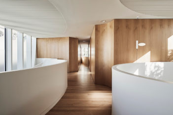
The consistent architectural language and limited material palette translates its neighbours’ Victorian decorativeness into a work of originality, free of pastiche or sentimentality. It is truly a house for the 21st century. While the refined, almost minimalist detailing and carefully arranged photographs suggest otherwise, it is an environment that can effortlessly and elegantly accommodate the contradictions and clutter of family life.
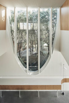
The house expands the potential of a small building by juxtaposing unexpected elements: the monumentally scaled windows and the modest spaces inside; the lush joinery curves of the internal walls and the simple white timber boarding of its envelope; the simple prism of its external volume and the complex sculpture of its interior.
The architects’ and the builders’ undeniable skill in detail and material results in a building that looks effortless but surprising, meeting the brief with real beauty. In the clients’ own words, ‘it is inviting and luxurious and yet simple and humble.’
Award for Residential Architecture (New)
Basin Beach House | Peter Stutchbury Architecture
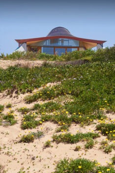
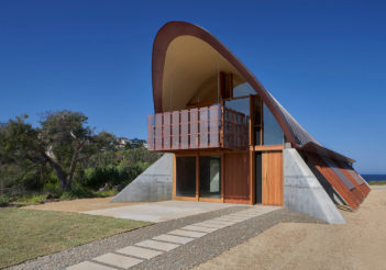
A curved copper shell stretching almost 25 metres from east to west creates a comforting cover for this private residence in an exposed location in Mona Vale on Sydney’s northern beaches. On either side, seven cast concrete feet anchor the building to the ground, like a crouching animal or a giant beach tent. Its vaulted roof rises away from the Pacific Ocean, concealing underneath a series of spaces – living, kitchen, family and then all three bedrooms – that retreat into increasing privacy the further their position from the water’s edge.
The eastern front frames views towards the headland, while screens provide privacy along the northern flank and frosted white glass allows light in but impedes views from the neighbouring apartment building.
It is a robust building – the harsh climate requires it. Copper, concrete and sandstone blocks, plywood-lined ceilings and extensive timber show the use of basic materials that reflect the surroundings of the house, aim for durability and are accessible and easy to maintain. Passive temperature controlling elements provide sun in winter, shade in summer and the orientation catches cooling summer breezes and diverts cold winter winds. The only concession to artificial comfort is hydronic heating.
This house is a beautiful response to a harsh context and environment.
Award for Residential Architecture (New)
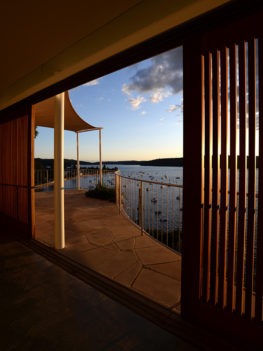
Breezeway House | David Boyle Architect
This family holiday house is situated in one of the quintessential small beachside towns of the Central Coast that are scattered along the eastern seaboard. Close enough to Sydney yet far enough to feel like a break, the cute beachside shacks which previously sat on large blocks are now long gone with their precious land sliced up to make the most of these highly coveted sites.
Breezeway House responds ingeniously to this, creating a generous four-bedroom home-away-from-home for multiple families. The house twists and turns along its linear plan to savour of the views it’s afforded while maintaining its privacy from the surrounding built up sites.
Impeccably detailed and playfully resolved, there is a real sense that love and care have been taken to design and build this house, from the fastidiously crafted timber joinery down to the perfectly cut brick shelf to place found treasures from the nearby beach.
The long linear plan is suited perfectly to the constant comings and goings of holiday life, allowing the building to open and shut as needed, while celebrating each moment of the journey.
Breezeway House is a holiday house that is light-hearted and fun; where detail, material and spatial experiences will surely invoke many fond memories in the years to come.
Award for Residential Architecture (New)
East Street | Kerstin Thompson Architects
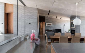
Located on the outskirts of the regional town of Albury, East Street is an excellent example of the humble suburban house transformed by sophisticated architecture. The project’s highly restrained material palette – a combination of concrete blockwork, dark plywood and fibre cement sheeting –is carefully composed to create spaces that are elegant without pretence.
The house sits unassumingly away from the street and has been carefully orientated on its semi-rural site to frame and capture the surrounding landscape. The planning of the house is simple and rigorous, allowing the users to occupy the spaces in varying ways as the seasons change throughout the year. Semi-enclosed veranda spaces and diagonal movements through the stepped volumes enlarge the spatial experience of the small footprint. The wet areas, kitchen and built-in joinery are free from unnecessary embellishment, allowing the basic materials to beautifully hold their own.
East Street is a fraction the area of the average Australian house and is one of the smallest projects Kerstin Thompson and her team have undertaken. The house truly demonstrates that building modestly and with care and consideration can cultivate results that are grand, generous and enriching.
Award for Residential Architecture (New)
Palm Beach Blue | Benn + Penna Architecture
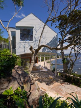
Palm Beach Blue is a playful reinterpretation of the humble beachside shack. Perched above the road on a steep west facing site, the four bedroom house is a gentle negotiation of a challenging terrain. Its formal outcome is also an expression of the programmatic spaces within, where an elevated volume containing the private zones of the house hovers above the open living spaces. These are situated on an existing sandstone terrace sculpted into a platform for social activities to take place. Full height sliding doors retract, expanding the living spaces out across this platform and taking full advantage of views across Pittwater. Subtle curving geometries carve out the building to enhance the experience of what is an undeniably beautiful landscape. Two dramatic voids break through the volume above, connecting sky to ground, and private to social below. Here a kaleidoscopic cut out allows a solitary moment to reflect on the views of the water beyond.
The weatherboard clad, pitched roof form of Palm Beach Blue is reminiscent of the home that was once there before. Its soft blue tones disappear into the sky above, while its sandstone platform anchors to the earth below. This is a retreat that allows its occupants full immersion within the landscape while remaining respectful to its existing context.
Commendation for Residential Architecture (New)
Bendalong House | Madeleine Blanchfield Architects
The pavilion is the centre of activity of this modest beach house on the south coast of NSW, opening up to the street in a generous way and encouraging social interaction. It rises just above the street on a plinth, but still offers a sense of retreat. Thoughtful detailing has created a four bedroom family home for the architect’s parents that fits its environment. So much so, the architect noted, that ‘kangaroos come and poo on the concrete at night and they eat my mum’s plants’!
Commendation for Residential Architecture (New)
One Wingadal Place | Collins and Turner with Temple and Stockwell
This unique architectural collaboration has delivered a unified, creative outcome, imaginatively resolving a complex brief with an extremely difficult site in Point Piper. Maximising the occupants’ views and privacy, the six bedroom house nevertheless carefully preserves the neighbours’ views and resolves the steep transition to the water, gradually opening up and rotating from the discrete entry to the two-directional harbour view.
Copper is celebrated throughout as a unifying material, from the richly decorative copper ceiling that defines the main living pavilion to slim facade elements and a crafted structural copper stair.
Commendation for Residential Architecture (New)
The Seed House | fitzpatrick+partners
This laboratory for sustainable systems and prefabricated mass timber construction, thoroughly researched and carefully detailed, has produced a model for a ‘100-year’ house. Innovative mass timber construction using high performance structural insulated panels joins a range of active environmental systems to create long-term sustainability, while the house’s lavish, four bedroom floor plan is designed to be modified over time as separable dwellings for the architect’s family. Purpose-designed fittings and hardware explore local manufacturing capability.
The cascading interiors showcase the quality of the timber and maximise the drama of the spectacular bushland site on Sydney’s Middle Harbour.
Commendation for Residential Architecture (New)
Tree House | Matt Elkan Architect
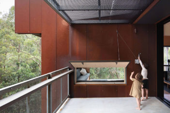
Tree house tackles an emerging crisis many bushy suburban sites face: building in fire zones. ‘The four bedroom family house in Bayview on Sydney’s Northern Beaches is a fine case study in how to resolve the sometimes inhibiting constraints of building in these challenging site conditions. Bushfire shutters are carefully detailed to be hidden, maintaining views and connections to the landscape that that are what have drawn people to occupy the bush. The resilient and tough weathering steel cladding of the outside is wonderfully counterbalanced by the soft light timbers of the inside.
Commendation for Residential Architecture (New)
Upside Down Akubra House | Alexander Symes Architect
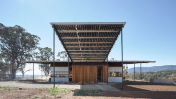
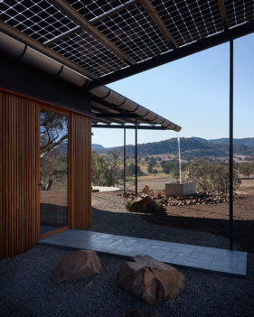
Upside Down Akubra is a minimalist off-grid three bedroom farmhouse that sits elegantly within its rural landscape near Nundle. An expansive steel framed roof projects beyond the home’s concrete walls, subtly framing views and providing shelter from the harsh climate. The building’s simplicity in construction belies an intelligent array of elements that renders it a self-sufficient habitation. PV cells extend beyond the roof to form an external shade structure, concrete formwork is reused in an inventive manner, and a single oversized gutter channels rainwater to an underground tank for reuse, its journey celebrated via a waterfall feature.
Commendation for Residential Architecture (New)
Wallis Lake House | Matthew Woodward Architecture
This low-maintenance three bedroom weekender on the NSW Central Coast designed for a client in the building industry captures beautiful lake views and invites a visitor to walk through its series of well-proportioned spaces.
Living areas in the off-form concrete pavilion and recycled blackbutt timber-clad private wing offer flexible rooms in a building that is immaculately detailed and executed.
A 40,000L rainwater tank services all indoor taps and toilets, while laundry grey water is recycled for garden irrigation. Its high thermal mass and a green roof over the living space help regulate room temperature and louvred windows encourage natural cross-ventilation.
Residential Architecture – Multiple Housing
Aaron Bolot Award for Residential Architecture — Multiple Housing
Verve Residences | CKDS Architecture with Hill Thalis Architecture and Urban Projects
Consisting of a pair of small, fan-shaped footprint towers and a linear podium fronting King Street, Verve Residences brings a commanding presence to Newcastle’s streetscape and skyline that challenges the monolithic, single use, tower and podium type. The project creates a new urban frontage to King Street, one of Newcastle’s major streets. The thoughtful planning provides public space along the canal and communal landscape spaces that are a striking contribution to the city.
The compact towers are defining urban markers without appearing large or bulky. Their increased perimeter, splayed balconies and articulation of the base ensure that many apartments enjoy corner positions, with extended sunshine and natural cross ventilation. Apartment layouts take advantage of the aspect and have extensive views. There is natural ventilation and daylight to the double open-ended common lobbies on all levels.
The main lobby is welcoming and feels special. The interpretative art infill element with its references to the geological and mining history of the site is unique and painstakingly assembled, giving something back to the public domain. The raw and robust building materiality suits Newcastle and will age well. The project is an exemplar combining public benefits, activation and leading residential design.
Award for Residential Architecture – Multiple Housing
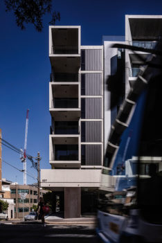
537 Elizabeth Street | Woods Bagot
Maximising a tight urban corner site in the dense city fringe, 537 Elizabeth is an exemplar in quality amenity, planning and materiality. Comprising 12 one bedroom plus study apartments and ground level retail, the design has been enhanced through the close and collaborative relationship between architect and client as developer and builder. The result is a high quality and crafted solution to densification representing a future model for urban living.
Skilled use of shared space and flexible, bespoke joinery imply a spacious interior, with the corner location allowing dual aspect and increased daylight and ventilation for apartments. Attention to detailing and craftsmanship elevates the beauty of this small group of apartments, reflecting the synergy of the team throughout the design and construction process.
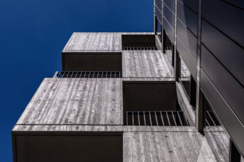
The long facade’s sliding rhythm of solid and void breaks down scale and increases visual interest of this bookend building. End facades complement and enhance adjacent built form, composing high amenity outdoor spaces with acoustic and visual privacy.
Robust and timeless materials minimise maintenance and enhance durability, demonstrating an appreciation of quality detailing and elegant simplicity of finish.
537 Elizabeth is the future model for compact urban sites, presenting crafted quality and amenity for residents and neighbourhood revitalisation.
Award for Residential Architecture – Multiple Housing
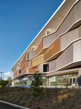
Boomerang Tower | Bates Smart
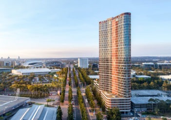
Boomerang is a high density mixed-use project that responds to the bold urban scale of Olympic Boulevard with a strong singular approach. The project redefines the masterplan for two towers into a single, taller sculptural form above a detailed podium, which strengthens the primacy of the boulevard as it is both a marker in the landscape, and an edge-defining whole urban block.
The sculptural tower form pulls apart traditional tower planning typologies using context, orientation and environment to remould the floor plate into a sinuous slender plan. The re-made plan creates two northern facades, deflects wind load at the curved edges, and provides all apartments with direct sunlight.
The podium facade is thoughtful and inventive, blending the requirements of carpark screening and sheltering the commercial office space in a singular, cohesive skin. The zigzag facade design allows window panels to face away from direct sunlight and reduce solar heat gain in the office spaces. A subtle change in material as the skin wraps the carpark provides 100% natural ventilation to all parking areas.
This is an exemplar of the high density urban tower typology, responding to the context and environment at many scales.
Award for Residential Architecture – Multiple Housing
Studio Apartments | Hill Thalis Architecture and Urban Projects
A generous quality of light and space within Studio Apartments elevates this expertly designed and executed development into an archetype for the studio typology.
The cleverly articulated five storey street wall steps back with screened upper levels creating a strong, unified facade. Cleverly sited on a challenging triangular site, apartments fan toward the northern street facade, opening up to light and ventilation with a retained sense of enclosure. Carefully designed balustrade elements to balconies visually extend studios, allowing a balance of sunlight, acoustic and visual privacy.
The arrival sequence for residents and visitors is a journey toward the layered rear garden, with naturally ventilated open gallery access to apartments. A roof terrace provides a communal gathering point, screened in the setback upper levels, providing outlook over the southern garden.
Low-tech environmental principles coupled with astute awareness of site conditions, deliver apartments with 100% solar and ventilation compliance. Simple, robust materials are executed elegantly externally, and carried internally to well considered finishes and joinery, providing a high quality of amenity and enduring design.
The generosity of space and spirit of the Studio Apartments is to be congratulated and demonstrates the potential for equitable and diverse density in existing urban locations.
Award for Residential Architecture – Multiple Housing
Waterloo Apartments | Chenchow Little
With its northern frontage overlooking the new Dyuralya Square, Waterloo Apartments is the centrepiece of the Lachlan Precinct, an area of former industrial uses. It is an inventive and distinctive insertion into the recent built fabric of the precinct. The project is architecturally complex with layers of reference and experience.
The architectural response references traditional wetland stilt structures through an expressed structural system, while also transforming the standard concrete column structure to define an integrated base and rooftop pergola structure. Columns located in front of glass walls define a structural skeleton, the defining character of the architecture.
On close inspection, the building demonstrates a diversity of expression in the highly visible elevation that relates to orientation and siting. The balustrades of the wrap-around balconies decrease in solidity with the height of the building; the north and south faces are split with pedestrian slots bringing light into the building’s centre; the west face has remote controlled louvre screens. The generous living areas, screened with light curtains, open out to the balconies.
A limited palette of materials including concrete, spotted gum, glass and green tiles have durable, self-finishing properties. The building is a highly nuanced and intelligent architectural achievement.
Commendation for Residential Architecture — Multiple Housing
Blackwattle Apartments | Turner
Blackwattle Apartments is a thoughtfully crafted, faithful response to the affordable housing masterplan. The thin building responds to the context of narrow streets and lanes, and broader urban/suburban duality of Glebe.
Glebe’s industrial history is echoed in the materiality, repetition and proportion. Fine grain detail references local terrace typology giving individuality to architectural expression.
Throughout the project thoughtful and inventive moments of delight in detail, colour, materiality, signage, and storytelling create a strong originality and identity for the architecture.
Commendation for Residential Architecture — Multiple Housing
The Burcham | Allen Jack+Cottier
The adaptive reuse of the original Wrigley Chewing Gum factory has been complemented by two new residential apartment buildings, creating an elegant, exemplary residential community. The new forms are distinguished, with clean, refined modularity of structure.
The relationship between old and new has been executed with cleverness, allowing The Burcham living spaces throughout to be light filled, with industrial finishes and materiality. The evocative communal open space enhances this unique living experience, which provides a richness and opulence for residents.
Small Project Architecture
Robert Woodward Award for Small Project Architecture
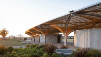
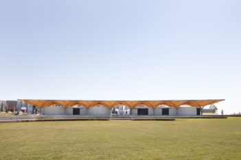
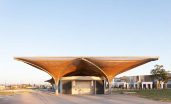
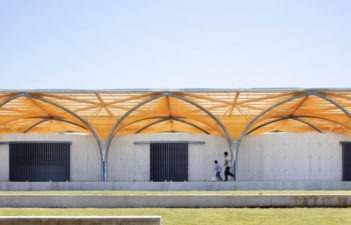
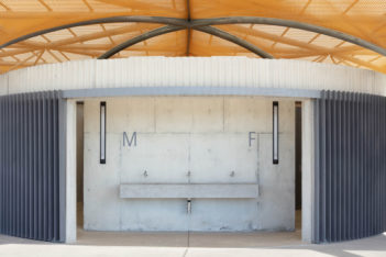
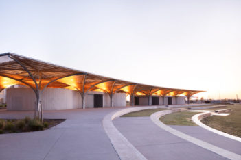
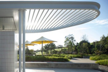
Marsden Park Amenities | CHROFI
All projects should have an ambition greater than just the client’s brief. The best ambitions should improve the public domain. CHROFI’s Marsden Park Amenities exemplifies this spirit.
Marsden Park Amenities appears to be one of the first public interventions in this new estate and therefore bore a heavy responsibility. The new residential estate on the flattest of Cumberland Planes needed a public building of civic scale to give it a gathering place of importance in an otherwise background of low-rise, repetitive suburbia.
Embracing the side of a main street with its flowering rosettes of columns, these amenities hold a sweeping, unifying, curving roof of suitable civic presence. Clad in a golden mesh, juxtaposed curvaceous forms skillfully roll in and around the columns to comfortably plan for toilets and change sheds for the local sporting fields. The roof acts as a parasol over the curved forms below and is generous enough both to allow a vista between the building elements and to accommodate casual public gatherings on the concrete podium under its ample overhang.
This is skilled architecture moving effortlessly beyond the brief to not only satisfy the programmatic requirements, but more importantly to define a public space with a beautiful and resolved architecture of uplifting civic gestures and fine details.
Award for Small Project Architecture
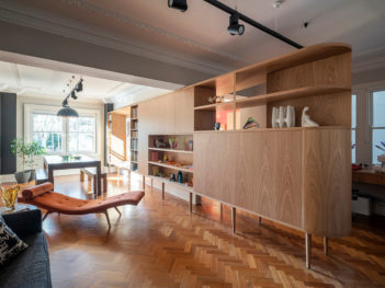
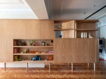
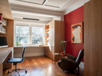
Lawler Residence | Andrew Donaldson Architecture and Design
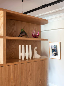
Lawler Residence cleverly utilises a single furniture element to achieve a complete spatial transformation of an existing 1940s apartment. Mindful of the degree of intervention the budget would allow the seemingly straightforward manoeuvre of introducing a wrapping piece of joinery successfully redefines the sequence of living and working spaces within the apartment.
The intervention itself forms as part bookshelf, art display, room divider, storage cupboard, desk and work bench constructed as a folding timber element which wraps the existing single dividing wall between the rooms. The form of the piece is materially and geometrically informed by the art deco nature of the apartment with the American Oak finish and coved corners enhancing its ability to appear as a natural intervention to the apartment. This level of respect for the inherent quality of the existing space allows the considered degree of intervention to enhance the unique features of the apartment. It is this wider elevation of the overall space and transformation of the inhabitants’ use of the apartment that the success of Lawler Residence is truly exemplified.
Award for Small Project Architecture
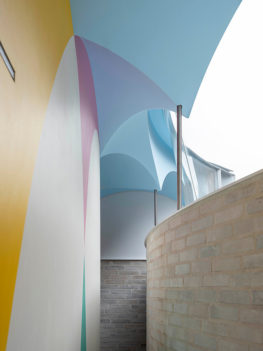
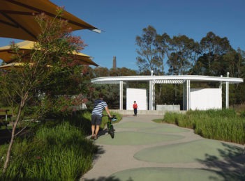
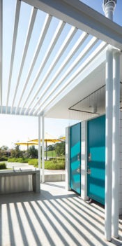
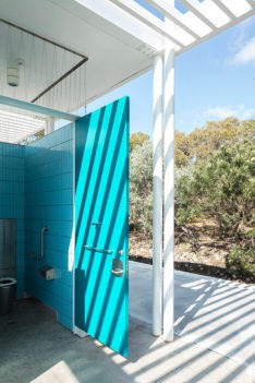
Sydney Park Amenities | Aileen Sage Architects with City of Sydney
It is impressive to be able to balance robust materiality, vigorous maintenance schedules, and safety concerns within a smaller budget and still achieve a delightful outcome. Aileen Sage has successfully navigated these challenges with their project Sydney Park Amenities.
The careful design process began with a survey of Sydney’s amenities blocks, allowing the architects to expand upon the City of Sydney’s years of experience. Overcoming a five year design timeline, the building creates a playful addition to the park. The lightweight canopy structure ties together the various built elements and also integrates complex services for the surrounding park. The architects deploy clever touches of colour to enliven the building, red grout amplifies the white tiles while each toilet has its own pop of colour inside waiting to be discovered.
Not simply a toilet block, this expertly designed project fits well into the existing parkland context and provides social spaces around the edges to be enjoyed. Aileen Sage is to be congratulated on adding to the rich history of amenities projects in Sydney.
Commendation for Small Project Architecture
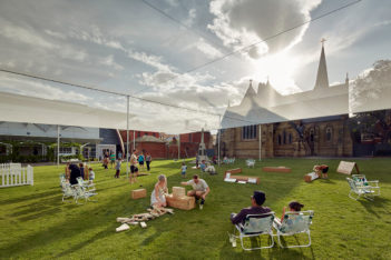
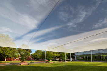
Summer Place | CHROFI
A small project with a big dream: to stimulate the public’s mind to think about this potential public hub serviced by the spokes of public buildings enclosing the square.
CHROFI’s elegant and contextually agricultural shade structure makes a simple gesture of forming and holding the square lightly. The smart thinking extended to an afterlife of the structure, where a buy-back offer helped fund the project at the end of its time.
The best projects have an ambition greater than themselves, and Summer Place reaches for that stretch goal; to act as a catalyst for something bigger; to make a great, green public square.
Commendation for Small Project Architecture
Wicks Park Amenities | Sam Crawford Architects
The Wicks Park Amenities is a simple design that begins to transform a previously underloved park. The timber box with beacon lighting provides a focal point within the park and reorientates visitors to deter antisocial behaviour. Sam Crawford Architects have balanced the need for robust details suitable for a public area and safety concerns while also providing a building that welcomes visitors. Although modest in size, this project uses architectural thinking to improve public space.
Urban Design
Lloyd Rees Award for Urban Design
Metro North West | Hassell with Turpin Crawford Studio and McGregor Westlake Architecture
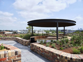
Sydney Metro Northwest is a richly interwoven project that integrates the public realm, infrastructure, and a sustainable vision for future density through art, landscape, and architecture across many scales. This is a series of eight projects, operating both together at the metropolitan scale of Sydney through a unified kit of parts, and independently, connected to each place through art and landscape, grounding each project in history and giving meaningful identity to place.
The orchards that historically populated the North West are reinterpreted through colour, and layout, with colours referencing their diverse produce. A gradient of colour becomes the journey along the 31km corridor though the North West. The grid of the orchards sets the organising principle of the public domain and allows detail and variation within its logical order.
At the centre of each project is a generosity of public space, the large light filled public rooms of the concourse levels and canopies are visually transparent and look out to a varied typology of public open spaces, plazas, linear street edges and parkland groves.
This is a project that looks forward to how Sydney could be, making space for people and for the future public life of each community.
Award for Urban Design
Anzac Memorial Centenary Extension | Johnson Pilton Walker with Government Architect NSW
The ANZAC Memorial Centenary Extension is a project that required gratitude, thinking and achievement. The service people, their families, Australians, New Zealanders and the world were watching.
The ANZAC Memorial Centenary Extension’s public and cultural benefits are obvious – facilitating memory, respect and gathering. Paying tribute to all the intrinsic thinking that lead to the original memorial and public space, it is a subtle yet powerful design that bookends Hyde Park.
The designers have paid great respect to the historic visions of Norman Weekes, Raymond McGrath and Bruce Dellit. The thinking is illustrated by the urban response that enhances the experience and place for visitors. The architect’s conviction is in the flawless expressionism and detailing, acknowledging the core purpose and narrative of the ANZAC Memorial – remembrance, reflection, comfort and commemoration.
The architect led a large complex team through many stakeholder opinions, and the sophistication, simplicity and strength of the design helped guide the resolution and completion of this iconic memorial.
Finally, the integration of art enhanced the thinking through reflection – this project has completed what is considered to be the keystone monument of Sydney, ‘intended always to express with dignity and simplicity’ in the words of Bruce Dellit, 1934.
Award for Urban Design
CBD and South East Light Rail | Grimshaw with ASPECT Studios , on behalf of Transport for NSW, project collaboration with City of Sydney and Randwick City Council
The Sydney CBD and South East Light Rail is a legacy project for the people of New South Wales.
The complex partnership between allied disciplines, all working together, created an outcome that is for the people of the CBD and South East Sydney. The navigation of all the stakeholders was intrinsic to the success of the project.
The challenge of inserting light rail through the historic heart of central CBD and beyond has resulted in a skillfully adaptable and flexible solution.
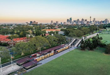
This is more than a simple transport project – it has created an experience of all the localities it dissects. The public and cultural benefits have been enriched with faster, safer and convenient public domain, creating a journey through distinct communities and vernaculars. The project design restores connectivity and therefore creates community and cultural interrelation – a city of diverse experiences and place.
The design team’s resolution of light rail stop locations and their placement was contextually smart; the positioning being essential in enhancing adjoining urban programs. The materiality and sophisticated detailing proves to be a jewel in the overall Sydney Transport Network – bronze canopies, flashes of copper and granite surfaces all contextually responsive and iconic to the Harbour City.
Award for Urban Design
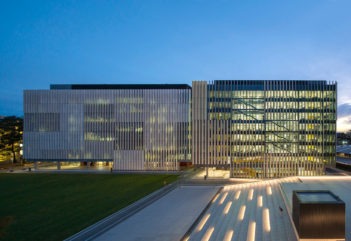
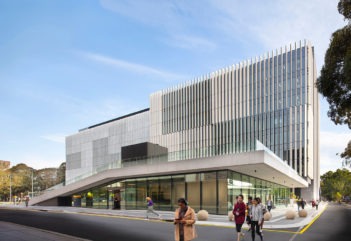
University of New South Wales Science and Engineering Precinct | Grimshaw
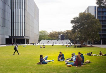
Sited in the UNSW Science and Engineering Precinct, the project comprises the civic-scaled Alumni Green which at the same time folds over the subterranean performance art theatres and creates an elevated, tiered platform that overlooks the gardens of the Round House, a flanking colonnade and cross site pedestrian pathways to access building entries. The project is distinguished by its restrained aesthetic and refined detail that underscore a seamless integration of external open spaces and pathways that unify this lower part of the campus.
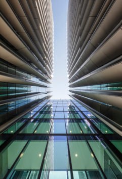
The Alumni Green succeeds as a subdued, large, north facing, landscaped space between the residential colleges and the broad colonnade of the Science buildings, a new open space for the campus that connects the upper library campus down to the new light rail station of Anzac Parade. Unexpectedly, vertical metal blades of the Science Building intermittently extend to the ground to define the wide, north facing colonnade.
The gently folding, raised and stepped platform that defines the performance space successfully provides an outdoor auditorium, casual seating and informal meeting place. At night, the stepped platform is a sublime and impressive element illuminated by understated and soft lighting – a counterpoint to driven campus life.
Commendation for Urban Design
Sixty Martin Place | Hassell
Elegantly defining the corner of Macquarie Street, Sixty Martin Place is simultaneously constitutes a strong architectural landmark at city scale and enhances urban experience at human scale.
A civic room adeptly transitions the level changes, providing connection and a new city space, while reflecting upon the site history and St Stephens Church. The sculptural tower steps and curves to embrace and respect the church steeple.
Sixty Martin Place graciously defines its prominent location, delivering quality urban space and respect for context.
Sustainable Architecture
Milo Dunphy Award for Sustainable Architecture
Marrickville Library | BVN
The project team’s approach was about community and placemaking, and sustainability was a strong component of that vision from the start. The building successfully expresses that vision — an inviting, beautiful piece of architecture which offers benefits to a large and varied community.
The jury commends the role of the architect/architecture in building a relationship of trust and partnership with the client to serve a greater objective. The client and community knew what they wanted as an experience but couldn’t imagine how it would manifest in built form. The architect responded to those needs, creating the space which shelters, supports, and celebrates them.
The building is a clever adaptive reuse, which honours the heritage and history of what came before by effectively incorporating it into the new. Retaining the old hospital building respects the memory of that use, as well as providing embodied energy benefits.
The design uses an abundance of natural light and incorporates natural/mixed-mode ventilation and sustainable timber and recycled bricks.
Award for Sustainable Architecture
Arkadia | DKO Architecture with Breathe Architecture and Oculus
The two key design drivers for this multiresidential project were responding to community and addressing climate change. For the former, the team went doorknocking to ensure the locals directly informed the design response. The latter was acknowledged by the team as the single biggest issue facing humanity in the 21st century, calling for a groundbreaking effort.
The DHA/Breathe/DKO/Oculus team worked together to push the boundaries and each other, taking on an extra degree of difficulty in delivering this development.
The building features an extensive roof garden, complete with beehives, food production, and shared amenity spaces in a strong landscape integration.
The building skin is made up of nearly half a million recycled bricks and articulated with deep reveals and solar shading to the north and west. The window openings allow cross ventilation, summer shading and winter sun penetration.
The building is fossil fuel free. The power is 100% electric, in a highly efficient building with a thermal performance of 6.2 stars (NatHERS).
The team has also taken on an additional role as mentors, providing ongoing guidance to users on operating the building.
Award for Sustainable Architecture
Warrumbungle National Park Visitor Centre | TKD Architects
Located 20km west of Coonabarabran NSW, the Park and original Visitor Centre were devastated by catastrophic fires in 2013. The project team sought to create something extraordinary and were committed to understanding the opportunity this building presented in the minds of the community. In response to the community’s vision and the unique place of the project, the team worked in collaboration with National Parks and the local Aboriginal elder to develop the interpretive aspects of the centre. They have delivered an inviting and beautiful piece of architecture that will help visitors be present in the place. Powerful, curving, stone-clad walls celebrate the iconic volcanic dykes and rock formations. The main space provides unobstructed views of the notable rock formations, ‘Breadknife’ and ‘Belougery Spire’.
The project is a statement of resilience and rebirth, exemplifying architecture’s role as healer. Sustainability aspects of the design included: use of thermal mass to regulate temperature, natural ventilation throughout, a PV cell array for electricity, and water collection for toilets and irrigation. Local endemic plant species were cultivated specifically for the project in collaboration with local experts and were selected to withstand dry conditions and minimise irrigation.
Commendation for Sustainable Architecture
Axle South Eveleigh | fjmt
The team viewed the success of this project as being ‘not about one big move, but an accumulation of smaller moves’. The architect ensured the introduction of this building benefitted the community – integrating a childcare centre, quality retail, creative spaces, landscaping, heritage interpretation, public art, and a skate park. Axle was designed to achieve a 6 Star Green Star Design and As-Built v1.1 rating together with a 5 Star + 40% NABERS Energy rating and 4 Star NABERS Water rating.
Commendation for Sustainable Architecture
Daramu House | Tzannes
This project builds on the achievements of its sister building, International House Sydney, taking CLT technology further to explore modularity and flexibility for future use. Adaptable for future tenants, floor cassettes can be removed; providing the opportunity to be dismantled at end of life and modular timber elements reused. A PV array in the roof garden provides 25% of the building’s energy. Integrating systems for better performance, it uses its growing green roof to cool its PV panels, increasing efficiency.
Commendation for Sustainable Architecture
Wildlife Retreat at Taronga | Cox Architecture
The first of its kind in Australia, this hotel is one of two nationwide to achieve a 5-star Green Star rating. The project vision is to enable connection to nature as a first step towards stewardship, blurring the boundaries between the habitats of the human and the zoo residents. The Wildlife Retreat at Taronga has provided a unique opportunity to influence attitudes and behaviours of guests towards sustainability and wildlife conservation. It incorporates CLT, rooftop PVs, stormwater collection and reuse.
COLORBOND® Award for Steel Architecture
COLORBOND® AWARD FOR STEEL ARCHITECTURE
Bankwest Stadium | Populous
The award jury, composed of jury chairs and BlueScope representatives, was impressed by the architectural and structural achievements of Bankwest Stadium. Populous has successfully delivered practical solutions and polished details with a dash of colour. One of our jury members had the pleasure to watch a pop concert in this stadium and was amazed by the experience, despite not being a fan of crowded concerts. The design celebrates steel in its natural form and supports local manufacturing; the stadium was built using Australian steel fabricated and painted in Western Sydney, where the project is sited. Cleverly designed with repeatable elements suitable for installation using standardised construction techniques and sized to minimise transport impacts, the architects’ astute approach produced great construction and budget efficiencies and also minimised impacts on residents. The articulated western façade clad in metal sheeting also enhances the form impressively, creating a dynamism as it changes throughout the day.
Commendation FOR STEEL ARCHITECTURE
Upside Down Akubra House | Alexander Symes Architect
An example of regional architecture excellence, Upside Down Akubra House, utilises simple, robust elements that are brought together in a straight forward, yet innovative way. Steel is an essential compositional component both internally and externally. The facades feature a combination of reflective and matte metal cladding, zinculume custom orb in the lower portion of the facade shimmers in the sun, illuminating the home in the landscape. The roof and steel structure evoke the simplicity of traditional farm structures but with a clean and contemporary refinement.
Enduring Architecture
Award for Enduring ARchitecture
Palm Garden House | Richard Leplastrier
Built between 1974 and 1976, Palm Garden House by architect Richard Leplastrier, invites us to imagine a simpler life lived more in tune with nature. Tucked into a gully on Sydney’s northern beaches, Palm Garden House is a hidden sanctuary designed for a professional client by an architect and educator who has studiously shunned the spotlight over his long and influential career. Behind rammed-earth walls, within the embrace of ancient palms, the house all but dissolves into a sun-dappled landscape. Leplastrier and some shipwright friends built the house. Its two rooms are joined by a central corridor, along which a steel framing system supports the two skins of the house: its timber and canvas linings, and a twin roof of rolled copper. All the essential elements of domesticity are compressed into a rammed-earth wall along the corridor, so the overwhelming experience is of the contemplative garden: the trickle of water, the rustle of leaves, shadows playing on fabric walls. For 45 years it has nourished its owner, who shares it still with the birds, inspects and water dragons that inhabit this cool, meandering oasis. The years have brought not decay, but a lustre to its timbers, and a lichen colony to the retractable canvas roof. All else is thoughtfully preserved. In a post-pandemic world questioning values and ways of life, Palm Garden House is a reminder of our elemental selves, and a touchstone to architecture that is built with nature, not against it.
